Rich colors seep into the air around them, creating a field of decadent, earthy hues. Looking at FENIX® materials, you can just tell they feel good.
A super-matte, low-reflective, anti-fingerprint, nonporous surface is at play—and “technology has never looked more beautiful,” jokes Gerri Chmiel, senior design manager.
The surfaces feel like a new way to experience color, especially when mounted to cabinets and vertical surfaces. “It’s a very livable yet luxurious color palette,” Gerri says.
The FENIX collection includes classic, best-selling neutrals alongside deep, daring blue and burgundy, rooted in nature and put on display through innovation. Studio Sixtysix explores the intrinsic timelessness and allure of natural earth tones and the impact of great color in FENIX soft touch surfaces.
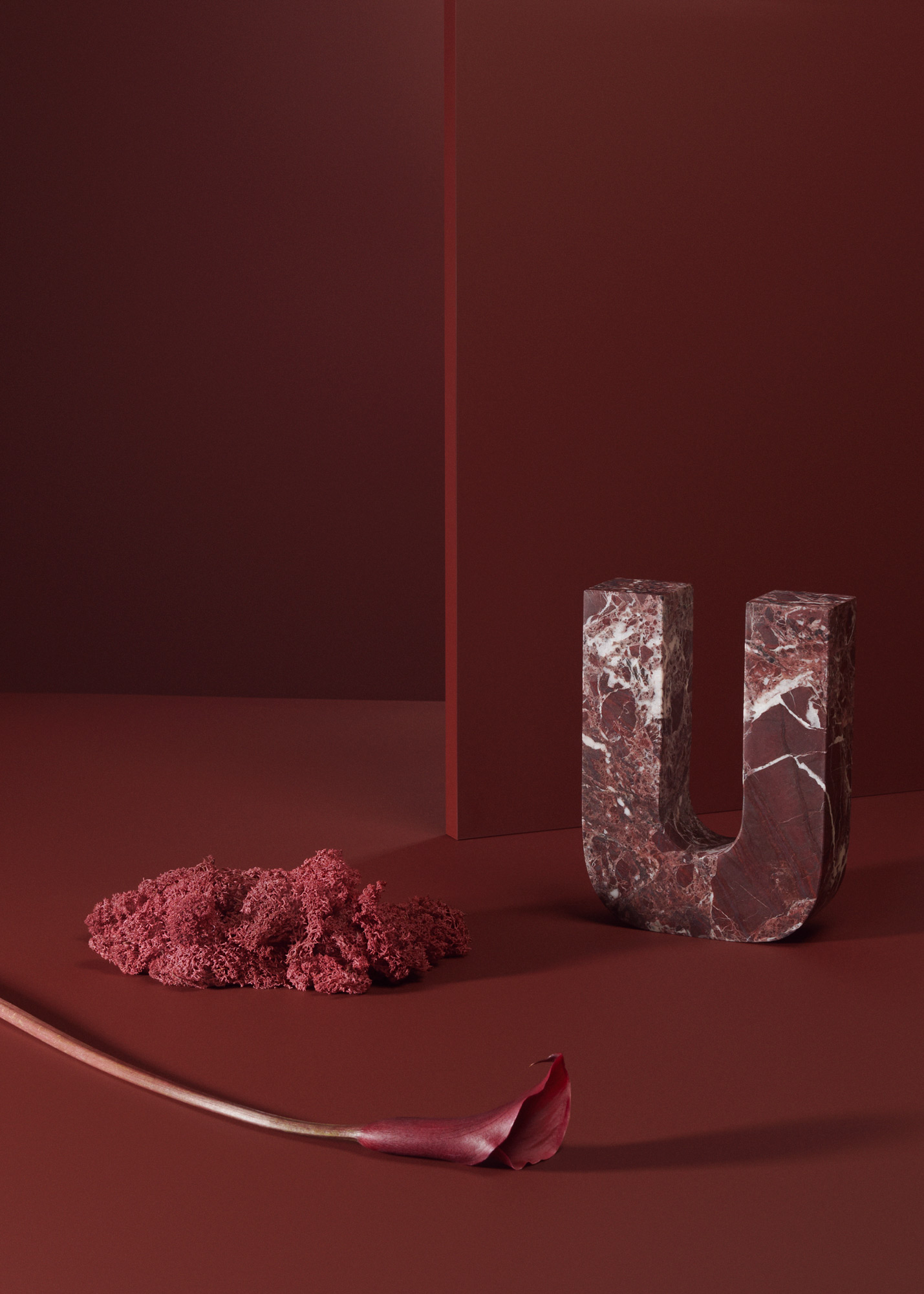
← The desert-like burgundy of FENIX in Rosso Jaipur is perhaps the epitome of nature meets innovation meets opulence. “It has that immediate impact of the color with the super matte finish,” Gerri says. “You’re not walking into a room and seeing a sheen, wondering what the material is because you can’t necessarily see it. You really notice the color when you walk in, it is upfront.”
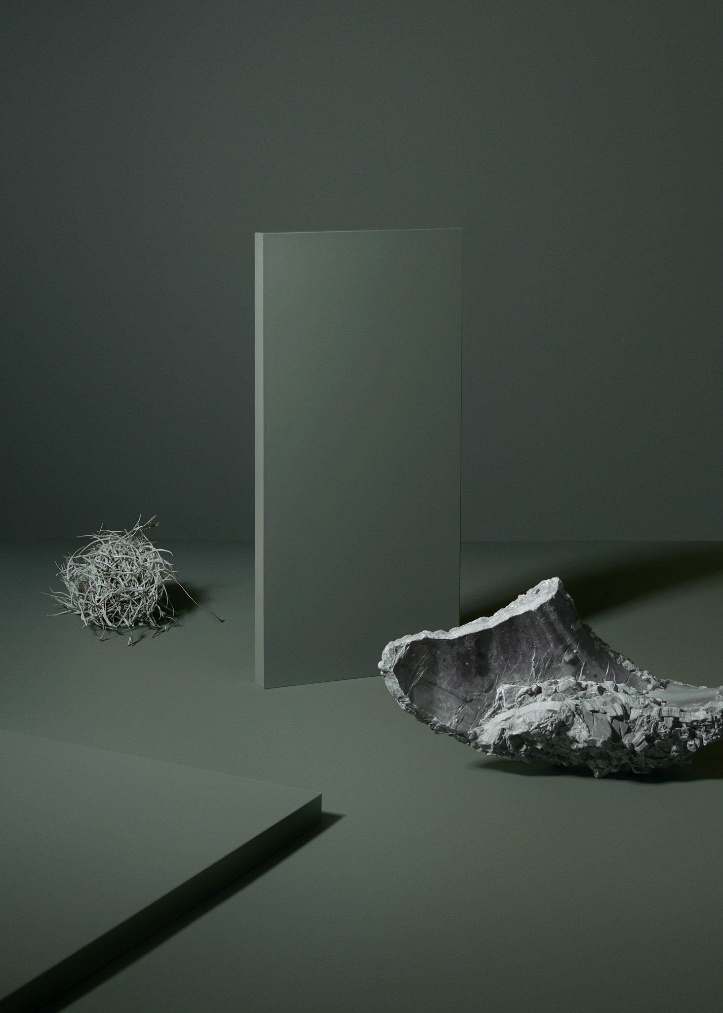
While Nero Ingo, Rosso Jaipur, and Blu Fes have the deep and moody atmosphere on lock, Verde Comodoro reminds us that natural hues can be peaceful, soft, soothing, and relaxing, too. “Like a spa bathroom,” Gerri says.
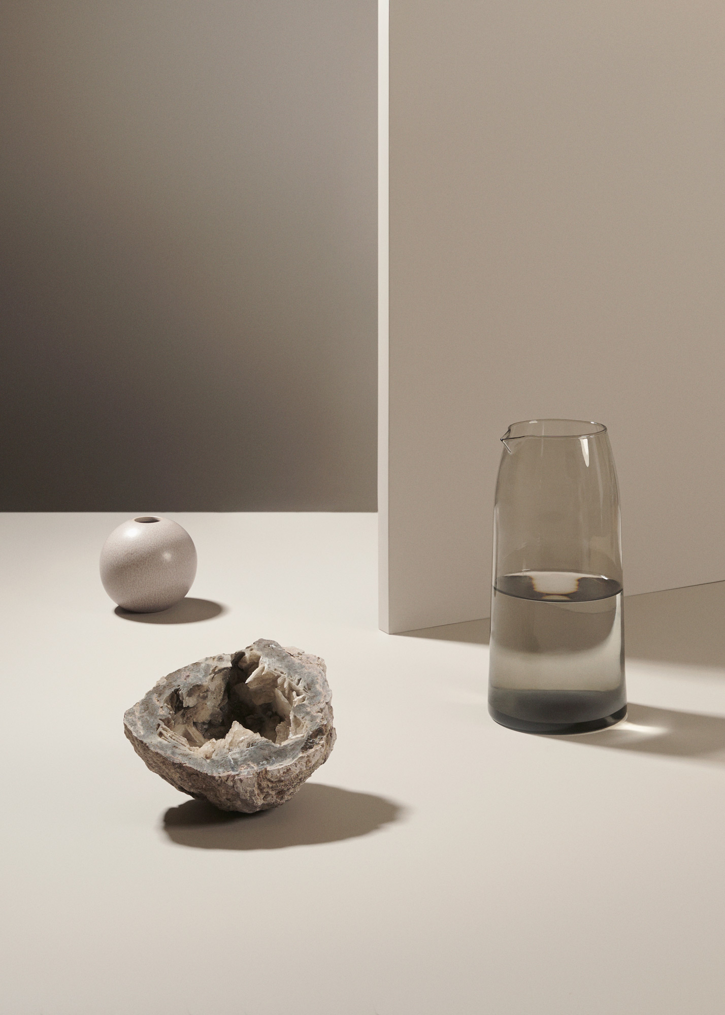
← Great colors like Beige Arizona certainly look rich, but a different kind of decadence comes with living with FENIX day-to-day. “It’s a luxury to have a matte surface that doesn’t require any special maintenance.”
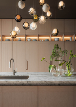
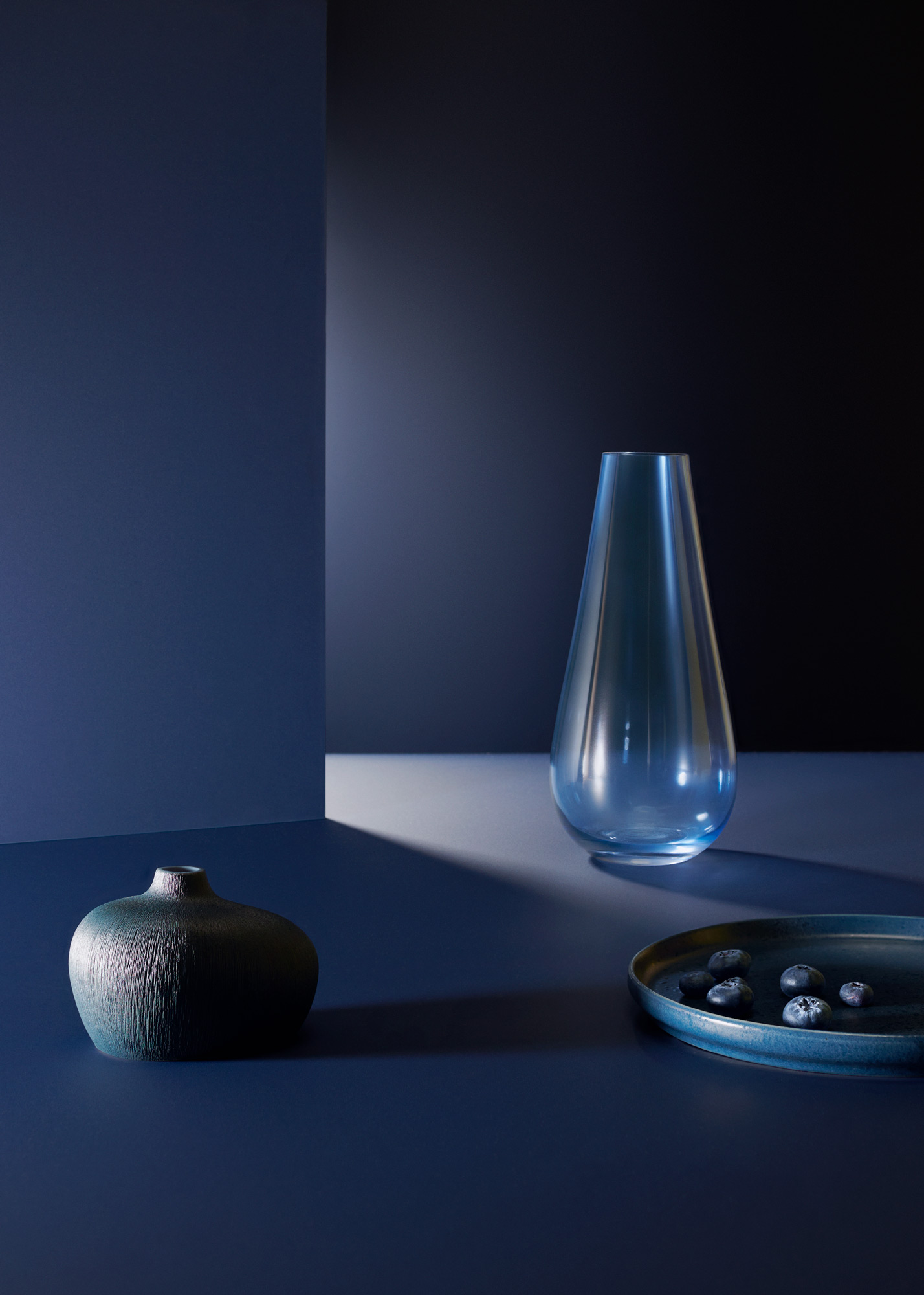
→ Gerri is excited to see more of the deep-ocean blue of Blu Fes on cabinets (and countertops).“You can do that moody interior with [Blue Fes], too. At the Kitchen and Bath Industry Show this year, lots of blue was represented. I found that really exciting, that we’re going into this blue direction,” she says.
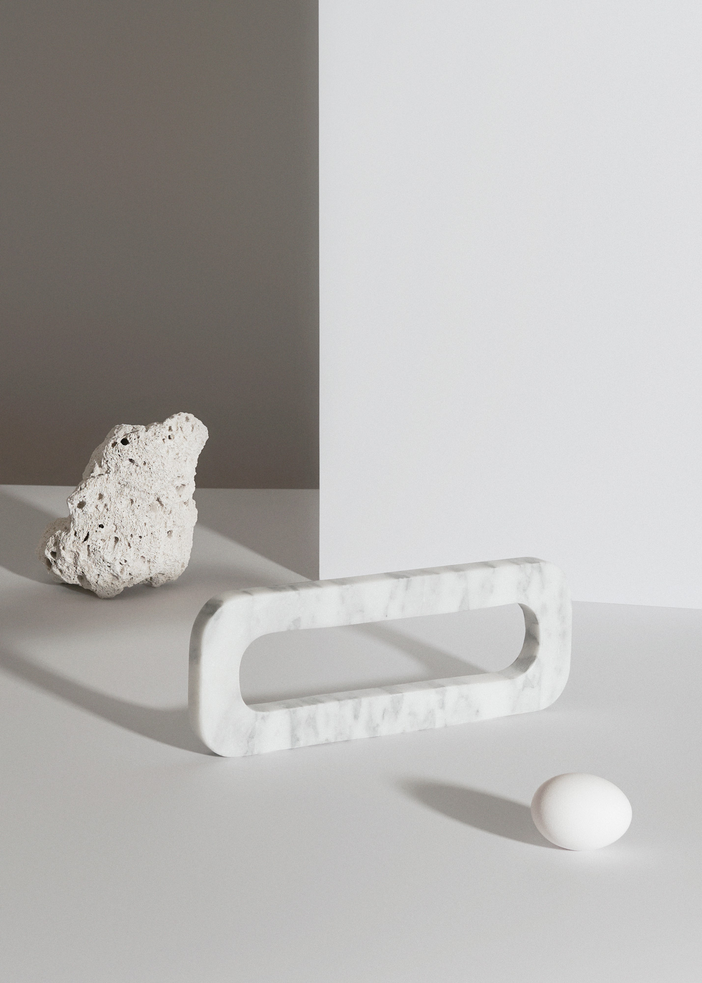
Engineered to be soft to the touch, “FENIX has a warmth to it,” Gerri says. “We’re so used to feeling the cold and hard surfaces of granite and quartz, so it’s a really delightful feeling and a surprise when you touch it.” Even the cool Bianco Dover white has a cozy tactility, apparent even to the eye.
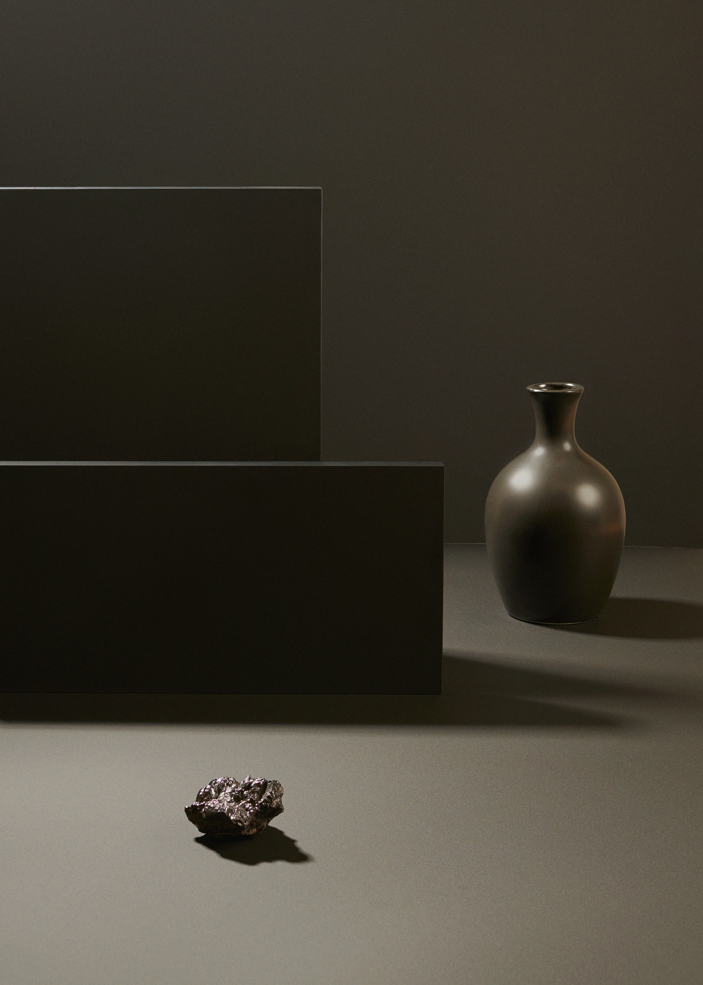
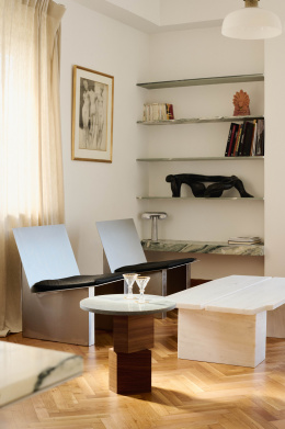
← Colors like Nero Ingo pack a punch with FENIX. “It’s just such an easy material to find a home globally, whether it’s kitchen or bath, vertical or horizontal, it’s very versatile,” Gerri says. “It can lean more contemporary, but it’s still approachable.”
Words by Lark Breen
Photos by Chris Force
Styling by Kristina Walton Zapata
Concept Produced by Studio Sixtysix
Retouching by Happy Finish
Studio Sixtysix is the in-house creative agency to Sixtysix magazine. Studio Sixtysix stories are conceived, produced, and edited by Studio Sixtysix.
A version of this article originally appeared in Sixtysix Issue 08 with the headline “Natural Harmony.” Subscribe today.
Subscribe to our weekly newsletters Noted and Money Folder by Chris Force
Trending at Sixtysix:
- Issue 16 of Sixtysix is here. The design, the people, and the ideas worth keeping off your screen. Get your copy.