“Packaging can be theater, it can create a story.” Apple’s Jonathan Ive dropped that pearl of wisdom in Walter Isaacson’s authorized biography of Steve Jobs. And even though he was referring to the “ritual” of unpacking a physical product, the same sentiment applies to the digital “packaging” that is a creative professional’s business website. It’s where a designer sells their services, their work history, their mission, and it needs to quickly communicate a narrative—or at least a strong sense of individuality and personality. With that in mind, we went looking for inspiration. Whether you’re starting from scratch or just looking to update what already works with some fresh new features and clever additions, below are some techniques—paired with specific examples—that will help in your hunt for the best website design inspiration.
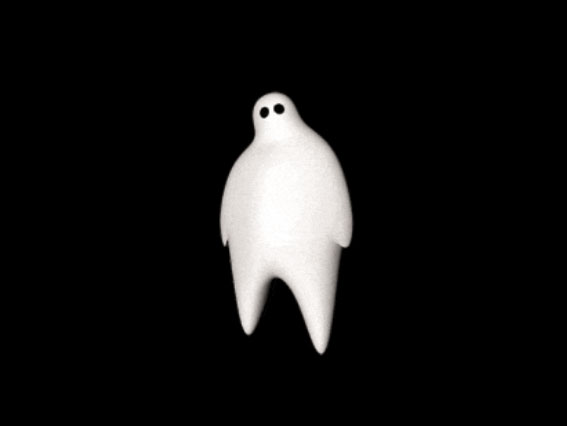
Phantom uses load time for some well-placed, almost subliminal branding. Screenshot: Phantom.
1) Getting Loaded
First things first. Before your would-be client sees anything else on your site, they see the loading symbol, especially if you’ve got a lot of nifty graphics or animation that need to gear up. Done wrong, this can be simply irritating for the user—the Spinning Wheel of Death for CVs, if you will. But it can actually be playful, fun, and communicative of the brand.
For instance, London- and Auckland-based creative agency Phantom’s loading graphic is a 3D representation of their ghost-like logo. The design quickly rotates, dissipates away, and suddenly you’re at the homepage—having already taken in the brand’s aesthetic and visual sensibility.
Another good example: iFly KLM Magazine. The company site has garnered recognition from Awwwards with its beautiful, 360-degree interactive page, but its loading sign is literally the first thing that stands out. “Trust us, you want to turn up the volume during this experience,” reads the text, just below a headphones icon encircled by a loading-progress circle, letting you know you’re about to experience something (else) impressive.
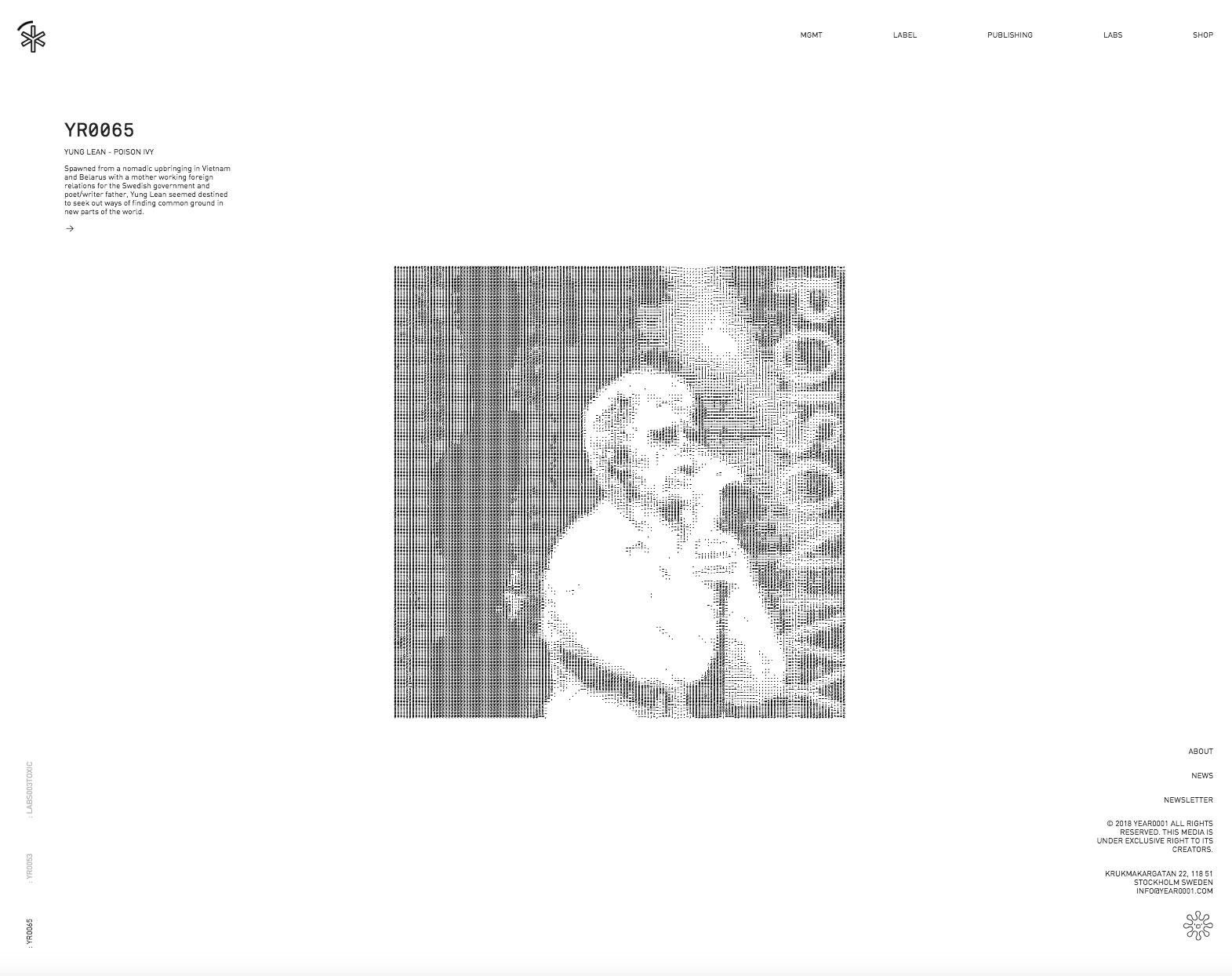
Photos automatically alternate—with a cool pixelation twist—on YEAR0001. Screenshot: YEAR0001.
2) Change Up the Photo
The home page, it should go without saying, needs to deliver the goods and look great, too. It needs to be informative, of course, but it also must convey your professional aesthetic. One of our favorite ways to achieve this is with a shifting photo effect.
Jit Team is a Polish information technology and services outfit, and their website is a study in how “dynamic home page” need not be synonymous with “busy home page.” It’s clean and crisp, but the simple choice to automatically shift out the background images, which feature various members of the company in various whimsical poses, keeps the aesthetic from scanning overwhelmingly minimalist.
Also check out Stockholm-based record label YEAR0001, whose home page achieves the same result but with a stylized pixilation effect that adds an extra dimension of visual flair. It cycles through three photos and similarly helps the tastefully designed, minimalist aesthetic (it’s in all black and white) of its site pop a bit.
3) The Transition Phase
Transitioning from one page to the next doesn’t have to feel like a perfunctory experience. For proof, look no further than the website for creative agency Cult. The transitions are dynamic, but smooth and slow enough to keep the user experience uninterrupted. The sharp black-and-white design, coupled with warm undertones, adds to the sense of visual panache.
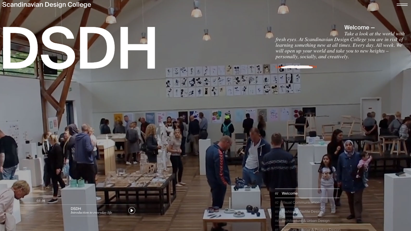
Surprise: The Scandinavian Design College’s website boasts several clever design components. Screenshot: DSDH.
4) A Better Hover
It follows that a design school would have plenty of imaginative-yet-unobtrusive elements featured on its site. And there is indeed a lot to love about DSDH Scandinavian Design College’s website—the high-quality video, the intuitive UX, the crisp fonts—but our favorite detail is its clever hover effect. Point your cursor on almost any link and watch it instantly create a nifty scribble-out effect. It looks incredibly snazzy, and it doesn’t manifest so quickly that you lose your bearings in terms of navigation.
5) Change the Cursor
Toying with the cursor can be a risky proposition. You never want to overly subvert the user’s experience, and this can potentially be a way to strip a would-be client of their sense of familiarity as they navigate your site. But when done well, not only will it not leave visitors unmoored, it will go a long way toward enhancing your brand’s visual identity.
The Inlay is a digital and branding studio located in Manhattan, and their blueprint-inspired website also recently landed an Awwward win. One of its selling points is surely their cursor, which displays as a design circle rather than the old-fashioned arrow to which we’re all accustomed.
An Awwwards nominee, Yukie Nail and Hearts Hair NY’s website—replete with undulating aquatic effects—is a captivating example of what full-screen WebGL can do. But it’s winning in a simpler way, too. Check out the cursor—a crisp, clean white circle. The fact that it initiates all those cool wave-like 3D patterns doesn’t hurt, either. Side note: This site also boasts a simple-yet-inspired loading symbol, a 0-100 counter, which speeds along quickly and reads easily as well.
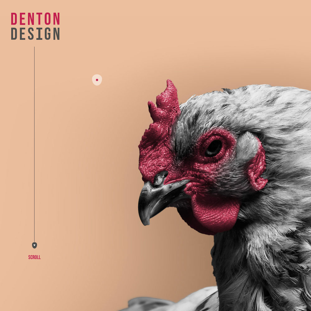
And over at Denton Design, the site reimagines the cursor as a simple red dot that trails along a larger shadow dot. It’s not too dissimilar from the mouse pointer trail option available on most computers, but rather than an accessibility feature, the technology here is used toward creative design. It’s a clever way to make your site more engaging.
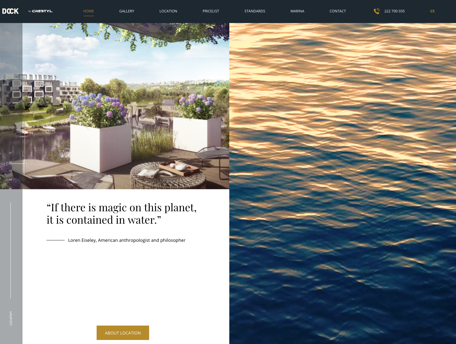
Aside from some splashy WebGL water desks, Dock Prague employs a handsome SPA navigation, with a handsome custom scroll. Screenshot: Dock Prague.
6) Reimagine the Scroll
We’re suckers for single-page application. Rather than loading page after page, the application keeps the user experience extremely fluid by dynamically rewriting a given page. Dock Prague, a Czech apartment development project, utilizes Vue.js for its SPA layout, with one page seamlessly transforming into another with each scroll up or down. The design nixes the navigation bar that we’re so accustomed to seeing in the browser—a potentially dicey UX decision that’s easily shored up by the inclusion of crisp-looking, interactive progress sidebar.
7) Come Out and Auto-Play
Speaking of potentially dicey decisions, going the auto-play route with your audio is just as likely to leave a user angrily scrambling for the “mute” key as impress them. Not all surprises are happy ones, and that’s certainly true in web design. But if you’re, say, an audio professional who’s specifically looking to show off your production, design, or editing chops, this move makes perfect sense. If it’s music in particular you hope to spotlight, check out So Young Magazine. Their example—embedded Spotify playlist with track controls at the top left of the screen in addition to the playlist controls below—is instructive.
8) Getting Animated
If you’ve leafed through the above sites, that means you’ve already taken in some top-notch animation to fuel your website design inspiration needs. Still, it bears singling out. Whether it’s a playful, line drawing spurred to life (see Clemens Hill Wines’ delightful home page lead-in) or animation teeming with interactivity and gorgeous, Barba.js-fueled transitions (check out Russian production enterprise company Diatech), the effect of a well-honed CSS3 animation is truly worth the time investment.
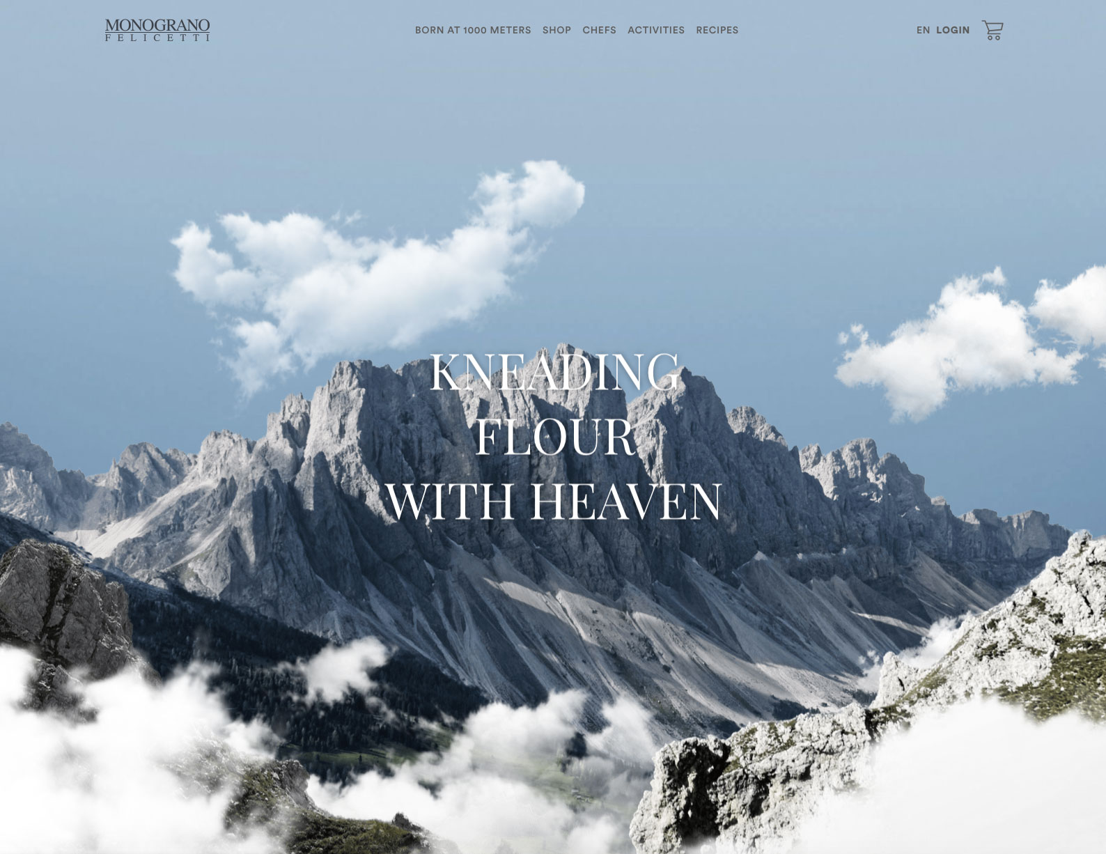
Monograno Felicetti’s header uses interactive animation but still presents as crisp and clean. Screenshot: Monograno Felicetti.
9) Good Clean Fun
You’d be forgiven for worrying whether the cumulative effect of so many bells and whistles is slow-to-load sites, overburdened hard-to-process graphics, videos, and animations. And to be sure, you need to be judicious; just because something looks cool doesn’t mean it’s a fit for your site. But it’s important to stress that, with right back-end development and a diligent sense of optimization, striking design does not need to equate to slow loads. Two great examples are: legendary Italian pasta-makers Monograno Felicetti, whose site employs nifty header animation and shaded interactive graphics yet still loads well and displays clean, and 10x, a music site that proves colorful interactivity and creative transitions can also be crisp and unfussy.
