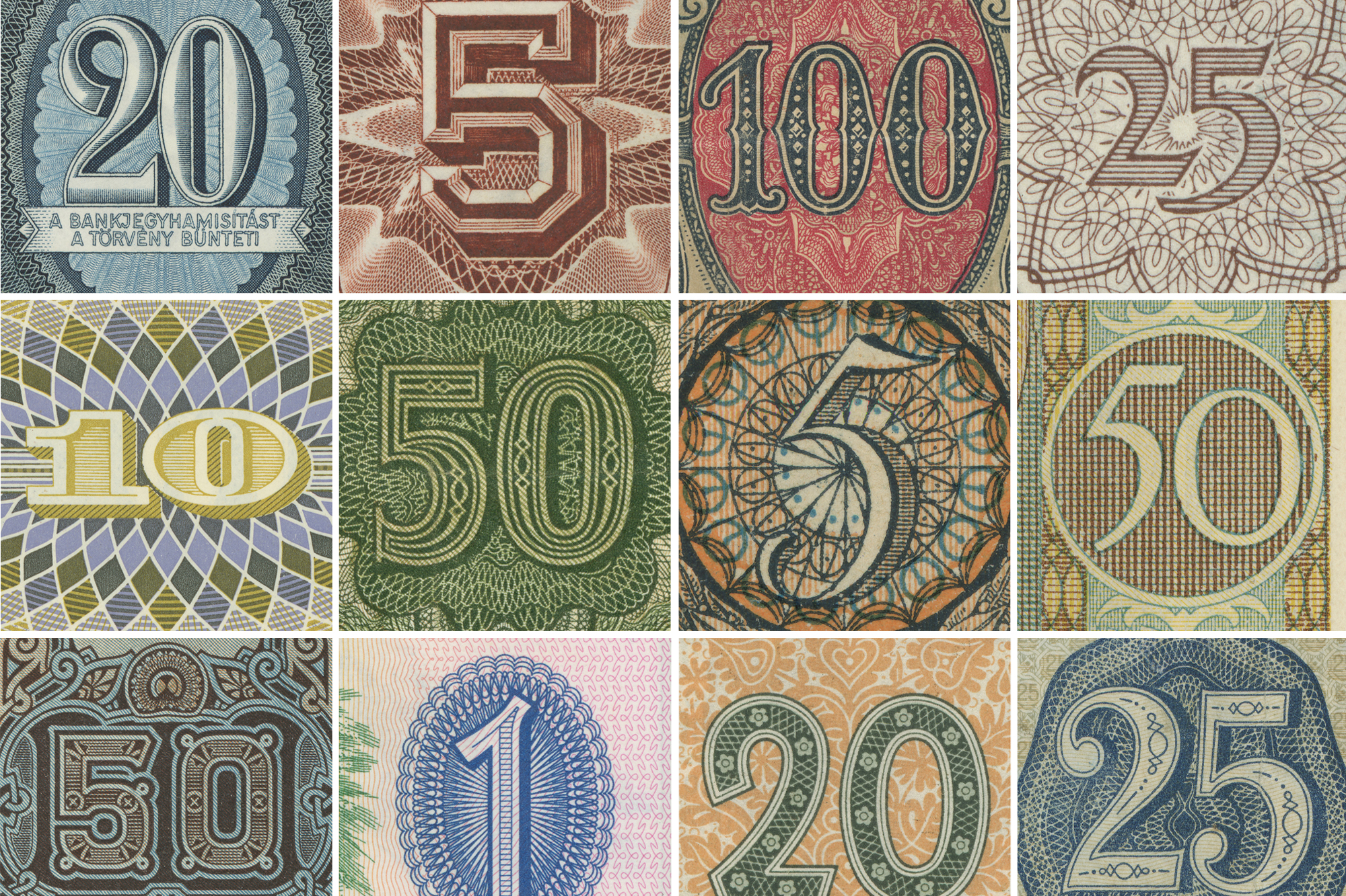
Typographer Tobias Frere-Jones has been collecting since he was a boy. Over the years, his passion zeroed in on the lettering within his collections, and he felt driven to dig even deeper, dissecting historic typefaces, collecting anecdotes, and amassing an assortment of rare treasures. Here, he shares a few examples of how collecting continues to inform his design process.
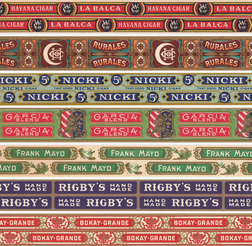
Old cigar box edging strips from Tobias’ collection
1. Collecting is an attitude.
Tobias considers the interesting items he picks up as having the potential to answer questions he doesn’t yet have. “There’s a satisfaction in having this beautiful thing arrive, whether it’s a type foundry specimen book or a batch of old lottery tickets or some piece of enamel signage. But it’s also the idea that something in here may be useful at some point. As much as I collect books or other objects, there are also non-tangible things I collect, whether they’re stories or anecdotes that are pleasing and satisfying, that can also turn out to be useful in some way. I think of it as gathering answers or pieces of answers, trusting that the question that goes with the answers will come along at some point.” A set of Bulgarian lottery tickets—with their delicate yet blocky numerals—was the impetus for the Conductor typeface.
RELATED | Beyond Stunts with Stefan Sagmeister
2. It’s important to understand how something was made before making something new.
“Whether it’s a typeface, an enamel sign, or a bank note, you need to understand how it was made, what the technology was at that time, and what its limitations were.” Tobias points to Bell Gothic, circa 1930s, as an example. Developed for phone books, it has particularly “unusual moments of construction in how the lowercase is put together,” he says. He notes a defensive strategy in letters like the b and the d, as the creator expected distortion to happen on press and acted proactively. He says the technique is repeated in Bell Centennial about 40 years later. Those ideas were combined with the notion of what emotional impression the typeface should have, and this became a new design called Exchange. “That’s another way of making use of all of these things I’ve collected. They can be very direct or they can be put under a microscope and dissected to see how they’re made—to try to learn from that and not just admire it.”
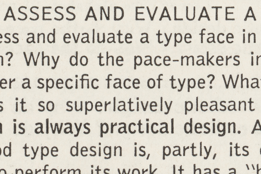
A close-up of the Bell Gothic type from 1937
3. Timing is everything.
When Tobias was a teenager, he had the idea to make a typeface based on highway signs. “At first it seemed like this kind of esoteric joke not many people would get.” A few years later, he watched as styles changed and the grunge movement arrived. He started trying to imagine what would happen next. “I realized—and this was not at all what I was thinking originally—this very straightforward sans serif that actually had some noise and dissonance in it might actually find some traction if this was the frame of mind people were in, so I decided to propose this design. It ended up being Interstate. The one thing anyone can control is when you decide to do something. Thankfully that paid off and showed up at the right time.”
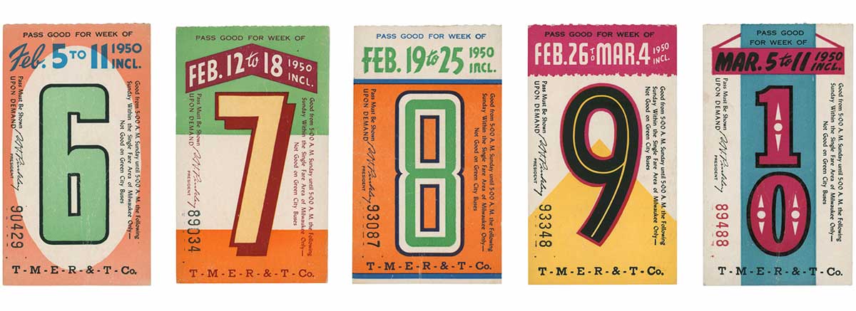
More selections from Tobias’ extensive type collection: transit passes from the 1950s
4. Don’t design for what’s popular now.
The design for Empirica had been around since 1994, and while Tobias always had a strong attachment to parts of it, he wasn’t sure how to expand the family. So he and Senior Designer Nina Stössinger waited for what felt like the right time to release it and watched what other people were reacting to, “which is not about watching what’s popular and trying to make some of that,” he says. “By the time you make something that mimics that, people will have moved on. The trick is to figure out what people will want after they move on from whatever they are doing now.”
Images courtesy of Tobias Frere-Jones
This article originally appeared in the Spring/Summer 2019 issue of Sixtysix with the headline “Tobias Frere-Jones.” Subscribe today.
