I’ve interviewed dozens of designers and creatives over the last couple months, and it doesn’t matter if it’s product design, illustration, or even fiction, everyone emphasizes the same point they say takes a creation from good to great—the story.
And the best stories are personal. That’s been the Brizo® brand’s experience, too. The luxury faucet brand finds inspiration from personal stories and experiences at every turn. “We always start conversations around what moves us,” says Jen Wareham, product marketing manager for Brizo. “Maybe it’s a design era or a material or a piece of jewelry or anything that’s really captivating us. We use inspiration from our lives and the things around us to actually start the creations, and the story builds from there.”
“It feels very traditional, but it could go into more of an industrial or masculine aesthetic as well. There’s flexibility in the design.”
You can trace the impetus of Brizo’s new Rook® Kitchen Collection back to when Seth Fritz, the industrial designer of the collection, was perusing an architectural salvage shop; he was drawn to an old warehouse cart and took it home to make it the centerpiece of his three-season room, surrounded by mid-century modern furniture. Seth was drawn to the piece’s history as well as its design elements, like rivets. While the piece was timeless, it also felt modern. “It’s that tie to timelessness we’re trying to capture throughout the brand, and at its core what timelessness is about is the tie to history, the tie to stories,” Seth says. “Simply put, it’s the emotional connection we’re creating in things we’re designing. It’s the emotional connection to things that are in your home, things you love, things you want to share with people when they come to your house.”
That feeling goes beyond the physical product, though. Consider the sound water makes when it comes out of a spout, or the feeling of water hitting you in the shower. “At its core it’s nostalgia. The open channel spout in the related Rook Bath Collection, for example, is almost like a babbling brook. You might think about being a kid dumping water over your head or at a beach playing in the water,” Seth says. “You get all these nostalgic feelings, and that’s the beauty of design to me. That’s why I love being a designer; it’s capturing the essence of those connections and trying to put it into a product.”
But the brains behind the Brizo brand know designers need flexibility, too. How one person interprets even something as simple as a gold finish differs from another. The beauty of the Rook Kitchen Collection is that the interpretations are endless. We experienced that firsthand. Within the Rook Kitchen Collection, Brizo offers a pull-down kitchen faucet, pull-down prep faucet, bar faucet, articulating bridge faucet, deck and wall mount pot fillers, and accessories. You can find products in Brilliance Polished Gold, Polished Chrome, Brilliance Stainless, Brilliance Luxe Gold, and Brilliance Luxe Steel finishes. “The finish gives you so much flexibility. One is really warm, really refined and elegant, and another is really cool and almost industrial feeling,” says Lucia Bayt, brand manager for Brizo. “There’s flexibility in the industrial design where you can adapt it to a number of looks and feels with the finishes and with the architecture.
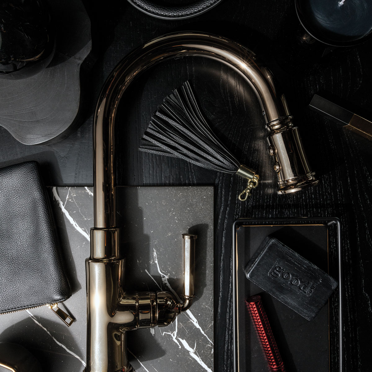
Photo by Chris Force, prop styling by Kristina Walton Zapata
Daring
Part of Brizo’s mission is to “surprise and delight,” and that’s daring. “It’s a fun thing we say. ‘What have you done that’s a surprise and delight?’” says Seth Fritz, the collection’s industrial designer. It could be the sound of water or the look of many pieces assembled flawlessly. It could be the interaction it invites, from how easily the wand docks to the way the handle feels in your hand. “We could’ve easily taken the handle from the earlier Rook Bath Collection and turned it 90 degrees up, but we always want to push design to the next level. I took the essence of that design—the timelessness, the beauty, the nod to vintage—and changed the aesthetic a little bit,” Seth says.
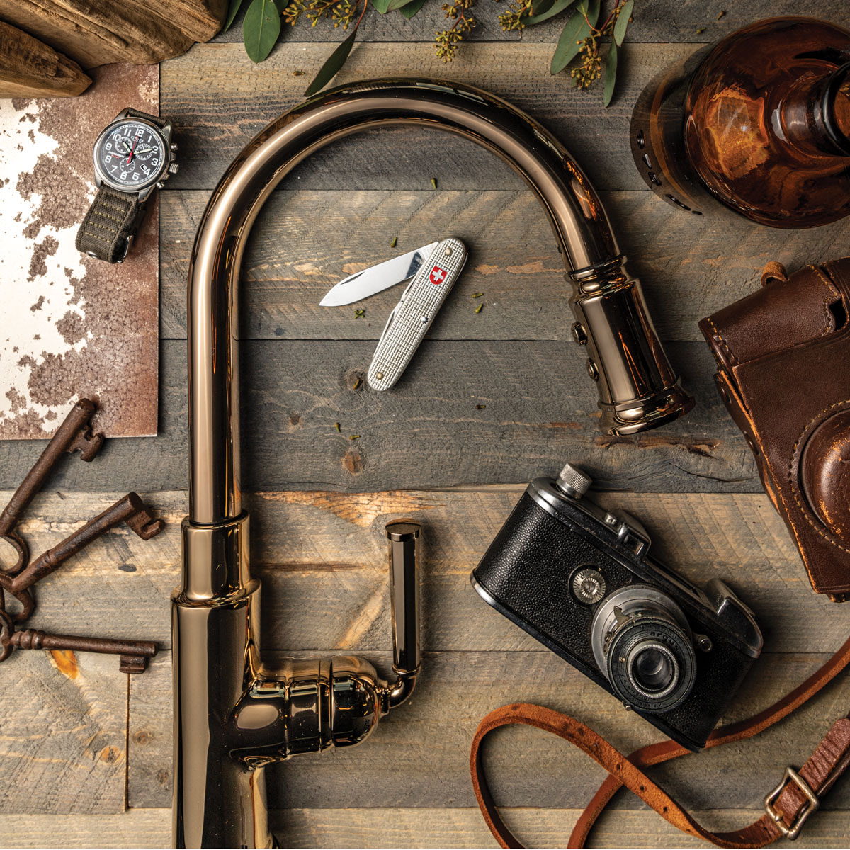
Photo by Chris Force, prop styling by Kristina Walton Zapata
Adventurous
“It’s hard to define, but you know it when you see it,” Seth says. Rook’s geometric base and traditional frame is offset by chamfered handles and the subtle sweep of the sprout. High-quality American craftsmanship is clear from the wand’s metal buttons to the magnetic handles, which all fit without screws. The hex points, too, line up perfectly. “They’re crisp and clean; even how we engineered them to be installed on the faucet is sharp,” says Jen Wareham, product marketing manager.
[rp4wp]

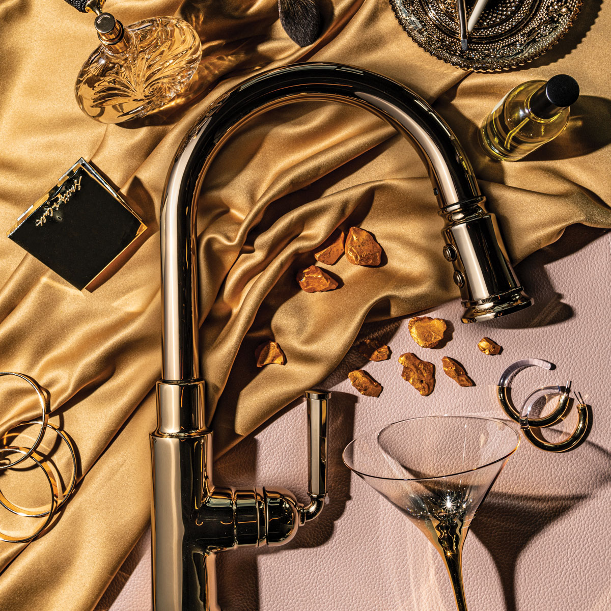
Photo by Chris Force, prop styling by Kristina Walton Zapata
Provocative
“There is something really feminine and provocative about the polished gold, the way it looks sleek and elegantly beautiful,” says Lucia Bayt, brand manager for Brizo. “Those details also make it a little bit more provocative. You want to touch the metal buttons on that wand.”
This article originally appeared in the Fall/Winter 2019 issue of Sixtysix with the headline “The Anatomy of Good Design.” Subscribe today.
PRODUCTION CREDITS
Produced by Studio Sixtysix
Words by Laura Rote
Photos by Chris Force
Prop Styling by Kristina Walton Zapata
Studio Sixtysix is the in-house creative agency to Sixtysix magazine. Studio Sixtysix stories are conceived, produced, and edited by Studio Sixtysix.
