As the bathroom increasingly becomes a place of refuge—a quiet zone to unwind without distraction—more consumers are seeking calm, inviting design to complement it. No matter who you are, you spend a lot of your life in the bathroom. “Why not make it a pleasant place you want to spend time in, whether you’re soaking in the tub, getting ready for work, or helping your child on and off the potty?” says Michelle Logsdon, photo stylist for Signature Hardware. Each of these three Signature Hardware model bathrooms offers its own take on how to make a tranquil space. Here, Michelle and Rachel Lawrence, senior creative strategist at Signature Hardware, walk us through how to design a bathroom that’s simultaneously beautiful and relaxing.
A Sense of Peace, Three Ways
Lagom
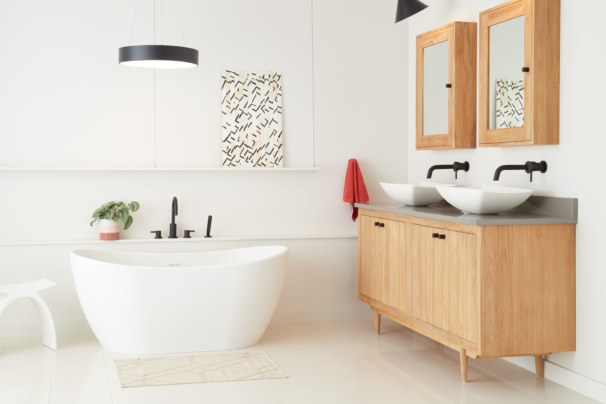
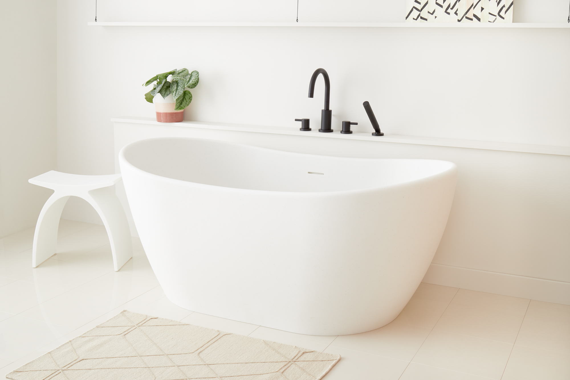
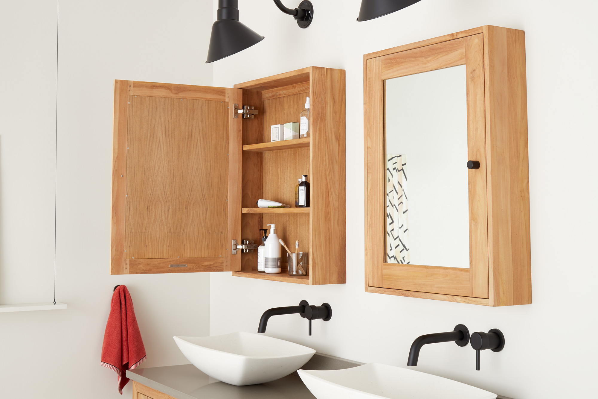
This bathroom, with its speckled white resin tub, is minimal and open, drawing on Swedish and midcentury tones. Clean-lined storage and teak medicine cabinets eliminate clutter by providing “a place for all things large and small,” says Signature Hardware’s Michelle Logsdon.
Signature Hardware Photo Stylist Michelle Logsdon says the “lagom” room is Signature Hardware’s barest room to date.
- Signature Hardware Photo Stylist Michelle Logsdon says the “lagom” room is Signature Hardware’s barest room to date. Photo courtesy of Signature Hardware
- Photo courtesy of Signature Hardware
- Photo courtesy of Signature Hardware
Wabi-Sabi
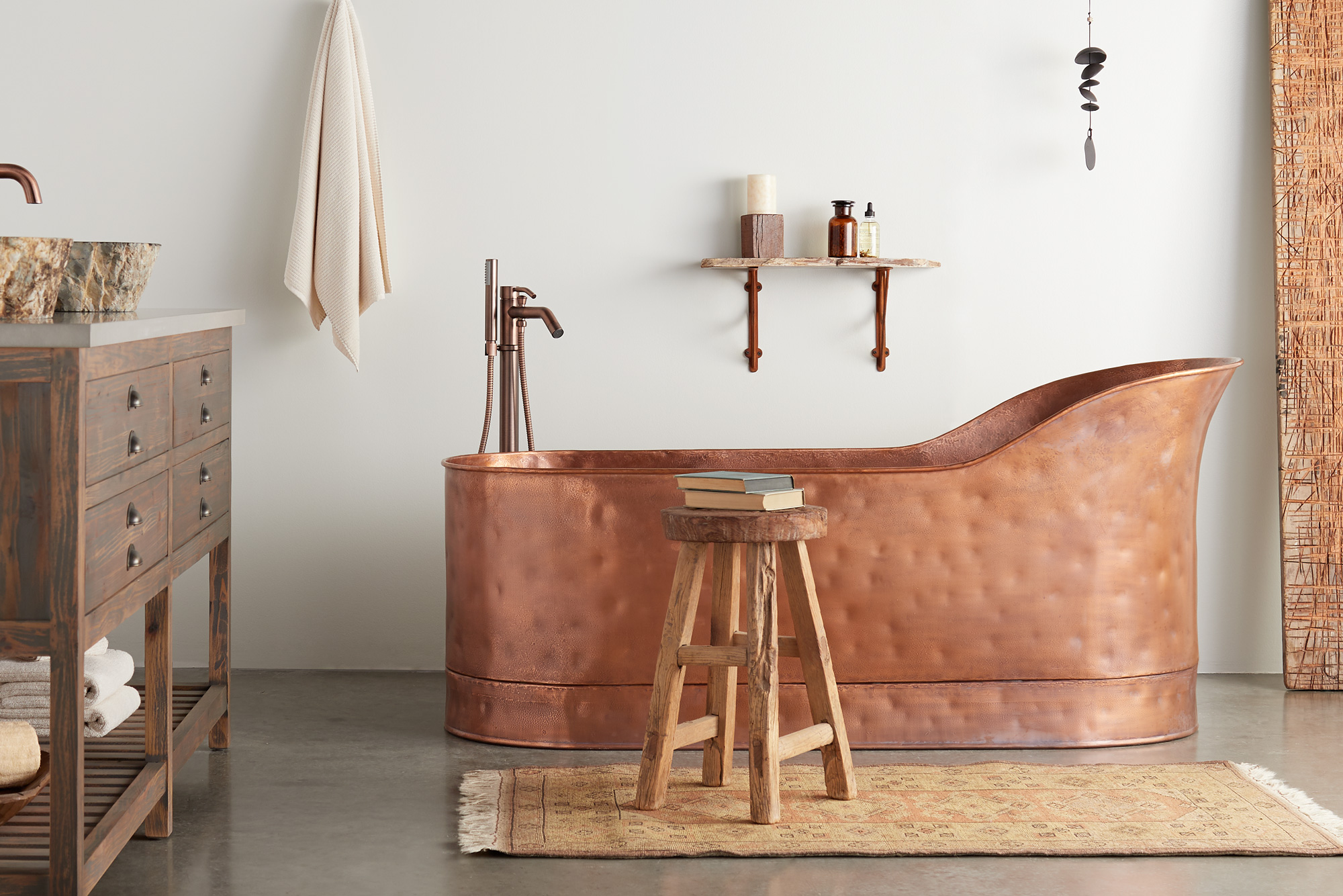
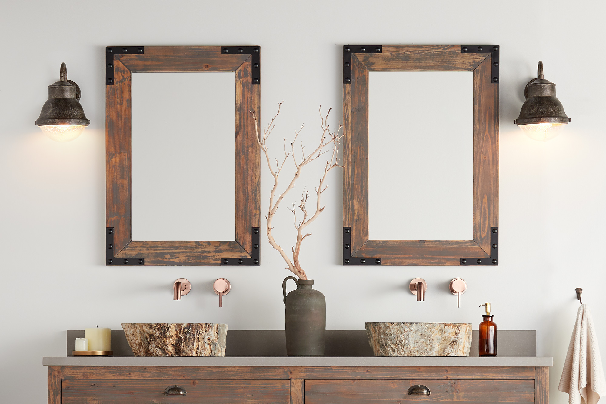
Classic neutrals and natural elements shine in this room alongside a vanity made from reclaimed bar wood and a rustic copper tub. The concrete floor demonstrates how to integrate an industrial, more conventionally cold material into an otherwise calming environment.
This room incorporated Signature Hardware’s studio floor with sealed concrete, which Michelle says most people thought was crazy. “I pushed for it, and ultimately it worked.”
- This room incorporated Signature Hardware’s studio floor with sealed concrete, which Michelle says most people thought was crazy. “I pushed for it, and ultimately it worked.” Photo courtesy of Signature Hardware
- Photo courtesy of Signature Hardware
- Photo courtesy of Signature Hardware
Warm Minimalist
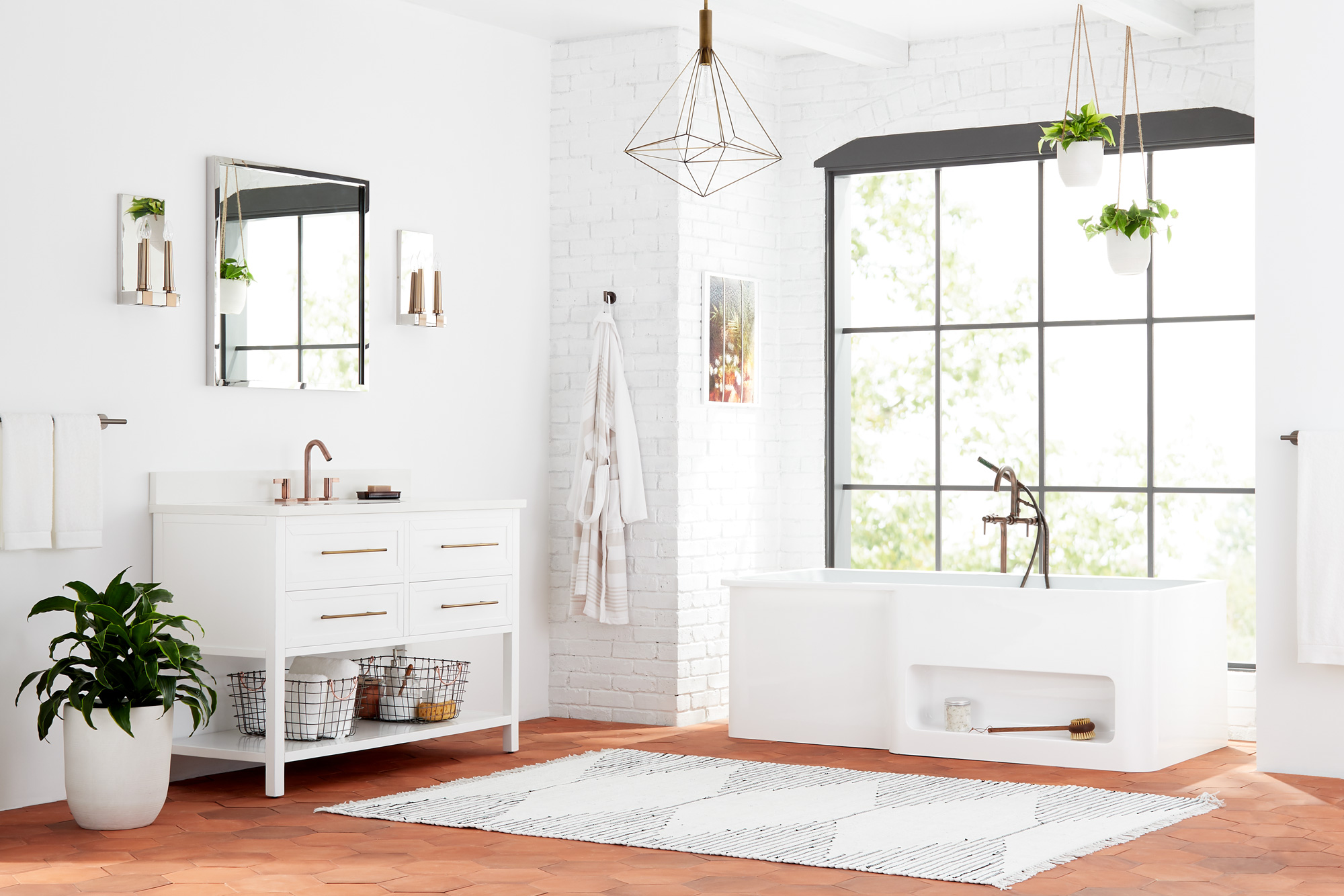
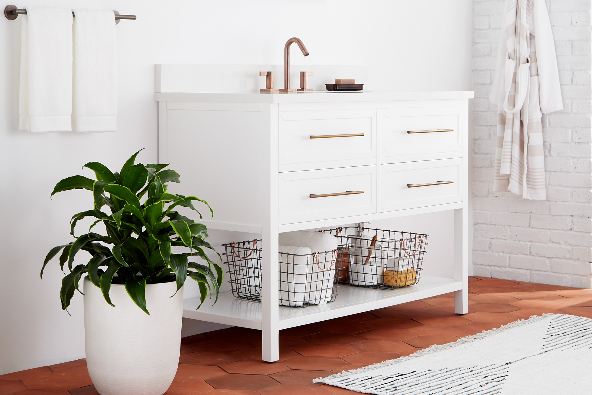
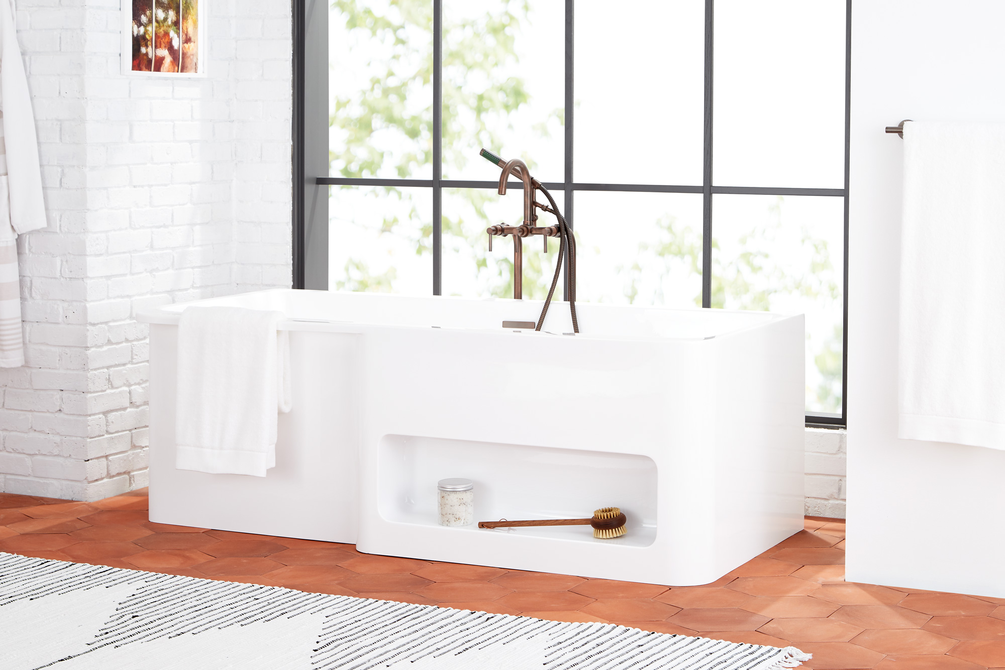
A terra-cotta floor and white walls in this loft space offer up a clean, bright, and simple palette with personal touches sprinkled throughout. In particular, Michelle incorporated mixed metals—a “fun trend that people are either loving or hating,” she says.
- Photo courtesy of Signature Hardware
- This room came together after much cutting and assembling and many injured fingers from Signature Hardware’s lead set coordinator, who laid out the artisanal terra- cotta tile floor. Photo courtesy of Signature Hardware
- Photo courtesy of Signature Hardware
Seven Steps to Creating These Tranquil Looks
1. Pick your palette
The design team at Signature Hardware typically starts by choosing a tranquil, relaxing color palette as the foundation for an entire room, but that palette differs for everybody. “Some people are calmed by cool colors and some are calmed by warm colors,” Michelle says. Ignore design conventions and focus on a foundation that puts you at ease, whether it’s soft gray paint or bright white tiles.
2. Find a point of inspiration
Michelle says there’s often one design element people grab onto, whether it’s a natural wood vanity or a copper faucet or even the shape of a light fixture. “That inspires them and they can bring things together that complement that element.”
3. Use natural materials
Rachel recommends incorporating natural materials, especially stone and marble. “Natural elements and materials give you that sense of being one with nature and one with your environment,” she says. “It brings you down to earth and lets you reset yourself.” Pay special attention, she says, to not just the material but the treatment. With stone, for example, look to maintain the same rough edges and organic variation you’d find in nature.
4. Choose the right fixture
Everyone has a different style aesthetic when it comes to lighting, but Michelle says you still need to look for something appropriate to the space. “You don’t want to put a giant chandelier in a room that’s much too small for it,” she says. She recommends using a tape measure to physically map out the amount of space that will be taken up by the fixture before you purchase. And for the right mood, consider something dimmable. “Even the type of light bulb can make a big difference,” she says. Daylight bulbs, for example, will keep your room color corrected to bright sunlight, while soft white bulbs will add warmth to the space.
5. Less is more
All three models draw on highly modern, minimalist ideals—the idea that tranquility in contemporary terms often relies on eliminating excess. “Right now we’re really revisiting a lot of clean, classic, minimal design looks, like integrated drain systems without a lot of plumbing visible,” Michelle says. Another bonus? It’s lower maintenance. “I have a 2-year-old and two cats and a dog. The idea of integrated plumbing I don’t have to dust around makes me very happy.”
6. Warm up your metals
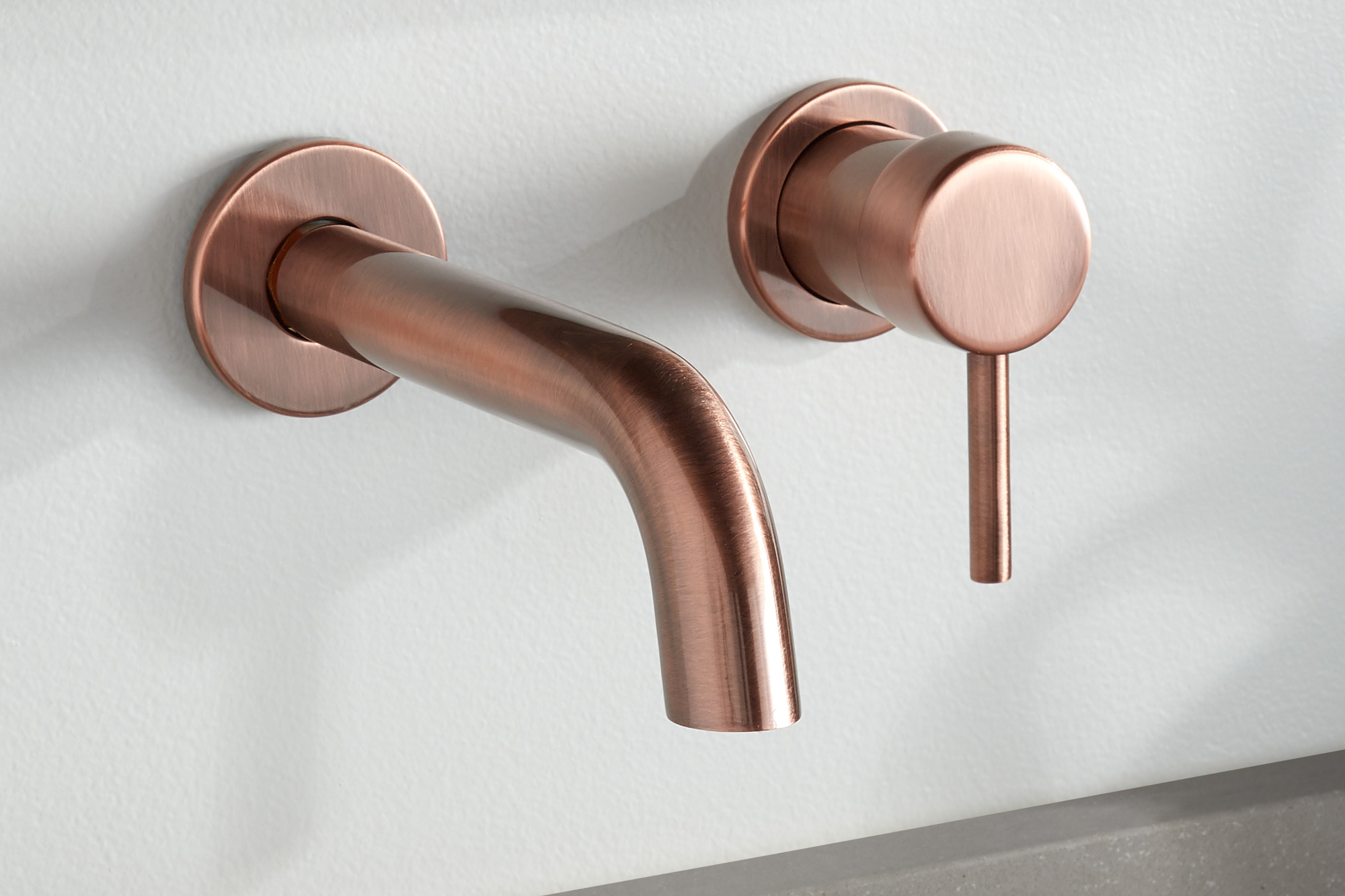
These three rooms are distinct but share common elements—and it’s not just their deep, inviting soaking tubs. Michelle used warm-tone metals, whether antique copper or fixtures in black—in each. She says they’re the new neutral. “I try to stay away from colder tones like chrome if we’re going for a relaxing feel more than a refined space.”
7. A private oasis
Rachel adds that, while the kitchen is often considered the heart of the home and the space where everyone gathers—therefore calling for a different decorating energy—the bathroom feels like more of an escape. “It’s where all of your personal items are, the things that tie into that idea of self-care,” she says. “You can relax, whether you’re doing your makeup or putting on a face mask. It’s the one room in the house where you can just shut the door and be by yourself.”
This article originally appeared in the Fall/Winter 2019 issue of Sixtysix with the headline “Minimalist Design for Tranquility.” Subscribe today.
PRODUCTION CREDITS
Produced by Studio Sixtysix
Words by Sarah Treleaven
Photos courtesy of Signature Hardware
Studio Sixtysix is the in-house creative agency to Sixtysix magazine. Studio Sixtysix stories are conceived, produced, and edited by Studio Sixtysix.
