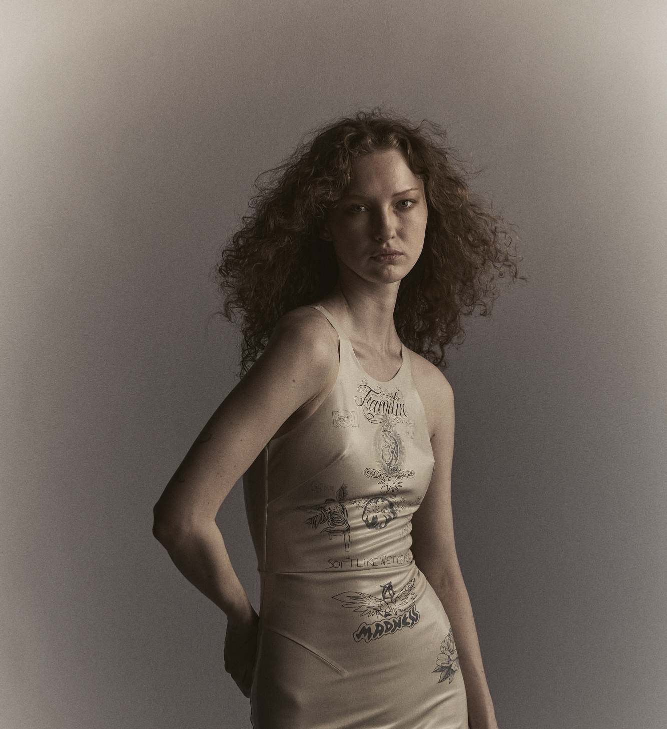
When we think about pattern, our minds often go straight to the bold: animal print, brocade, floral, something loud and geometric, made in a flurry of colors that floods the senses. It’s one reason why some designers stray from busy motifs, opting instead for a pleasant palette of neutrals and solids.
But like color, pattern exists on a spectrum. “Pattern can go two ways: It brings you in if the space is really minimal or stark, which is a trend right now,” says Dorothy Cosonas, creative director of KnollTextiles, “or it can be the large idea of the ‘Gucci mashup,’ where there’s a whole bunch of patterns in the space, and you go into overdrive looking at it.”
In the brand’s latest collection, called Decennium, Dorothy and her team have found the happy medium, pairing bold, abstract patterns—“when we do patterns, we tend to go big,” she says—with more muted designs. Here Dorothy shares how to achieve a similar balance, designing with pattern so that it overjoys, not overwhelms.
***
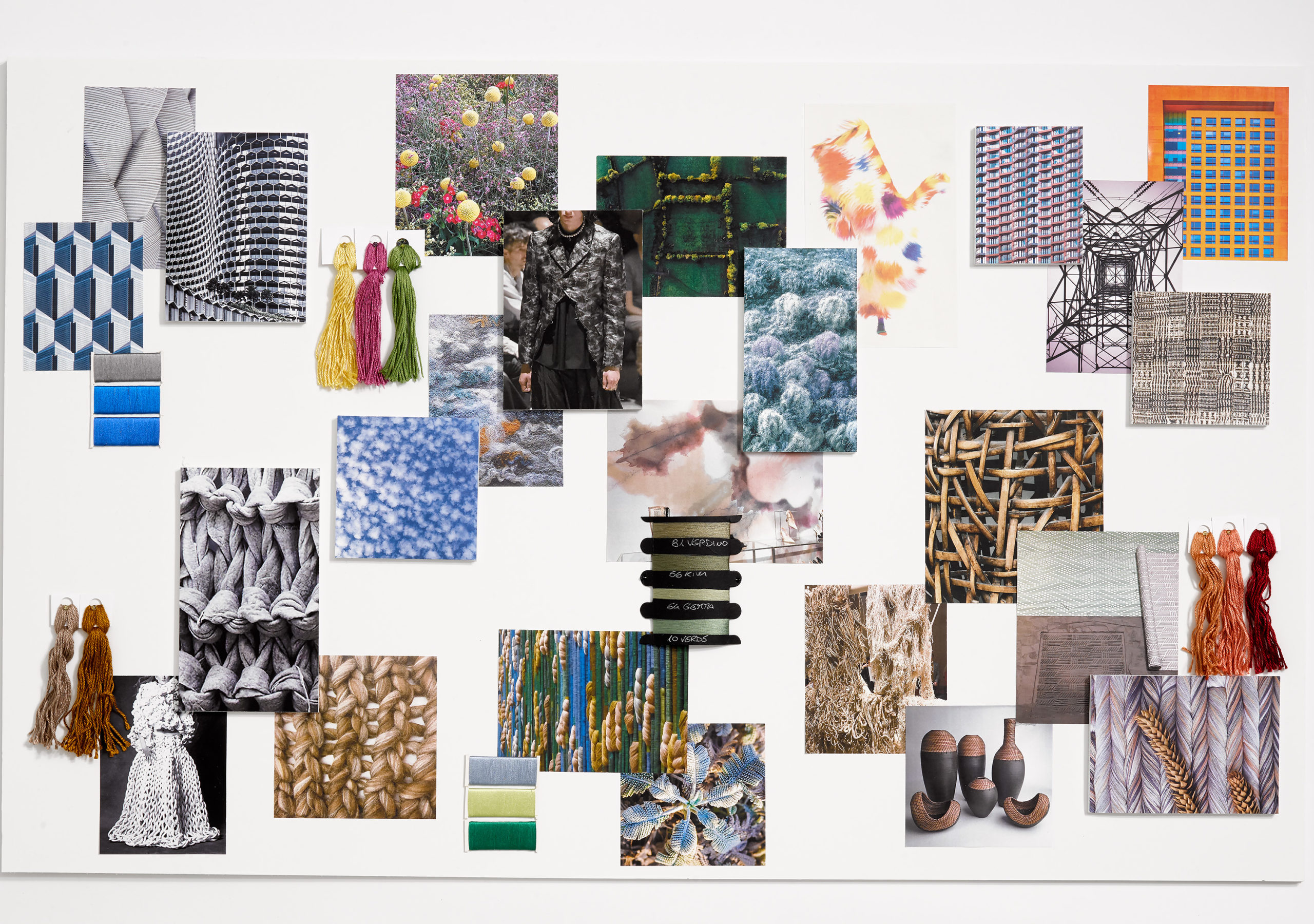
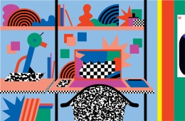
The KnollTextile team’s mood board for the Decennium Collection.
Do your research.
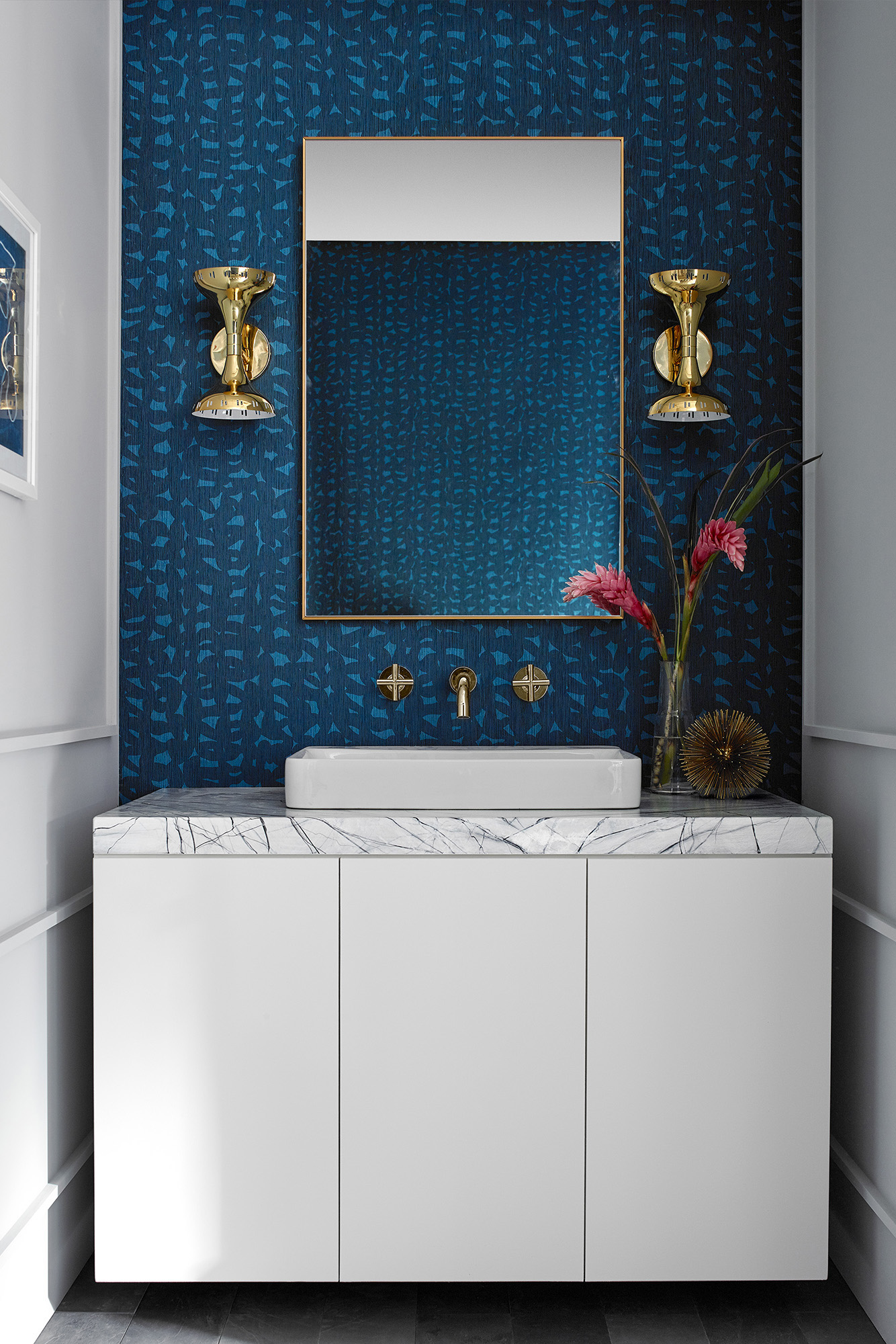
With Decennium, it was about researching fiber art and exploring dimensional forms that you see in nature, meaning cloud formations and things like that. We kept these as overriding concepts and the main focus for Floressence and Billow, the two main patterns within the collection.

This image of clouds was the KnollTextile team’s main inspiration behind Floressence.
Find an inspiration point.
For me personally, I go to books for inspiration, not only from our own world, meaning interiors, but art, fashion, nature, and architecture. But I think the biggest driver for me is fashion. I feel like it’s the one industry where there are still a lot of disrupters, and I think that’s so important to keep design on its edge. That industry keeps design alive from a pattern and color perspective.
“Every time we launch a collection, I have to make sure that we’re not being repetitive in any way,” Dorothy says. “With Decennium, we reviewed our line, and we determined that we really have a need for more abstract, organic and bold patterns in both upholstery and wall coverings.”
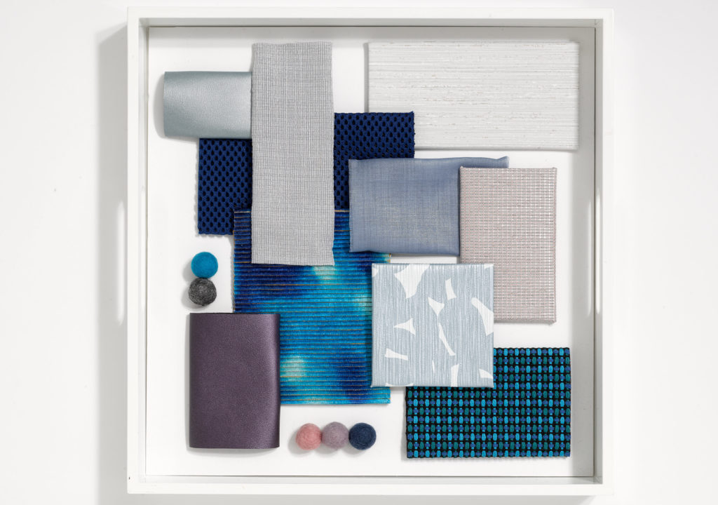
Create a mood board.
We always create mood boards and storyboards in the office to keep us going, so we can reflect back and make sure we’re staying on point in terms of specific point of view.
-
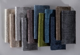
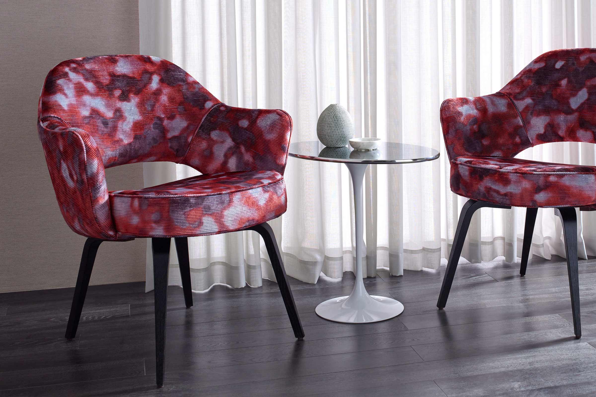
- Billow is a two-tone organic wall covering pattern inspired by chunky open knits and fiber arts.
-
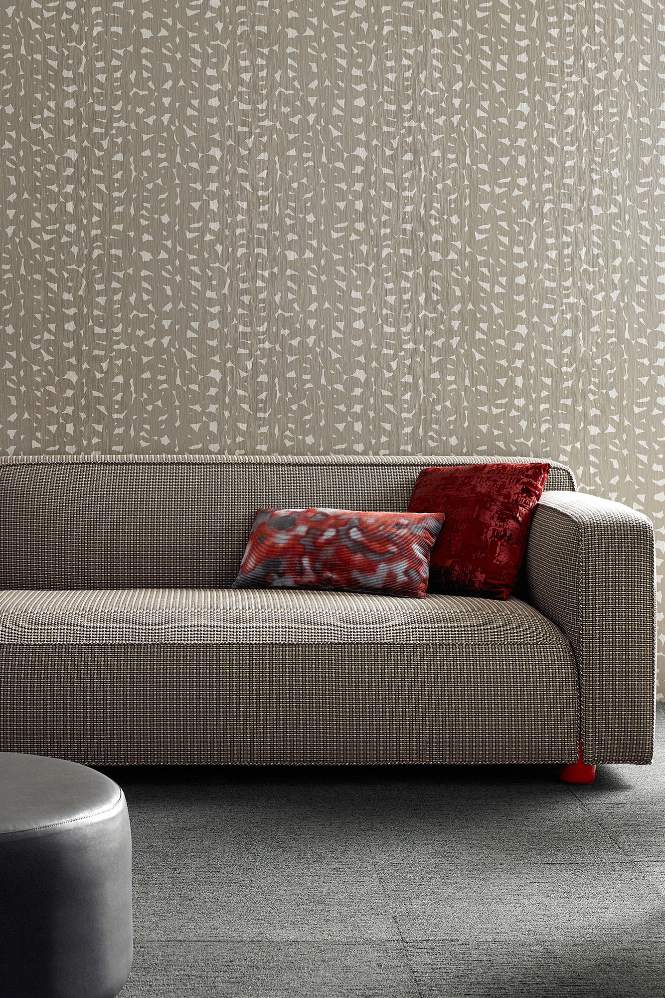
- Billow also has a vertical emboss. The texture adds extra visual interest and structure to the pattern.
Try a multi-color pattern.
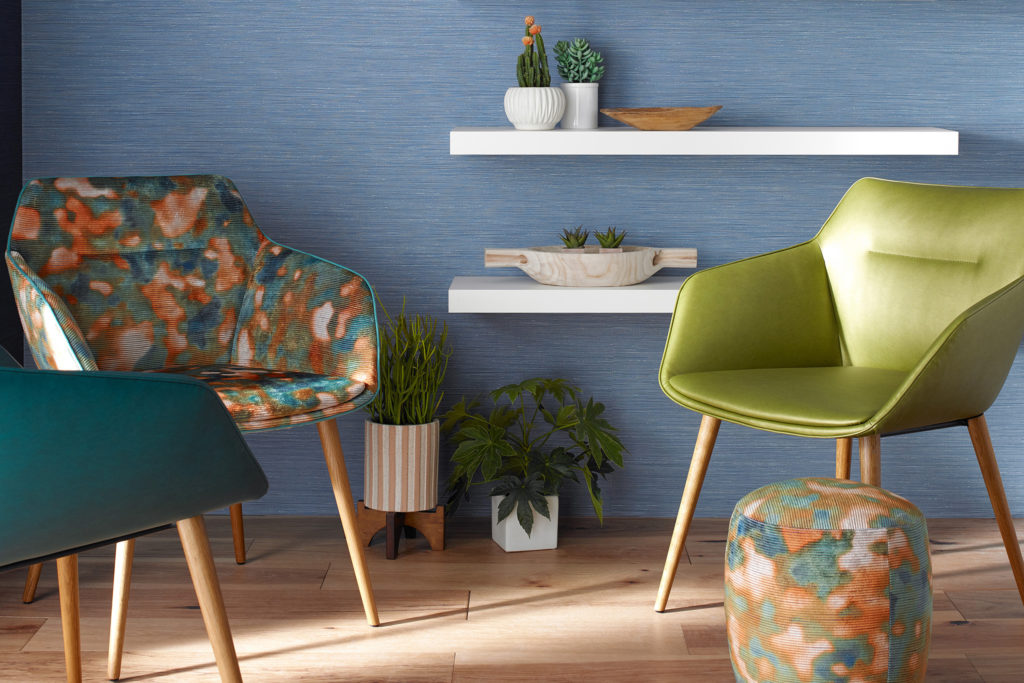
Designers often want pattern, and they want it to be unique—but not too specific so they feel like they can only use it once. That’s the beauty of when you do a multi-color pattern. You can draw out certain colors and build an entire palette around it. In Billow, you definitely get the feeling of the drama, but because of the different colorways, it’s a pattern you can use and use and use.
Same thing for Floressence. There’s a specific colorway, for example, called Blackbird. It’s very moody and understated, and yet there are these underlying colors in the palette itself that are current—brown, lavender, purple. Those trend colors are fresh in a lot of people’s minds but are being combined with safe colors. That’s key in terms of designing. How do you make someone feel like it’s of the moment but will last a while?
“When we create a collection, it’s really about color, texture, and pattern,” Dorothy says. “When you do solids or textures that are multi color, those are the backup singers, if you would. But then you have the stars, which are the patterns in the line.”
Don’t be afraid to go bold.
Pattern can take a little getting used to, but it’s not that different from when people put a bunch of solids into a room. Pattern can be a focal point, but it also allows the furniture and the space to speak in a different way.
Add texture.
Together, texture and pattern together create even more visual interest. That’s an element you want in things that are meant for the long haul, meaning something people will live with for a while. When you add texture, it can hide the sins of everyday wear and tear and also bring warmth to the space.
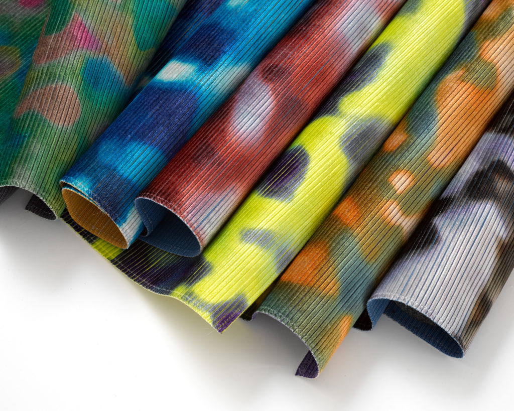
Floressence is printed on a custom-dyed, ribbed velvet ground cloth.
Photos Courtesy of KnollTextiles