It’s no secret that workplaces are changing. Remote work has become a necessary part of life, begging the questions: What happens when we go back to work? How will offices change, and what will their design focus be?
We might not have all of the answers yet, but some commercial designers are already taking steps toward a newly designed future. In the spirit of NeoConnect and togetherness while apart, let’s explore what that future might look like.
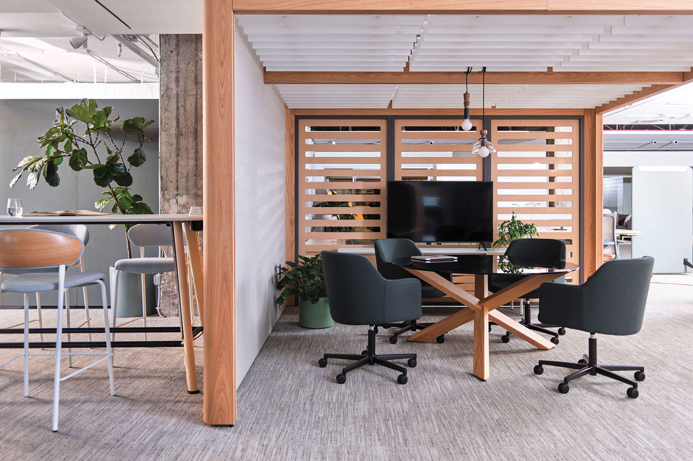
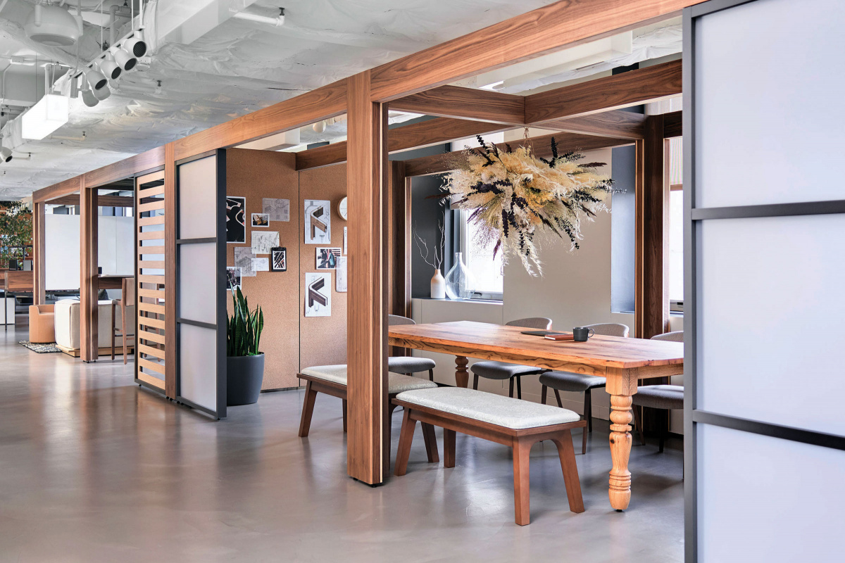
- Made of sustainable wood and aluminum, Obeya can be altered, assembled, disassembled, and relocated onsite with little disruption. Photo courtesy of OFS
Flexible Spaces Become the New Normal
A sense of place is vital to productive work, and yet some environments, such as open office plans, “can cause a kind of paralysis,” says John Phillips, vice president of design at OFS. It’s why the furniture manufacturer partnered with Roger Webb Associates: to create a new, flexible environment conducive to all types of work.
The solution was Obeya, an architectural structure like movable scaffolding that can be shaped to an individual or group’s needs, be it private nooks with partial dividers or large collaborative meeting rooms.
“It’s about trying to create environments that give you a number of settings so you can do your best work with or without people,” Roger says.
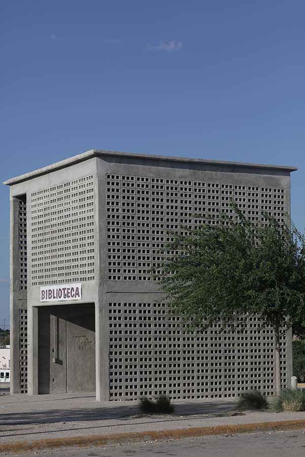
- Tatiana designed her flexible housing prototype—which can be expanded and reduced—to help tackle Mexico’s housing crisis. Photo by Santiago Arau.
- “We needed to talk to the people who were going to live in the house,” Tatiana Bilbao says of her social housing project. Photo by Ana Hop
A Bigger Emphasis on People-First Designs
Just as office furniture needs to be conducive to productive work, at the end of the day, it’s built for people, by people. Designs that are people-first with a greater emphasis on wellbeing and meeting the needs of all types of people will become priority.
“I believe in architecture for human beings, and human beings are everyone. All of us—high income, low income, medium income, any gender, any race, any human being,” says architect Tatiana Bilbao. “That’s why my work ranges so much, because human beings range so much.”
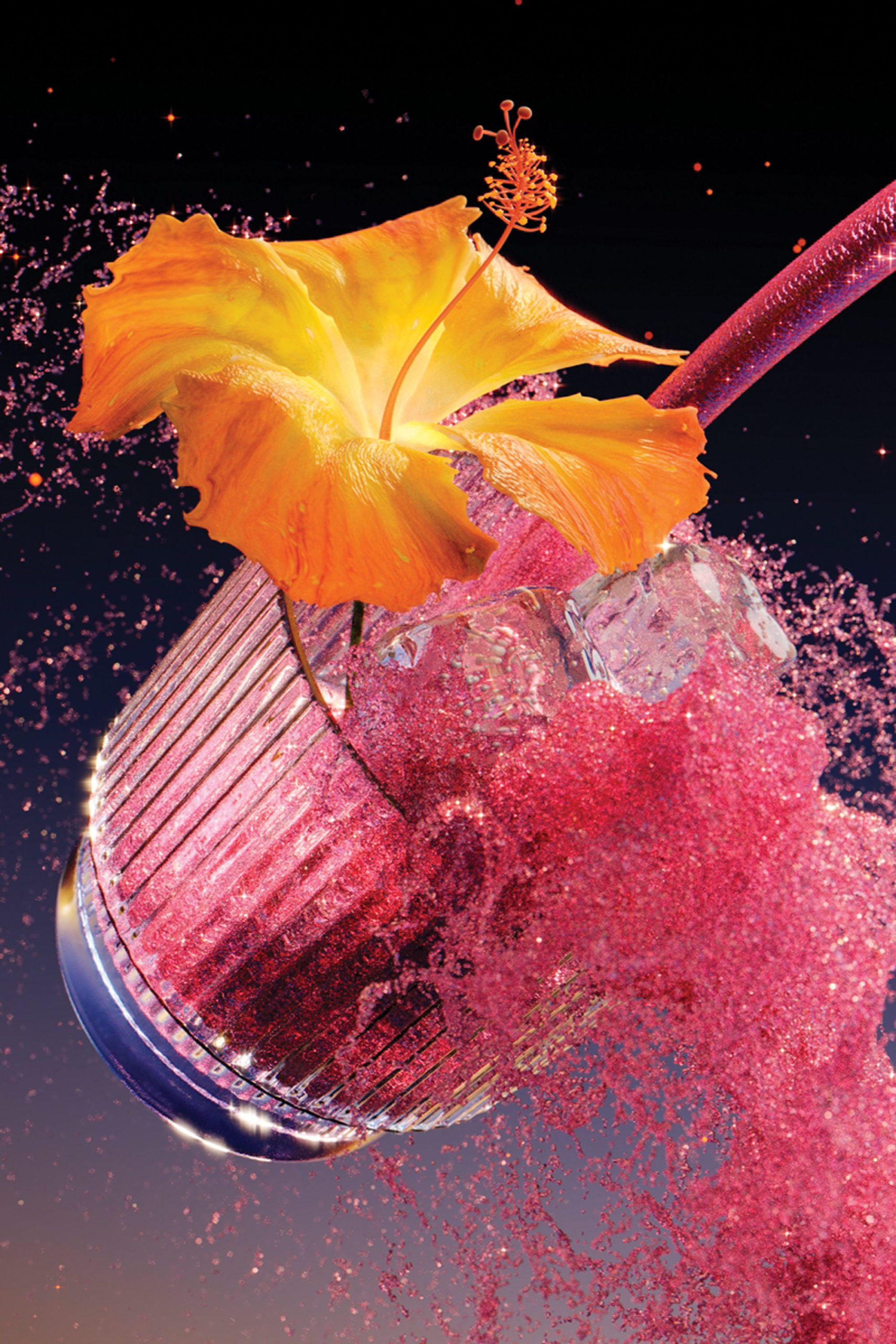
- RoAndCo worked with Kin on brand strategy, branding, the hero bottle design, and the art direction of the launch campaign. For the launch, they art directed animator Ada Sokol to create CGI animations. Photo courtesy of RoAndCo
- In this scene, the lapsed pour speaks to Kin as a liquid catalyst for all bliss, no booze. As Kin fills the cup, the flower begins blooming, illustrating a sparked consciousness and sense of awakening. Photo courtesy of RoAndCo
Branding That Shows Purpose
It’s not just physical spaces or objects that will be people-first, either. Branding in general will be less about companies individually and more about their purpose in the collective industry, to their customers, and in the world at large.
For Roanne Adams, founder of branding studio RoAndCo, an audience-first approach should connect and challenge target audiences—an impossible feat without sincere creative energy at its root.
“We see [branding] as beyond just creating a logo and a typeface,” Roanne says. “We see it as answering, ‘What is the grander vision that’s actually going to communicate your purpose to your audience?’ It’s creatively fulfilling for us to work with them to find ways for them to do good for all—not just for their bottom line.”
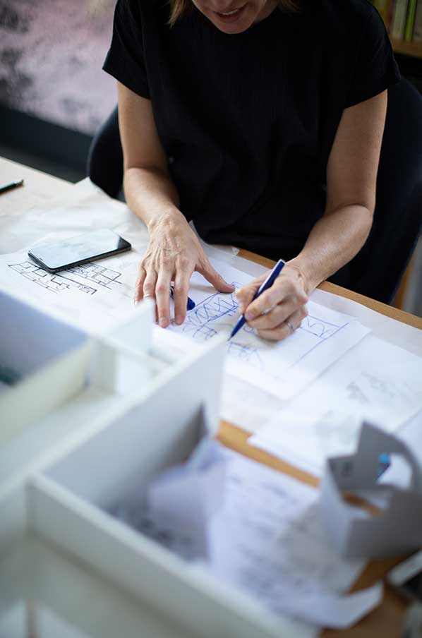
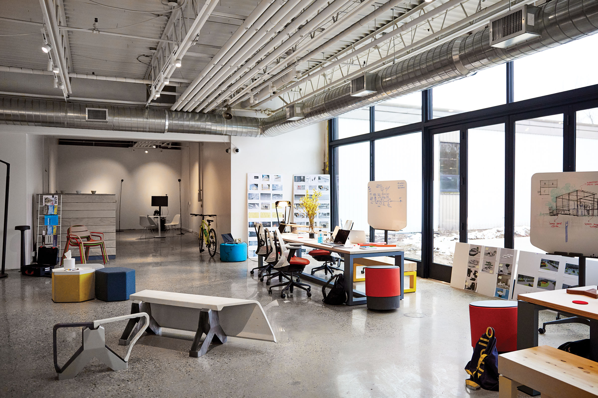
- A peek into Landscape Forms’ collaborative studio space. Photo by Pete McDaniel
Open Offices as Collaboration Centers
At Landscape Forms, one of the many reasons the team is able to put out upwards of 16 new products a year is because of the company’s highly involved design process. From day one of a new project, everyone—design, engineering, marketing, manufacturing—is involved, with mockups, models, and drawings left out in the open as each project progresses.
“We want everyone to challenge our thinking. When we mock it up, be that a 3D printed or a handheld model, it’s about soliciting feedback,” James Bucholtz, product engineering group leader, says. “The goal here [is] … to do the right thing for the organization.”
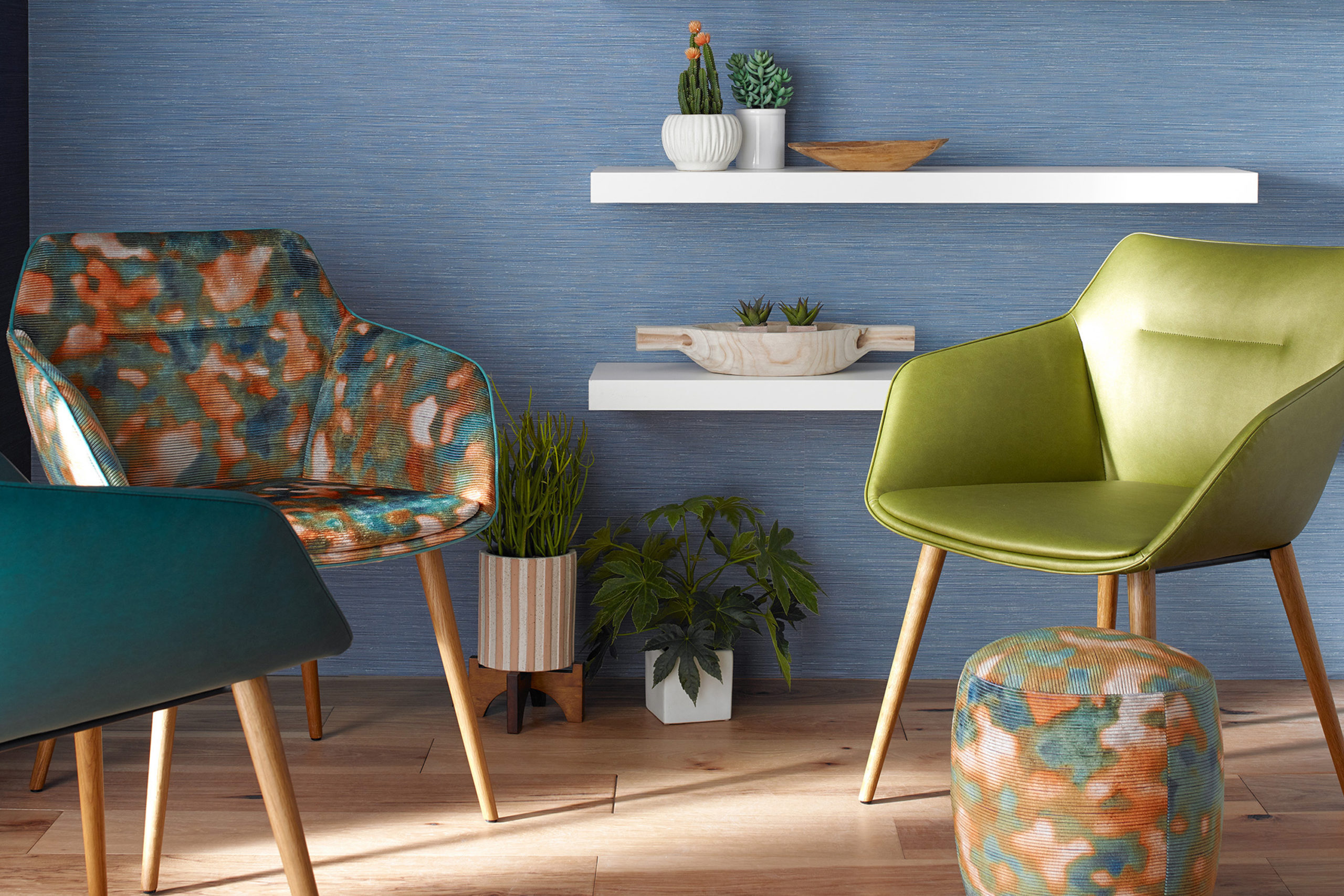
- Pattern can take a little getting used to, but it’s not that different from when people put a bunch of solids into a room. Pattern can be a focal point, but it also allows the furniture and the space to speak in a different way.
The Need for More Playful Environments
What all of these projects have in common is the charge to break down traditional office setups and processes and build them back up again, only bolder, with the intention of creating more dynamic and fruitful spaces. And to be successful in that, designers can’t be afraid to step out of their own creative offices and try something new.
Pattern, for instance, is a design element often shied away from for fear of being too bold, too adventurous. And while it’s true that pattern can be a strong focal point, “it also allows the furniture and the space to speak in a different way,” says Dorothy Cosonas, creative director of KnollTextiles.
“Designers often want pattern, and they want it to be unique—but not too specific so they feel like they can only use it once,” Dorothy says. Her advice: Get your feet wet with a multi-colored pattern. “You can draw out certain colors and build an entire palette around it,” she says, giving the space a chance to be a little more playful without feeling like too much.
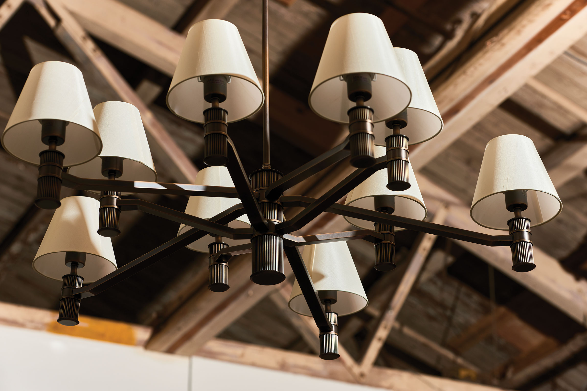
- Rejuvenation Lighting Designer Brandon Jorgensen shares his inspiration and what it takes to make the Rigdon 10-Arm Chandelier as part of the esteemed Portland-based lighting company’s in-house design team. Photo by Bill Whitmire
Traditional Designs Get Modern-Day Makeovers
As design pushes forward to a new future, that doesn’t mean forgetting the past altogether, either. Just ask Rejuvenation Senior Designer Brandon Jorgensen.
“Rejuvenation was a place where you could go and find that period fixture for the old house you were restoring,” Brandon says. “At some point, a switch happened. The brand went from being very period-authentic to having this great in-house design team where there’s a focus on taking inspiration from history and then designing new products across multiple aesthetics.”
The new Rigdon 10-Arm Chandelier, for example, came to be after Brandon spent some time in the company’s in-house library, a vault of catalogs, books, and artifacts going back to the 1800s. A 1940s candlestick in the archive became the impetus for the new lighting fixture.
And with that thinking as a guiding force—updating the traditional for modern spaces—the brand has stayed true to its mission while remaining relevant in an ever-changing world.
