The New York Islanders were one of the worst franchises in sports during the mid-’90s, marked by incompetent management and on-ice futility. But the hockey team’s true nadir was a failure of branding. After a playoff drubbing in 1994, the team infamously swapped out their beloved logo—associated in the minds of fans with the team’s dynastic 1980s run—with a cartoon fisherman, one that fans quickly realized bore an uncanny resemblance to the Gorton’s frozen fish mascot. Coupled with garish, new turquoise-and-purple uniforms and a new mascot that was known to take physical punishment from fans, the new logo represented an object lesson in everything not to do when it comes to rebranding. The process was hasty, with next-to-no research involved, and illustrative of how abdication of corporate leadership can trickle down, causing disastrous effects for brand identity.
We spoke with Nicholas Hirshon, author of We Want Fish Sticks: The Bizarre and Infamous Rebranding of the New York Islanders, a new history of the debacle. We talked about the dangers of underestimating logo identification, how branding disasters can feed a larger sense of disappointment, and how crummy designed can be sometimes be reclaimed with pride, given enough time.
People often have deeply held passions about logos and brand identity whether they realize it or not. There was even a big online kerfuffle recently after Slack unveiled a new logo. But that must go doubly when you’re talking about something as heated as sports fandom. Was the team just oblivious to this at the time?
Islanders ownership definitely underestimated fans’ affection for the team’s original logo. It was the only logo the Islanders had worn, and it symbolized one of the greatest dynasties in sports history, when the Islanders won four straight Stanley Cups in the early 1980s behind Hall of Fame players like Mike Bossy, Denis Potvin, and Billy Smith. The Islanders’ owner during the dynasty era, John Pickett, still controlled the team in the mid-1990s, but he had moved to Florida and handed over day-to-day operations to a group of minority stakeholders who became known as the Gang of Four. That combination of absentee ownership and lack of institutional knowledge in management spelled trouble. The Islanders were swept by their geographic rivals, the New York Rangers, in the first round of the 1994 playoffs, and the Rangers went on to win their first Stanley Cup in 54 years.
The rebranding’s use of teal smacked of trend-hopping, incorporating colors used by then-new franchises in San Jose and Anaheim. COURTESY OF UNIVERSITY OF NEBRASKA PRESS.
The Gang of Four came to the conclusion—and this is really astonishing—that Islanders fans were starting to associate the original Islanders logo with the failure of the Rangers series more than the increasingly distant run of Stanley Cups. Sure, fans were embarrassed by the Rangers sweep, but I don’t think the logo had lost any of its luster. But ownership didn’t have the money to sign elite players or upgrade the Islanders’ deteriorating arena, so they tried to make some quick money and create a little excitement by unveiling new jerseys. It turned out to be a disastrous decision. That’s the logo that Islanders fans had been seeing on their favorite players’ chests and wearing to games for nearly a quarter century. The original logo conjured so many positive memories for the fan base. To move away from that without conducting any serious research—no focus groups, no interviews with fans—was absurd.

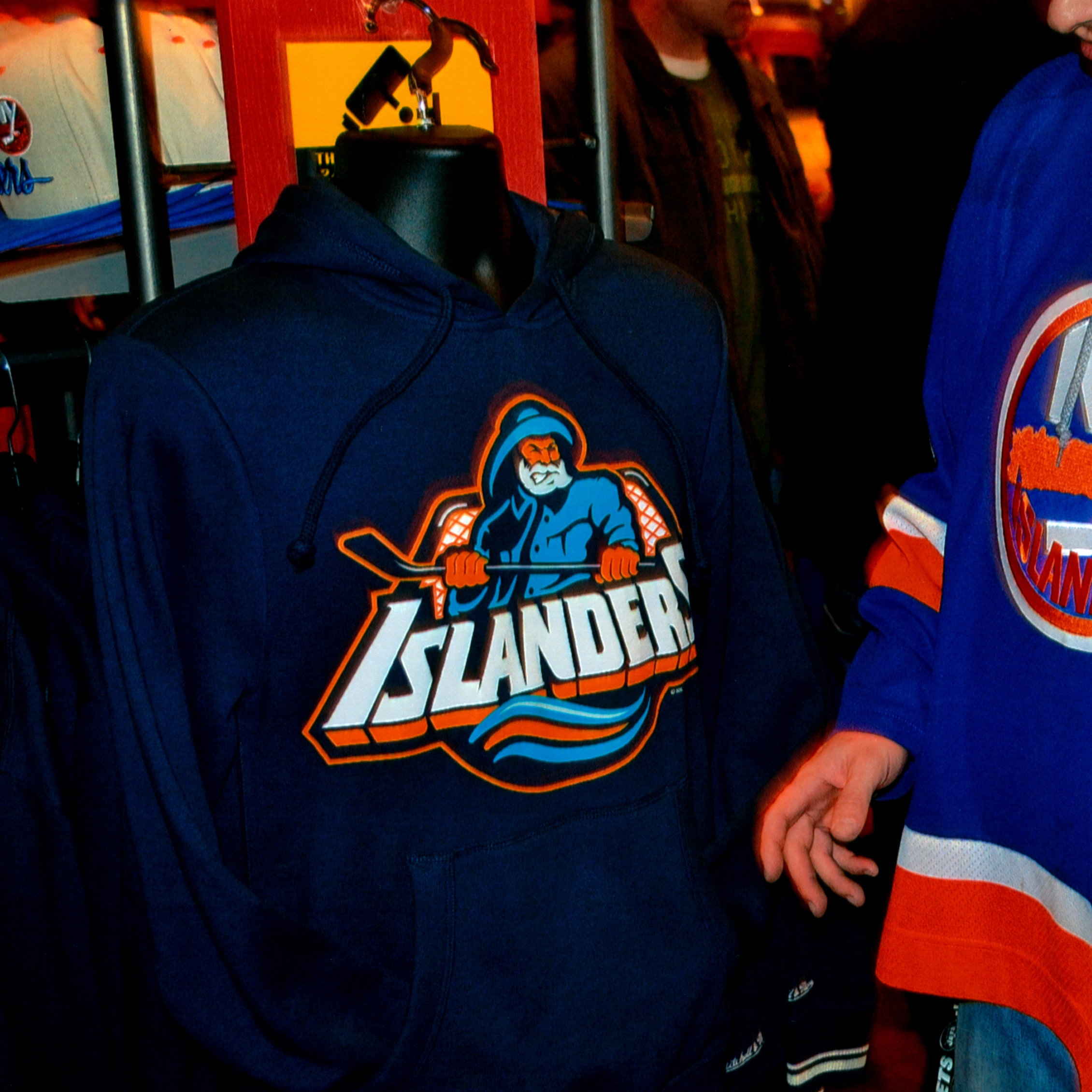
The Islanders eventually wore the “fish sticks” logo as throwbacks. Winger Cal Clutterbuck wears the fisherman-logo jersey in a 2015 home game. PHOTOGRAPHY BY IRENE JEDRLINIC HIRSHON.
So, no focus groups. Was there any kind of internal or external research done on how people might react?
Amazingly, there was almost zero research done on the potential reaction to the logo. I describe in the book how Tim Beach, one of the Islanders executives, brought the fisherman jerseys to classes at a high school on Long Island and his alma mater, Quinnipiac University in Connecticut. He asked the students to vote on whether they liked the new jersey, and he told me they were split about fifty-fifty. And that seems to have been the extent of the token research process that did not include a single poll of Islanders fans. There was a sense that Islanders ownership had already made up their minds to adopt the fisherman logo, and the other voices in the room weren’t going to speak up against the people who paid their salaries.
“The original logo conjured so many positive memories for the fan base. To move away from that without conducting any serious research—no focus groups, no interviews with fans—was absurd.”
Is there any love nowadays for the “fish sticks” logo? If so, how do you explain it? Is it nostalgic, ironic, or genuine? Or some combination thereof?
Islanders fans are divided about the logo. There were a lot of factors that doomed the fisherman logo beyond the departure from tradition — the Islanders’ poor play, the hiring of a coach who shoved and spit at his players, a doomed trade for a star who initially refused to report to Long Island, and the team’s purchase by a supposed billionaire who turned out to be a con artist. There’s still an older segment of the fan base that grew up with the dynasty teams in the early 1980s and associates the fisherman logo with the Islanders’ fall in the 1990s. They see that and think about everything that went wrong. But there’s a younger segment of the fan base — and I’m in this category — that grew up after the dynasty era and doesn’t remember the mid-1990s teams that well. For us, the logo looks retro, and it’s a badge of honor to wear a fisherman jersey. It says that we’ve been fans of this team through its lowest points, and we didn’t just jump on the bandwagon when the team started playing well this season. It’s hard to say why fans despise or adore the fisherman logo, but I have a sense that even some folks who once hated it are warming up a little as the years pass.
Read more design and book coverage at Sixtysix.
What’s the biggest lesson from this whole fiasco from a logo/team identity perspective?
There are a few lessons. One, obviously, is to conduct research before making such a significant brand change. Focus groups would probably have turned up the logo’s similarity to the mascot for the Gorton’s frozen seafood brand, which led fans of opposing teams to chant “We want fish sticks!” Another lesson is to unveil a new logo when the team is on the rise. The fisherman logo may never have been a huge hit with fans, but I’m convinced the reaction would have been more positive if the Islanders were winning. Once the team started unraveling, the fisherman jerseys became an easy target.

“We Want Fish Sticks” author Nicholas Hirshon donning the infamous “fish sticks” logo on his tie. PHOTOGRAPHY COURTESY OF NICHOLAS HIRSHON.