In the Kings Cross studio in London, Mat Cash and his colleagues spend months unpacking project briefs to get to the heart of a building or product’s real potential. Since joining Heatherwick Studio in 2006, Mat has been responsible for some of the studio’s largest projects, from Zeitz MOCAA in Cape Town—a re-invention of a historic grain silo into a cultural institution—to working on a surprising world pavilion in Shanghai. The key to designing remarkable projects, he says, is asking the right questions, having a diverse team, and never being afraid to be weird.
***
Each project is a marriage.
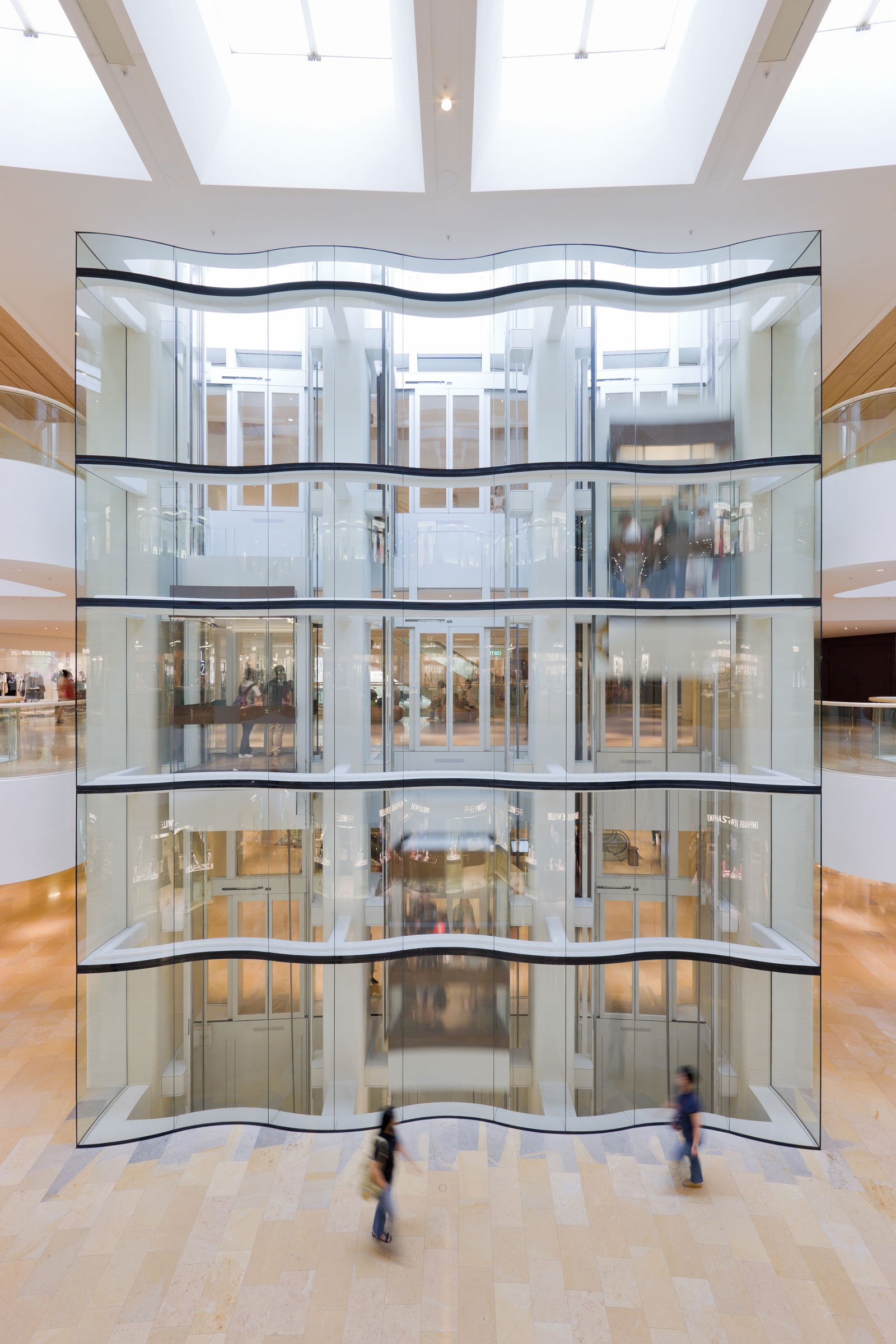
It’s a serious commitment because, as a studio, what we produce is our currency. That’s what we do. We’re not interested in paper architecture; we’re interested in building things. When we’re speaking with potential clients or collaborators, I always think, “Do I want to sit with this person for the next five or eight years. Would we enjoy it? Would we have fun? Would we learn from each other?” I did a project in Hong Kong—a 650,000-square-meter mixed-use Pacific Place—that started in 2005 and finished around 10 years later. That’s a long journey, and it doesn’t matter how exciting the project is, to keep your energies and interests and engagement you have to really enjoy the people you work with.
- Inside Pacific Place, a luxurious shopping center in Hong Kong. Photo by Iwan Baan
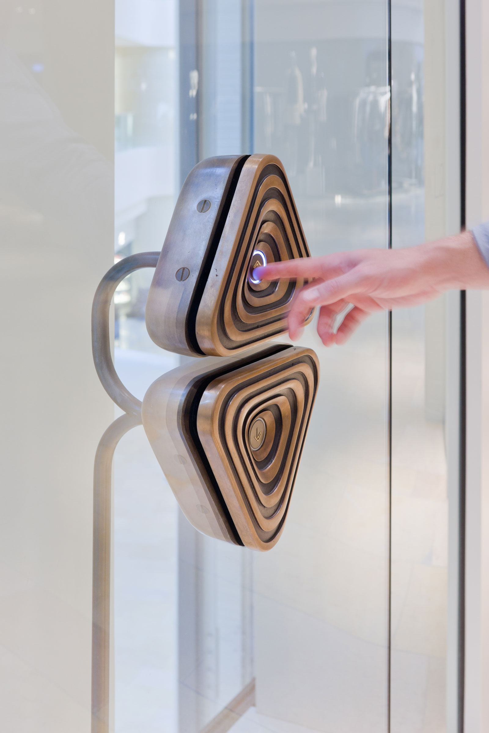
- Detailing inside Pacific Place. Photo by Iwan Baan
Weird is good.
Where does ambition meet convention? People often come to us with interesting challenges. It’s really about their vision, their confidence, their ability to not cut and paste what they’ve done before, to allow the space to do something different. We had someone come in and speak to us about designing an old people’s home. That’s not a typology that often gets brought to us. When I say weird, there’s an unusual, interesting design problem: “Why aren’t people thinking more about that?” Bringing a different perspective is exciting and interesting.
Work backwards.
Quite often when a project comes to us it doesn’t look like the same project at the end. We spend a lot of energy working with the client to figure out what the design problem is. We can spend weeks and months unpacking and repacking what our clients want and reframing it back to them before we put pen to paper on any potential solutions. Many designers were used to going along the decision tree—“Should it be tall or small? Fat or thin? Red or blue?” All of those hundreds of design decisions might lead to an outcome. We work backwards, looking at all of the different possibilities to unearth the real design challenge.
What are you really trying to achieve?
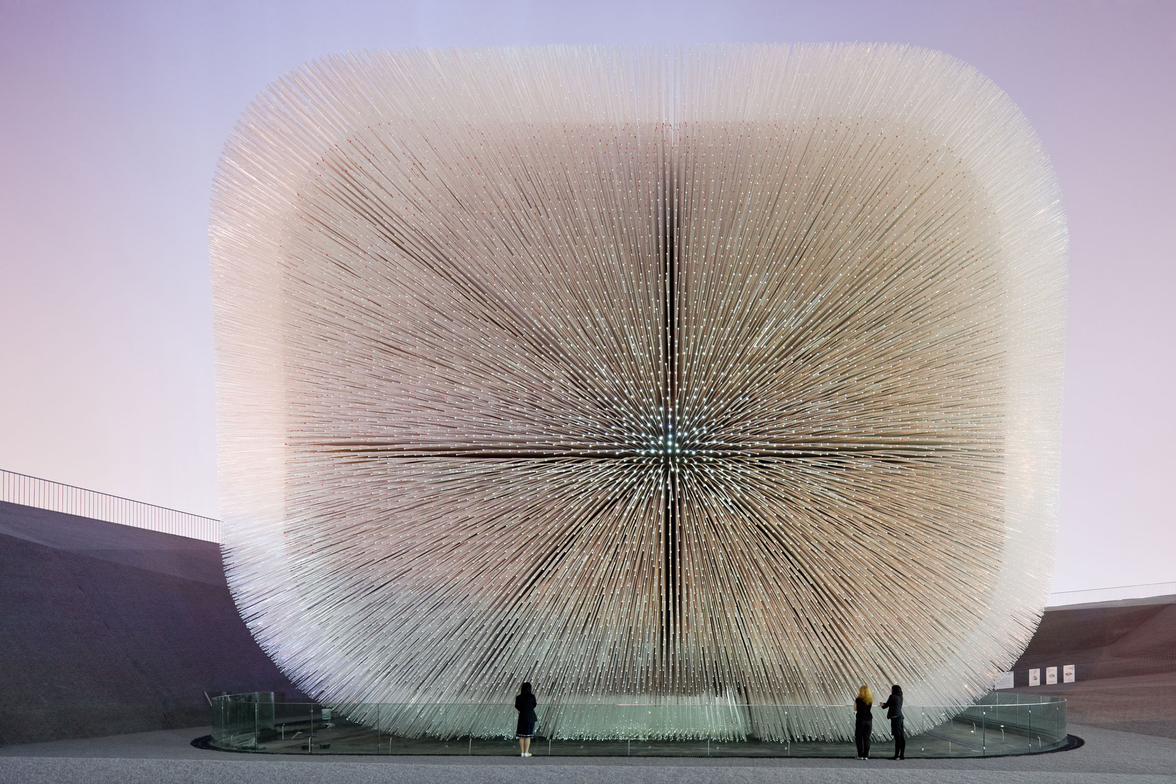
For the British pavilion in Shanghai—the kind of hairy building we designed—the brief obviously didn’t say “hairy building.” It was 200-some pages that said it must communicate Britain’s manufacturing heritage, the British landscape, our industry, David Beckham, the royal family, taxis, all of these things. But by trying to do everything we’re doing nothing. We went through that document to boil it down—What’s the purpose? At the end in small print it said it wanted to be in the expo’s top five pavilions. We said, “That’s what you want. The rest is ancillary.” This is a promotional tool for the UK, but if people don’t visit, you can’t promote. World expos are visited by millions of people. It can take hours to queue for a pavilion. In Shanghai they had over 200 pavilions so we were up against stiff competition. We started thinking about how when you’re there all you want to do is rest. You want to sit, but there’s isn’t anywhere to sit. We also wanted to do something extraordinary. People have to choose which of the 200 architectural “wow” moments to engage with, and if you create a building that doesn’t look like a building—it has soft, swaying edges—that stimulates curiosity. You think, “There’s a place I can rest, and it’s got something quite interesting to look at. Let’s go there.”
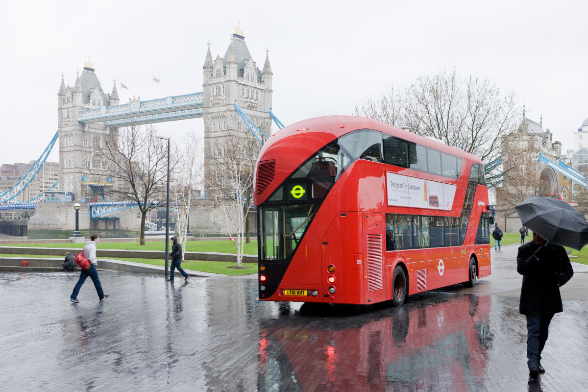
- Heatherwick Studio updated London’s iconic double-decker bus. Photo by Iwan Baan
Leave room for stretch.
When we designed a new bus for London we asked thousands of questions. You go in with very little knowledge; it’s an amazing course in learning about someone else’s industry. When you get on a bus in the UK there are fluorescent lights, nuclear warning yellow handrails, strange purple and green seats, and you think, “This must be driven by regulation.” When you dig in, you learn you don’t need to make the handles nuclear warning yellow. The code doesn’t require it. It’s a learned behavior. You do need contrast between the vertical pole and the background, but people think “contrast” and turn to nuclear warning yellow. That’s the biggest contrast you can have. They aren”t thinking about what it does to your eye or the fact you have to sit there and look at that. Our distinction is much softer. You can still see the pole, as you must, and it still complies, but it’s a softer hue, and our seats are a warm reddish color. Nothing is stopping you from making this a nice place—why not design it like a lounge? You can use colors, materials, and tones that are restful, relaxing, and more meaningful.
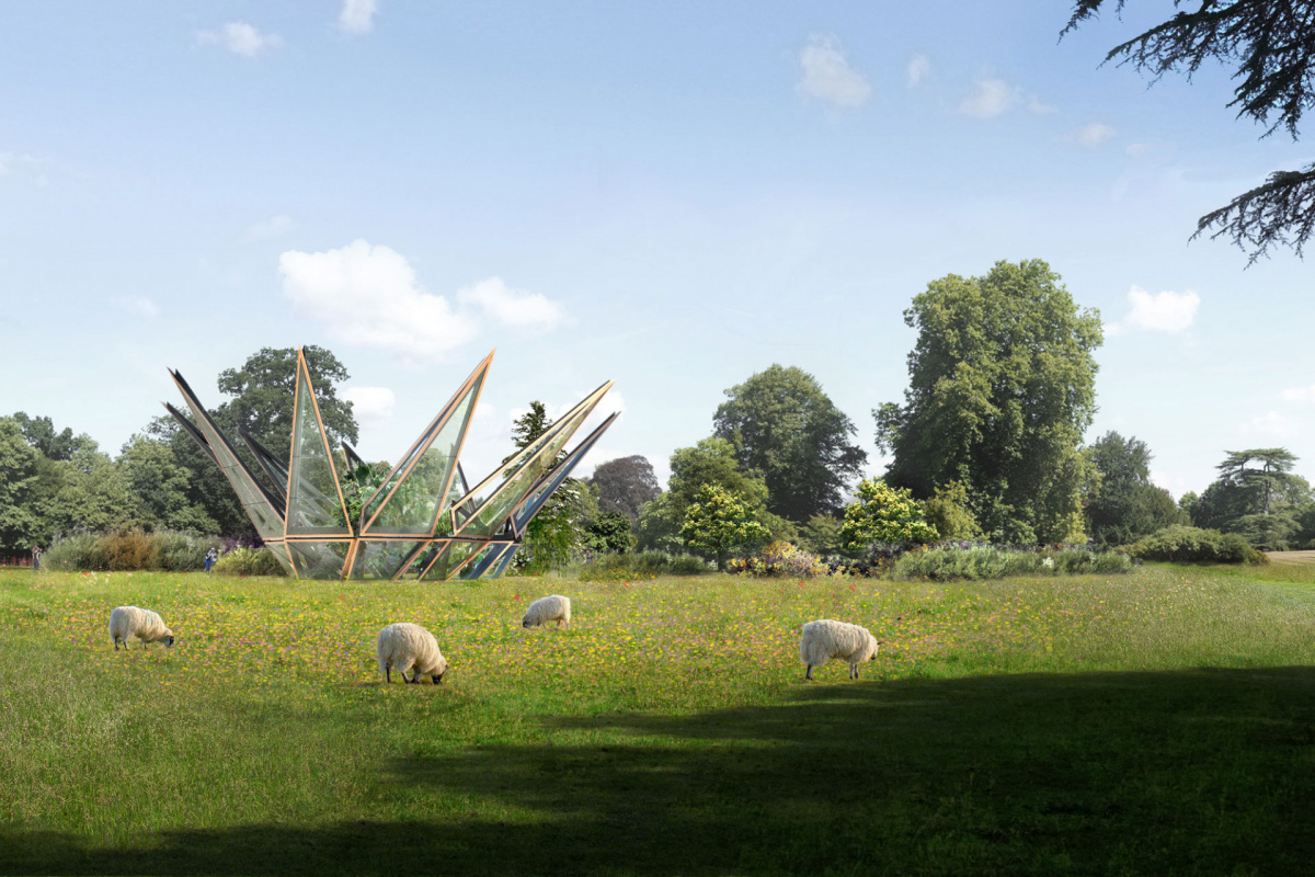
- The Woolbeding Glasshouse opens and closes like a flower. Photo courtesy of Heatherwick Studio
Focus on what interests you.
We have five design partners, including Thomas Heatherwick, the founding partner. We each run a cluster of projects, maybe eight to 10. Individually we try to make our portfolio very varied, and that’s deliberate because we enjoy working all different scales. I might be working on a small glass house in southern England or I’m also designing a light at the moment, and I’m doing a big retail project in Prague. I don’t discern the difference—each one has its own particular design challenge, and each stretches different parts of my thinking as to how to solve those challenges. We only do the stuff we’re interested in. We have to be true to ourselves so you don’t get in a situation where you’d really like to work on one thing and not another. That’s dangerous because you start to produce work that has less thought and less care, less attention, and suddenly you’re doing a range of work that includes stuff you spent loads of thought on and other stuff you just managed to do. I don’t ever want to be like that.
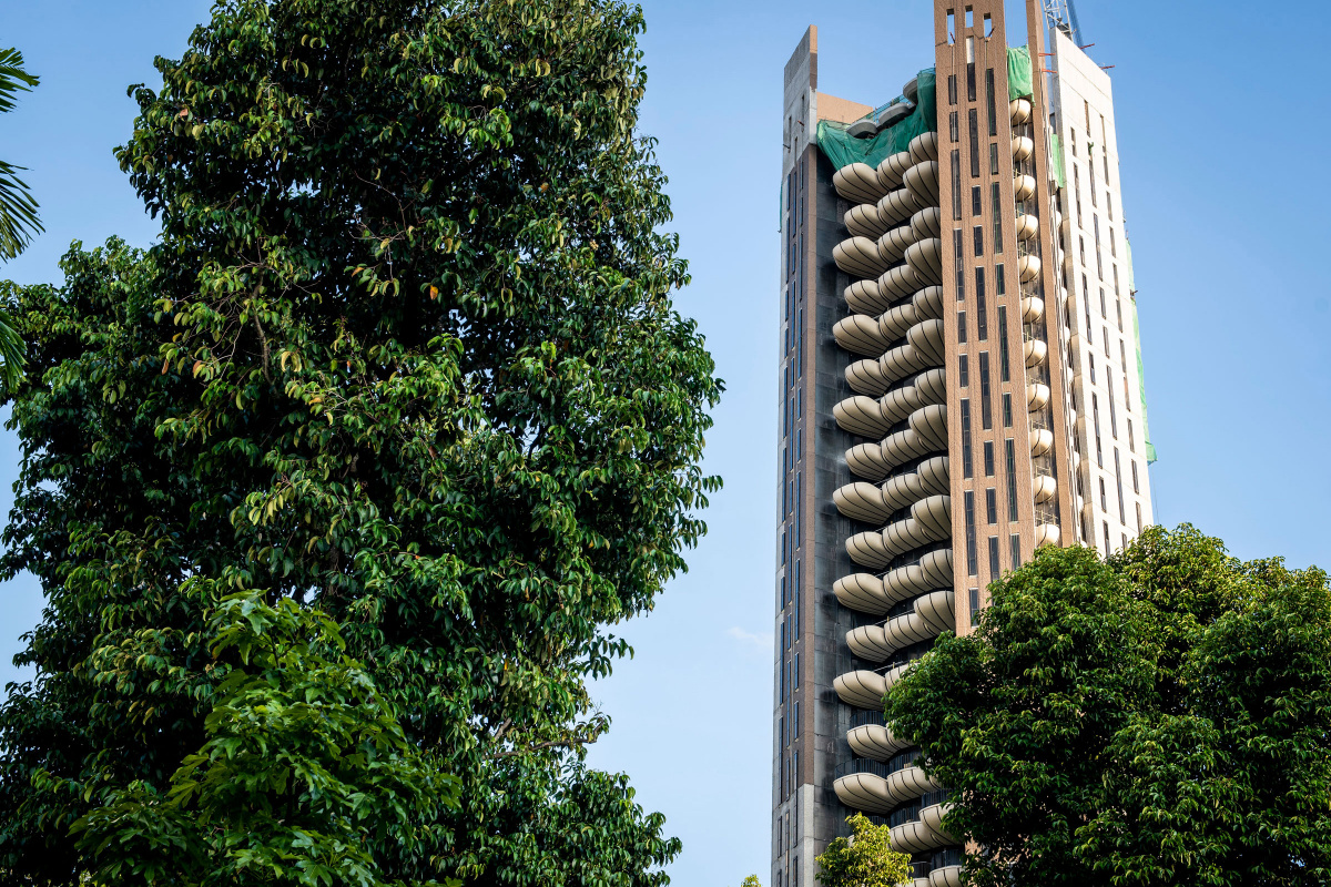
- EDEN, a 20-story residential concrete tower in Singapore. Photo courtesy of Swire Properites
Appreciate the making.
As things scale up, you can get more disconnected from the making—the actual creation of the thing. Our studio is always trying to keep as close a link to the making as possible. We used to have our own projects. We had our own construction company. We used to make a lot of our own stuff. As we’ve gotten bigger that’s become less practical and less possible. We now work with fabricators very closely to understand that whatever we design has to be built, manufactured, and produced. That connection with making makes our projects more readily deliverable so they can actually happen. And through the process of making we often come up with interesting outcomes.
Keep a fresh perspective.
Project teams are made of individuals with different experience levels and backgrounds. By doing lots of different things you exercise different parts of the brain. If someone has designed a hotel, quite often we would take them off the team that’s designing another hotel because they would have their own unconscious bias. They can come in and critique and give their opinion—we’re not going to lose that experience—but they won’t drive it in order to get a fresh perspective and to remove the possibility of repeating.
