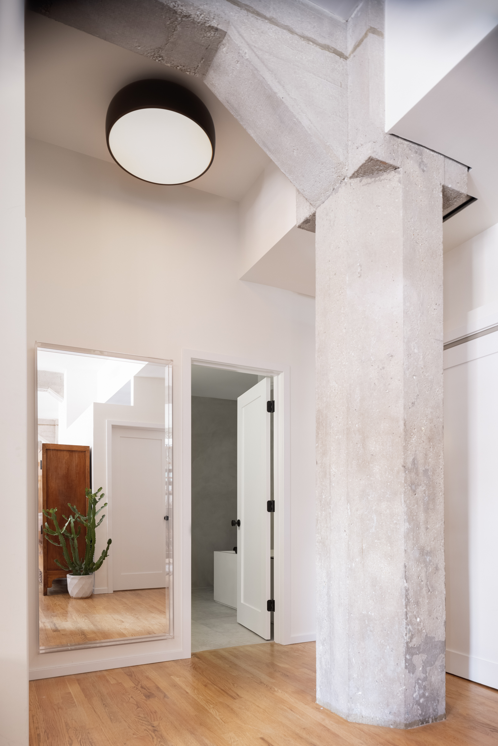
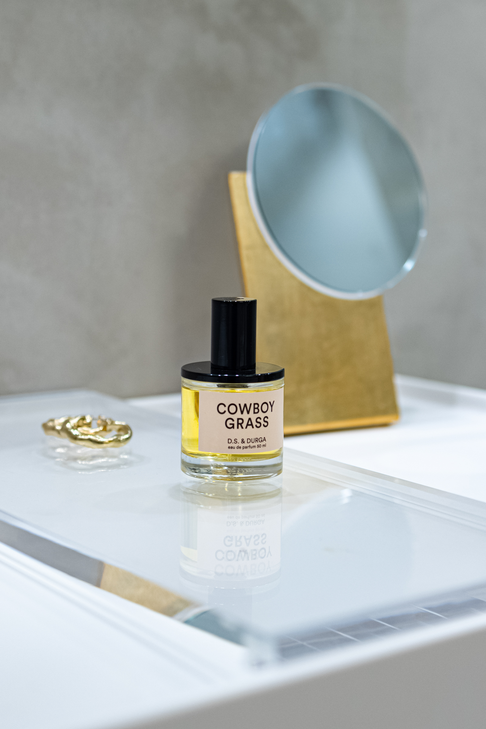
This downtown Chicago loft was first built in 1916. Designed by architect George C. Nimmons, the building served as an active printing press for more than 70 years. In 1987 New York City developer Duncan Henderson acquired the building (it reminded him of the loft he lived in back in SoHo) after realizing its potential for a loft conversion.
The building’s NYC loft vibes is one of the things that drew me to it, but the bathrooms were outdated and felt out of sync with the rest of the loft’s utilitarian and structural aesthetic.
I needed a complete loft bathroom renovation. I needed something modern yet peaceful and functional at the same time. But where to begin?
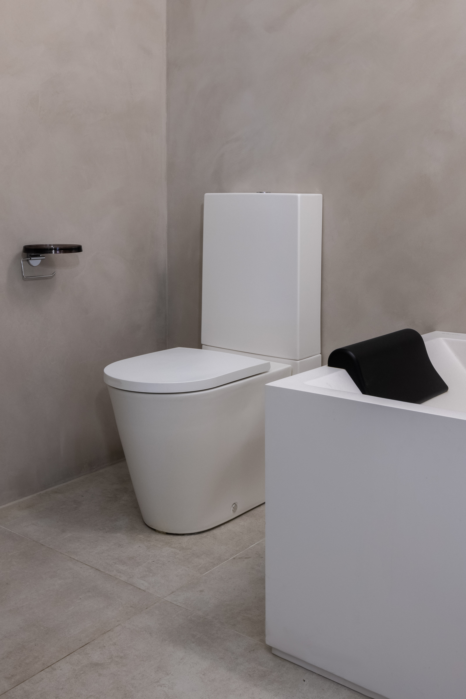
- Kartell by Laufen floorstanding WC
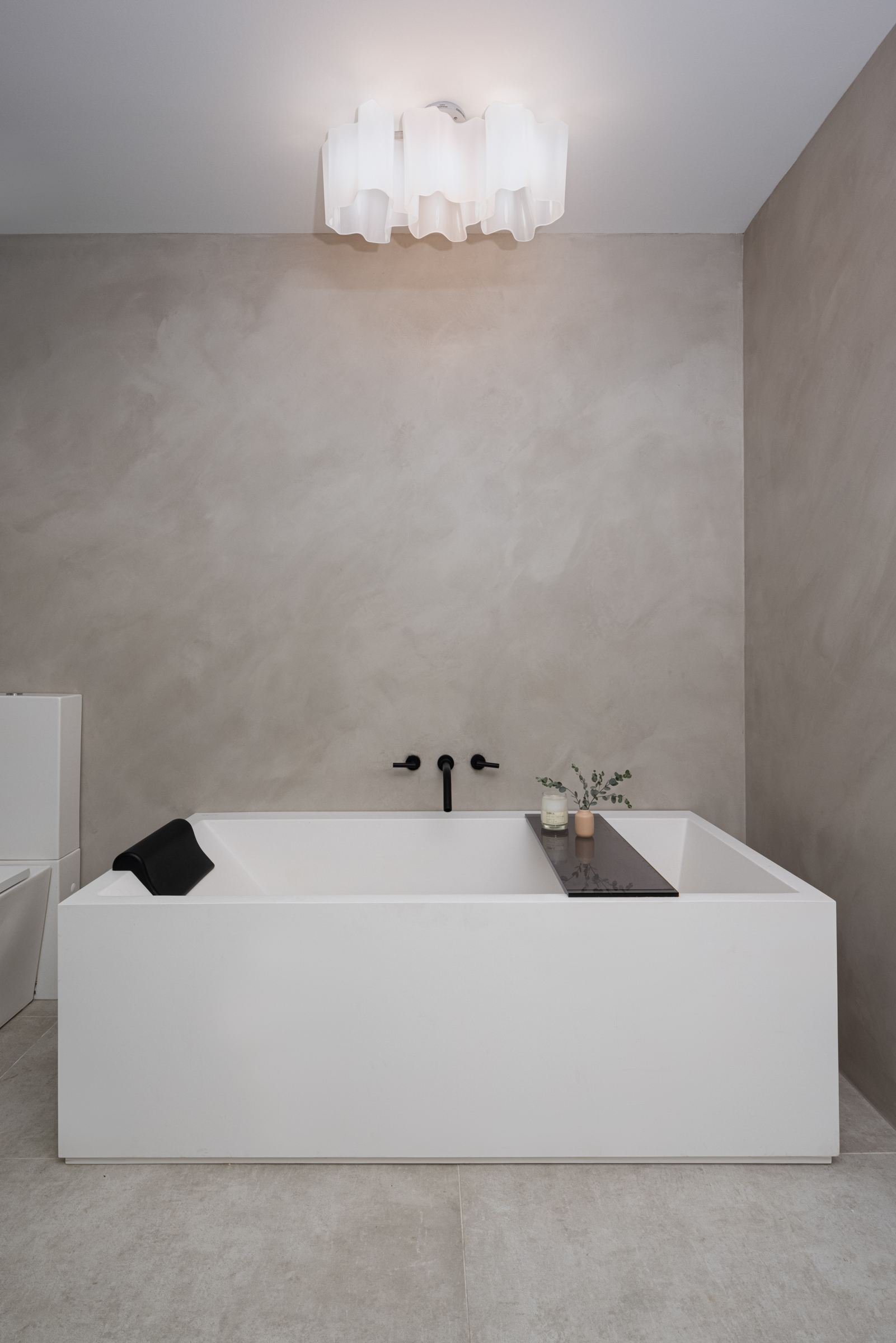
- Kartell by Laufen freestanding bathtub
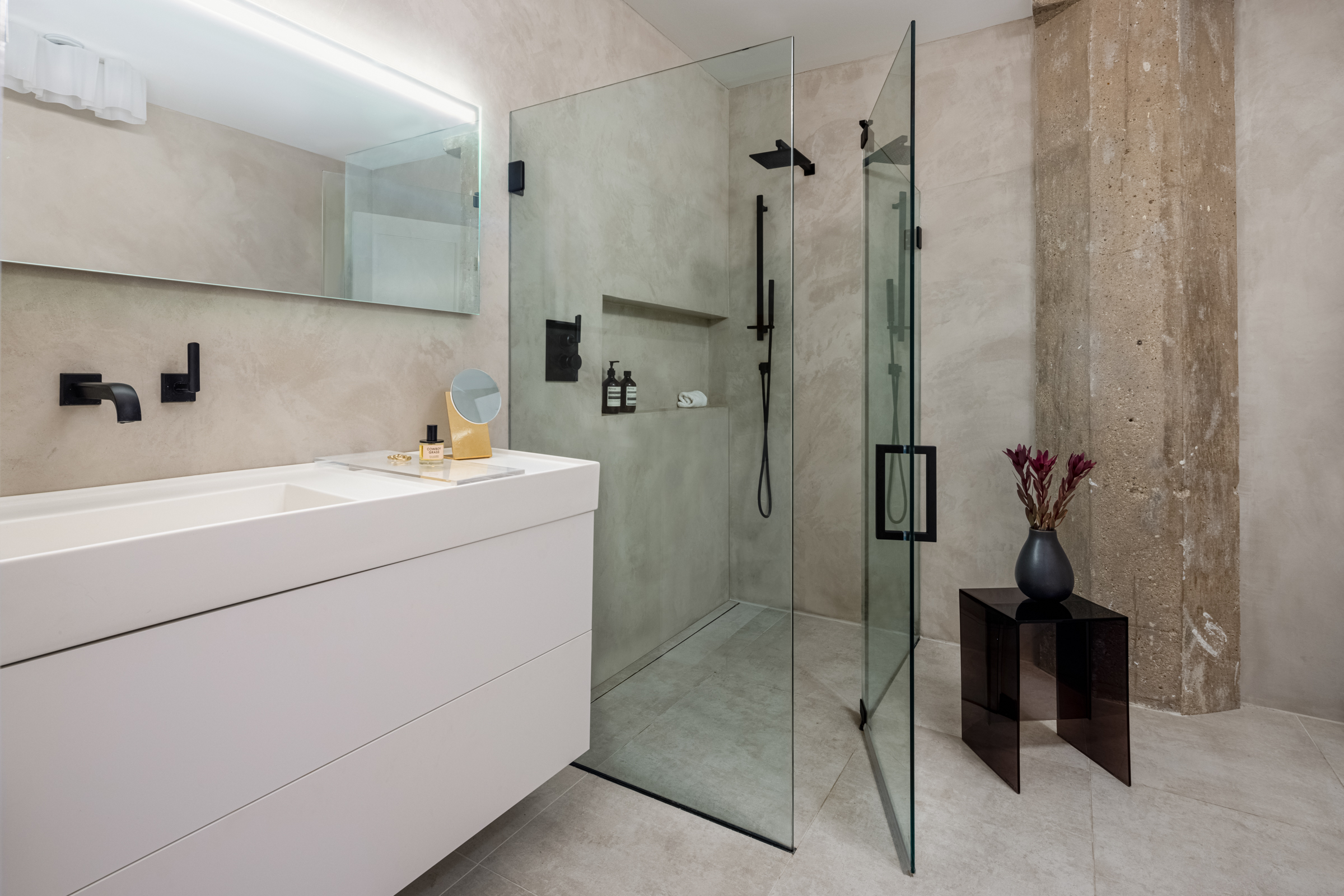
The first thing I did was look into Kartell by Laufen’s options. I had seen their work debuted at Salone del Mobile and was drawn to both the design (clean, architectural) and the craftsmanship (beautiful surfaces, perfectly beveled edges).
It’s hard to capture in photography, but the Kartell by Laufen pieces are made from a special matte-white ceramic material. It immediately feels special, unique, and luxurious. “It’s a cast mineral material made of different natural minerals, which are combined together according to a special Laufen formula,” explains Stephen Barry, Laufen Managing Director North America.
In other words, it’s a secret Swiss blend. There’s nothing else quite like it.
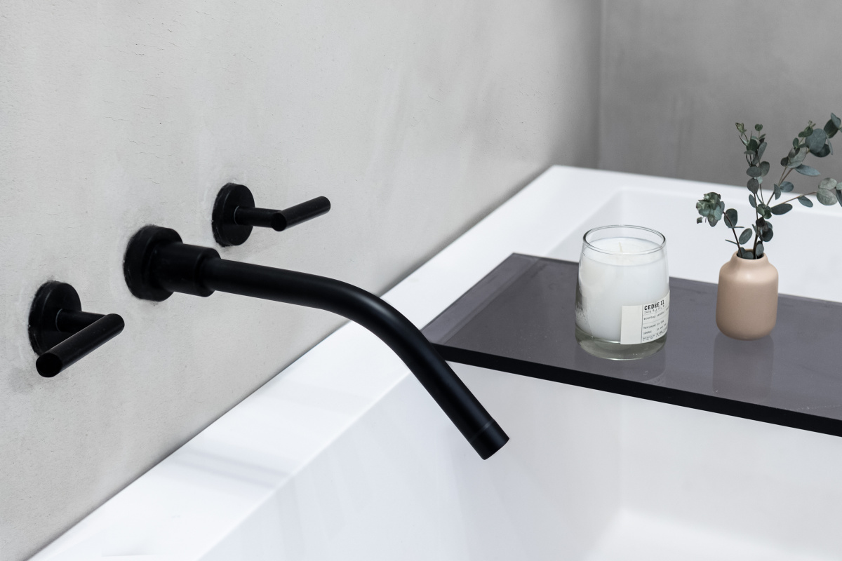
Loft 2.0 Collection by Watermark Designs: wall mounted bath spout and trim
I was also drawn to the engineering of the products; the vanity has no exposed drain. The freestanding tub has extremely thin walls, yet seamlessly hides a built-in overflow valve. The design offers a small footprint perfect for city-sized bathrooms but still with ample room to bathe in. It looks nice. It feels nice.
- Cove Collection in Linen by Atlas Concorde USA
- Only Me Mirror in Crystal by Philippe Starck for Kartell. Smithfield ceiling light by Jasper Morrison for FLOS sourced from YLighting.com
With Kartell by Laufen lined up for the bathtub, vanity, toilets, and sinks, I moved on to flooring. The key design element for the bathrooms was the massive exposed hexagonal concrete pillar.
We choose to keep the pillar exposed to keep with a utilitarian look. We set out to find flooring that would work with the concrete but push it away from brutal and pull the design toward a welcoming and calming finish.
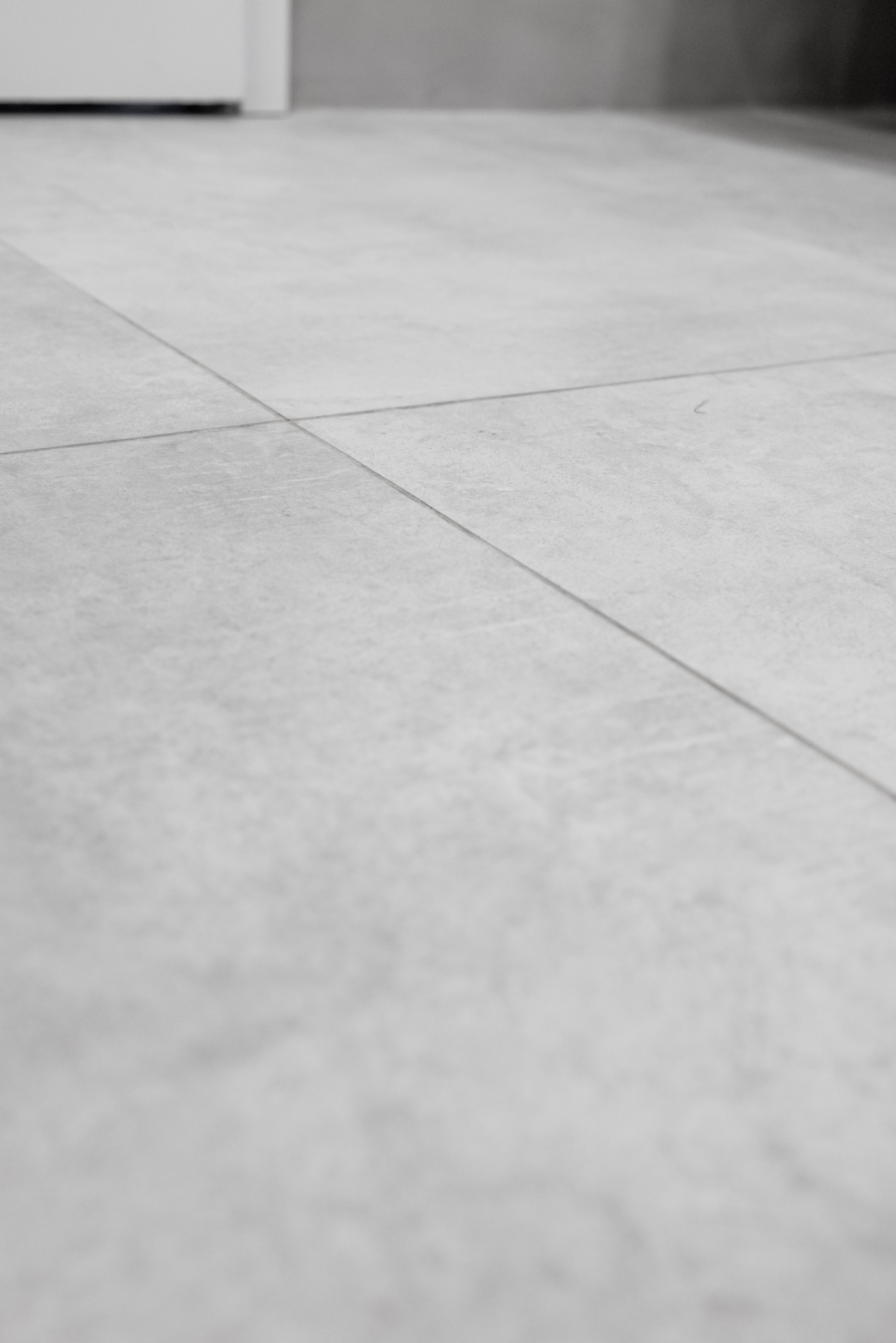
We found the perfect tile with the Cove Collection from Atlas Concorde USA. They describe the tile as “urban character mixed with handcrafted beauty,” and that matched exactly with what we wanted.
- Custom glass shower enclosure by Basco
The Atlas Concorde USA tile’s layers of neutral tones covered with subtle thin scratches makes for a material that seems fresh but still ancient, clean but not sterile. It’s a beautiful material with a matte finish and even in large format is not too slippery for wet surfaces.
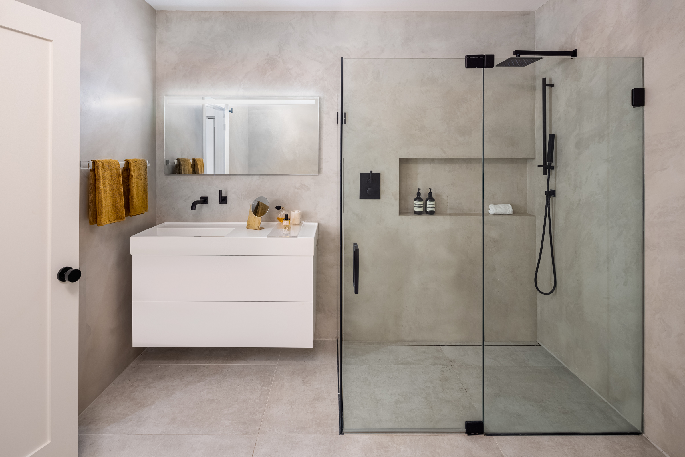
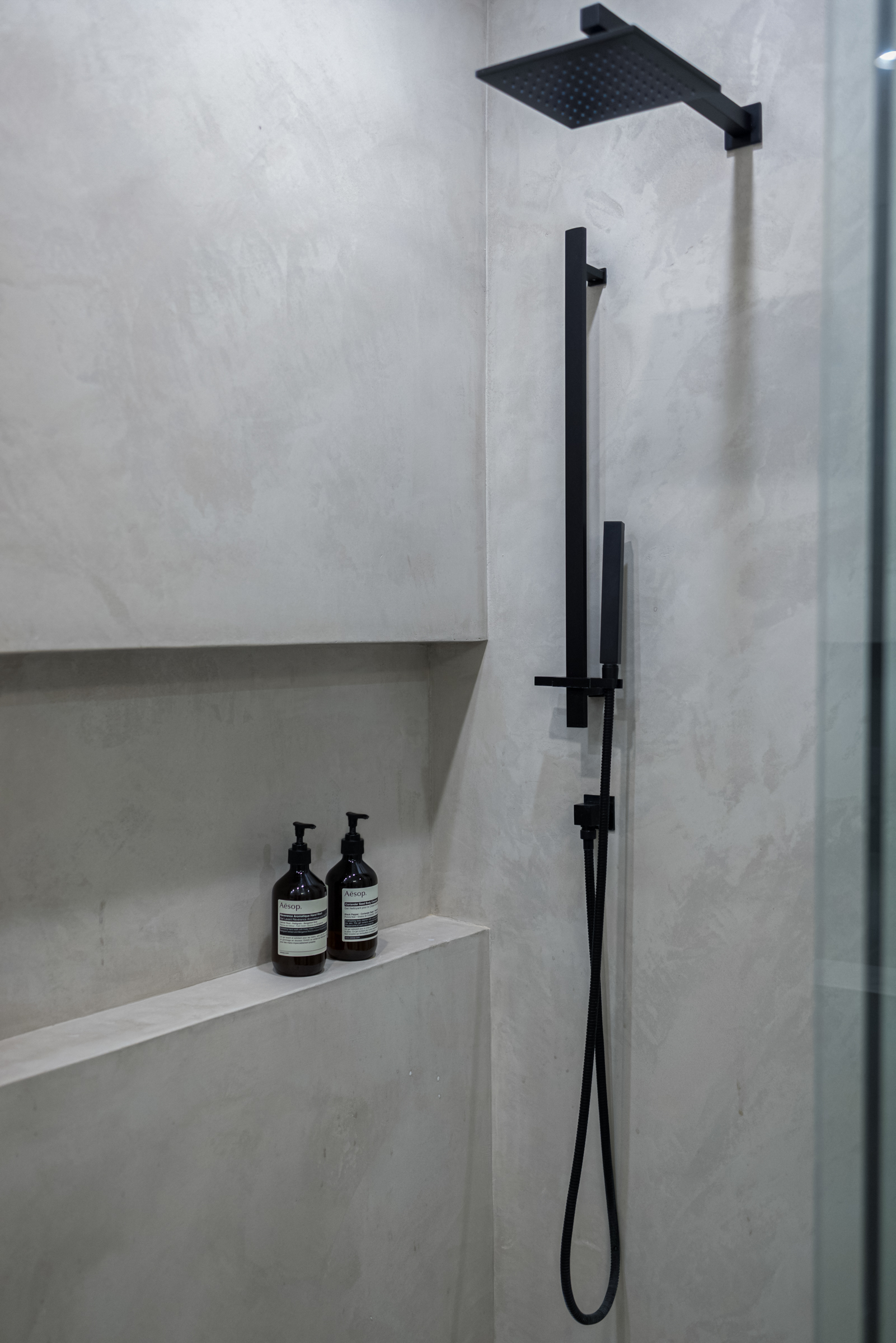
From a practical standpoint we really wanted a niche in the shower with the cleanest lines possible. We landed on covering the walls and the niche with Venetian plaster. Since it’s completely waterproof we were able to wrap everything in it with no seams. It also provided a waterproof backdrop for our wall-mounted trim.
- Venetian plaster by Chicago Ornamental Plastering
- Brut 64 collection by Watermark Designs
To make sure the surfaces came out right we turned to the experts at Chicago Ornamental Plastering. The fourth-generation plastering contractor can make pretty much anything. We showed them one of the Cove Collection tiles and told them to color-match and add some hand-finished details. After a few samples they showed us what they had in mind, then spent several days applying meticulous layers by hand to the bathroom. We were thrilled with the outcome; it adds a beautiful finish to the room.

Logico Triple Linear Semi-Flushmount Light by Gerhard Reichert, Michele De Lucchi from Artemide sourced from YLighting.com
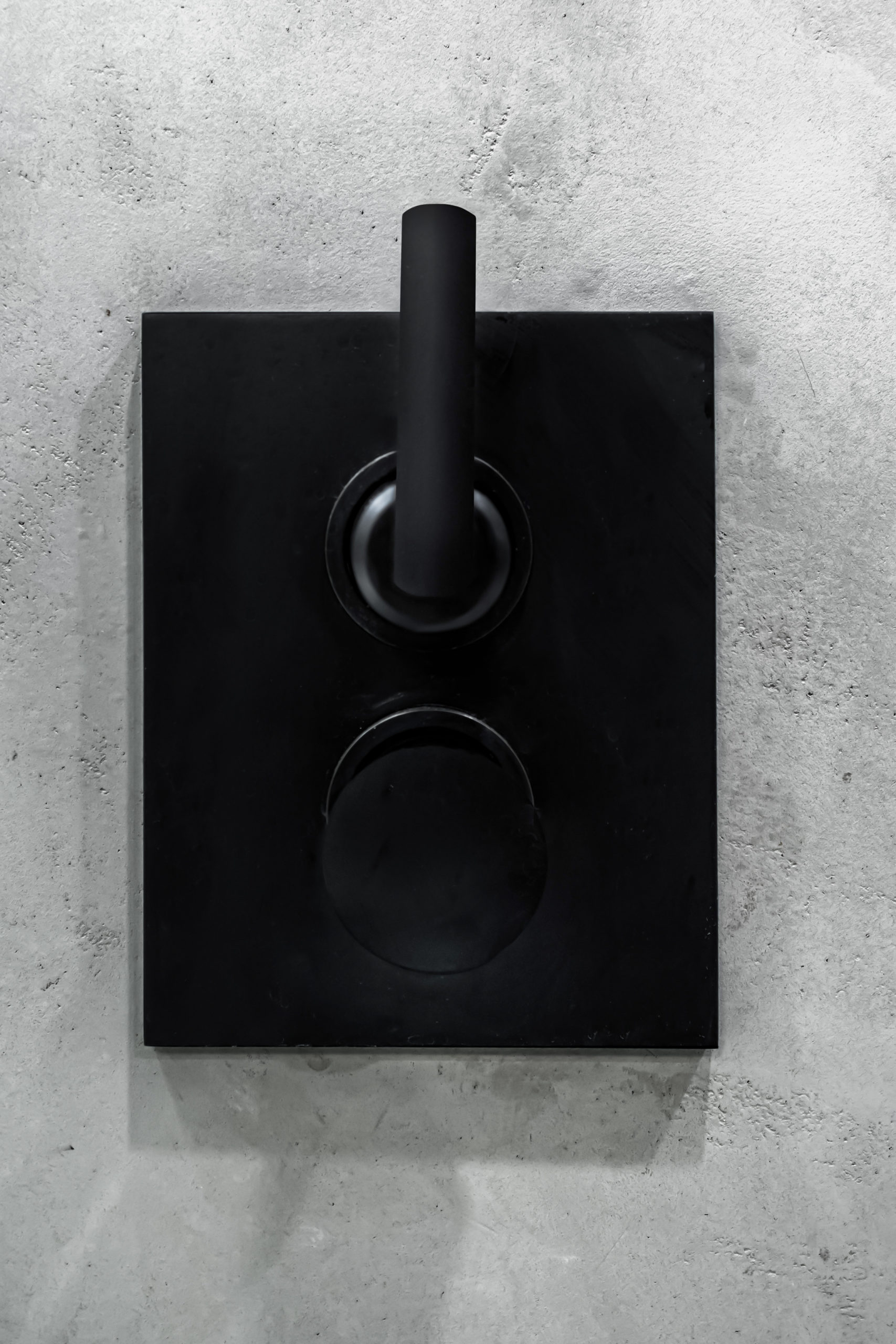
We knew we wanted matte black trim with really clean lines and angles. Watermark Designs in Brooklyn had the perfect products in Brut 64 collection designed by O&G Studio. We were drawn to the simple design and that it was possible to get a flawless matte finish. (It didn’t hurt knowing Kanye West had the same line put in his house.)
- Washbasin shelf by Kartell by Laufen
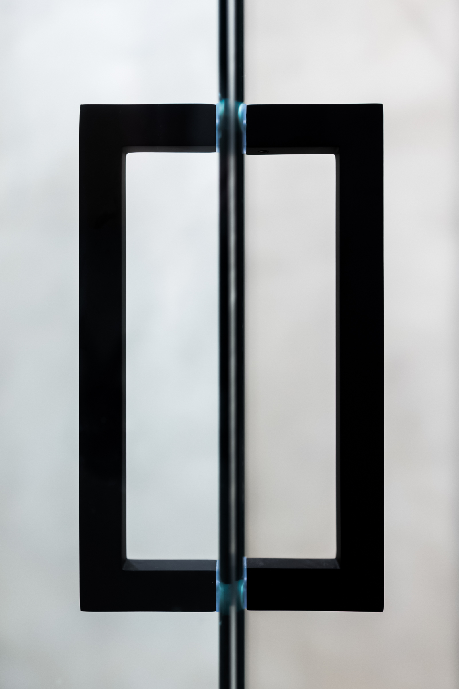
- Custom matte black shower handles by Basco
Keeping with the minimal look we turned to Basco Shower Enclosures to create a custom shower door. They were able to create an enclosure with limited hardware using a special glass, creating an architectural feeling without a lot of bulk frames. Critical to the minimal look is a sleek linear drain from Infinity Drain, whose clever design allows it to be mounted right up against the wall. Not only is it nice to not have to stand on a drain while showering, there’s no clutter on the floor—enhancing the simplicity of a curbless shower design.
The linear drain also allowed us great coverage to place a custom radiant heated floor mat down from NuHeat. The heated floor controls are hidden away inside the vanity and easily set by an app on your phone.

Linear Drain with tile insert frame from Infinity Drain. Tile by Atlas Concorde USA
Before the renovation the bathroom had really terrible lighting, so it was high on our list of issues to resolve. We started with the Avalon LED mirror from Astro Lighting. It fit perfectly in the space and offers a ring-light glow. After adding updated recessed lighting into the ceiling we searched for something with personality that could offer some texture. We chose the Logico Triple Linear light from Artemide. We felt like the curvy edges broke up the bathroom’s hard lines—and its diffused light and shadows add a touch of drama.

Floorstanding WC, Max Beam stool, washbasin, and All Saints mirror by Kartell by Laufen
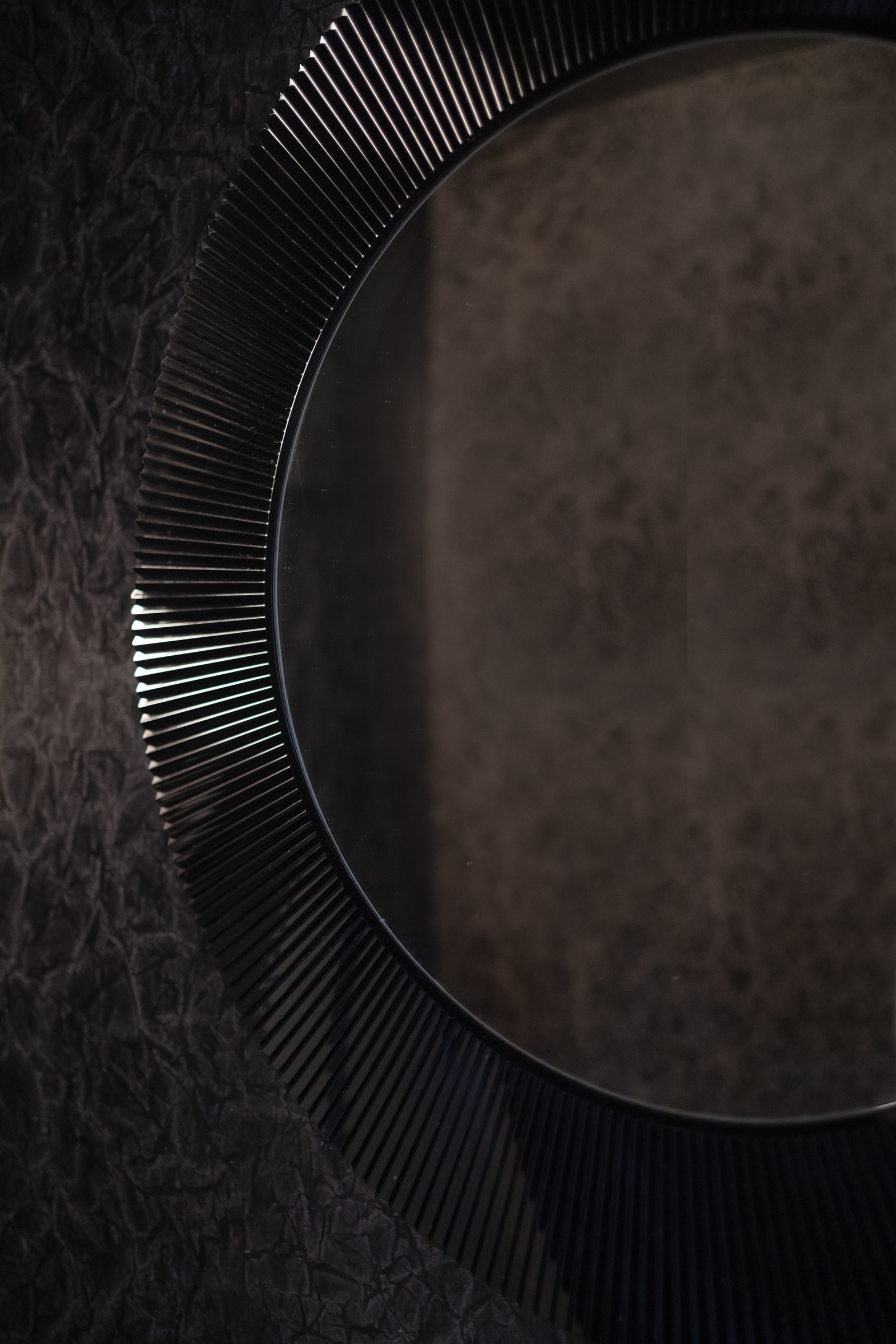
While we were renovating we decided to work on the loft’s half bathroom, too. Why not? We pulled the Cove Collection from Atlas Concorde USA into the room as well as a striking combo of a matte white washbasin from Kartell by Laufen with their black All Saints mirror. To punch up the theatrics of the room we finished the walls with the Mesa hand-painted wallpaper in slate from Maya Romanoff. It’s an amazing paper that brings the small room to life.
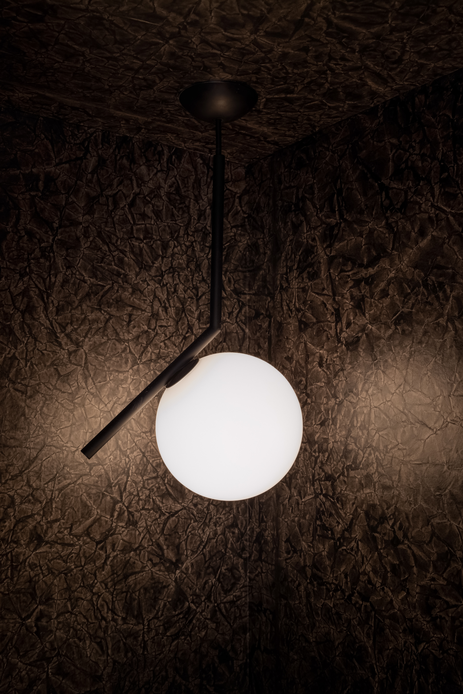
A hanging corner pendant light by FLOS creates a theatrical vibe in the room and plays off the subtle design of the deck-mounted monoblock Loft 2.0 mixer from Watermark Designs.
- IC S Pendant Light by Michael Anastassiades from FLOS sourced from YLighting.com
- All Saints mirror by Kartell by Laufen
Finally we had to pick out the hardware for the doors and the hallway entrance to the full bathroom.
We wanted sturdy hardware with a matte finish to match the feel of the solid core doors we hung. We landed on Circolo brass knobs from Viaggio Hardware. The knobs are simple and sturdy with a subtle hammered texture and no visible screws on the rosette.
The final bathroom renovations do a great job at updating the 105-year-old building to a modern, functional space while keeping elements of the original building intact.
Project Team
General Contractor: Product Construction
Product list
