A bit of wonder. An unexpected twist. These are two of the imprints you’ll find on every Marcel Wanders studio design.
“We are at our best when we design for people whereby we love to surprise—evoking an emotional involuntary response of joy and enlightenment,” says Marcel Wanders, the Dutch designer and creative director at Marcel Wanders studio. “It starts with experimentation. Using exciting effects, dazzling details, and eccentric patterns and colors to surprise and delight.”
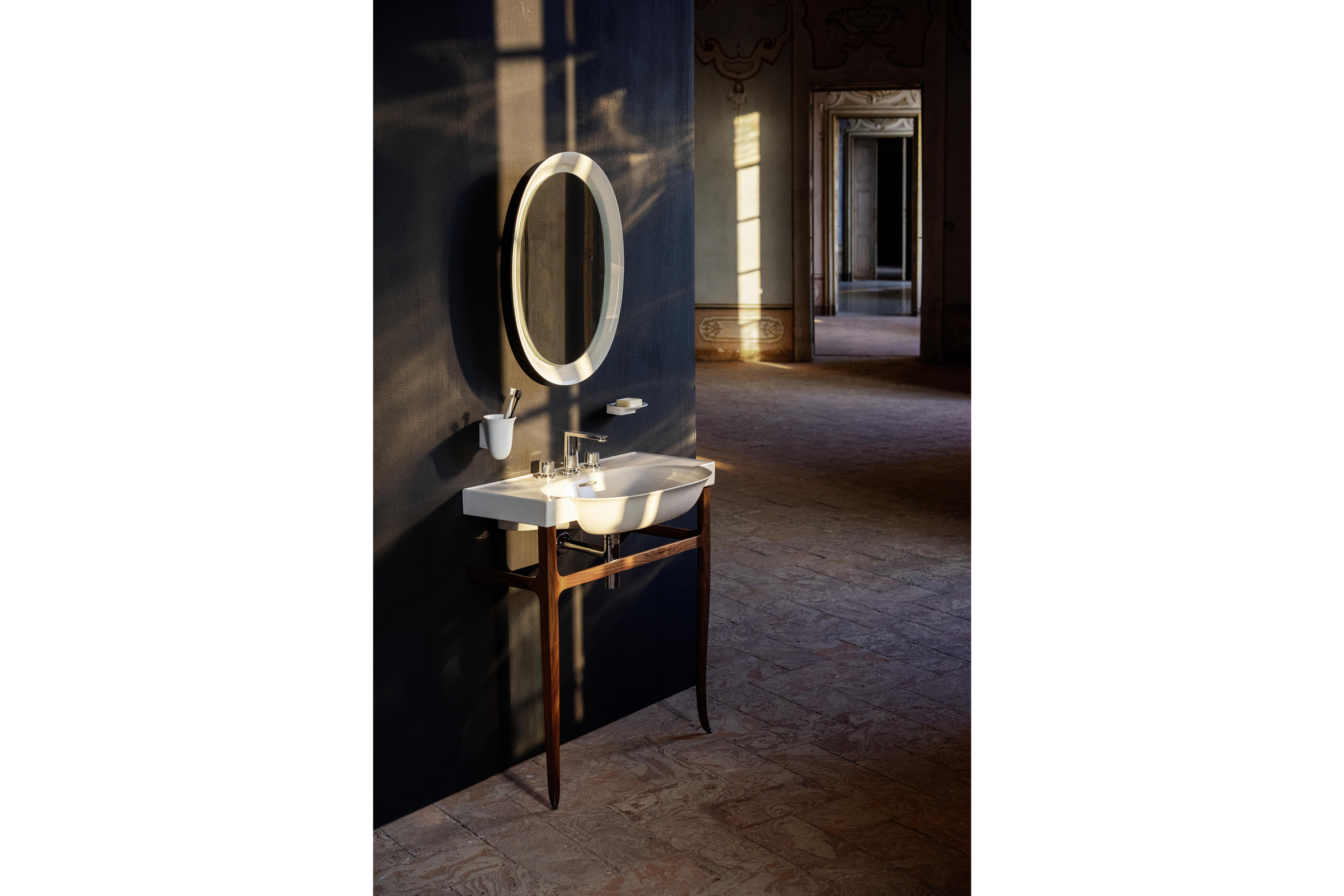
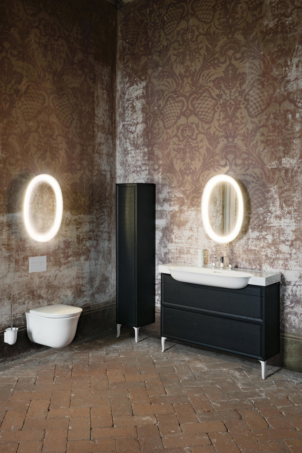
- “The narrative of each space can be defined by the designer, developer, or homeowner with The New Classic pieces as the artwork. With the thin, clean lines of our basins in extra-thin ceramic married together with the details of our furniture and accessorized with our lighted mirror, the design possibilities are nearly endless,” says Stephen Barry, Laufen’s managing director of North America. Photo courtesy of Laufen
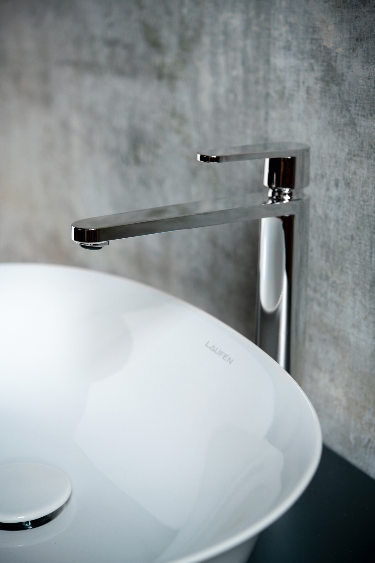
- The New Classic combines practicality with contemporary style, using soft, elegant lines and durable materials to feel at home in any setting. Photo courtesy of Laufen
That dazzle is why high-end Swiss bathroom design brand Laufen sought to collaborate with the global product interior design studio in Amsterdam under Marcel Wanders and Gabriele Chiave’s creative direction.
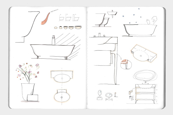
The result, called The New Classic, showcases Laufen’s thin ceramic material in new ways as part of this latest bathroom collection. The complete bathroom collection also includes furniture and accessories. While Laufen had become known for using the ultra-thin ceramic in a traditional, square style, The New Classic collection pushes the material further with feminine curves and softer shapes.
“The mission was to create a design series that was a departure from the Laufen norm, to break into a new realm of design,” says Stephen Barry, Laufen’s managing director of North America.
The goal for The New Classic collection was just as it sounds—to design something that was both new and instantly classic—and its mission offered up the kind of contradiction that the Marcel Wanders studio loves, according to Creative Director Gabriele Chiave. “That resonates a lot with the work we do, which is to create something a bit universal that speaks to past sensations and emotions while still being contemporary.”
Building on that idea of contradictions, Gabriele, Marcel, and the team began toying with the idea of masculine and feminine, combining soft, curved shapes with sharp, architectural lines. “A beautiful architectural volume can uplift and support beautiful elements of the past. You can see each piece has a straight, square-shaped body, and on top you have a curve, which brings a softness to the environment of the bathroom,” Gabriele says about The New Classic washbasins.
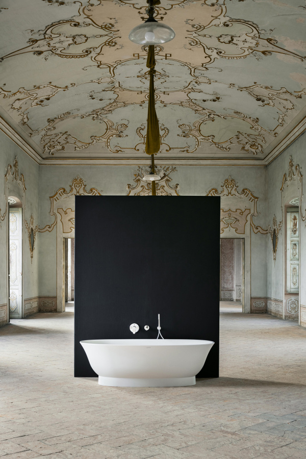
The New Classic allows designers to tell any story they want. Photo courtesy of Laufen
Gabriele says softness is needed in the bathroom, an area where people are at their most vulnerable. “Those kinds of shapes are more reassuring and more comfortable, softer,” he says. “It speaks to our body, which is not a little square box but a soft body.”
To achieve a collection that felt at home both in the past and the future, Gabriele and the design team got to work on their storytelling from their Amsterdam studio. They created elaborate city-inspired sets, “dressing up” the bathrooms for a make-believe home in Moscow or one in New York. “We visualized the collection in different geographic contexts with different types of people. There was the Parisian set and the Moscow set and one in south France. The Russian one was rich in language and materials. The one in France was a bit more natural with wood. It was the same collection, but they were dressed for different occasions,” Gabriele says.
It was a crucial part of the process, as it allowed the team and the client to see the collection in context and imagine how it could speak to a much wider audience.
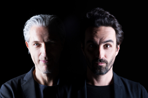
Marcel Wanders and Gabriele Chiave. Photo courtesy of Laufen
“We love to embrace the past and blend it into the now and future,” Marcel says. “In this instance the idea originated with the concept of a table you would find at your grandma’s home—a real classic. As soon as we added soft, elegant lines the whole collection started to take shape. I kept imagining the pieces in a house just sold to its new owners who would feel as if they didn’t have to refurbish it, simply because the pieces left became the foundation of its design.” He says using Laufen’s unique thin ceramic material was crucial to the collection’s development, as it allowed them to add the feminine touch to the design, creating thinner products that were softly shaped without compromising on strength.
Gabriele says Laufen’s unique thin ceramic mimicked the lightness and beauty of the old metal washbasins like Grandma used, with thin, sharp edges. It knocked that “blobby” prototype out of the water. “We invented a new way to speak with that material,” Gabriele says. “Laufen had already mastered the thinness, but they used all very square, super thin, sharp edges in their collections. That was one way to speak with the materials, but we spoke another language—soft curves, organic, and feminine instead of architectural and sharp.”
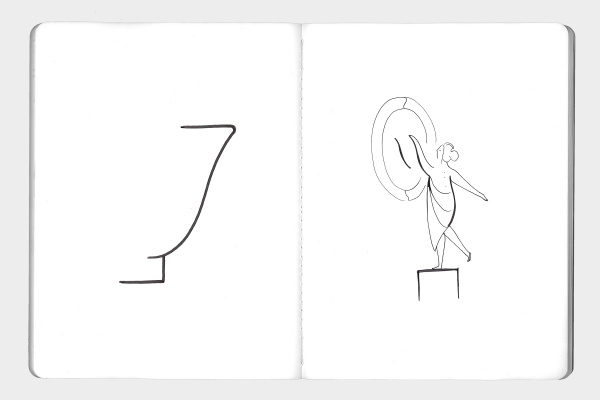
- Gabriele sculpted the forms using the curves of the human body as inspiration. “When we present it it’s not just about the product, it’s about the whole story,” he says. Photo courtesy of Laufen
- “A beautiful architectural volume can uplift and support beautiful elements of the past. You can see each piece has a straight, square-shaped body, and on top you have a curve, which brings a softness to the environment of the bathroom,” says Gabriele. Photo courtesy of Laufen
For Laufen’s North American market particularly, The New Classic is a home run. “Most European manufacturers are focused on a more modern and ‘European’ look. The American consumer and designer will see and admire this new design collection as a new take on a classic design,” Stephen says. “Although we are a relatively young country, we pay homage and respect the past. This collection will steal the hearts of today’s design-driven consumer.”
Marcel says striking that balance between old and new, familiar and exciting, is all part of the process. “That is a constant play of forces. Throughout all we make, we always look to bring the human touch back to the design. Whether we design a chair, bathroom, or hotel room, we begin and end our thinking by considering how a person will experience our design or how it plays into their emotional state. A vase is not great because it can contain flowers.”
A version of this article originally appeared in Sixtysix Issue 06 with the headline “The New Classic.” Subscribe today.
