In a world where approximately 10% of the population struggles with dyslexia, finding ways to improve reading and writing experiences for individuals with this neurological disability is crucial. While the impact of text presentation on dyslexia has been explored, little research has objectively measured the influence of font types on reading performance. However, a recent groundbreaking study conducted by researchers from the NLP & Web Research Groups at Universitat Pompeu Fabra in Barcelona has shed light on this topic.
The study, which utilized eye-tracking technology, aimed to examine the effect of font type on the reading speed of individuals with dyslexia. In a within-subject design, 48 participants with dyslexia were asked to read 12 texts, each presented in a different font. The researchers compared the reading performance across various font styles, including sans serif, monospaced, and roman fonts, as well as serif, proportional, and italic fonts.
The results of the study were remarkable. The findings indicated that sans serif, monospaced, and roman font styles significantly improved reading performance for individuals with dyslexia, while serif, proportional, and italic fonts had the opposite effect. These findings offer valuable insights into the typography choices that can enhance accessibility and legibility for people with dyslexia.

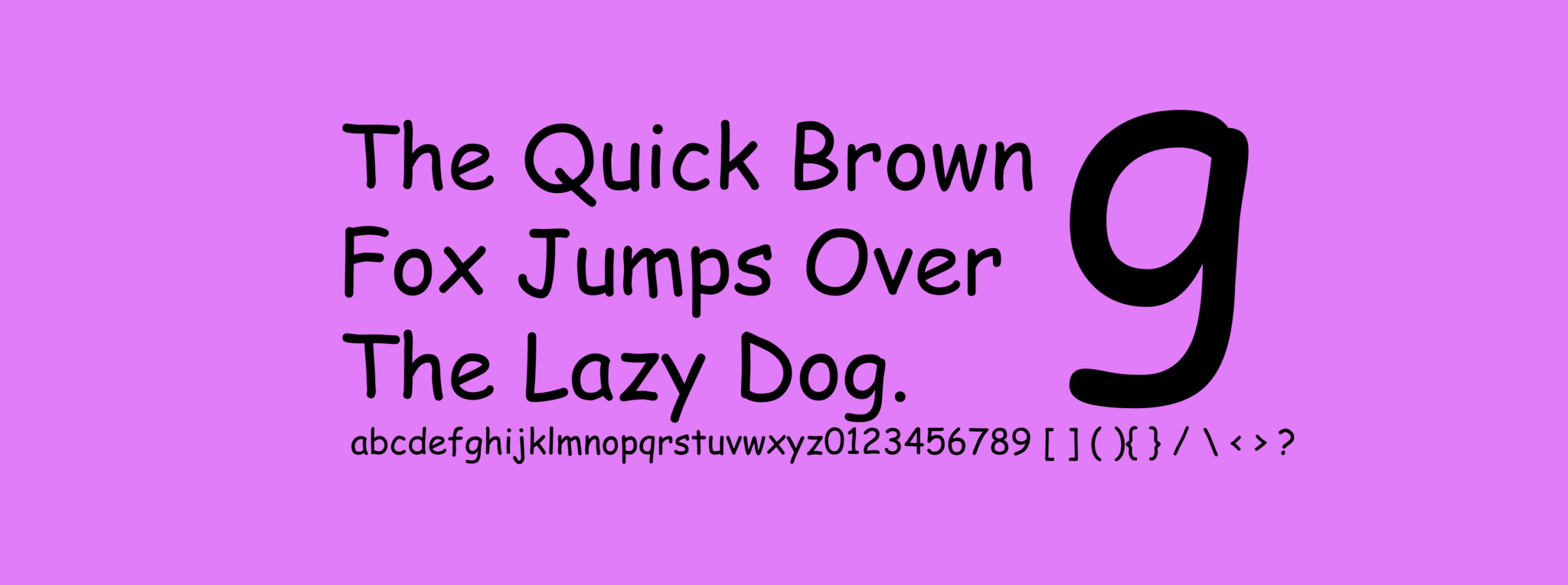
Font samples with letters prone to legibility problems: Comic Sans, Comic Neue (an alternative published 2014), Candara (a font also considered “casual”[24]), Trebuchet MS (a Windows standard font), Andika (a font designed for legibility), and Komika Text.
These findings challenge some of the existing recommendations put forth by dyslexia associations. The British Dyslexia Association, for instance, suggests using Arial, Comic Sans, Verdana, Tahoma, Century Gothic, and Trebuchet, without providing clear evidence for these choices. The study’s results provide a scientific basis for font recommendations, emphasizing the importance of sans serif, monospaced, and roman fonts for individuals with dyslexia.

An example of Comic Sans
It is worth noting that while the study focused on font types, other factors such as font size and background color can also influence readability for individuals with dyslexia. However, the study’s findings highlight the specific impact of font type and offer practical insights for designing dyslexia-friendly texts.
Dyslexia is a complex and often misunderstood condition. It affects individuals’ ability to accurately recognize words, leading to difficulties in reading and writing. This neurological disability hinders access to written information and can impede vocabulary and knowledge development. Despite its prevalence, dyslexia is often detected through low academic performance, making it crucial to find effective strategies to support individuals with dyslexia.
By shedding light on the impact of font type on reading performance, this study opens up new possibilities for designing more inclusive texts. It underscores the importance of considering font choices as a means to enhance accessibility for individuals with dyslexia. Implementing dyslexia-friendly fonts such as Helvetica, Courier, Arial, Verdana, and Computer Modern Unicode can contribute to improved reading experiences and empower individuals with dyslexia to access information more effectively.
The study also emphasizes the need for further research in this field. While this groundbreaking experiment provides valuable insights, there is still much to explore regarding the relationship between typography and dyslexia. Future studies could investigate additional font characteristics, such as letter spacing and line spacing, and their impact on reading performance.


