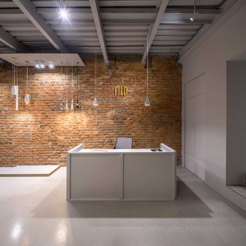
The store and office of emerging Ukrainian design duo FILD, in the Shevchenko neighborhood of Kiev, is easy enough to spy, thanks to its distinctive color scheme: ash grey brick around a bright yellow front door. Inside, among the clean lines and open spaces: more ash grey and bright yellow accents. At the desk is a stack of business cards—which sport that same singular combination of ash grey and yellow.
The through line is representative of both the minimalist approach and identity awareness that, along with a strong focus on sustainability, define the husband-and-wife team, which designs lighting and functional interior objects while also doing interior design. FILD is the first Ukrainian studio to exhibit at the Stockholm Furniture and Light Fair, and their notable projects include interiors for the headquarters of Creative Marketing Solutions Group, the largest advertising holding company in Ukraine. We spoke with designer Dan Vakhrameyev about the helping pioneer the Kiev design scene, the evergreen joys of minimalist design, the challenges of working alongside one’s significant other, and more.
Why did you decide to create your own design studio?
Since my curious youth, I always saw design as my calling and never had a second thought about my life direction. The only [second thought] was that time in high school when I was about to become a b-boy dancer. (Laughs)
Meeting my future wife, Kateryna Vakhrameyeva, in 2012 was a crucial moment for creating a company. Basically, FILD grew strong taking its foundation from our relationship and mutual support, and we were able to develop a brand together. I was working with graphic design and Katya was the CEO and founder of an international fashion brand. It took us some time to fully dedicate ourselves fully to FILD, so we officially became a company in 2014.
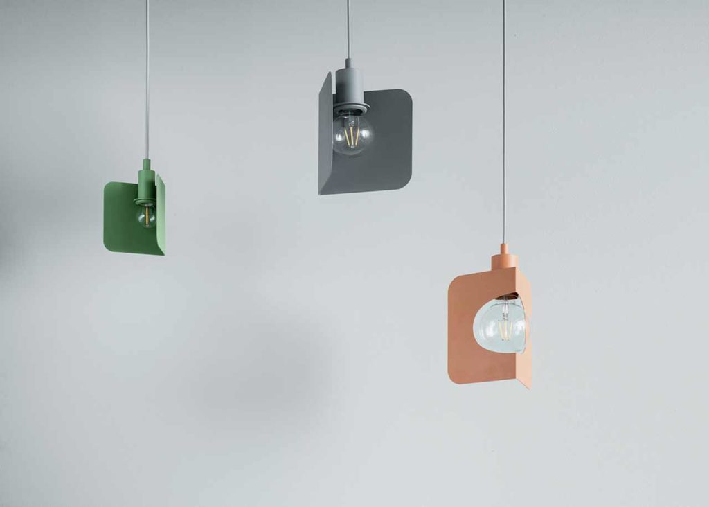
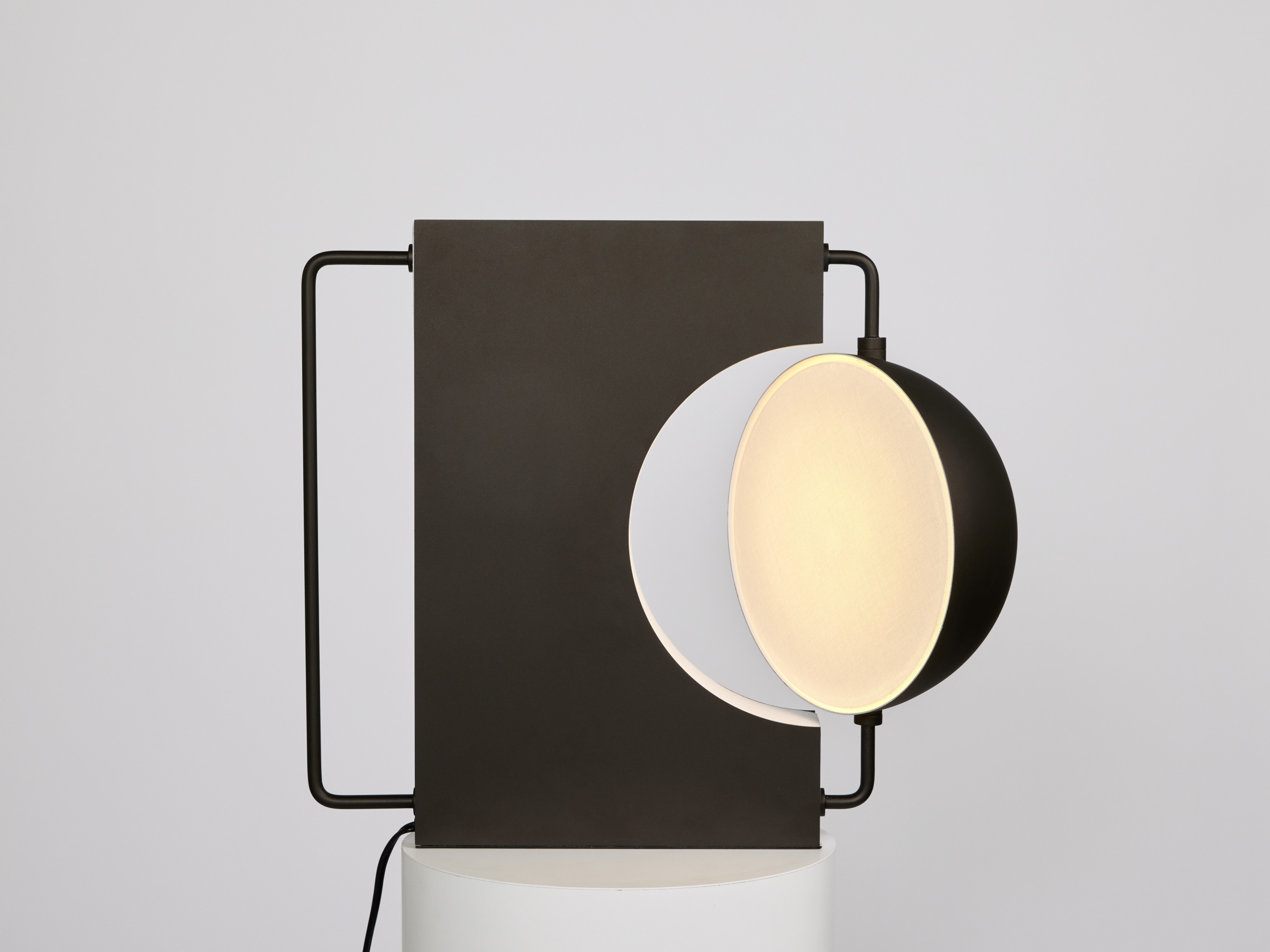
One of FILD’s most recognizable lighting designs is the Corner Pendant Lamp. The Corner line also features a sconce and table lamp.
Where did the inspiration for the company name come from?
I don’t want to disappoint you, but there’s no significant legend behind the name, unfortunately. It’s based on my perception of graphic lettering and the actual sound of the name; we had no previous association with the name. We wanted it to be spacious, short, sharp. and accurate. So FILD was born. (Laughs)
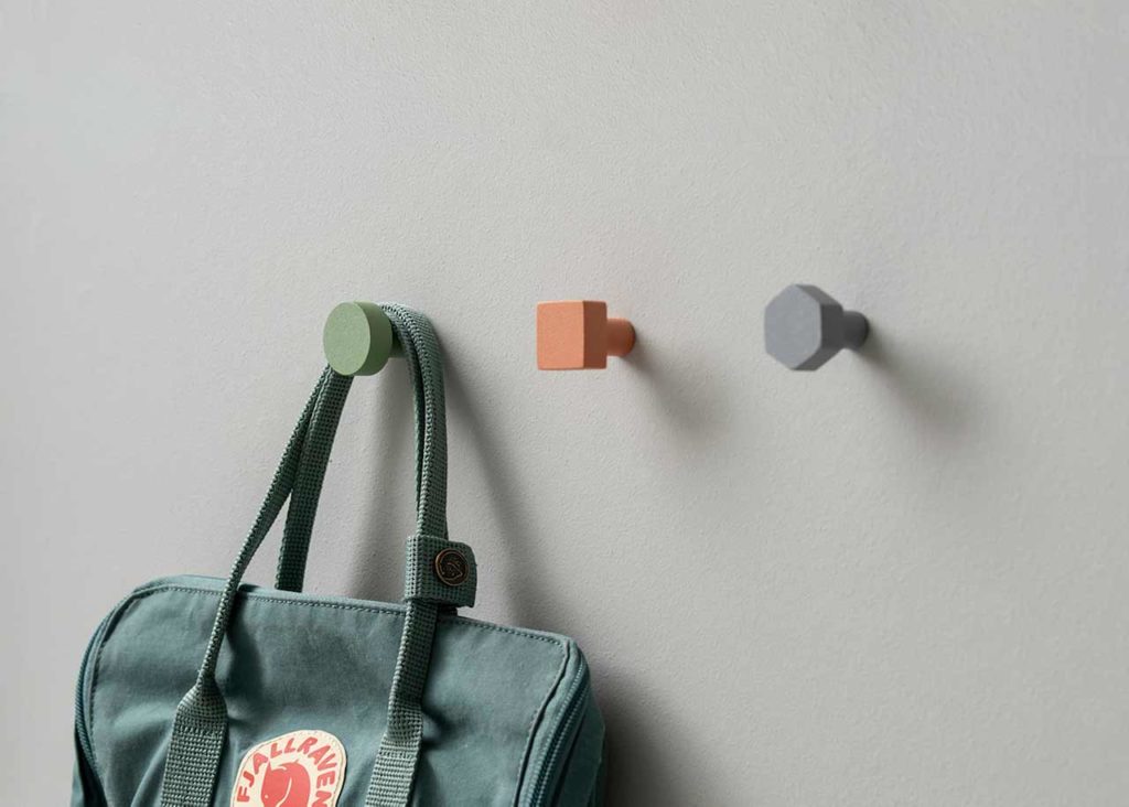
FILD’s wall-mounted Geometry Hooks are crafted from powder-coated steel and made in seven different colors.
How did you get started with your first object design collection, Sustainable Origins?
We completed a few interior design projects between 2013 and 2014, and each time some interesting light, furniture, or decorative element was needed. At the time, Ukraine was lacking in interesting brands. You saw a lot of bad quality copies and fakes or extremely expensive big brands from Italy and Europe. The middle-class market was not fully formed yet due to all the political and economic turbulence, but our friends wanted to have something interesting and new for a decent price. So we designed and produced the first objects for interior projects for our friends, and since we had gathered five for six elements, we ended up organizing what was essentially the very first presentation of an original contemporary Ukrainian design collection, in December 2014.
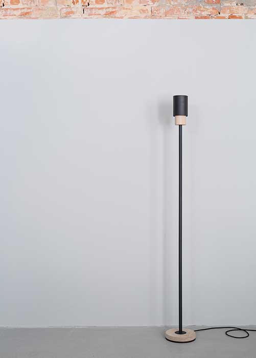
The Sustainable Origins (SO) Floor Lamp.
Your team seems to be one of the few objects design studios in Ukraine. Was getting started a challenge?
Yes, you’re very right. Our first presentation was actually the first for the whole industry. We gathered all the appropriate press and worked to promote local, original design in general, as a showcase of the possibilities of local designers. There were a lot of manufacturers who never asked for original design from young, local talent. At the time, they preferred just to copy designs from Scandinavia and Europe—and copy them poorly—than to take a risk and develop something locally. But since the revolution, and after a lot of collective effort from the [design] community, we’ve seen great changes and there’s more to come.
Read more interior, product and industrial design stories at Sixtysix.
What’s something you consider unique about FILD’s designs compared to other designs?
We never try to compare ourselves with others. We truly believe in the uniqueness of each individual, and following your own path is most important of all. FILD is very family-driven and a very personal brand, I would say. We mainly use hand-crafted elements. My father helps a lot with production and assembling and refuses to accept payment—which is definitely great for our accounting. All the designs come from an inner feeling rather than from market research. So I guess we just make honest products without having to compromise quality, and we respect our partners and grow day by day, trying to be better people with each sunrise.
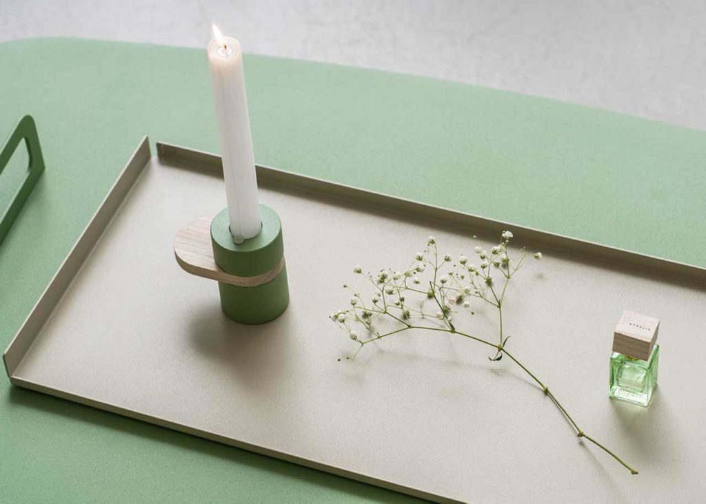
FILD’s Tom Tray. It was also produced in forest green, along with Corner lights, Geometry Hooks, and other designs, for the 2019 Stockholm Furniture and Light Fair.
How has your style evolved over time?
Honestly, I do look skeptically аt some of my earliest sketches with a humble smile and think, “Why did I ever consider this cool?”
But some of the very first models, such as SO8, SO6, and SO5, they’re simple and timeless, I think. But, of course, we upgraded some details after their initial launch. In general, it’s common for me to improve some elements over the time. It shows that we keep growing and changing, and you can’t remain stuck in one fixed positing. Now, I dedicate more and more time to color and texture, which is not less important than the form itself. Whatever the case, the core vision remains the same: minimal, clean, accurate lines and forms.
Why do you prefer minimalism?
I honestly love the simplicity of geometric forms, understandable lines, and the purity of space compared to the overwhelming outside world. I’m a great admirer of nature, and when it’s contrasted with minimalist objects, there’s a real balance. The greatest part of minimalism is self-sufficiency.
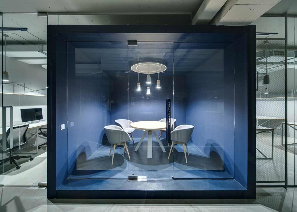
A workspace in the CMS Group headquarters, for which FILD designed the interiors.
What’s it like running a design studio as a husband-and-wife team?
Surprisingly very balanced. I’m responsible for design, manufacturing, and production. Katya manages sales, new partners, promotions, and finances. We have a great respect for each other’s part of the work and fully trust in the process.
Doing everything together is the all-important strategy decision—even responding to your questions. (Laughs) I’m convinced it’s a blessing to find a relationships like that. We built it step by step, valuing each other’s contributions. Surprisingly, there’s been no controversy about how to build the company. We have the same vision for most of the processes and a full commitment to each other—some “magic,” perhaps.
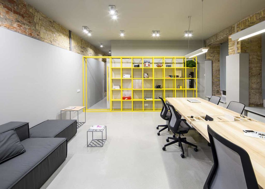
A room inside FILD’s office and store, in Kiev, shows off the characteristic grey-and-yellow color scheme.
How do your individual strengths and weaknesses play to each other?
I wouldn’t call them “weaknesses.” There are some things that require more of your attention and work, but those also become a source for self-development.
Some things you can’t fully control. It’s more about building a healthy attitude toward a given issue—any process requires the creative part and the realization part. When more people are involved in the process, it doesn’t always go the way you want it. So, you accept the reality of life, the human factor, and the fact that some outside irritations might sometimes shake the inner balance and piss you off. (Laughs) Sports activities, which I’m pretty committed to also, help restore the balance and wipe out the negativity.
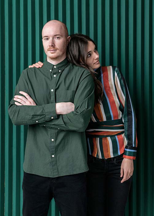
Dan and Kateryna Vakhrameyev
All photography by Andrey Bezuglov. Interview edited for clarity.
