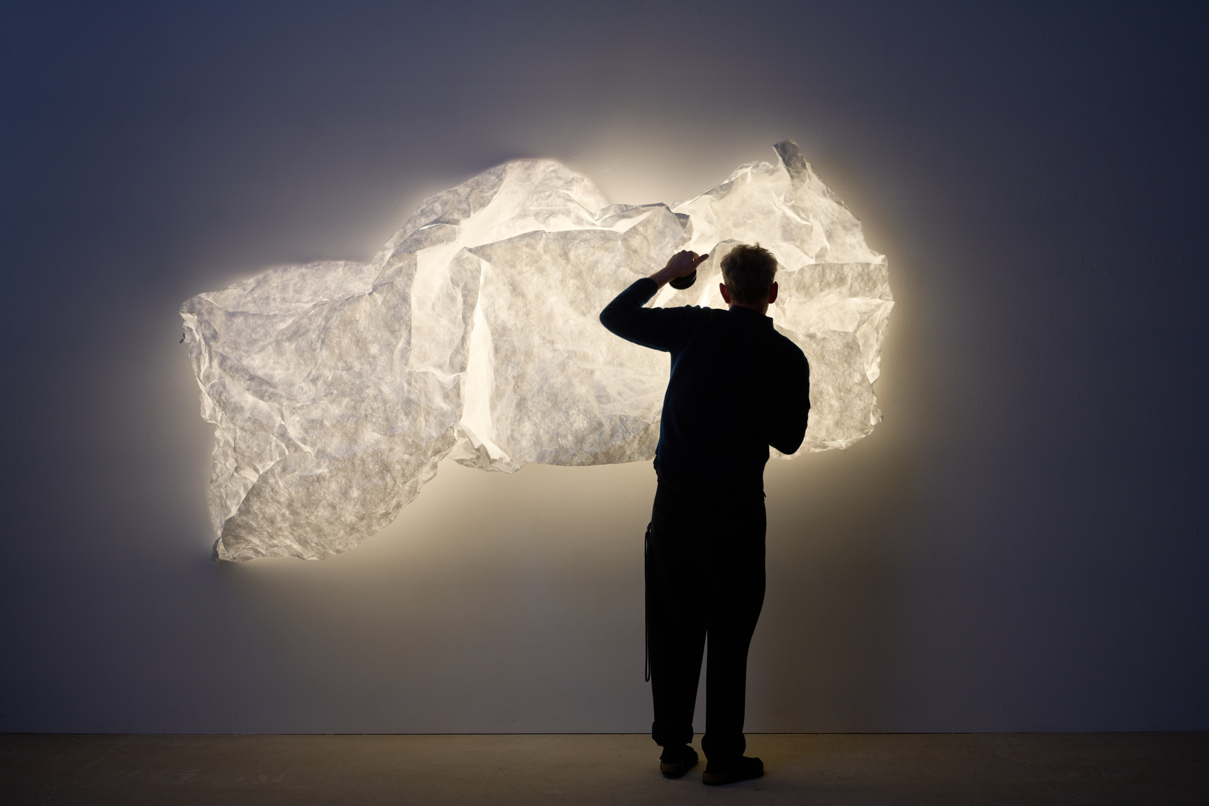
Erwan Bouroullec has a face on his desk. Not a photograph or a mask, but two black magnetic dots pressed into a sheet of crumpled Tyvek. Some mornings he nudges the material up, and the thing looks alert, almost cheerful. Other mornings he lets it droop, and it looks like it’s just woken up.
That object is an early prototype of Maap, the new lighting system Erwan designed for Flos, distributed in North America through DWR exclusively.
It took him two years to get Maap’s material to hold a wrinkle on command. The light is built from Tyvek, the same tear-proof, paper-like material used on FedEx envelopes, stretched taut over a steel frame the size of a small wall. There’s no glass, no shade, and no fixed form. You install four LED bulbs, clip the Tyvek shell to the wall with a set of oversized magnetic discs, and then, per the actual instructions, you crumple it. The pleats you make by hand are what give the light its structure and its stability.
It’s a strange proposition for a lighting brand with a back catalog full of Achille Castiglioni and Philippe Starck: a fixture that arrives, essentially, unfinished, and asks the owner to finish it. Erwan spent that two-year stretch filling his studio with prototypes, testing weight and size and folding until the material found its own logic. I sat down to chat with him about the development of Maap, and his philosophy on design as we move into an increasingly technological future.
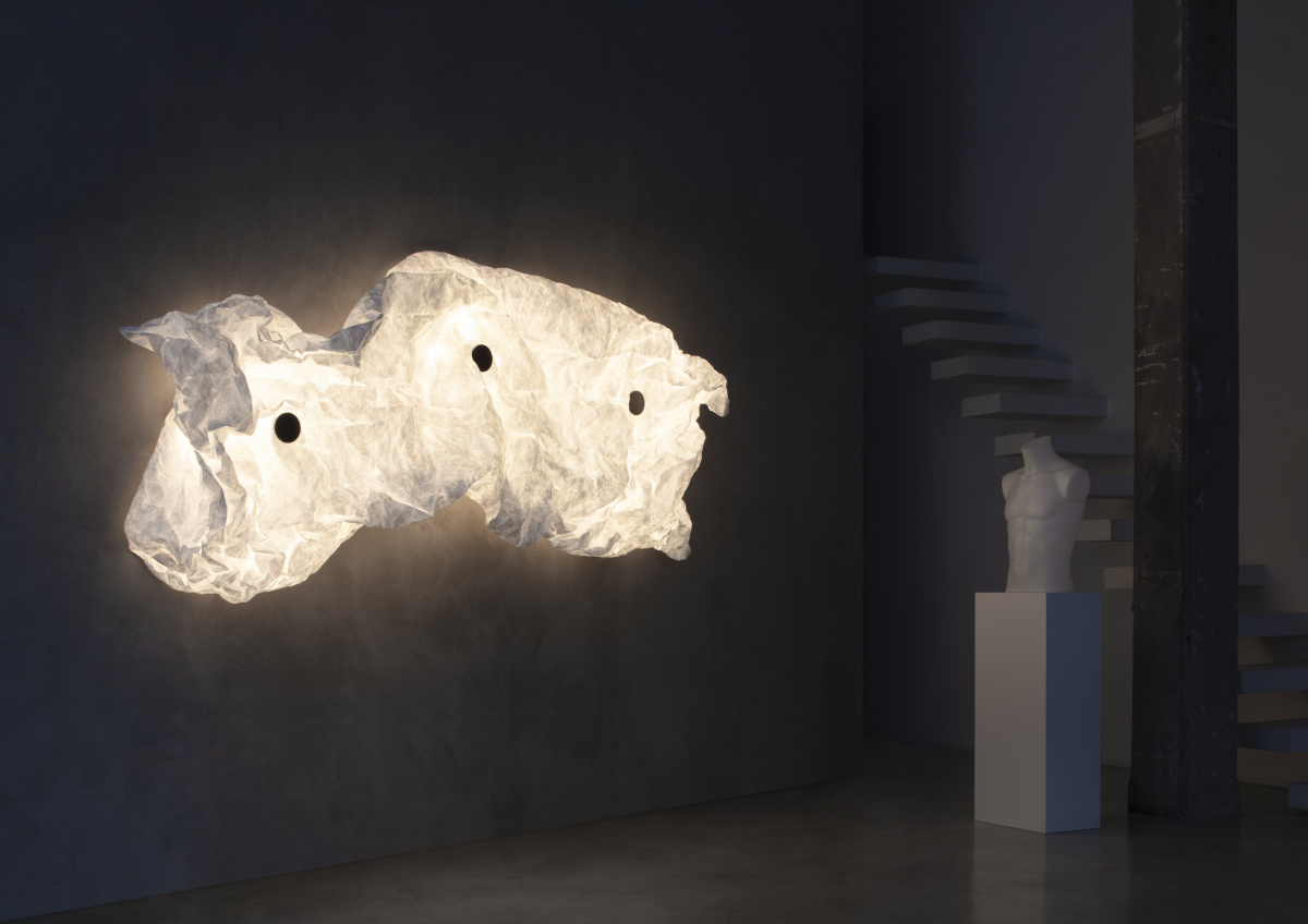
Part sculpture, part atmosphere, Maap invites its owner to crumple, reshape, and complete a piece that Erwan Bouroullec deliberately left unresolved. Photo by Santi Caleca, courtesy of Flos
You’ve talked about resisting the traditional design process: sketching, engineering, rendering, in favor of working with your hands. When did that shift happen for you?
I was born in the countryside, so I’ve always been doing something with my hands: construction work, building, that kind of thing, even as a kid. Being engaged in making is very natural to me. But in the case of Maap specifically, most product design today is made for industrial production, which has a very common basis: things should be identical and ready out of the box. With Maap I wanted to do a large piece of lighting that fought against a desire I have for lightness. I don’t want to make things that are heavy, expensive, or difficult to carry.
So paper became a natural lens for me, which meant the DIY method would be to stretch and crumple it. It sounds strange, but crumpling gives rigidity to the envelope. It creates pleats that give it structure. There was no proper engineering that could be done here. We could count the number of pleats, but at the end of the day, everything comes down to a gesture that each person makes with their own hands.
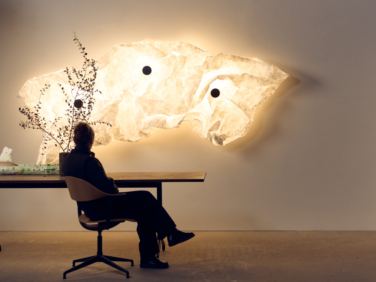
No two folds are alike; each crease is a small, permanent decision made in the moment of installation.
Developing the lamp was more like a recipe. A chef has a tone in mind, an idea, but they need to practice it many times to find the balance between ingredients, the timing, and the proportions. That’s what we did for a long period. We checked weight and size over and over to get to the final design.
How long did the experimental process take to develop Maap?
About two years. What we were mostly fine-tuning was finding the right material. Paper was the first intention, but it was too fragile at that scale. So we moved to Tyvek, the material they use for plastic bottle labels. It behaves incredibly similarly to paper, but you can’t tear it. It’s also waterproof and much more durable.
We spent a lot of that time just finding the right weight and size. For a while we debated whether the shape should be something other than a rectangle. We tried roundish forms, but we went back to something much simpler. I could say we haven’t done much, but we’ve done a lot. I’ve got a studio full of prototypes.
Your work often reads as a balance between clean geometry and something messier, more natural. Do you see Maap that way?
Yes, this was an important project for me because it involves a few different things I care about. There’s a fascination with geometry, and inside the crumpling you find a kind of geometry 2.0, or the geometry you find in nature. If you look at a tree, it’s actually very geometrical. It follows clear rules that let it grow and stay stable, even in a storm. It’s far from random, but it’s also never symmetrical. It’s organic.
You find that in Maap. The only rule you can really give someone is to try to keep it roughly square. Then there’s the black dot on top of it, which tells the opposite story: a very pure point of geometry, something your eye recognizes instantly. So it’s playing with contrast, something simple against something elaborate. It looks big, but it’s actually very lightweight. I think we’re around 500 grams for the envelope itself. I like that contrast; something that could feel dramatic but is actually very simple to make.
Do you design with a specific context in mind, a certain kind of room, a certain kind of client, or is that deliberately left open?
I’m someone who’s always pleaded for what I’d call “the minimum.” I’ve always loved rural simplicity. I’m French, but I’ve always had trouble connecting with French luxury. I’ve never worn a branded bag. It’s not that I dislike the aesthetic; it’s more that it feels a bit like a UFO to me.
I think we’re at a moment in our civilization where we’re surrounded by fakeness, materials pretending to be something they’re not, for purely visual reasons. A perfume bottle will have a gold detail applied to a piece of plastic. It’s not that I mind gold as a design choice; it’s that applying gold to plastic is a stretch that’s slightly dangerous, because people stop recognizing the materiality around them. I was in Las Vegas in January for the trade show, and almost nothing there is what your eyes tell you it is: glass that’s plastic, surfaces painted to look like gold. We’re also a civilization that practices less and less DIY, less making-by-hand, than we did 50 years ago.
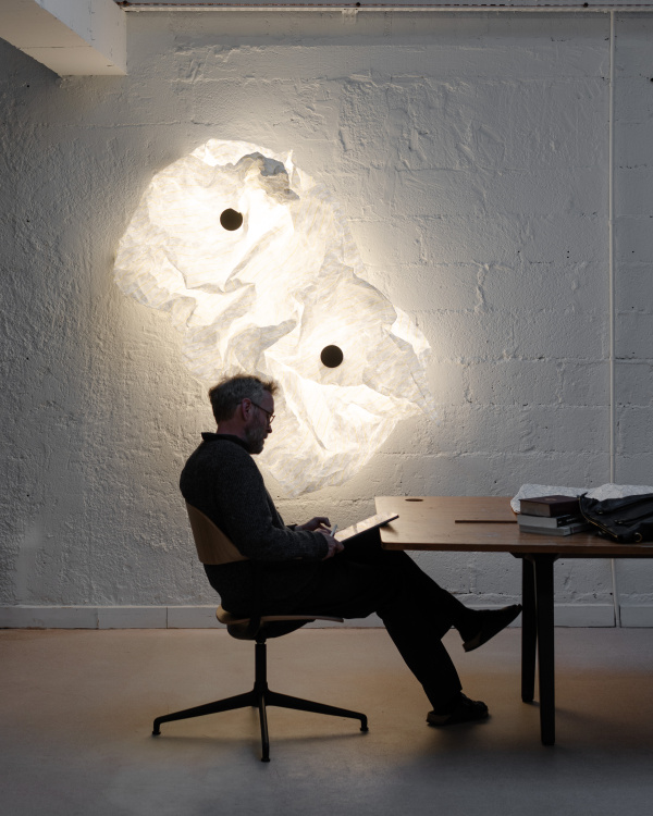
At full extension, Maap spans up to 3.2 meters, its light diffusing across the surface rather than radiating from a single point.
So maybe Maap is a plea for a bit of clarity. If a child were to walk up to it, they’d be curious. And as soon as they touch it, it’s clear: it’s paper, it’s direct. I’m a product designer, and one of the things I like about the job is that I never know the customer. I try to build in a kind of universality, because the object could end up anywhere. Design, to me, is a lot about maximizing the minimum. I try to input as little as possible. A dot on an envelope—your eye doesn’t see more than that. But it’s also meant to be a companion to your life.
We’re in an era where a lot of designers lean heavily on screens, precision, control, and now AI. Do you think that’s pulling design away from materiality?
I don’t really have a complaint about designers using computers. I do a fair amount of computer coding myself, sometimes for drawings, and I’ve been using AI to help me code. But there’s a limit I find important, going back to that idea of geometry 2.0. Our brains don’t really have the capacity to create the kind of well-balanced complexity you find in nature. But if you give a piece of software some very simple rules and a bit of randomness, it can create a complexity close to what’s inside Maap. In a way, Maap is informed by the basic coding I do myself.
I do think seriously about the era of design we’re in. 20 years ago, Jasper Morrison and Naoto Fukasawa coined “Super Normal,” a strong statement that said, “let’s be clearer and more honest in what we make.” We were reacting to an earlier era, you could say personified by Philippe Starck, full of extravagant language, humor, strangeness. Important work, but often with a limited lifespan.
But something happened after Super Normal, too: design started looking backward, toward Quaker furniture and that kind of restrained, well-executed woodwork. I’m a little wary of that, honestly, because that furniture came out of a fairly rigid, religious civilization. I think the real task now is building some new typologies, new formats, because the world needs actual answers, not just references. Take sustainability: every contemporary designer will tell you “long-lasting.” But if you live in Paris, New York, London, Barcelona, and you’re 20, you’re not carrying the same furniture with you until you’re 40. I see a lot of beautifully executed wood chairs I’m not convinced by. They’re beautiful, but not comfortable or dynamic. Design has the tools to keep moving. So it’s not that I care whether AI is used or not. I’m more concerned about design getting a little reactionary, repeating old recipes that aren’t actually contemporary anymore.
Walk me through the mechanics of Maap. How does someone go from a flat sheet on the wall to a finished form?
You start by installing a simple steel disc on the wall. A unit with four bulbs sits on top of that disc, and then another disc, essentially identical to the first, sits on top of the bulb unit with a large magnet built in. The envelope itself is basically a rectangular bag with a large hole cut into the back, ringed with magnets. You bring that hole up to the disc on the wall, and it clicks into place, held by the magnets.
From there, you to shape the envelope by hand. Once you’re happy with the form, you take one more disc, a black one, a bit like a hockey puck, made of simple, fairly heavy steel with its own magnet, and press it over the top to lock the shape in place.
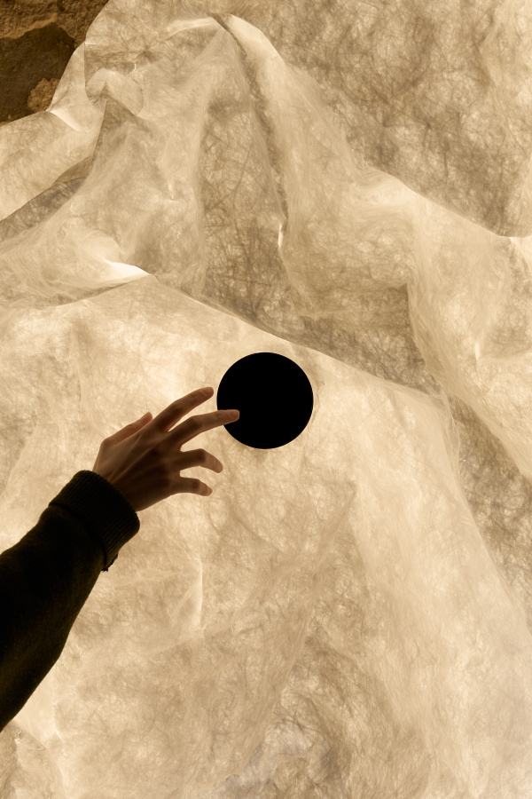
Maap allows you shape the envelope by hand. Once you’re happy with the form, a magnetic disc locks the shape in place.
I’ve had one of the very first prototypes at my studio for a long time. I set it up on an equilateral triangle, totally symmetrical, so it looked like a face: two eyes and a mouth. I still have that instinct. Every time I walk past it, I’ll play with it a little, pull it up if I want it to look more awake, let it overlap if I want it to look sleepy.
Is the object meant to be set once and left alone, or is ongoing manipulation part of its intended life?
I don’t expect the end user to keep reshaping it constantly. But it can look strange to people at first, and there’s something valuable in that. Once someone crumples it themselves, they understand it completely: that it’s tough and fragile at the same time, that if you treat it properly, nothing bad happens. If you want to bring something relatively fragile to someone, the best thing you can do is let them touch it, let them understand it. That builds a bond between the person and the object, the same bond you build when you make a kid a blanket fort out of cardboard, rough and imperfect, and it becomes precious anyway.
A lot of what design does for us, beyond the object itself, is help us live together. A coffee cup isn’t really about holding coffee; it’s about the welcome, the ritual, the conversation you have while you’re making it. Manipulating Maap is part of that same process. It’s probably one of the most expressive pieces I’ve designed, and also one of the lightest, in every sense.
Design Within Reach (DWR) will serve as the exclusive retail partner for Flos during the first six months of the launch. Maap is available for purchase at Flos flagship stores, flos.com, DWR stores, and dwr.com.