One of the jobs of a good designer is to fight cliché—and few spaces carry as much preconceived baggage as a cannabis dispensary. Nina Grondin, cofounder of Chicago-based hospitality design firm Curioso, knows this firsthand. Her studio sidestepped the hazy, green-neon vibes associated with even medical cannabis shops in developing the high-design space at Seven Point, a dispensary that opened in 2016 in the Chicago suburb of Oak Park.
It’s one of several of Nina’s designs that subvert convention while still prizing experience, including a baseball-inspired hotel situated mere yards from one of the world’s most hallowed ballparks. We caught up with Nina to discuss her approach, how she pivoted from finance to design, and why faddish design is anti-sustainability.
You cofounded Curioso about seven years ago. How has the industry changed since then?
Things have changed significantly in hospitality. Since the recession, timelines have gotten shorter; project teams have gotten smaller. It used to be you’d have projects that would last three or four years—now it’s really two, maybe three years. And you’d work on these massive hotel projects, and now the trend is smaller scale, more boutique, more experience-focused projects. Every single large hotel brand also has their unbranded or softly branded collection of boutique hotels and properties.
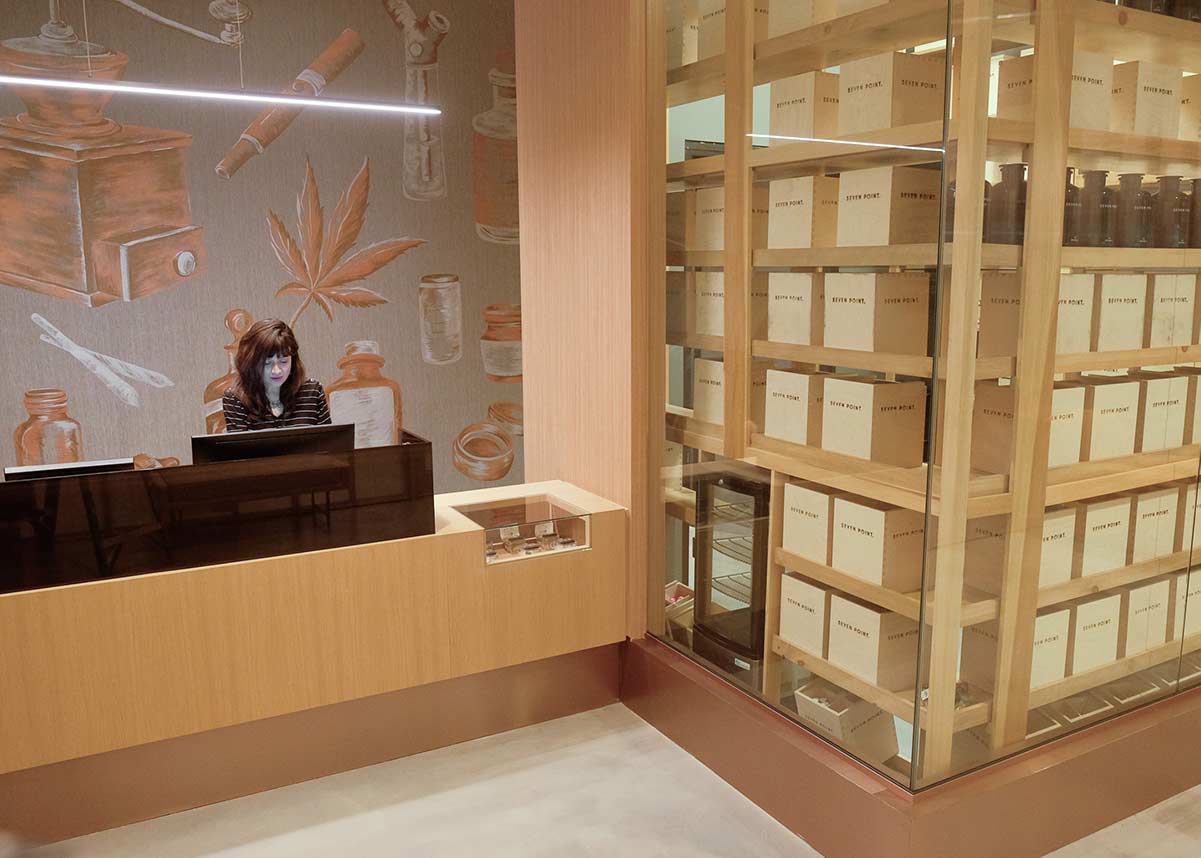
The few directly cannabis-related visuals at Seven Point, like this mural, were done with a consciously ‘fine art’ approach. Photo courtesy of Curioso
I think that unique, interesting, and memorable design has become much more democratic. Good design is no longer reserved only for four- or five-star properties. You can find motor lodges on the side of the road that are really thoughtfully designed and provide an interesting experience. That’s something I’ve been personally really excited about. There’s so much more of a focus on design and it’s really becoming much more for everyone.
Related | Sherry Dennis is Evolving Hospitality Design in a World of Boutique Hotels
Everyone is looking for that unique experience, and that’s something that we’ve seen brands struggle with: How do we maintain our ethos and grow and keep our standards, but make sure everyone gets a really unique experience wherever they go? We’re definitely much more in the boutique and lifestyle world. We actually don’t do too much work with the larger brands like IHG, Hilton, Marriott, or—if we do—we work on one-off projects that are more lifestyle-focused.
What’s that decision-making process like at Curioso, choosing whether or not to work with a major brand?
We have many conversations with them. It gets challenging. Very few of those large brands actually own their properties. They’re usually either franchise or management companies, so the developer or owner ultimately becomes the client. These brands will mostly put us on the preferred list or recommend us to a new owner. If there’s anything we’ve learned at Curioso working in hospitality it’s that it all comes down to the project team—and it’s not really about the brand or the project.
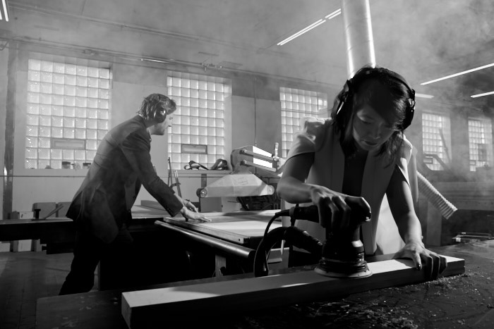
Nina Grondin, right, and Curioso co-founder Dan Pierce getting their hands dirty. Photo by Daniel Kelleghan
If you have a great owner willing to roll up their sleeves, dig down, and get into the design process, and not simply look at things through a spreadsheet, that results in a better project. If there’s a great architectural partner or contractor we’re working hand in hand with, that’s really what creates a good result. So we’ve been incredibly lucky in our six years as a studio in that we’ve worked with a handful of clients over and over again. You basically practice as a team working together. The second project is better, then the third is better still. By the time you get to that fourth project, it’s seamless. For us the biggest determination of whether we take on a project is the people. It’s kind of like dating; you have to get to know each other and feel each other out. If you get along really well, things are going to be good.
Interior design is your second career, after having worked in financial marketing before transitioning into design. What was it like taking that jump? And has that experience in your past industry been helpful now?
It’s been extremely helpful to have a different background and perspective, especially because we work in commercial design. Hospitality is a business. Most people are not opening up a hotel or restaurant purely out of love—they also need to make money. It’s how they feed their family and send their kids to college. So having that business background and knowledge [means we’re] able to work through a pro forma with our clients and be able to understand the return on investment for, say, adding an extra 5,000 feet of meeting space.
“I love that, at the end of the day, [your work] is built and in the real world. You can sit in the lobby of the hotel you worked on for three years. There’s satisfaction in that.”
We’re maybe a little different that way, in that we don’t come in, take your program, and design it. We help the owner work through, is this the right move for your business? One of the things we really pride ourselves on is, every project that we’ve worked on is still open. One closed, but that was a matter of multiple circumstances, then we helped flip them to a different concept and now they’re doing extremely well. I really do think that designing with that business background in mind helps significantly.
Relative to getting into design, I found that financial marketing is kind of a lonely world. You spend most of your time at your computer working alone. You create powerpoint presentations, and people pay you a ton of money to do it, then you present it to someone and they put it on a shelf, and say, “Great, thanks, let’s do this again next year.” And you’re not really sure if any of those ideas are ever implemented. It felt fairly disconnected. You’d spend a lot of time and energy on something you never see the fruits of, other than a paycheck. So what I really, really love about design is how incredibly collaborative it is. You have to work with not just your design team but architects and general contractors, people who make fabric and furniture, and it literally takes thousands of people to bring a hotel project to life. And as a designer you work with every single one of them, in one capacity or another, creating. I love that, at the end of the day, it’s built and in the real world. You can sit in the lobby of the hotel you worked on for the last three years. There’s satisfaction in that.
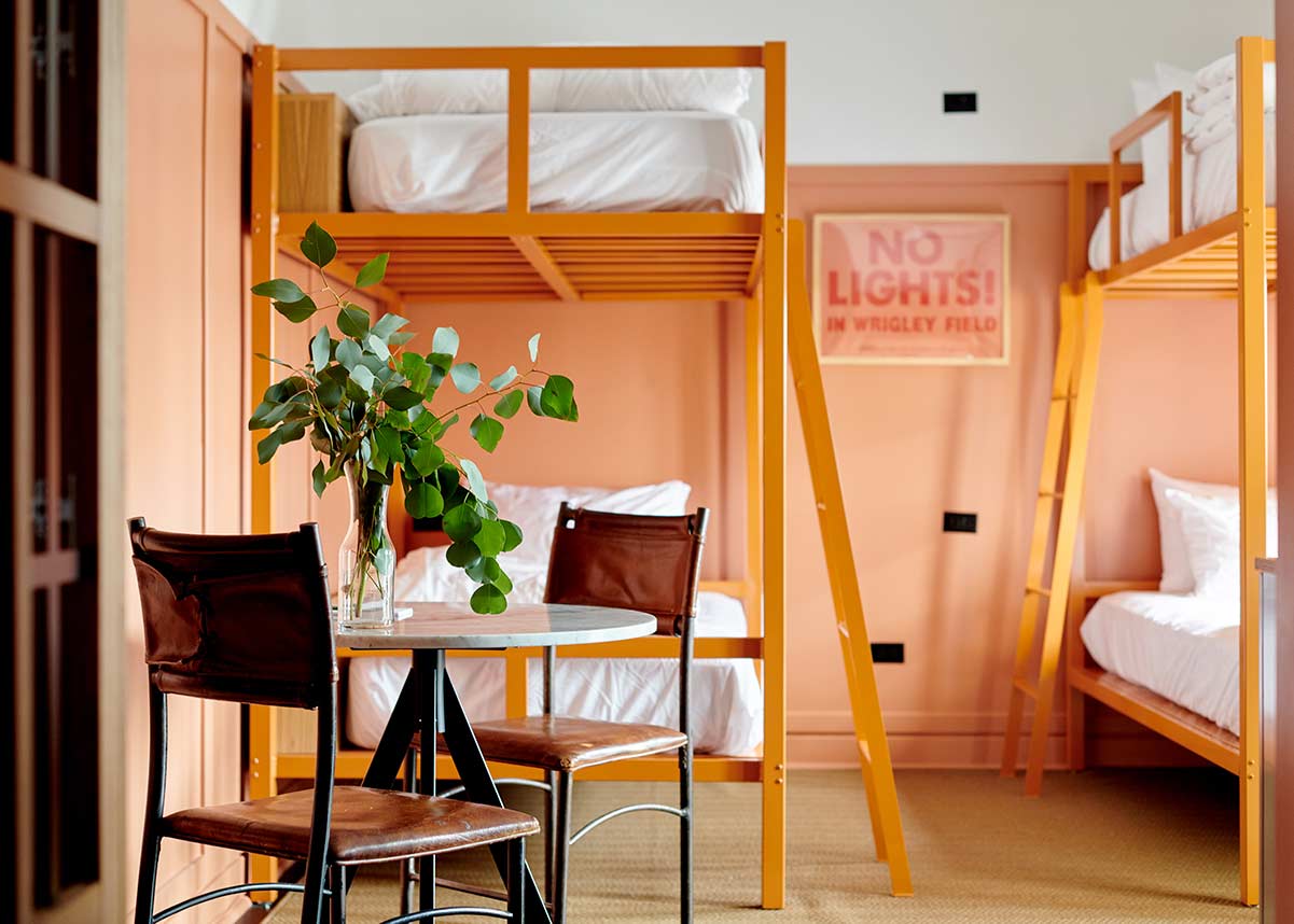
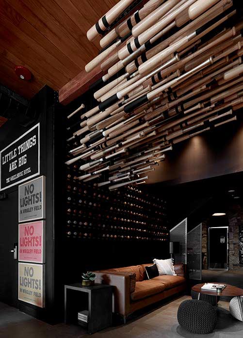
A sign at Wheelhouse references the old battle against installing lights at Wrigley Field. Photo courtesy of Curioso
The Wheelhouse Hotel in Chicago is baseball-inspired. How do you make sure a theme doesn’t tip over into the realm of novelty?
That was really important, that we weren’t designing a baseball hotel, but at the same time you’re literally a block and a half away from Wrigley Field. You can’t ignore the Cubs. So we really tried to create a persona for that property. The first time we toured it, it was pretty much gutted and it felt like somebody’s old home—like a great Chicago greystone house. We wanted it to feel intimate, like you were staying with a friend rather than staying in a hotel, because it does feel like a house. So we thought, what type of person would live a block from Wrigley?
You’re obviously a Cubs fan, but with this great home, you probably also have an awesome personality and have a lot of interests. So we thought about the history of Wrigleyville and the Cubs, and we really dug into William Wrigley as a person. How does someone who creates a bubblegum empire then come to own a baseball team and create this entire community? So we used him in a way as a basis. If this were his home, what would it feel like? Of course he’s going to have baseball stuff, but he’s eccentric, so he’d do amazing art installations, he would be a collector and travel the world and bring in furniture from different places. We didn’t want it to feel expected.
One of the best things about understanding the intimate nature of how someone lives is that it’s not too thematic, because people are complex. They may go to India and find a sculpture that they put next to a mid-century modern chair next to a picture of their mother. So we really wanted to create a hotel that would tell that kind of story. People are not a specific style; life is really colorful … If [a design element] brings out some sort of an emotion, it’s worth considering.
- A baseball-bat art installation … Photo courtesy of Curioso
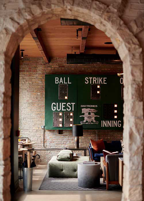
- … and a decorative scoreboard at Wheelhouse. Photo courtesy of Curioso
I’m fascinated by Seven Point, the cannabis dispensary you designed in the Chicago suburbs. It’s clear Curioso knew what they didn’t want to do, in terms of avoiding head shop-style clichés. How did you decide what you did want to do?
We knew that in order to avoid stigma, we had to take everything and flip it on its head. We wanted the space to feel sophisticated and really warm and welcoming. What I love about hospitality, it allows you to reach into almost any industry and see through a different lens. As long as there are people there, hospitality exists.
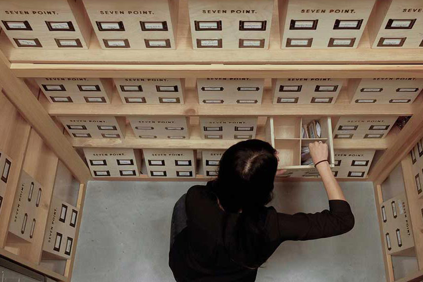
So we wanted to take every single thing that was part of this industry and maybe perceived in a negative or a typical way, and turn it through a hospitality lens. How do we make a given space feel more like a lobby? Or, if you go into most dispensaries, security guards sit in this little booth behind bulletproof glass, and we thought, OK, why don’t we make an entire wall of glass. And, yes, the state mandates it has to be bulletproof, but instead of a little window, let’s make a bigger piece, let’s lower the desk so he’s not towering over you—make them as much a concierge as a security guard. We also convinced the client to move 90% of their back-of-house operations to front-of-house. That keeps team members in front of patients and interacting with them. It activated the space so there’s constant activity and movement. We knew that education would be a huge aspect, and our client has some 400 different products. So getting those team members out front was key.

Curioso also designed the branding for Seven Point dispensary. Photo courtesy of Curioso
And the owners were willing to get in deep in the design. We actually designed their entire brand as well as the space. And they wanted to name it Seven Point for the seven points on a cannabis leaf. And we got that, that’s cool, but if we’re going to have a such literal name then let’s make sure there’s no reference at all to any cannabis on any of your branding. Not one iota. Let’s make sure we’re not using the color green, because everybody does that. Let’s make it much more sophisticated but also approachable, so having a black-and-white palette and using a sans serif font that’s friendly. Then the owner did want to get some imagery of a cannabis leaf or at least a bud in the space, so we found an artist who made a giant, hand-painted, metallic-paint mural in a much more fine art element than a digital or cartoonish style. The decisions almost made themselves: The client wants this; how do we turn it in a really unexpected way?
How does Curioso go about making local connections in an unfamiliar environment and capturing the essence of a place? Like, finding a local artist to paint a mural in a space?
You have to just spend time there and throw yourself in. Look around and talk to people. We have a couple of people on our team who are amazing at digging out things. Right now, we’re working on a new project in Detroit, and our team just goes there and spends time, eating in the restaurants, going to the shops, scouring social media. We’ll also go on a parallel path—like in the the Detroit project there’s a local architect who’s helped us engage with the artist community. And there’s a couple of pretty well-known curators who have a network of artists. So we can show the initial design direction, and he’ll say you have to talk to this guy and this girl and this metal fabricator, and you start the dialogue.
Related | The Stunning Siren Hotel is Pulling Us to Detroit’s Renaissance
We literally spent two days in Detroit, and the curators set up two full days of meetings with artists. And a lot of these people work in collaborative spaces or artist co-ops, so we may be there talking to someone who does this amazing, digital LED art but we see awesome paintings next to us that we could totally work with. So it’s a very organic process, but you can only do it by being there and immersing yourself.
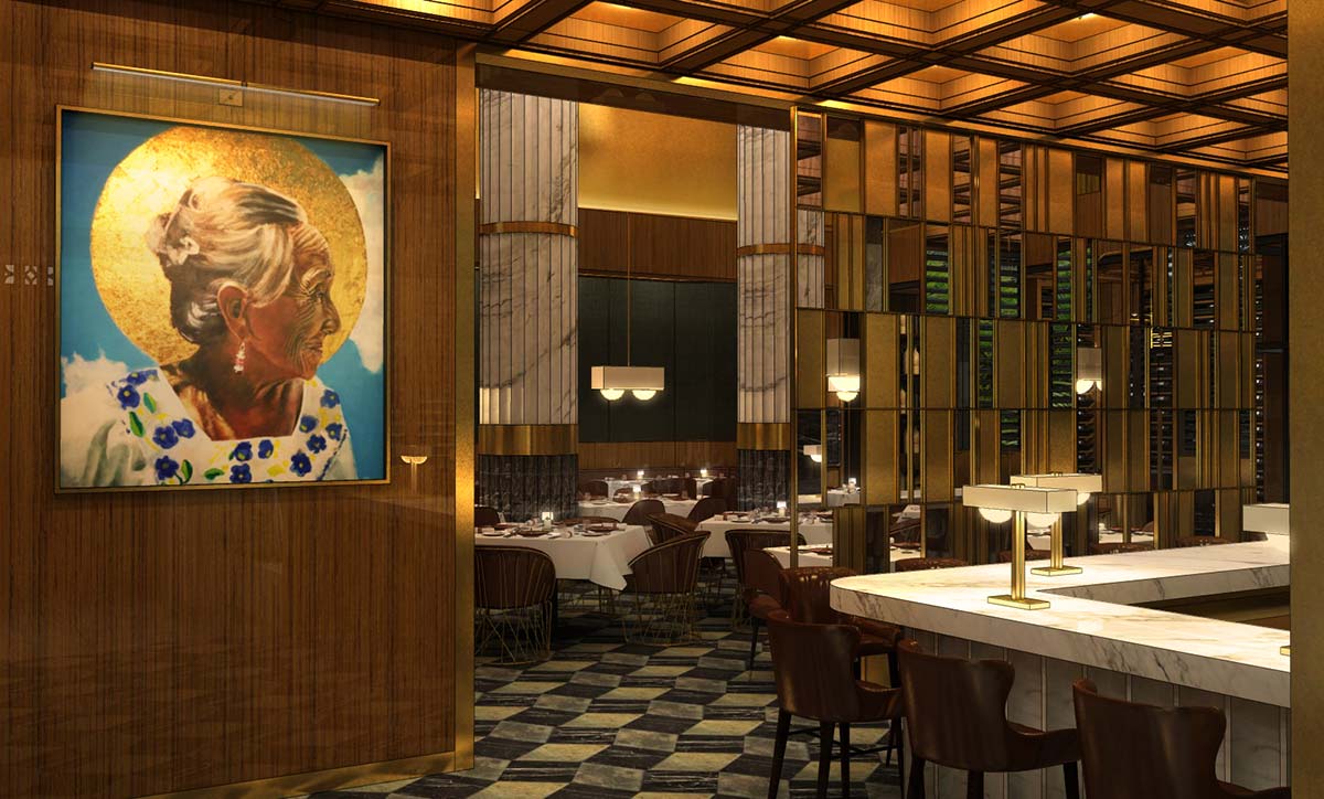
The bar entryway at Estudio, a Cancún boutique hotel with interiors by Curioso. Photo courtesy of Curioso
Are there any hospitality design trends you avoid and, vice versa, ones you think are great and should be explored more?
Design is becoming so much more universal. Sometimes you see the same things pop up at the same time all over the world. Maybe it all started with reclaimed wood. Then it became brass, then matte black, and now terrazzo is having its heyday. But none of this stuff is new. It’s just like fashion: Neon is suddenly back in. People get into trouble when things are brought back in a way that becomes more of a fad. It’s short-lived and will feel dated quickly. I think the key is to understand design that’s more timeless—at least in the shell of the space. Then you can bring in elements that are maybe more trendy at the time. We discuss this in the studio a lot. How do we make sure we design timelessness, where the spaces still feel relevant in five years, in 10 years?
Another thing we think seriously about is that design cycles are getting shorter. People feel they need to renovate their hotels every seven to 10 years. That’s been fine, but at the same time, materials are becoming much more durable and long-lasting. I can’t tell you how many times a client wants to rip out the carpet, wants all new walls and floors, but the stuff is actually in really good shape. So that creates a ton of waste, and when you look at how many hotels there are, I’m not sure how sustainable it is. So we try to make sure we design in a way that stays relevant. Some of these fads and finishes will feel dated, so somebody’s going to come in, rip it out, and throw it all away. I’m not sure we as a design community have a solution for it just yet, but if can remember classical tenets then maybe we’re setting ourselves up for some better, longer-lasting spaces.
