“I love branding because it’s kind of like the gateway drug to design,” says Ben Crick, creative director at COLLINS. Working with companies like Spotify, vitaminwater, smartwater, and Mailchimp, Ben is constantly talking with clients about the design decisions that can help meet their business goals.
“Designing systems for companies that have 2,000 to 5,000 to 10,000 people, or create an extreme amount of work each day, you have to build something for other people to execute against or build from, which is a totally different form of design than a small studio that designs all of the artifacts for a problem,” he says.
Here Ben shares how to shift your mindset to design better commercial work.
***
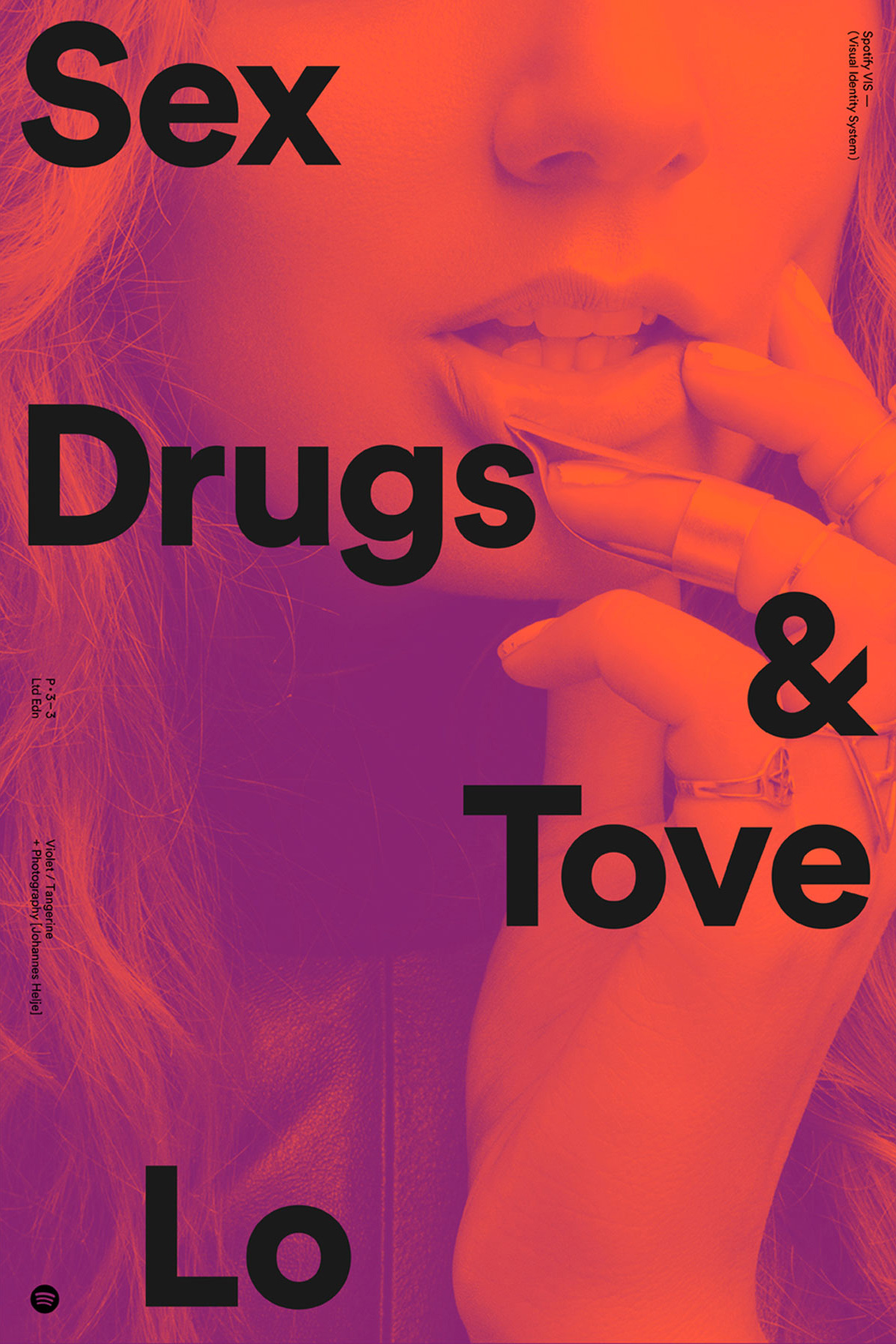
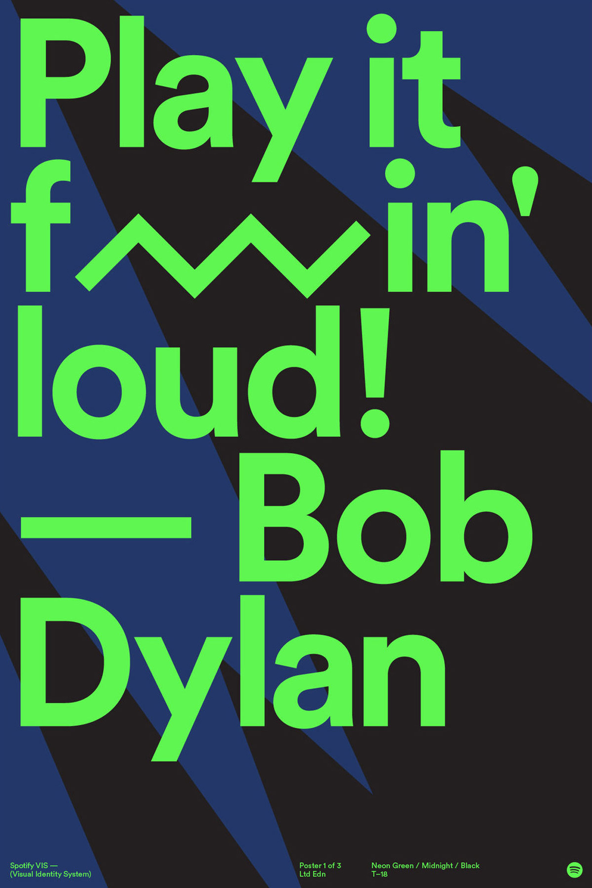
- “Spotify is crazy because everywhere you can imagine a brand to exist visually, they’ve done, and every version of that is a new expression of their identity system,” Ben Crick says. “I think that’s the beauty of it. Working at that scale, if you can build a system that enables people to do good work, it becomes much bigger than any individual.”
Understand that clients come to you because they want results.
It sounds really simple, but I think a lot of designers start from a very central point of view, which is, “What opportunity does this project allow for me and my craft to do?” It’s fine to think that, but when you’re talking to a client, you need to understand what they’re looking for out of this partnership. It’s no insult to designers, but a client comes to you because they want a result. They aren’t looking for beautiful posters; they’re looking for some kind of business outcome. You’re helping them get to that outcome, and you can make beautiful work in the process, but you need to help them understand why the choices you’re making help solve their problems and not just why the choices you’re making make for a better-looking artifact.
I try to step out of design and think of it from other professions. If I go to a mechanic, he’s obsessed with spark plugs in the same way that designers are obsessed with typography and color. But I don’t need to know that stuff nor do I really care, because fixing engines is not my passion. I just want my car to work.
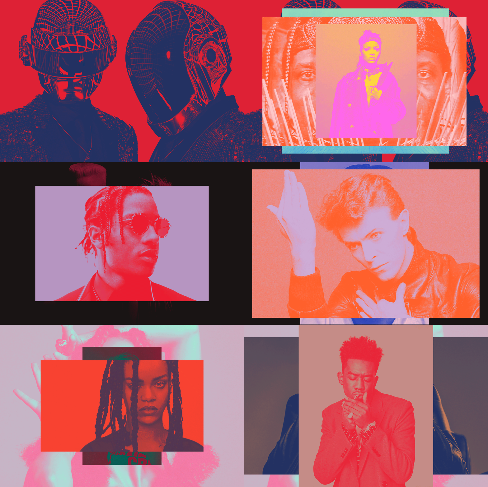
- Ben Crick is behind Spotify’s now-signature artist-forward visuals.
- Spotify’s brand identity uses a lot of bold colors to tap into the vibrancy within music itself.
Like Spotify, tap into the right brand narrative.
When we got involved with Spotify, they were really just entering the US market. Their reputation was more around a piece of software and not around an understanding of the culture of music. When an album launches, everyone gets the same press kits, so the challenge was how do we make Spotify a noticeable voice in this conversation and not just have the same images? How can we make it so we demonstrate this company’s musical knowledge and not just a platform on which music takes place? That was the shift we were making.
The visual identity was the tool for doing that. We went and looked at a lot of album covers, and thought the Spotify brand needed to feel like an album cover. So that’s how their brand ended up super colorful, vibrant, energetic, and always changing, because we wanted them to feel like music.
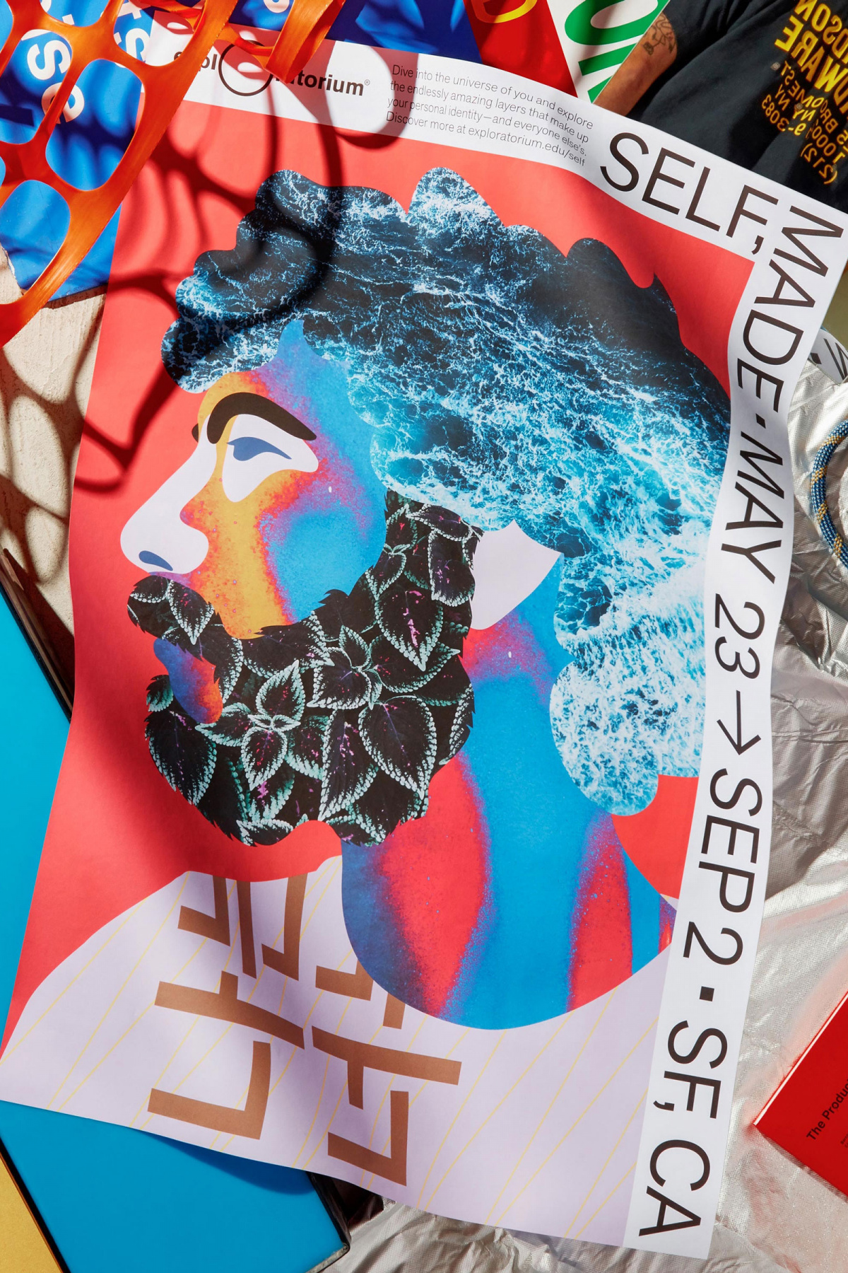
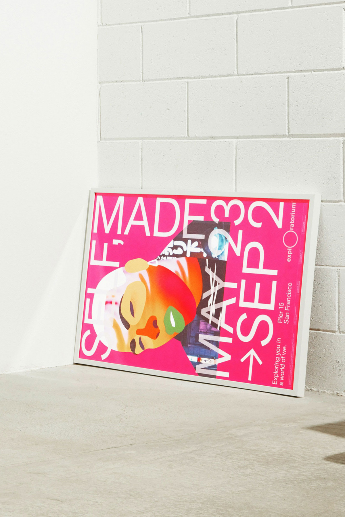
- Ben Crick and COLLINS designed marketing materials for “Self, Made,” an exhibition exploring self-identity, at The Exploratorium, a science museum in San Francisco.
- The Exploratorium’s “Self, Made” campaign shows how identity is an evolving collage made up of our experiences, emotions, and environment.
Recognize that everyone is allowed to have their own tastes.
If you’re having a conversation purely about the aesthetic value of things, everyone has different tastes, and you’re going to end up with misalignments and frustrating conversations where the client likes this shade of blue versus the shade you’re recommending. If they say that, you can’t win that argument; everyone is allowed to have their own tastes. But if you frame it from the perspective of, “Hey, this blue doesn’t work because it’s too close to your competitors’, and this blue is more differentiated”—that’s much harder to argue with.
Find more time to not be a designer.
I think a lot of young designers make the mistake of thinking that being a good designer means making your entire life about design. The older I get, the more I think the opposite is true. Increasingly these days, I try to find more and more time to not be a designer because it makes me more empathetic to everyone else, who are ultimately our clients. At the end of the day, design is for people and making people’s lives better. The more you understand people, it’s easier to solve problems.
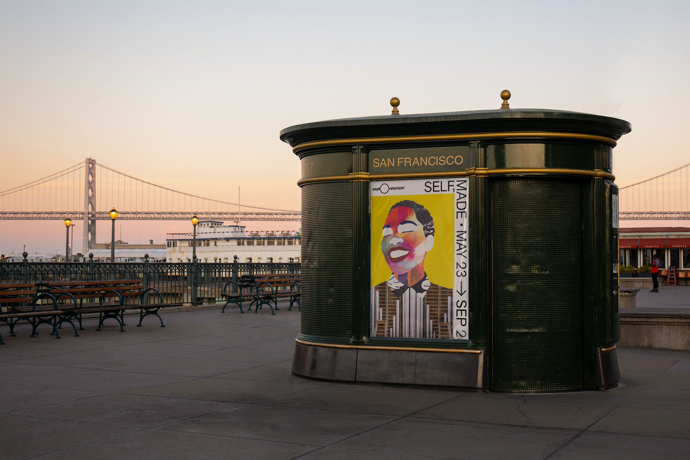
- Ben Crick and COLLINS’ “Self, Made” campaign for The Exploratorium encourages viewers to go beyond the surface level of appearance to explore the depths of personality and the experiences that have shaped us.
Invite randomness into your practice.
Especially now, with so much of design being on the internet and everyone looking at the same sources for inspiration, you see a lot of trends rise and fall over the course of the month. That ability to accidentally stumble on something is much harder than it used to be. It’s nice to find opportunities for randomness in your life because it surfaces things that you never would have stumbled upon if you were being intentional about it.
For example, last weekend, I went for a walk around the city for three hours, which became an architectural tour—San Francisco has the most beautiful houses. I would never for a project sit down and go, “OK, I’m going to look up Victorian-era houses as an inspiration point,” but those happenstances are the kinds of things that fuel more interesting work. I saw these beautiful ornate houses, and maybe that inspires an idea of something being more ornate here and there.
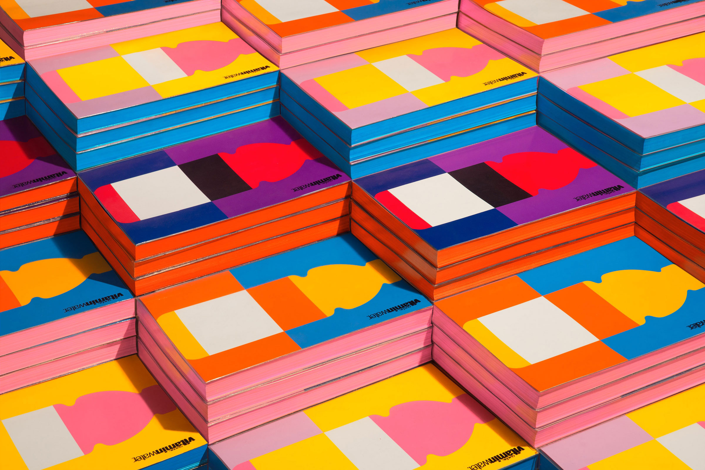
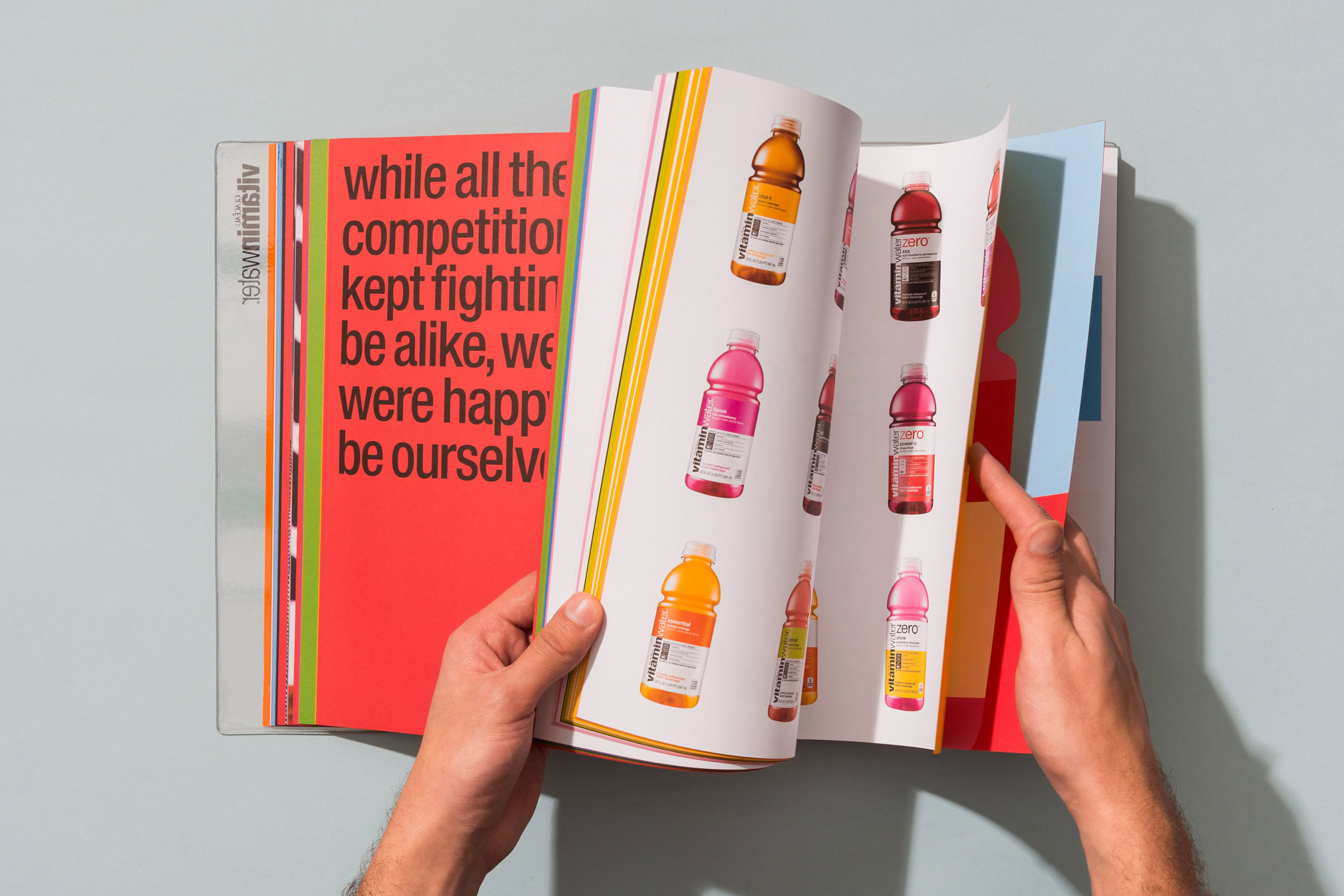
- Along with its visual identity, Ben Crick helped develop the vitaminwater brand book. One part brand history book and one part roadmap of the future, the book is based around the vivid visuals Ben created.
To be interesting, be interested.
The most effective designers I’ve ever met and work with tend to be curious people. A healthy curiosity and skepticism of the way things are tends to lead to people who are interested in the world around them and seeing opportunities for ways to improve our world. It’s that cliché, “To be interesting, be interested.”
Photos courtesy of Ben Crick
