Whether trekking around the Grand Canyon, whitewater rafting, or taking portraits of a cancer patient, professional photographer Jared Polin of FroKnowsPhoto.com captures moments that captivate. Jared’s been doing this work for years and also gives frequent talks on how to be the best photographer and run a successful business.
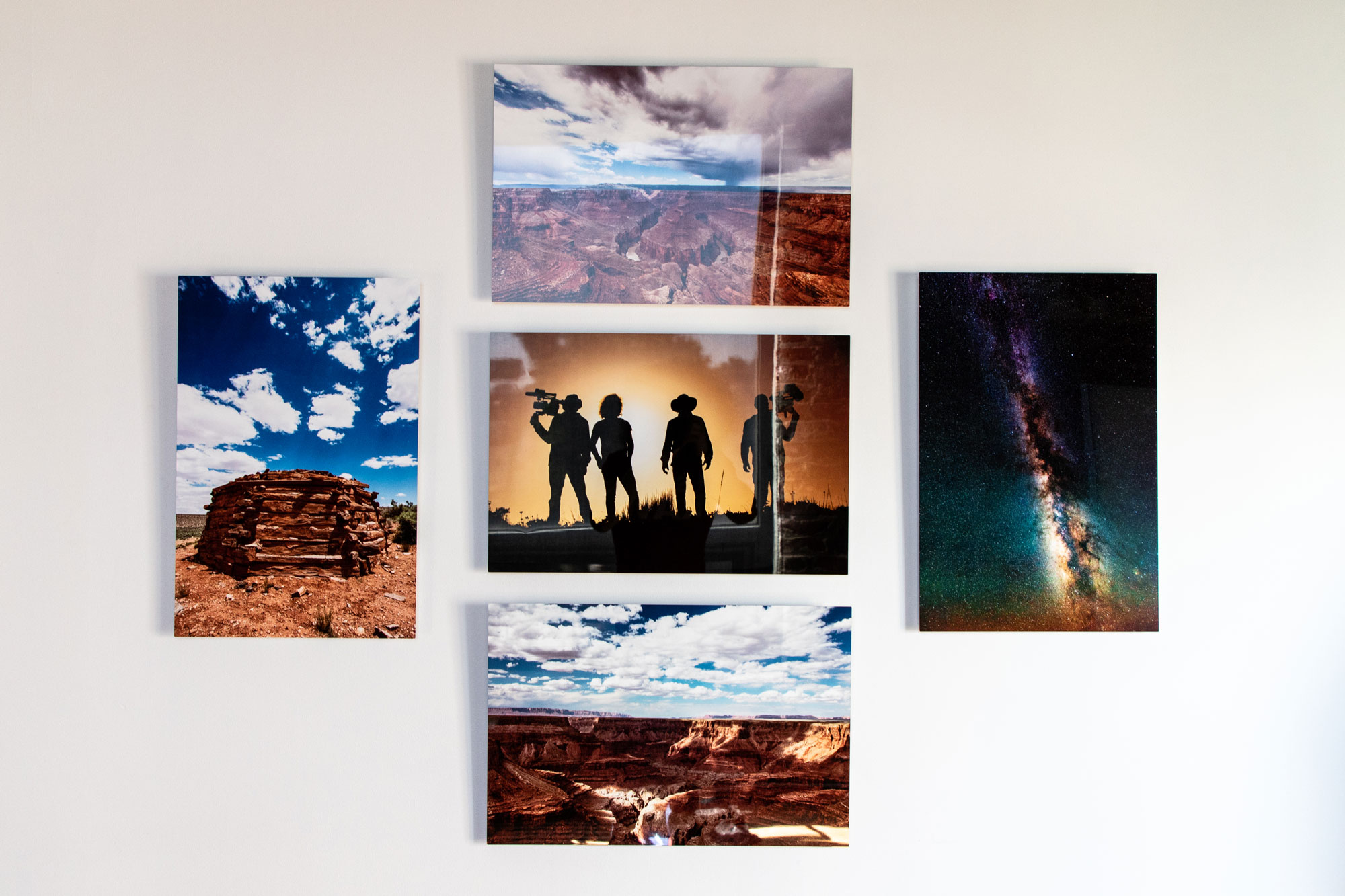
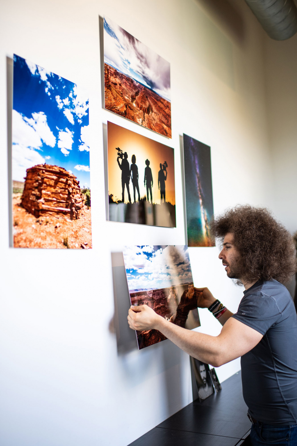
Photography is Jared’s job, but it’s also his passion. It’s important for him to do it well for clients, but it’s just as important to him at home. He wants his work to tell stories and engage visitors. In his own house, he used AdoramaPix to create a gallery wall of the Grand Canyon that showcases a life-changing experience—one that ultimately revealed to him that the canyon was a lot more than a giant “hole in the ground.”
RELATED | How I Made the Leap to Full-Time Photographer
Statement Pieces
Jared loves to hang large, stand-alone images as powerful statement pieces, but he admits one image doesn’t always tell the story. “I don’t think one or two images does the job. You need three, or five, or seven. I tend to lean toward odd numbers.” To represent his Grand Canyon trip, he chose five. When working with portraits, he recommends lining three to five images up in perfect sync across the wall.
Layout
Layout should reflect the story. In this case, the wall represented a photography camping and cultural trip Jared took for a show he was working on. He used a silhouette image of all the photographers as the focal point and surrounded it with the best photos from key moments of the trip. In the end, he felt it gave a well-rounded overview while encouraging conversation. “If it tells me one thing, it’s that you have to get out and experience this world, no matter where you go. Whether it’s the Grand Canyon or somewhere else, take your camera, capture your experience, and share it with the world.”
Selection Process
It helps to narrow the often hundreds of images down to 10 to 15 for consideration for any gallery wall. Here, Jared wanted to showcase the stars, the Navajo hogan he spent time in, and, of course, the canyon.
“I’m not a matte finish type of person; it’s too dull. I want vibrance. I go for highly reflective because it’s what makes the image more saturated.”
Materials
For this gallery, Jared chose his favorite AdoramaPix material: metal. “I like my images to be vibrant and boomy,” he says. Plus, metal prints from AdoramaPix are sturdy and come ready to hang right out of the box. “You don’t have to get glass, don’t have to get it framed. I don’t have to do anything,” he says. They can also be easily cleaned with water or other non-corrosives. For landscapes and old family portraits, Jared recommends canvas.
Pro Tip
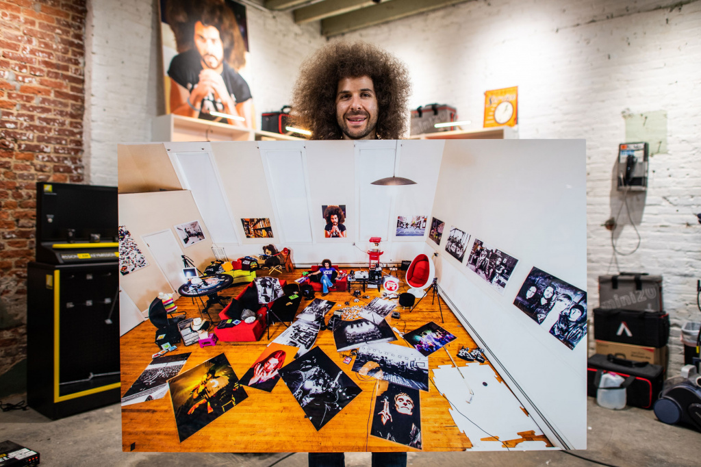
The bigger the better, though wall size and image quality must be considered. Jared doesn’t resize any images, so most of his work can be printed in large format. For this wall, he used 16×24—smaller than what he typically uses.
Studio Sixtysix is the in-house creative agency of Sixtysix magazine. Studio Sixtysix stories are conceived, produced, and edited by Studio Sixtysix.
This article originally appeared in the Fall/Winter 2018 issue of Sixtysix. Subscribe today.
