When I sit down with designers George Yabu and Glenn Pushelberg, we talk about what makes a hotel feel like it truly belongs. Not just to a brand, but to a place. That idea came to life as we perused images of their design work on Park Hyatt New York—a hotel that doesn’t just sit in Midtown, but feels like an extension of the city itself.
Both George and Glenn tell me Park Hyatt New York’s design pulls from the refined comfort of a well-appointed Manhattan home. Contemporary art, custom furnishings, and rich materials create a space that’s sophisticated but never intimidating. “We wanted it to feel like you’re stepping into a friend’s home,” Glenn told me. And it does. Light filters through carefully placed openings, terraces offer quiet moments above the streets, and polished stone meets soft fabrics in a way that makes you want to settle in.
That same sense of place carries over to the duo’s Park Hyatt Shenzhen. Once a fishing village, Shenzhen is now China’s Silicon Valley—fast, ambitious, always moving. But inside Park Hyatt, the pace slows. Warm textures soften the city’s high-tech edge, creating a retreat where guests can pause before diving back in.
Gianna Annunzio: You’ve worked on quite a few Park Hyatt properties worldwide. How did that relationship develop?
George Yabu: I think different developers fell in love with our work. And to be honest, sometimes the hotel brands themselves can feel a bit flat, so we have to protect the client’s vision.
Glenn Pushelberg: Once you design one successful Park Hyatt, they’re naturally going to recommend you for other projects. It becomes a self-fulfilling cycle. That’s true for other brands as well—if you do a good job, they’ll keep coming back with more projects. The recommendations typically come from the hotel operators rather than the developers themselves!
Developers often shop around for hotel brands to manage these residences, and we help guide them toward what makes the most sense for the market. It’s interesting to see how our work can influence those decisions.
Behind the Design of Park Hyatt New York
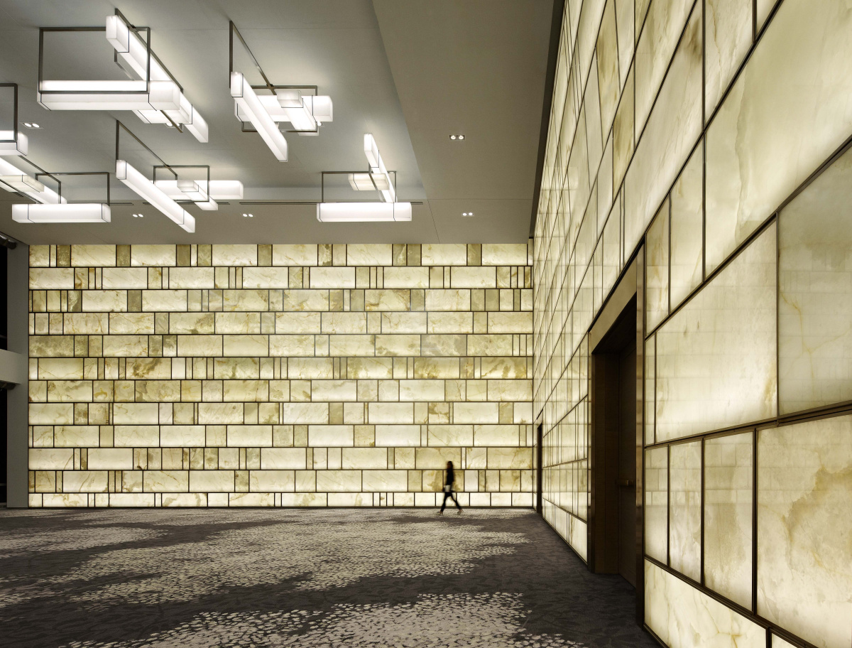
For Park Hyatt New York’s ballroom, the duo’s focus was on creating a “sexy” space that resonates with people. “We couldn’t compete on scale, but we could create an atmosphere that felt special and could flex between a sales event and a personal anniversary celebration.” George says.
Glenn: When we designed the New York project, we wanted to create something that truly belonged in the city—something stately and timeless. The client wanted to build the best ballroom in New York City, not the biggest. That vision led us to this iconic ballroom which people choose because of its beauty.
George: The backlit onyx wall, for example, isn’t plastic. It’s a genuine natural material that gives the space its signature glow. Event spaces are tricky to design because they need to work for everything from a healthcare seminar to a wedding reception. The space needs to be neutral and flexible so clients can bring their own decorations, but it also has to resonate with potential renters. If it doesn’t stand out they’ll just choose a different venue.
This particular ballroom isn’t huge; there are larger spaces like the Javits Center and other big venues around the city. But our focus was on creating a “sexy” space, one that resonates with people. We couldn’t compete on scale, but we could create an atmosphere that felt special and could flex between a sales event and a personal anniversary celebration.
We picked timeless color choices, a classic quality of materials, and highlighting—no pun intended—the onyx’s luminous, natural, dimensional quality. People now call the ballroom as a destination special.
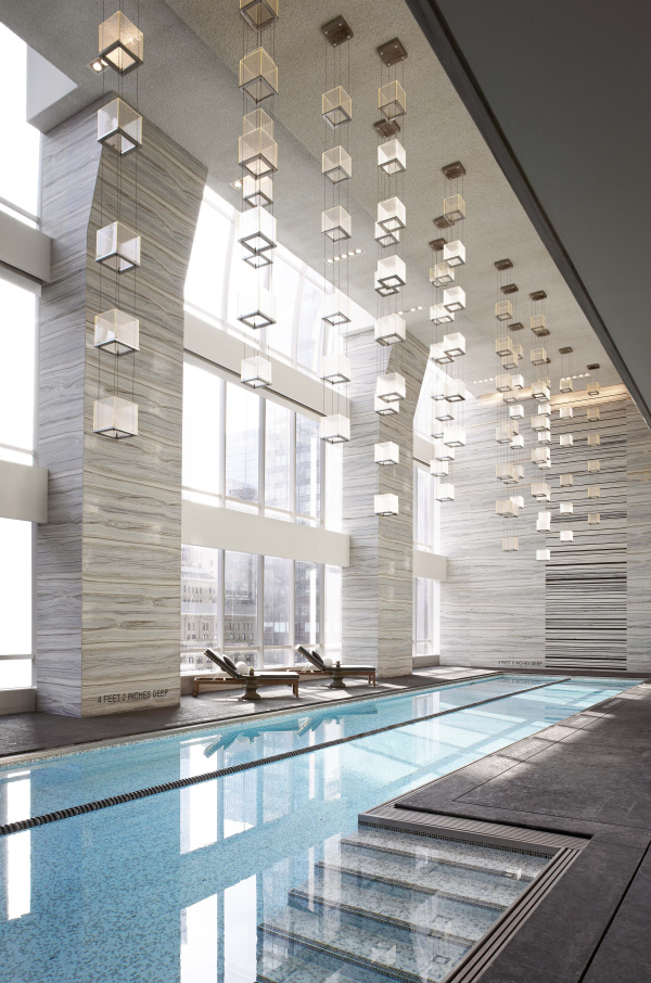
The light fixtures here in the pool atrium are cube-shaped and float above the space. The onyx walls in the ballroom are more vertically oriented, while the atrium’s lights have a more horizontal composition.
George: The lighting throughout the hotel actually echoes the design of the ballroom. The light fixtures here in the pool atrium are cube-shaped and sort of float above the space. The onyx walls in the ballroom are more vertically oriented, while the atrium’s lights have a more horizontal composition. They reflect beautifully in the pool below. The verticality of the design also speaks to Manhattan itself with its upward-reaching architecture. The triple-height glazing was a generous amount of space to allocate to the project.
Glenn: This particular photograph is the most published image of the hotel.
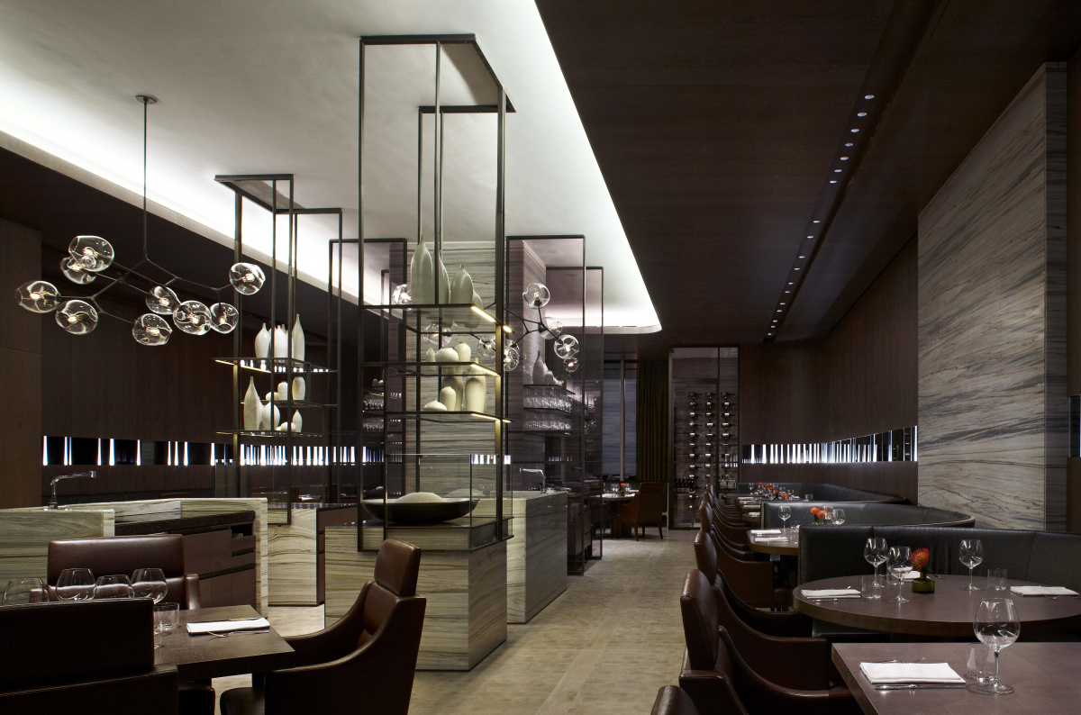
Breakout areas can often feel dull, according to Glenn and George. In this pre-function area, the meeting energy continues even during breaks. The space works equally well during the day and in the evening, thanks to the contrasting materials: stone walls paired with deep tobacco-painted surfaces.
Glenn: The breakout spaces, like the one we’re seeing here, also reflects that design philosophy. This is a pre-function area on the meeting room floor where the chef can come out and cook for you or serve lunch.
George: It’s where a meeting carries on! These breakout areas can often feel dull—just a table with coffee and sugar. But here the meeting energy continues even during breaks. The space works equally well during the day and in the evening, thanks to the contrasting materials: stone walls paired with deep tobacco-painted surfaces.
This reminds me of something we learned from Thomas Keller during an interview for one of his restaurants. He emphasized how important it was for the serving staff to feel connected to the kitchen team. He described it as a performance: the servers witness the finishing touches, like a sprig of parsley, and then go out to serve guests with that same sense of care and attention. We applied that here too. We wanted adjacent waiter stations to share the same high-quality materials and lighting as the dining areas so it wasn’t jarring to move from the front to back-of-house.
The walls in the lobby are inspired by fashion designer Halston’s use of ultra-suede in the 1970s. Instead of traditional wood paneling with trim, Yabu Pushelberg used a chamfered design to create a modern, textured effect.
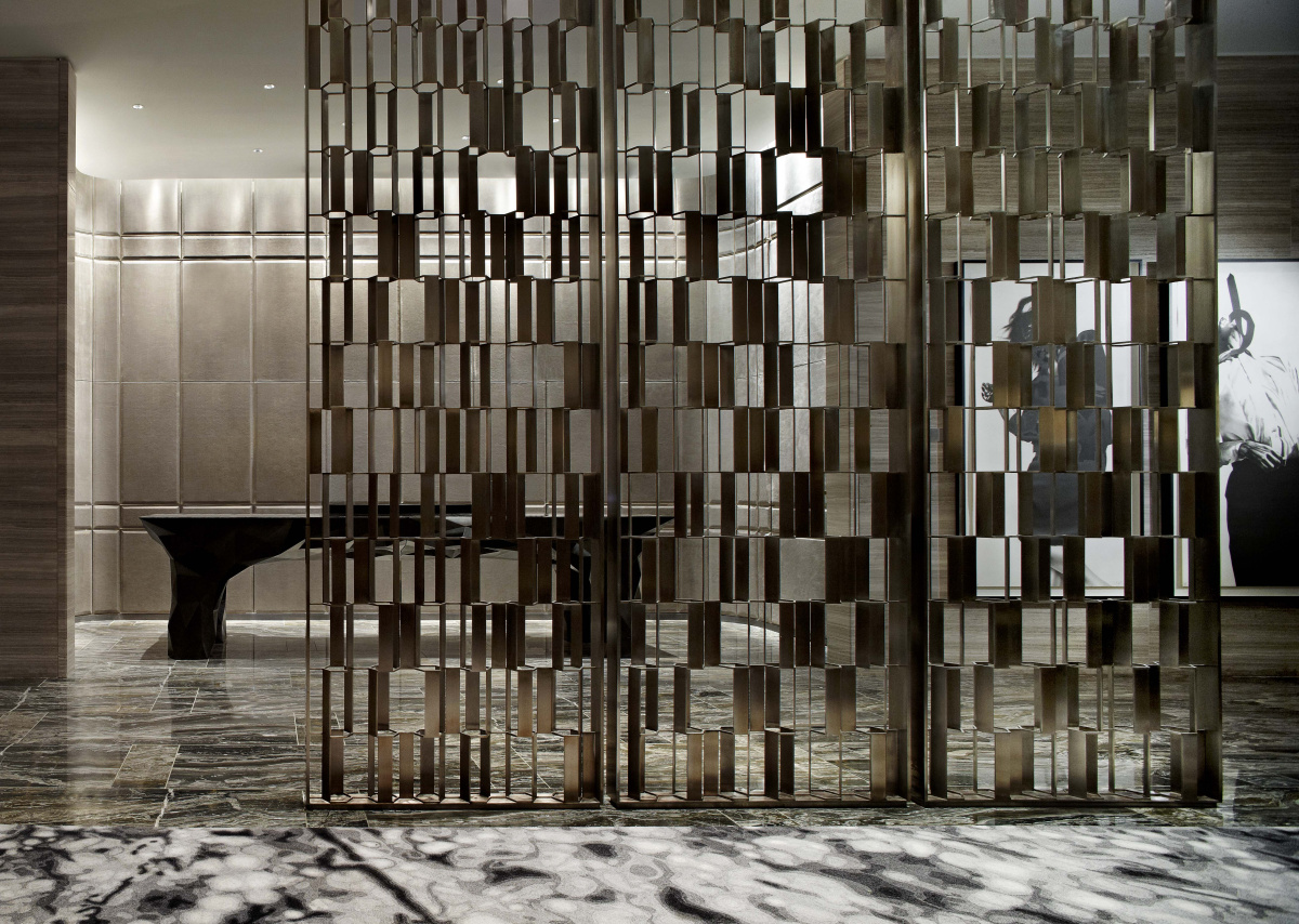
Glenn: The hotel itself was designed to feel more intimate than the grand, traditional hotels uptown. It appeals to discerning travelers looking for something special but less formal. If you see asymmetry, or see fuzed spaces but can still navigate, it’s a much more relaxed and contemporary way of living. If this were another brand we may have approached it differently. This area was an experimentation with screens to define spaces.
George: Ultimately this hotel offers a more relaxed, contemporary experience compared to the traditional “room upon room” layout of older hotels. The design invites guests to move through the space in a more organic, intuitive way while maintaining that sense of luxury and warmth.
The walls here, for example, were inspired by fashion designer Halston’s use of ultra-suede in the 1970s. Instead of traditional wood paneling with trim we used a chamfered design to create a modern, textured effect. It’s a subtle nod to the past but feels contemporary.
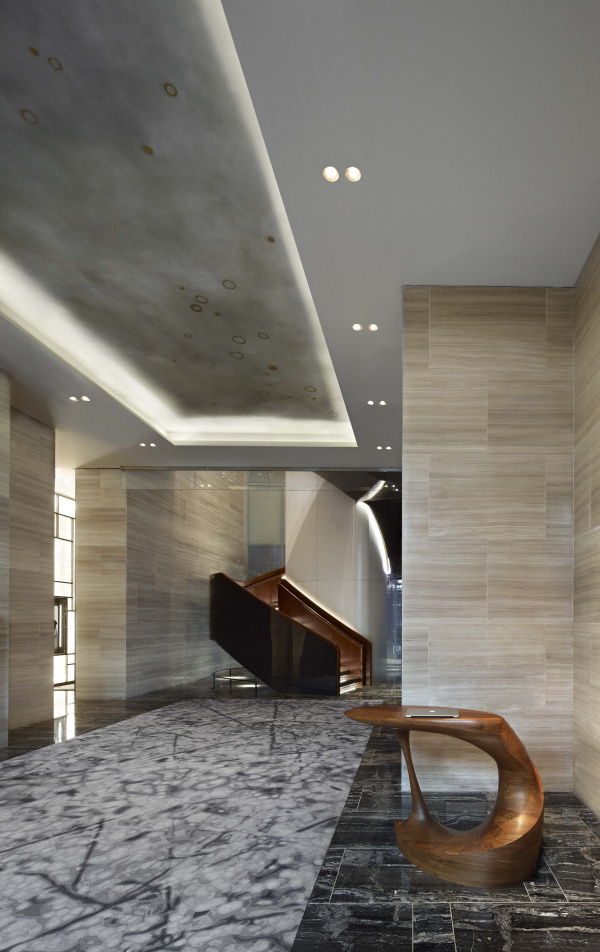
“The stairs lead up to the space we saw in the previous image with the reception area,” says George. “It’s not a grand galleria–more like a narrow passage–but we wanted to make it feel special even though it was just a requirement.”
George: This is the entrance on the ground floor from 57th Street. The stairs lead up to the space we saw in the previous image with the reception area. If you look to the left, you’ll see another luminous wall. It’s actually a required public access corridor as per New York City building code. The developer had to provide access from 57th to 58th Street. It’s not a grand galleria—more like a narrow passage—but we wanted to make it feel special even though it was just a requirement.
The height of the space adds to the drama. It feels more spacious than it actually is.
The City View room offers a rare sense of space in Manhattan, nearly twice the size of a typical hotel room.
The City View room offers a rare sense of space in Manhattan, nearly twice the size of a typical hotel room. Floor-to-ceiling windows showcase downtown’s skyline, and some rooms provide a partial view of Central Park.
Designing Park Hyatt Shenzhen
-
- This space has a cinematic quality reminiscent of Wong Kar-wai’s work in In the Mood for Love with that nostalgic, sexy atmosphere. “It’s like a nod to the past,” George says.
-
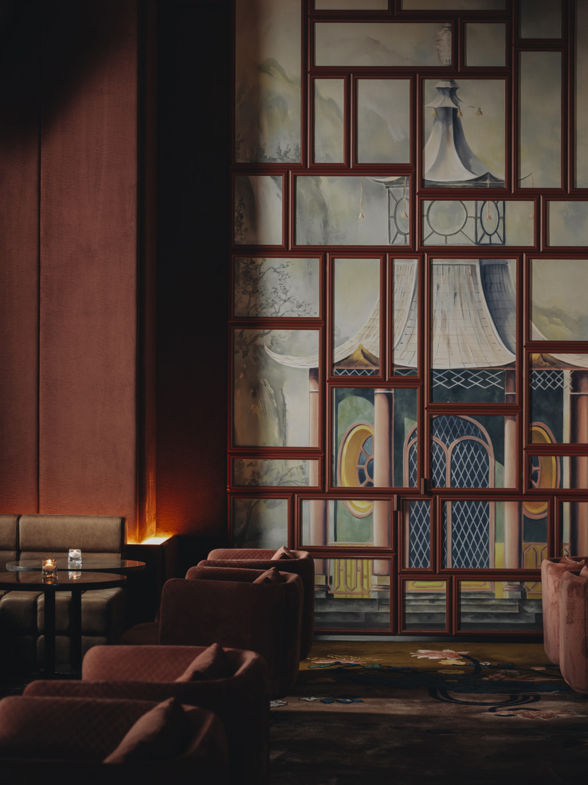
- “We were inspired by Chinoiserie and colonial design but wanted to reimagine it in a contemporary way. We weren’t sure how it would be received given the historical context, but the Shenzhen team was really receptive.”
George: This space has a cinematic quality reminiscent of Wong Kar-wai’s work in In the Mood for Love with that nostalgic, sexy atmosphere. It’s like a nod to the past. This is more of a bar or a cafe-bar. The previous area was more of a space where a chef might come up to cook during meetings, but here we were focused on creating a dramatic, cinematic feel.
We were inspired by Chinoiserie and colonial design but wanted to reimagine it in a contemporary way. We weren’t sure how it would be received given the historical context, but the Shenzhen team was really receptive. The windows you see aren’t real; they’re painted canvases framed to create that illusion.
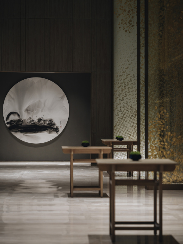
“This is a pre-ballroom area. The golden screens you see along the hallway create a visual rhythm and foreshorten the space. The tables are inspired by Chinese scholar brush paintings. They were placed intentionally to maintain a sense of presence even when the rooms aren’t in use,” says George.
George: This is a pre-ballroom area. The golden screens you see along the hallway create a visual rhythm and foreshorten the space. The tables are inspired by Chinese scholar brush paintings. They were placed intentionally to maintain a sense of presence even when the rooms aren’t in use. The hallway is actually quite large with meeting rooms on either side. We wanted to avoid that empty, transitional feel typical of pre-function spaces.
Glenn: Most pre-function spaces outside of ballrooms and meeting rooms are really ill-considered. They’re just “nothing” spaces where you gather. We always want to make them as special as the ballrooms and meeting rooms themselves.
George: A lot of architect-designers would leave something like this last on their list, but it needed attention.
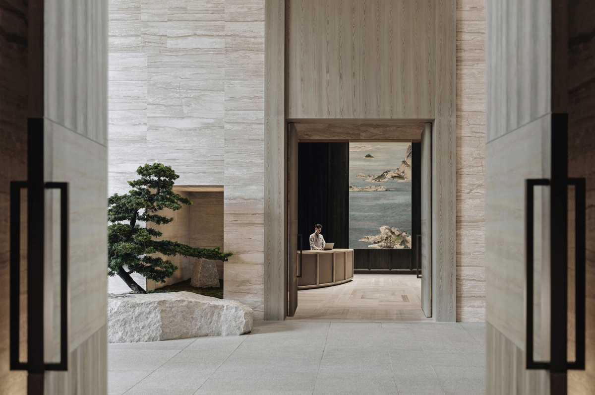
“We placed some rocks and manicured trees around this area as well. We liked playing with formality and informality here, using asymmetry and visual cues to lead guests toward the elevators instead of wayfinding signs. It’s really instinctually done,” says Glenn.
Glenn: This is the ground-floor entrance before you go up to the hotel. The porte cochère is just to the left. We placed some rocks and manicured trees around this area as well. We liked playing with formality and informality here, using asymmetry and visual cues to lead guests toward the elevators instead of wayfinding signs. It’s really instinctually done.
George: The stone patterning on the tiles is a nod to traditional Chinese hutongs. When it came to the ferns we had discussions about what made the design distinctly Chinese, not Japanese. We focused on subtle differences like the placement of urns alongside plants in the ground, which is more typical in Chinese design. It’s that order/disorder that makes it look Chinese to me.
Glenn: What I also liked about the project was our creation of spatial variety throughout the hotel—moving from large, open spaces into smaller areas. There’s always a transition of environments that you move into. It also goes from architectural materials, to wood, to deeper colored materials also changes your mood.
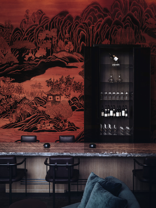
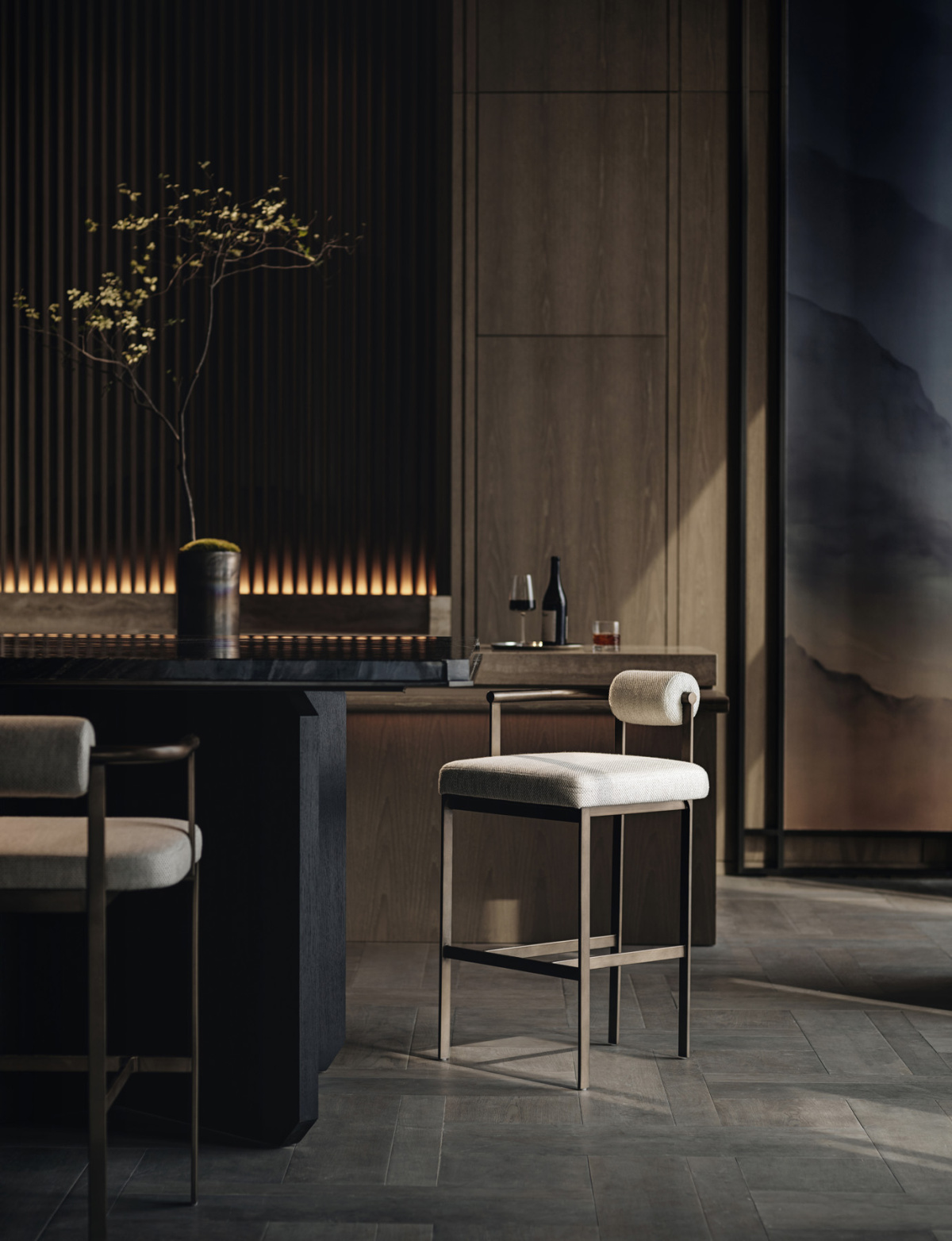
The colors in the hotel bar are rich and saturated, not just from the artwork itself but also from the carefully articulated lighting. The lighting’s adjustable color also temperature adds a cinematic quality to the space, with varying shades of red that shift throughout the room.
Glenn: We wanted this bar to feel like a hidden gem off the main lobby and encouraging guests to explore and engage with the space. It’s long and narrow with one huge mural.
George: The colors are rich and saturated, not just from the artwork itself but also from the carefully articulated lighting. The lighting’s adjustable color temperature adds a cinematic quality to the space, with varying shades of red that shift throughout the room.
Glenn: We commissioned this wall art. We often work with a selection of artists depending on the project’s needs. These artists in particular are Canadian Chinese.
George: We took on this project before we had our in-house art consultant practice. Now we have a dedicated team that conducts in-depth research to find site-specific artists.
-
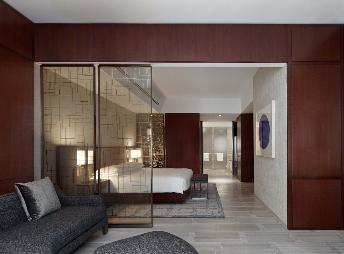
- This suite was inspired by the moodiness and contrast of old black-and-white films.
-
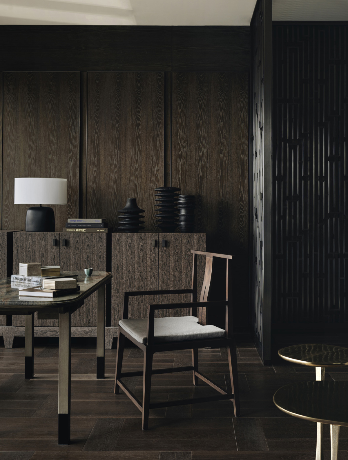
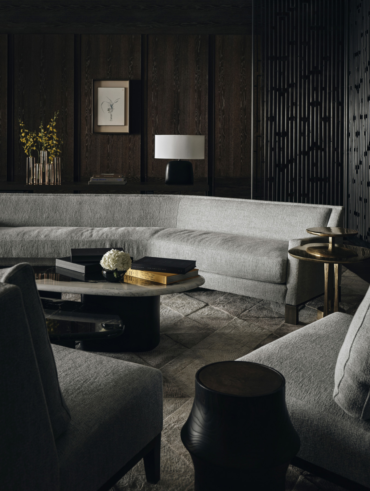
- “To make a hotel feel good, we design it like a home,” says Glenn. “We mix different furniture styles rather than matching everything perfectly. It makes the space feel more purposeful and comfortable.”
George: This suite was inspired by the moodiness and contrast of old black-and-white films. The dark walls and decorative screens create a dramatic backdrop for the silver and platinum furniture. We wanted to evoke a sense of nostalgia, like transitioning from black-and-white to color cinema.
Glenn: To make a hotel feel good, we design it like a home. We mix different furniture styles rather than matching everything perfectly. It makes the space feel more purposeful and comfortable.
George: I think a good example of that is the subtle curve of the sofa. It creates a sense of imperfection that feels natural and comfortable. Many Chinese interiors embrace symmetry, but we drew inspiration from old merchant and fisherman homes where spaces were added organically over time. The result is a mix of order and disorder which feels authentic to the history of Shenzhen. It has this organic architectural heritage despite being such a modern city today.
Shenzhen was originally a fishing village, and now it’s a tech hub–China’s version of Palo Alto. It’s intense working in that city environment. We designed this Park Hyatt to reflect that contrast: a rustic, calming retreat amidst the city’s fast-paced and high-tech environment.
Glenn: It’s a comfortable, easy, but special interior that you can unwind in.