Walking through the new White Rabbit Global Flagship Store in Shanghai is a bit like entering a dream.
The X+Living design—complete with elaborate flowing milk art installation—challenges any notion of a traditional storefront.
Instead, the store is designed with a funhouse vibe, encouraging you to wander, ooh, and aah as you quite literally go with the flow. The design team wanted to create a surreal setting for a magical shopping experience for the new candy store, according to Li Xiang, who leads the firm.
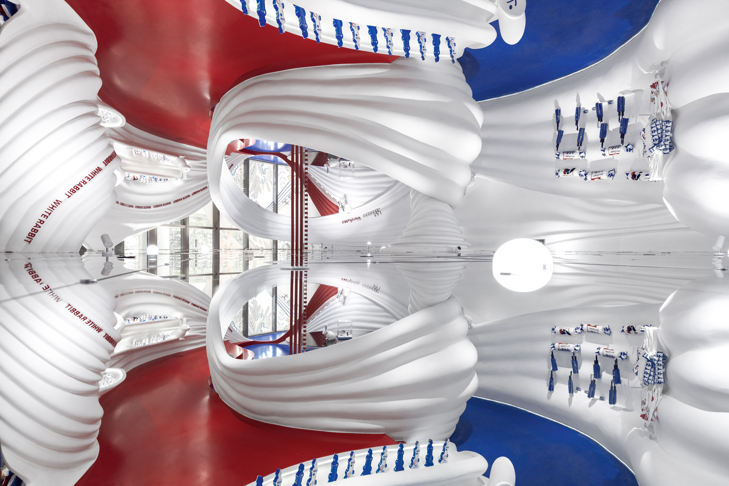
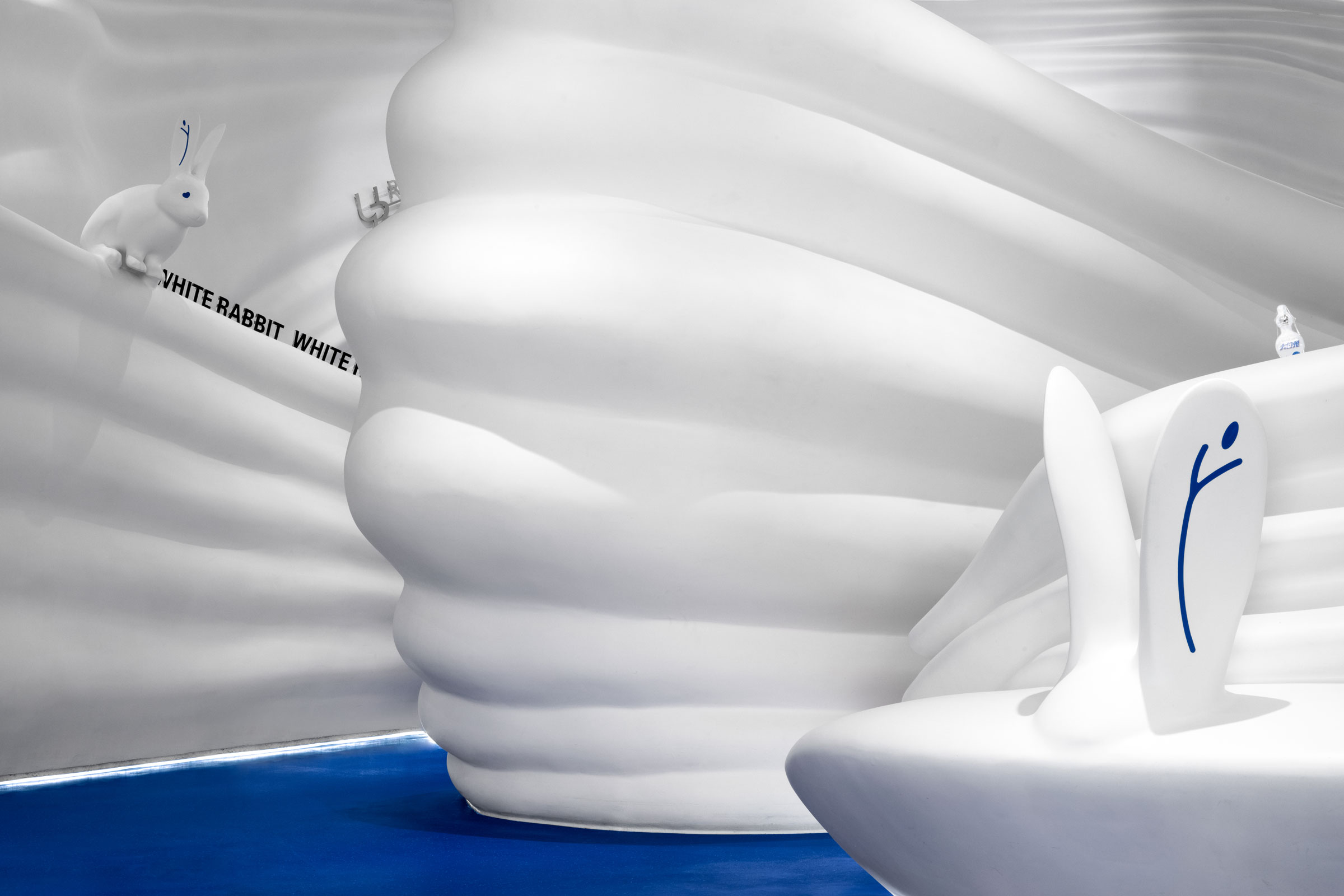
Across roughly 650 square feet, a 3D-printed shape simulates the flow of milk—a whimsical nod to the production process that ultimately results in those creamy candies on the shelves. “Creating the flowing milk structure was quite challenging,” Li says. “We had to integrate practical functions into the curve-shaped installation and guarantee aesthetics at the same time.”
The team used foam 3D printing for proofing, then turned to fiberglass to create the mold. “It took us a long time to adjust its shape and curves to achieve the result we wanted.”
For the finishing touches Li and the team stuck to the White Rabbit brand colors of white, blue, and red—using white liberally. “The large area of pure white color makes the shape of the installation appear transparent and dynamic,” Li says. “The polished blue terrazzo floor embellished with white particles echoes the main color, and the red is used as a decorative color on the pendants and decorative lines and geometric figures, making the space more avant-garde.”
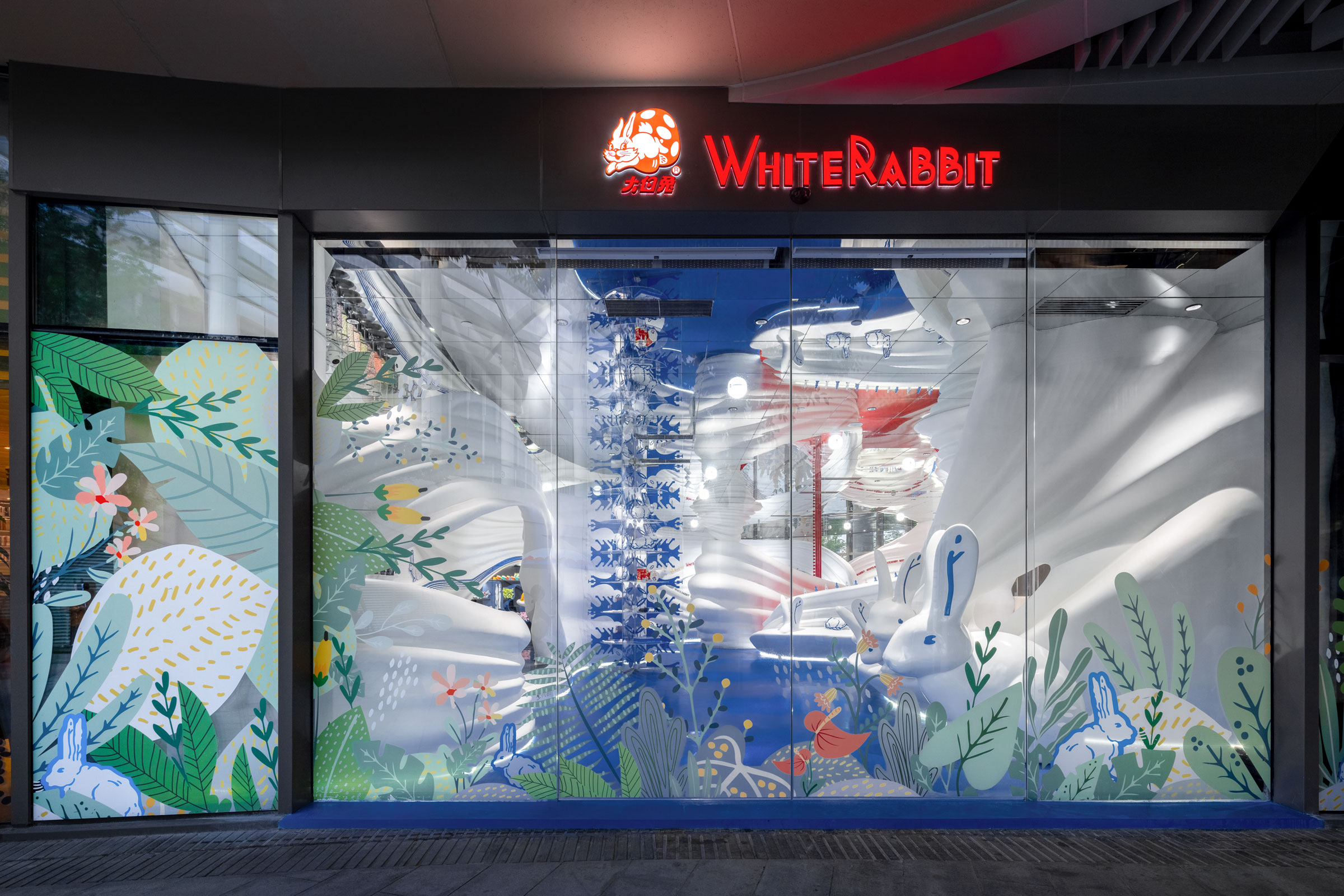
In the front window an oversized rabbit sculpture adds to the sense of fantasy. Further inside the store, a ball pit continues that feeling of playfulness, as it houses merchandise like White Rabbit body pillows and invites customers to climb in and snap a photo for the ’gram. A mirrored ceiling helps expand the space visually and further brings out the fantastical feeling.
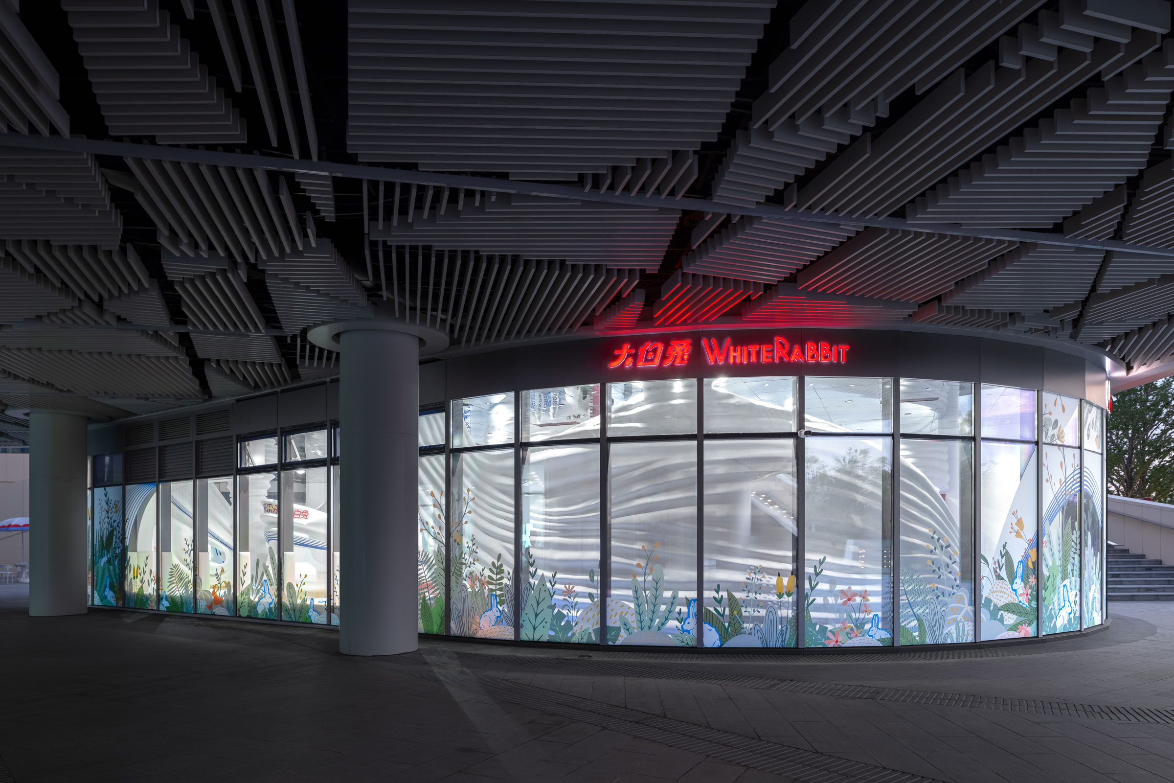
“The floor to ceiling glass window design allows the entire internal design to be shown to the public, adding public art characteristics to the commercial space,” Li says. “At the same time, the illustration-style green plants and the brand mascot rabbit stickers on the window adds a touch of mysterious storytelling to the whole space, as if falling down a rabbit hole and entering a sweet and pure white whirlpool by accident.”
- Outside the White Rabbit flagship in Shanghai. Photo by SFAP
- The seemingly random shape of the overall flowing milk installation was carefully planned, so as to stretch and extend the consumer’s wandering path. X+Living used terrazzo for the White Rabbit floor, both for the material’s durability and for the nostalgic feeling it offers up. Photo by SFAP
- Spherical lights dot the room irregularly. “Since we used floor to ceiling glass window design, there is enough natural light to light up the space. The lights inside the store are mainly used to set the tone.” Photo by SFAP
A version of this article originally appeared in Sixtysix Issue 07 with the headline “X+ Living White Rabbit.” Subscribe today.
