Vibrant color, unexpected shapes, and raw data tell the story of the African American experience in the early 1900s in ways you’ve probably never seen—unless you’ve been to London’s House of Illustration recently.
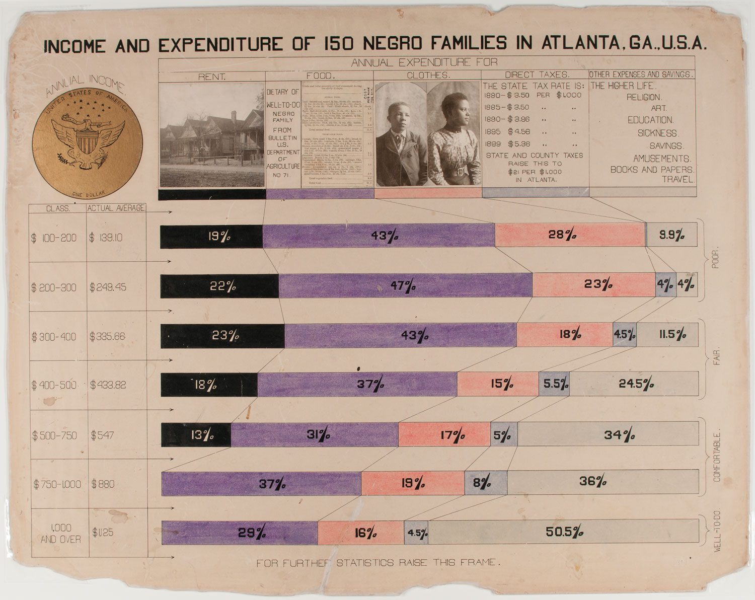
As part of an exhibit through March 1 at the House of Illustration, “W. E. B. Du Bois: Charting Black Lives” highlights 63 graphics shown at the 1900 Paris Exposition, covering topics like “conjugal condition” by age, African American teachers in public schools, and income and expenditure. It’s a remarkable set of graphs, charts, and maps that set out to refute racism and counter white supremacy with hard facts and statistics, produced by Du Bois and a team of African American students from his sociology lab at Atlanta University.
Du Bois (1868-1963) was one of the most influential African American activists and intellectuals of the 20th century. He cofounded the NAACP and wrote The Souls of Black Folk in addition to being a sociologist, historian, activist, data designer, and black protest leader. I recently spoke with exhibition co-curator Katie McCurrach of House of Illustration to find out more about what we can all learn from these works—and just what makes them so compelling.
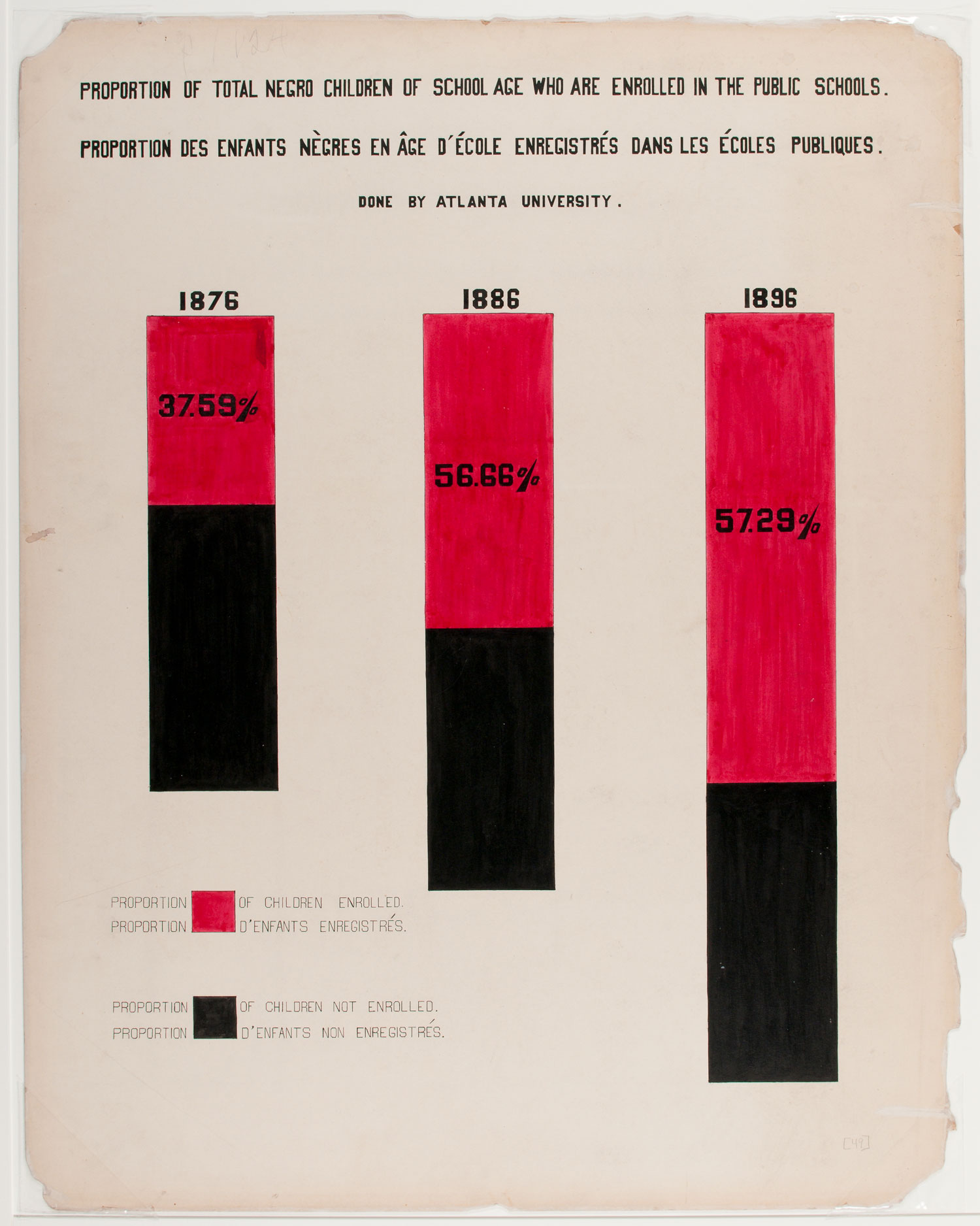
- Proportion of Total Negro Children of School Age Who are Enrolled in the Public Schools, “W. E. B. Du Bois: Charting Black Lives.”
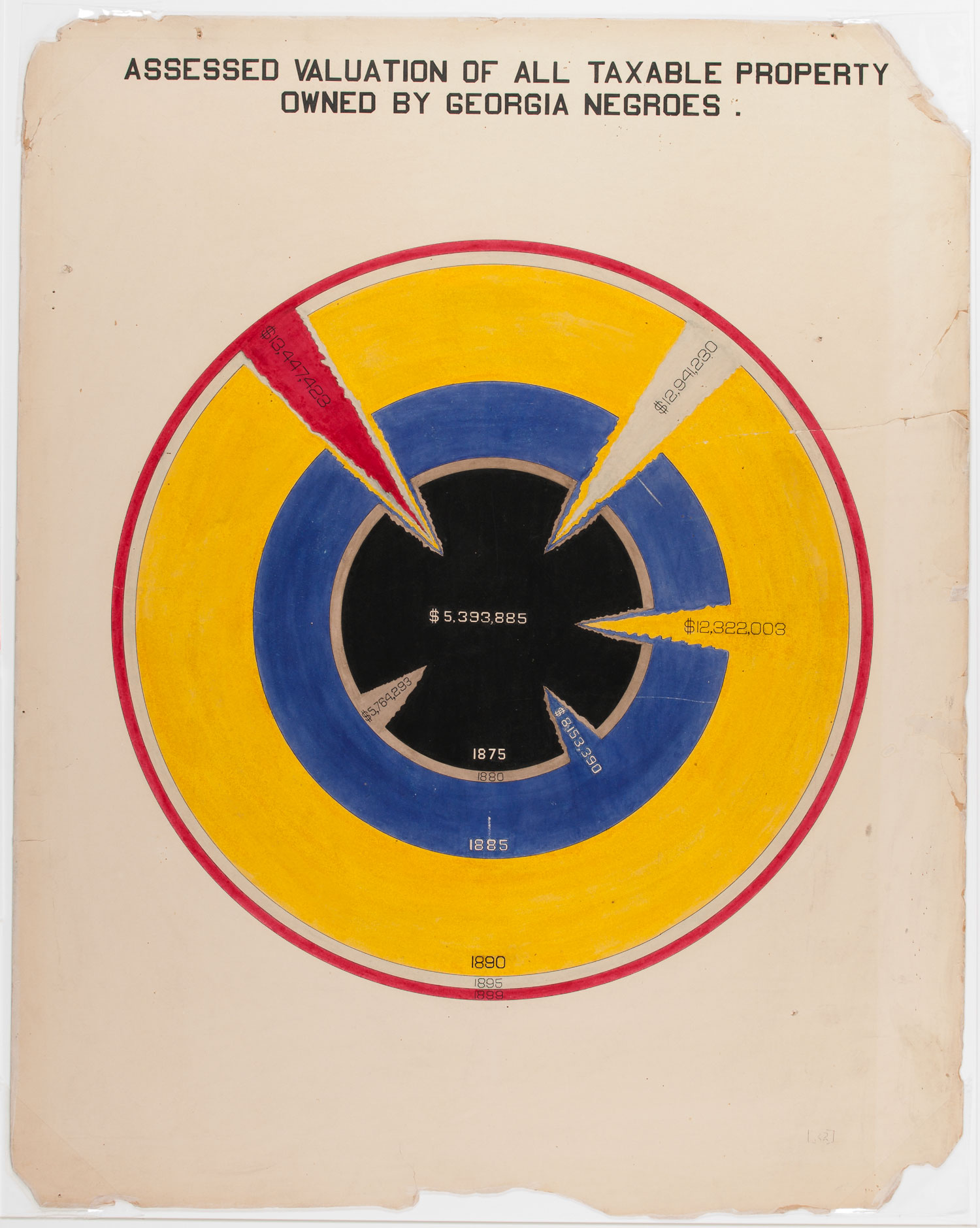
- Assessed Valuation of All Taxable Property Owned by Georgia Negroes, “W. E. B. Du Bois: Charting Black Lives.”
What resonated with you most when you first saw this work from W. E. B. Du Bois?
The vibrancy of the color is very striking and something you might not expect for work from 1900. Also the wide variety of methods Du Bois was using. He was appropriating some very conventional forms of data visualization—the bar chart, the pie chart. Those have been used since the 1700s and 1800s. He’s deliberately taking on things like maps used by colonial empires to show ownership of people. He’s really taking them and reappropriating them to use for his own purposes, which is quite a radical act.
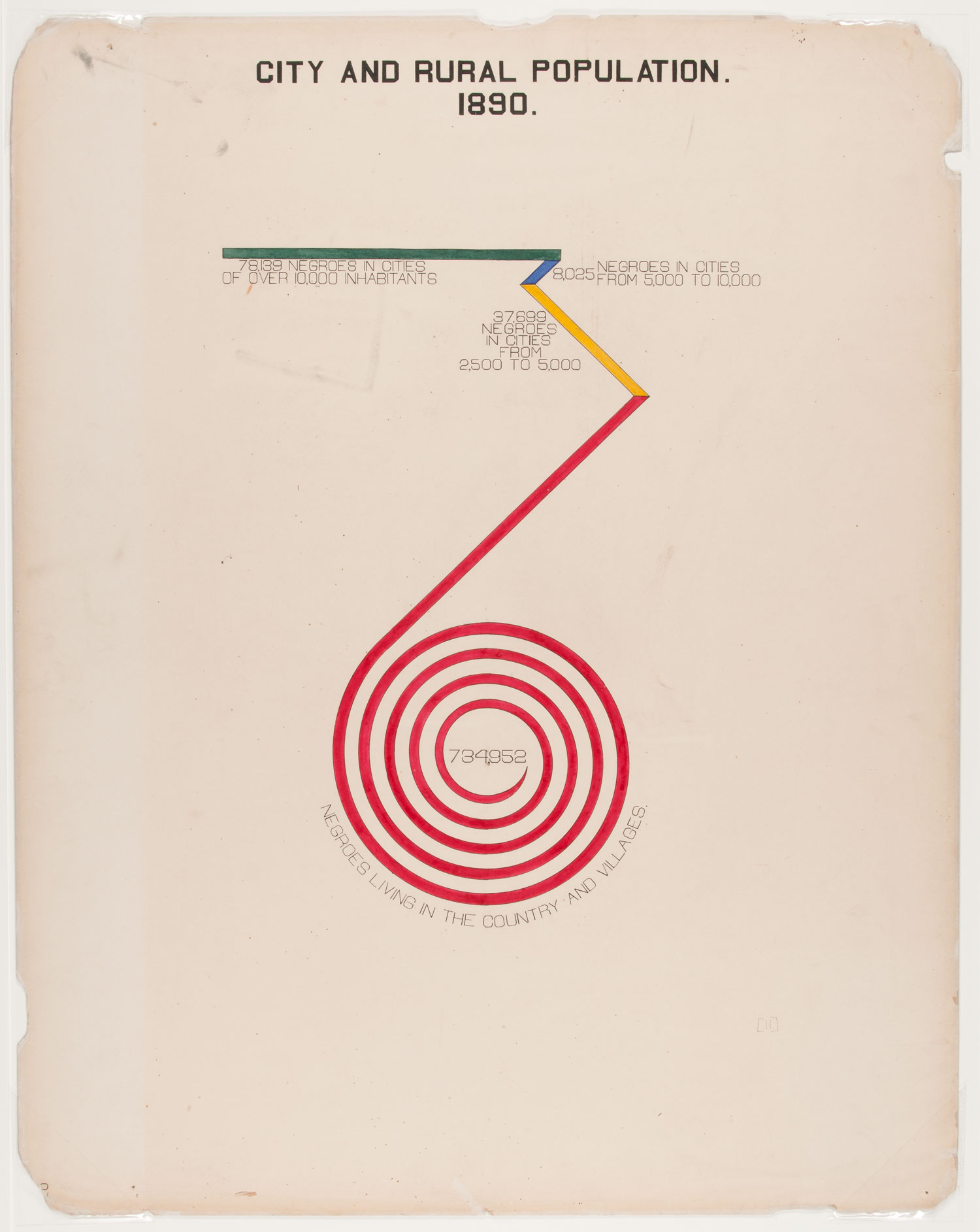
He was also using some unconventional methods, some experimental methods. We see a lot where Du Bois uses a spiral shape instead of a straight bar to show huge figures of information that can’t even fit on the page. He has to make this spiral to fit the whole bar onto the page. That wasn’t conventional practice. That’s quite unusual, and quite visually striking as well.
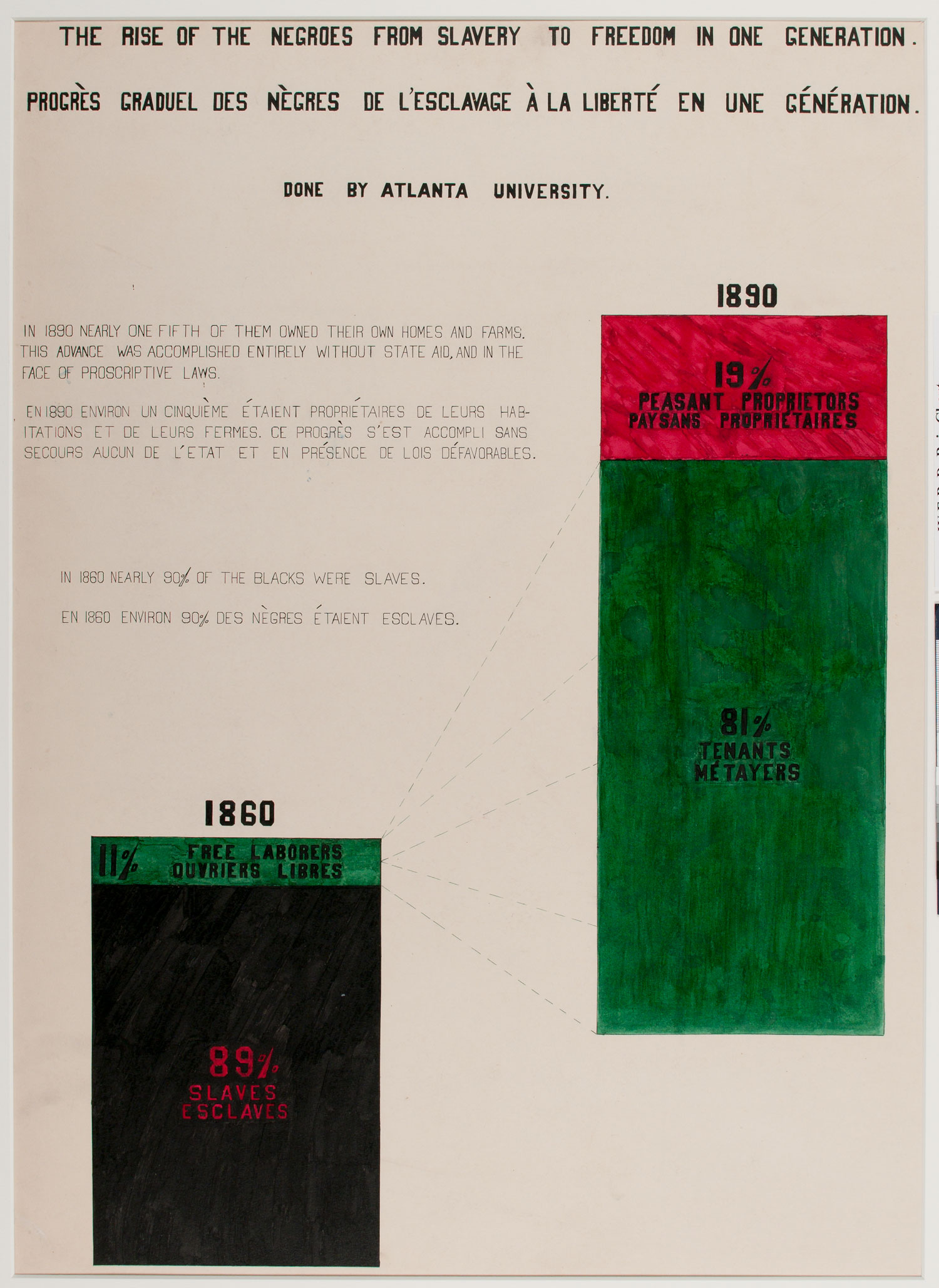
- The Rise of the Negroes from Slavery to Freedom in One Generation, “W. E. B. Du Bois: Charting Black Lives.”
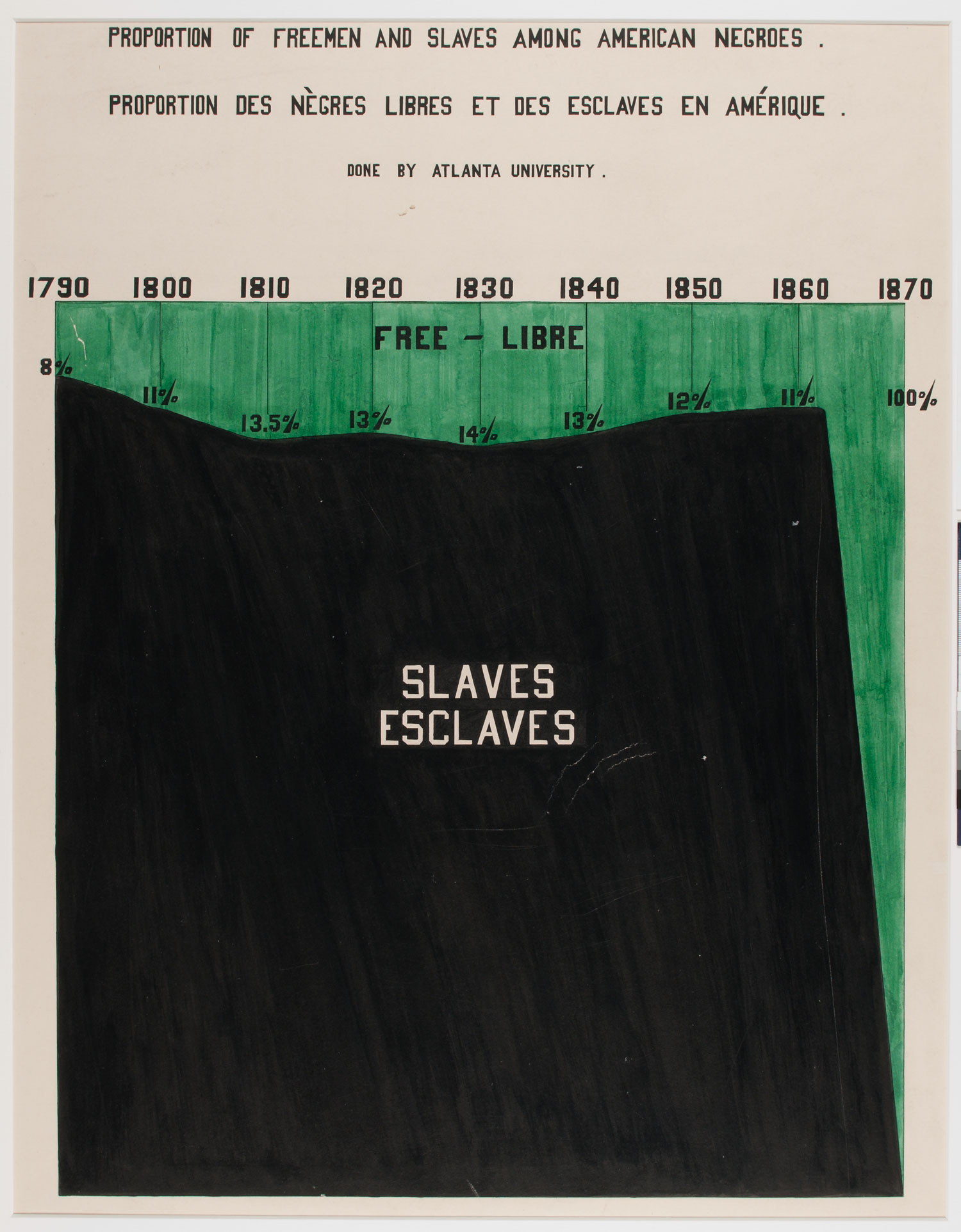
- Proportion of Freemen and Slaves Among American Negroes, “W. E. B. Du Bois: Charting Black Lives.”
What made this a significant set of work for House of Illustration?
Many people know about W. E. B. Du Bois for his literary works. One of his most famous texts is The Souls of Black Folk, which was published in 1903. But a lot of people don’t know about the infographics work he was doing before that as a sociologist.
We saw this and thought this really resonated with what we’re trying to do at House of Illustration. In all of our exhibitions, we’re always trying to show how illustration has been used for various practices, whether that be to challenge people’s ideas or to convey information. People think illustrations are purely children’s books—which obviously that’s a large part of illustration and something we track in as well—but illustration has had a much more diverse role than that. This work by Du Bois really seemed to be an amazing example of illustration being used to campaign for a particular cause or to change people’s ideas in a radical way.
We’re very keen to show that side of what Du Bois was doing, and to share that with visitors who might not have heard about this side of his work, or even about Du Bois in particular.
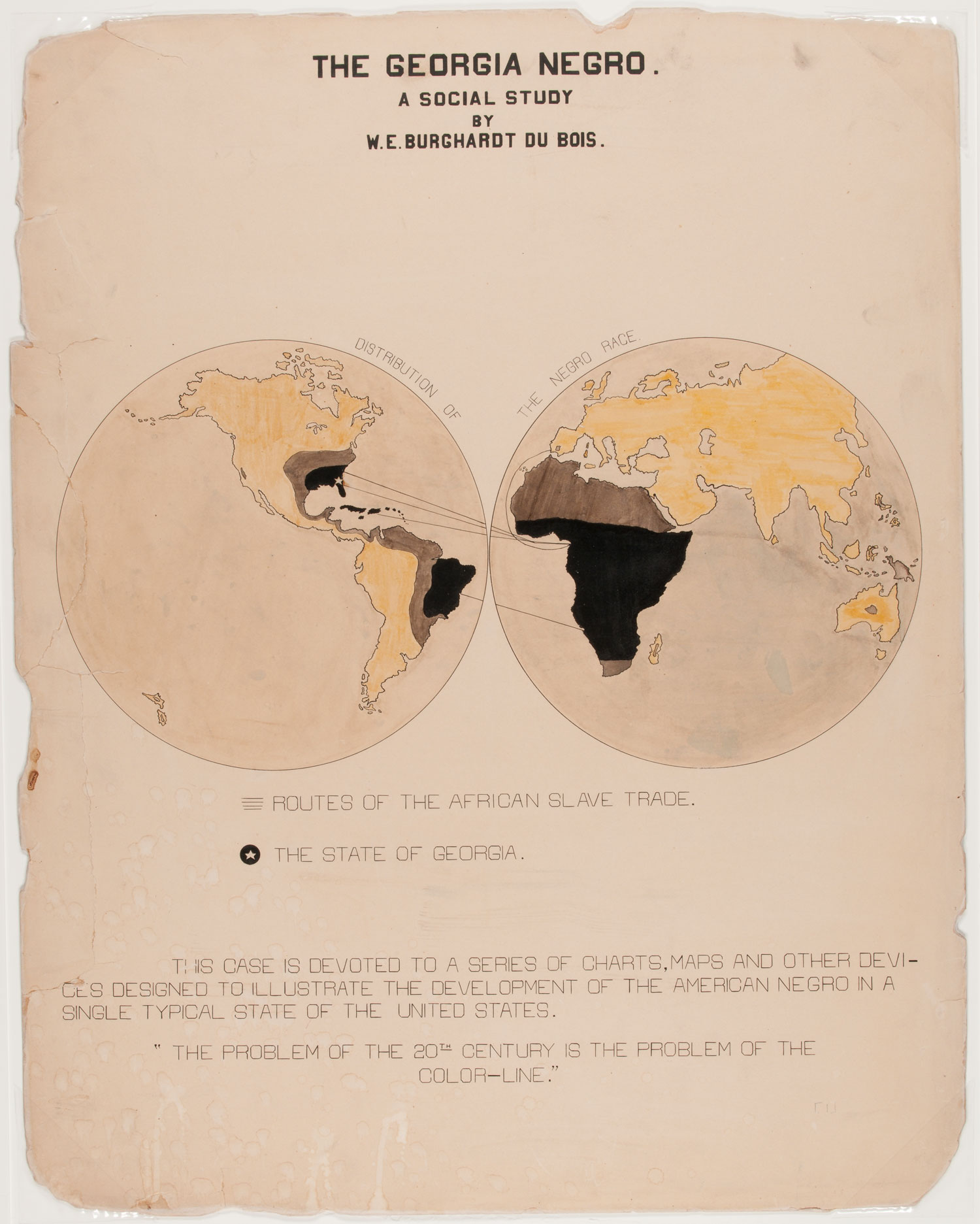
- The Georgia Negro, “W. E. B. Du Bois: Charting Black Lives.”
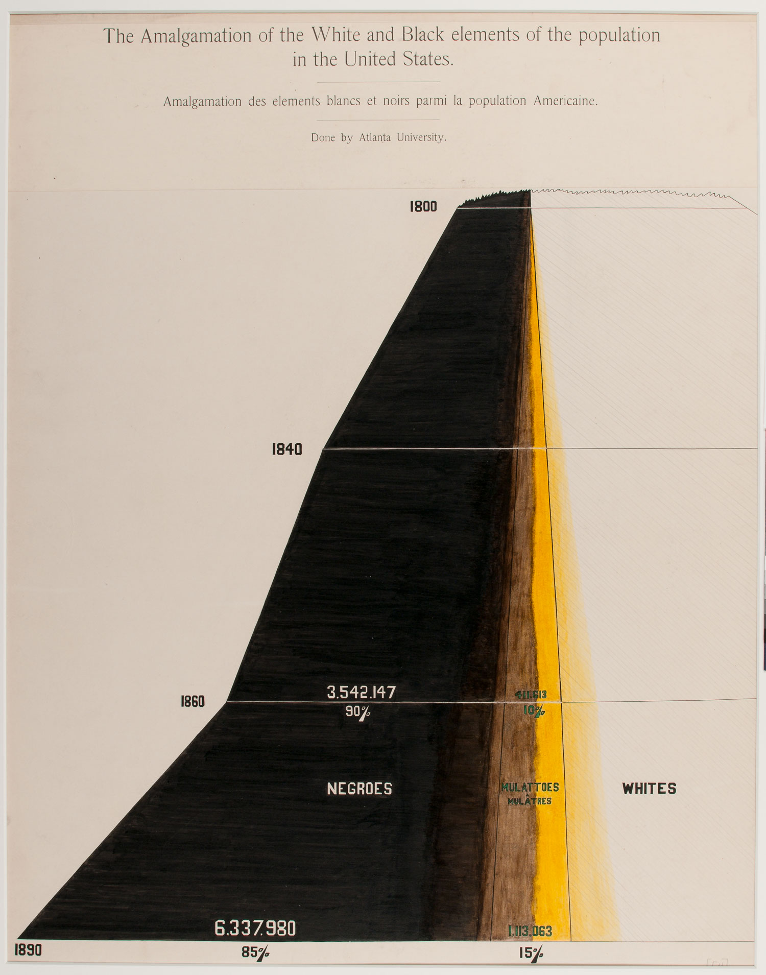
- The Amalgamation of the White and Black Elements of the Population in the United States, “W. E. B. Du Bois: Charting Black Lives.”
Are there particular illustrations in this set that spoke to you more than others?
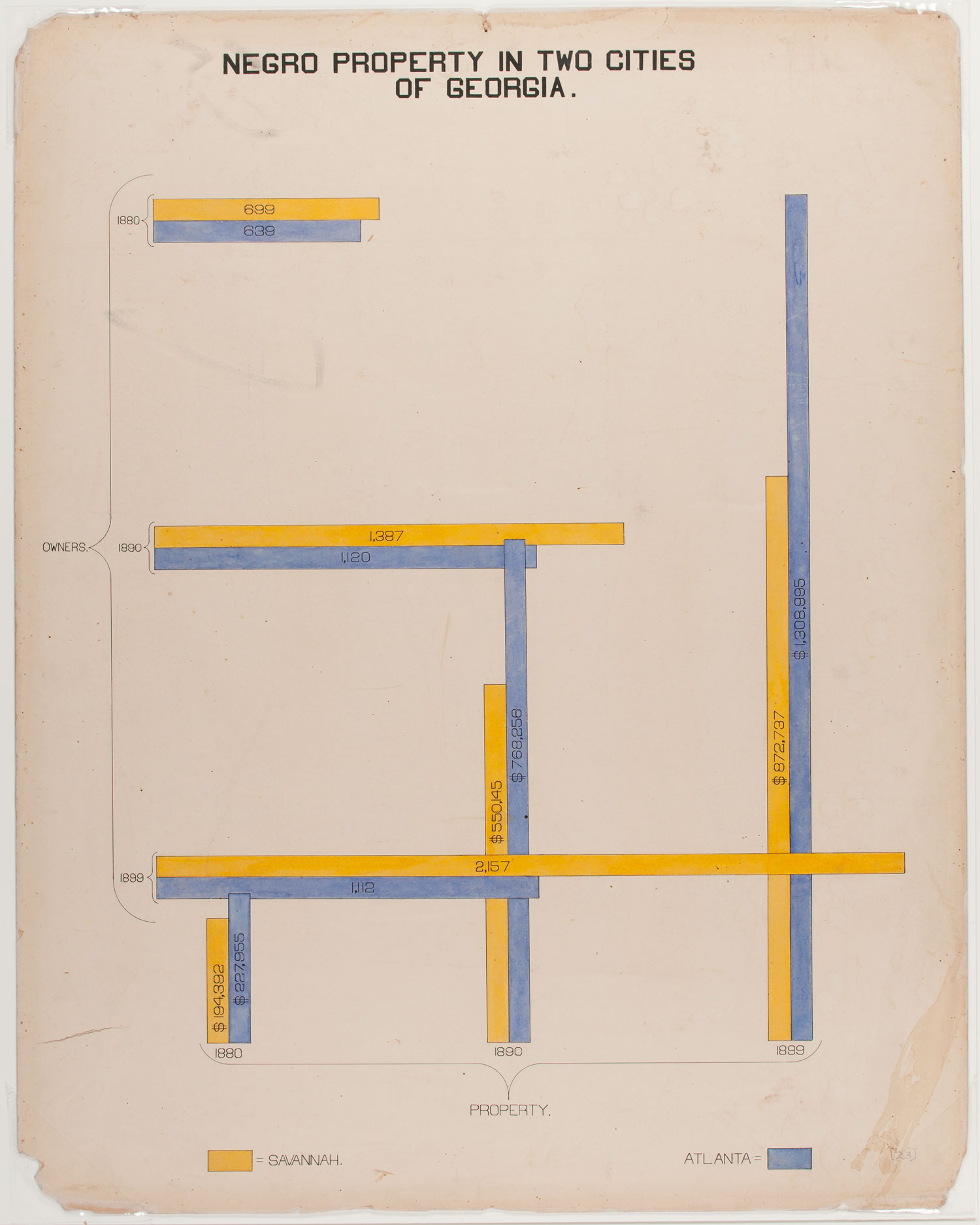
There’s a couple that stand out because of the way in which they’re being incredibly radical politically, but in a way that was quite subtle. There’s one chart that evaluates town and city property owned by black Americans in Georgia. At first glance that’s just a chart describing how much the property they owned was worth, but Du Bois has plotted this change in the value of property against sociopolitical events. He explicitly mentions lynching and klu kluxism. That’s incredibly bold of him to have said that quite so explicitly and showing how new laws discriminating against African Americans really influenced how much their property was valued at, but also the violent context for black people attempting to own property. It wasn’t just that it was difficult for them; it was potentially life-threatening. That’s really fascinating.
People might see the chart as neutral or scientific. Of course that’s partly why he’s using them—because he believed in the power of statistics as a scientific way of showing things to change people’s minds. But at the same time, they’re deeply political and radical views as well.
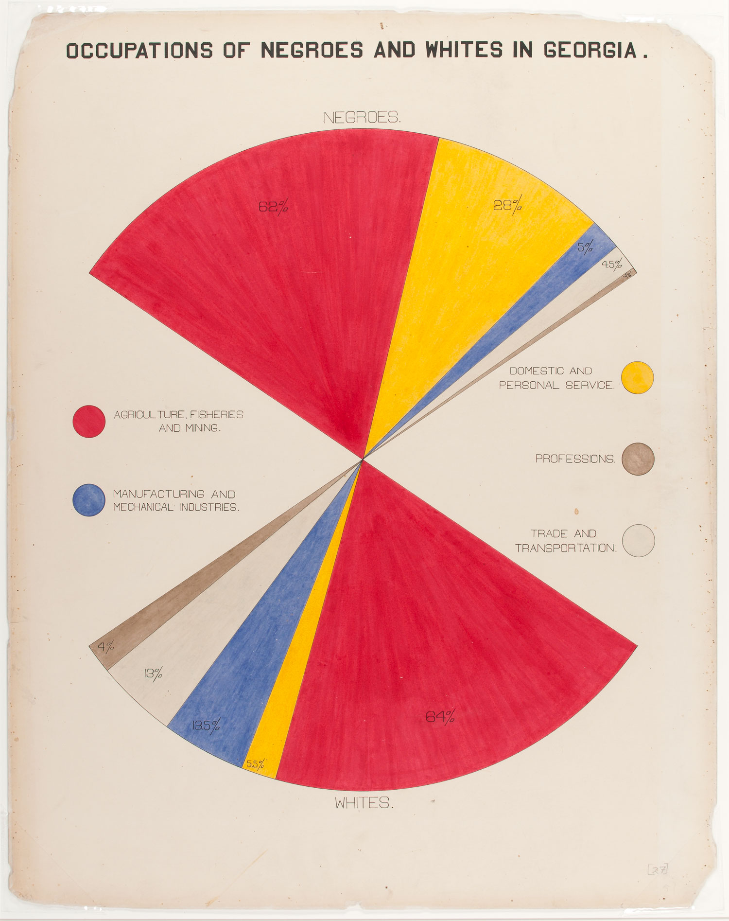
- Occupations of Negroes and Whites in Georgia, “W. E. B. Du Bois: Charting Black Lives.”
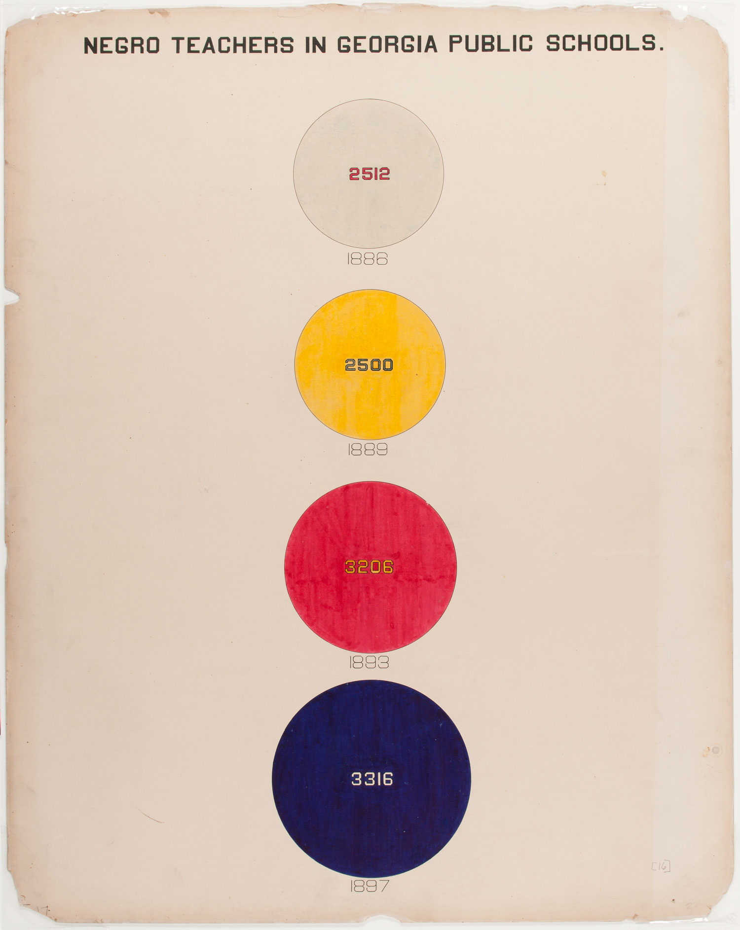
- Negro Teachers in Georgia Public Schools, “W. E. B. Du Bois: Charting Black Lives.”
Why does Du Bois’ experimentation with color, shape, and even message interest you? What can we learn from that?
I think it’s important for all illustrators and artists to experiment as part of the process. We do like to have illustration show processes because fine art has a lot of academic work written about experimentation and process and research and how artists create work. There’s a great deal of information on that. With illustration, people can assume work magically appears on the page. But of course illustration has its own history and research behind it. Experimentation can be a big part for illustrators, as well as this real rigorous research you see in Du Bois’ work.
- City and Rural Population, “W. E. B. Du Bois: Charting Black Lives.”
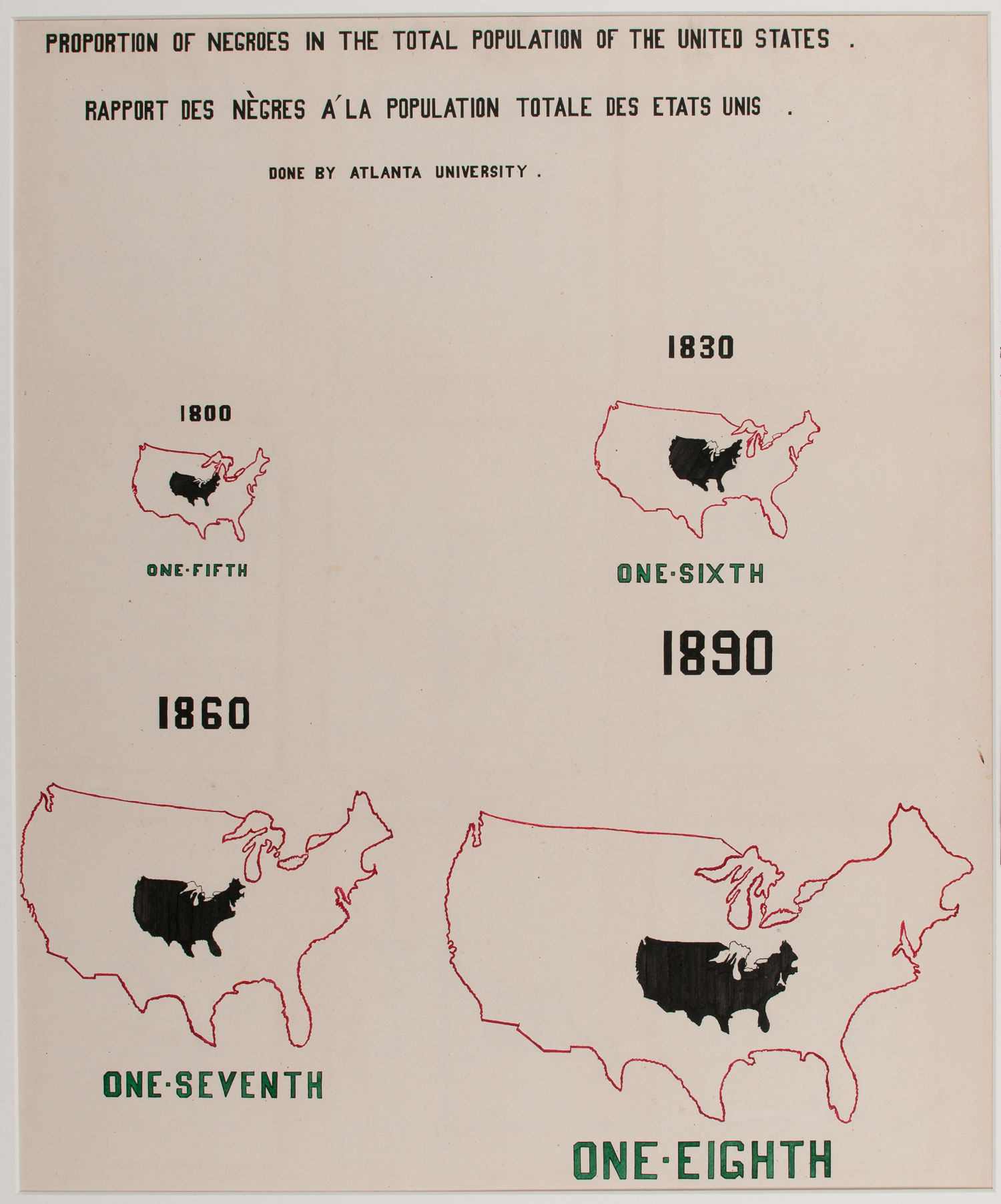
- Proportion of Negroes in the Total Population of the United States, “W. E. B. Du Bois: Charting Black Lives.”
I think there are also limitations in Du Bois’ work. He was very pressed for time. He only had a couple of months in which to put these charts together with students from Atlanta University. It would be interesting to know what he would have done differently if he’d had more time.
As a whole the charts build up a very compelling argument. If we had more historical context, which we try to do in our preparation for the exhibition, there’s a lot that can be broken out of that. Some of them, on first appearance, take a little bit of work to understand. Maybe part of that is because we’re not the original audience. We need to have the same background and context in which to understand them. Some of it is because some of them are experimental in terms of their visualization technique.
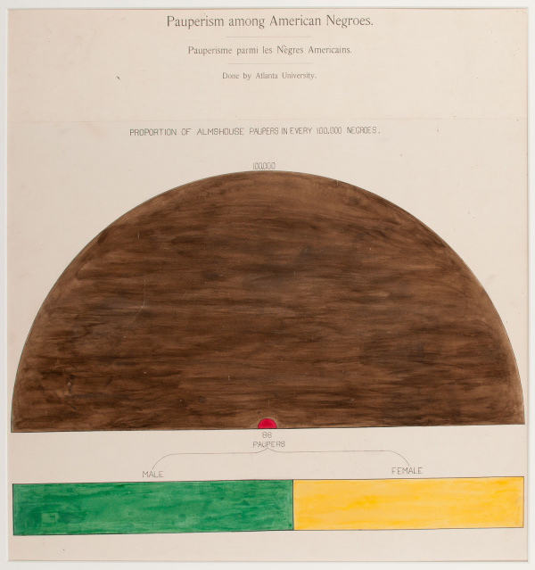
Pauperism among American Negroes, “W. E. B. Du Bois: Charting Black Lives.”
What else has working with this exhibit taught you?
I’m really grateful to have had Professor Paul Goodman (professor at the University of the Arts London, a curator, scholar, and specialist in black urbanism) as my co-curator. He has the academic background in a lot of this.
It was 40 years after the emancipation of slavery in the US, and Du Bois was mapping those years to emancipation in these charts and showing what black lives looked like in the light of that history. I am ashamed to say I didn’t know as much as I thought I did about that context. Examining these graphs has given me a much better understanding on the ways in which slavery affected all aspects of black people’s lives. It wasn’t just in terms of what they could or couldn’t do economically, but in terms of marriage, in terms of literacy, all sorts of social and political and economic ways. The breadth of these charts gives the sense of that.
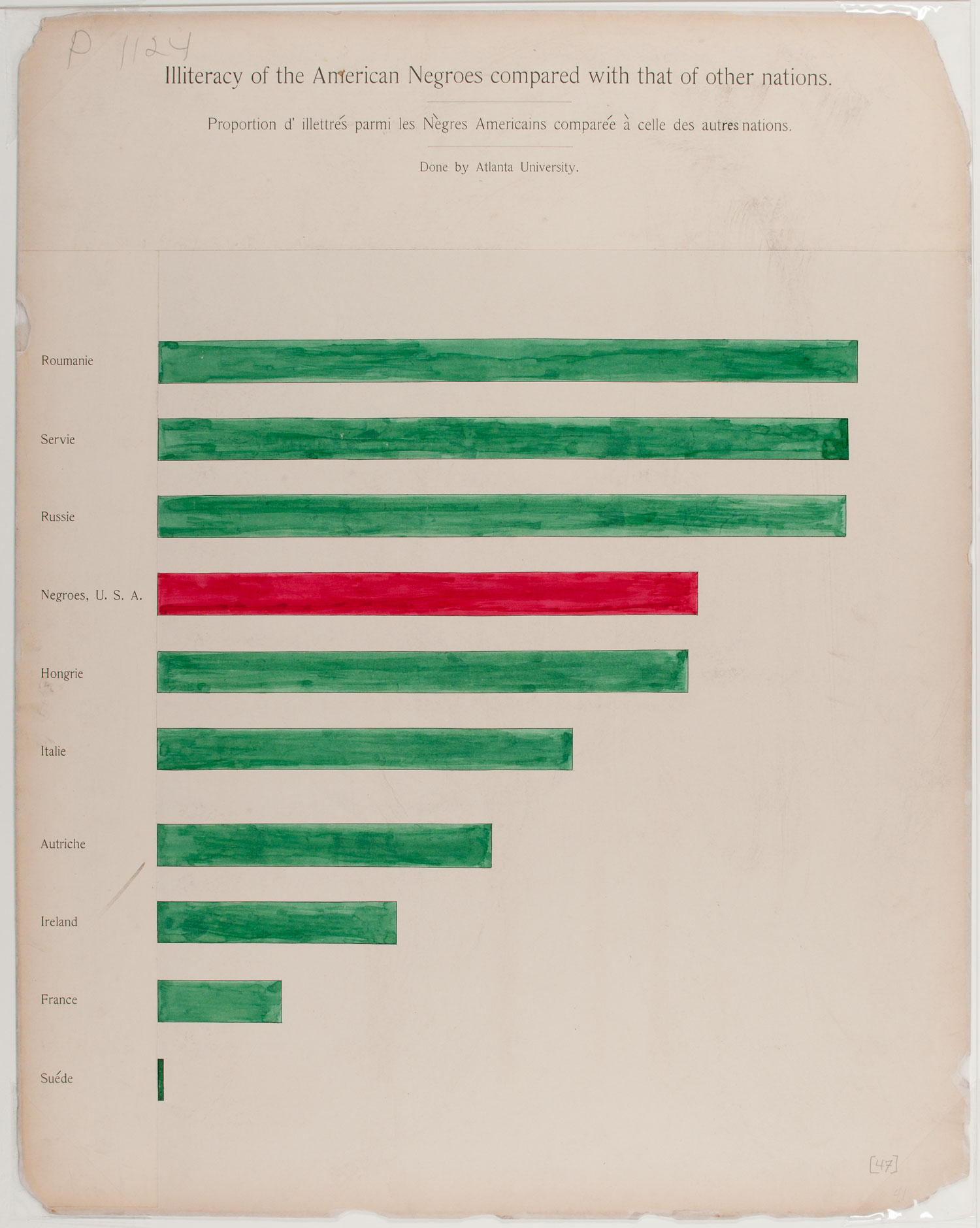
- Illiteracy of the American Negroes Compared With That of Other Nations, “W. E. B. Du Bois: Charting Black Lives.”
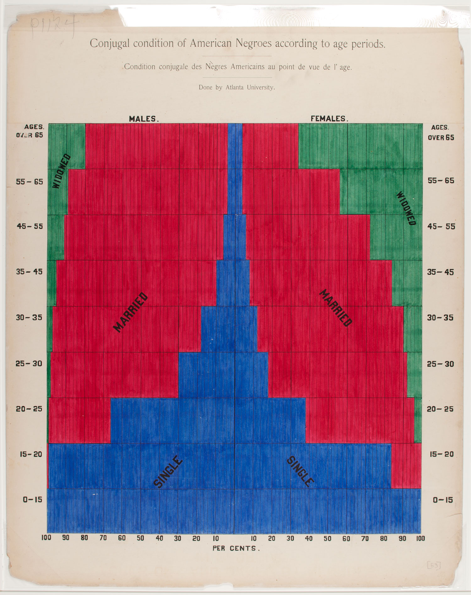
- Conjugal Condition of American Negroes According to Age Periods, “W. E. B. Du Bois: Charting Black Lives.”
When did Du Bois and his students actually make these graphics?
They were making these in 1900. He was commissioned to create an exhibition of these for the World Fair in Paris, the Exposition Universelle, the idea being to refute racist ideas about black inferiority. He decided the best way to do that would be through these charts.
He had less than four months to work with a team of students to create these charts, and you can see that. They’re amazingly consistent considering it was in such a short time with several people. But there are a few inconsistencies in terms of the way type was being used and font was being drawn, given the time pressure and working with several people at once.
Although the exhibition here features reproductions of the charts because they’re too fragile to travel from (The Library of Congress), we’ve printed them at the size they were originally. We haven’t touched them up at all, so they still have this sense of how they were formed. You can see the fingerprints; you can see the sketch marks. They’re quite tactile looking.
- Negro Property in Two Cities of Georgia, “W. E. B. Du Bois: Charting Black Lives.”
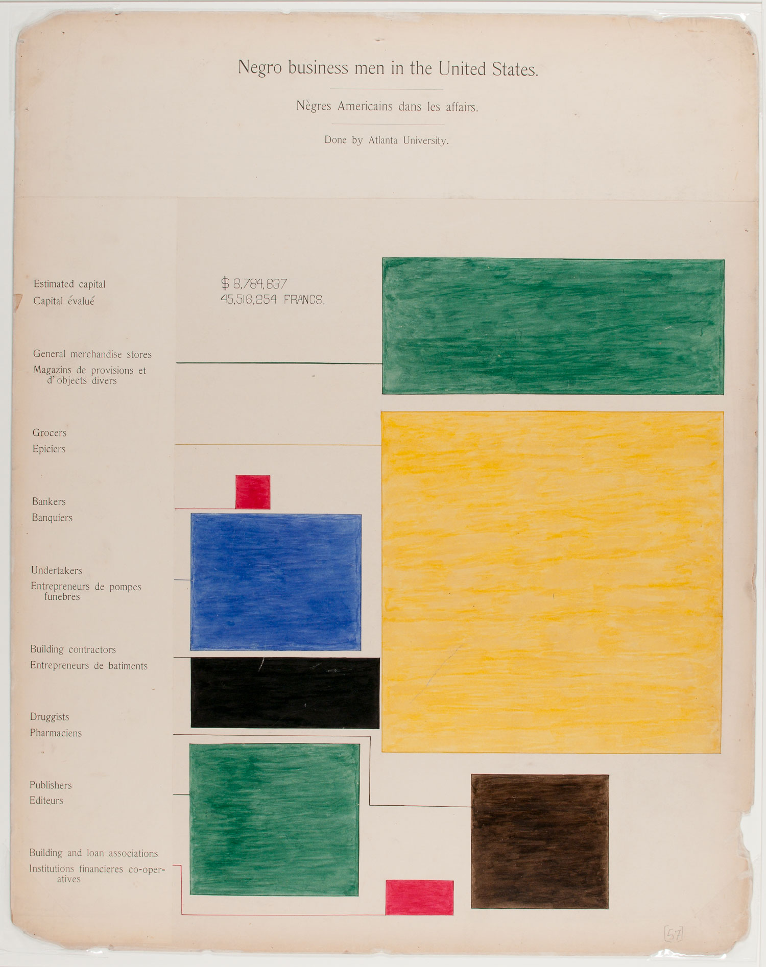
- Negro Business Men in the United States, “W. E. B. Du Bois: Charting Black Lives.”
What happens to this exhibit next?
At the moment we’re marketing it to tour. We’ve had some interest at popular venues but nothing confirmed yet. What we’ll do is wrap everything up for storage. If we have enough interest then we’ll be able to organize a tour where it can go to a few other venues, hopefully at least within the U.K. but maybe further. We’ve had really good feedback so far.
Photos Courtesy The Library of Congress
