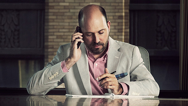
After more than two decades designing interiors, Tom Polucci has racked up a prolific list of achievements.
What design means to him:
“For me, it’s a couple of things. First and foremost, it’s about creating a solution to a problem. And problem isn’t necessarily a bad word—all kinds of things need to be solved.
Design is also about humanity. We’re designing space for people. People have to feel good about it. They need to be energized and excited when they walk into an environment. It needs to inspire them. They need to feel emotionally connected to it…there’s nothing worse than walking into a big, beige box.
Design is also fun because you get to know people when you’re working with them. There’s an intimacy between the designer and the client. You get to really understand their needs and issues and work together to create the best possible solution.”
Collaboration:
“I’m really proud of my relationship to the group of people I’m very lucky to work with every day. Design is not a single vision or approach. It can’t be. It takes many people to create the right kind of solution. Each person has a different specialization or expertise, and every person is passionate about something that can be brought into that project. Orchestrating that is probably my greatest thrill.”
His personal theme song:
“Right now, anything from Glee!”
Sustainable design:
“I like to use materials that people can ask questions about and point at but not just look at and say, ‘That’s sustainable.’ I don’t want them to say, ‘Oh, that’s bamboo.’ I want them to look at something and question it and go, ‘That feels like it has authenticity and character to it.’ I want them to wonder how it became part of the environment they’re in.”
What offices should be like:
“It’s exciting to see people own the environment and be behind the message. [In HOK’s new office, which Polucci helped design], when World Cup soccer was going on, there would be a dozen and a half people in the café, cheering when the USA games were on. That is really cool that there is a place blow off steam.”

Where he would go if offered a free plane ticket anywhere in the world:
“Rome.”
His favorite spaces:
“I like that spaces tell stories. It creates ownership not only for the team but also for the client. At the Washington University School of Medicine [Farrell Learning and Teaching Center] open house, the class president of the medical school got up and talked about how the building we had designed worked, even though he was never part of the design process. To hear him describe that was so thrilling. He completely got the building. He owned the story. He got the space and knew why things were there. It was intuitive enough.”
Favorite websites:
“NYTimes.com, UrbanSpoon.com, Gilt.com, RueLaLa.com, Ted.com, ArchiDose.Blogspot.com, and HokLife.com”
The greatest compliment he’s ever been given in his work:
“Probably that we listened to the client and exceeded their expectations.”
What he doesn’t leave home without:
“Sunglasses.”
Text by Jamie Hartford
Photos by Jane Gaspar
(A version of this post originally appeared in Design Bureau (2011). Published with permission.)


