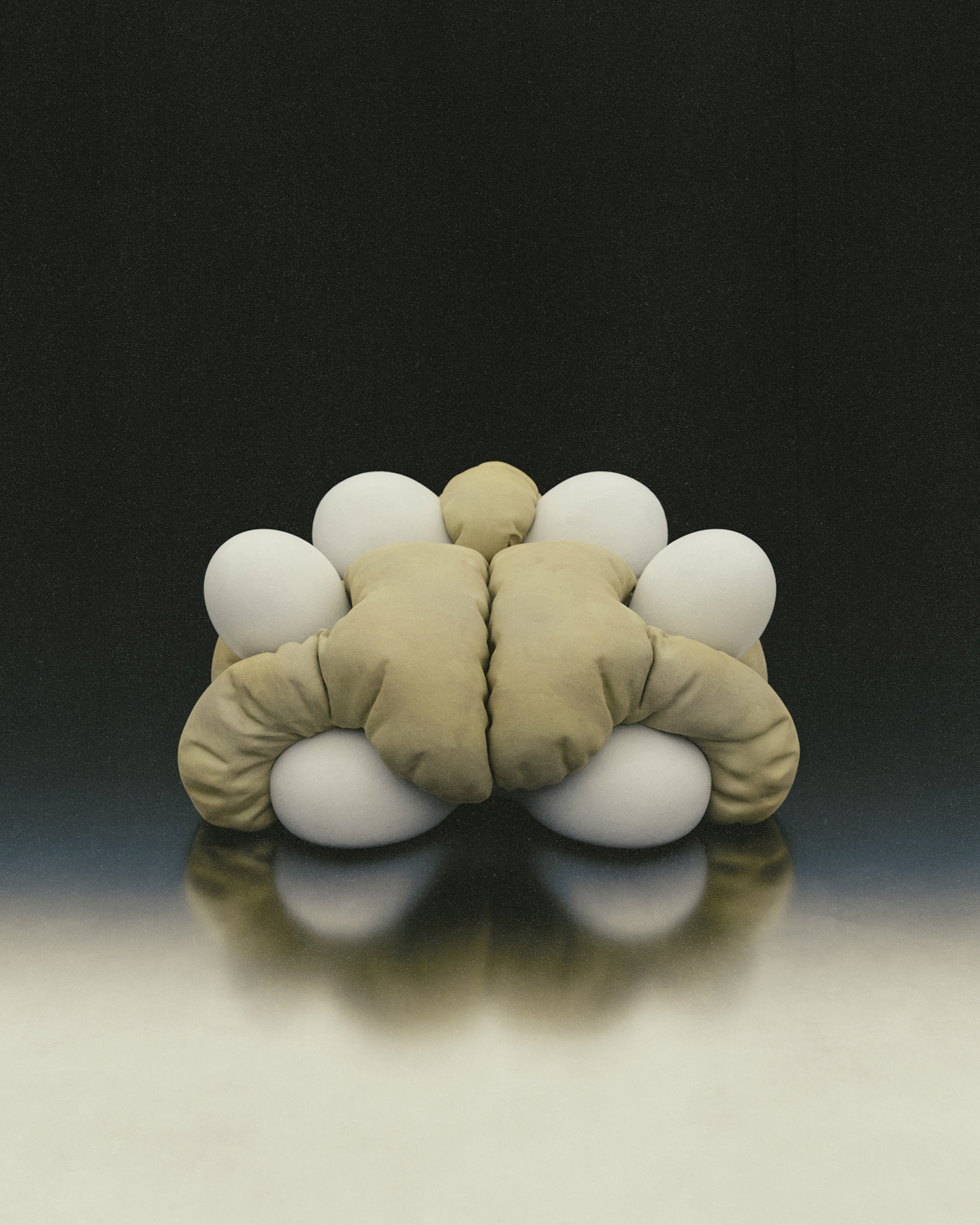
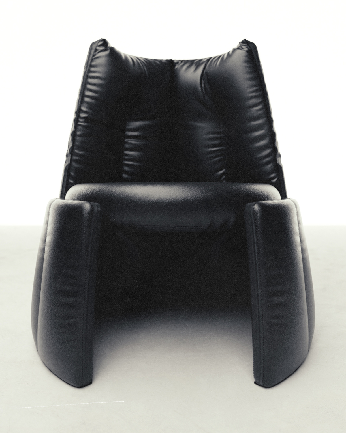
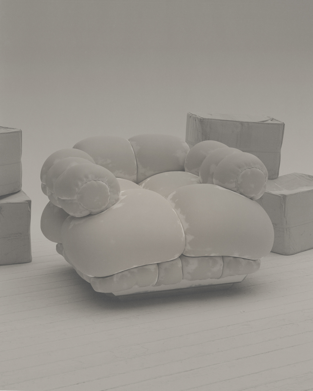
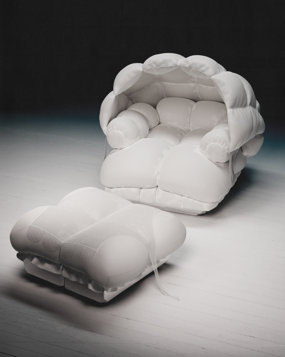
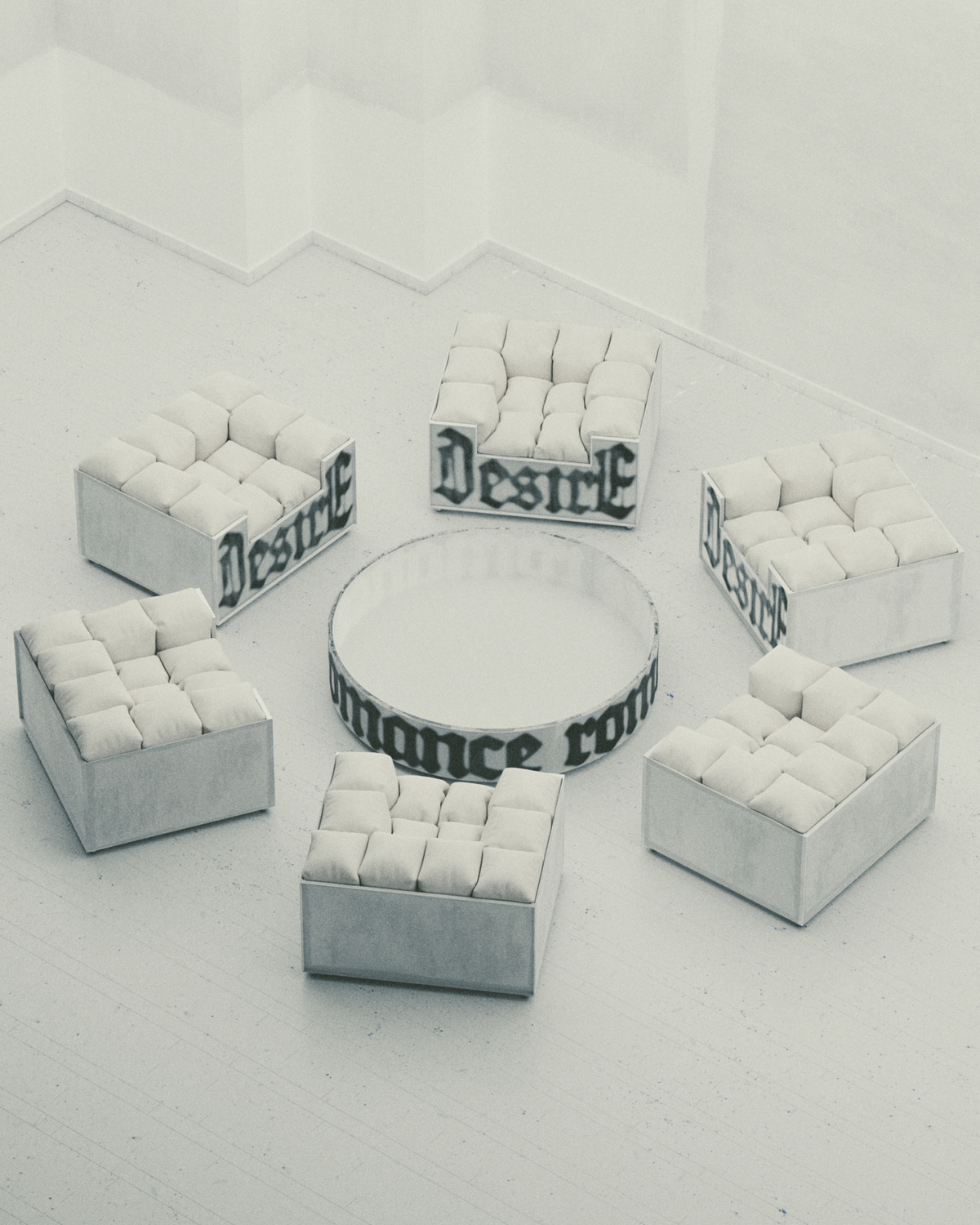
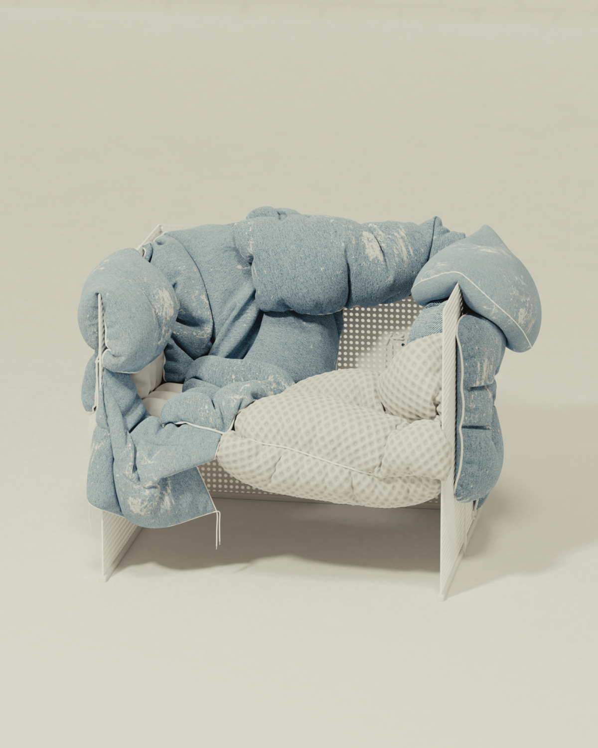
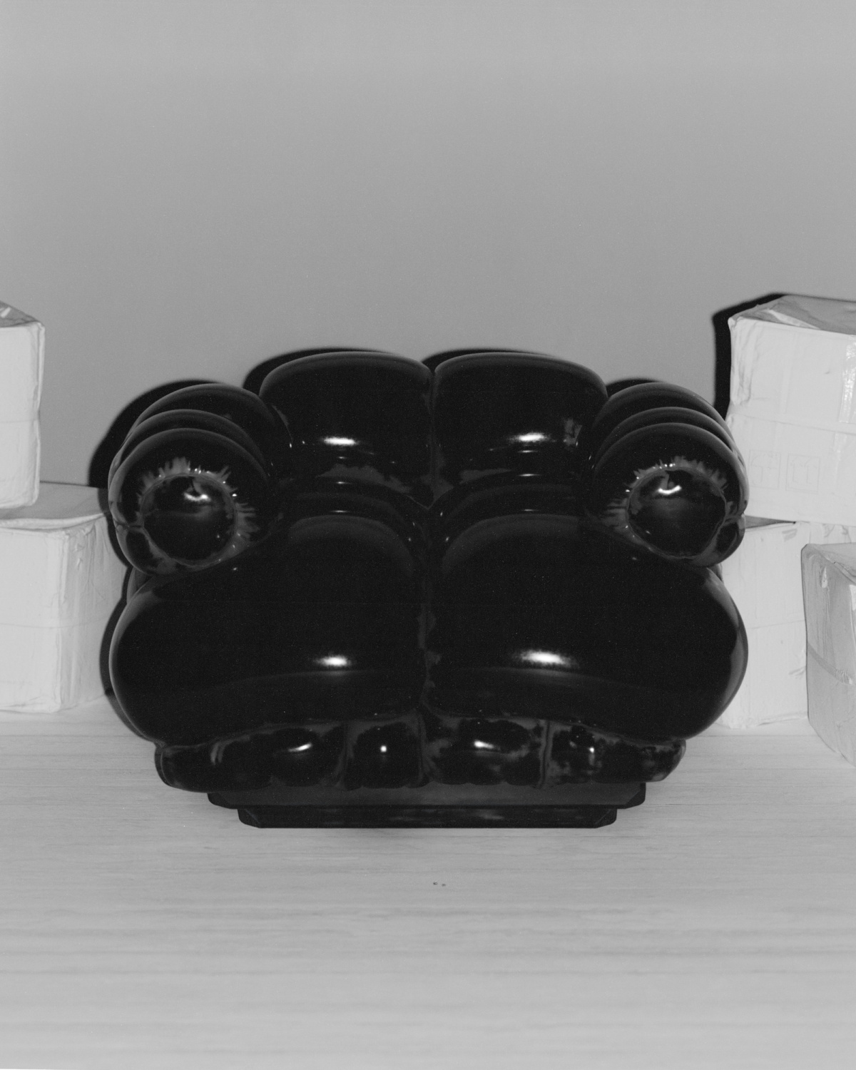
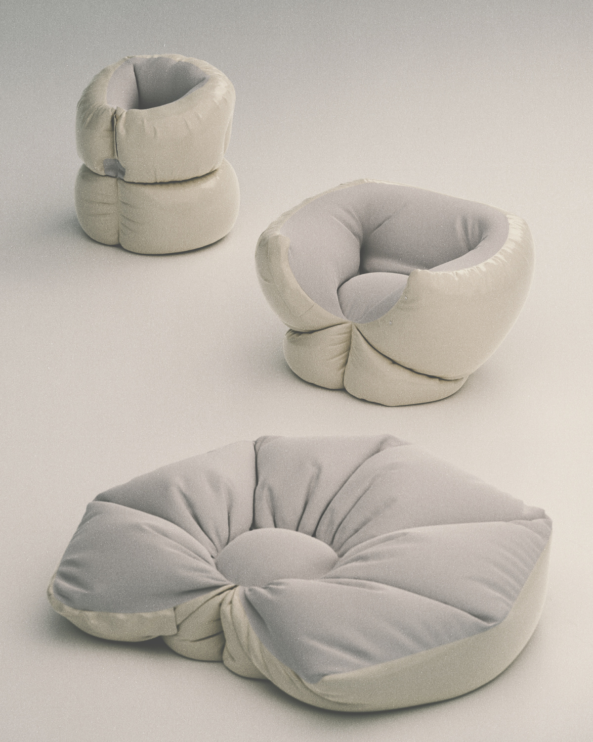
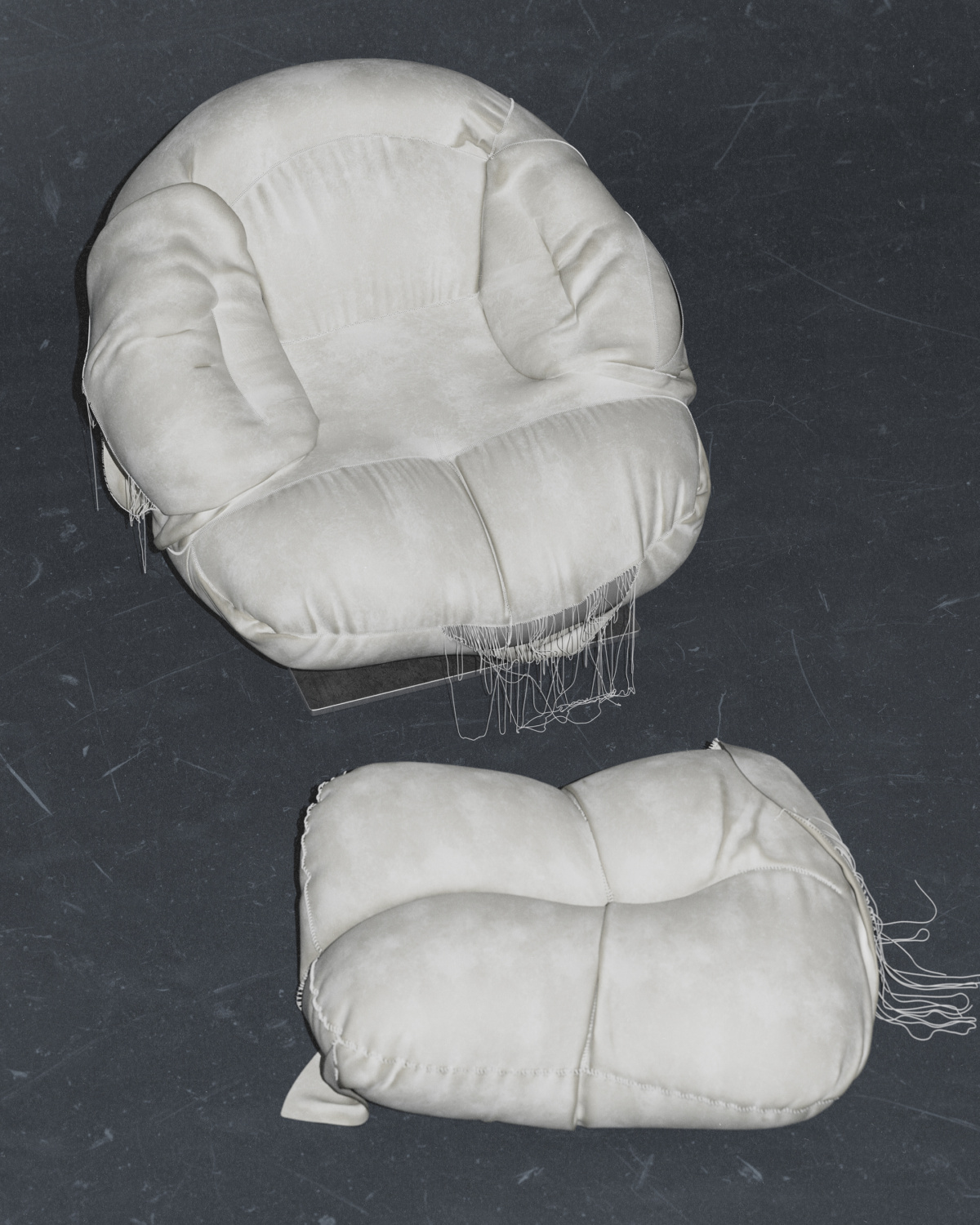
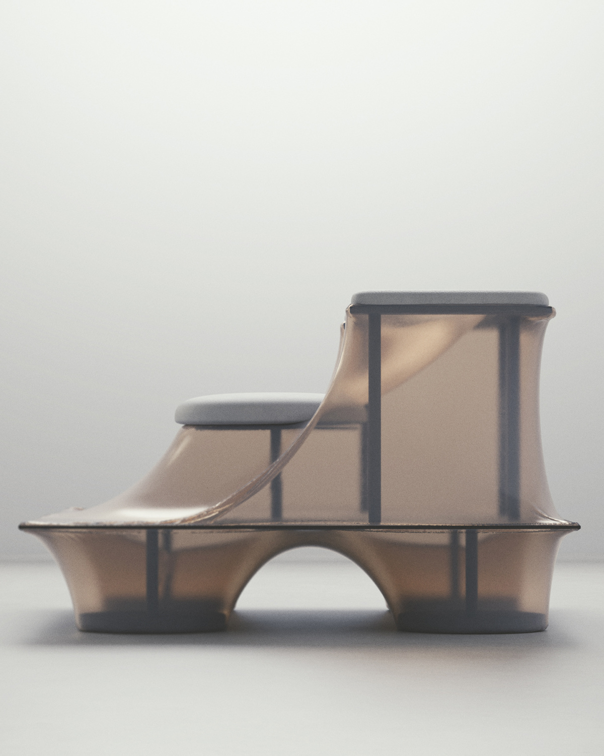
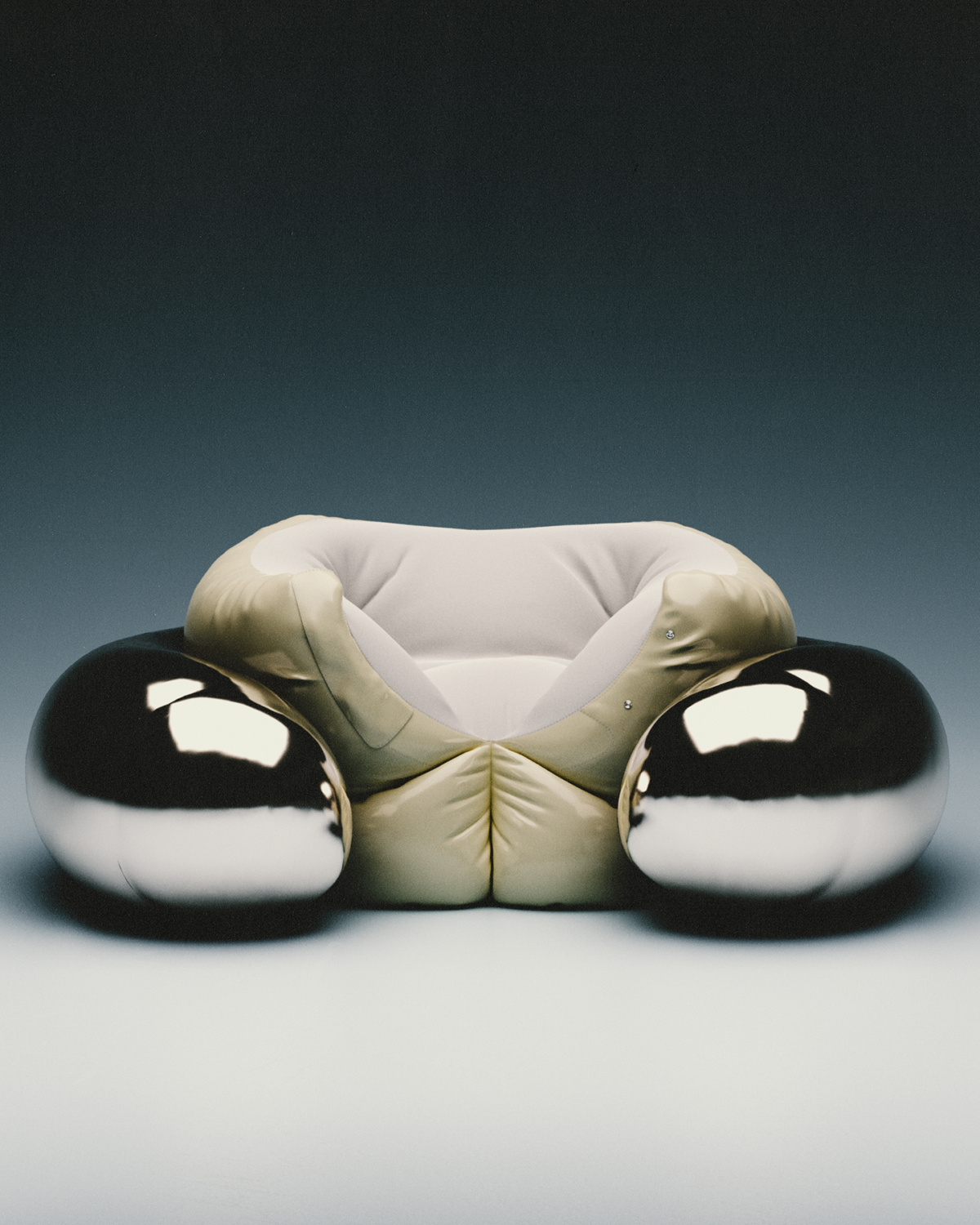
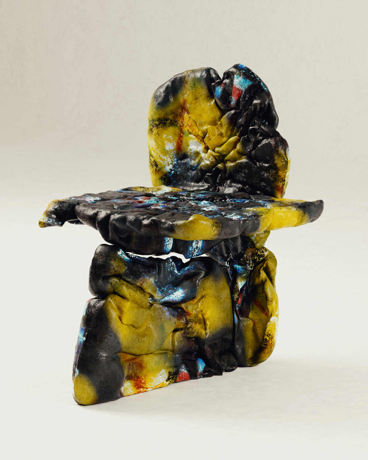
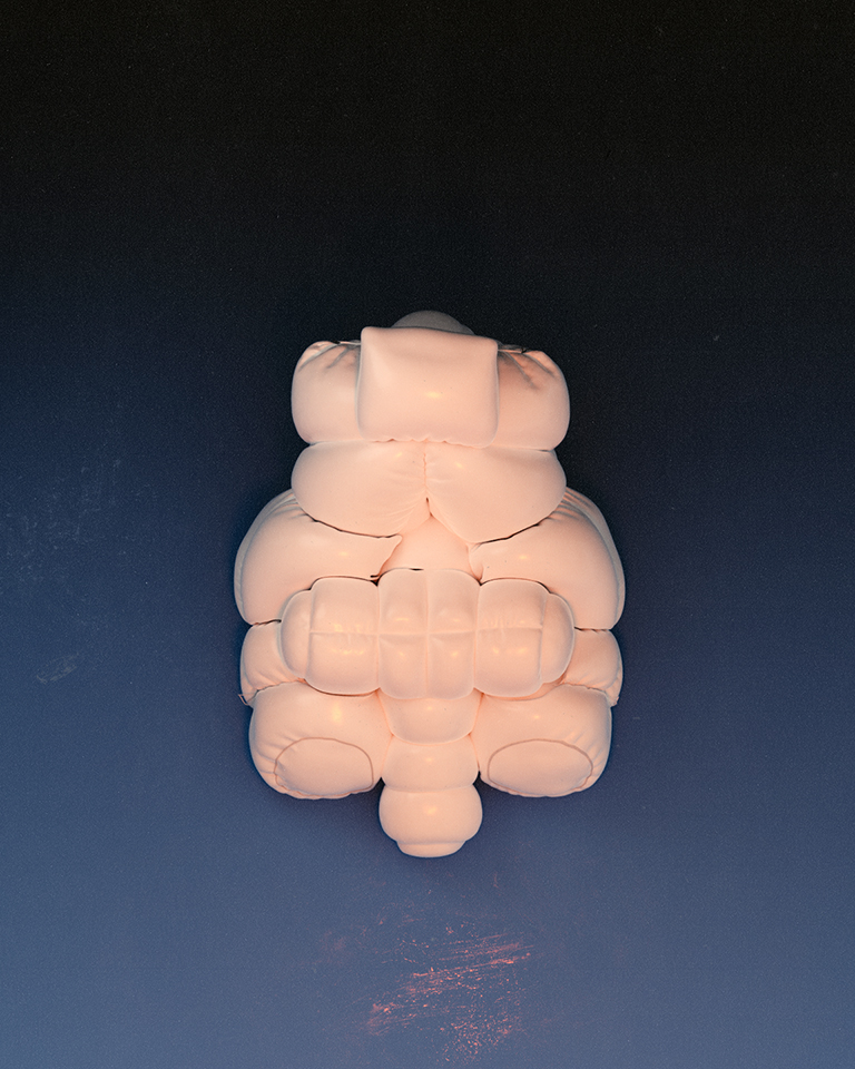
Four legs, a backrest, and somewhere comfortable to place your arms. These components make up your typical chair. Not so for set designer, furniture maker, and 3D artist Tom Hancocks. For him there may be a few more surprising elements thrown into the mix—say a deconstructed cushion, some tassels, or the words “desire” printed on the front.
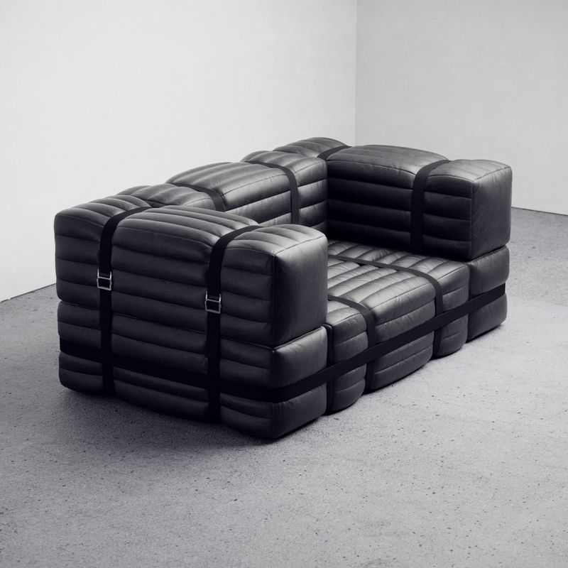
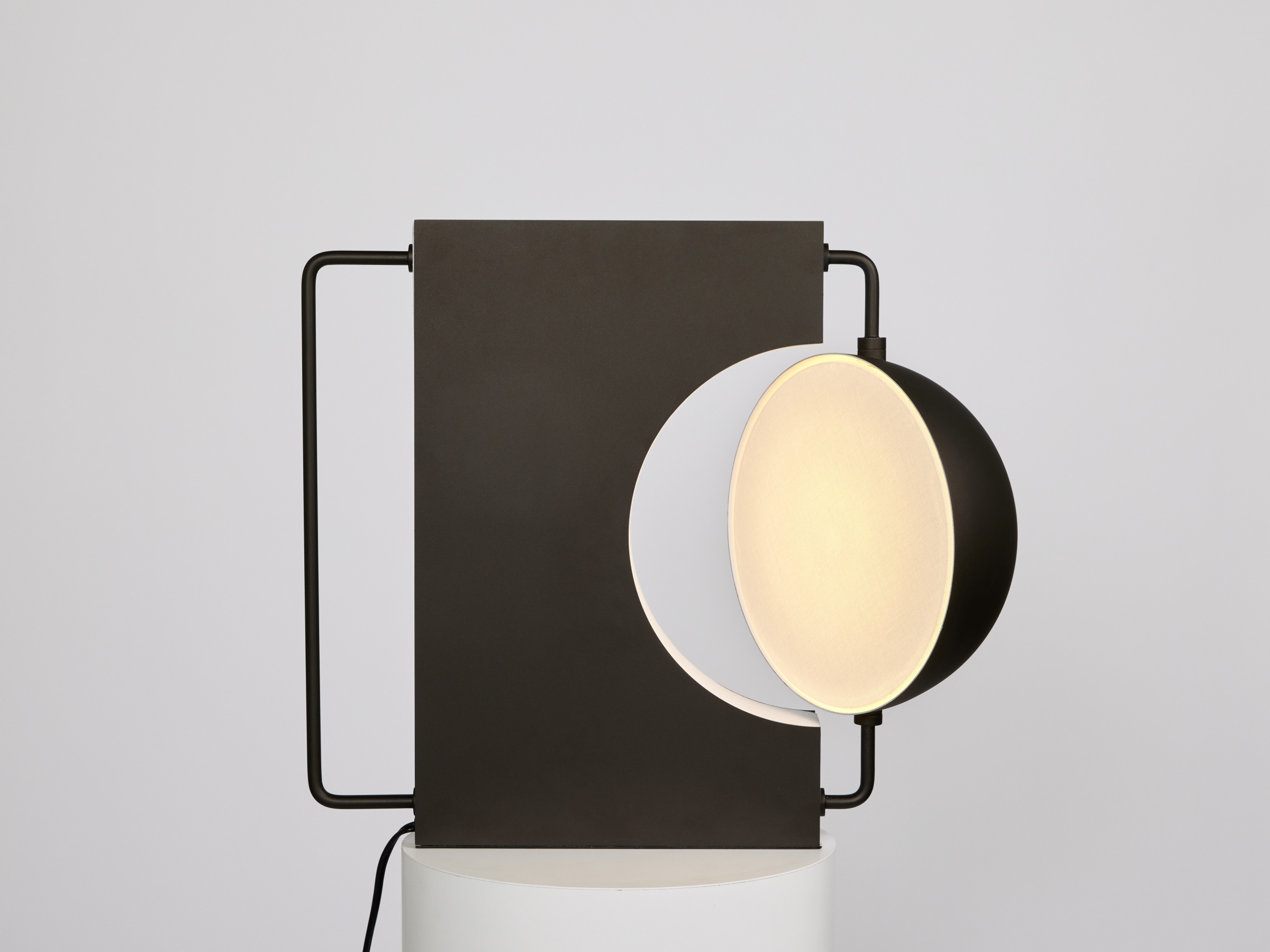
In Tom’s otherworldly designs chairs get an anthropomorphic makeover, sporting bubbly silhouettes and shapes that mimic clouds. At first glance they look exactly like chairs. But on closer inspection you start to notice ambitious material pairings—glass, brass, marble, unraveling seams, for example, which may be too costly or complex for the typical furniture maker.
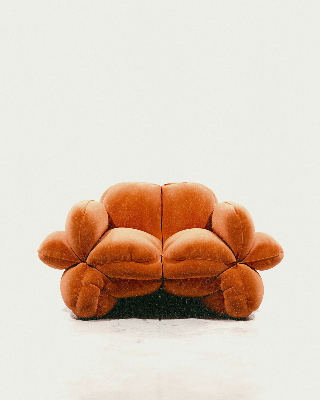
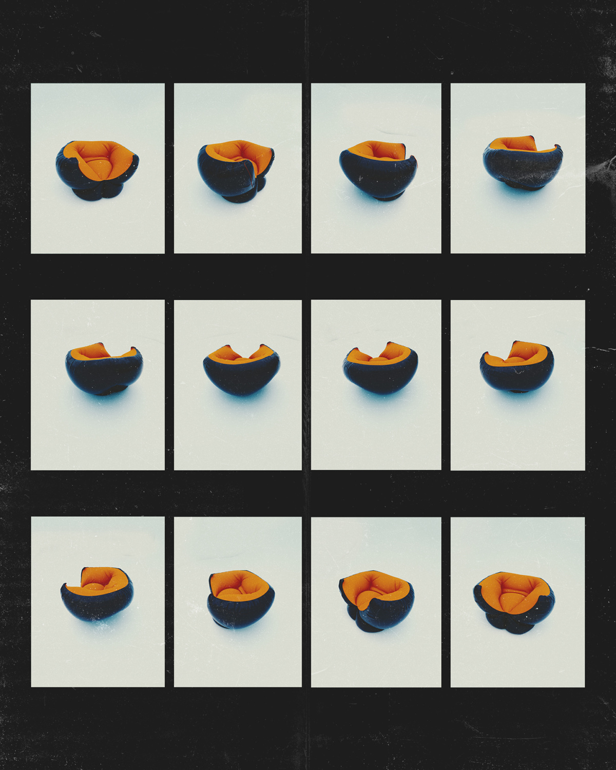
- An orange chair looks as if its central seam has been split open. The design was inspired by fashion techniques—how a jacket might open up and splay out.
- Working digitally gives Tom the ability to create without boundaries; it also reduces the material costs and is far quicker than making furniture in the flesh.
Tom, though, has no constraints because his designs are fully realized in 3D. If you were to request one of his furniture pieces in the physical form, he’d have to turn you down. “It’s a double-edged sword because you have that illusion at the beginning, and people question whether it’s real or not,” he says. “But then you have people reaching out, asking, ‘Can I buy this?’ Or they want to use it for something. You have to tell them it doesn’t exist—and you’re just a guy behind a computer at the end of the day.”
Originally from Melbourne, Tom has spent the past 10 years in New York. When asked to describe his journey to where he is today, he explains how he more or less fell into it. Growing up he never took his craft “too seriously” and perceived it more as a hobby, making GIFs for Tumblr in his spare time. “I wouldn’t share them with anyone now, but it was fun at the time,” he says. The GIFs, though, were just the beginning, as Tom now incorporates the same playfulness and experimentation into his own digital designs.
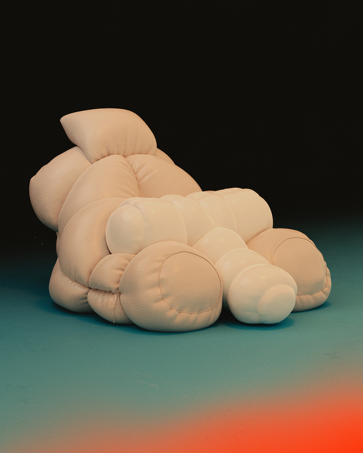
- Chair design for “Vital Pleasures,” part of Melbourne Design Week. The group exhibition asked designers to question what it means to design and create in a world of uncertain futures.
- Innovation and originality are two factors at the front of this designer’s thought process, and ergonomics comes nearly last—as that matters much less in a digital world.
Tom’s personal work—an ongoing series of conceptual chairs—is the most recognizable part of his creative output. Published solely on his Instagram page, he tends to make 20 or 30 versions of each in an array of colors before posting the final image online. The various iterations enable the designer to test whether the concept is worth pursuing further. In the end he’ll usually publish one or two ideas from the bunch.
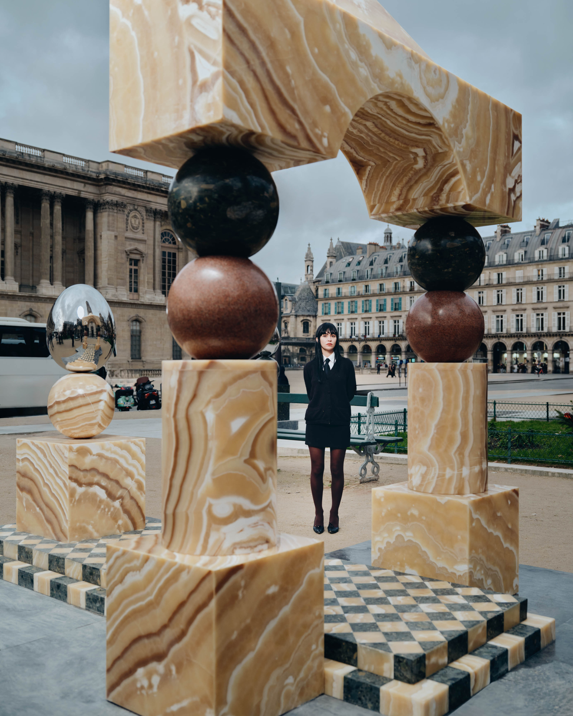
Sharing his work on social media garnered Tom clients. He’s steadily building a commercial portfolio filled with digital animations for brands and 3D set designs and visualizations for the likes of Dion Lee, an Australian brand based in New York and frequent collaborator. “The stuff that pays the bills,” he says. “Every now and then there’s an actual piece that gets made [in the real world], but the digital [products are] more frequent.” Tom is currently speaking with a gallery in Paris about a project, for example, so that’s exciting, he says. “With the help of the internet you meet people and put your work out there. It’s been a lot of being in the right place at the right time and having internet access for it.”
Working in the digital world makes sense for Tom. Not only does it give the designer the ability to create without boundaries; it also reduces the material costs and is far quicker than making furniture in the flesh. “If a piece of furniture is being built, then there’s a lot of back and forth with whoever’s making it,” Tom says. This is most prevalent when you’re working on a client brief and need to meet certain requirements. “It’s going to be 10 times more expensive to make it this way, especially if changes need to be made,” he says.
- Freedom to create transmits to the environments the chairs sit in, too. Sometimes the background leads the way in the design before choosing a chair.
- “Maybe I could spend too much money and make all this stuff,” Tom says. “But then do we need more objects in the world? … Conceptually you get just as much presenting an image as you do presenting an object.”
Innovation and originality are two factors at the front of this designer’s thought process, and perhaps surprisingly, ergonomics comes nearly last. “When you get the liberty of making digital work, you don’t have to worry about [ergonomics],” he says. Elements like comfort and function—say a suitable frame that will support your posture—may not make Tom’s priority list. When he does end up making a real chair, which isn’t often, some of the product design fundamentals could be lost. “You realize it’s something you’ve avoided a lot when you probably shouldn’t have,” he says, highlighting the importance of ergonomics in physical pieces. “I guess that’s why you end up sticking with the digital stuff more, because you get more freedom.”
- “I don’t know if there will be one perfect thing, but I think a perfect design is whatever expresses something new to you,” Tom says.
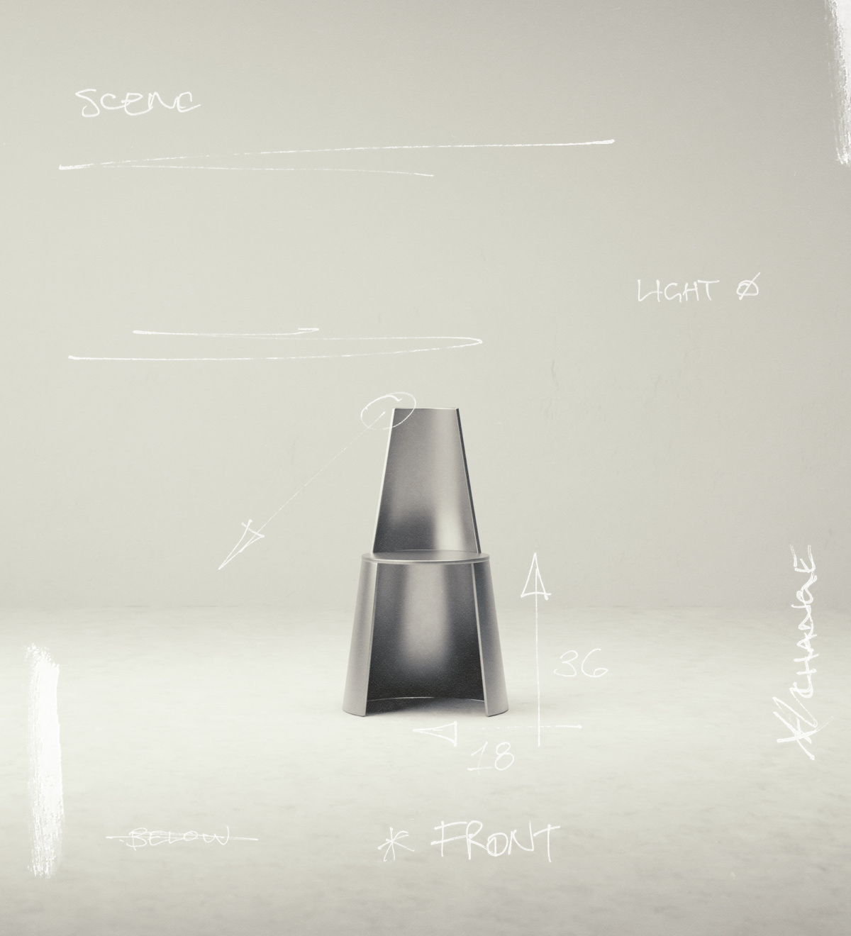
- A minimalist, sci-fi feeling is perhaps the common backdrop for Tom’s ongoing conceptual chair series.
This freedom to create transmits not just in the digital furniture pieces themselves but in the environments they sit in, too. For Tom it’s an even split between what comes first; sometimes the chair will initiate, while other times the background leads the way before pairing itself with a suitable chair or object. “That’s what I get hung up on. I’ll have one piece of the puzzle figured out, and I’ll be trying to see what other pieces fit with it.” Despite the back and forth, the most common backdrop for Tom’s designs sits harmoniously within the realm of sci-fi and minimalism. In a subtle nod to the white gallery concept—with walls so blank they could be paired with anything—Tom envisions gradient color palettes that reflect and complement the furniture pieces at hand.
Take the “cheeky” marshmallow design that appears soft like clouds. Positioned in front of a spacey emerald green, black, and red background, the chair appears comfortable but also problematic. You might wonder where you’ll perch and how you’ll get back out again; it looks awkward but appealing. Created for an exhibition in Melbourne, the piece was derived around the topic of “pleasure-related furniture,” says Tom, further using the words “sexy, squishy, body-kind-of-feeling” to describe it. “Not to be coy about it—I took the sex furniture approach, but I didn’t take it too literally.”
In another design, a bright orange chair looks as if its central seam has been split open. This one was inspired by fashion techniques—how a jacket might open up and splay out, Tom says. Incorporating fashion hardware and details and seeing how they’d interact with furniture, the resulting piece is much more plausible for the physical settings. “I think it would be fun to explore it in real life,” he shares, hinting at a possible future project.
It’s clear that designing digitally has many benefits. Beyond speed and cost savings, Tom finds working in 3D relieves some of the pressures of the physical world. With the influx of imagery and information online, his audience may not interact as much with his designs as they would with a physical piece of furniture—and to him, this isn’t necessarily a bad thing. “People aren’t investing as much time into it, and there’s not as much pressure with people seeing it for that long. Maybe people will only see it for a few seconds on Instagram, but at least for me, it’s still there as a portfolio,” he says.
In this sense Tom’s digital designs can be viewed as a portfolio of his favorite personal works and a source of inspiration for him to refer to later. “It’s the best of both worlds. You can have it as a reference and you’re not stressing about spending $2,000 or spending two months making a product. It’s something fun you did, and you can show people.”
Despite the many benefits of digital design, the temptation to bring his objects into the physical realm is slowly increasing for Tom. So will he ever leave the digital world behind? “Maybe I could spend too much money and make all this stuff,” he ponders. “But then do we need more objects in the world? It’s definitely not a necessity for society. And conceptually you get just as much presenting an image as you do presenting an object.”
Digitally, he says, he can make whatever I want. “I don’t know if there will be one perfect thing, but I think a perfect design is whatever expresses something new to you. I try to avoid that mindset, where something has to be too idealistic. The more expressive it is, that makes it perfect.”
A version of this article originally appeared in Sixtysix Issue 10 with the headline “Perfect Expression.” Subscribe today.
