I’d been walking around New Orleans all morning and afternoon when I turned the corner and finally found a bit of respite—the Eliza Jane. On a relatively quiet side street (compared to the heart of the French Quarter), the hotel’s Press Room bar and lobby area called to me—have a glass of $5 wine (happy hours are a godsend), sit by the fireplace, peruse some old books, and sink down in one of the overstuffed couches and stay awhile. And so I did.
Establishing such a distinct sense of place in what is a new location is no easy feat, especially when you take into account things like hotel brands. The Eliza Jane opened in 2018 as part of the Unbound Collection by Hyatt, but the property feels both like it’s been there forever and that it’s right at home on Magazine Street. Careful consideration of location and history plays a huge role in making places that are built to last, according to Sherry Dennis, senior interiors associate at Stonehill Taylor, who designed the Eliza Jane. Sherry and the design team put in many hours of thoughtful research and planning when it came to developing a strong narrative for this and other beautiful hotels across the country. “We start each project with a lot of research. You don’t want to be in Aspen in a hotel that feels like it should be in Key West,” Sherry says. “The place really informs what the design is going to be.” We recently talked to Sherry about the importance of location, the future of hotel design, and just how she found herself among the designers who define the places we want to linger.
Tell us about how you got into design. Where did your journey start?
I always wanted to be an architect growing up as a kid, so I went to college and majored in architecture. Then I came to New York and got a job at this architecture firm, and I worked there for about nine months until an opportunity came around on the interior side of our firm, which is a bit more design-related. I helped out with that project and kind of never went back to the architecture stuff. I’ve been on the interior side for about 14 years.
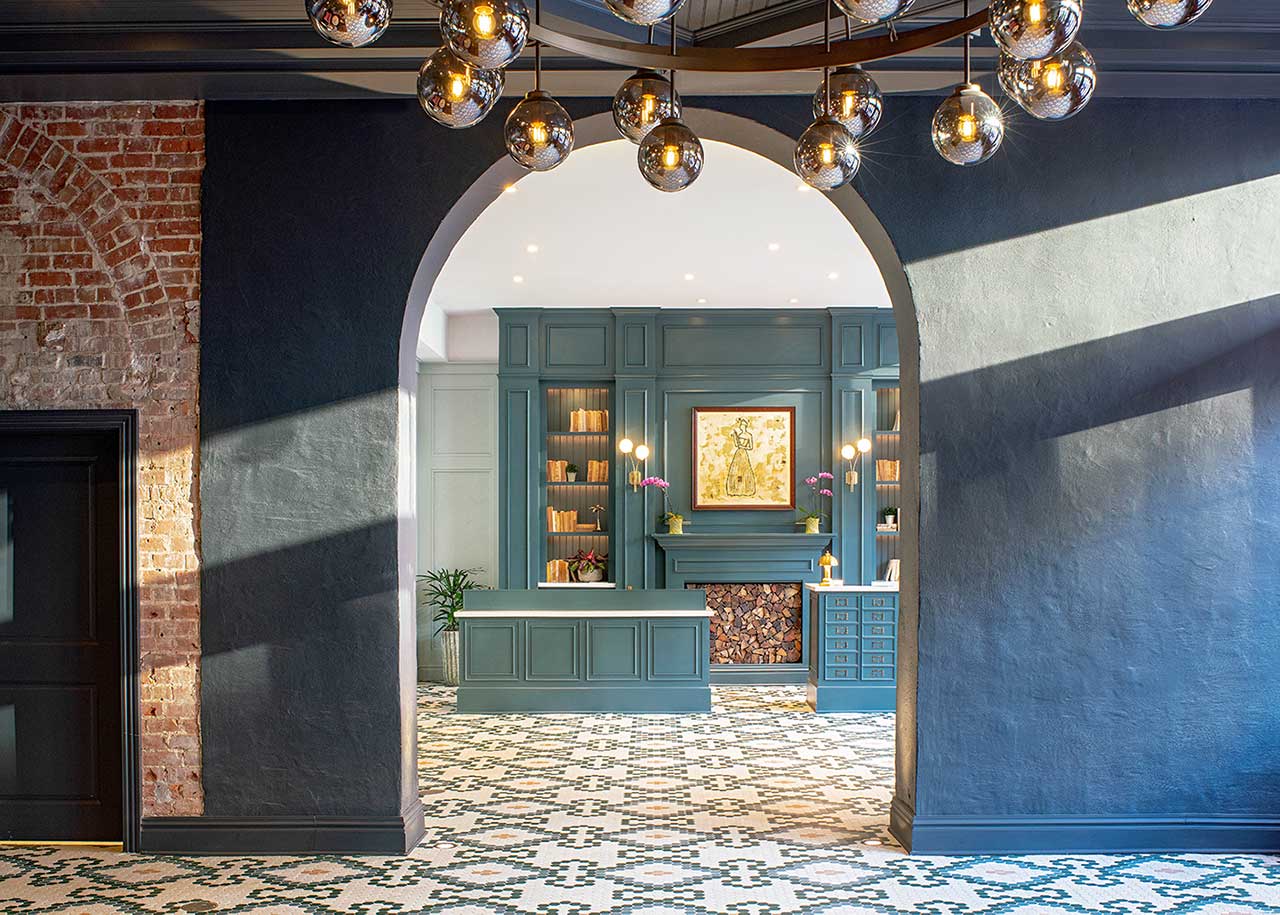
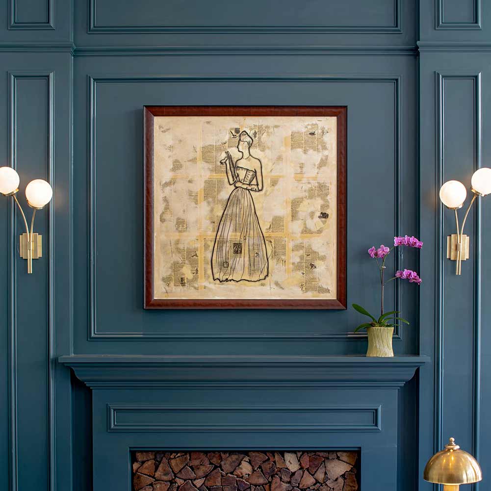
The Eliza Jane space pays homage to its past occupants—The Daily Picayune newspaper, plus Gulf Baking Soda company, Peters Cartridge shop, and Peychaud Bitters factory. Research revealed one standout tenant, Eliza Jane, publisher of The Daily Picayune. The first female newspaper publisher in the country and a larger than life New Orleans figure, she evolved into the namesake and persona of the hotel. COURTESY OF STONEHILL TAYLOR.
I always thought being an architect was like being a designer, and I think that line is extremely blurred—it’s not black and white between interior and architecture. In a lot of firms, architects do everything or interiors do everything, and it just happens to be that at Stonehill Taylor we have architecture with a capital “A” and interior design, which is more on the design side. I guess I always wanted to be a designer, and in my mind, that was architecture because architects design as well; it just so happens that in our firm I fall on the interior design side. I don’t feel like I chose interior design; I feel like it’s all the same. I consider myself an architect by training, but on the design side.
Tell me about some of the exciting work you’ve done recently with Stonehill Taylor.
The Eliza Jane—that whole process was amazing; the clients were amazing. We always start every project with a narrative based on the site and we do a lot of research, and New Orleans is New Orleans. There’s nothing like it. So we did a lot of research on the building, and the building had so much history and so many stories—it’s almost like we had to narrow down our narrative because there’s just so much history and information. That was just an amazing project because of the clients and because of the brand, everyone wanted to see the narrative through. A lot of times it’s like we start with a narrative and then it gets watered down and you can’t get back to it, but the Eliza Jane came out of history. The main thing about that project was the layering. New Orleans has a layered history. And then the buildings have layers themselves. There are these secret interior courtyards, our building had that, and it was everything that was New Orleans. That project, from start to finish, never lost the essence of what we were trying to do. The mayor was at the opening and was very excited about how it was a nod to what New Orleans truly is. I felt like a lot of our recent projects had been for a brand, but this was really truly for the city, and that has to be one of my favorite recent projects.
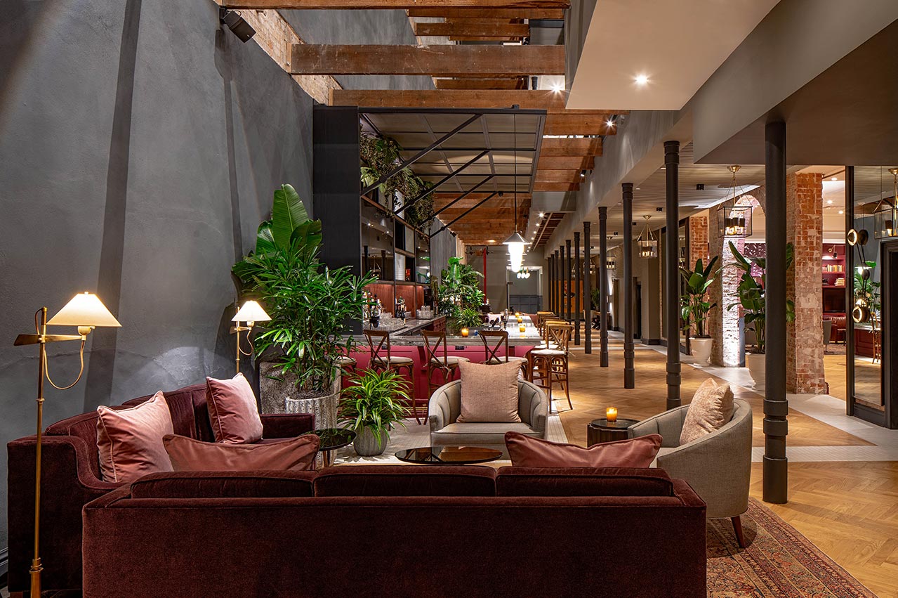
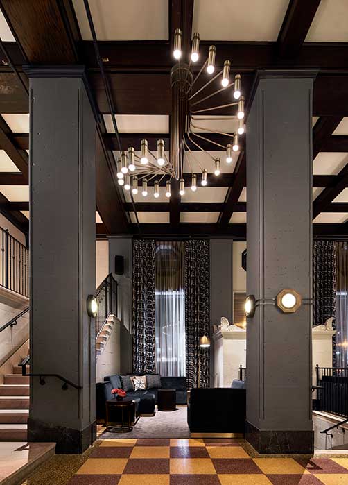
Stonehill Taylor transformed the interiors at The Eliza Jane, a 196-room hotel on Magazine Street in New Orleans. The hotel is built within seven historic warehouses that stand distinct on the outside but have been connected with luxurious accommodations and a 2,000-square-foot interior courtyard. COURTESY OF STONEHILL TAYLOR.
How do you celebrate the history of a place but still create a new, exciting property?
We always want the hotel to also have a sense of place and be unique, so we like to be more of a nod to the place. For instance, take the Holston House in Nashville. It’s very easy to be like, “Let’s make it honky-tonk music” or whatever, because that’s what New Yorkers know of Nashville, but we don’t want to go that way. What else is Nashville? We don’t want to see designs that are stereotypes of a city. Could we have done Mardi Gras in New Orleans? Sure. But instead we chose the history of the street, which is Magazine Street, and the history of the building, which housed a factory for bitters. Then of course there’s Eliza Jane herself [the first female newspaper publisher in the country]. We like to dig a little bit deeper.
“It’s about being creative but knowing when to put the pencil down.”
We feel like with Eliza Jane we really got to the heart of the building. There are seven buildings in a row, and we broke through the walls to get through the corridors of the hotel, and through each corridor we wanted you to know you were in a different place. For example, there’s the newspaper part, and then you go through a roughly cut brick wall and enter a different warehouse and that’s where the bitters were. Sometimes we get buildings that have no history at all, and we have to make something up, but we definitely don’t play on stereotypes and we try to go way deep into history.
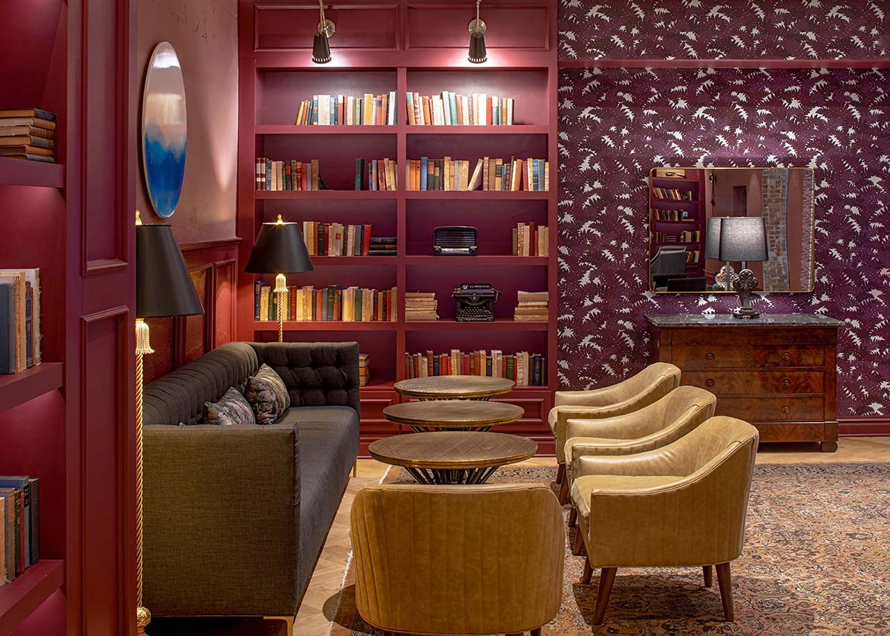
‘There was an architect of record in New Orleans and we worked hand in hand with them to break through the walls and convert the warehouses into guest rooms and make the whole entire thing a hotel,’ Sherry says. COURTESY OF STONEHILL TAYLOR.
How do you find a narrative if a property has no history, though? Or what if it’s a renovation?
We did a project a few years ago called the Renwick in New York. It’s a very Gothic style of architecture. We were looking into the history and were kind of like, “Eh,” but then we found an original certificate of occupancy that talked about how it originated as artists’ studios. So our entire narrative was based on this being a hotel for artists—not just painters or drawers, but writers, filmmakers, and photographers. We drew our entire narrative from finding that one certificate from like 100 years ago; that stuff is like gold.
You can pull a narrative from anything. If you’re talking too about renovations versus a new build, we’re doing a lot of new builds lately, and for that, we have to work with the architect. The envelope of the building somehow has to be in a conversation with the design that we’re doing on the interior of the building, so we work very closely with our architects. It’s not like we’re doing our thing and they’re doing their own thing; we want to make sure it’s a cohesive product.
How would you describe Stonewall Taylor’s aesthetic overall?
I feel like we pride ourselves on not having a look. We like to do good design, so I’d like to think someone would walk into one of our hotels or projects and think, “Oh, this is good design and I can kind of see the story they’re telling. Maybe that’s Stonehill Taylor,” but we don’t have a look and I think that’s primarily based on the fact that every time we start a project, we have a new narrative and we start with a place. Every project is different. I don’t believe Stonehill Taylor has a look, but I hope the look we do have is good design.
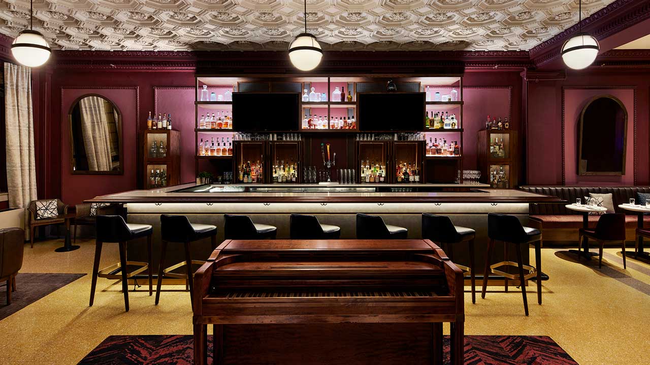
At Bar Tenn, inside the Holston House hotel in Nashville, a repurposed vintage piano anchors the space and also provides guests a spot to rest their drinks. COURTESY OF STONEHILL TAYLOR.
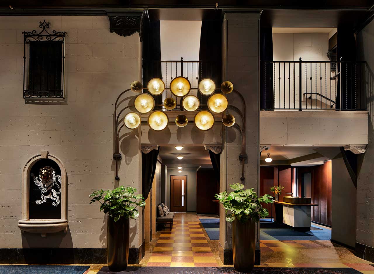
For Holston House, Sherry and the design team wanted to draw on Nashville’s musical heritage without being on the nose. This entryway light fixture, for example, was inspired by Phil Spector’s legendary Wall of Sound production technique. COURTESY OF STONEHILL TAYLOR.
Are hotel imprints a symptom of poorly designed hotels? Is there a need for big, globally consistent hotel brands anymore?
You have to think about the clientele and the people going to these properties. I know a lot of people who like brands—there are a lot of people who like to use their points. The world of hospitality does seem very small, but it does have to facilitate everyone out there. There are people who travel a lot who want consistency, and those big brands offer consistency. It does have a place in this world, and people want to use their points, whether for business or pleasure, and they want to know that if they’re staying at a branded Hyatt somewhere, that’s going to be consistent in a different country or different place.
But I still feel like there is a need for the Airbnbs out there because there is also that clientele. There are people who want to know exactly what they’re getting into when they open the front door and there are people who want a different sight every time. I also feel like those may seem like different spectrums, but sometimes that might be the same person. It depends on where you’re going, why you’re traveling, and what your needs are. I do still feel there’s a need for branding. Personally I like the one-offs and boutiques, but if I had a shit-ton of points and I just wanted to leave for a couple nights, I’d want to use that, too.
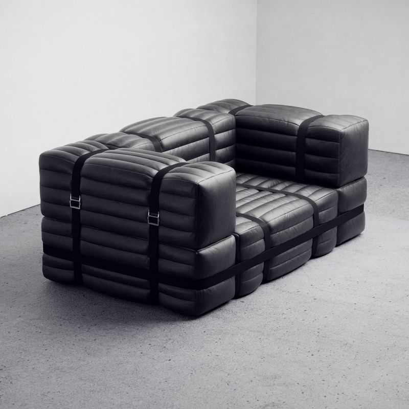
- Leather furnishings and terrazzo floors feature prominently at the Holston House lobby…. COURTESY OF STONEHILL TAYLOR.
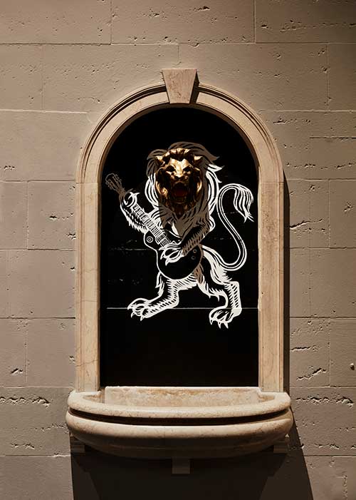
- …as do subtle nods to Nashville’s musical legacy. COURTESY OF STONEHILL TAYLOR.
How does the evolution of hotel design fit into that story?
Right now we’re working hard to make hotel designs feel residential. I don’t know where it goes from there.
Think about back when everyone thought outlets beside the bed looked really ugly, so we started hiding them, but from an operation standpoint, when no one could find the outlets and called the front desk complaining, it came back around and we started making them visible again.
Back in the day everything matched—the nightstands matched the drawers and everything was wood. Now I feel like we’re making it feel more residential, like your home. We’re designing hotel rooms that aren’t matchy-matchy. But I don’t know if things will go back to the old way. I feel like the residential trend is going to last for a little while.
Read more hotel, hospitality, and interior design stories at Sixtysix.
Hospitality design also seems to be moving hyper local, trying to cater to local markets. Is this ever an ethical concern for you? At what point is a multinational company bullying local business?
I don’t think the hotels we are doing are taking away from local business. What we’re doing now when we do design locally is like offering a place where you can buy flowers or get coffee. I think we are adding to the community, and that’s hospitality. I don’t think it’s gone that far, so right now I think it’s a positive thing. We did a hotel in Portland, Maine, called The Press Hotel, and it was very localized and very part of the community. The client with the firm lived locally, was very involved, and was all about trying to enliven the community there. They even have an art walk in Portland, and we designed a gallery for local artists and became part of the local art walk. We always make a point to involve any kind of local businesses, and I still think we’re contributing and involving the local community. It only helps the property if the neighbors are also happy about the property.
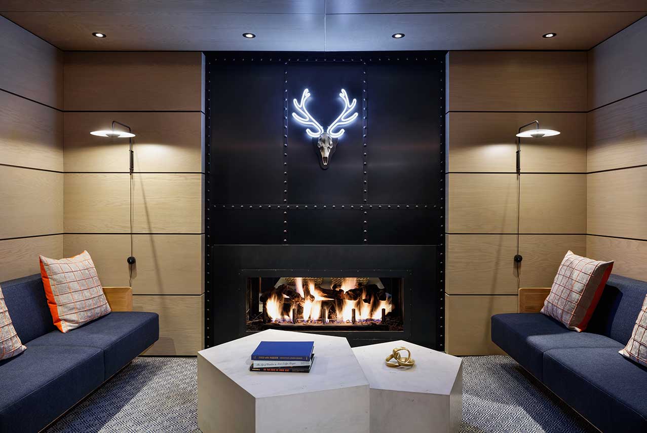
For the Limelight Hotel Snowmass, near Aspen, the design team looked to juxtapose comforting earth tones with colorful accents—like the neon antlers that overlook gray pentagonal tables below. COURTESY OF STONEHILL TAYLOR.
Was there ever a time when you had a particularly difficult client or project?
The challenging thing is trying to keep up the narrative. We try not to change it. I think one of the most challenging parts of design is the initial presentation—where it’s a concept and it’s amazing—and then having to bring that through. That does happen sometimes where the difficulty becomes carrying the initial thought throughout the entire project. We had a recent project where the client did remind us, “You sold us on this concept and narrative, and I want to make sure you tell us how this is getting carried through.” You do get lost a little bit in the process and need to make sure you’re not becoming a robot and just knocking things out.
How do you make sure it’s not just going through the motions?
Metal on FF&E can be very expensive, so if metal somehow was a part of the narrative and to make a piece of furniture less expensive we need to get rid of the metal, we need to intelligently think—and we do this with our industrial designer—how do we still make this have a nod to metal even if it’s not really metal? Maybe we have a different material veining through some wood that looks like metal. We need to reinvent the piece in an economically intelligent way that still works with the narrative that has to do with metal. You can’t just get rid of stuff; you have to rethink it. It’s always on an item by item basis.
How much of being a great interior designer is the creative brain versus business brain?
I would have had a different answer seven years ago, but I’ve been in the business long enough to know there is that business side. We have fees and you can’t burn through those fees. It’s about being creative but knowing when to put the pencil down. Because you’ll never stop designing, you could go forever, but in a business world, that does not work. It’s a time-management thing. You have to set deadlines for yourself; it’s how creative can you be within this deadline, not how creative can you be if you had an infinite amount of time. From a business side, you have to trust yourself, know you made good creative decisions, and then go with it and move to the next thing. From a billing side, because I’m also a manager, I don’t want my people working until 2am every night because that’s not physically plausible. They might want to because they’re younger and enthralled in design or whatever, but that doesn’t make a good designer. Just because you keep designing and keep overthinking doesn’t make a good designer; a good designer in the business world is someone who trusts themselves, is confident in themselves, and knows when to stop and move on.

Sherry Dennis. COURTESY OF STONEHILL TAYLOR.
What is the biggest challenge of hotel design?
I was in a restaurant in a neighborhood I used to live in like two nights ago, and I know that restaurant is 10 years old, but if I had just gone in there for the first time two months ago, I would have thought it was new. With a new build, when you’re designing something that isn’t going to be birthed for four years or five years, you can’t be trendy. You can’t be like, “Oh, this lamp is the hottest lamp right now. We’re going to use it,” because in five years it won’t be the hottest lamp. So I think that’s the biggest challenge—like how do you design something that is new and cool and in the moment, but five years later isn’t old and dated and tired? I don’t know the answer to that, but it’s a challenge. You have to think, “Will this survive five years from now?”
