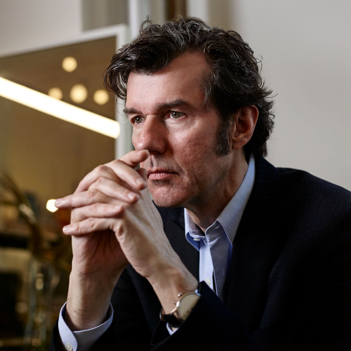
Stefan Sagmeister appreciates a good view. His design studio, Sagmeister & Walsh, which he runs with his partner Jessica Walsh, overlooks New York City’s bustling Broadway Avenue, the Flatiron portion, and his West Village apartment looks out on 14th Street. He also loves spending time on trains, zooming past landscapes from a cozy window seat. The fact that Stefan, 56, enjoys a good view makes sense for his career. He’s a designer first and foremost, who also occupies territory in film, performance art, book publishing, music album packaging, and conceptual exhibitions. Born in Austria, he earned an MFA at the University of Applied Arts in Vienna before decamping to New York City’s Pratt Institute on a Fulbright Scholarship. In 1993 he opened his namesake studio, with a focus on designing for the music industry, racking up cover credits for Aerosmith, Lou Reed, and Jay-Z, among others, and two Grammy Awards for art direction and design. The studio diversified its client list after a few years because, as he once said to Dezeen, “the 29th cover wasn’t as much fun as the first.”
In 2012, Stefan added Jessica as a partner, titillating the industry with his announcement—an email blast featuring the duo posing nude. A career full of eccentric stunts—to promote a 1999 lecture he was giving, Stefan had the details of a poster carved into his own skin—and eye-popping designs—see The Rolling Stones’ visually textured Bridges to Babylon album cover or photos of his “The Happy Show” exhibition, which took over the ICA Philadelphia’s second floor with a graphic exploration of happiness—have earned him the reputation of a provocateur. Adding to that reputation is his inherently anti-capitalist stance on time off, forever canonized in a TED Talk.
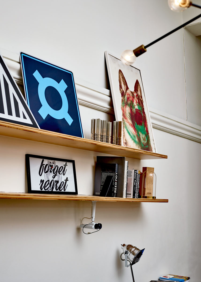
On a frigid Saturday morning, after a run on the High Line and a lengthy client meeting—an unusual itinerary, says Stefan in his distinctive Austrian accent, as he generally doesn’t work on weekends—we meet at the Sagmeister & Walsh studio. The work space is a bit unkempt, or “lived in,” with scattered soda cans and dog toys, and it’s also on view for anyone with a WiFi connection, as the studio’s website runs a livestream of the Sagmeister & Walsh offices 24/7. If you tune in at 9pm on a Thursday, you may still find a few designers clicking away, providing unfiltered exposure to the studio’s day-to-day operations, and to about a dozen employees who are extremely invested in their craft. (The studio has 10 full-time employees total.) Other artists have tried to copy this perpetual livestream on their own sites, Sagmeister reveals, but the system was developed by a Google X engineer and, according to Stefan, those copycat attempts have failed.
- Photo by Noah Kalina.
- Photo by Noah Kalina.
Was there a moment when you decided to become a graphic design artist?
I consider myself a designer more than an artist. I went to design school and ultimately what Jessica and I run here is a design office, where most people have a core design education, but we run a practice that sometimes goes into the space that’s normally occupied by the art world because we do exhibits in museums or galleries—but we still see everything we do as design. The way I became a designer is that I was—and I don’t mean this lightly, I mean this really—fortunate to know very early on what I wanted to do. At 14 or 15 I played in bands—not very good ones—and I started to write for [liberal magazine Alphorn] and then discovered it was more fun to design the magazine, if you could call that design, it was all very rudimentary, than it was to write.
Plus, knowing from playing in bands that there is a job designing album covers, I was not alone among aspiring designers in thinking it seemed like a fun job. At that point I longed to finish high school and then study design, which I did first in Vienna and then I got a scholarship to study here and I got a Master’s in Brooklyn. Then I freelanced, first here in New York, but also in Hong Kong in a more commercial space, and then I worked a little bit for my favorite design company in New York, which was called M&Co run by [Hungarian-born graphic designer] Tibor Kalman. Then I opened my own space in 1993 and ran that for about 20 years or so, and I think six years ago Jessica Walsh became a partner here. We’ve been running it ever since.
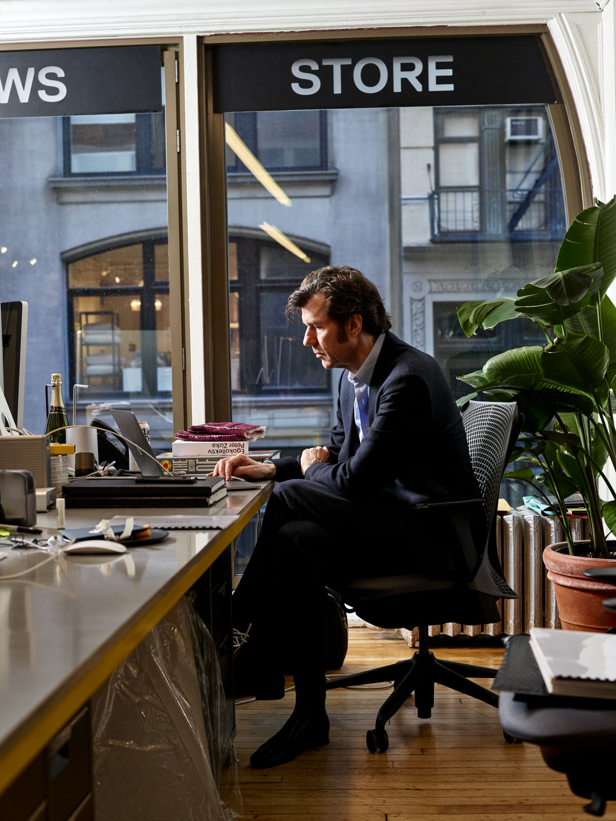
Photo by Noah Kalina.
Did you meet other young, cool creatives during this period?
Yes. I joined the magazine as a writer originally, and it just so happened that nobody wanted to design it. That job was open. This was pre-computer and headlines were set with a thing called Letraset, and we didn’t really have the money to buy fresh sheets, so we got old Letraset sheets donated from proper design offices, which had missing letters. It was easier to do them by hand than to carefully reconstruct an “E” that was mostly missing. Those were my first design experiences, but I enjoyed it because the magazine was culturally active and would organize anything from music festivals to demonstrations, so lots of other items of design were necessary: Posters, little billboards, leaflets, and things like that. It all fell to me as the designer, and I was 15—designing a poster and then seeing it glued up along the town, it was sort of satisfying.
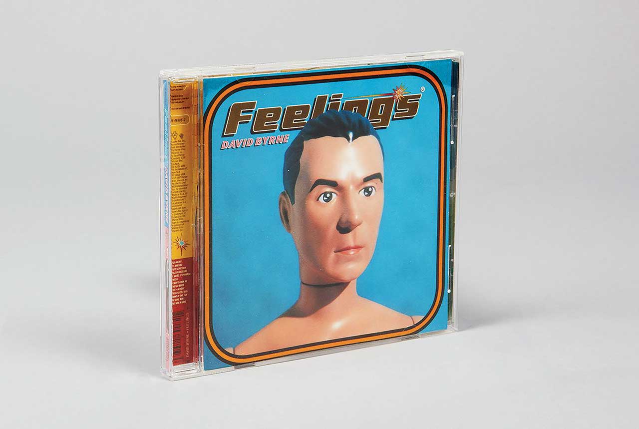
Photo by Tom Schierlitz.

The round-cornered Feelings CD packaging features happy, angry, sad, and content David Byrne dolls. Designed by Stefan and Hjalti Karlsson, the packaging includes a sophisticated, color-coded ‘David Byrne Mood Computer’ (printed on and under the CD) that lets you determine your current feelings. Photo by Tom Schierlitz.
You eventually did end up designing a lot of famous album covers. Do you have a favorite?
I definitely enjoyed working with Lou Reed and I very much enjoyed working with David Byrne. Those were two clients we worked with a lot, not just on a cover, but we did books and other material for both of them, and I felt close to both of them. I genuinely liked them as people and when I ran today in the morning on the High Line, I was actually listening to Transformer—an old Lou Reed album. So both musically and personally, we got along super well, and for Lou I would say Set the Twilight Reeling was my favorite cover. It was also the first cover we did for somebody who was genuinely famous. And with David my favorite cover would be Feelings. Feelings was an interesting process. Generally, if a musician came to us with an idea we always said no because we felt the concept was a big part of what we do and if that was taken away, it didn’t make much sense for us to do the project. In David’s case with Feelings, it was actually him who came up with the idea.
Related | Marcel Wanders is the Busiest Man Who Never Works
David was a little bit of an exception at that point. In the ’90s, very few musicians were visually sophisticated. Most of the people we worked with had spent their entire youth in rehearsal spaces; they needed us. This has changed now: If you go to Rough Trade in Brooklyn and look at some of the best covers, you’ll see that a number of them are made by musicians. But at the time, David stood out as somebody who was really visually sophisticated, and he thought it would be a good idea to have a portrait of him as a doll and I had liked that and thought we could execute that. So he went into a 3D scanner, which at that point was super cutting-edge technology—no other design firm had heard of this thing—and we got a scan back and it was completely unusable.
This was in the mid-’90s. And basically the scan was not really translatable into what we needed; the scan was so complex. It was too much information. After we had gone through all that trouble, in the end we took all around photographs, regular, flat photographs of David and worked with a product maker to create a doll. We made a physical doll and photographed it and got much better results. Because the album was called Feelings, we made four different dolls, happy, sad, angry, and bored, I think—or a blank one. I was close to Lou until the end of his life and still feel very friendly toward David I just saw him do the new tour, which is absolutely fabulous.
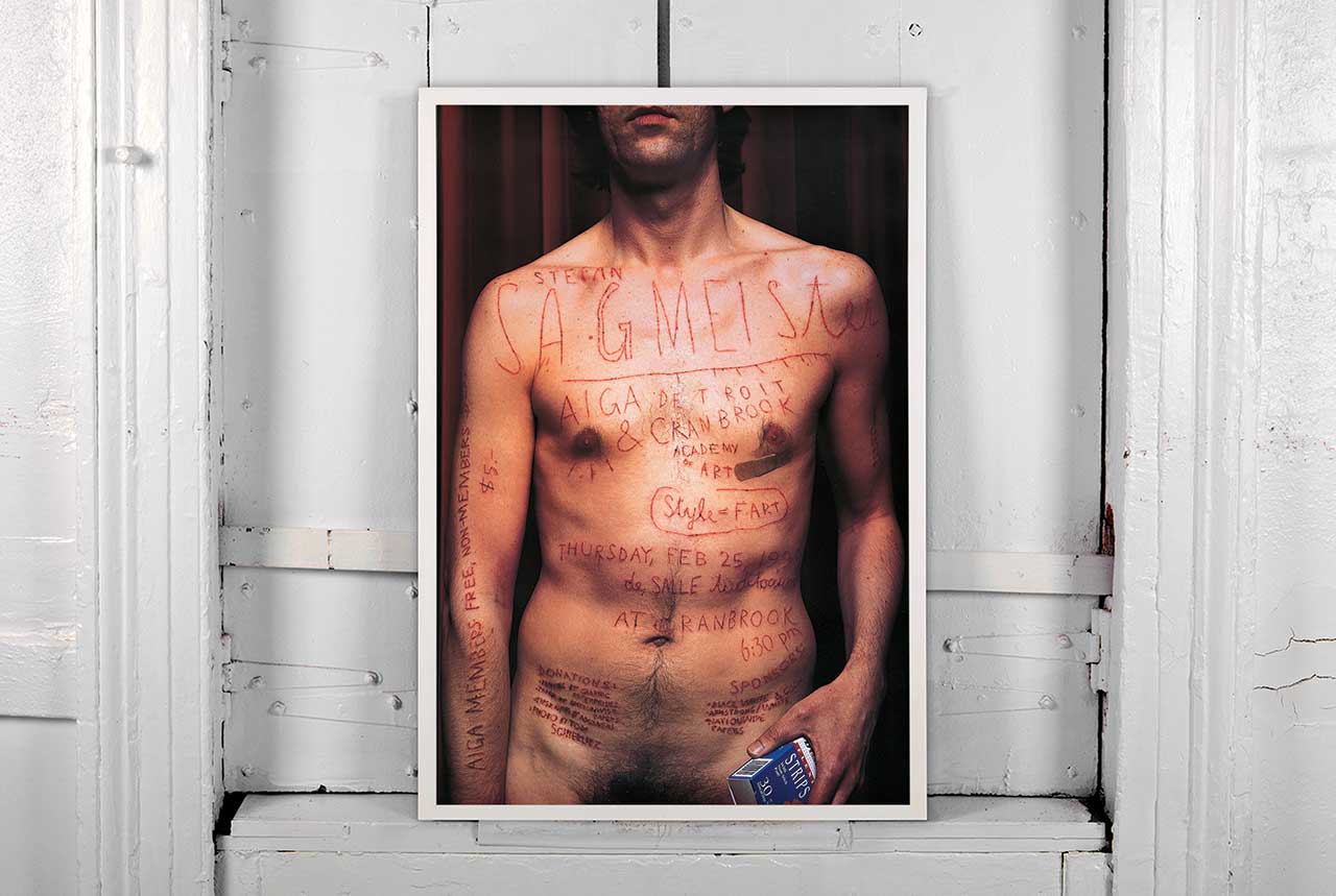
In his most famous poster, ‘AIGA Detroit’ in 1999, Stefan wanted to capture the pain that coincides with most of the studio’s design projects. Stefan asked an intern to carve the poster’s text—for a lecture at Cranbrook college near Detroit—onto his torso with an X-Acto knife. Photo courtesy of Sagmeister & Walsh.
After having run your company solo for so long, what made you decide to bring Jessica on as a partner?
It was very timing based. Throughout the existence of the studio there were always people who were very good and ambitious—and they tended to leave after two years. I’ve gone through that process a number of times. When Jessica worked for us as a designer, it was pretty clear to me that this was going to happen again. Also the process of looking for another really good, ambitious designer became boring, so I felt like it was time to try something different. We always have three-year terms of agreement, so we’re not professionally married until the ends of our lives. This is a situation that is supposed to last as long as it’s good for both of us.
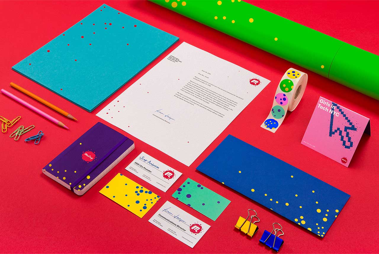
Photo courtesy of Sagmeister & Walsh.

Meetup needed a system that invited viewers to find their community on a small screen in a way that was both efficient and fun. Sagmeister & Walsh came up with a solution to allow easy navigation of categories and subcategories using a limited number of symbolic, colorful photography and many duotone-based background images. Photo courtesy of Sagmeister & Walsh.
You seem very open when it comes to mentoring other designers. Where did the idea to share other designers’ work on your own Instagram under the hashtag #WhyBeautyMatters come from?
Previously, I did a more useful version of what I’m doing right now, where I literally just critiqued people’s work—I asked people to send anything in. This time I’m asking people to send something beautiful, and I’m only showing the beautiful stuff. But there were long periods of time where I asked people to send in work for me to critique and I’m doing this because there’s a need, because a lot of people ask, “Can you look at my portfolio? Can you look at my piece? What do you think of that?” We also—and I haven’t done that in a while but I might pick that up again—had a Monday salon going on once a month where 12 designers maximum would come to the conference room to show their work and then I would harshly critique it. On Instagram it’s a little bit different because it’s so public and you don’t want to be extremely devastating to somebody in public. If we’re doing it here, it can be much tougher because it stays between the 12 of us and everybody hopefully learns from the things I say. I stole that idea from a woman I admire greatly, Louise Bourgeois, who did that constantly. I think she did that every Sunday, and I went to her salon once. It was fantastic and extremely harsh. She was really devastating.
How old were you?
When I did that I was in my mid-30s. Louise was already in her 90s.
So you were already well into your professional career and you still found it necessary to have your own work critiqued by Louise?
Oh yes, I think it’s helpful. I have to admit she was quite positive about my work, but when she learned that I didn’t want to switch over into artwork, that I actually was fine remaining a designer, she was a little pissed because she felt like I was wasting her time, because she felt like there was a difference—which I agree, there is a difference. But it was still very helpful to see what somebody who is so steeped in that world and has been doing such fantastic work for 60 or 70 years, would think of what we do.
How do you choose people for your own salon sessions?
It’s basically everybody: First come, first serve. It’s not that heavy. I’m not inundated. Whoever writes, we write them back and say that Monday is open, until it fills up.
How do you keep up with so many demands on your time?
I’m not stressed. It’s totally fine. A lot of the weight on my shoulders was taken away by Jessica.
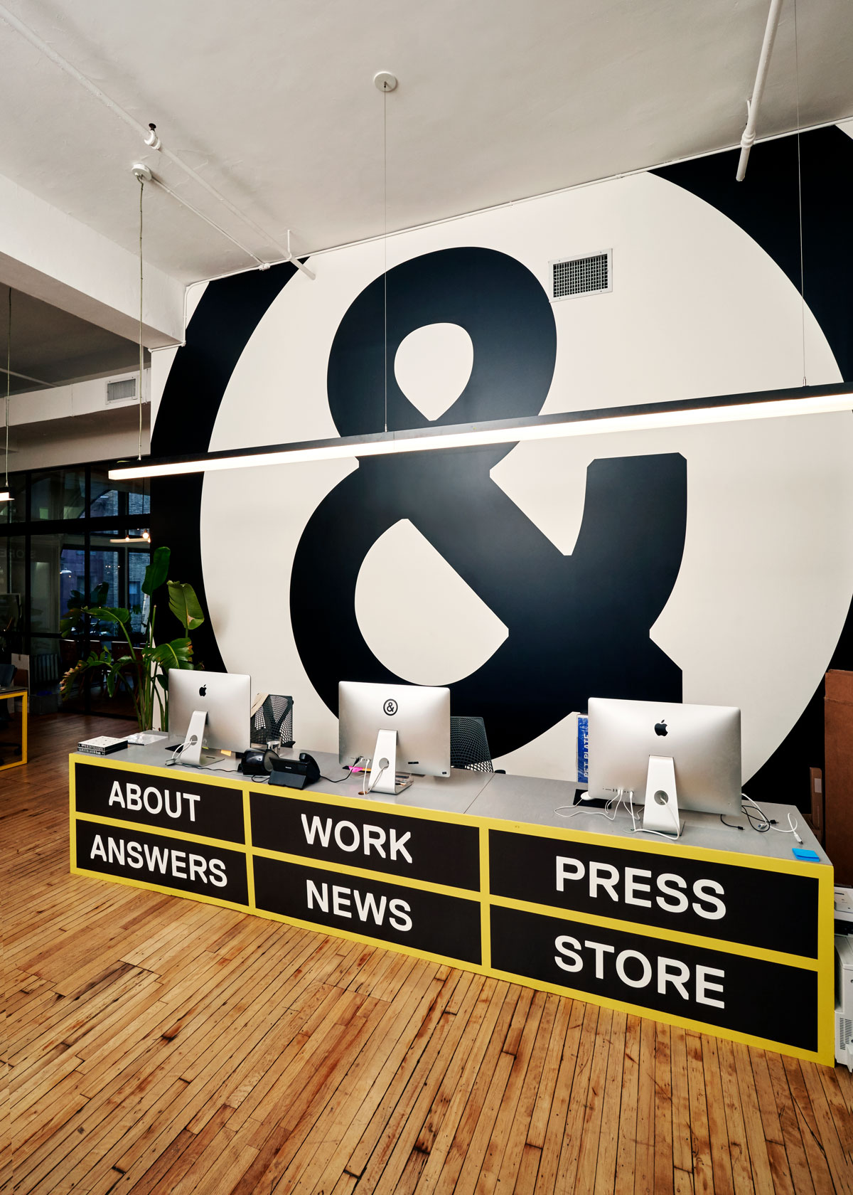
Photo by Noah Kalina.
Speaking of stress, one thing you’re known for is taking a year-long sabbatical every seven years. How is that viable for you on a business level? How does it affect the day-to-day operations of your agency?
From the studio point of view it was different every time. The first sabbatical was the most radical, where we really closed. At that point we had an answering machine that said “call us in a year.” The second time was a little milder. We had one designer stay behind to at least answer the phone and finish up some long-term projects, and the third time was almost no interruption because Jessica decided she didn’t want to do a sabbatical, and the studio basically remained open, just with me missing. But I found that all three were completely viable business-wise, that my fears were the biggest the first time around. I had all sorts of fears, mainly, “Oh my god, we’re going to lose all the clients, we’re going to be forgotten, all that we’ve built in the first seven years will be gone and we’ll have to start again,” and none of these fears materialized. We actually found our clients reacted with slight envy, you know, I want to do this, too, and none of my assumptions were true. Lou Reed even moved his release date so we could still do the album over.
There were basically no downsides and almost all upsides, including even the strangest things, like I felt there was a financial upside seen over the long term. Because of the sabbaticals, we started to do more things that other design studios don’t do, so we completely took ourselves out of this price game. It wasn’t like we did the same stuff that other design studios did and clients would just go with the cheapest. So even financially it turned out to be successful, but of course that was not the reason to do it. The biggest thing I got out of the sabbatical was that I could continue looking at design as a calling rather than a job. And that’s a big deal because getting bored with the things that you do is a giant problem in most professions.
“The biggest thing I got out of the sabbatical was that I could continue looking at design as a calling rather than a job.”
It’s a big problem now for young creatives to balance paying their bills with doing what they love. There are so few coveted passion-driven jobs left. What’s your advice for balancing commercial work with work you love while making a real living?
I think the two-pronged approach worked in my generation. Every designer I know whose work I admire has big interests outside of design, so their work has influences not just from the design world, and works on some sort of personal thing they want to do no matter if they can use it somewhere else or not. I found from a purely practical level I have to try out new things for myself first before I could properly build them into a client project. And if I don’t try them out first, it’s not really practical to try them out on a client as I don’t know what the outcome is going to be. So that two-pronged approach is always the absolute basis for anybody in illustration or photography, there is no fashion photographer that doesn’t have a personal portfolio. Every one of them does that as a matter of course and I think that should be the case in design as well. All the designers I respect do that. I see that being very much the case for very young people.
Social media can be an extreme advantage in that world. When I was on sabbatical in Tokyo, there was a whole scene of young designers who weren’t Japanese, who lived in Tokyo, did their personal work, had Instagram accounts where they published their personal work, and got enough jobs through these accounts to make fine livings in Tokyo. This wasn’t possible when I came of age as a young designer in the ’80s. You could freelance and, in my case, I freelanced for clients, but you couldn’t have done that in Tokyo unless you spoke perfect Japanese and freelanced for proper clients in the city, which take time to build. In many ways, there are disadvantages, and I had advantages when I moved to New York that somebody who comes now wouldn’t have, including that I could buy an affordable apartment. Impossible now. We lose a good number of employees to freelance. If you’re very good, and we try to work with very good people, it’s possible to make a fine living and do your personal work. Also, if you have a sizable Instagram account.
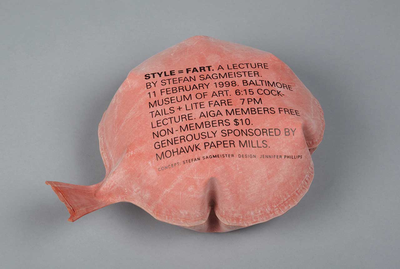
A whoopee cushion designed for a talk Stefan delivered at a Baltimore museum. Photo courtesy of Sagmeister & Walsh.
It also requires working all the time.
There are disadvantages to that, too, absolutely. There are also certain jobs you don’t have access to, specifically if you’re a freelancer for other agencies, you’re not really in charge of jobs. If you’re able to freelance directly for clients, that’s a different thing because, ultimately, then you’re running a small design studio. It depends on where you are. When I was young, it wasn’t interesting to freelance for agencies because you were never really in charge of the whole thing, and you often weren’t even part of client meetings, meaning you couldn’t direct what ultimately went into production. But freelancing for clients was totally fine. You learn everything, including everything about having to sell the idea and having to make sure it sees the light of day without changes implemented that would destroy it. So it was also the biggest learning experience.
You were once quoted as saying, “I personally believe that print is going to be around for a very, very long time … If I’m wrong, future designers will have to be screen-based … I’d rather move to Sri Lanka and build a house than become a website designer.” Have your feelings changed since then?
If a client comes to us and says we have this gigantic site, just do that, we’ll say no. We’ll do sites and social media campaigns as part of an overall strategy when we do a rebrand, like in the case of the Jewish Museum. And that makes a lot of sense because the holistic approach just makes sense. I still believe that to be the case. I find it pleasing, either in print or even in a film, when things are done. There’s a point when you make a film when the shooting is wrapped, the editing is wrapped, the color correction is wrapped, and it’s done and it’s out there and you can discuss it, but you don’t have to touch it again. The problem with websites is they are constantly changing. I have very good friends who do nothing but sites and even when you say, “Oh, I didn’t know you did blah blah blah site, let’s look at it!” and they say, “Well by now it’s half a year old and the client has been supervising it and now it looks like a piece of shit.” So it’s this never-ending story. There was a time when I thought it was just a problem for me because I’m not that age, but I’ve been speaking at a lot of digital conferences and I’m surprised that I have a lot of 20-year-olds surrounding me, asking me how to get a job in print. So I think there’s an unsatisfying feeling out there about this Sisyphus-like task of constantly trying to better a thing that’s constantly changing and is never really at a point where it’s finished.
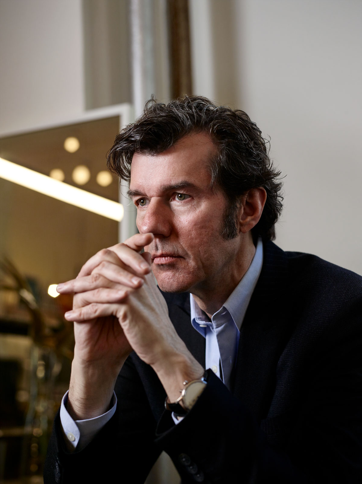
Photo by Noah Kalina.
It’s hard to keep up when the technology changes so quickly. What do you see as the future of design?
I was always a bad predictor of the future, so I’m not sure I’m going to be any better now. Clearly, so much more of it is animated. The still image has already lost and will continue to lose much of its value. I think that’s going to continue simply because of the screen-based nature of so many things—be it on a phone screen or a screen in a shop window or in Times Square. But other things, I don’t really know. For a while it looked like 3D printing was going to be gigantic but so far, as far as the consumer is concerned, it’s still niche. I know people who print houses, but I don’t know if that’s going to take off in a big way. Of course, if printing houses becomes a dominant way to build, it’s going to be an unbelievable change as far as formal possibilities are concerned because complexity doesn’t cost anything in 3D printing, so we’d move away from these modernist boxes 100% because suddenly you can do, for the same price, whatever form you want. Look at how professional photographers have become so much less important in the past decade—this desire for the hero image clients would pay significant money for to a star photographer has decreased; that hero image doesn’t play the same role online as it used to in a printed magazine. I don’t expect, even though you can think maybe there’s a new technology that changes the design industry like it did photography, or that technology has wiped out entire professions like it did to typography—which was then taken over by designers the way design has taken over much of photography’s world. We, as a design studio, have a photography studio where a significant percentage of jobs that would go out to photographers we now do in-house because we can and it’s not that difficult. I don’t expect the same thing to happen to design, simply because I think we’re pretty far from the point where artificial intelligence is so sophisticated it could make good and usable design decisions—come up with a concept and make those decisions. I don’t think it’s impossible this will happen, though. I read a very good proposal by a friend on the field of computational aesthetics. Basically this field would work with people from art history, people from coding, people from artificial intelligence, to create a possibility for computers to come up with aesthetic concepts and make aesthetic choices. I think sometime in the future this will be possible, but I don’t expect it to be around the corner in the next five, eight, 10 years.
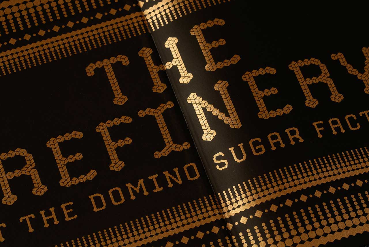
A detail image of Stefan’s Domino Sugar Factory mailer book. Photo courtesy of Sagmeister & Walsh.
What inspires you?
Oh, lots of things. Easy ones would be train rides—not so easy to do in this country because there’s not that many trains to take.
We have a whole subway system!
They don’t count. I don’t like the subway, I can go on the record with that, even though they’re doing a good job with some of the newer stations. By a train ride I mean an outside train, that has a proper length of time, in the hours, where you see a landscape going by. Any chance I have I’m definitely not flying—I’m taking the train. That possibility to be on the move, and it works much better in a train than it works on a plane for me, and see a landscape flying by that’s just distracting enough not to be boring but not so distracting that you can’t have a continuous thought, I find inspiring. I find entering a new hotel room, even if it’s not a particularly good one, can be inspiring, specifically if it has a view, specifically if it’s in an exciting new city so I can have a walk around the city and then have a first night in the hotel. I find that to be a good possibility to think of things.
This article originally appeared in the Spring/Summer 2019 issue of Sixtysix with the headline “Art Director Stefan Sagmeister Believes in a Calling.” Subscribe today.
