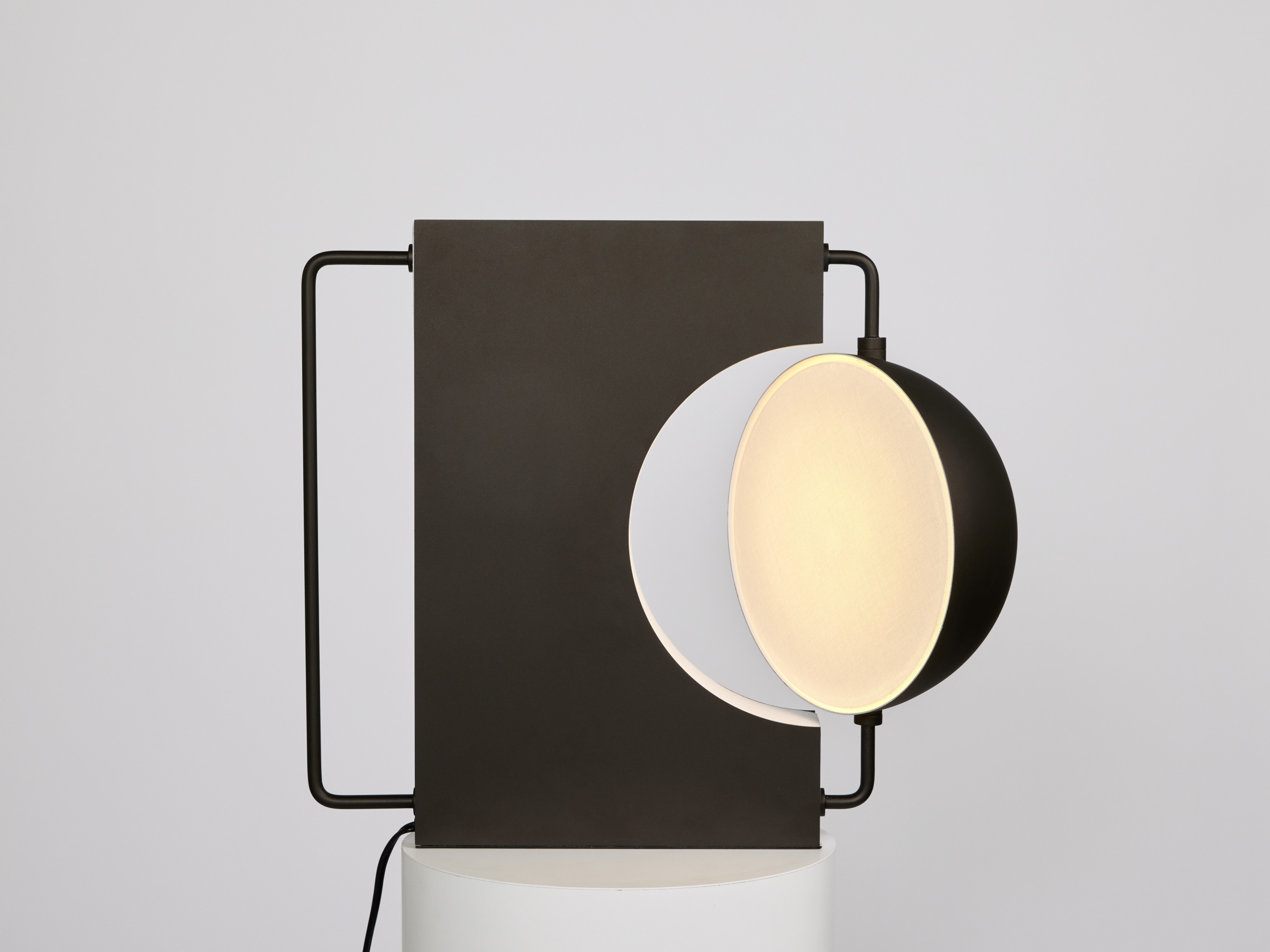
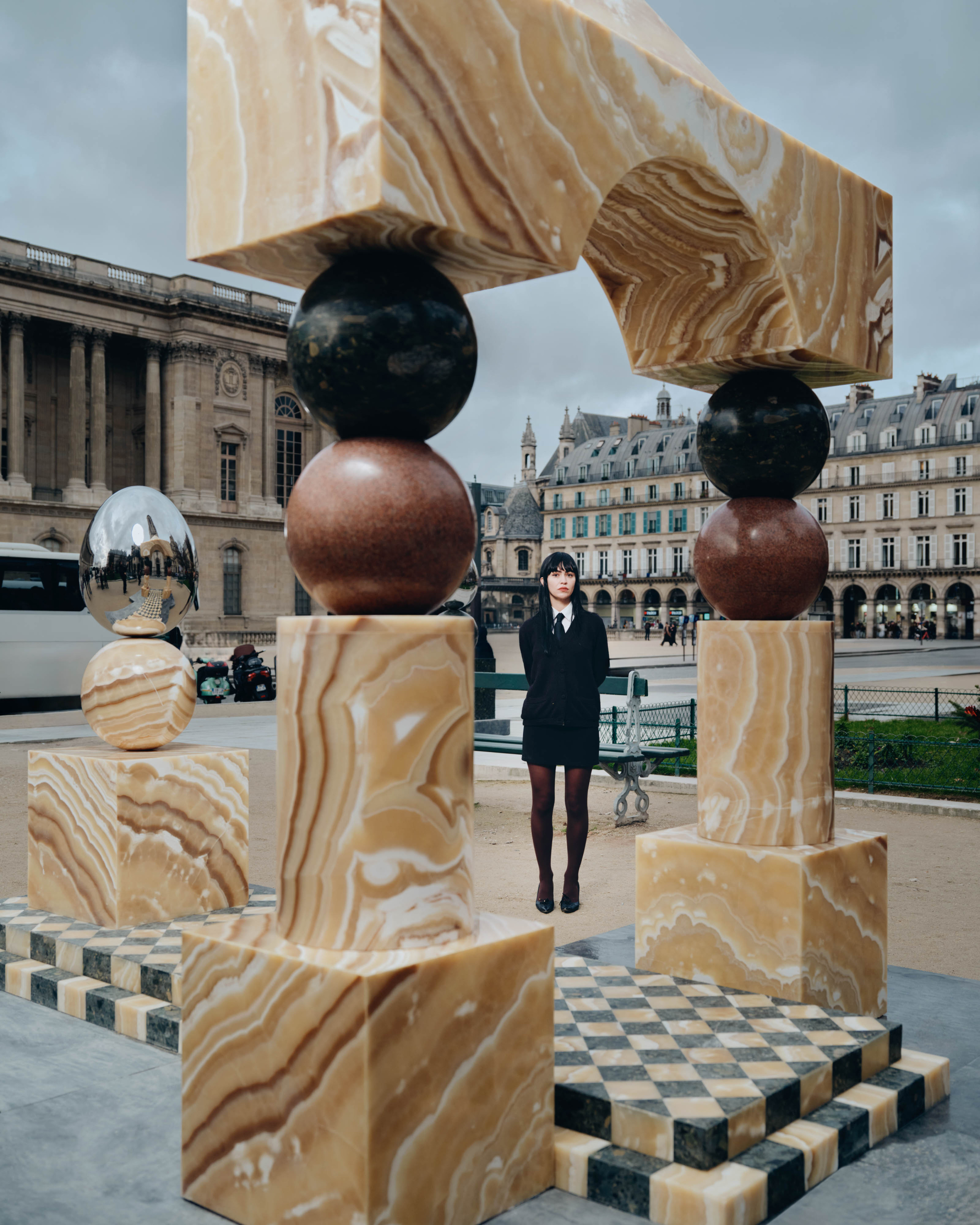
Now the head of industrial design at virtual-reality company Oculus, where he works on VR headsets like the Rift and Go, Seattle-based product designer Peter Bristol was previously the creative director of Carbon Design Group. There, he and his team were behind the hardware design for a number of distinctive Microsoft products, including the Xbox 360 controller, the original Kinect motion-sensor input, and the Sculpt split keyboard. Oculus announced its acquisition of the Carbon team in 2014, just a few months after Oculus itself became a subsidiary of Facebook. Outside of Oculus, Bristol designs striking lighting and furniture pieces; he has lighting lines with specialty studios Juniper, which produces his THIN chandeliers, and Visual Comfort.
Tell us about what you’ve been working on lately. Is there a project that keeps you up at night?
It seems like it is everything added together that keeps me up at night. Which project specifically probably depends on the day. My work at Oculus is pretty consuming, and I am always thinking about new ideas for Juniper and Visual Comfort. I also tend to continually add to the ever-growing backlog of personal projects I’ll likely never get to.
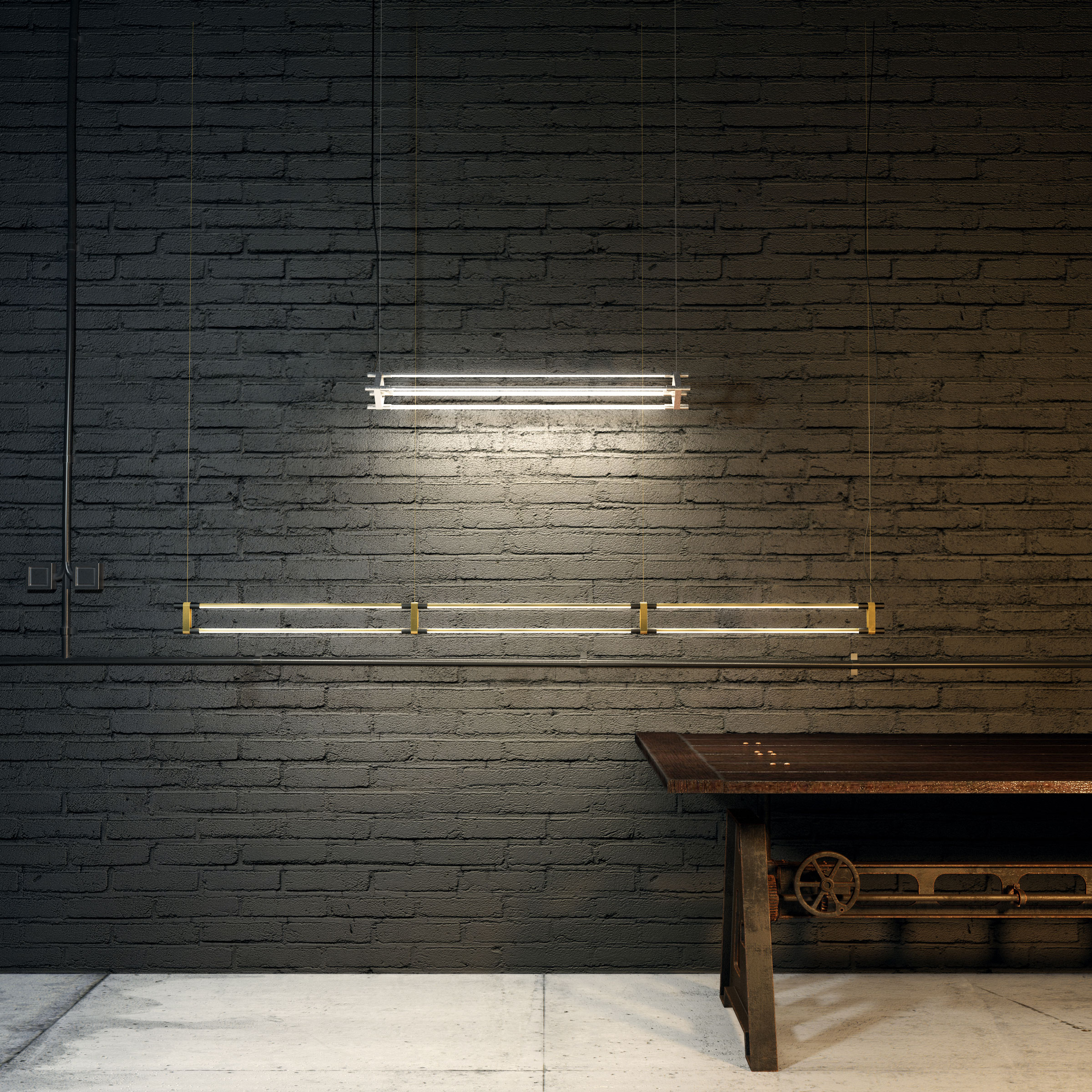
Peter’s THIN suspension lights and sconces light up a space with simple, minimalist style. COURTESY OF PETER BRISTOL.
Prior to Oculus, you won all sorts of accolades for your work on products for Microsoft, including the Sculpt keyboard and several mice. Can you walk us through your thought process in reimagining such familiar peripherals?
Process is something that varies so much from project to project, and those Microsoft peripherals were each very different. We were lucky to get plugged in with a great team at Microsoft. Like most design efforts, the goal is finding a new and valuable perspective, whether through an idea, a conviction, an insight, or just raw effort.
The ergonomic mice started by leveraging more traditional methods. We would cast and sand and Bondo (and recast and sand and sketch and Bondo) until we had something that felt right physically and had a recognizable, clear gesture. Then we would start the laborious task of bringing it to life, which started another iterative process of scanning, CADing, printing, and refining. Some of the results were quite fantastic, like the Mobile Mouse 4000, while others felt more like they were a result of the process. In contrast, the Wedge mouse was a bit of a reaction to all the ergo efforts. It was an idea that came from simply holding a AA battery between your thumb and ring finger and wondering how little you could add to make a functional mouse. The result really challenged the current paradigms.
In general, people tend to lean on process as if going through the motions will somehow magically kick out an amazing product. I guess I feel like you design by whatever means necessary until you have “the idea.” The process really just provides you with different ways of looking at the problem.
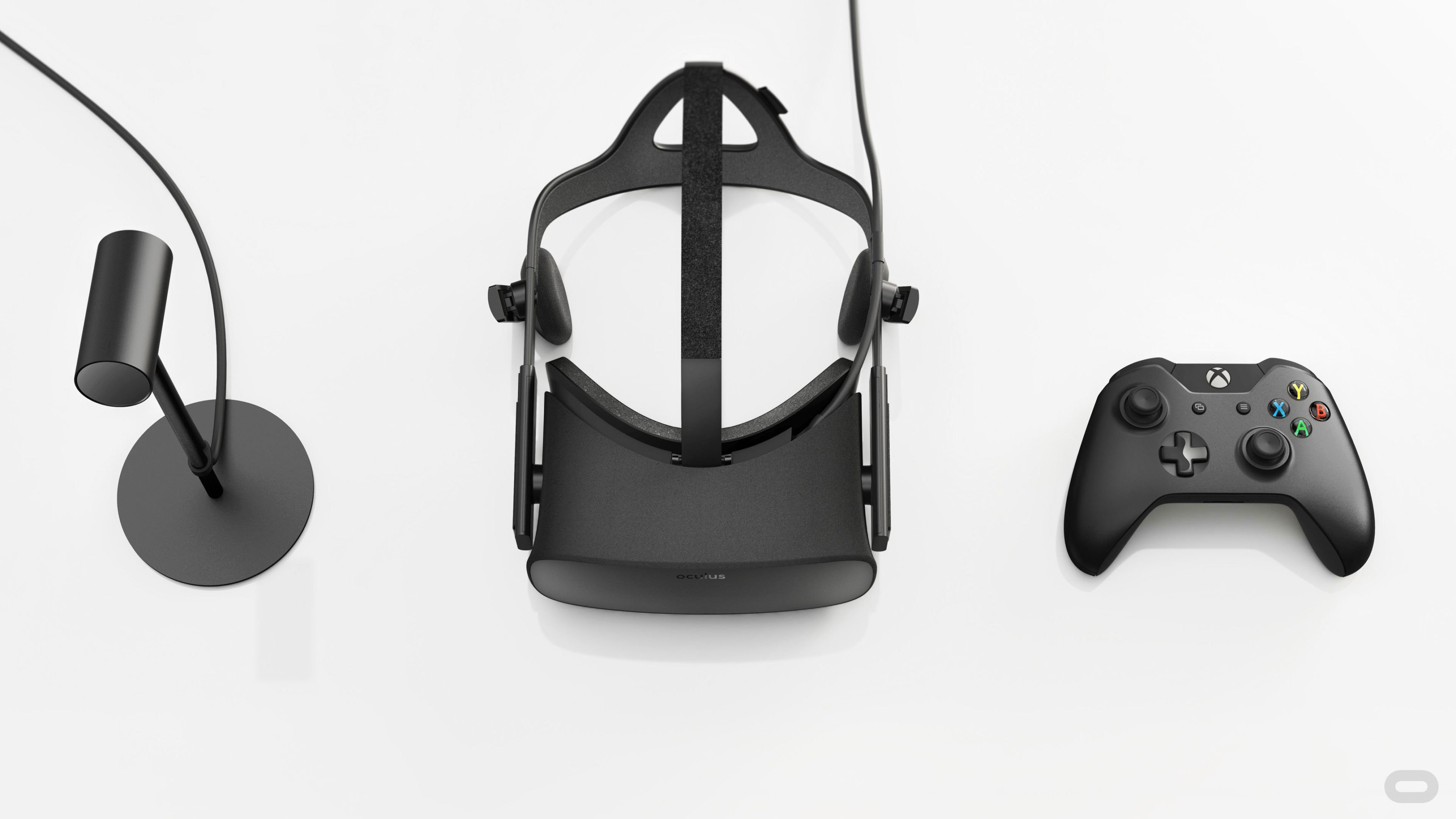
Peter’s work includes the first virtual reality system for consumers. COURTESY OF PETER BRISTOL.
Many of the products you and your team have worked on, before and after being acquired by Oculus, are made for intimate interaction with human bodies: the aforementioned keyboard and mice, video game controllers, remotes, now VR headsets. How do you approach balancing ergonomics and aesthetics?
In concept I think you nailed it, simply balancing the fact that worn or held products will inevitably also need to exist on their own. Yes, they should make you physically comfortable, but they should also make you mentally comfortable. It seems like we can have both.
We often talk about ergonomics on a range from subtle cues (like buttons on a phone) to prescriptive forms (like a handle with finger grooves). You cannot always design yourself out of ergonomic forms, but prescriptive ergonomics also come at a cost. When you don’t use them as designed, they’re not comfortable. Instead, even on very ergonomic products, we often aimed at “guided” comfort that worked well, but didn’t punish you if you used it another way.
In addition, we spend a lot of time working to find pure, math-driven forms that happen to occupy the same points in space as a comfortable solution. This relentless hunt for common ground between simple and complex is often where real magical solutions are born.
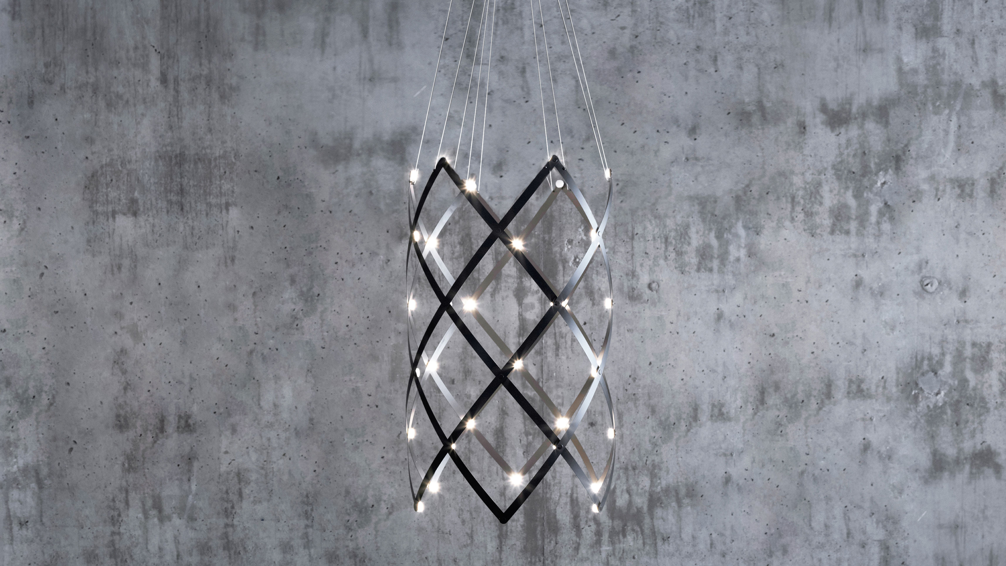
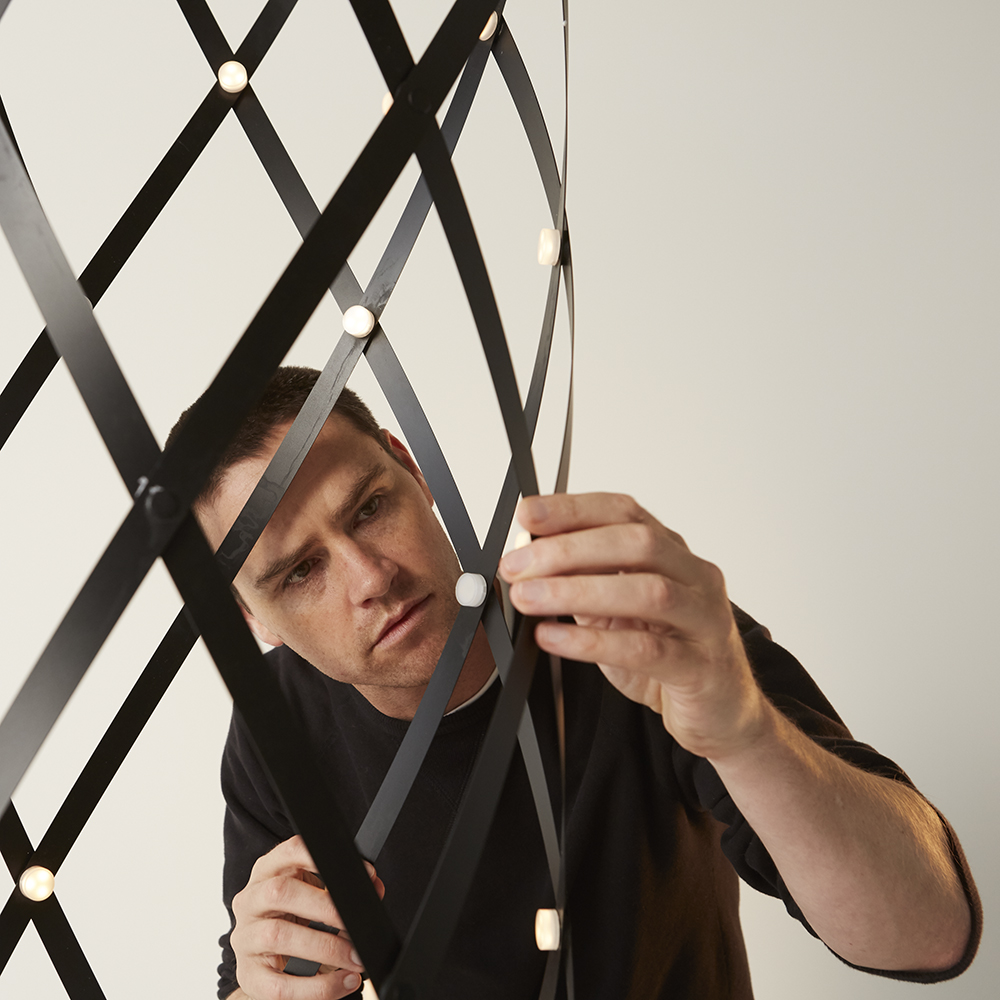
Peter’s Interlace ceiling light for Visual Comfort. COURTESY OF PETER BRISTOL.
Your parallel design practice is in functional home decor—furniture and lighting instruments. How does your interest in those types of products intersect with your work on tech gear?
I guess I am interested in almost every type of problem? I feel like they might inform each other a bit. Lighting design is often driven only by the designer, and the lights become artistic statements, while complex consumer electronics can often look like a literal illustration of constraints and requirements. In contrast to these outcomes, the simple and modular nature of the THIN line [of lamps for Juniper] is more like a toolkit for architects and designers to use for their vision, while details like the stretch fabric canopy on the interior of [the Oculus] Rift bring a level of unexpected delight.
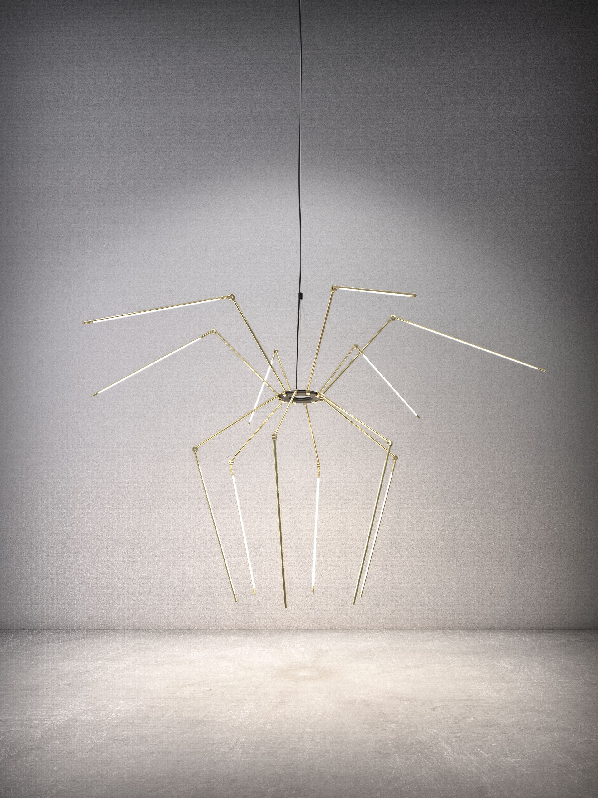
- Peter Bristol’s Juniper THIN Chandelier has 12 adjustable arms, allowing the fixture to stretch out like a spider… COURTESY OF PETER BRISTOL.
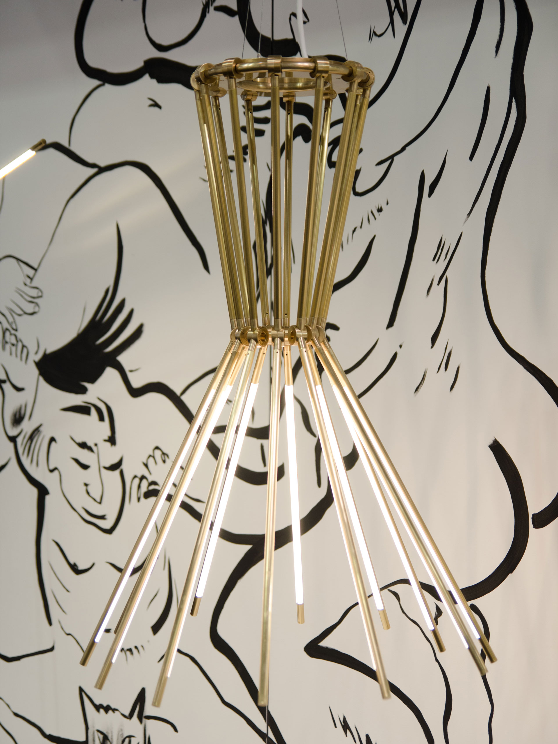
- …or close up to resemble a more traditional chandelier. COURTESY OF PETER BRISTOL.
I’m intrigued by your American Standards Lamp project, which embraces quotidian elements of American home design—the standard light switch and wall outlet—to create something at once surprising and familiar. Does that impulse play out elsewhere in your work?
Hmm, kind of. The American Standards Lamp is far closer to art than design: It combines the most standard/familiar elements of the current state of U.S. housing construction in an interesting way. It’s like an illustration of an observation, probably falling a little shy of a “statement.”
I don’t know if I ever strive for surprising, but I find that the balance between “new” and “familiar” is often important. If things aren’t in some way new, I’m not sure why they are being worked on. This new can come from the technology (i.e., something like VR) or the idea itself (i.e., my Interlace woven chandelier), and the familiar is more like the execution side. The details, forms, materials should feel natural or familiar, even when the underlying design is bringing something new to life.
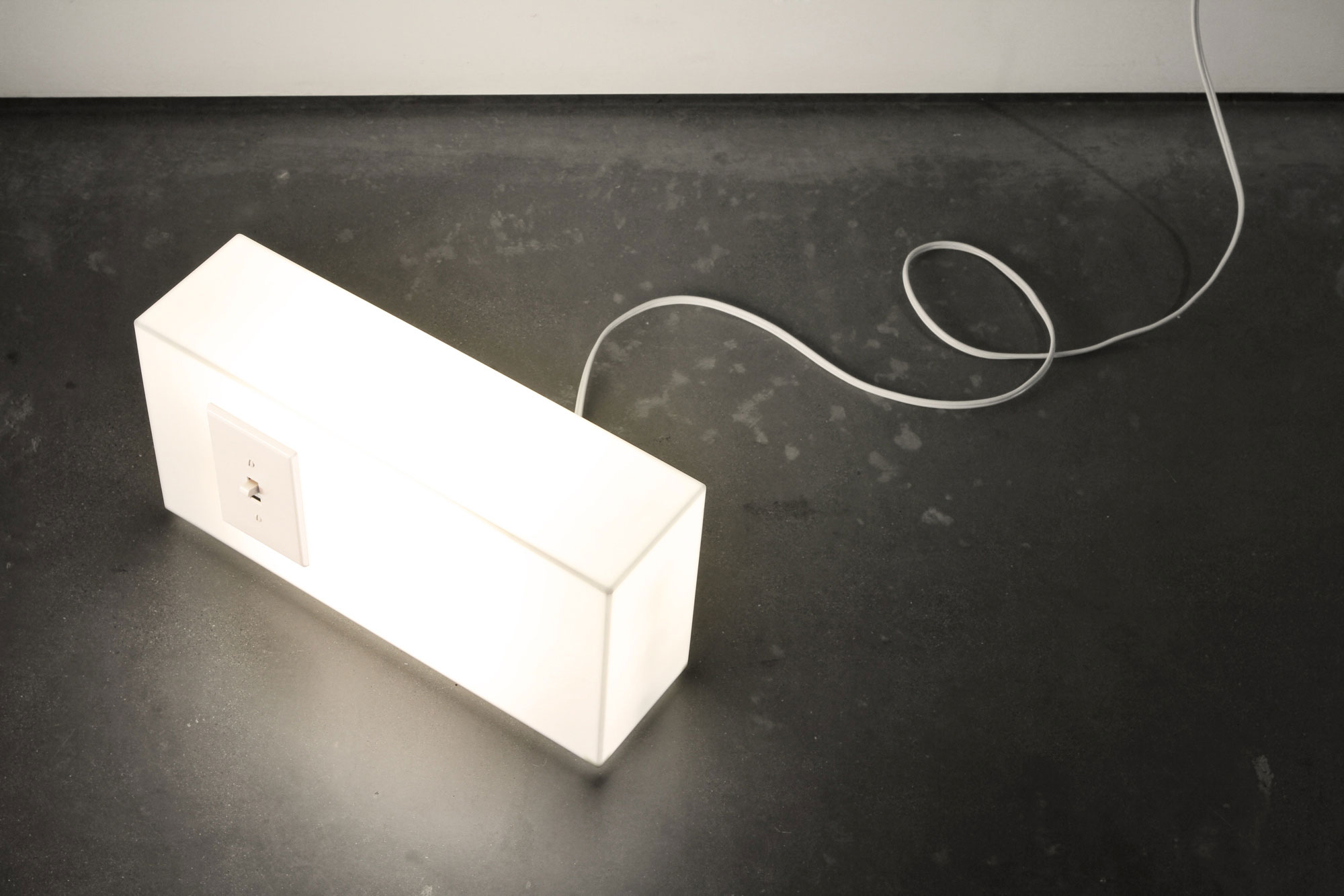
The American Standards Lamp re-envisions your standard home light. COURTESY OF PETER BRISTOL.
When and how did you develop an interest in art and design?
Cliché answer, but honestly I have been design/art-focused since as far back as my memory goes. I’m sure this has to do with a healthy combo of nature and nurture. I would say it didn’t really shift from the art side of things to the design side until college. Funny, I loved products when I was young, but I sort of assumed they were “born” magically out of the brands. It didn’t immediately dawn on me that they came from actual people.
What current designers inspire Peter Bristol lately?
There is so much inspiration out there these days you have to be careful or you can get sidetracked from actually doing anything at all. I think my judgement method might make you laugh: I use what I call the “jealousy” test when looking for potential team members and for knowing when I really admire something. It’s just such an instant signal, when you feel that “’jealousy” that you didn’t come up with the idea, or probably wouldn’t have reduced it in the same way, then you know it’s inspiring.
That said, the first few who are top of mind: Moooi and Marcel Wanders are amazing, Apple is still able to do things no one is capable of, Philippe Malouin is just incredible. Companies like Muuto, Hay, and Blu Dot all have great, unique perspectives, Killspencer’s approach is pretty awesome, Volvo’s new line is impressive, and there are so many newer clothing/shoe/accessory companies that have great site, brand, story, and product combinations.
Read more furniture, industrial, and product design stories at Sixtysix Magazine.
