Every Thursday the Sixtysix newsletter delivers the latest creative news, designs, and insights straight to your inbox. Here are this week’s highlights. Not on the email list? Subscribe now.
***
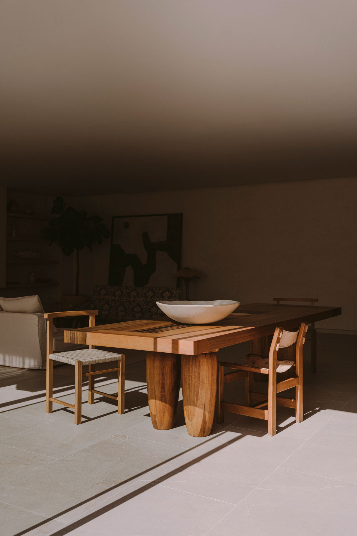
Photo courtesy of paradowskistudio.com
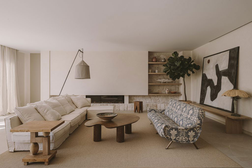
In Spain, Paradowski Studio combines design styles for this Mediterranean-like retreat.
+ Based in Krakow, Paradowski Studio is known for bridging design styles, which is exactly what Founders Zuza and Piotr Paradowski did for PDM House in Majorca. Modern, vintage, and Mediterranean sensibilities combine for a tranquil escape.
+ The interiors feature a 1960s jacquard sofa; a Philipp Mainzer stool; modernist chairs from the 1920s; a monumental dining table by Henk Vos; a midcentury Danish desk; and vintage pieces such as the bamboo console table.
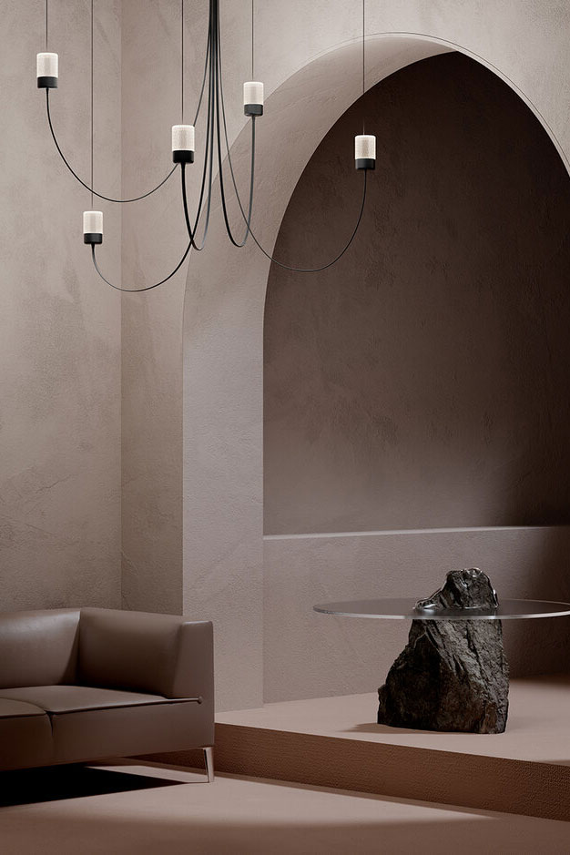
Photo courtesy of paulcocksedgestudio.com
Paul Cocksedge’s chandelier for Moooi is shaped by gravity.
+ The Gravity Chandelier is made of LED lights enclosed in crystal shades, which are attached to thin, flexible cables. Each light is suspended from the ceiling independently, leaving the chandelier’s form up to gravity’s pull on the cables.
+ “I wanted to re-engineer the traditional chandelier. It’s usually made out of rigid solid pieces of metal, and so the Gravity Chandelier is a contrast to that,” Paul told Dezeen. “I think the Gravity Chandelier is about allowing the customer to be involved in the creative process of the form of the lamp.”
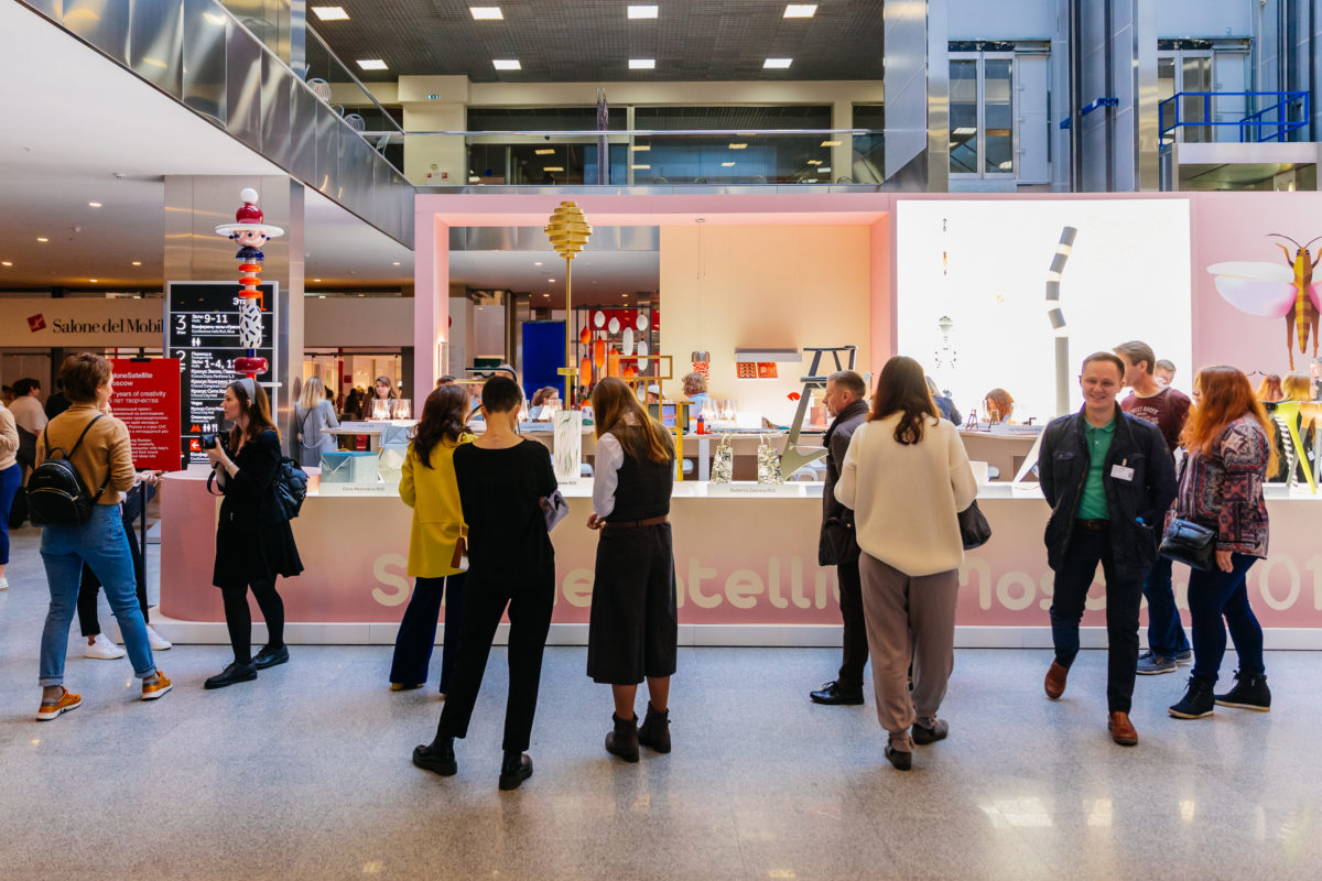
Photo courtesy of Salone del Mobile.Milano Moscow
Salone del Mobile introduces a new digital platform for this year’s fair.
+ The platform will run alongside the in-person event on September 5–10 and will allow brands to create interactive profiles with virtual showrooms, product libraries, and more.
+ “It’s a business tool for the companies and a virtual harvester of beauty, value, and quality. A virtual space for sharing interpretations of design and innovation, allowing for a glimpse of the future of the sector and nurturing it with visions and possibilities,” said Marco Sabetta, the fair’s general manager.
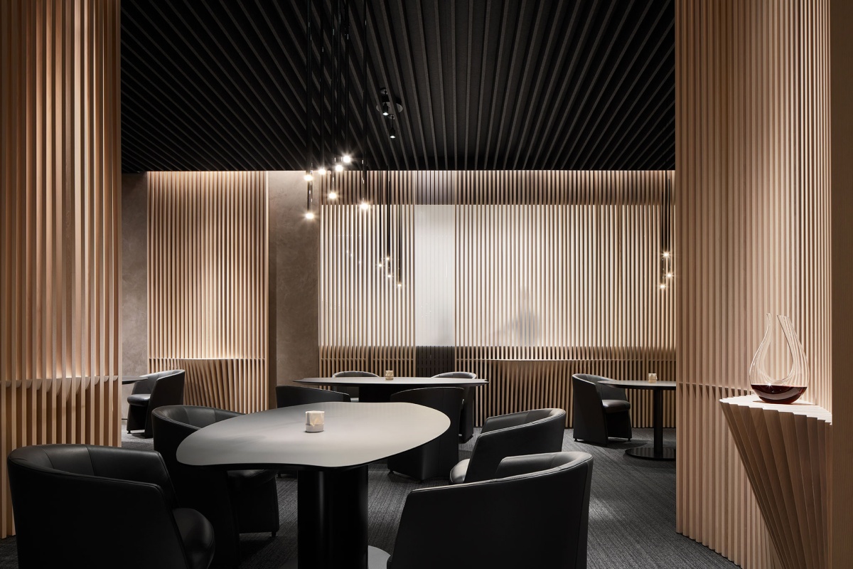
Turf Design helped to transform Ever into a luxurious, quiet dining experience. In addition to Turf’s acoustical felt panels in the ceiling, black leather Rolf Benz dining room chairs and Vibia Slim pendant lights give the main restaurant its warm feel. Solid ash slats form decanting stations for each table. Photo by Kendall McCaugherty of Hall + Merrick Photography
Check, please: These new design-focused restaurants elevate dining.
+ Now that indoor dining has reopened around the world, all eyes are on restaurants dishing up new culinary experiences, both in cuisine and the design of the spaces themselves.
+ The interior design of new restaurants like Lola Taverna and Popular in New York pay homage to their culinary roots, while others, such as industrial-designed Damian in LA’s arts district, are a nod to their neighborhoods.
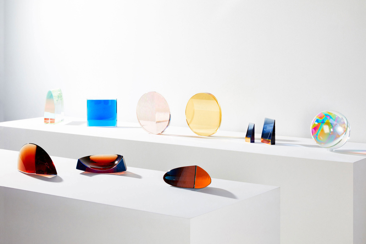
Photo courtesy of thefutureperfect.com
Glass artist John Hogan’s latest series invites you to see the light.
+ “Ultraviolet” features discrete glass objects that act as prisms in the presence of ultraviolet light. “I’m fascinated with the duality of ultraviolet light. On some level, we need sunlight to create serotonin, which makes us happy. Then again, too much sunlight can cause cancer and other deleterious health effects,” the Seattle-based artist told Sight Unseen.
+ Many of the objects in the series also include trace amounts of uranium that create a fluorescent glow. “There aren’t a lot of things on earth that can verify the presence of UV light. Glass can do that,” John said. “This is just the beginning of a more focused investigation.”
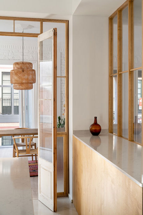
Photo courtesy of babelstudio.net
BABELstudio’s Spanish apartment focuses on light and connection.
+ Called Sombrerería, the project mixes new materials with legacy elements of the apartment, including its original French doors.
+ A highlight of the space is the new wood-glass divider between the living room and kitchen, which separates the spaces yet still emphasizes connection with three rows of windows rather than a solid wall.
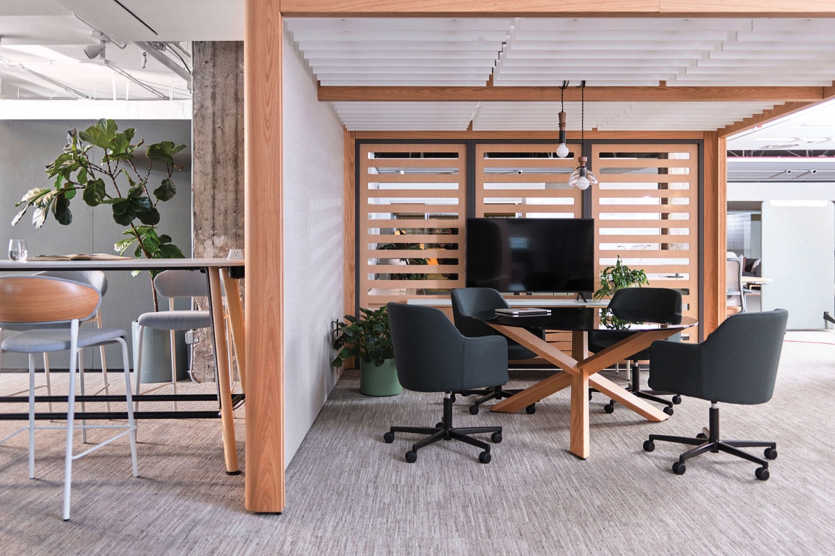
Enclosed or open, acoustic or dynamic—flexibility, choice, and variety have been incorporated into Obeya so its function can be defined by the end user. Photo courtesy of OFS
In rethinking office design, science agrees that an open office design has negative impacts.
+ A new study shows that an open office design increases a negative mood by 25%—and that was only after 8 minutes in a simulated noisy open office environment, not 8 hours.
+ Although the study showed no immediate effect on work performance, it deduced that ongoing stress from open office designs are detrimental to both well-being and productivity.
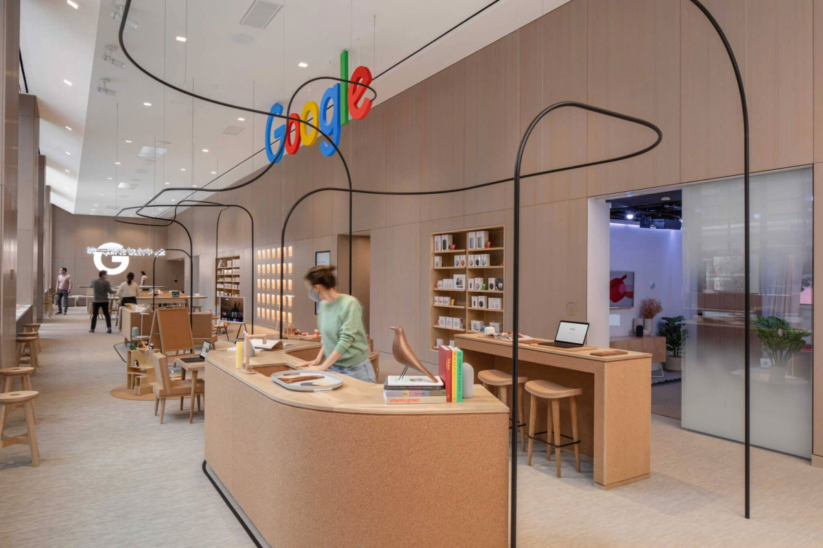
Photo courtesy of rmdny.com
Suchi Reddy talks through the designs that brought Google’s first retail space to life.
+ Working with Ivy Ross, Google’s vice president of hardware design, and Nathan Allen , head of store design and special projects, the Reddymade studio founder created a “Tiffany-like” storefront to inspire wonder and bring attention to the brand’s physical products.
+ A main theme of the store’s design was neuroaesthetics, with tactile surfaces such as cork and wood that inspire a sense of welcoming, warmth, and comfort.
***
Want this news roundup send straight to your inbox? Subscribe below.
[ninja_form id=3]
