Wallpaper makes people nervous, and Nate Berkus knows it.
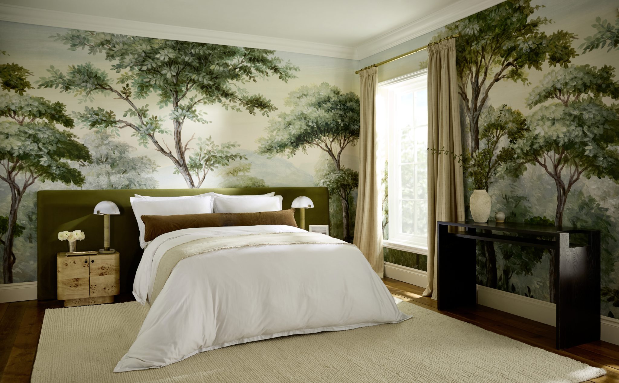
“People have so much fear around wallpaper,” he tells me. “It often feels like such a massive commitment.” After three decades of deciding what goes on other people’s walls, Nate has created something for the cautious homeowner he speaks of: The Curated Home, a collection of 42 wallpapers, three custom murals, and 14 coordinating paint colors, created with British heritage house Graham & Brown.
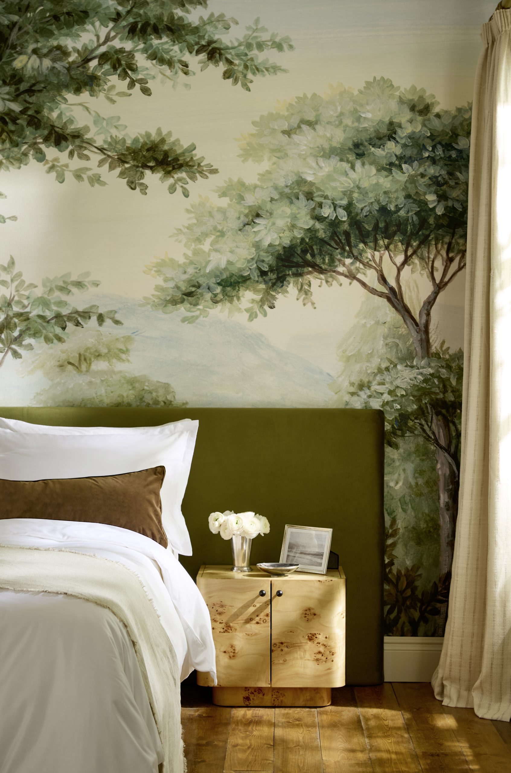
The pairing began with an archive. Nate wanted a partner with a past he could dig through, and found one in a family-run company now in its fourth generation. What followed was a long volley of ideas. Nate, who says he works best with moodboarding and collaging what inspires him, sent his field notes to Graham & Brown’s studio to develop it.
“I actually prefer that prepwork more than the launch,” he says. “It’s the research, the back and forth, and the conversations about historic pattern and scale and livability.”
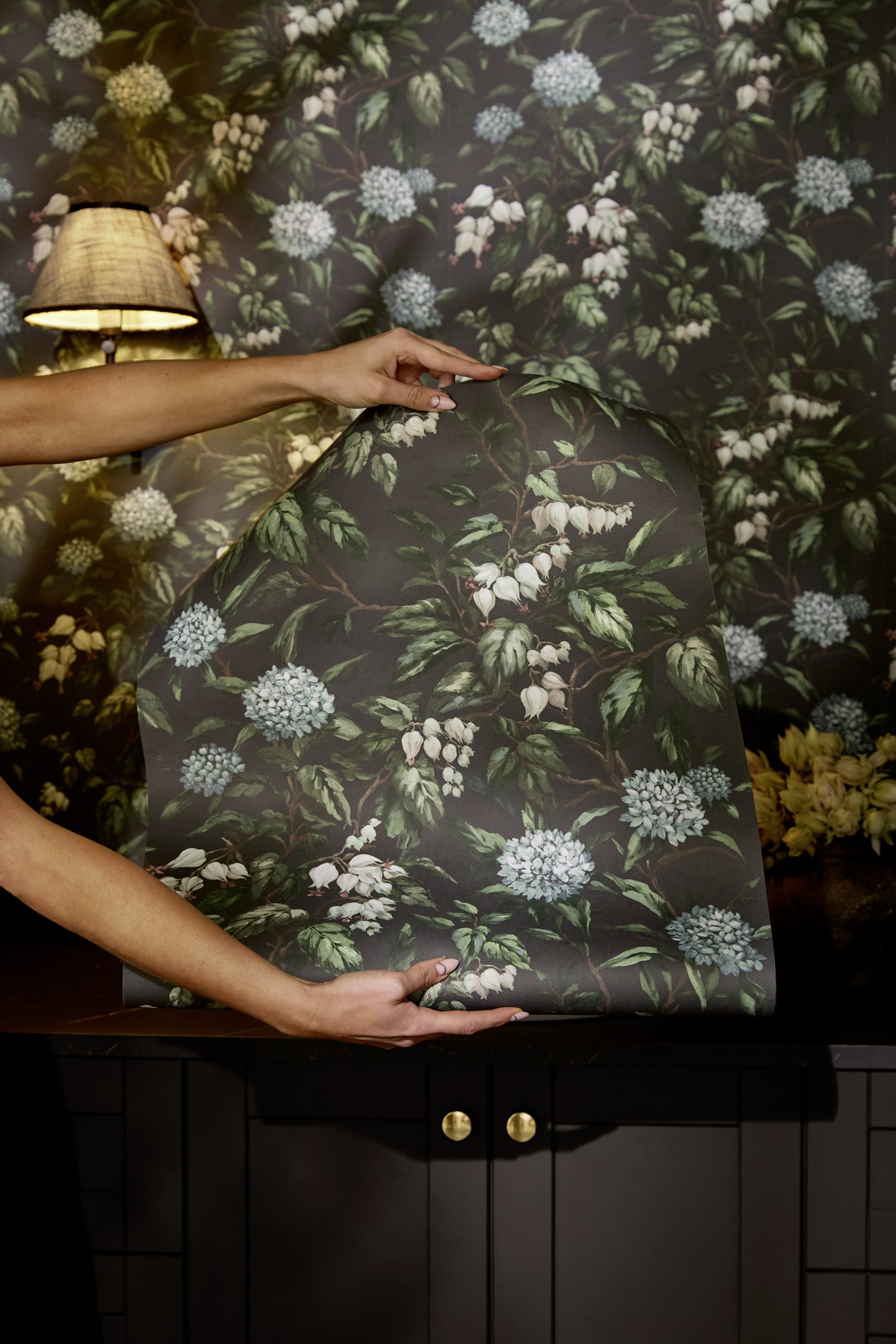
Nate has always been a collector of the past. Travel, architecture, and history have long shaped his design vocabulary, and The Curated Home leans on all three. It has a particular fondness for classic European motifs and historic pattern work reinterpreted through his own lens.
“I’ve always loved the way old things can sit with new things,” he says. “To be able to take things that are rooted in history, and reissue them with some manipulation to create something that feels both old and new at the same time, was the leading thought process behind the collection.”
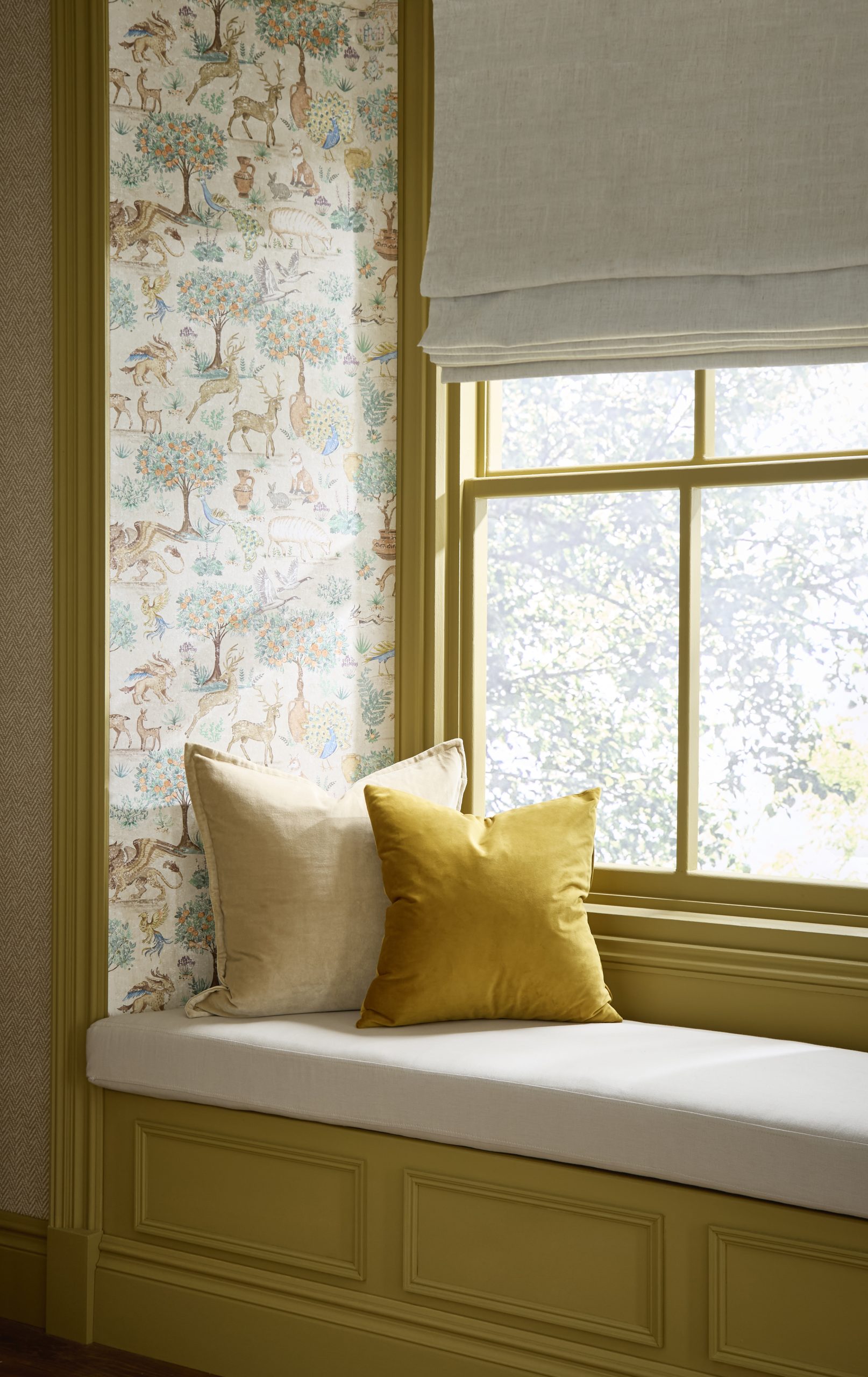
That appetite for the aged and storied runs from Graham & Brown’s own archive, which supplied the botanical trees and heraldic imagery of the Archival wallcovering theme, to the sun-warmed stone, aged wood and olive groves of Nate’s property in Portugal, which colored the moodier half of the palette and gave Menagerie its cast of animals, birds, and decorative vessels. Even the kids’ rooms he decorates at home played a part.
“I was also thinking about how children’s rooms can be a little bit more sophisticated,” he says. “You can lean more into whimsy with these pieces as opposed to a cartoon.”
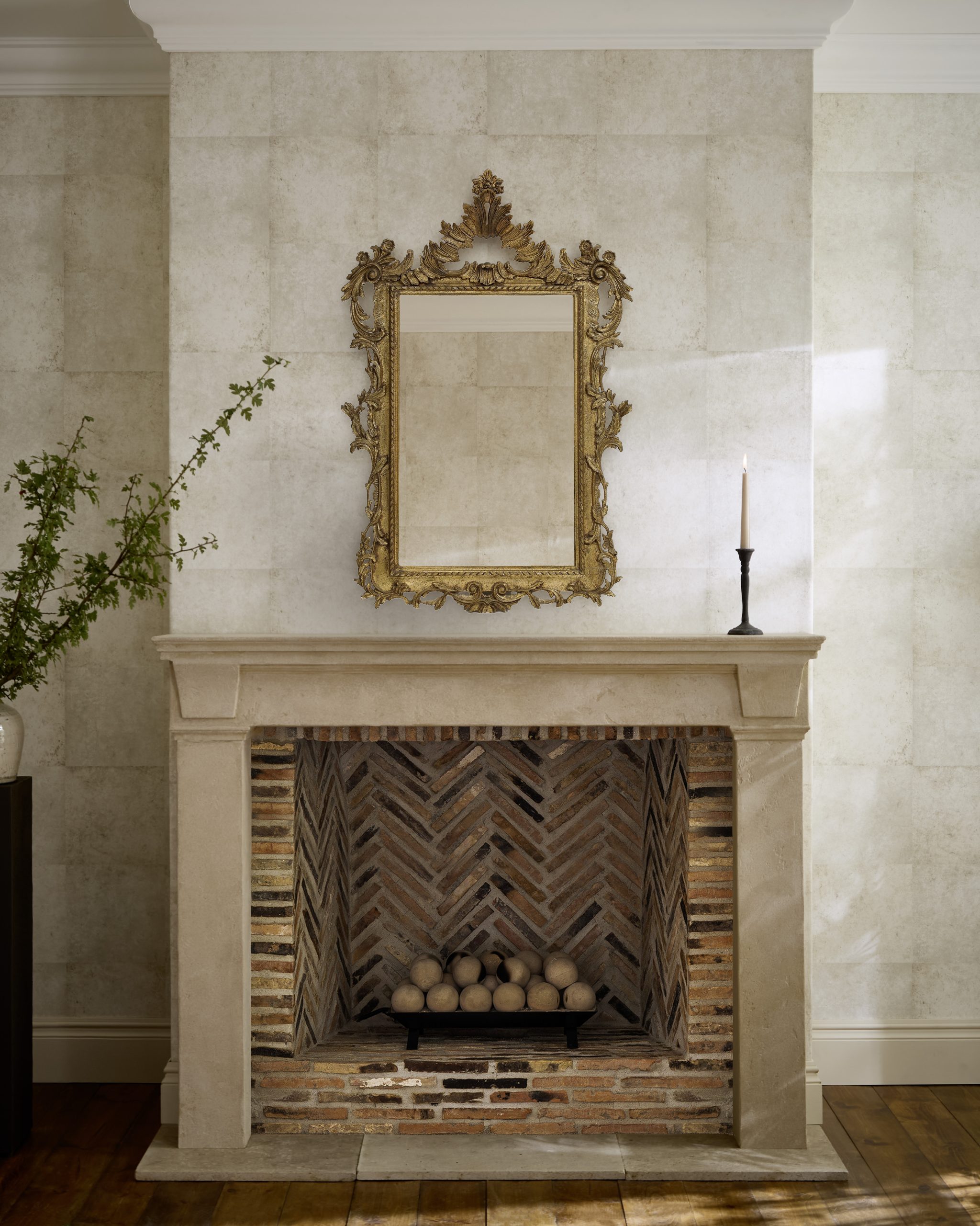
Nate has also long been open about being anti-trend, and he wanted to prove that wallpaper doesn’t need to be outrageous.
“Wallpaper can be rooted in history and travel, in colors that aren’t terrifying,” he says. “These tones are the kind you’d want to live with for the next 10, 15, or 20 years, rather than pulling from the last trend you saw in a magazine or on Instagram.”
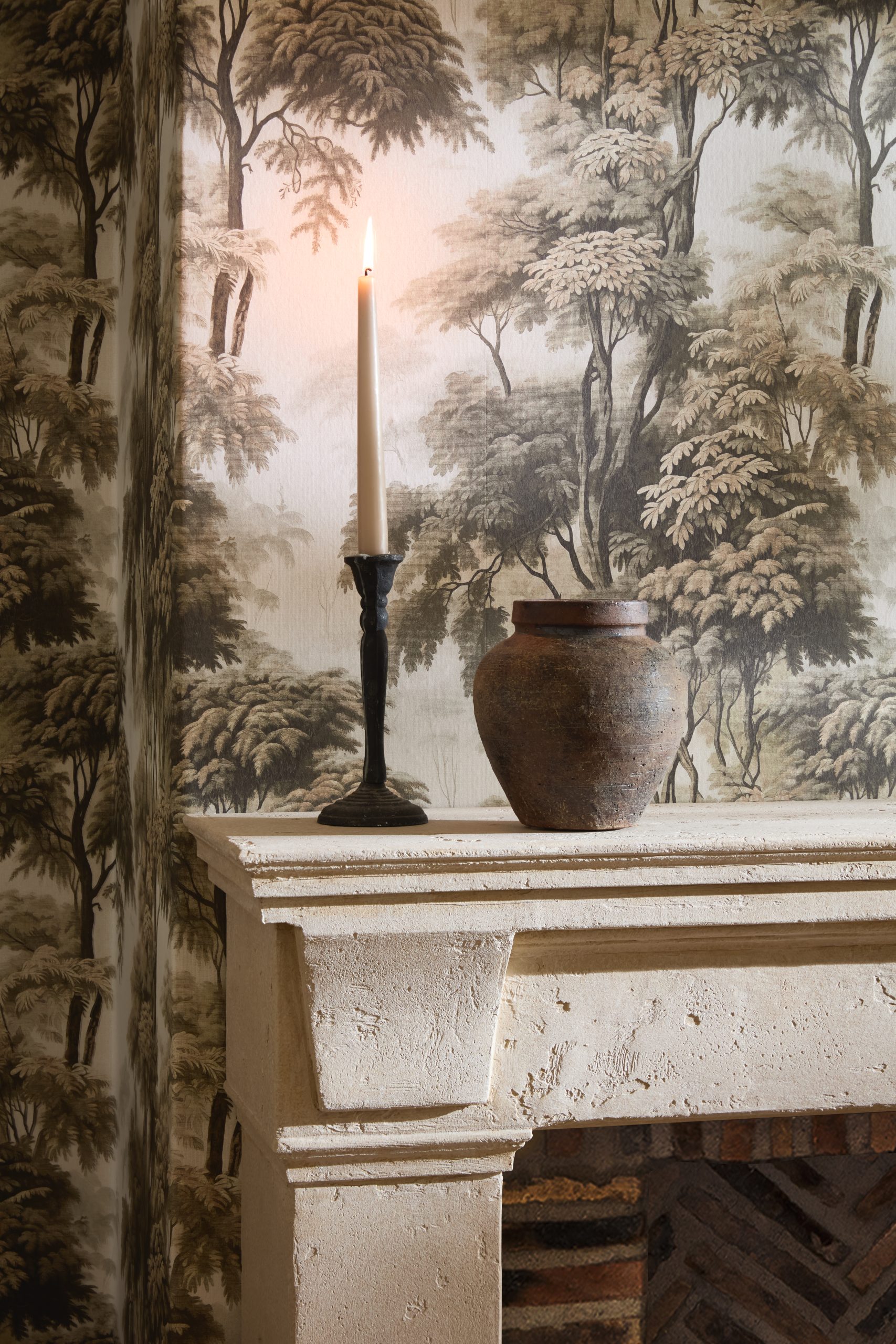
That conviction comes from how he works. Nate tells me has always decorated in a way that’s not beholden to an era or doctrine. Outside of paper and paint, he’s often in architectural salvage—about 90% of the lighting his studio specifies is vintage or antique, along with a high share of the furniture. The collection, he says, is built to settle a familiar dilemma. “You want to reach for a stripe, but you want to reach for a herringbone, but you also might love a botanical. I think this collection answers a lot of questions for people, in a palette that feels rooted in timelessness.”
The collection also reflects a larger shift in his partnerships. “What is the ‘new American design?’” he says. “What is the classic that could be around forever? It’s not trend-based.
“I have practical knowledge from being a designer for 30 years,” he says. “But these are the experts. I’m not done learning.”