Kitchen Tours with Creatives goes behind the scenes to photograph some of the top creatives in their home kitchens, exploring their design philosophy and what they most love about their own spaces.
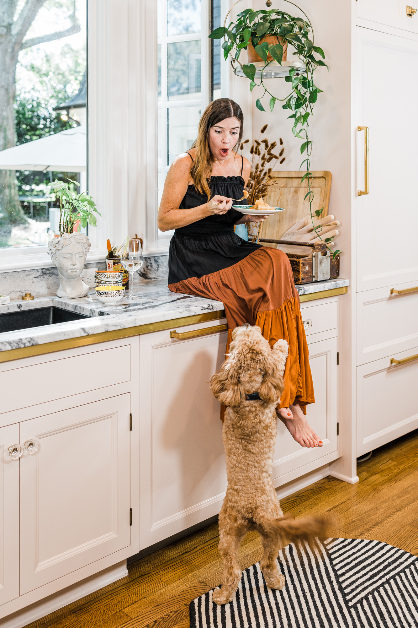
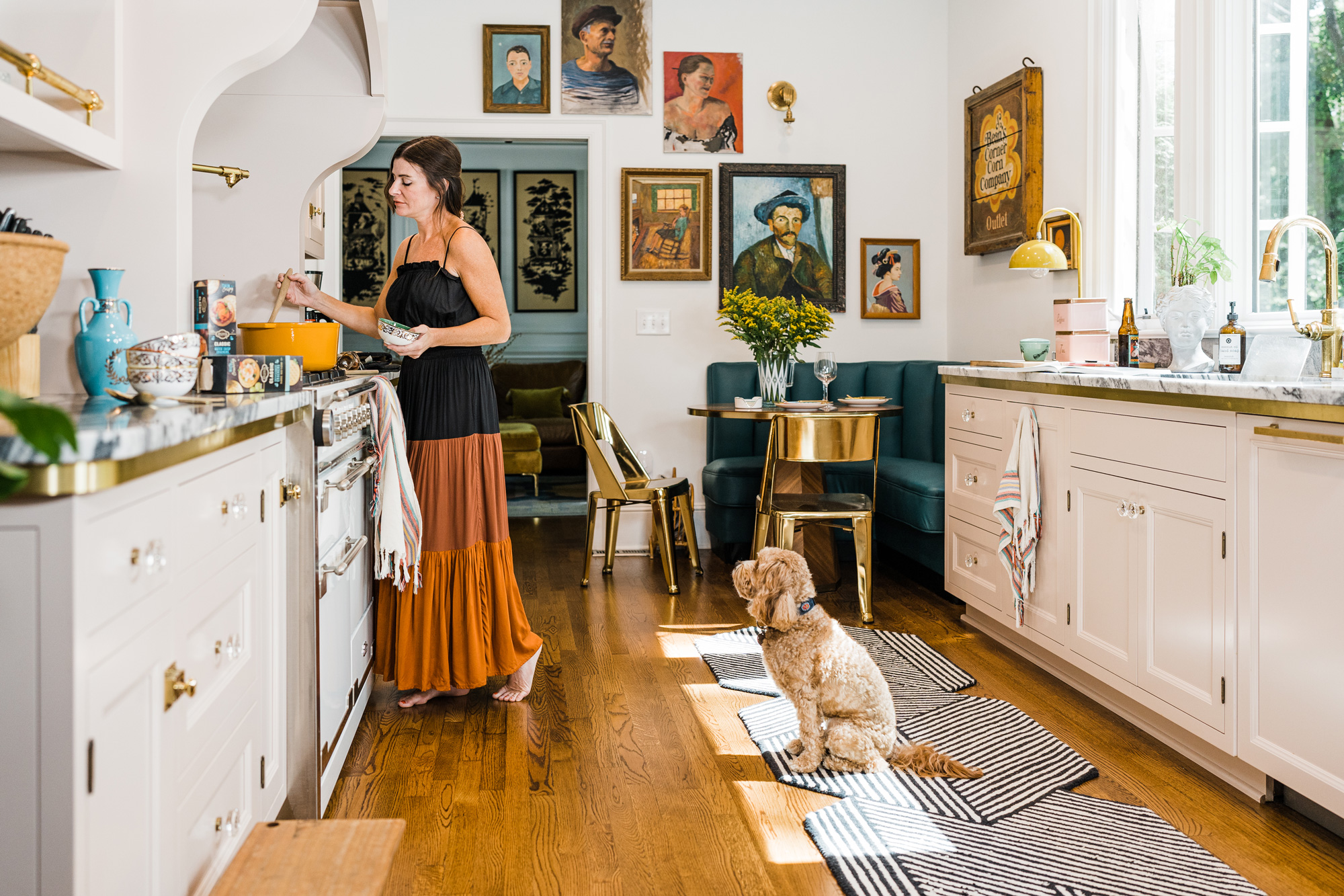
As the owner of vintage and eclectic style interior design company Home Ec., Natalie Papier knows a thing or two about color and light.
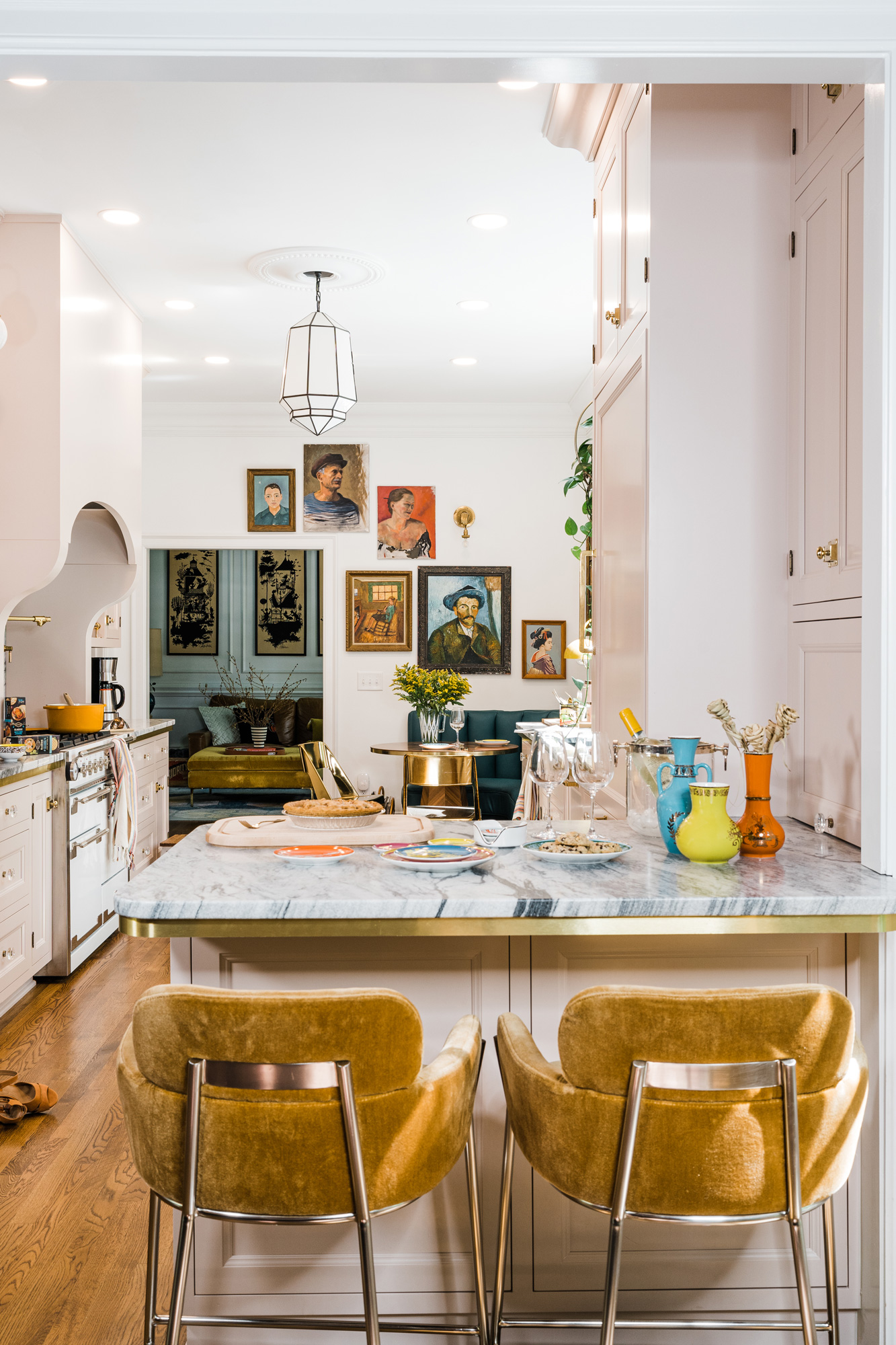
“I have a strong belief that homes should be a reflection of the people who live in them—full of life, character, and warmth,” she says.
We recently caught up with Natalie in the kitchen of her own home in Charlotte, North Carolina to find out more about her personal interior design preferences and how she most likes to spend her time at home.
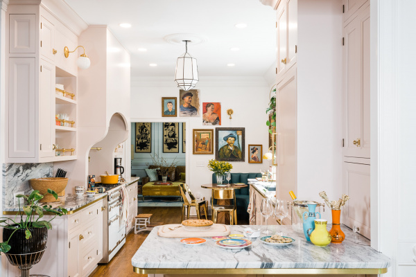
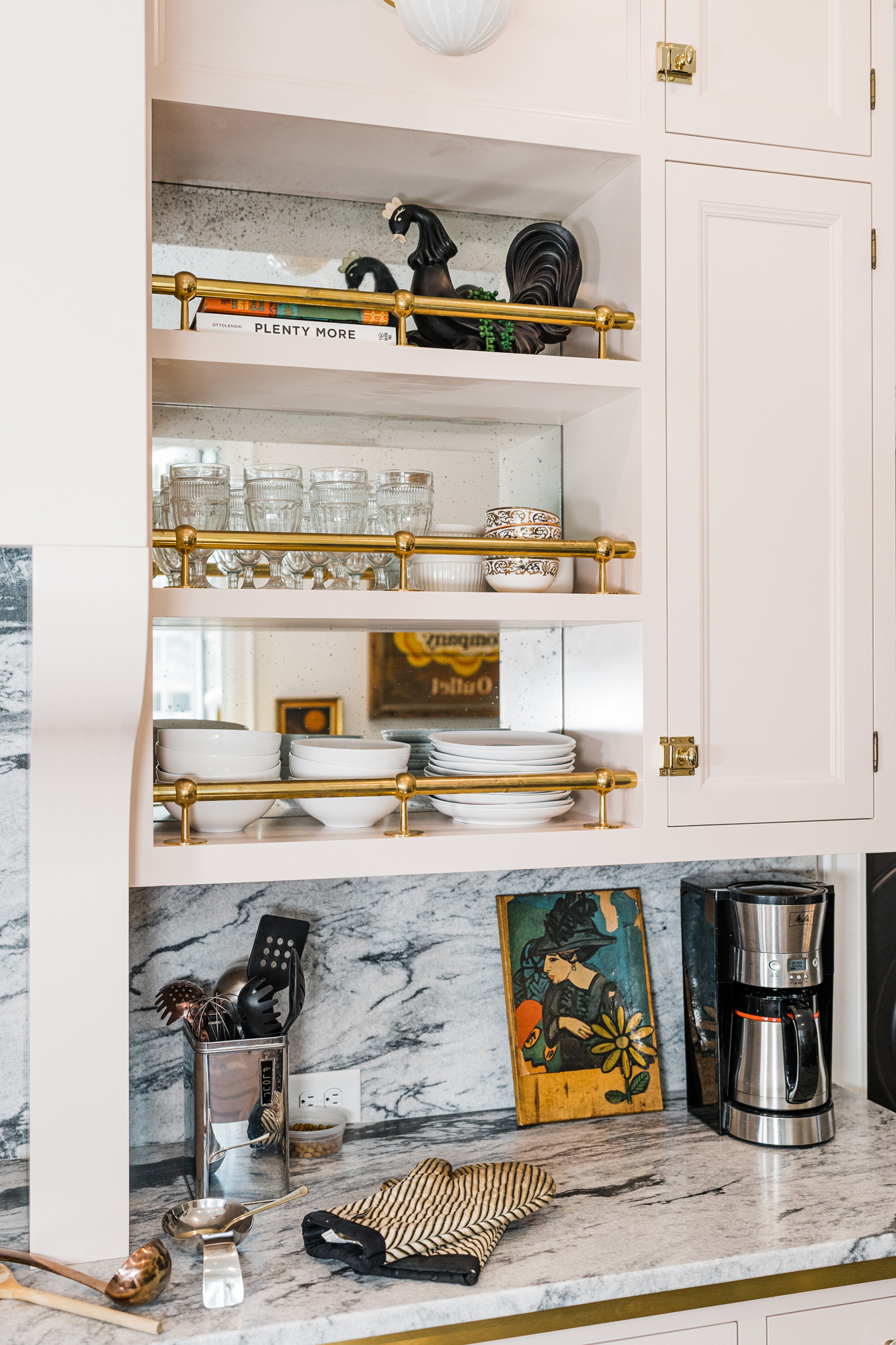
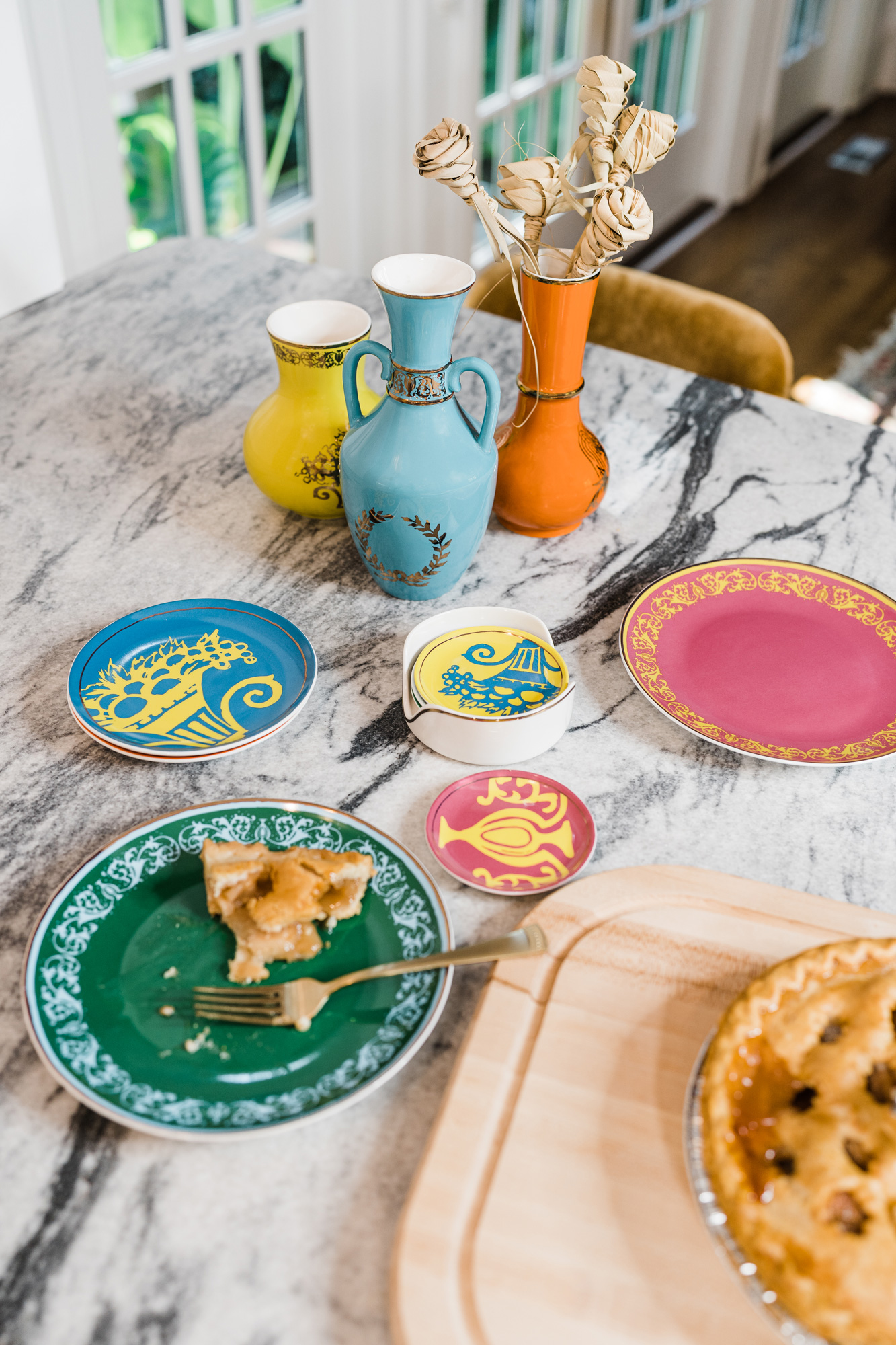
“There is always room for a color pop—especially in a pretty vase (like these from Lenox’s LX-Remix collection), whether you use it as a bud vase or decoratively on shelving. These pieces add so much interest to your countertops,” Natalie says. Photo by Megan Easterday
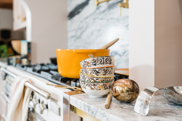
Lenox LX Remix set of four bowls. Photo by Megan Easterday
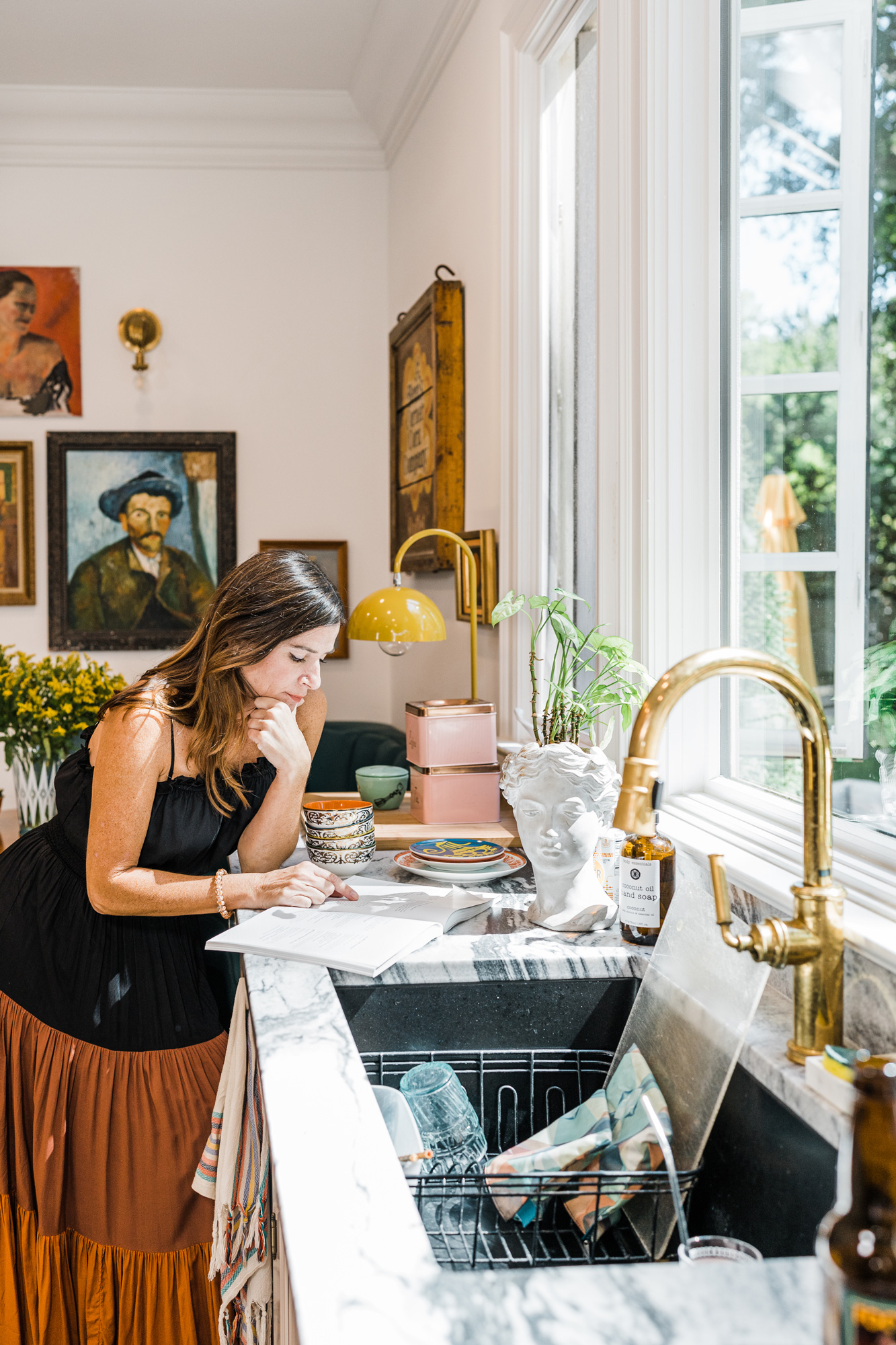
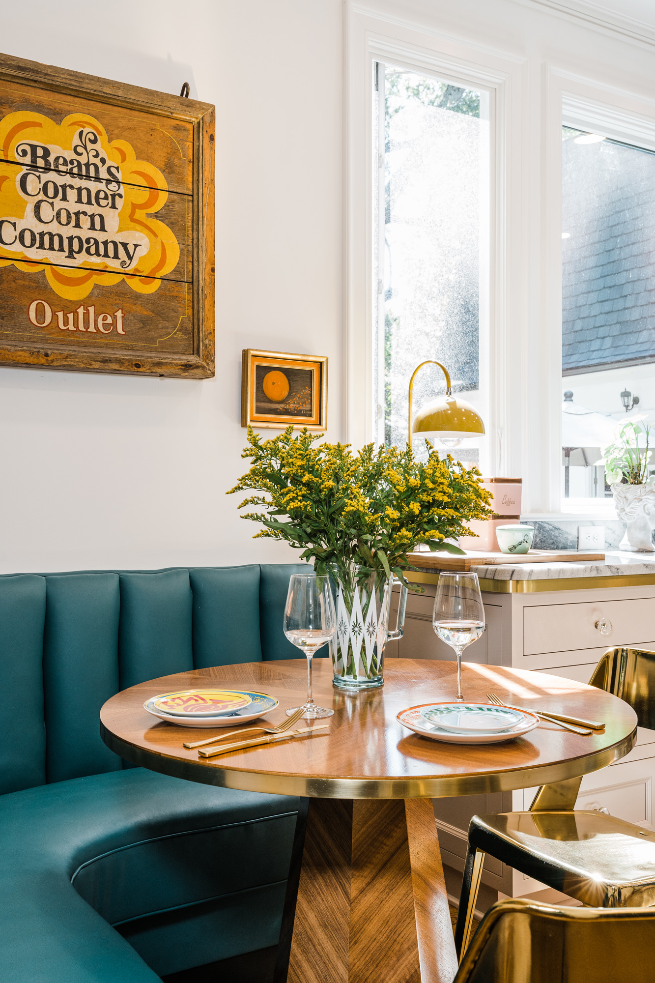
I spend most of my time in the kitchen… either sitting at the counter working, chatting with my kids in the breakfast nook, hanging with my husband when he cooks, or washing the dishes—which I don’t mind at all since I don’t do the cooking.
One unexpected thing I love in my kitchen is… the openness between the sink and stove. It’s where random family dance parties occur.
One thing I simply can’t live without is… a lot of light! When I designed this kitchen I wanted it to be as light and bright as possible.
When it comes to kitchen design, I really wish people would… stop just following trends and consider a design that is functional, works with the bones of the home, and is authentic to your design style. Less focused on doing what is IN and more of what works for YOU.
I use color… everywhere! Pops of color in art, pillows, decor, furniture, and paint bring joy and life into the spaces I design. But it’s all in the balance. I like to pair bold color pops with warm woods, plants, vintage, and natural elements.
I think pattern… is the most fun to play with. I really enjoy mixing different scale patterns for an interesting, layered design. It’s also an opportunity to bring in color in a big or subtle way.