As the curtains fell on Milan Design Week 2023, the global design community was left in awe of the extraordinary displays of creativity and craftsmanship that graced the city’s showrooms, galleries, and palazzi.
The week-long extravaganza, often referred to as the ‘Super Bowl of Interiors,’ was a showcase of the latest trends in design, from sustainable concepts that merge technology and nature to flexible living spaces adaptable to contemporary needs.
Major brands launched new collaborations with extravagant opening receptions alongside new talents, such as Sofia Zevi, who launched her new gallery space featuring a furniture collaboration with Chiarastella Cattana and architect Edgar Jayet. Nina Yashar, Milan’s doyenne of design, also made an impact with her showcase of Brazilian masters at Nilufar Gallery.
Milan Design Week 2023 was more than just a showcase of the latest trends, it was a celebration of the design industry’s ability to innovate, inspire, and shape the future of our living spaces. Here are the 16 exhibitions, products, experiences, and innovations that made our jaws drop:
1. Poikilos by Objects of Common Interest
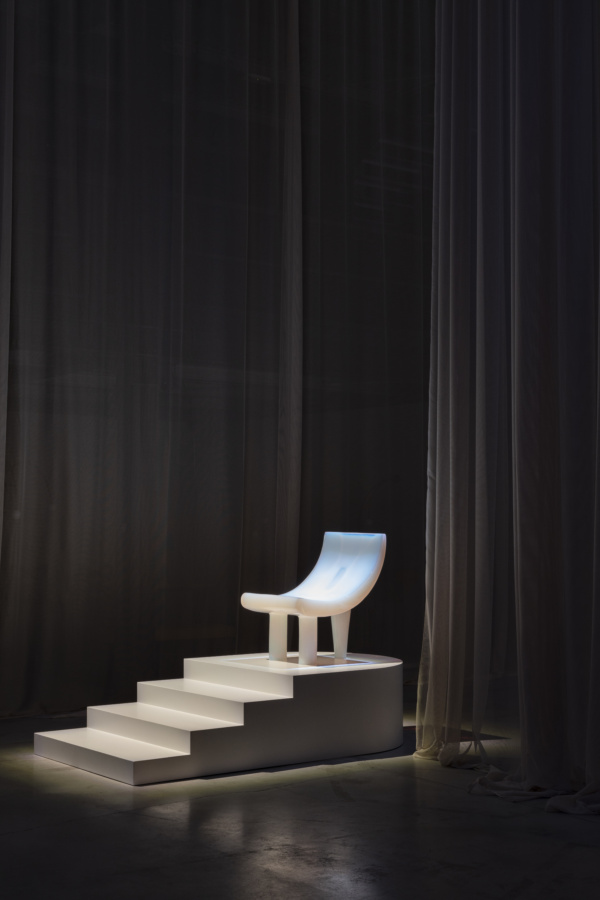
Photo by Ruy Teixeira, courtesy of Objects of Common Interest
The iridescent resin pieces Objects of Common Interest brought to Nilufar Gallery for Milan Design Week offer endless intrigue in their ethereal materiality. Studio founders Eleni Petaloti and Leonidas Trampoukis took on the specially formulated techniques and recipes of master craftsman Ovidiu Colea.
Ovidiu had been casting resin for 40 years when Eleni and Leonidas began learning how to produce his particular recipes and inherited his machinery. Upon Ovidiu’s retirement, he entrusted Objects of Common Interest with his techniques and equipment, helping them move everything to Athens and train the staff.
Poikilos is the first collection to result. Curated by Valentina Ciuffi of Studio Vedèt, the exhibition utilizes the pearlescent resin in sculptural furniture and homeware with the same contemporary aesthetic Objects of Common Interest is known for.
2. La Manufacture at Casa Manzoni
Courtesy of La Manufacture
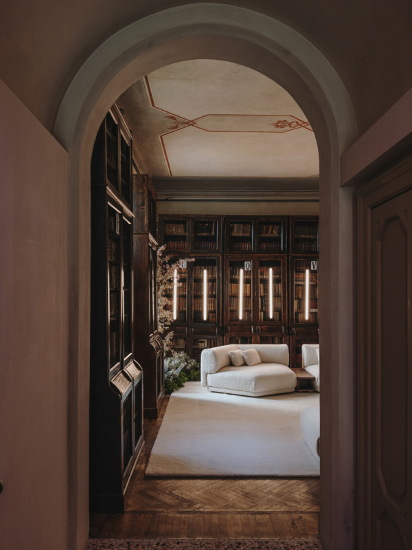
La Manufacture took over Casa Manzoni, where famed Italian writer Alessandro Manzoni was born in 1785, with a contemporary atmosphere complete with new products from Sebastian Herkner and collections by Neri&Hu, Nendo, Luca Nichetto, Patrick Norguet, Noé Duchau- four-Lawrance, Front, Ana Moussinet, and others.
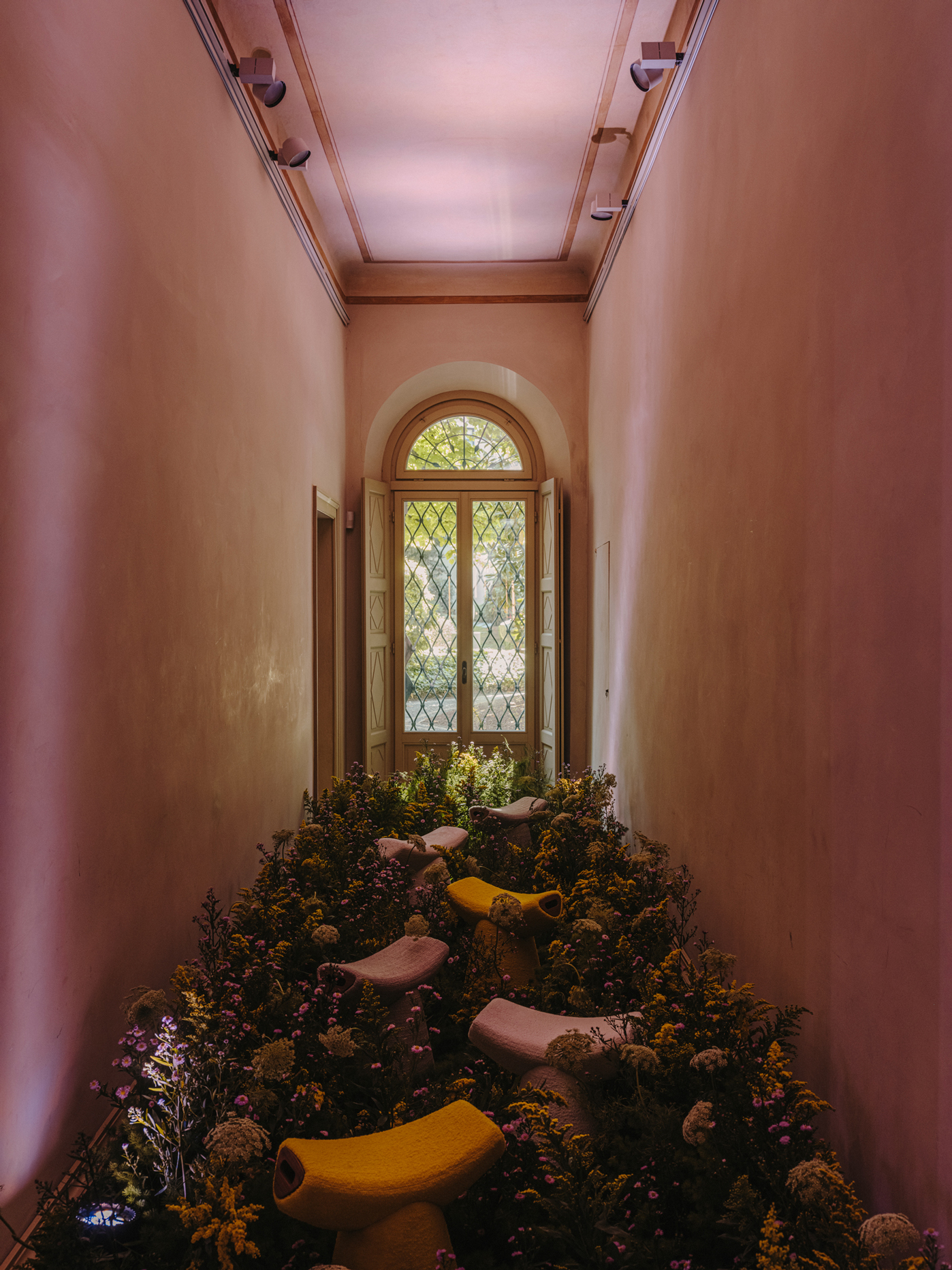
Wildflowers and greenery sprawled through the hallways as the harp of Mary Lattimore strummed through the air. The voice of actress Elena Rivoltini recited passages from Promessi Sposi, by Manzoni, and the classic French treat of bread and chocolate greeted guests. Seven distinct rooms and an outdoor patio host three nature-inspired collections by Sebastian Herkner: Moos, Gem, and Breeze.
The complete sensory transformation of Casa Manzoni served to showcase the French-Italian roots of La Manufacture, placing them in contrast with the historical site to create scenes of great beauty and intrigue, grounded by the new collections.
3. Desacralized by Galerie Philia
Courtesy of Galerie Philia
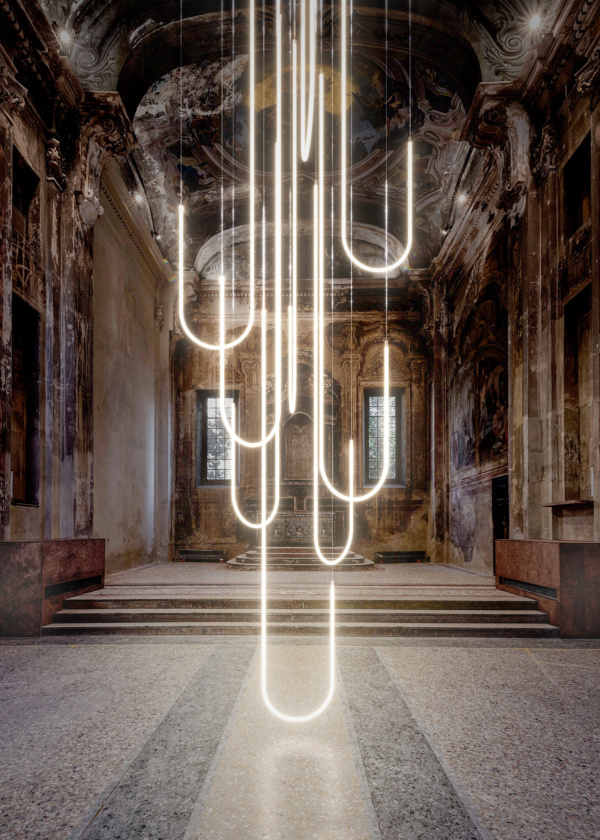
Galerie Philia concluded its investigation of the sacred with “Desacralized,” an exhibition of 20 designers’ work in a desacralized church just outside the city center. The gallery transformed the Italian church into a secular building, asking designers, including Rick Owens and Ukrainian studio FAINA, to take a cue from the history of the building and its transformation from religious significance to commonplace in works made exclusively in white.
The resulting exhibition took on a dreamy, otherworldly quality. The feel was slightly post-society—an 11th century building no longer a place for religious veneration but for stripped back simple appreciation of beauty. Each of the featured designs investigated elements of what makes a thing sacred through its history, iconography, and symbolism.
At the center of the exhibition, Italian design duo Morghen Studio interpreted the grandeur of a classic chandelier in a sculptural light installation, Cascades of Light. Studiopepe brought an octagonal marble side table inspired by ancient Italian baptistery and the symbolism of the number eight, which signifies rebirth in many religions.
4. LOEWE Chairs
Courtesy of LOEWE
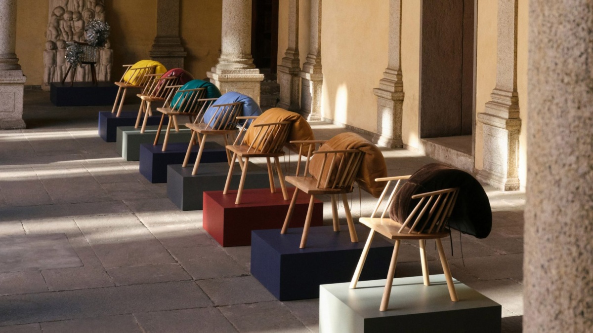
Loewe took the opposite approach from desacralization, celebrating the aesthetic and functional value of chairs in an exhibit dedicated to the infinite possibilities of the furniture. Loewe collaborators embellished 30 stick chairs—both antique and newly crafted—using various materials to show how a simple object transforms to something truly noteworthy with embellishment.
The project utilizes the brand’s special attention to craftsmanship, weaving leather, natural fibers like raffia, metal foil, shearling, and felt to bring new textures and colors to otherwise simple chairs. The chairs become bright, playful objects, in an interaction between the designer, their chosen material, and the humble, functional chair—now significantly less humble.
Leather cushions topped eight paper loom chairs by Belgian weaving specialists Vincent Sheppard and new stick chairs by the British company Westonbirt Woodworks. All the chairs were for sale, as well as the bags and leather goods inspired by the materials and techniques at work in the chairs.
5. Apacheta by Loro Piana
Courtesy of Loro Piana
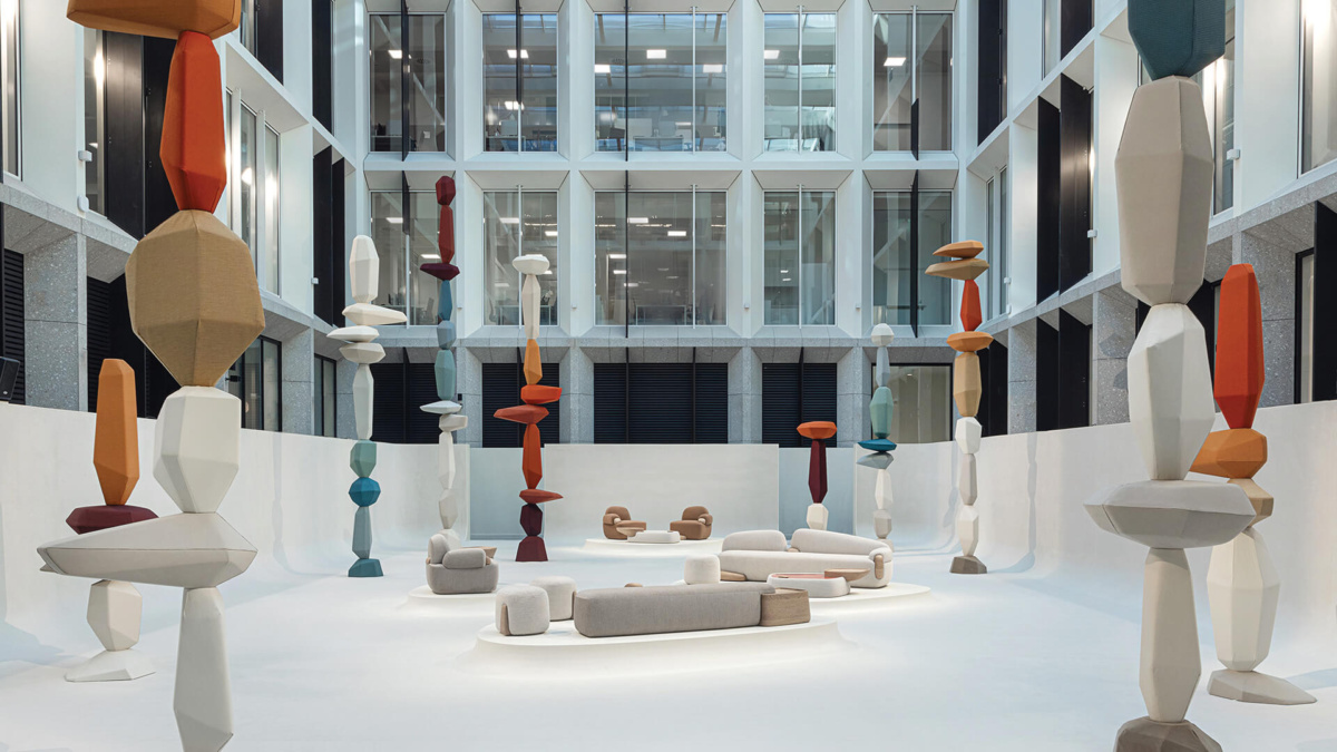
Loro Piana’s normally sleek and sedated headquarters received an Andean makeover, with tall pillars of earthen color rising in the quartyard. The installation, designed by Argentine designer and craftsman Cristián Mohaded, was more a landscape than an exhibition.
Cristián was inspired by Apachetas, piles of stones that honor the spirit of the Pachamama (Mother Earth) and indicate paths and passes across the Andes. Over centuries, travelers carried the stones, adding to the stony stacks to guide the way for those who would follow.
Cristián’s interpretation, though distinctly rocky in shape, is soft and tactile thanks to the upholstery made of vicuña, the precious animal fiber from Cristián’s home region of Catamarca, recycled from old Loro Piana collections. The designer also created a series of furniture with stonish shapes softened by the texturally rich Loro Piana textiles and ceramics in colors that reference Argentine lagoons.
6. Dior by Starck
Courtesy of Dior
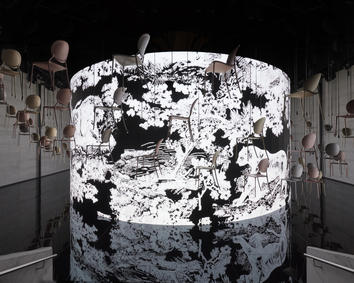
Philippe Starck imagined the Miss Dior chair back in his original Dior by Starck collection in 2022, but this year he used the chair in an enchanting installation right at Dior Maison’s home in Brera. The chairs, suspended in the air, formed an aerial display with whimsical notes. A magnetic black floor reflects the chairs in a hypnotic, surrounding experience.
7. “No Sense” and “Silence” by Dimorestudio
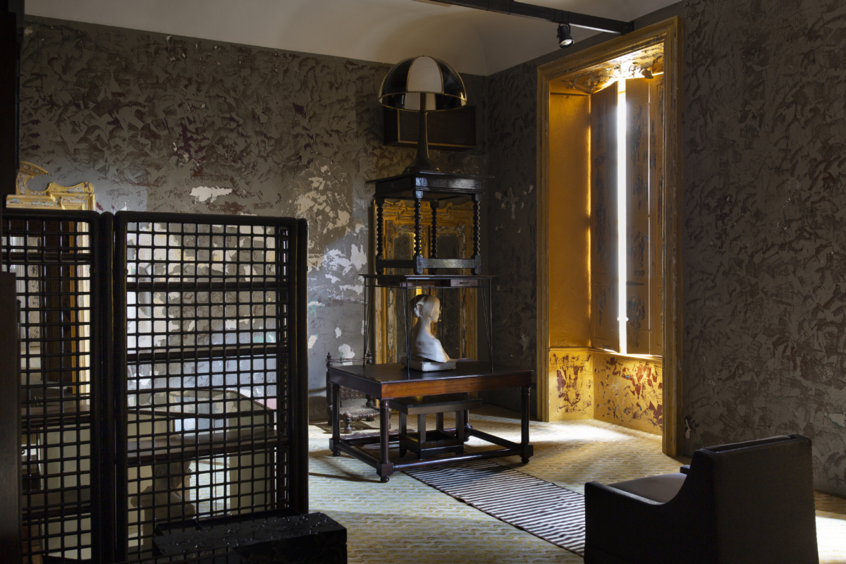
“No Sense” by Dimorestudio. Photo by Silvia Rivoltella
The trio of Dimorestudio, Dimoregallery, and Dimoremilano celebrated its 20th anniversary with “Silence” and “No Sense.” Creative Director Emiliano Salci designed the two installations complement each other. “Silence” told the story of the inspiration behind Dimorestudio in four environments viewed through holes in the wall. A fifth environment revealed the future of the studio: a new language returning to classicism, sophisticated, without excess, and never ostentatious.
In “No Sense,” the studio filled a historic Via Solferino apartment with work by young living artists alongside two masterpieces contributed by Galleria Massimo Minini in a return to the roots of Dimore with the ingredients that have come to define their style. In the darkness of the old apartment, works like a storage unit by Achille and Pier Giacomo Castiglioni, a bookcase by Afra and Tobia Scarpa for B&B Italia, and vb.v 006, an early work made by Vanessa Beecroft, are stacked up and arranged without obvious reason. A distinct apocalyptic feeling pervades the strange assemblies. As you explore the space, it becomes clear that although the installation is without sense, it is not without source—the sensibility of Dimorestudio is strong throughout.
8. Giorgetti Spiga – The Space
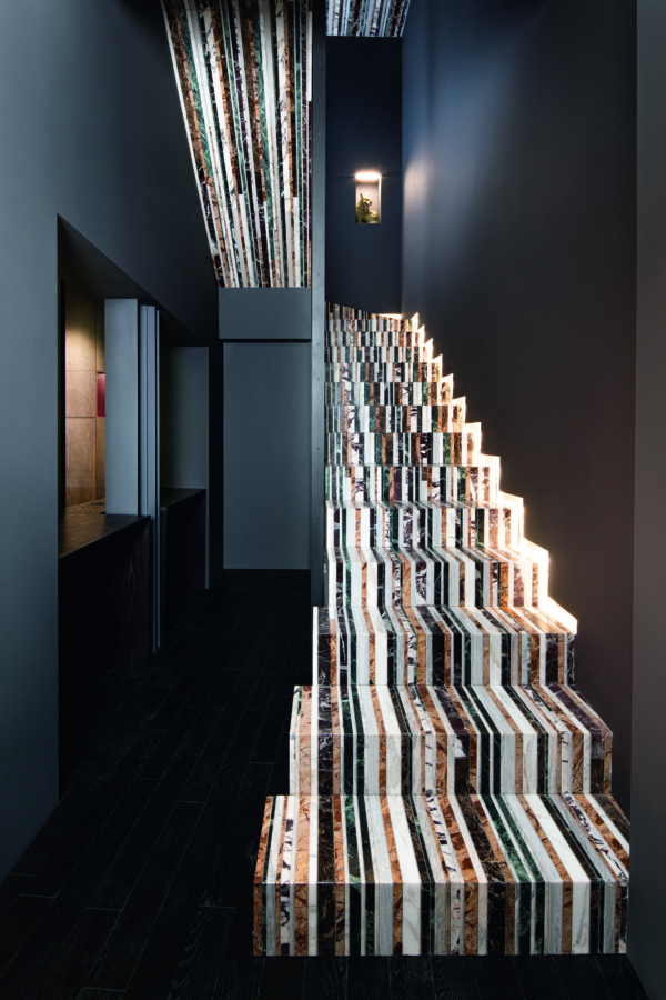
Photo by Simona Pesarini, courtesy of Giorgetti
A 125-year history of design is on display in the new house of Giorgetti in the heart of Milan’s high-end fashion and galleries. The Place by Giorgetti Spiga takes over Palazzo Giorgetti, a 17th century building, with bespoke beauty curated entirely by Giancarlo Bosio—from the custom-made parquet to the stunning, long striped marble staircase.
The Place goes beyond the design of the objects within to consider the full world of Giorgetti, from head to toe, in a full sensory space. Pieces from Oblong Contemporary Art Gallery and Brun Fine Art & Antiques Gallery surround Giorgetti’s masterpieces with still more beauty and sophistication.
9. Shigeru Ban’s installation for Yamagiwa
Courtesy of Yamagiwa
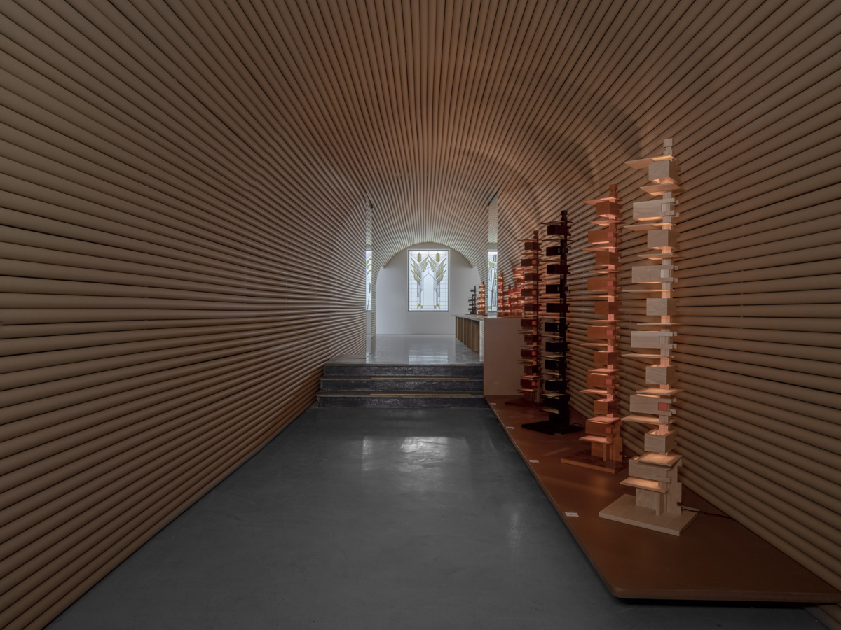
The Harmony of Form and Function displayed the Taliesin lights of Frank Lloyd Wright, produced by Japanese lighting brand Yamagiwa. Designed in 1933, the lights appear as tall strings of geometric squares and rectangles, totemic versions of the revered architect’s typical style.
To complement the geometry of the lights, architect Shigeru Ban created a tunnel-like space from paper tubes. His design for the tunnel drew inspiration from Frank’s own designs: the glass tube corridor at the Johnson Wax offices and the entrance area of the VC Morris Gift Shop, where long, thin bricks similar in color to the paper tubes. Paper tubes often appear in Shigeru Ban’s work, and in this case create decorative screens and a complete environment to appreciate the lights while also being easy to disassemble and repurpose upon the exhibit’s closing.
10. Clay Court Club by Cristina Celestino
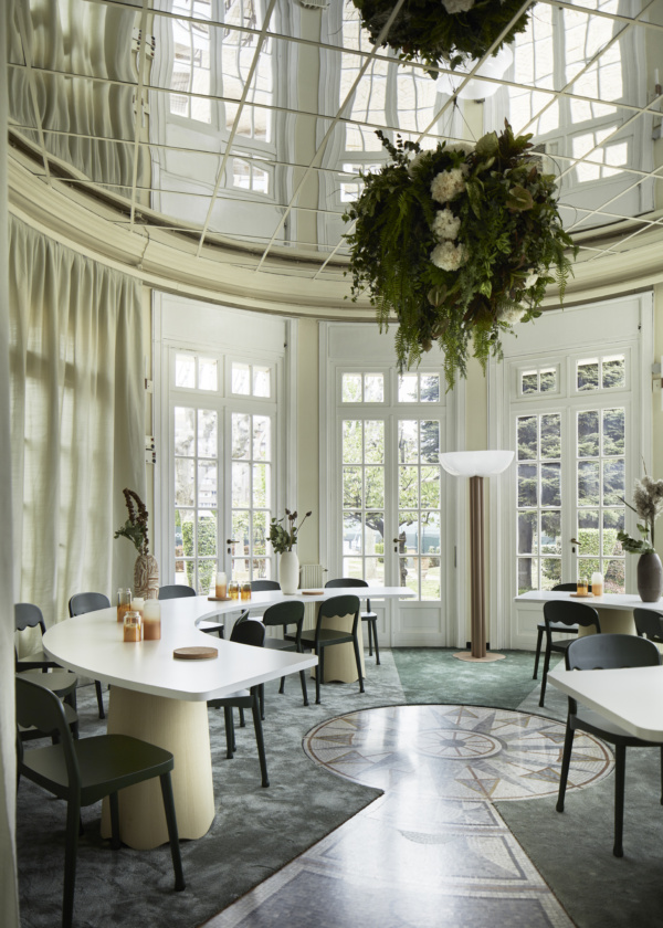
Photo by DePasqualeMaffini
It’s not often that a luxury design exhibition offers an opportunity to work out, but the Clay Court Club, designed by Cristina Celestino, combines the clay of a court with the clay used in design to emphasize the design history of Milan as shown in the headquarters of Tennis Club Milano Bonacossa.
The building, originally designed by architect Giovanni Muzio and constructed in 1930, contains rich original geometric and architectural details that embrace symmetry. Cristina utilizes furniture that references tennis motifs—nets, courts, rackets—and plays with lines and semicircles to blend the building’s original design with newly introduced objects. Chairs with interwoven details like tennis rackets, a bench similar to courtside seating, and temporary flooring that matches the red clay of a court all offer reference points to the sport and connection to the building’s roots.
11. Bottega Veneta “Vieni a Vedere”
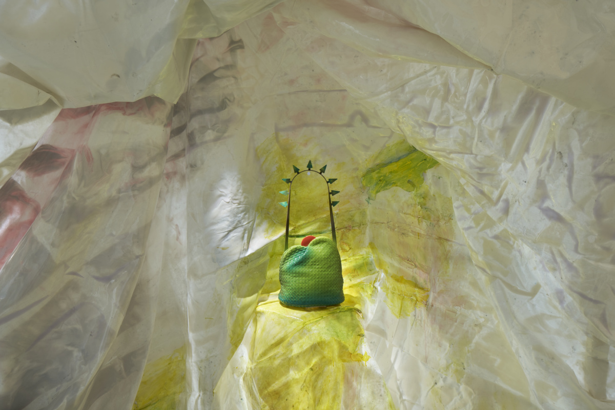
Photo by Matteo Canestrato, courtesy of Bottega Veneta
Gaetano Pesce is an Italian Radical Design pioneer and octogenarian, and now he is also a designer of bags! After creating Bottega Veneta’s Summer ‘23 runway set, Gaetano’s relationship with the fashion house continues with two optimistic, landscape-inspired bags revealed at Milan Design Week.
One bag, My Dear Mountains, found its inspiration in Gaetano’s installation of the same name for the facade of the Aspen Art Museum in 2022. It features a red clasp peeking out from the peaks to remind of the rising sun—as does the other design, My Dear Prairies, a fringed bag resembling rolling hills.
Both bags intend to show an optimistic view of the world to uplift people facing dark times. The bags were presented in a space like a cave made of resin-covered fabric and complete with wood carvings that suggest early cave art.
12. Louis Vuitton Objets Nomades
Courtesy of Louis Vuitton
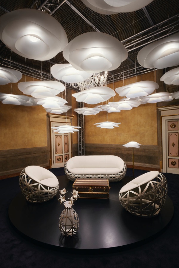
For the sixth year, Louis Vuitton presented the newest in its furniture and design objects collection during Milan Design Week. Since its creation in 2012, the Objets Nomades collection has grown to over 60 pieces by internationally renowned designers.
This year, 11 new Objets Nomades by innovative designers sat in the spotlight in the historic Palazzo Serbelloni. In the courtyard, a pavilion by MARC FORNES / THEVERYMANY glinted in the sun, a coral-like being seemingly bubbling up from the courtyard of the palazzo in an anodized aluminum structure. Ultrathin and speckled with holes, the structure interacted with light in a form that welcomed visitors inside to see the bold new works by Atelier Oï, Raw Edges, Atelier Biagetti, Marcel Wanders, Zanellato/Bortotto, Studio Louis Vuitton, and Campana.
13. SolidNature “Beyond the Surface”
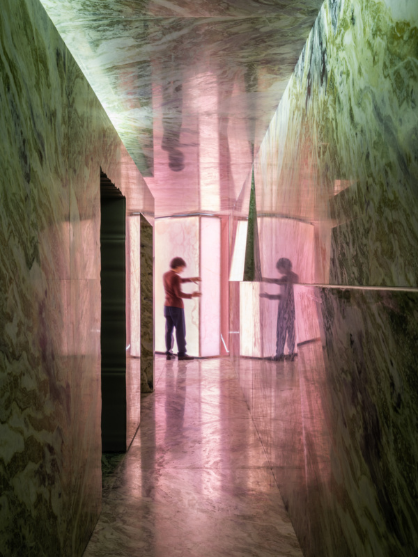
Photo by Marco Cappelletti, courtesy of OMA and SolidNature
SolidNature guided visitors through the process of realizing dreams in its first ever solo-show at Milan Design Week, Beyond the Surface. The immersive installation by Ellen Van Loon and Giulio Margheri of architectural firm OMA connects the formation of stone and achieving dreams, creating spaces that encapsulate the process of making something reality.
A narrowing corridor of onyx slabs represents the compression of stone and the narrowing focus of day-to-day lives. The stone-filled room led visitors from narrowing into confrontation, revelation, dedication, patience, reward, and paradise, where the stone and dream parallel merge in realized designs by Sabine Marcelis and Bita Fayyazi, among others. The journey through the space aimed to inspire and prove SolidNature’s dedication to creativity through comfort-zone- and boundary-pushing applications of stone.
14. Tacchini Flock
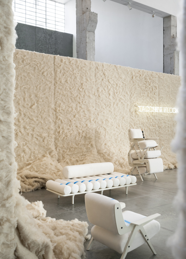
Photo by Andrea Ferrari, courtesy of Tacchini
Italian furniture manufacturer Tacchini collaborated with design studio Formafantasma to present an innovative sustainability-focused project titled “Tacchini Flock.” The project, which was showcased at an installation at Capsule Plaza, reimagined the upholstery of seating by introducing a sustainable, nature-based approach. Inspired by antique mattress production techniques, surplus sheep’s wool was used to replace industrial foam in the manufacture of iconic Tacchini designs. This process utilizes natural latex in combination with non-polluting sheep’s wool, a material often considered waste, to provide softness and stuffing to the furniture pieces.
The Flock project reworks four iconic upholstered seating options — Le Mura, Costela, Five to Nine, and Lina — from the inside out, addressing the circularity of materials.
15. Lindsey Adelman

Photo by Matteo Imbriani
At Alcova, the chandeliers of Lindsey Adelman were inside the first door at the entrance. Their jewelry-like chains and embellishments glint against the darkness of the old slaughterhouse walls, creating a magical and uncanny effect. The works combine blown glass with elements like rocks and metals in highly experimental compositions—some feel like geometric entrapments holding the lights in place, some like highly calculated mobiles, and others like lazy blobs of glass lounging against jagged rocks.
The works are part of her new LaLAB venture, wherein Lindsey steps beyond her usual studio practice to let her wildest ideas out and works without boundaries. The “Soft Opening” at Alcova showed three series: Cages, Mobiles, and Rock Lights.
Other Highlights from Milan Design Week 2023
Other brands with fantastic new products include Porro with the new ‘Romby’ armchair by GamFratesi, Rimadesio’s interpretation of modernity with the Sail sliding panels playing a crucial role. The Flos booth at Euroluce was a centerpiece of the fair, full of lighting designs from over the years—and a new lamp, Bilboquet. Inspired by a 16th century game and an exploration of magnetism, the lamp is Flos’ first collaboration with designer Philippe Malouin.
Foscarini’s new collections met the public at Euroluce and in two Fuorisalone installations by Ferruccio Laviani, presenting new lights like the textured pendant FREGIO by Andrea Anastasio in collaboration with Bottega Gatti. cc-tapis presented its contract carpets, cc-tapis project, at Salone del Mobile, with high-design offerings from Patricia Urquiola, Formafantasma, Objects of Common Interest, and more.
Sancal took us back to the ’80s with a disco themed palette, new collections, and special re-editions inspired by their 50th anniversary. Also in celebration of 50 years, Cassina’s exhibition, ‘Cassina Echoes’, marking a half century of their I Maestri collection, was certainly one to visit. The return of the beautiful 1967 Kashima sofa by Michel Ducaroy for Ligne Roset is worth noting—though it has perhaps been overshadowed by the 50th anniversary of the brand’s iconic Togo Sofa.
