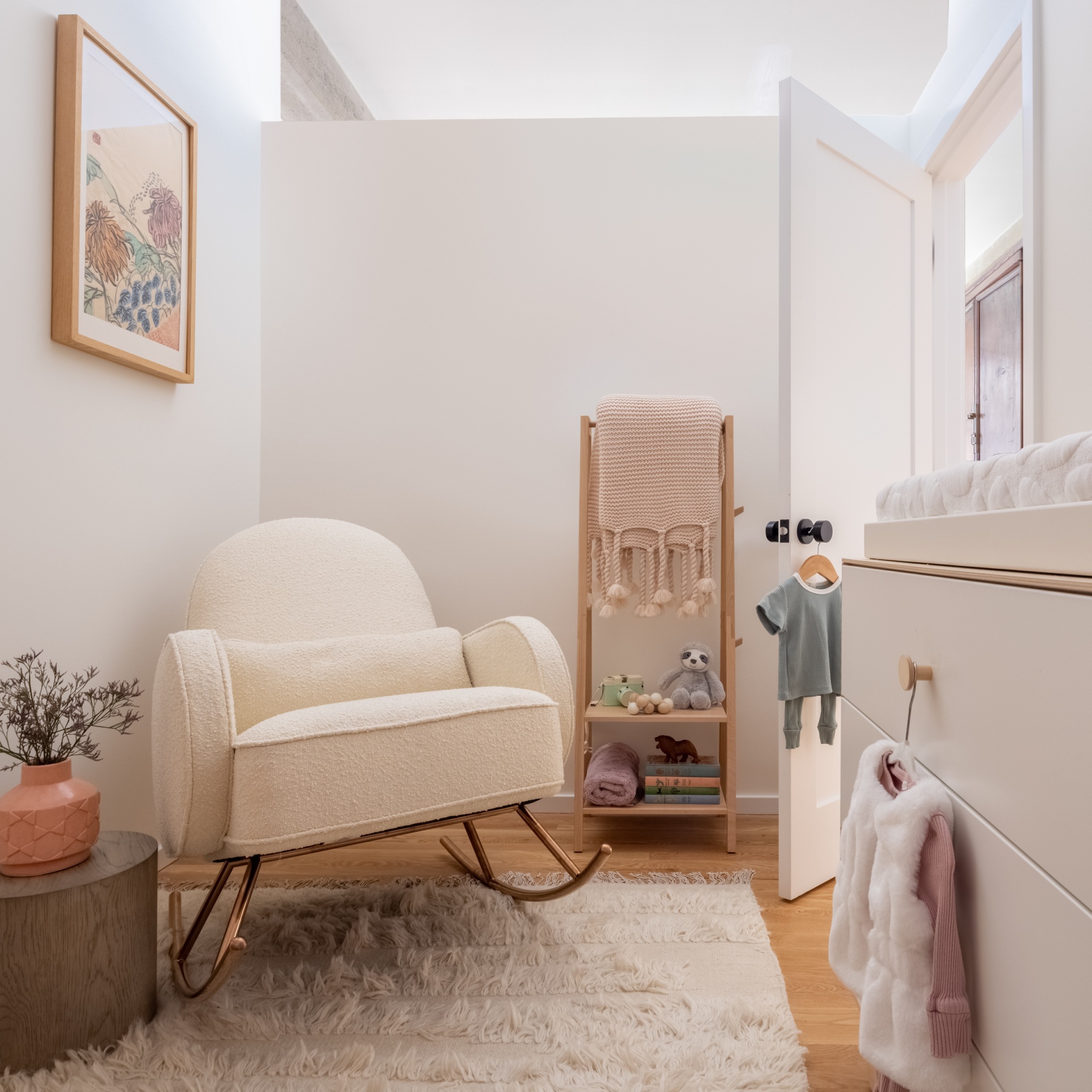
“I love working on nursery projects,” says Kathy Kuo, CEO of Kathy Kuo Home. “It’s a space where you can play out all your childhood fantasies for your newborn, and take risks that you wouldn’t typically take in the rest of the home.”
Earlier this year Kathy collaborated with the founders of Sixtysix magazine, to help them make their nursery dreams come true. It was all part of a larger renovation to a historic downtown loft—circa 1912 by George C. Nimmons in the Chicago school of architecture. A key concern in the project was getting the space planning right, the room was previously being used as a walk-in closet.
Kathy says the biggest challenge for this nursery project was the layout and size of the room. “Given the small space and structural obstacles—two of the walls don’t touch the ceiling—it was important for us to identify the key pieces to have in the space and make sure any additional items would only complement the design and not clutter it.”
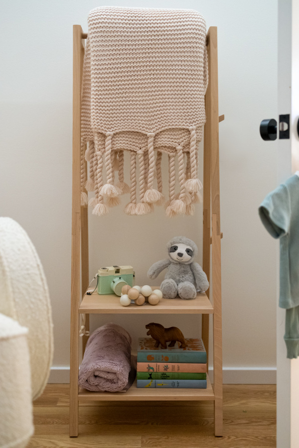
Cloathing rack SAGA in FSC certified blonde wood by Kid’s Concept. French Country Trestles throw by Pom Pom. Circolo Hammered Rosette Knob in Satin Black by Viaggio Hardware.
The design team wanted to incorporate a wardrobe or armoire into the room, as the small area was without closets. “We ultimately ended up doing something a little outside of the box; we couldn’t fit a closet in the room, so we selected a coat rack with open storage instead. It has the same functionality, while looking chic and simplistic—the style our client was going for.”
We asked the pros at Kathy Kuo Home for their top tips for how to design a loft nursery in a small space and more.
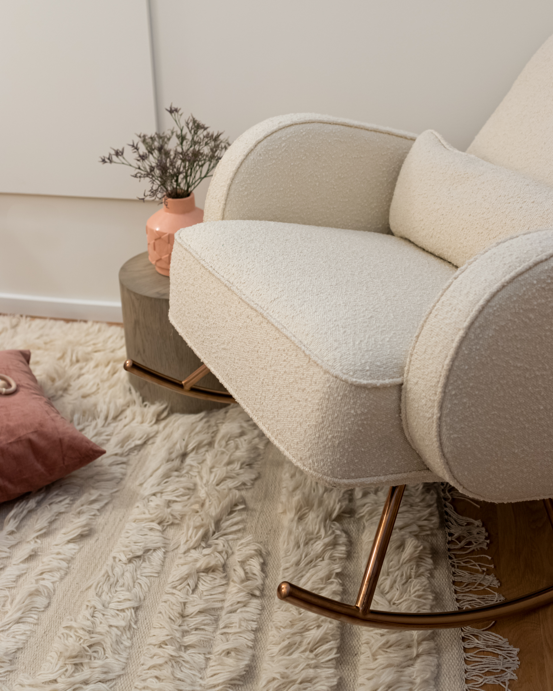
- Nursery Rocker in Classic Textured White Boucle with Rose Gold base by Connor Modern.
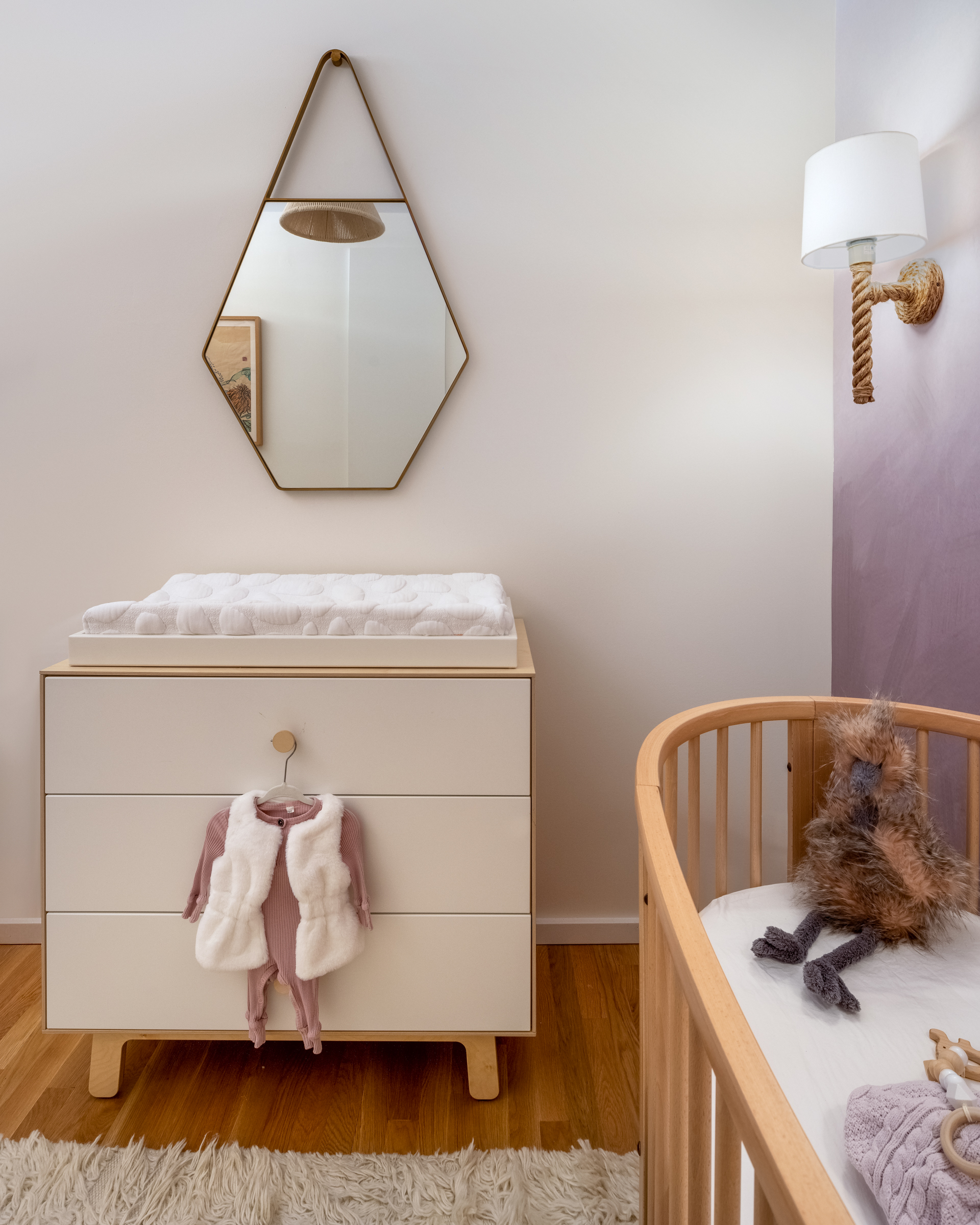
- Changing Station Dresser in birch by Oeuf Sparrow.
Tips for Working with a Designer: Set expectations.
“It’s important that you are on the same page with how you operate prior to starting the project and set expectations from the beginning,” Kathy says. “How long will the project take? How do you handle budget constraints or product cost changes? Try to get a sense of communication style and how involved you will be in the decision-making process, if that is important to you.”
Understand the real size of your space.
“The most important piece of advice is to start with accurate measurements and plan out the ‘program’ of each area of the room,” Kathy says. She defines “program” as how a space will be used functionally.
“In our case, we had a focal wall at one end of the room, a dresser next to it for storage, and a seating area in the corner diagonal from it, so even though the space was small it had a nice flow.”
Another pro tip Kathy offers is to make an L with both hands and create a vertical rectangle. Move your hands through the space, as this is how you will view your space. “It’s like creating well composed moments or vignettes for your eyes to rest on. This is also how you can understand height and scale,” she says. “In each ‘moment,’ does it feel right? If not, move around some things, or create placeholder blocks in your head of what you may need.”
On the Chicago loft project, Kathy and the team strategically selected products that utilized as little floor space as possible so the design didn’t feel clunky.
“We did this by taking advantage of the wall, opting for a hanging mirror alongside a chandelier and sconces as opposed to floor and table lamps.”
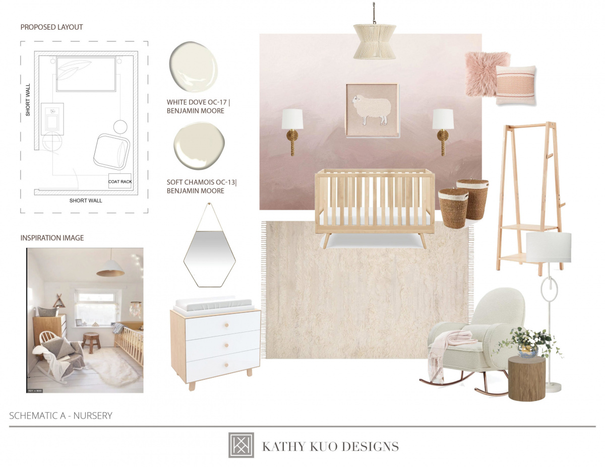
Kathy Kuo provided this schematic to work out the design approach and present the color palette.
Create hierarchy in the design.
Planning is key, Kathy says. “You always want to make sure there is enough circulation space around things—that drawers can open properly, rugs can fit well under the doorways—and our client can reach into all the corners even though the space is tight. Just like when we are designing larger spaces, we also want to create a hierarchy among the pieces so our eyes bounce around in the space, and when you step into the space it feels like the placement of everything is carefully thought through.”
The crib is typically the primary piece in any nursery design, so selecting one that fits the space is crucial when determining the remainder of the layout. Kathy says the Stokke Sleepi crib is a great option for smaller spaces, as the circular shape allows more options for placement, and the wheels make it easy to adjust positioning—not to mention it can be expanded so it can grow right along with the child.
“Maximizing storage space by selecting versatile pieces is another easy way to make the most of a smaller nursery space,” Kathy says. She points to the Oeuf Changing Station Dresser as another great option, as it also includes three drawers of storage. “Once your child no longer needs a changing station, that component can be removed and you’ll still have a chic dresser.”
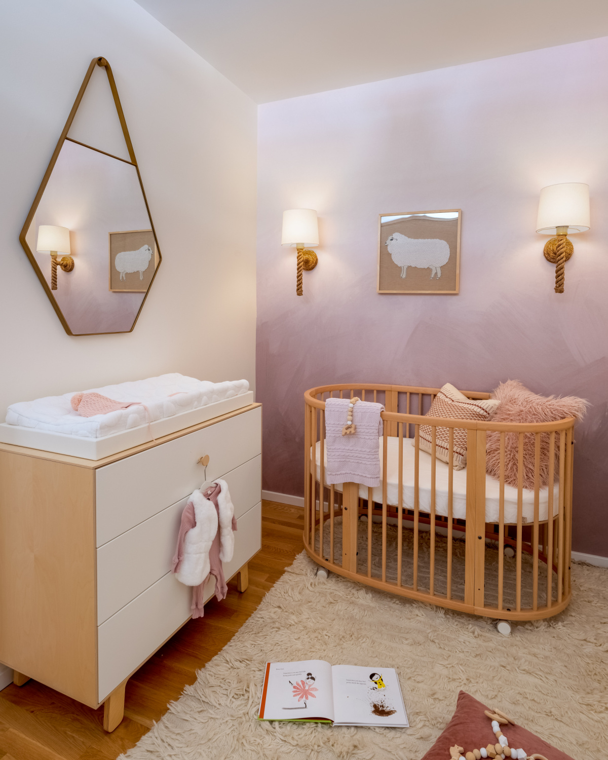
Kathy Kuo Home added a natural rug and fur down pillow to create a sense of texture and softness to the loft nursery.
Consider texture.
“We always center the design around the client’s aesthetic, style preferences, and lifestyle needs first,” Kathy says. “For this particular project, the client wanted to incorporate textures and tie the pink tones together throughout the space, so we went with materials like wood, rope, and boucle to create the warm, dream-like space you see now.”
It was also extremely important to consider the dynamics of the pieces in terms of their size and height, so that nothing would be too tall or overpowering in any sense, whether it was the crib, the chandelier, or the rocker.
PRODUCT LIST
3 Drawer Changing Station Dresser by Oeuf Sparrow
Organic Pebble Changing Pad by Nook Sleep
Hexagonal Gold Metal Frame Mirror by Larry
White Boucle Nursery Rocker by Connor Modern
Woven Cotton Hourglass Pendant by Giovanni Coastal
Cloathing Rack by Kid’s Concept
French Country Trestles throw by Pom Pom
Sleepi Crib by Stokke
Douglas Sconce by Arteriors
Pink Fur Down Pillow by Natalie
Natural Rug by Ellen DeGeneres X Loloi
Oak Cylinder Accent Table by Kelly Hoppen Morgan
Misty Pink-Tone Wallpaper by Anewall Roke
