From the minute you roll up to a hotel, you have an idea for how your stay will play out. The revolving door might be motorized and have large enough spaces for your bag to join you without hitting the back of your ankles with every step. The lobby glows with warm light, or maybe wakes you right up out of your jet lag with harsh overheads.
Based out of Sixtysix’s home Chicago, the hospitality design and development firm Gettys Group takes welcoming environments seriously, from your first glimpse of a hotel’s branding to check out. They are the team behind the recently revamped Chicago landmark Tribune Tower, Minneapolis’ Art Deco wonder the Rand Tower, and countless hotels around the world. From the branding to the development to the procurement, Gettys Group creates the ultimate hospitality experience in hotels firmly rooted in and inspired by their surroundings.
Gettys interiors is the largest team within Gettys Group, led by principal Chris McDonough. With a full service design studio equipped to handle story-driven boutique hotels, a select service studio, and an additional support studio based out of Manila, the team is equipped to handle any scope of project, and works closely with the other branches of Gettys to create enriching spaces. We spoke to Chris to understand how great hospitality spaces come to be.
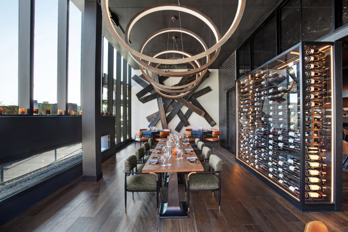
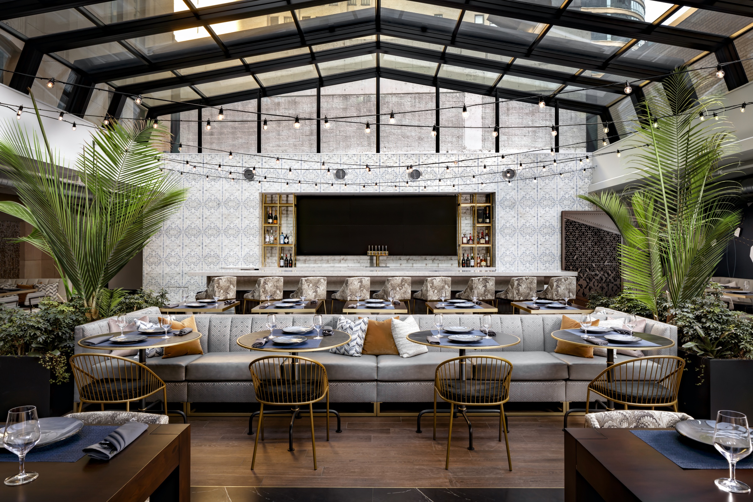
Dynamite at The Farnam private dining room. Photo by Eddie Harper
Since Gettys Group is such a large firm with several branches working more or less in sync, what does Gettys Interiors do, and how does it fit into the overall structure?
We are basically a full service hospitality design and development company. We do branding for many of our hotels that we design. We do procurement of furniture for many of the hotels that we design. We also have been developing hotels ourselves, for a number of years now. We like to think we can handle any and all scopes that are needed, but we also all operate a la carte, so each project can just be a specific line of services that we work on.
It’s more common than not to have more than one service working on a project. That’s what we strive for. We want to have as much of that process and ownership of the project as possible. Over the years we’ve developed and we keep improving our brand storytelling process and then translating that into interior design concepts and actual design. It is very clear when branding and design are not in, you know, synergistic bliss.
We work side by side—most of us are in Chicago, and we literally work all on the same floor. So even when the other services aren’t used on a project, we benefit from each other’s expertise. We draw upon each other’s knowledge.
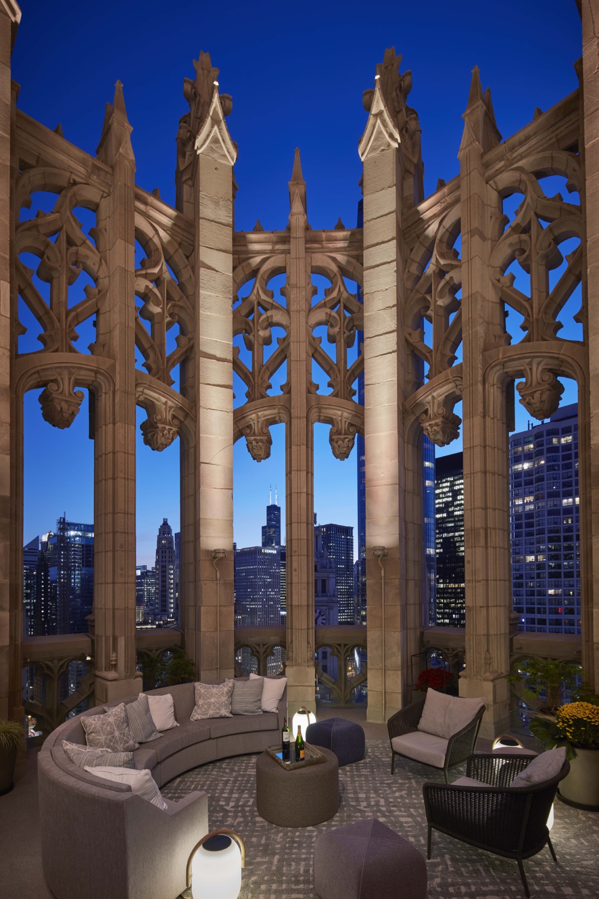
- Tribune Tower crown at night. Photo by Dave Burk
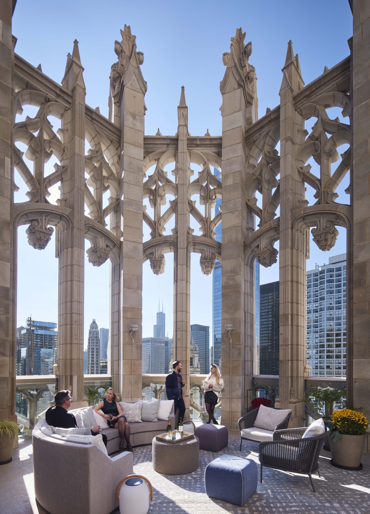
- Tribune Tower crown. Photo by Dave Burk
What are, more or less, the steps of designing a hotel? Is there a moment when you feel like things are really starting to click into place and you can envision how people are going to be using the space as it’ll end up being?
We do a lot of research to really understand the locale, the market, and what stories there are for us to draw upon. Then we’re getting ownership approval, but we’re also getting brand approval from the hotel groups. We figure out a strong foundation of the story, but also what the market needs. Once we get all that information gathering and foundational work figured out, we really begin designing it.
The design process is a lot about mood imagery, some narratives and writing, and quickly getting into 3D models and studies of the spaces. Particularly if it’s a renovation and there’s already a space there that we’re working within, we’ll quickly generate floor plan programming and diagrams to understand the flow of the hotel or the flow of the restaurant. Then we quickly get into 3D views to fully understand the opportunities that the spaces are presenting that tie back to that story.
“It is very clear when branding and design are not in synergistic bliss.”
Once you start to see it dimensionally, you start really launching into true collaboration with the owner, with your team, with the architect. You start shaping all those spaces together, and that’s when I think you can start to really feel what the outcome will be.
What is it like working with big hotel groups? How much creative freedom do you have, and how much does the hotel group brand guide the style of the spaces?
It very much depends on the brand, or the brand family. We work very closely with Marriott, Hilton, and IHG—those are the big three—and others. Over the years, we have developed a close relationship with many of the people in those brand families, so there is a good level of trust there where we’ve delivered on our promises of strong branding and strong design.
Each brand has their goals, and the larger brands, like Marriott for example, have many smaller brands that they have to delineate from each other. There’s great freedom in terms of creating a beautiful space and creating a very deep story, certainly on boutique hotels or soft branded hotels. They want a bespoke, specific experience for their guests.
Then for certain brands, the guest room itself is more of a package. You know, they want every Moxy room, as an example, to feel like a Moxy, but the lobbies and lounge spaces can be unique or bespoke to that city or that market.
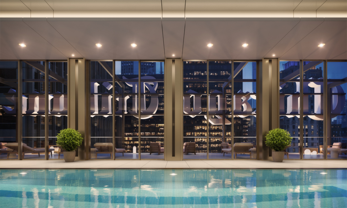
Tribune Tower pool. Photo by Dave Burk
Are there particular packages or spaces that are really enjoyable to design, or others that are especially challenging?
We all love hospitality. We’re very hospitality-focused just in our mindset. So honestly, we do love all spaces, certainly the F&B spaces [Food and Beverage, like restaurants or bars—sometimes flipped to put the drinks first: B&F], the lobby spaces, the spaces where people can be communal and share the experience. That’s where we get to show a deep, meaningful story for the hotel itself and make it memorable.
In terms of challenges, there’s just different project types. Obviously a new build has its own challenges in terms of creating something from scratch and working within the architectural kind of a core and a shell. We’re trying to help shape that as that’s happening. That’s really rewarding, and something we’re very strong at is designing from the inside out versus from the outside in. As you’re trying to transform a space, that’s one of the most fun aspects to our world is like, there’s this thing that already exists, and then a year, year and a half later, you walk in, you’re like, “Oh my God.” It’s a completely different experience for a guest. That’s what we love trying to do.
I’m sure you get a lot of those in Chicago because there are so many incredible older, really stunning architectures to transform. As Gettys Group is based in Chicago, how do you think that this particular city’s atmosphere and culture impacts your philosophy and style?
In a city like Chicago, any other larger metropolis, there’s so much to draw from and so many stories to uncover. I mean, there are a lot of like cliched or expected or traditional things that people might see Chicago as, but on some of our projects we’ve uncovered really interesting connections, histories, and stories.
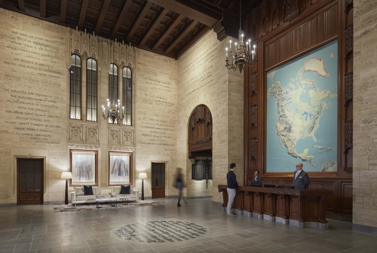
Tribune Tower lobby. Photo by Dave Burk
Sable [a hotel located on Navy Pier, opened in 2021] is an example of that on the branding side. We went pretty deep on Navy Pier and the military history there to create a brand story. But we do that on every project, regardless of the assignment. We’re somewhat design agnostic, so every project to us is different. We don’t have a certain look or style. Our identity is rooted in the research, and the story and what the market needs and the client.
But I think there’s a Chicago kind of welcomeness and hospitable aspect to how we design, as well as a pragmatic approach too. It’s not all just about looking pretty. It really has to work and function for an ownership group and for a guest. And it has to make money, right? We want to build beautiful spaces, but we think we’re very smart with how we use the space, too.
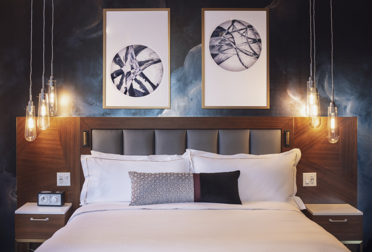
Rand Tower Guest Room. Photo by Brandon Barre
Is there a hotel you’ve worked on that stands out as a favorite?
Yeah, it’s interesting. For years we had so many projects in Chicago, and it’s been a little quieter lately. We’ve been doing so many projects in so many other areas.
One is Rand Tower in Minneapolis so it’s still regional. It’s a beautiful 1920s Art Deco building, and we were part of the development team, working with a local developer from day one to bring it back to life. It’s a case where we designed, branded, designed, and procured the project and turned basically an old office building into a beautiful, modern hotel but within a historic shell. We created a new roof deck, which previously was just an open roof. There was nothing to it, and we created a brand new F&B, revenue-generating guest experience. Any and all branding and coloring and fonts and story, all of that was all Gettys.
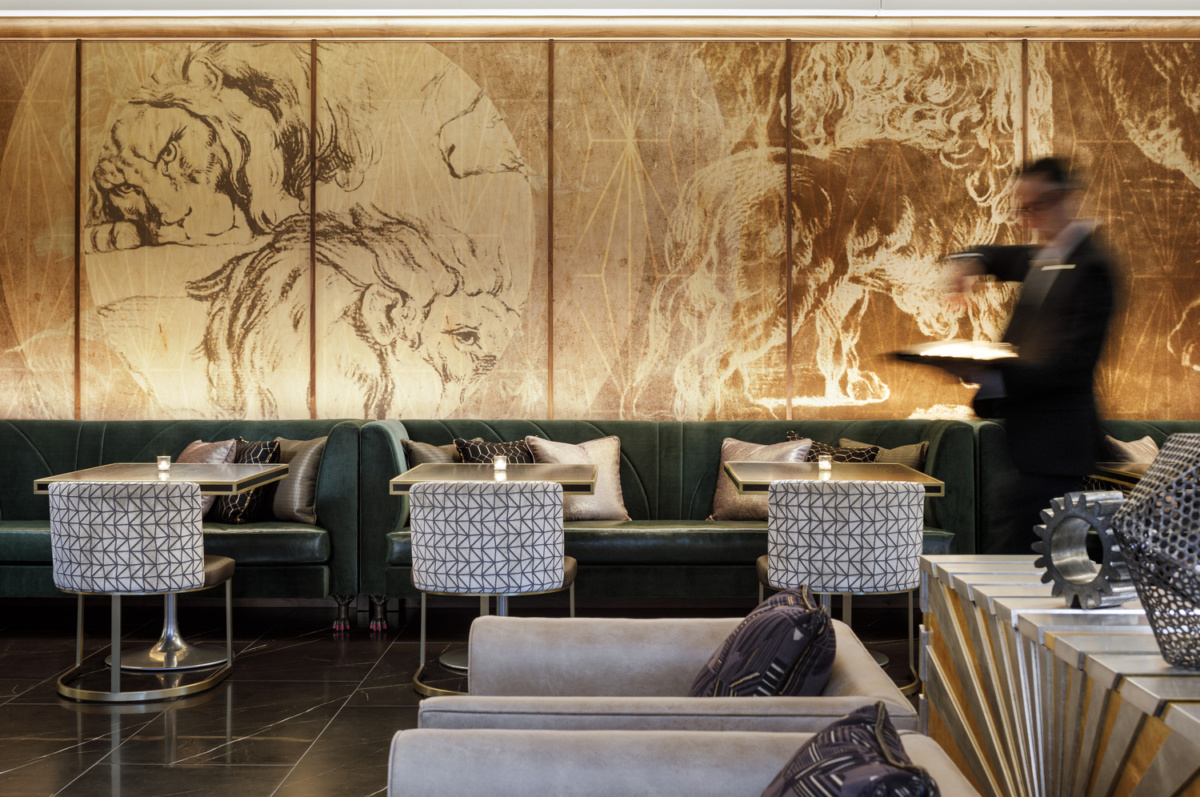
Rand Tower Hotel, a Marriott Tribute Portfolio Hotel in Minneapolis. Photo by Brandon Barre
When you were designing the F&B spaces there, what are some of the common threads or things that you are very considerate about maintaining in the public spaces and in the private spaces like the bedrooms that create that continuity and story line in a hotel?
Actually, in an odd way, we tend to want the food and beverage spaces, particularly a restaurant or a bar, to have its own identity. We want the guests to experience those spaces as a different kind of memory or different experience. It’s complimentary, but it’s a completely different story. It’s a completely different name.
Back in what I would call actually the bad old days, people didn’t want to be in hotel restaurants and lobbies. People wanted to go to a different restaurant or some other space. But now people will go to hotels just for the lobbies, just for the bars and the rooftops. So what’s driving that is it’s a destination in its own right. It has its own story and experience. In Rand Tower, that one ties together a little bit more because it’s a little more of the ’20s Art Deco era that we embraced, but in a modern way.
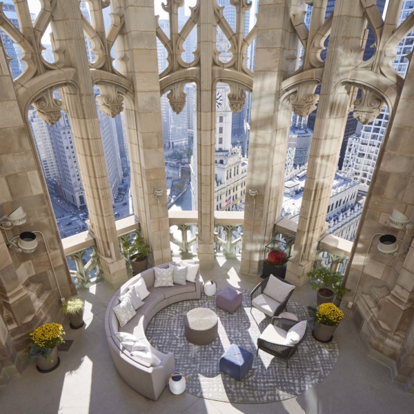
Tribune Tower crown. Photo by Dave Burk
You also did the Tribune Tower here in Chicago, which feels kind of similar. What did you do to transform this architectural landmark?
Tribune Tower was just an incredible transformation of a historic office building into residences. It’s a condo building, but there’s 55,000 square feet of amenity space there—all the lobby spaces, the mail area, all the normal spaces. And then we included a lot of event space and rentable lounge spaces, some flexible bar areas, a game area, like a dart lounge, and then the roof deck and pool component. We were instrumental in those spaces as well.
Are there particular strategies that you employ to blend a building’s history with its present day function or the way that you envision people engaging with it?
For that one particularly there were certain spaces that were just historically protected and sacred. We had to maintain those, for sure: the lobby space, and obviously the exterior, you really can’t touch. For us it was more about the level of finish and quality that we wanted to employ. There’s a certain look and feel to it. We knew we had to create something that was timeless within that historic shell, so it really turned into what were the appropriate materials to use everywhere that would blend with the existing materials in history.
Then we let the furniture be a little more modern and reflect what people’s expectations are today so that all of that amenity space is really just an extension of the individually owned units. How would they want that level of quality to be expressed, that they’re expecting in their own home living there?
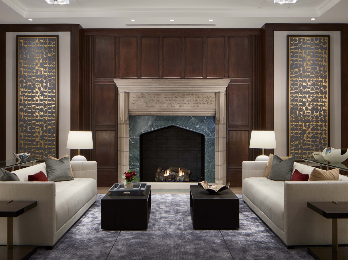
Tribune Tower fireplace. Photo by Dave Burk
What are some of those material tie-ins that connect to the building’s history?
Part of it’s the palette itself—lighter, more neutral for the finishes, particularly in the units—and just using certain classic materials: marbles and granites and travertine that are very complimentary to the existing stone work of the building itself.
At the end of the day though, it was really a clean slate inside, because the interiors were offices, and it wasn’t like anything was historically referencing outside of the lobby spaces. We did have a little bit of flexibility there.
How do you weigh all these different levels of design decisions, from the building history to the way people’s lives fit into it, to create the “story” of the space?
I think you bring up a good point around there’s different scales of design. You’ve probably been in spaces where you can tell if one person did this and another firm did that, and it’s not blended together, and it’s not really a cohesive experience. We take to heart that we want to provide that cohesive experience, and shaping the space isn’t just one scale, right?
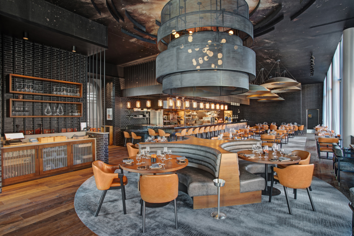
Dynamite Restaurant at the Farnam, an Omaha hotel designed within an old office building. Photo by Eddie Harper
Just figuring out how the spaces should flow together in a big hotel, what the program is, what the guest journey is—that’s a big deal for us, certainly in hospitality and in Gettys Group. We have this sort of macro view of things, but then we’re designing down to the furniture, the detail on the furniture, the artwork, the story that the artwork tells, the accessories. So that takes a broad amount of people and experience to pull all that together. In terms of a hospitality minded approach or outcome, all those scales really matter for that interior design type of process.
Of course, and then when a guest eventually comes to stay in the hotel, they actually do engage with the space on a really intimate level. The experience goes way beyond the first impression of “Oh, this is nice!”
I think it is a right brain, left brain thing, particularly with Gettys. We have a pragmatic approach, like I said, but it does need to look and feel beautiful. But you’re right, if the lighting’s not right in the bathroom, you’re going to feel that. If you don’t have a place to put something or plug something in or set your glass down, that’s part of that experience. It can be the most beautiful lobby in the world, but if you’re sitting there and you can’t actually like, operate, then it’s frustrating.
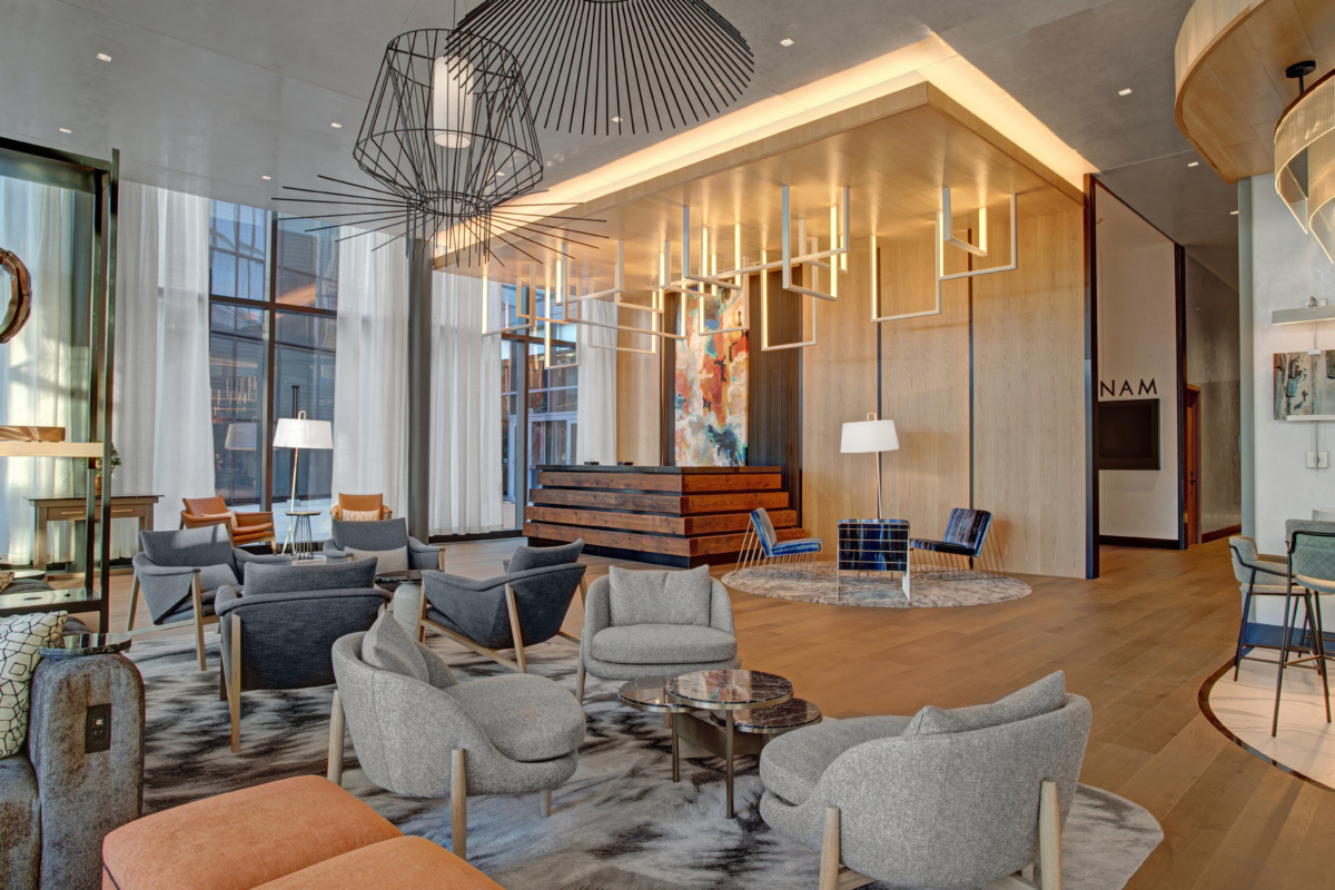
Lobby of The Farnam. Photo by Eddie Harper
Why does that first impression also matter?
We partnered very closely with a husband and wife developing team to design another pretty transformative project, the Farnam Hotel in Omaha, Nebraska. They wanted to create something very special in Omaha—it’s right downtown, just above a new park area. They really wanted to create a gateway to that city, because oftentimes people come into an airport and then they go right to their hotel. Hotels become these markers and gateways for cities and for owners.
