When architect Emanuela Frattini Magnusson spotted a set of beautiful wooden boxes in her client’s office, she had to ask: who made these? The answer was Lars Beller Fjetland, a Norwegian designer working an ocean away. That chance discovery sparked a friendship between two designers who think remarkably alike, though they took opposite paths to get there.
Emanuela, daughter of legendary Italian architect Gianfranco Frattini, grew up immersed in design but detoured through business school driven by a question: how does design create value in the corporate world? Her career has since bridged the worlds of design, architecture, and strategy. Her latest project with Momentum reimagines geometric patterns, translating them into textiles that feel both timeless and contemporary.
Lars came to design from a different direction. While studying biology, he became obsessed with flea markets and dumpster diving, rescuing discarded objects and reimagining their potential. That curiosity eventually led him to business school, and later to design school, where he found his calling. Now based in Norway, Lars has become something of an evangelist for aluminum, convinced it’s the material of the future.
In this conversation Lars and Emanuela discuss timelessness and patina, their unconventional educations, and why the best projects often come from the tightest constraints.
“Design is problem-solving,” says Lars. “Even my whimsical products involve problem-solving—I’m defining what the problem is. You go through mental exercises, and how our different brains are wired determines the output.” Photo courtesy of HEM
Emanuela Frattini Magnusson: We met through a client, which tells you something—our work shares an affinity for using materials correctly and approaching design briefs in a similar way. I saw these beautiful wooden boxes at my client’s office and asked who designed them. They were made by Lars. That’s how I discovered his work several years ago. We later met in person in America and in Milan at Salone.
Our aesthetics aren’t identical, but they have affinity. Decoration doesn’t really interest us—it’s a result of our thought process rather than the goal. With certain colleagues you find common ground and share similar views on design.
Lars Beller Fjetland: I was honored to be invited into this conversation. I have so much appreciation for Emanuela’s work. We have a similar approach and a deep appreciation for materials and using them in ways that make sense, not fighting the material but working with it. That’s probably how we ended up with similar clients.
We’re not preoccupied with trends. We live in our own bubble, making things that interest us and hoping they interest others too. But that’s not the driving force; it’s more inner curiosity. I have a childish curiosity about things. Some projects I make are silly and don’t necessarily have a specific purpose, but they’re personally motivated.
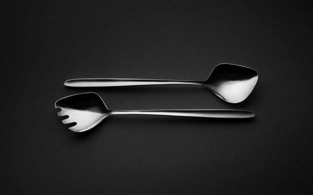
“Neither of us is motivated by money professionally,” says Lars. “I love meeting interesting people and having interesting conversations.” Above: Lars’ Monstera silverware for SJUR POLLEN, photo courtesy of SJUR POLLEN.
I agree about using materials for what they can offer, sometimes finding new ways to use them. We both like to work with a long-term view and not doing things quickly and cheaply. It’s presumptuous to want your work to last, but it’s also responsible. Build things so they don’t fall apart after three months, so the material doesn’t need expensive maintenance, so it’s okay to age and have patina.
You’re touching on something important about sustainability. A lot of a product’s impact is decided at the material stage—what raw material are you using? But there’s also visual relevance. I try to make things timeless; that’s my goal. We need products that will be visually relevant in 50 years or longer. If we make products with excellent materials but they’re perceived as irrelevant in 5 or 10 years, we’ve lost. We need both visual aesthetic relevance and good materials that can patinate and gain quality through aging.
It’s a more European approach—letting things age and show signs of time, which is its own type of beauty.
I’ve visited residential houses in Milan and seen old Carrara countertops worn down in kitchens, and it’s beautiful. In Norway we renovate every 20 years so things never reach that point. Because we renovate so often, we never really invest in quality. Seeing worn-down staircases and terrazzo flooring in Milan made me realize there’s quality and beauty in patina and in being able to observe use.
That connects to timelessness and our backgrounds too. I was taught that design is a thought process you apply at different scales. That’s why Italian architects were trained to design everything from ceramic tiles to major buildings. You’re asked to design something, you have the technical tools to make it real, and you do that at different scales. The complexity changes but the problem-solving doesn’t.
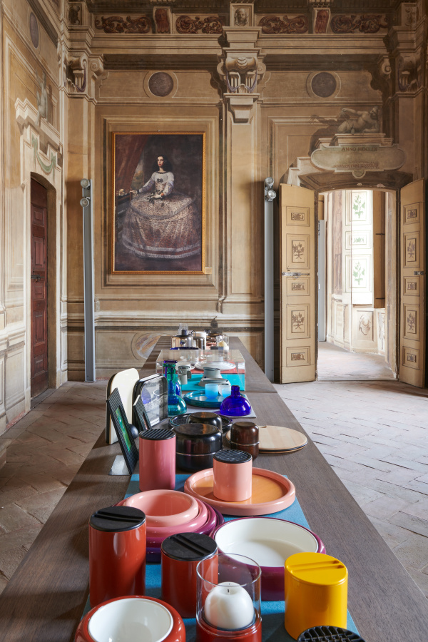
“My father drilled the idea of timelessness into me,” says Emanuela. “He always said: ‘Do things with the best quality you can afford. Don’t cut corners because you’ll regret it.’” Opposite: The Gianfranco Frattini exhibtion at Palazzo Arese during Salone del Mobile 2023. Photo by Max Pescio
My father drilled the idea of timelessness into me. He always said: “Do things with the best quality you can afford. Don’t cut corners because you’ll regret it. Invest in quality for the long term.”
Design is problem-solving. Even my whimsical products involve problem-solving—I’m defining what the problem is. You go through mental exercises, and how our different brains are wired determines the output. I’m realizing I can apply this method in other fields too. When I interact with students, I tell them not to limit themselves to products. This way of thinking can be applied everywhere.
We’re educating too many furniture and lighting designers every year. What are they supposed to do? It should be about opening up the field to show we can do more than just products.
Exactly. There are many good solutions to one design brief. Design isn’t an exact science. But there’s an objective component—needs, resources, costs, available tools. How you solve all of that depends on who you are—your background, the people you’ve met, places you’ve lived, experiences, personal preferences. That shapes the objective requirements uniquely if your approach is sincere. If you’re not copying someone or following trends, but really trying to optimize the response with your own perspective.
The ingredients are the same, but the magic sauce is within us and the results can be radically different. I don’t mind constraints like price points or end users. Some designers prefer not to think about those things, feeling it taints the product. I’m the opposite. It’s interesting to narrow things down and have direction. When you make the right product that solves all these requirements, it has inherent beauty through the concept. It’s perfectly right for its purpose.
“Letting things age and show signs of time is its own type of beauty.” -Emanuela Frattini Magnusson
Most of my projects are self-initiated, but I don’t mind working on briefs. It’s actually nice to have parameters.
Even with self-initiated projects, you give yourself tasks that help you make something better, cheaper, and longer-lasting. There’s a reason for the project, and that’s your restriction.
Before design school I was confused about what to do. I studied biology for two years, then business school for three years. During business school I became curious about design—going to flea markets, dumpster diving, researching objects, and developing my taste. I learned so much during those years. It gives you an archive or a reference library, in a way. You’ve seen a million ways to solve a chair. How do you extrapolate the essence of reference projects and make them relevant today for that user group, material, or price?
If you’re a bit of a nerd who is interested in design history, the desire for timelessness comes naturally. Not everyone will be a historical figure in design, but you appreciate that quality in designers who made it. For me Alvar Aalto is the greatest because his designs are still modern and relevant.
Curiosity is key. The more you see and expose yourself to, the more ideas sit in your subconscious and accumulate. Then when you have an assignment, some memory drawer opens and resurfaces.
I find it interesting that you went from business to design school. I had the opposite path because it was always clear I loved what my father did. Going to his office was a joy—models, drawings, beautiful renderings by hand, masses of colored crayons. I thought, “If this is work, this is what I want to do.”
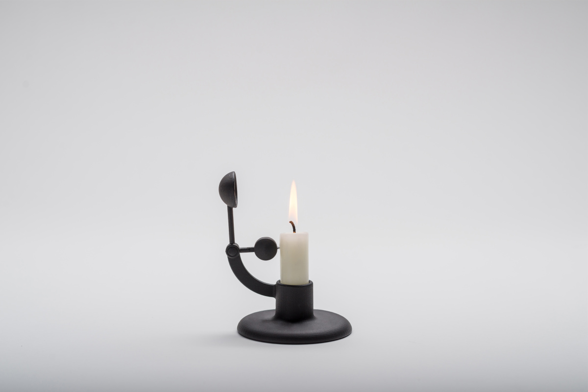
Moment candlestick holder in cast-iron for HAY, photo courtesy of HAY
But in architecture school, you don’t get any sense of how you fit into a value chain or economy. That was frustrating. Even in product design, you have to fit into equations that work for a company. I felt I needed to understand corporate operations better, so I went to business school afterward. We have parallel education paths, just in opposite directions.
It’s a good educational combination. Otherwise you’re in the realm of limited editions and art, which is great but different.
It’s a niche for sure. I wasn’t a good student at business school, but it had a big impact. I could sit with a CEO or marketing person and understand their language. They saw me as professional, not just a student. Sometimes it’s about asking the right questions and quickly understanding what the client really needs. By actively pursuing important details about price points and requirements, you understand what you have to make. Sometimes you realize the client’s asking for something they don’t really want.
We have a responsibility to ask the right questions and ensure the right issues are addressed.
In my business school class, I was the black sheep too—the only creative. Everyone else came from law, finance, or marketing. I wasn’t a genius either; I barely squeaked through corporate finance. But I felt I learned something missing from my education. It sparked my interest in working as a creative director in a larger corporation, and understanding how design adds value, makes more efficient products, and better workspaces. You need to understand how a corporation works to do that.
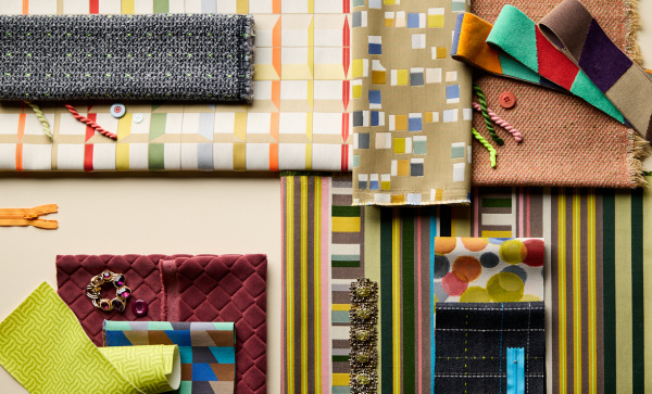
The Frattini Collection reflects a culmination of Emanuela’s dynamic design approach, highlighted by the bold Frattini Stripe. The stripe represents a harmonious conversation of hues and rhythms. Photo courtesy of Momentum
That’s what I’m doing now! I’ve been working as an art director for two years on strategy and concept development for a huge aluminum company. That’s why I said we can do much more than just products. We apply the same methods and logic, and it’s interesting what results we can achieve.
When I worked as a design director for five years, I realized we can design strategy. It’s the same process. We designed the thought process for workplace design to reflect corporate identity while being local. When you have offices everywhere and fly ten hours from New York to São Paulo, it’s nice to sense you’ve arrived somewhere different, not see the same thing you left.
Graphics has an important role—maintaining corporate identity—but architectural language, detailing, and materials should be local. The philosophy of designing space—transparency, common spaces, how people work—needs to be universal. It’s multilayered, and I wouldn’t have had that clarity without business school.
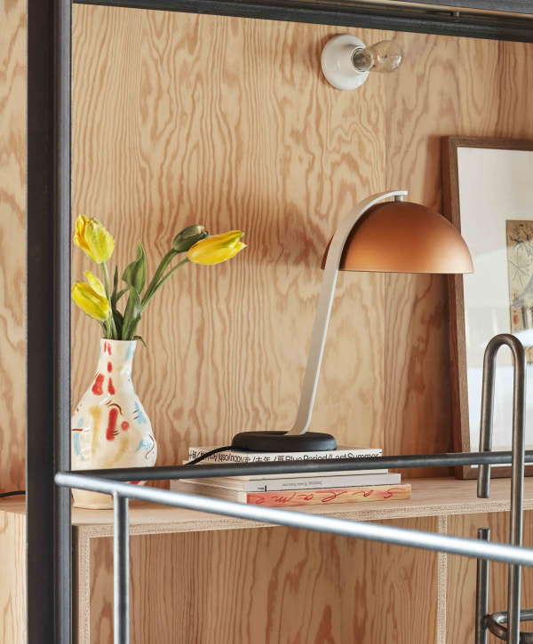
Above: Lars’ Touchwood chair is a versatile and welcoming all-wooden stacking chair that adds a touch of nature into everyday life. Photo courtesy of HEM
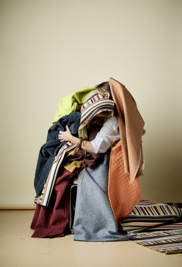
My new Frattini collection with Momentum incorporates a combination of being trained to work at different scales and mediums, always approaching assignments with the same thought process, plus understanding what my clients wanted from the brief. I’ve worked with Momentum for many years, and the collections we ended up developing together all have similar character—geometric in nature, and at a higher price point so we can work with more color and experiment with yarns. That gave me the freedom to think about patterns differently.
In this collection I liked the notion of structure—but if you create a rule, you also know how to break it. That makes the rule evident and more interesting, not just boring repetition. I could look at a stripe, manipulate it, or get inspiration from artwork, then manipulate and break it up to make it my own.
I totally get that. When I initiate a project, at some critical point I step back and look at what I’ve done against criteria I defined early in my career. I ask myself, “Am I answering this criteria?”
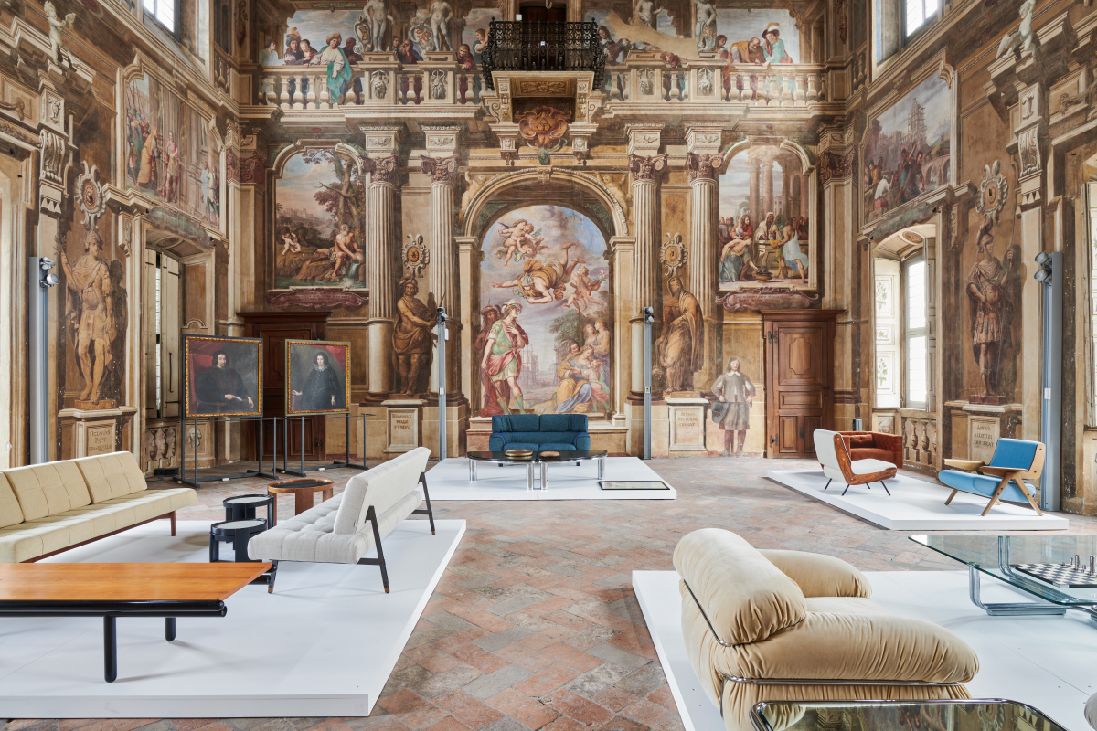
The Gianfranco Frattini exhibition at Palazzo Arese Borromeo near Milan. Photo courtesy of Emanuela Frattini Magnusson
It’s a quality to be consistent. In Norway we say there’s a “red thread” running through your projects. When you look at Jasper Morrison, you can see it’s his work. It’s an honor if people can identify your work without knowing anything, just by visual aesthetics.
That’s why I try to be consistent and pursue the same logic. I’m not shopping around in style. I have my aesthetic and stick with it. It doesn’t feel like a burden—it’s a relief. I don’t have to go there, I’ll stay here in my visual language where I’m comfortable. I’ve probably lost jobs because I won’t step outside my comfort zone aesthetically, but I’m fine with that.
Maybe one thing we share is integrity within the industry. It’s easy to jump on amazing opportunities that take you far outside your comfort zone and expression. I always turn those down because I’d struggle later—I wouldn’t feel good about the project, and it would bother me a lot.
For me, work has to be a sincere expression. I’ve been lucky with most jobs—I always give them my best shot. In a few situations I’ve said I don’t think I’m the right person, I can’t make you happy. Sometimes you need to walk away. If after months on a floor plan you’re still not there but think you’ve done the right thing and given your best, you say: I’m not the right person for you.
“I’m not shopping around in style,” Lars says. “I have my aesthetic and stick with it. It doesn’t feel like a burden—it’s a relief. I don’t have to go there, I’ll stay here in my visual language where I’m comfortable.” Photo courtesy of Lars Beller Fjetland
It’s tough to do, but neither of us is motivated by money professionally. I’m curious about people, I love meeting interesting people and having interesting conversations. If it’s all emails with nothing more than an exchange, I don’t find it interesting.
That’s why I love working with Italian brands. Many are still family-owned, so it becomes something different. Maybe you won’t get rich from collaboration, but there’s something else there that has value to me.
In architectural work, I find residential very difficult because there has to be good chemistry with the client. You always try your best, but if your ideas don’t resonate—it’s their home. Maybe we’re not on the same wavelength.
When it goes well, my best residential clients have become great friends. You work for them because you love it, they like your work, and you intuitively understand what they need, how they live, what they want.
I really like reinterpreting classics in my work, too—traditional patterns like brocades, tartans, polka dots, stripes. There’s endless variation on these themes in the Frattini collection, for example. I use them as starting points where I take a traditional pattern, simplify it, put it in a more contemporary repeat like cut-and-paste. Or I’ll use a fiber not used at the time, like something extremely shiny or day-glow, playing with contradictions and contrasts.
I feel similar when working with aluminum that is infinitely recyclable. Working on an aluminum bench called Bello opened my eyes to what an amazing material it is, a material fit for the future. It changed me. I put my studio dormant for two years to be an aluminum missionary, telling the industry what it can do—that we can use 100% post-consumer recycled alloys to achieve what we do with virgin material.
“Neither of us is motivated by money professionally. I’m curious about people, I love meeting interesting people and having interesting conversations.” -Lars Beller Fjetland
I also worked with wood and offcuts, but there’s a limit. When you use the tiniest scrap, you can’t do more. I found it fascinating to work with materials that create eternal loops.
One of my first projects was a spindle stool and chair with a cork seat. It’s a traditional theme but an unconventional material combination. It made sense to me; wood is strong and rigid, cork is soft. The part contacting your body is warm, soft, and nice to touch. The cork’s properties mean you can jam the leg into it—opposite of jamming a cork into a bottle. The cork pushes against the component making the construction stronger. Traditional theme, completely different through material use.
I think about color a lot too in these types of projects. For the Frattini collection, it took years to develop a day-glow yarn with the strength we wanted as an accent in textiles. For textile work, color is extremely important. Whether you work on texture to develop solids—texture reflects color in a certain way, so you adjust—or patterns, you consider how many colors affect cost, how many colorways in a collection, how to group them.
I collect color “stories” that I like. I still look through paper magazines—fashion magazines and niche, esoteric magazines. I literally collect pages of color stories, then look at them as potential patterns. Then I break them down into how many hues compose the story, and how many variations we should include in the collection. We always need a black-and-white dominant, something in the blue range, green range so I ask myself: “What do you combine with that?”
“I collect color ‘stories’ that I like,” says Emanuela. “I still look through paper magazines—fashion magazines and niche, esoteric magazines. I literally collect pages of color stories, then look at them as potential patterns.” Photo courtesy of Momentum
Within that you consider fibers and reflectivity. Color reacts very differently depending on how light hits it and what fiber you’re using.
In interiors color is more complicated. Especially in residential work, people don’t want to live with a lot of color. It’s very specific clients who like that. Color tends to be an accent on things you can change—upholstery, curtains. For the architectural part, there’s reluctance to be overpowered by color.
When you look at historic references like Victorian houses, English country houses, historic American houses using beautiful slate blues contrasting with white trim, it’s unfortunate. I renovated old historic houses, and working with clients we used historic color sequences that weren’t overpowering. But in interiors you have to modulate it and be aware of what it does to a space, how it affects how people look, and how it reflects ambient light.
When I did the Bello bench, I immediately knew color would be important for communicating the project. Everyone thinks of aluminum as grayish. To redefine the idea of aluminum, color played a huge part. I identified promising colors, blue and orange. The orange looks like everything you don’t think aluminum is. With subtle ridges on the surface it looks warm. You want to touch it. You’re bringing forth the material’s tactility and friendliness.
Even people who’ve worked with aluminum for years had a “wow” moment. It’s not that they haven’t thought of it, but seeing it in person at that scale is different.
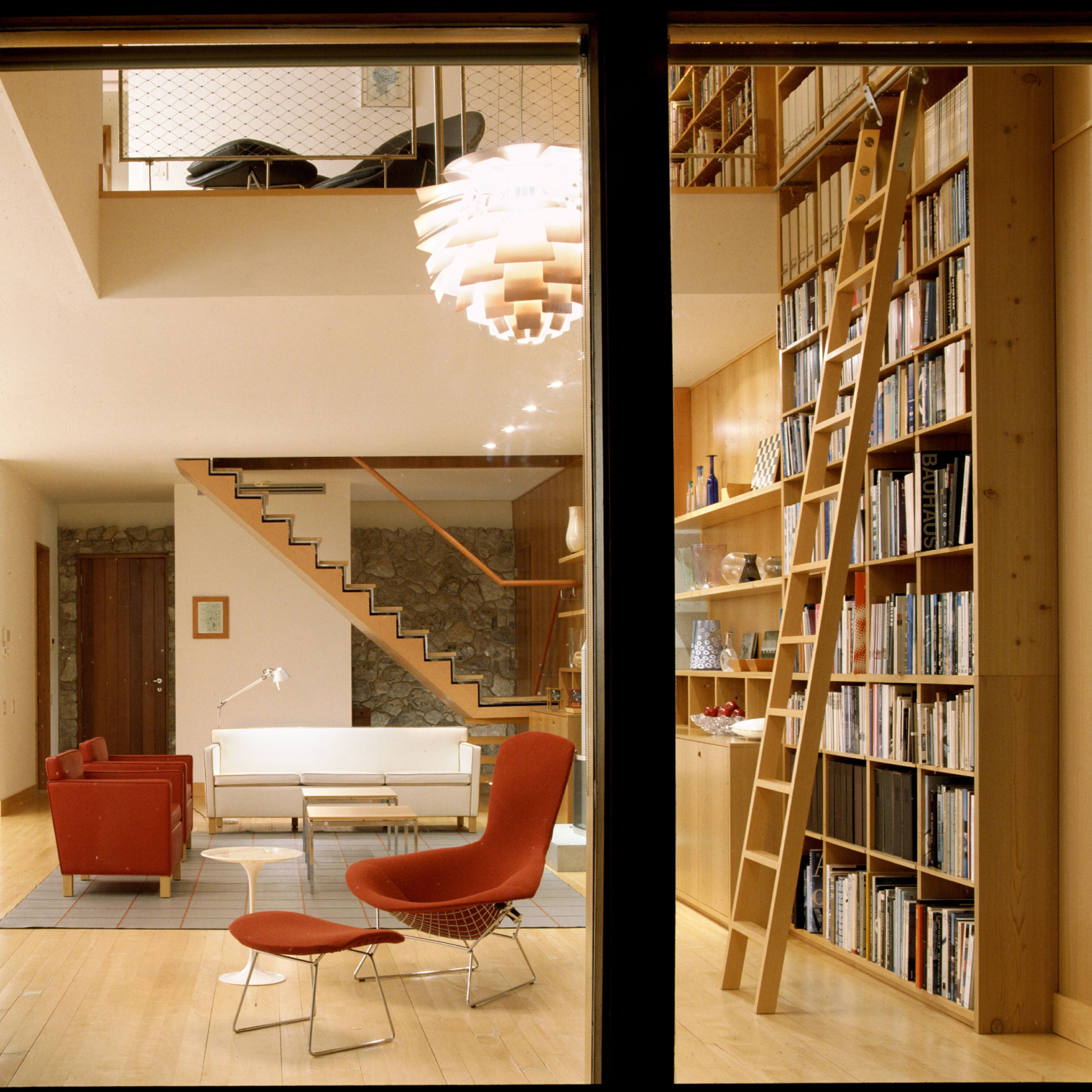
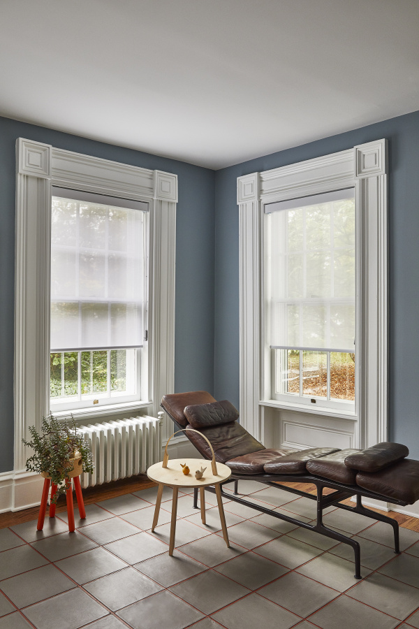
“House on Lake Erie” interior project by Emanuela Frattini Magnusson. Photo by Josh McHugh
In my art direction for other projects, I spent hours with the anodizer perfectly defining each color. For the 2025 exhibition with Hydro, we used experimental techniques, doubling colors and combining two different colors to form one that doesn’t exist in color charts. You haven’t seen it in aluminum yet.
The deeper I go into color, the more I see it’s extremely important. Prior to this I was reluctant to use color because clients rarely achieve the color exactly as imagined. When I was young, things didn’t pan out as I wanted, so it kept me away. But with these projects I can precisely define the colors I envision.
This year we made a purple color for Sabine Marcelis’ light. No one’s seen purple aluminum before at that scale and shade. It doesn’t sound like a great idea, but when you see it, you discover interesting things. The way the bulb interacts with the color brings out a beautiful pink hue from this purple object. It looks like something you haven’t seen before.
I’m getting extremely passionate about color, which was unthinkable a couple years ago.
Color trends often start with street fashion, get picked up in high fashion, then trickle into objects like consumer products, interiors, and cars. It depends on investment to produce the color. But I think fashion is where it starts—you see kelly green pop up in fashion, then a few years later in home textiles, and now used more in interiors. I’m interested in watching that, especially in advertising.
“I’m getting extremely passionate about color, which was unthinkable a couple years ago,” says Lars. Photo courtesy of Lars Beller Fjetland
You pick that up and work it into something forward-looking. From designing to release is at least a year, so you work with that forward-looking idea.
I also thought about texture a lot in the Frattini collection too, but it’s tied directly to using color in space. I’m not a maximalist who likes baroque overlay—I’m not saying it’s wrong, I just don’t like it personally. When you have too much air, too much color, it’s overwhelming. I think one thing kills the other.
If you have a color that is very strong and bold, what complements it is something more about texture, something you discover but is relatively quiet in color. Solids and interesting constructions. That was the concept behind those two complementary collections.
For the collection we introduced two textured patterns, velvet and wool. For other collections I did previously for Momentum, it was more about construction of patterns and colorways. I recolored an entire collection of solids that permeated all the patterns—textures they had, but needed recoloring. We did 20 neutrals and 50 colors across the spectrum to complement various patterns.
Historic house renovation in Rochester, NY by Emanuela. Photo courtesy of Emanuela Frattini Magnusson
They’re all separate individual collections, but they’re all based in geometry more than organic free-flowing patterns, with few exceptions. One pattern was inspired by watercolor dots put into a repeat, a free-flowing element. Otherwise I often lean toward constructions based in geometry.
The same goes for me. Although I’ve been encouraging people to go outside geometry, I find inner beauty in it. I can’t explain why—maybe it’s how my brain works. I love being in nature, I spent time in the forest, I live on a mountainside. I enjoy the randomness of nature, but for objects I interact with daily, I find less resistance in geometric objects. That’s a quality I need in most things in my house.
You can have objects that don’t follow those rules, that are louder, and appreciate them for being loud. But in my opinion, everything can’t be loud—it doesn’t work for me. I’m attracted to visual systems that just make sense.
Collaboration with clients sometimes helps make projects better too. I’ve been fortunate to meet amazing craftsmen, especially in Italy. A guy called Pierluigi Ghianda, an amazing wood craftsman—I worked on several projects with him and he absolutely made them better. He’d suggest building something a different way and it would be better. It’s this in-between space between two people doing their jobs where the outcome becomes more than the sum of its parts. Those are great opportunities.
-
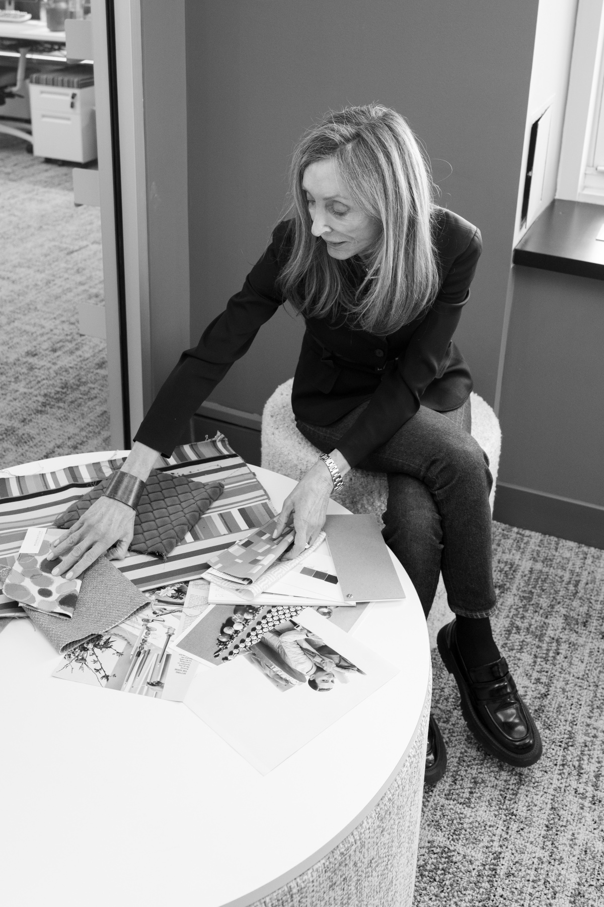
- Emanuela Frattini Magnusson. Portrait courtesy of Momentum
-
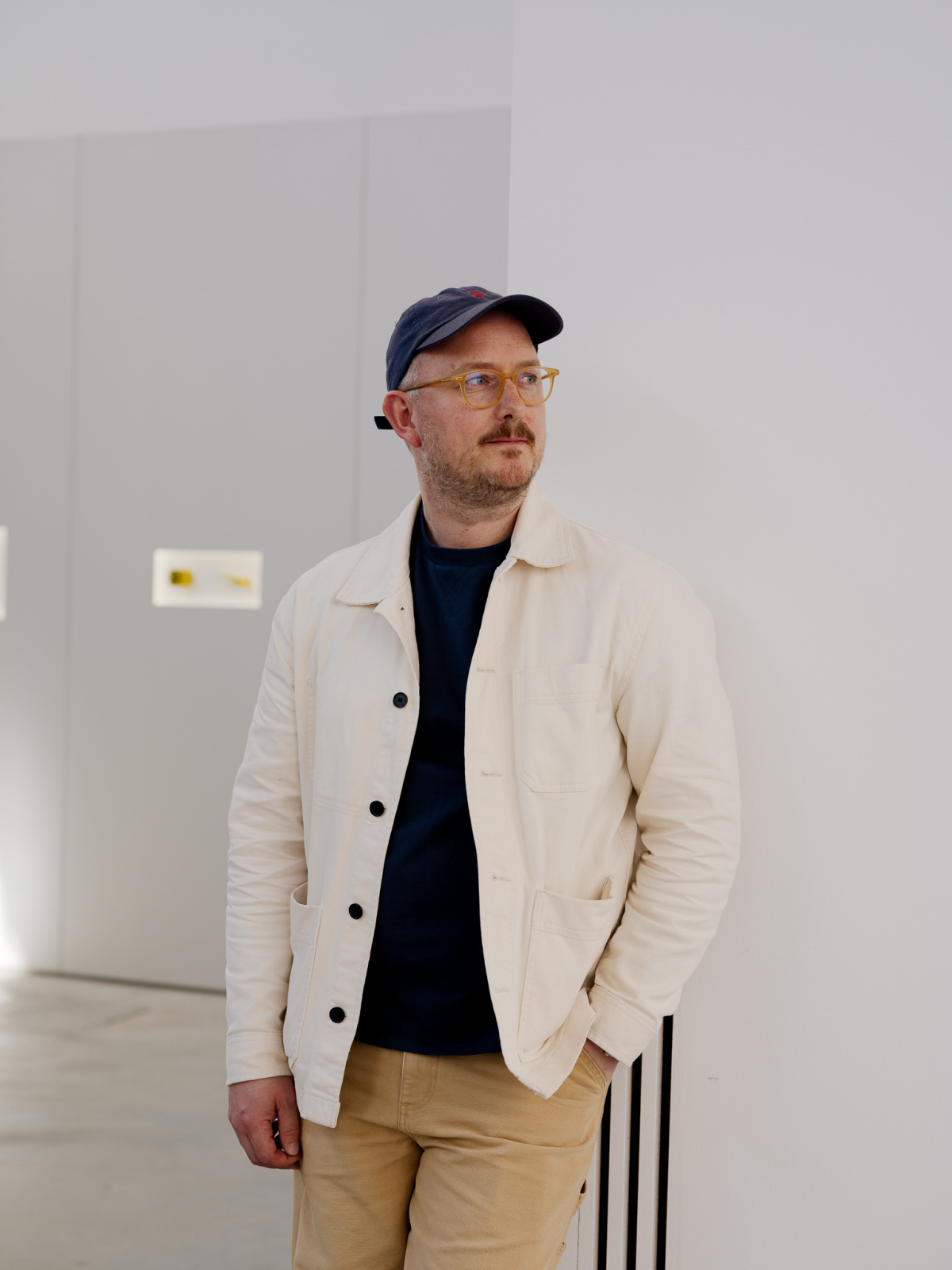
- Lars Beller Fjetland. Portrait by Einar Aslaksen
I love that expression “greater than the sum of its parts.” If you make those connections, something really special comes out. You feel that something special is happening.
I’ve worked on everything from Italian artisans to large-scale industrial projects. It comes down to the people. I’m in it for the relationships, the learning, and the inspiration. My big motivation is trying to get a little wiser and realize a vision—that gives me the biggest kick.
I feel extremely privileged to do this for a living. When I think about my greatest achievement in my career, it’s not winning awards—it’s earning enough to make a living from this. Having enough money for groceries and rent. Even though I’m past that level, that’s still my greatest achievement in my book. I remind myself of that as much as I can.
A version of this article originally appeared in Sixtysix Issue 15.