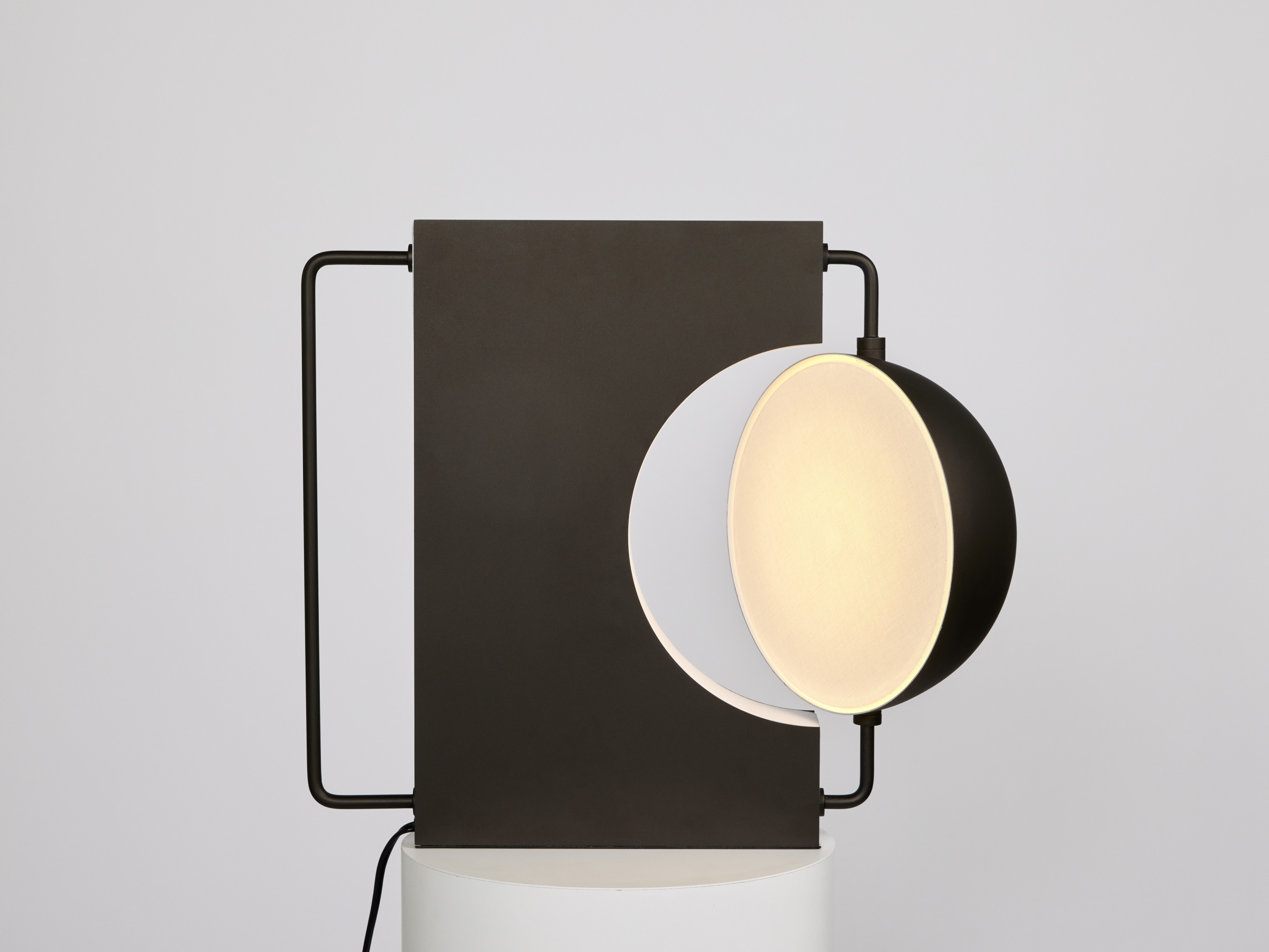
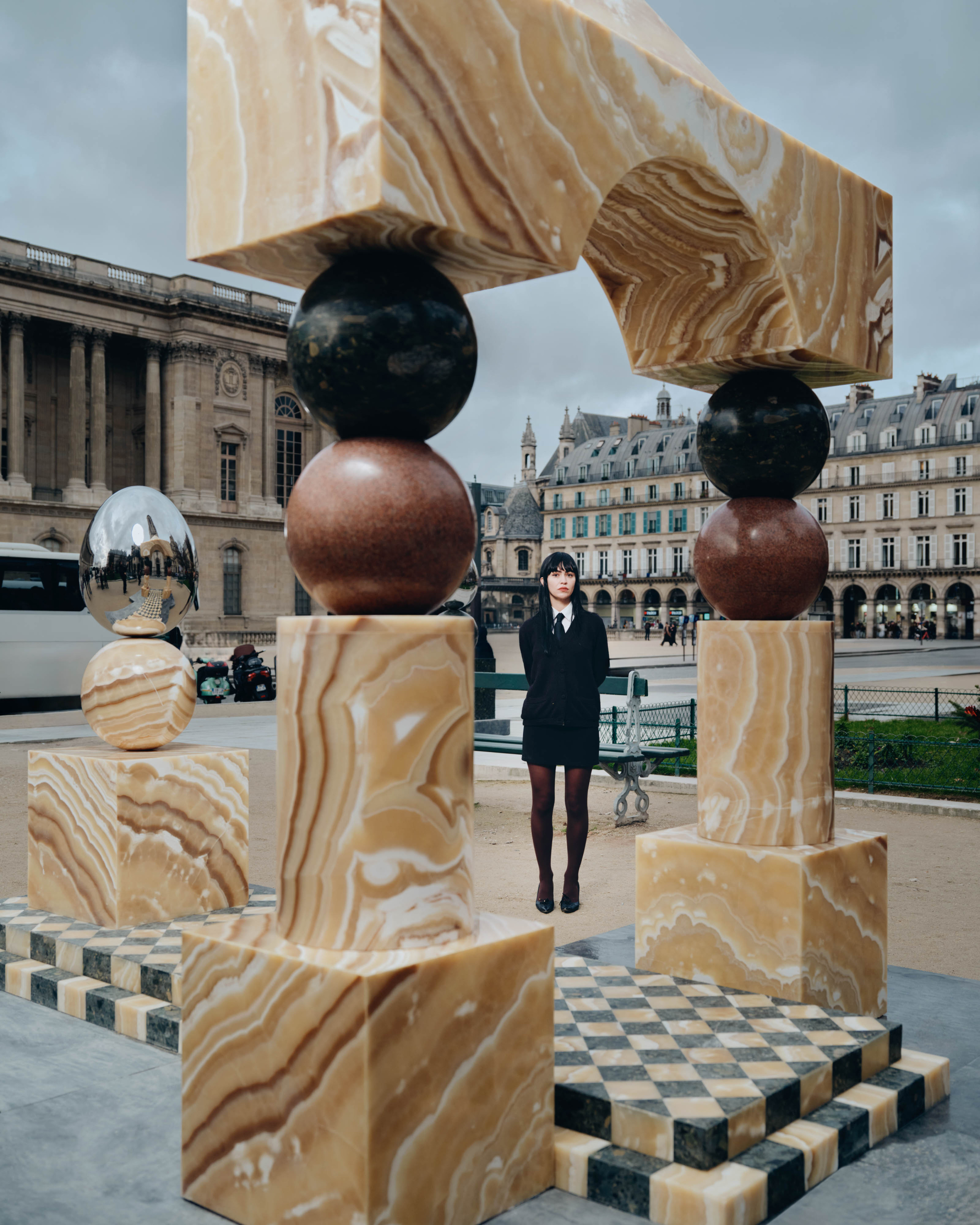
Elliott Barnes loves to set the mood. A Los Angeles architect turned Parisian interior designer, Elliott thinks foremost about creating a comfortable, yet refined atmosphere through rigid lines, texture, and daring mixes of aesthetic styles. In his first solo exhibition design, for New York City’s Jewish Museum’s “Mood of the Moment: Gaby Aghion and the House of Chloé,” Elliott sifted through the brand’s archives to find inspiration in the fluidity of Chloé’s designs.
The exhibition centers around the legacy of Chloé’s founder, Egyptian-born, Jewish designer Gaby Aghion, who developed Chloé’s first collection in Paris in 1952. At a time when made-to-order haute couture still ruled the French fashion world, Gaby designed her first collection and began building a new rulebook for elegant, relaxed, ready-to-wear fashion. Many talented young designers—including Karl Lagerfeld, Stella McCartney, Phoebe Philo, and Clare Waight Keller—have acted as creative director since, developing chic, dynamic looks for the free and modern “Chloé girl” Gaby created.
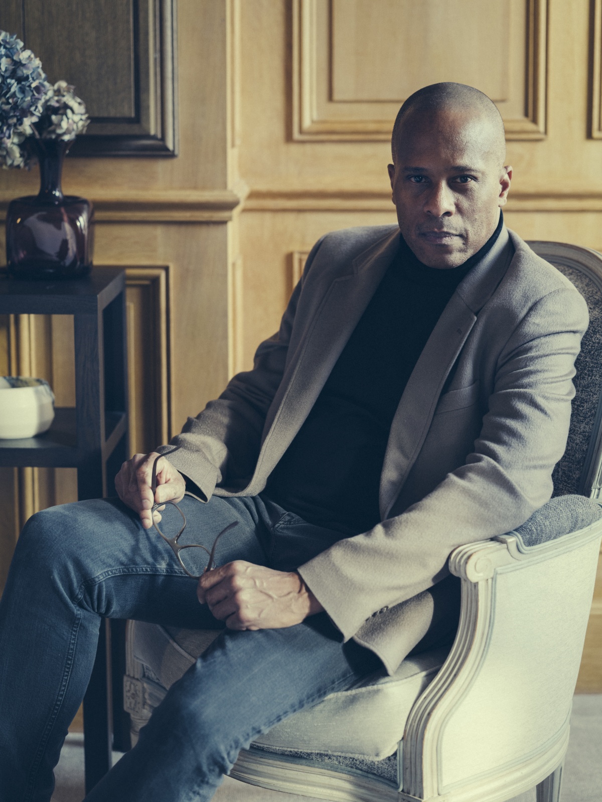
- “I try to design in such a way that we know where we’re going, but there’s still a little door open for the discovery,” Elliott says. Photo by Julien Drach
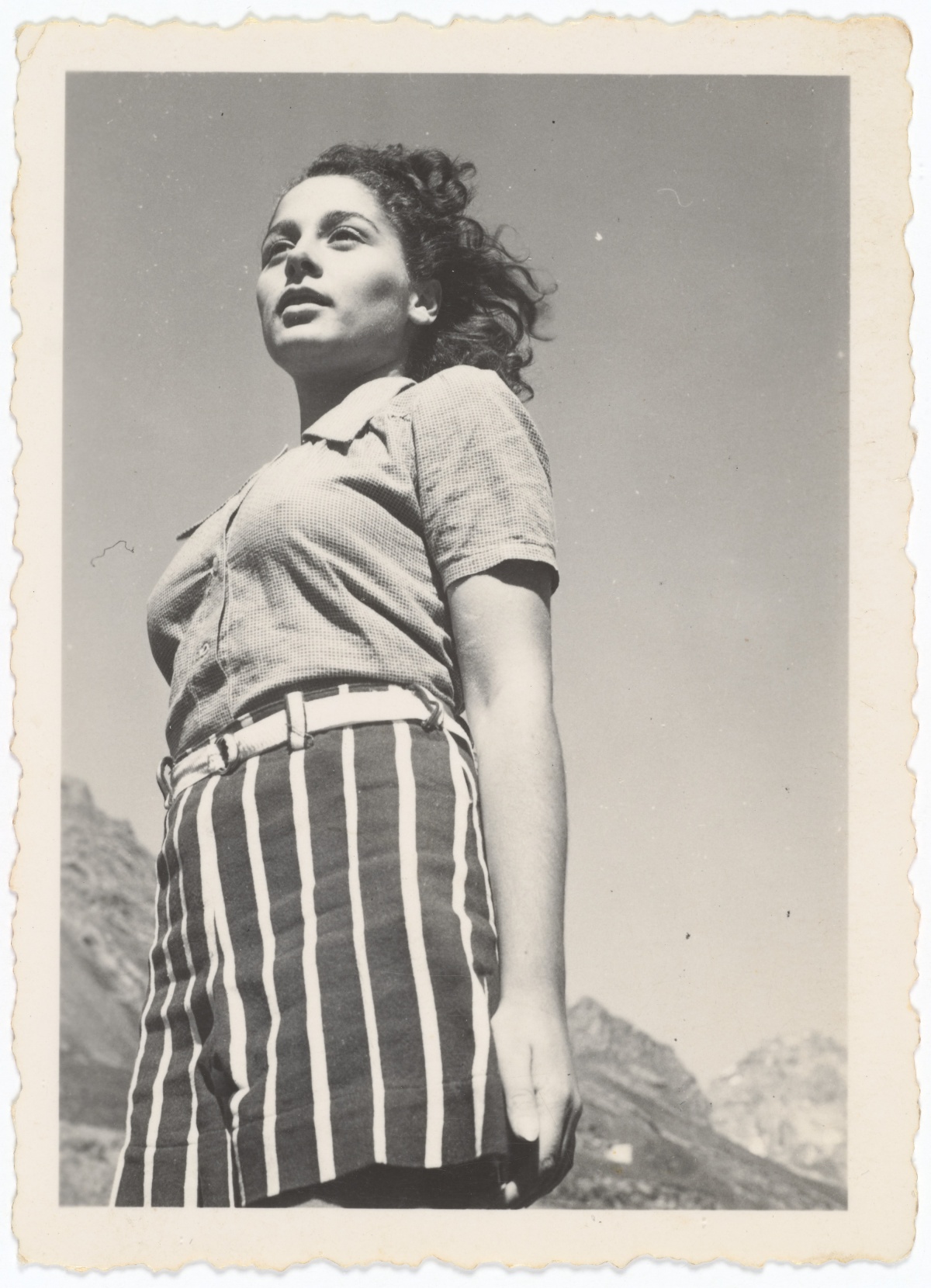
- Chloé’s founder Gaby Aghion in the desert near her hometown Alexandria, Egypt. Courtesy of Philippe Aghion and Chloé Archive, Paris
The exhibition reflects on Gaby’s vision with sketches, documents, and nearly 150 garments from Chloé’s archive to assert Gaby, who died in 2014, as a leader in modern fashion and position Chloé as a historically important fashion house. Elliott’s task was to find a way to present the world of Chloé without overpowering it.
I spoke with Elliott, who tuned in from a dying cell phone shortly after he returned to Paris. We discussed his first solo exhibition design, turning Tyvek into wallpaper, and how French designer Andrée Putman’s mentorship set up Elliott’s meteoric career.
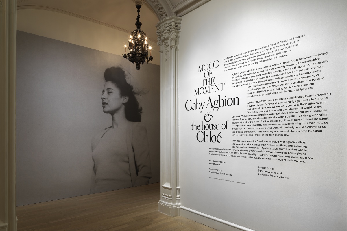
Entrance to “Mood of the Moment: Gaby Aghion and the House of Chloé
You did the exhibition design for this show about the fashion house Chloé. It doesn’t look like you’ve done a lot of exhibition design before, so how did you get involved with this?
Elliott Barnes: Exhibition design is very specific, as you can imagine. To be quite honest, this is the first exhibition design that I’ve done on my own name. I did a few before when I was with Andrée Putman.
It came about because the Director Emeritus of the Jewish museum, Claudia Gould, was a former client who has become a professional friend. For one of her last shows at the museum, she brought together an international team and thought about me to do the installation because Chloé is a French brand, but it’s exhibiting in the United States—and I’m an American, but now live in Paris. So there was a sort of duality going on that she wanted to bring to the project.
How did you embody the fashion of Chloé in the exhibition design?
Just as a stylist drapes a model with gauze or cloth, I would drape the museum. I started looking at the quality and the types of clothing that are emblematic of the Chloé brand—Maison Chloé. It’s all about fluidity. It’s also about being quite simple, being quite free, quite light. Unencumbered. There’s a certain nonchalance about it, what the curators called “Sprezzatura” which is the idea of performing something very complicated so well that it appears effortless. It’s taken a lot of energy and a lot of precision. This is very much part of the Chloé image, I would say.
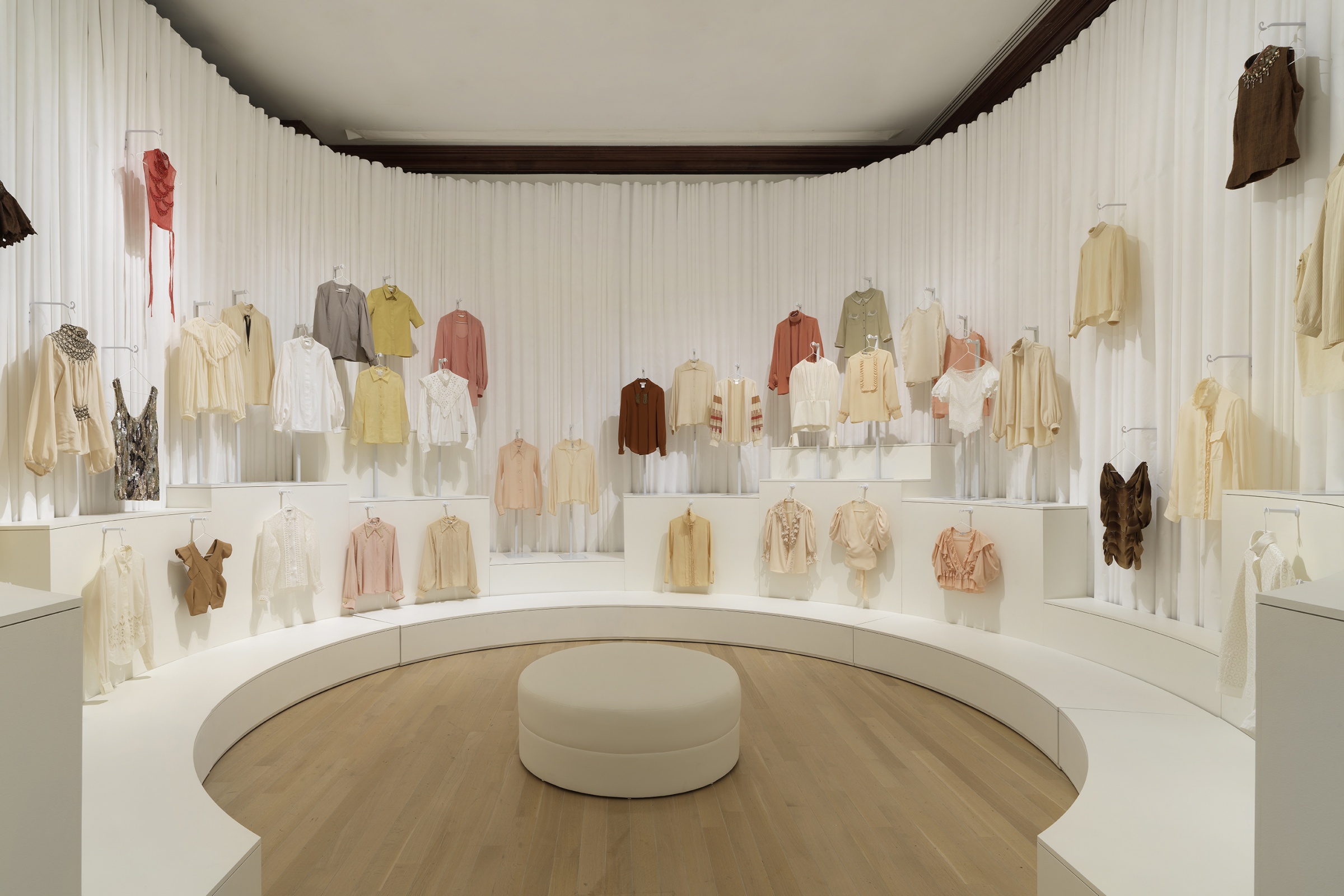
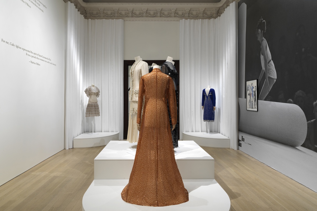
One thing that struck me about the Chloé garments, all throughout history, is that when the garments are even hanging on a hanger, there’s still the fluid movement in the detailing of the garment and even in some of the designs. Taking that as a cue, I decided to have an installation that was all about roundness. No straight lines.There are curves everywhere.
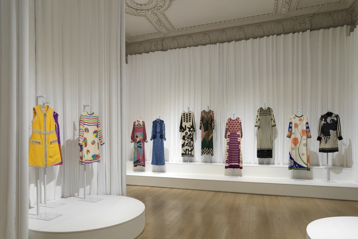
Tyvek adds a counterpoint and accent to fluid garments.
One of the things you are known for is straight lines, either in material or through shadow play. How was it working with curves instead?
It’s like learning a script for a movie or a play. I think it’s very fun. If the constraint is no straight lines, I just let it go.
Why did you use Tyvek for the backdrops?
I felt that fabric as a background started to cancel the garments out. There was no counterpoint, no offsetting, no accent. I needed to find material that wasn’t fabric.
One day I was at the archives here in Paris, and I was talking to the conservatoires and the chief archivist, and I saw this white paper material as a bag for the garments. It’s a paper called Tyvek that they use for garment conservation because it’s 100% neutral. It gives off no molecules that are damaging to the garment. It provides an incredible, protective barrier.
In normal life Tyvek is used in hospitals for personal protective equipment, it’s used in white rooms when they’re doing computer component work, and it’s even used in building installation, because it allows you to conserve energy. You can drive and see Tyvek around. So we used Tyvek as the background.
“Chloé is all about fluidity. It’s also about being quite simple, being quite free, quite light. Unencumbered. There’s a certain nonchalance about it. “
There are all kinds of other considerations that come into play, because you’re an institution, it’s a public area and it has to be fireproof. I had to respond to a lot of constraints. We left the very supple Tyvek, what they call “soft structure” Tyvek, and went to a harder structure Tyvek because it was more resistant, could stand up, and it was fireproof. But it was also flat, so another challenge was how to give movement and voluptuousness to the paper. I decided to create a bouclé, which is where you take the paper and you lightly fold it in half and keep it round. You don’t crease it. You just take the paper and fold it so you have a round loop. We did that on all of the Tyvek strips, and we vary the size. I created this whole code of big pieces, little pieces, medium sized pieces, and I put them all together to create this irregular pattern of fluid movement, which really echoes the fluidity that you see in Chloé garments, especially in Chloé blouses.
You’re considered a minimalist designer, and you just described Chloé’s clothes as looking simple, but being very complex. How do you compare your style with Chloé’s style?
I would say that I’m not really a minimalist, I’m more of a textured minimalist. I enjoy playing with textures, contrasting materials, and contrasting forms—like this idea of contrasting the Tyvek against the garment, not just not using flat Tyvek to make the curves, but actually giving it form is a way to go a little bit Baroque in the minimalist thing. It’s still very pared down, everything is white, because when you’re dealing with about 150 garments, you cannot come in and bring a color or texture that’s too pronounced. The minimalism perhaps comes in there but it’s not the dominant idea. The worst thing to have done with these really beautiful dresses would have been to give them a flat background because then nothing happens.
Did you feel restricted by having to work with white as your color palette?
No, because you can really talk about form then, right? When you think about what Le Corbusier did with the International Style, and the artists working with International Style coming out of the Bauhaus, all those buildings were white because they were really talking about the plasticity of form. When I was taking the Tyvek paper and curving it over, I’m really talking about the plasticity of form.
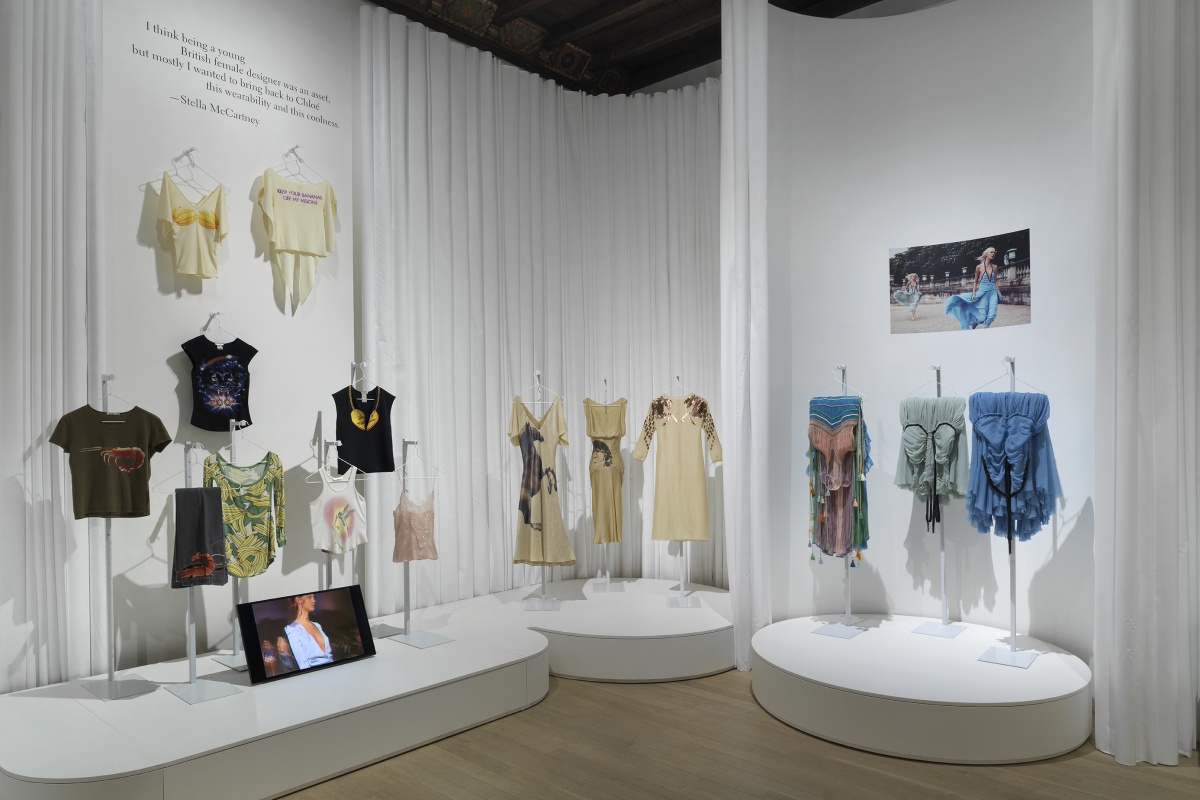
Elliott only worked in white. “I’m really talking about the plasticity of form.”
Being a person of color in the world of design, I was curious about how you felt working at the Jewish Museum, an institution focusing on a minority’s experience. Was there any kind of personal connection you felt while working for this institution?
Wow, that’s a very great question, and a very interesting question, one that no one has ever asked me, except for maybe in discussion with Claudia Gould.
This is a very personal story, but it’s a very important story, because I have been connected to the Jewish community even before I was born. My father left Houston, Texas to study medicine in Los Angeles. When he was driving around to find a place to live at USC, he would answer ads and when he got there they would say it’s not for sale, it’s not for rent, or it’s already been rented, because he was Black. This is in 1958.
On one trip out, he answered an ad, and he saw this apartment. He looked at it, he liked it, and then he walked away, and a man said, “Well, don’t you want the apartment?” That man’s name was Carl Reiss, a Hungarian Jew who left Europe right after the emperor was assassinated in 1914 with his family. And then he prospered, purchased apartments, and rented to my dad.
He and my dad developed a friendship. I remember that every Saturday after synagogue, Carl would come over to the house and serve bagels and he and my dad would read the L.A. Times and the New York Times until the afternoon. He was always my Uncle Carl. Always. When Carl’s wife, Rose, passed away, she said to my mother, “You are the only family we have, will you please take care of Carl?”
So this is very deep for me. I don’t want to say it’s a homecoming, I don’t want to be presumptuous, but it was a very natural relationship.
I’ve heard a lot of stories about how Jewish landlords were some of the few people that would rent to Black families. I see that solidarity and kinship.
Clearly. I’m involved in this program of portraiture of all the members of my family done by artists from the African diaspora that I’ve been working for about 10 years. The last work I received was a portrait of Carl. He’s part of the family. It’s as simple as that.
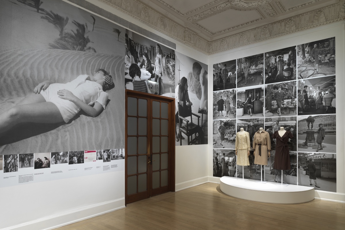
Andrée Putman taught Elliott to be daring in design.
What did you learn from working with Andrée Putman?
How many hours do you have?
How long will your battery last?
I’m an architect, and I was trained in architecture at Cornell. At a certain point, I was practicing architecture in California with a company called Arthur Erickson, and I decided to move to Paris. I came across Andrée’s work and her work resonated with my architectural training. Her consideration of history and the freedom and modernity with which she attacked a lot of different projects really spoke to me.
One of the things that I took away from her is this idea to be curious and to always try to discover. Andrée said that when you’re working on something you always have to dare, because if you don’t dare to do something, you’ve already lost the fight. It’s more of an attitude, it’s more of an approach. It’s freedom to mix something like a Lucio Fantana with a Caravaggio painting. To find a line that can connect, in a very subtle way, things from very different periods.
What is like the main thing you enjoy about interiors?
I sweat the details. I’m very concerned about how people can read details, and how details up to to influence and create rooms and ambiences. This is why I really am keen on following the projects from the conception all the way through construction, because you’re talking with artisans who bring to the table their experience, their ideas, their point of view. You become an orchestra conductor.
It’s a very fluid type of profession. I try to design in such a way that we know where we’re going, but there’s still a little door open for the discovery and the accident. Miles Davis said there are never any wrong notes. I really try to bring that attitude to the design process that we have in the studio.
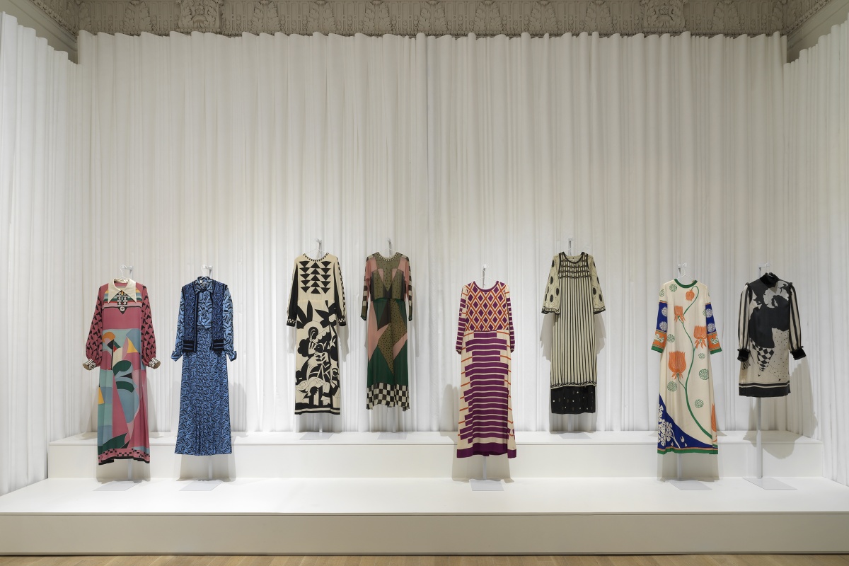
Elliott’s first exhibition design, Mood of the Moment: Gaby Aghion and the House of Chloé, at the Jewish Museum in New York City
Can you improvise when you’re working for a client?
Well, I mean, improvising is probably a little bit extreme, it’ll probably make a lot of people very nervous. We do a lot of drawings, so when we get to the site, we clearly know where we’re going and everything is priced out.
But I do a lot of renovation work, and sometimes these buildings have been around since the 17th century. When you’re taking apart a building to restructure and rebuild, you discover a new opportunity. So even though we’ve done all the background work, we still have to be open and let the building and space speak.
This is another thing to take away from Andrée, which is to say that when you get into a space, you don’t come with any preconceived ideas. You listen to the space and let the space talk to you.
How does the drawing help the process?
Drawing is key. And I say this to all the young designers coming up who are married to computers: take a bloody pencil and piece of paper and just draw. Drawing is a mental process because you are looking at something in the field, or maybe you’re imagining something, and then you have to translate that to an image on a piece of paper. That mental process is really important to understanding what space and form are all about. If you’re behind a computer screen, space and form is point seven nine, click right, move the mouse left, drop this, drag that, click on this other symbol. That is not form. Form is something that you can touch, that you can walk through, and you can translate that with a pen and pencil onto paper.
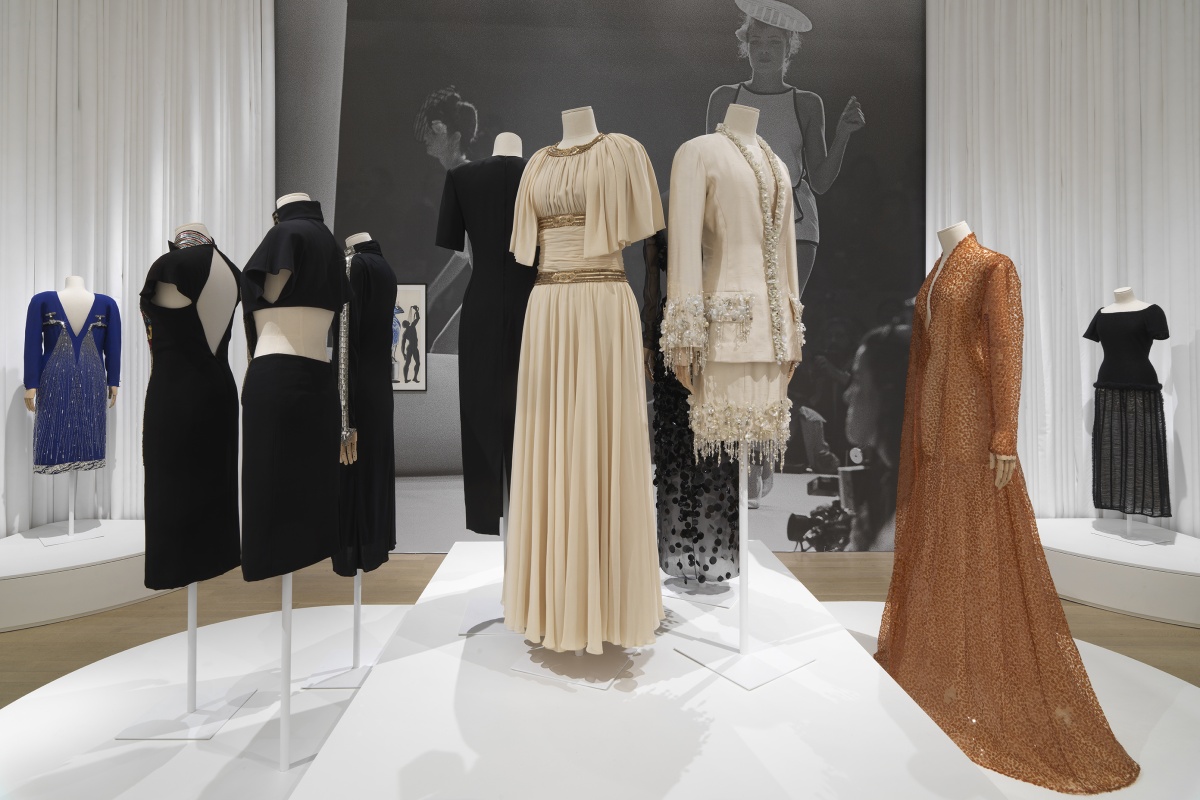
Installation view of “Mood of the Moment: Gaby Aghion and the House of Chloé” at the Jewish Museum
A lot of people have asked you about being American in Paris, but you’re from Los Angeles. I’ve lived here for 12 years. I wanted to know, more specifically, what’s it like being an Angeleno in Paris?
I was born and raised in LA and there is this part of LA that is in me. The LA side allows me to bring a certain easiness and casual elegance to this Parisian attitude. I found a certain parallel.
The other thing that I like about Paris, from an architectural point of view, is it’s an urban situation very much like any other city like New York, but the scale is lower, like Los Angeles. There are no real tall buildings here.
I grew up in a place called View Park, Baldwin Hills. I would drive to Santa Monica on the 90, the Marina del Rey freeway. When you get off of Slauson and you get on that freeway, and you look north in the wintertime when the rain has washed away all the clouds and smog, you get this perspective of LA that is breathtaking. That is unparalleled to anything you can see anywhere in the world.
Here in Paris, I live in a building on the top floor, and I have this perspective again. This idea of being able to see cities and suburbia from a certain vantage point is something that I’ve found here as well. I could never live on the ground floor again, that’s no longer possible. I have to live on a hill at least.
“The LA side allows me to bring a certain easiness and casual elegance to this Parisian attitude,” Elliot says.
Do you have any upcoming projects that you’re excited about?
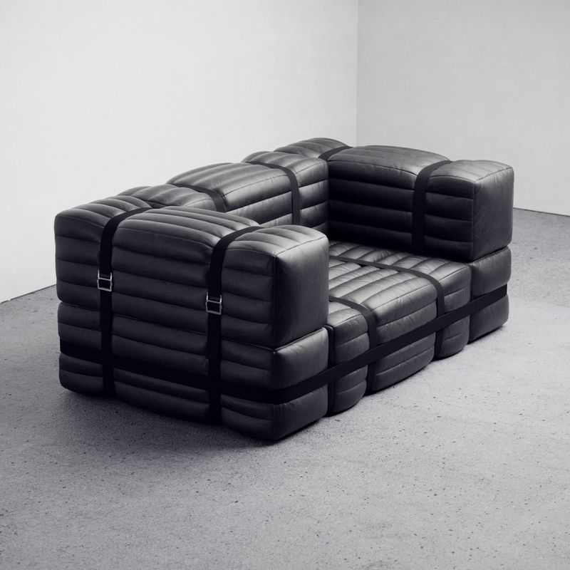
We’re working on a really nice project for the Champagne house Billecart-Salmon. They have a very great rosé and a very great blanc de blanc. It’s a house that’s been around since 1818. That’s a project that will open in June. And just this morning, it was confirmed that I will design the new boutique for Cifonelli, a men’s tailor. He’s one of the top five in the world. We confirmed the commission this morning. Also, we have a piece of furniture going into the collection at the Mobilier National, which is nice. There are some upcoming things that are going to be quite fun.
“Mood of the Moment: Gaby Aghion and the House of Chloé” is on view at The Jewish Museum in New York City through February 18, 2024.
