A 14,000-square-foot home 30 minutes outside of Toronto, in the distinguished Lorne Park area, is the kind of interior design project Eva Healy dreams about. The homeowners had a bold vision and a seemingly endless budget. And they brought on Eva, owner and principal designer at avenue design inc., to bring their vision to life.
“There was so much house we were able to think outside of the box,” Eva says. She and her team went to great lengths to show the clients what was possible, from stone in the kitchen to intricate millwork throughout the house to using decorative materials like EGGER’s Vicenza Oak (H3157 ST12) in both traditional and surprising ways—including as a work of art along a central staircase. When the clients saw what avenue design inc. dreamed up, they wanted it all.
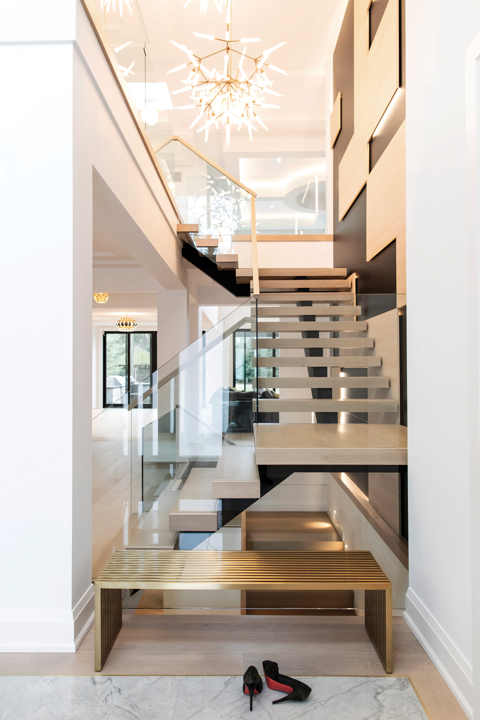
- avenue design inc. brought this house to life with Line to Line, who fabricated and produced all work, including a feature wall with staircase that uses EGGER paneling. “We were able to create an art piece out of it,” says Eva Healy, owner of avenue design inc. A Spur Grande LED Chandelier from Tech Lighting hangs over the stairs. Photo by AIA Photography
- Inside the 14,000-square-foot home featuring interior design by avenue design inc. just outside of Toronto. Photo by AIA Photography
Eva says the project, finished in late 2019, is classic and elegant with unexpected touches. “The clients definitely didn’t want a cookie-cutter home,” she says. “We liked the idea of mixing a classic exterior with a more modern interior, and more modern architecture mixed with more traditional. Bringing all the finishes together was really how we could tell the story, including designing beautiful built-ins in the kitchen.”
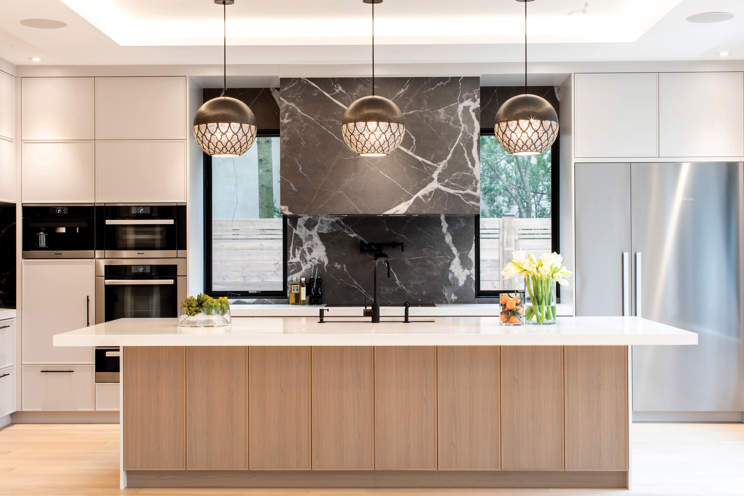
Eva says having a generic kitchen with simple Shaker-style cabinetry, like so many homes designed these days, wouldn’t do for this Lorne Park couple, as they wanted to go a bit more over the top. She and her team used EGGER’s Vicenza Oak decor at the bottom of the kitchen’s center island and stove wall lowers as a flat profile door and incorporated a paint grade material in the upper cabinets and other areas. “It has such a beautiful, soft texture,” Eva says of the Vicenza Oak. “It feels and looks like wood but has a very stable grain look to it, so it didn’t look too busy.”
Eva says natural wood can often pose a challenge to interior designers given its variation in grain and color. It can often look busy and be difficult to grain match, she says. “Approximately 99.9% of the time I will choose a prefinished decorative material like EGGER for my wood look.”
She used products like these in her own home, too. “I have EGGER in my house and, similar to what we did on this project, we used it on the lowers with painted uppers. I did everything on my lowers in this wood-based material because I have two crazy kids, a 6’4 husband, and a 100-pound dog. And my lowers don’t have a scratch on them because they’re just so durable. It’s such a great product to wipe down to clean and easy to maintain the look and the feel because the finish doesn’t wear off.”
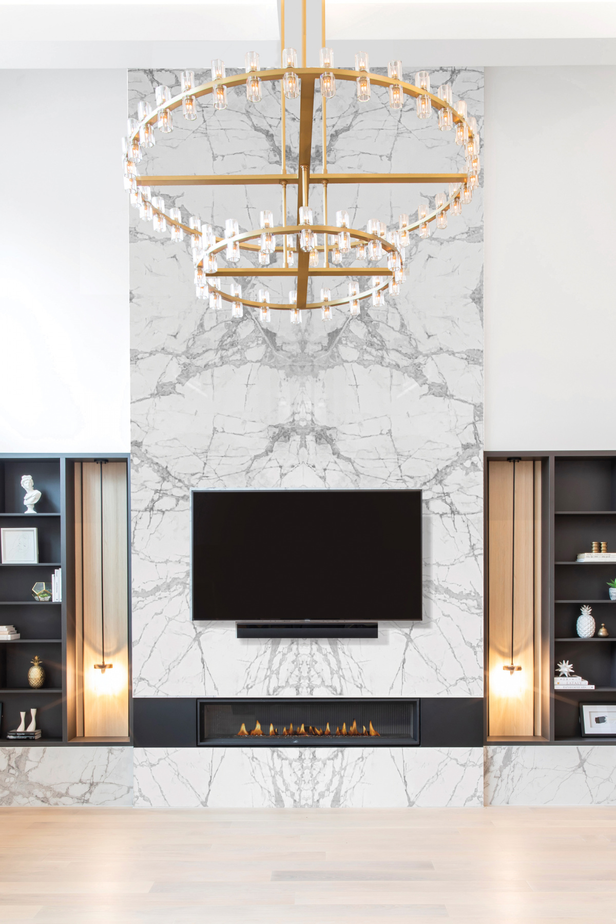
In the great room, a Restoration Hardware chandelier is juxtaposed against a Marquis Infinite fireplace with Mountain Treasure hearth stone from Nuovo Surfaces. Pendants are from Matteo Lighting. Photo by AIA Photography
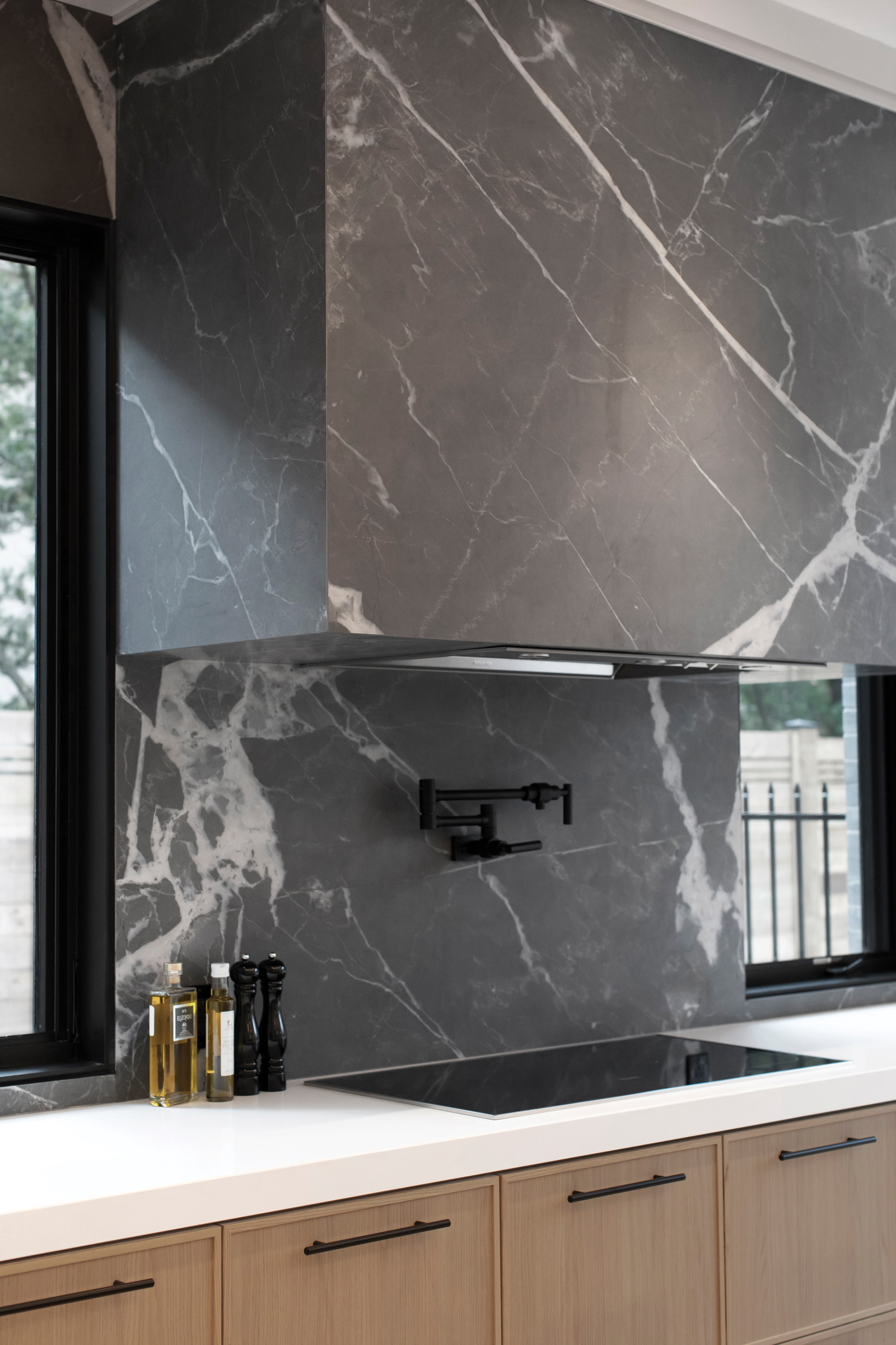
The design team mixed and matched EGGER’s colorways, textures, and woodgrains throughout the house. The Vicenza Oak decor offers a contemporary, elegant take on naturalness, according to Klaus Monhoff, EGGER’s head of design and decor management in Austria. He says interior designers often turn to EGGER because their decorative surfaces make it easy to mix and match materials and colors, just as Eva’s done in this kitchen, using light EGGER wood-based product against the dark stone backsplash and hood from Nuovo Surfaces in matte Calacatta Black. Kitchen counters are done in Pure White Caesarstone.
EGGER’s edge banding on the cabinets offers a seamless look thanks to ideally matched surface and edge materials that are often hard to find, Klaus says. “We meet designers’ needs for matching materials and make it very simple for them to have the decors they love, with complete color matching products,” he says. The edge banding enhances the real wood look of the island, while still being easier to clean and maintain than natural wood, according to Michaela Gimpl, decor management expert at EGGER in North Carolina.
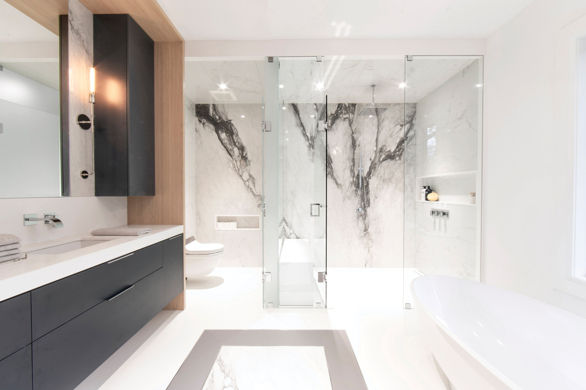
Backsplash stone from Nuovo Surfaces and Étoile de Rex cool the master bath, while pure white Caesarstone countertops continue the calm feel. Photo by AIA Photography
The design team was after the softness provided by the decor and texture of EGGER’s thermally fused laminate Vicenza Oak product with the ST12 Omnipore Matt texture—one of the nine textures in the EGGER Decorative Collection released in October 2020. The launch brought a new authentic alternative for solid woods to the North American market, Michaela says. She says Vicenza Oak’s light gray undertones in particular make it easier to combine with other colors and textures and use in a modern kitchen like this one.
That same woodgrain—the Vicenza Oak—was used on the staircase feature wall alongside EGGER’s Black U999 decor. “The staircase has a striking 3D feature wall constructed of millwork panels of different depths and sizes,” Eva says. “The Vicenza Oak panels were installed proud of the black panels so they could be backlit, resulting in an architectural feature that creates a glow that is especially cool at night. We created continuity and balance by using the Vicenza Oak throughout the home in different areas and applications.” You’ll also find that Oak product in the master bathroom and closet, the main bath (or kids’ bath), and in the mudroom with a mix of prefinished and paint grade material.
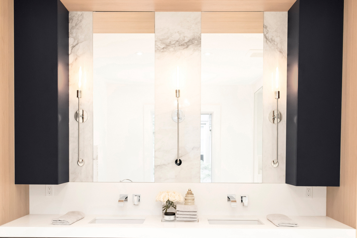
Dylan sconces from Mitzi by Hudson Valley Lighting round
out the look in the master bathroom. Photo by AIA Photography
“Every project starts with choosing the right materials and selecting a palette to go into the space,” Eva says. She says EGGER’s colors allowed her to build on a neutral backdrop and use clean lines for a simple, streamlined look while incorporating a lot of texture and depth with details in the millwork and hardware. “The hard surfaces really made everything come together,” she says. “It was more about, ‘How do we play with tone and texture and set the stage for all of the soft and pretty things that come after the house is built?’”
A version of this article originally appeared in Sixtysix Issue 06 with the headline “Seamless Design.” Subscribe today.
