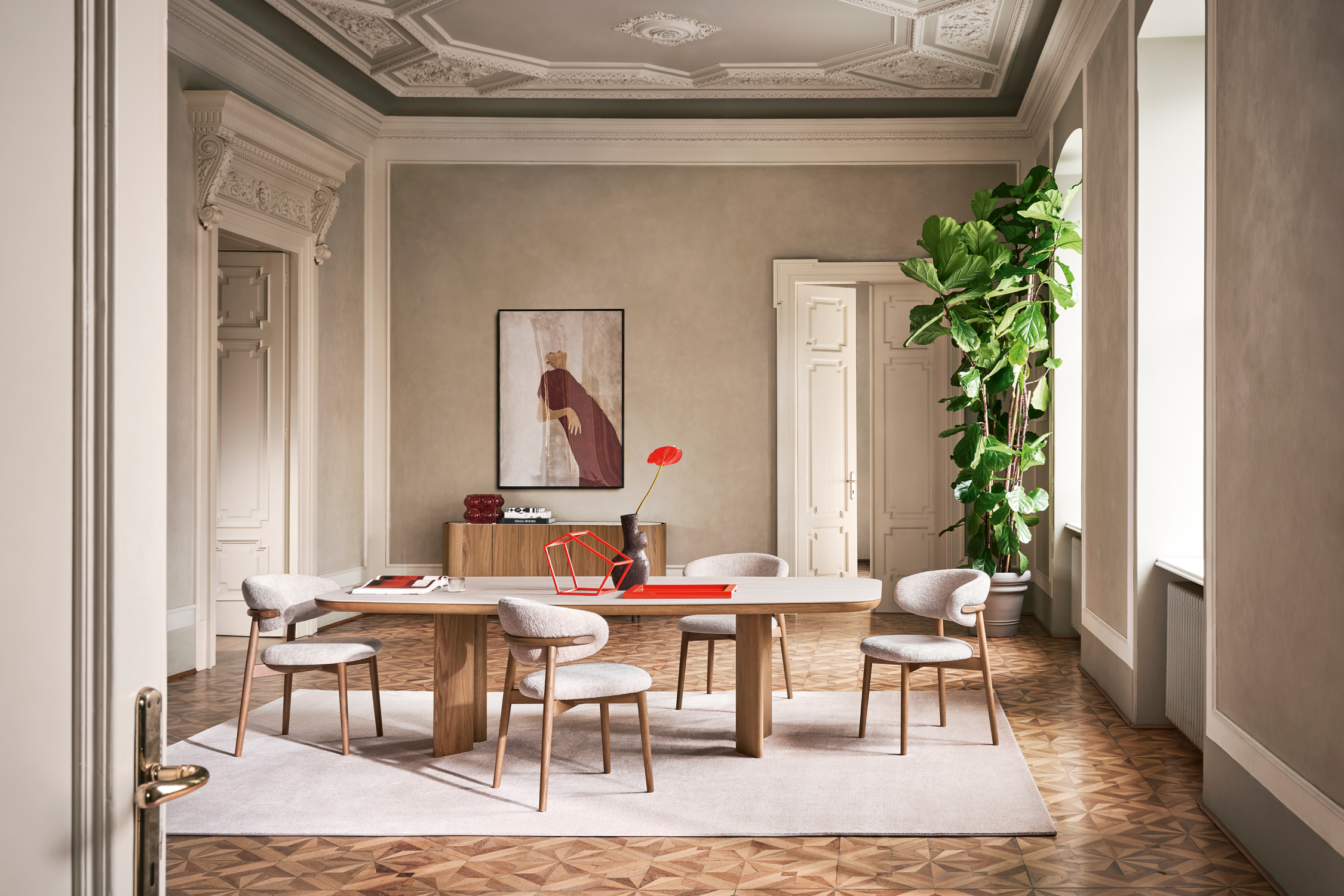
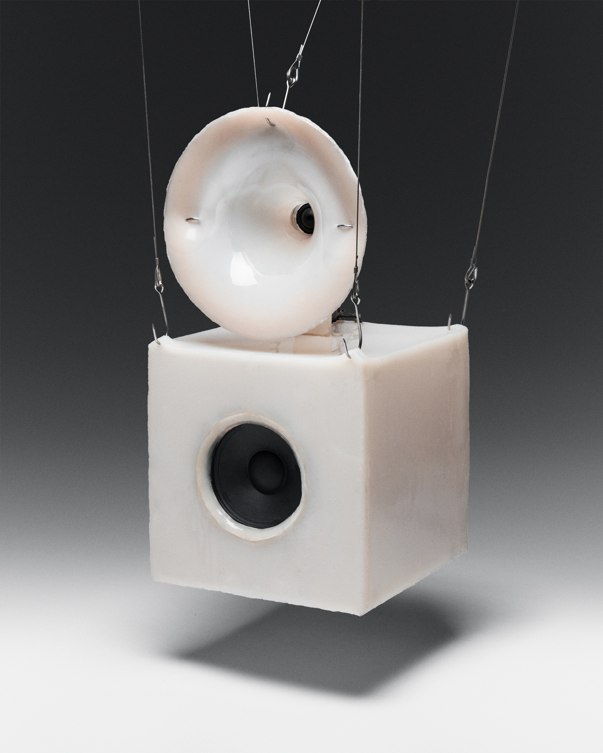
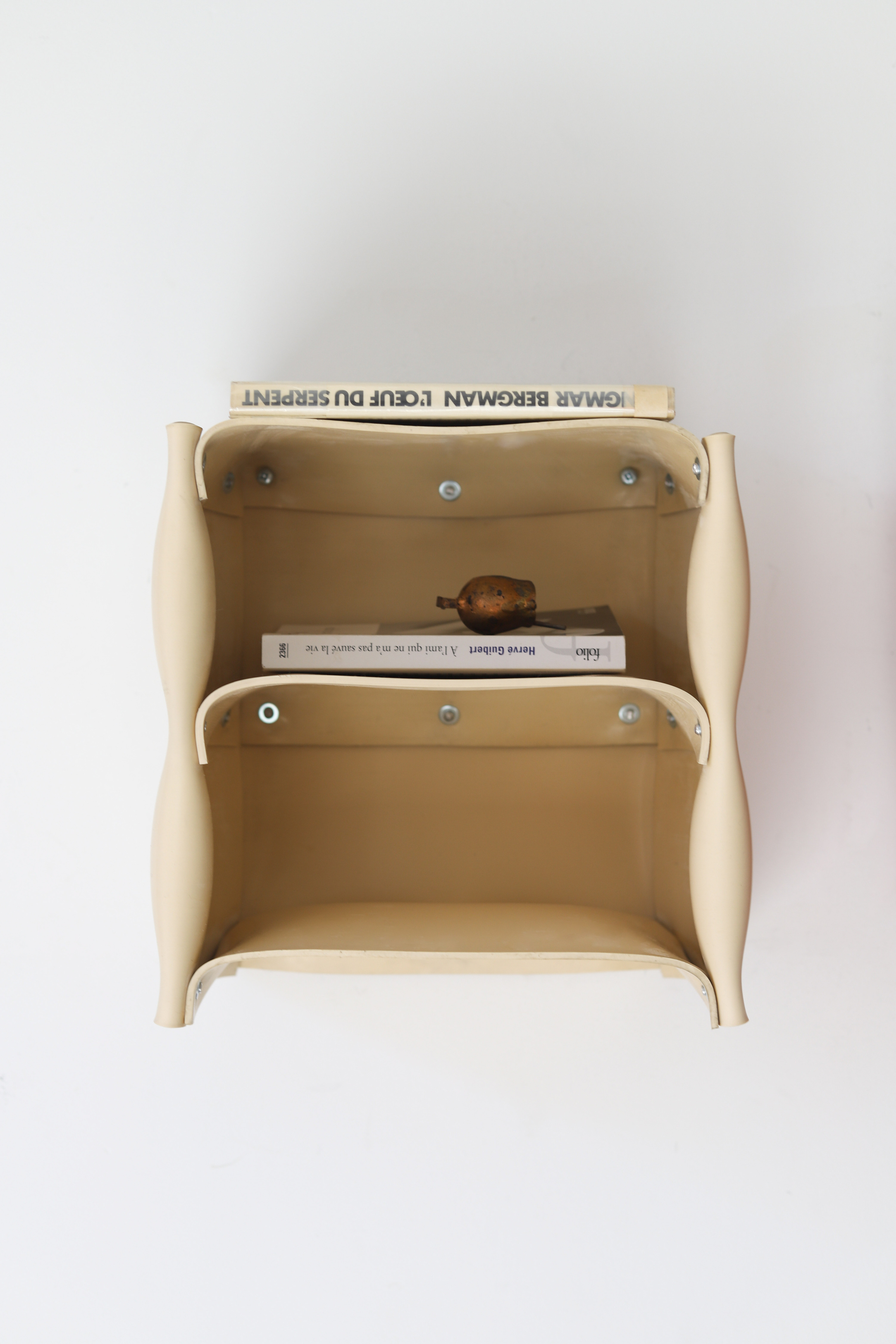
We meet at the crossroads of nostalgia and the future.
Optimistic, excited, carefree. A level of playfulness has always been important to Durasein, with solid surface choices that run the gamut from bold color to sparkle and shine.
Using Durasein’s bespoke patterns and Brilliant solids, beloved objects of yesteryear and retro colors combine to remind us anything is possible. Studio Sixtysix travels back to the future to find that the possibilities really are endless.
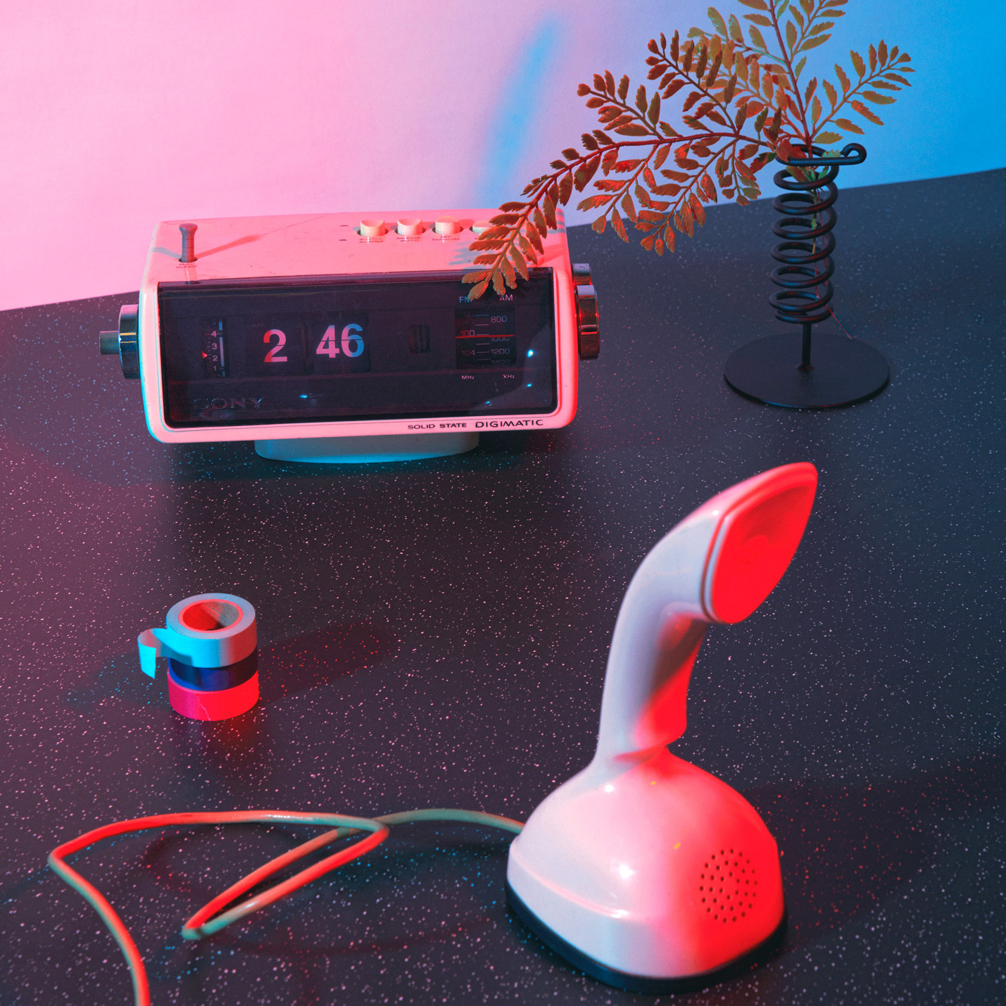
- Stretch out and explore against a Sea Blue backdrop that calls for pure imagination. “There’s an innocence to that color,” Carolyn says. “This was pre-digital, pre- social media. There’s something that is very exuberant about that color.”
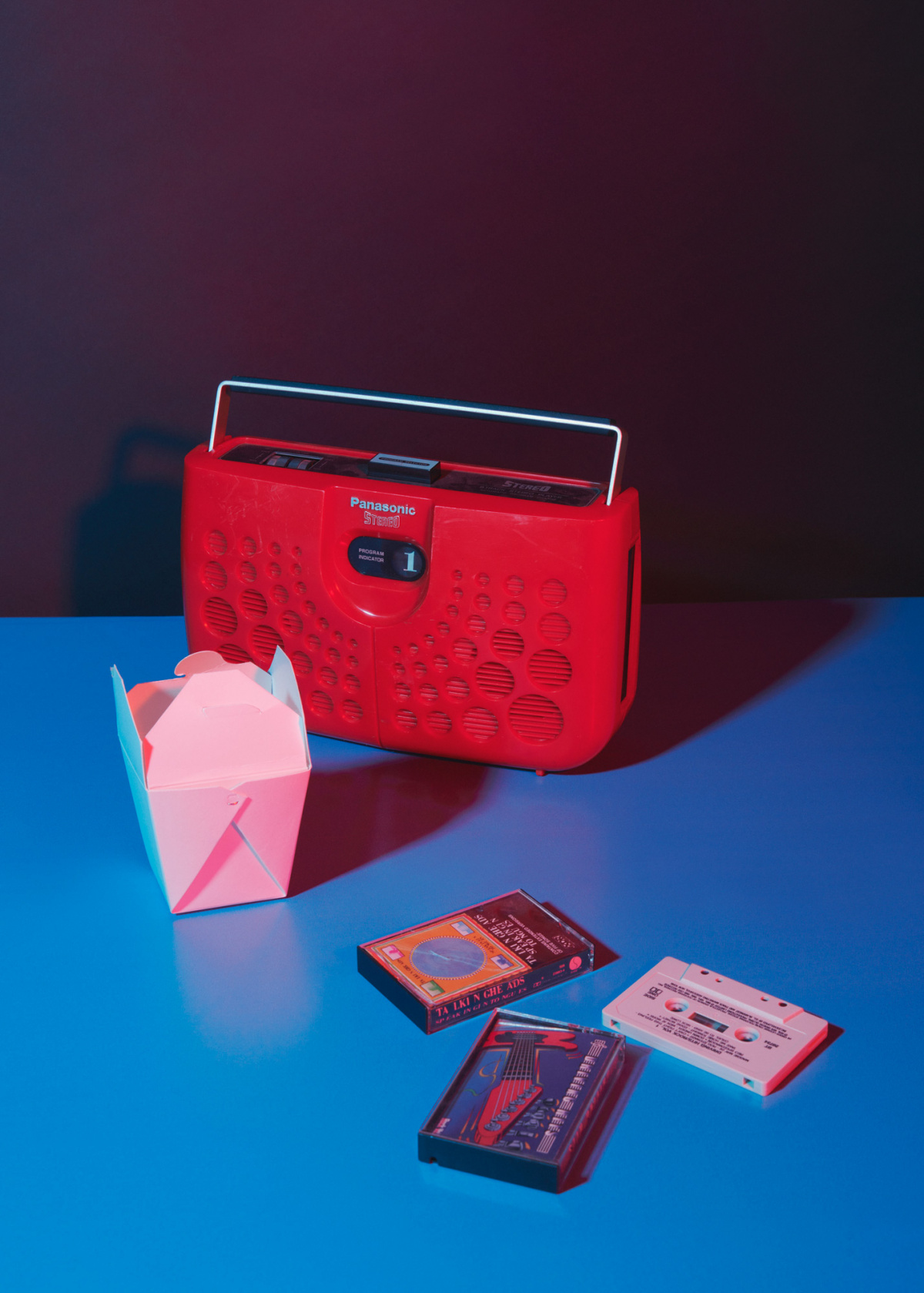
- Give the people what they want—room to breathe with a fresh, decluttered feeling. This luminous gray color opens the door for design bliss. “People are looking for that crisp, art museum vibe—the cleanliness and peace of mind and feeling of purity, spirituality even,” Carolyn says. “Luna is a color that can really set that stage.”

Galaxy offers the softer side of intrigue, reminding us of our place in the universe. Millennials, especially, feel drawn to all things retro, wanting to “cut through the noise” of constant bombardment from technology, Carolyn says. “Think about the 1990s. It was anti-corporation. It wasn’t about a blog or a brand. It wasn’t prescriptive. I think there’s a resurgence in that interest … And this realness, this sense of play—I think that appeals across generations.”
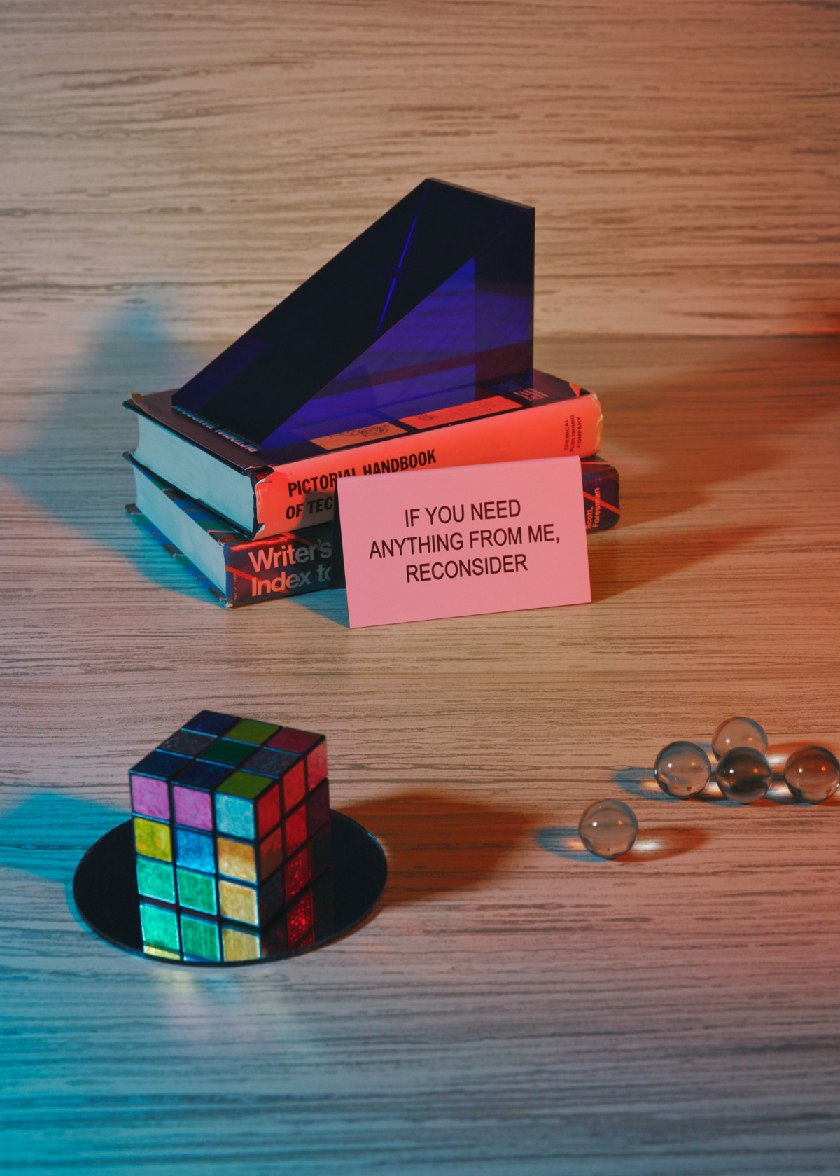
- Hickory is the answer to in-your-face colors and psychedelic patterns. It’s the grounding, calming force in a room. “We are realizing how important nature is and bringing nature inside with biophilic design,” Carolyn says. “Hickory has a beautiful wood texture with these wonderful tones and this very golden hue. It reminds me of the golden hour.”
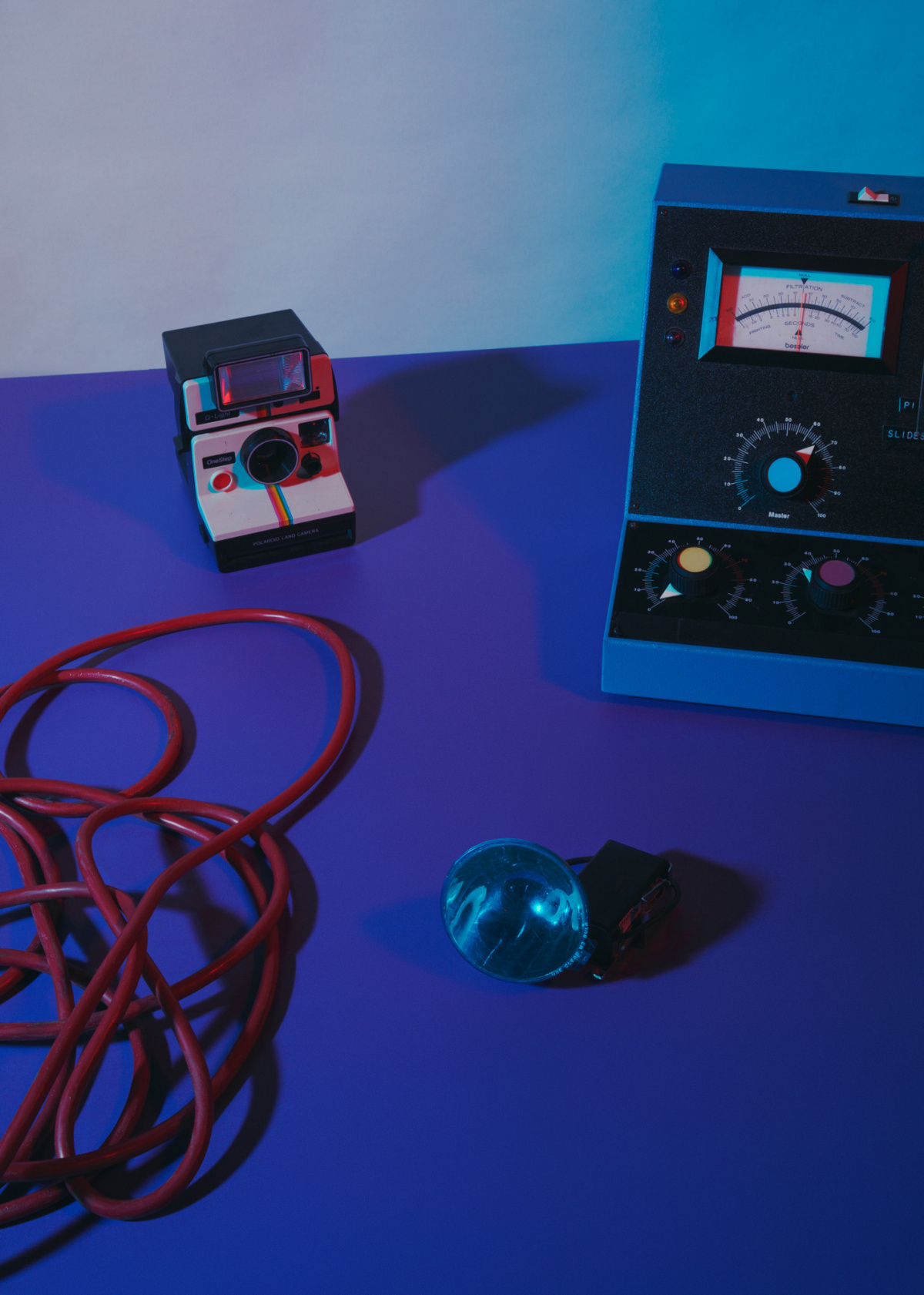
- Durasein’s Spiritual Purple is a trip down memory lane in the best way. It’s a grape-colored Dodge Neon, the feeling of your first car, freedom on the open road. It’s spontaneity. “When I see that color I think about the optimism it reflected in the late ’90s, early 2000s, and again now,” Carolyn says. “It’s a playful, joyful, youthful color.”
PRODUCTION CREDITS
Concept Produced by Studio Sixtysix
Styling by Kristina Walton Zapata
Photos by Chris Force
Retouching by Happy Finish
Words by Laura Rote
Studio Sixtysix is the in-house creative agency to Sixtysix magazine. Studio Sixtysix stories are conceived, produced, and edited by Studio Sixtysix.
A version of this article originally appeared in Sixtysix Issue 08 with the headline “Yesterday’s Future.” Subscribe today.
