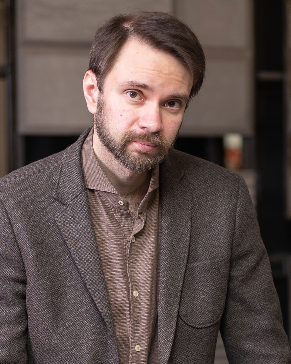
Dmitry Reutov is used to starting over, driven by a need for change and self-improvement. He keeps a tight schedule as one of Moscow’s least awarded but most hardworking—and now highly sought after—interior designers since his Mexican-inspired Manhattan interior became an overnight sensation with widespread publication all over the world. In fact the project, which incorporates a large rounded, pillowy sofa, is likely one of the main reasons that so-called “chubby” furniture is considered an interior design trend that will shape the next decade.
These days Dmitry runs between construction sites, his workshop, the airport, and interviews, but my persistence to catch him paid off as I hurried down a sleety Moscow side street to meet the man rumored to be unapproachable. To my surprise I was greeted with a warm smile, firm handshake, and soft-spoken voice.
It wasn’t his office or design studio we spoke in but one of Moscow’s biggest Italian tile showrooms. Business comes first—he needed to select a ceramic granite for a client. Despite his hectic schedule, he made sure that we had plenty of time to talk, turning away from his laptop and switching his cell over to silent. We sat down pre-COVID amid a sea of gray tile samples, the heavy clouds outside contrasting with the bright images of that now-famous New York apartment in my head.
Dmitry told us more about that project, the evolution of his work, and what he hopes to see more of in the interior design world.
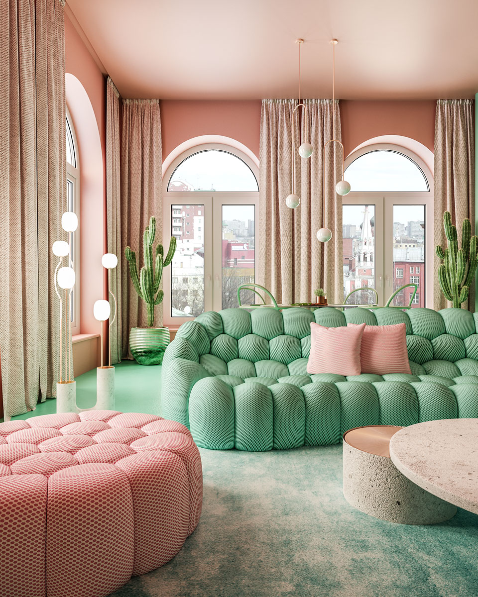
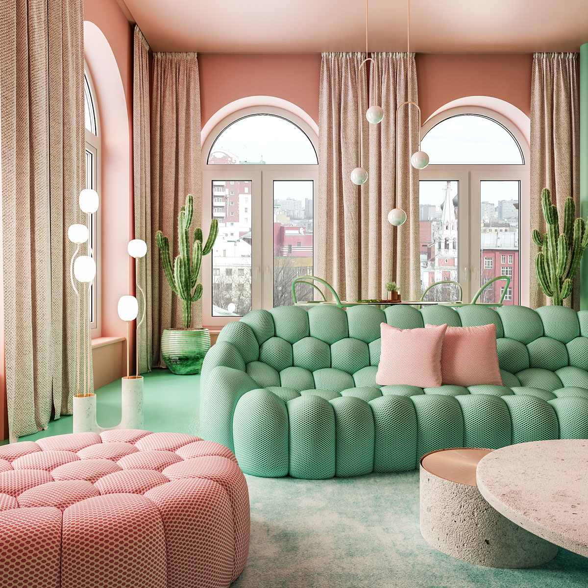
In addition to the concrete and copper coffee table of his own design, Dmitry incorporated a sofa and ottoman from the Roche Bobois Bubble collection in this Manhattan apartment. Photo courtesy of Dmitry Reutov
Talk to us about your “Mexican-style” New York apartment. What was the reaction like?
It’s a huge success I haven’t expected. It was published in October 2018 and sparked incredible interest and coverage. One of my Russian clients bought an apartment in New York and asked me to design its interior since they liked what I had done for them in Moscow. They left it all up to me but wanted to see something unusual. I love nature, but I wanted to create an interior I had never done before. I wanted to mix the designs nature and people create. I aimed to come up with a vibrant interior that would make big city people a bit happier.
Moscow and New York are mostly concrete jungles. Mexico inspired me with its cacti, old architecture, sunny colors, and vast array of natural elements already used in architecture ages ago. I wanted to combine nature and modern style to make something people would really like. I wanted my future customers to order something similar to that design because it’s different from what everyone has. I’m sick of customers coming in with magazines that carry classic, lofty, or minimalist interiors and nothing else. I want some kind of art space, although I’m sure many people are not yet ready to embrace it. Luckily there are appreciative clients, mostly foreign ones, but now I have two Russian clients who saw the project and asked to do something like that. I’d love to have more of those open-minded customers.
Was the furniture mostly custom-built?
Everything was custom-built except for the sofa, chairs, and lamps. We even customized the bathroom. I’m always trying to offer extraordinary solutions. We used polyurethane, cement, concrete, copper, and plastic in this interior. Plastic works very well for me. I love using concrete, but not gray. I like playing with colors. And cement. You can make truly amazing things. I used terrazzo here as well. Terrazzo has become fashionable lately, but in fact it’s a material that’s long been known for combining, for example, cement and marble chips.
I’m a big fan of Soviet architecture and design—that had a distinct style. If we walk through the remaining Soviet shopping centers or metro stations, we can see so much terrazzo. It’s also kind of protecting nature. We don’t “slaughter” marble by mining slabs; we pick chips instead and make beautiful material.
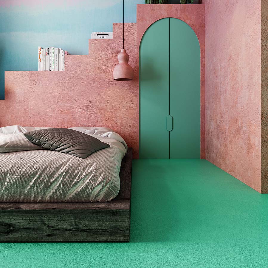
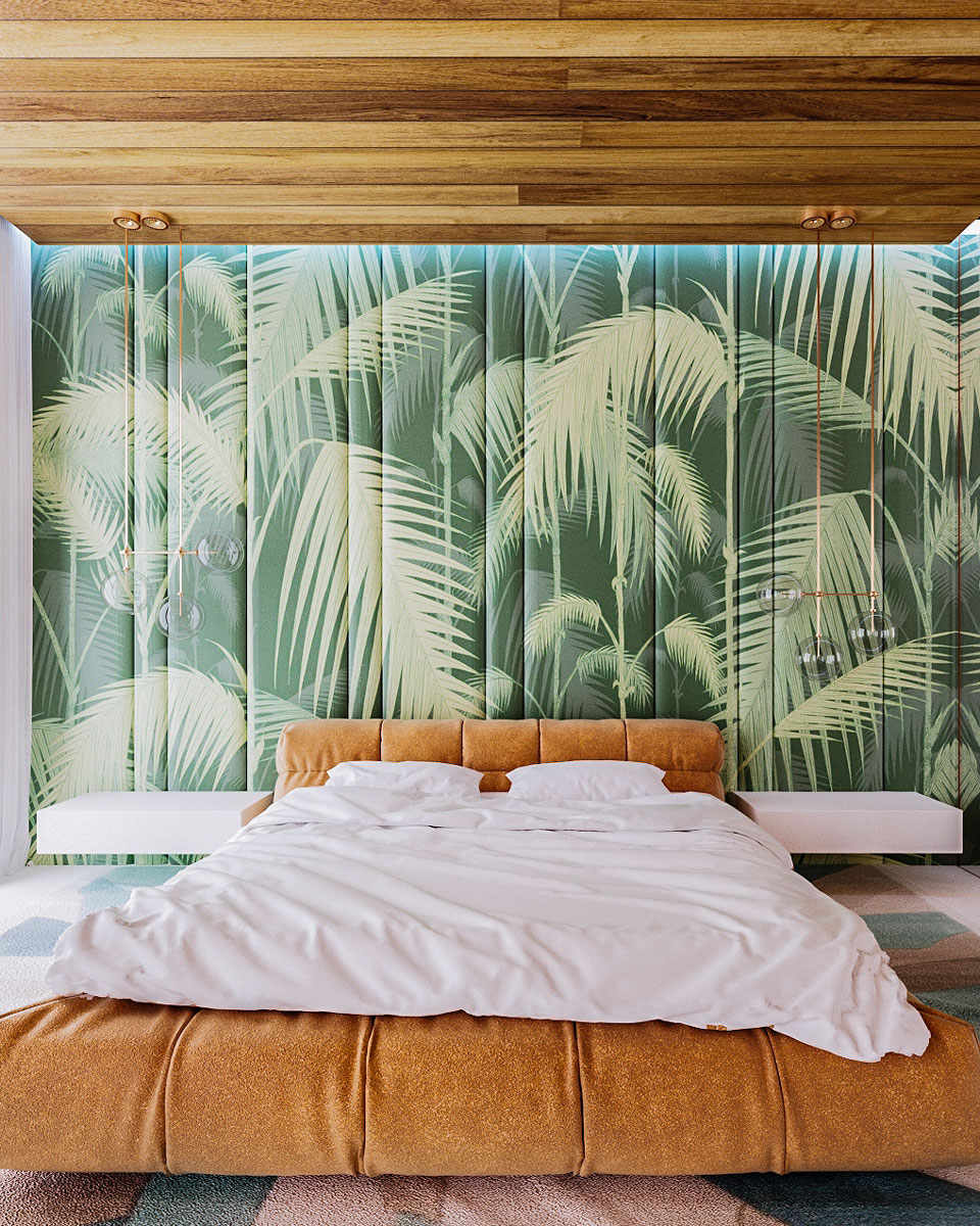
Dmitry’s signature style is nature-inspired, but using modern materials. You won’t find any wood in the Manhattan project. Photo courtesy of Dmitry Reutov
Did you really get a “carte blanche” go-ahead from the Manhattan client?
The only thing we discussed was some space planning. It’s a small apartment close to Central Park. They wanted to have a bed, sofa, bathroom, storage cabinets, and a place where they could eat. They didn’t need a proper kitchen, as this isn’t where they live all the time. We didn’t discuss color scheme or anything.
When they first saw it, they were a bit shocked. Anyone choosing an interior has basic expectations—for example, white ceilings. Everyone is used to seeing them. Their initial reaction was, “Where is the white color?” There is no white, but instead coral and green. They quickly got over that shock and fell in love with the vibrance. When you enter a bright space from a gray city street you feel like it’s summer. They also liked the non-standard furniture—for example, our kitchen unit. I wanted something not ordinary but comfortable since the apartment isn’t that big. I wanted to convey the feeling of a spacious living room.
The clients asked some questions, though, like how some things were going to work. The first question was if the kitchen unit was realistic and if such a thing existed. Since I also do furniture design, I created items that could be manufactured. The funny thing is—now people are wondering what the furniture is made of and where to get it; I’m getting lots of orders. It makes me happy as a creator. We are replicating the Manhattan project’s concrete coffee table to send over to Paris soon. We were asked what the floor was made of. Everyone is used to tiles, parquet, or solid planks. The flooring here is concrete, but it’s not gray, it’s colored, adding some irresistible charm on a budget.
Related | Fran Hickman on Designing Spaces That Feel Like Home
That interior has lots of cacti—one of my favorite plants. Cacti grow in hundreds of variations—flat, elongated, whatever. My columns are a creative interpretation of a cactus. The trunks stretch across the entire space. While doing this project I initially thought of arched vaults, but at some point I realized too many arches were not good. I needed something natural, but in a creative way. Nature is the best designer and creator that we can’t rival yet.
‘That was important to me. Trees are massively destroyed. My work is a sort of eco-friendly impulse to show how we should coexist with nature, use its designs, and interpret them in our homes.’ Photo courtesy of Dmitry Reutov
How has that project’s success influenced other projects?
If you look at my Instagram, you will see two other projects—another New York apartment and a villa in Ibiza. Both continue my interpretation of nature versus modernity. The Ibiza design is different because the customer has set certain limitations. The interior should be white. This is how it is traditionally in Spain or Greece. There are huge windows, and the interior is what is behind the window: the sea, the mountains, the trees. It has become a challenge for me. If Manhattan’s apartment is Mexico-infused, here I paid homage to the island of Lanzarote with its volcanic, surreal, Martian atmosphere. There are these round, crater-shaped arches. I wanted to shape the future. And I wanted to get away from a barren and banal design—no rectangular straight cabinets with a bed and two bedside tables.
Have you been working on anything unexpected?
There are a few projects that are unusual for me. I’m discussing developing furniture for several brands; they’re small but willing to do something exclusive and out of the box. One project is an aerospace company that has started manufacturing furniture. This is a family business that saw my design and saw this connection between nature and outer space. It’s going to be cosmic-themed furniture out of aerospace materials—carbon, aluminum alloys, and others.
“Nature is the best designer and creator that we can’t rival yet.”
How has ReutovDesign Studio grown into a full-service business in the last 10 years?
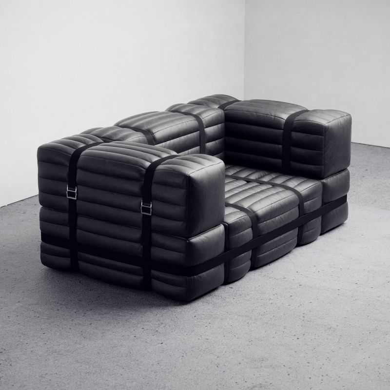
We have some serious construction issues in Russia. I faced the same problems in Spain. The same goes for furniture. There are a lot of cool brands out there but also lots of furniture I invent and design myself. It’s hard to find a high-quality, reliable, local manufacturer to produce it exactly as you penciled it. This is how my furniture production was born. I’ve gone back to outsourcing since my own resources are not enough at the moment. I do consider partnering with companies that are ready to bring my designs to life.
How has your business evolved in general?
From my first publication in magazines I saw a stream of customers. One of the publications featured a project that at that time differed from what was “normal.” A steady number of orders at some point led to my doing “conveyer” interiors that were all the same, and I lost my creative drive. In 2012 I decided I needed a reboot. I left design for a year, having opened a small shop and a restaurant—albeit in my own design. After awhile I realized trade and cooking was not my cup of tea either. A year later, I returned to design, but with a slightly different approach, wanting to make unusual interiors I would like myself.
It took me a few years of searching to find what would resonate with me and with others. I also went deep into construction and renovation. I had previously hired contractors, but now I set up my own construction and renovation company. On a side note, when I really like the project and have free time, I love doing some things with my own hands. I opened a small furniture manufacturer for my projects because you can’t easily find the furniture you need or want. Recently I’ve been more focused on finding my signature style that would be relevant around the world.
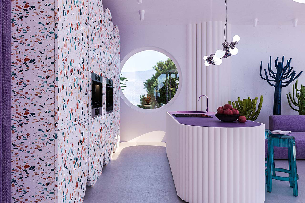
Even when working within design constraints, Dmitry always finds ways to introduce colorful forms in his interiors. Photo courtesy of Dmitry Reutov
What’s your day to day schedule?
My schedule is tight, but it’s hard to describe a typical day. I don’t call it work. This is a process for me, a process I love. I’m solving problems. Seven days a week. Quite often my working day begins with calls, decisions what to do, how to make things, who’s going where, then purchase orders, site inspections, endless meetings with clients, construction workers, partners, contractors. But I always spare myself some days for pure creativity because, at the end of a day, I am creating all the projects myself. I have assistants, but they are just to help me. I’m trying to spare myself at least two days a week to do that. It all comes down to situation and workload. It sometimes happens I spend a whole week onsite. Then I give myself an extra day or two. When my inspiration is here, I can work through the night. It all depends on the problems that arise, because it’s spontaneous, and you can’t predict or keep track of them unfortunately.
What is your current studio like?
My office is my workshop now. I have my designers there. This is just a workspace, but I’m currently setting up my new office. My primary demand was a river view. It was absolutely crucial for me to watch water from my office and workplace. This is a key element; this is life. Unfortunately, it’s very hard to find in Moscow. My office will have a river view and incorporate elements of my signature style, of course. As soon as it is ready, I will show it. I don’t have lots of employees. My design studio consists of six people. They are 3D visualizers and designers helping me bring my ideas to life. The total number of employees is 15, plus 15 freelancers.
We’re all in one place now, but there will be two locations in the future. The furniture design department will stay next to the production, and the office will be purely creative—these six people who are engaged in industrial and interior design. The head of construction and the foreman are likely to join designers in the office, too. We don’t take a lot of orders to avoid having to churn them out. I used to have more employees, but it murdered creativity for me. It’s now important to create one, two, or five projects only, but that are one of a kind.
Does your family fully support you?
I’m getting 99% of their support. The only thing they think is I spend too little time with them and get little rest. I’m always busy. On the other hand, I realize if I don’t devote enough time to creative development, I will stagnate. My mom used to show no support. Back in the day she thought I should have graduated from a university and been employed at some decent place. Now she supports me. Moreover, she works for me now, and my sister works for me as well.
- For Dmitry, finding his signature style was a challenging process that led him to leave the field for a while and come back stronger than before. Photo courtesy of Dmitry Reutov
- “A person fond of cooking spends less time in the living room. Some like bathrooms. I prefer as few shelves and racks as possible. I find myself trying to convince my customers to let excessiveness go.” Photo by Evgeny Gnesin
Is working with your family challenging?
Working with my mom and sister is easy. It’s so much more challenging with friends. All the friends I thought could work with me disappeared. I’ve always had a dream of building a family business, as it happens in Europe and the States. But I realized it’s not yet possible in Russia. To make it happen, everyone in your family must be involved for generations. We destroyed anything we used to have. We have no traditions, we do not support them, and it’s difficult to develop that. At some point I realized it was easier to hire enthusiasts—people interested in my business and looking in the same direction as me.
Do you look up to any other designers?
There are some architects and designers I like, but it’s more about the designs I like than personas. Sometimes I don’t even know who the author is. I like Frank Lloyd Wright and his famous Kaufmann house—a great example of how you can fit modernist architecture into the landscape. I like Karim Rashid and his unconventional approach to design. I like the architecture of Zaha Hadid with her reference to nature. I really like India Mahdavi and the way she works with colors and shapes; I’m even compared to her sometimes. I can mention Patricia Urquiola for her unusual, outstanding, beautiful designs. Perhaps my idol is nature. The designs nature creates always inspire and impress me. No one can surpass what is created by nature.
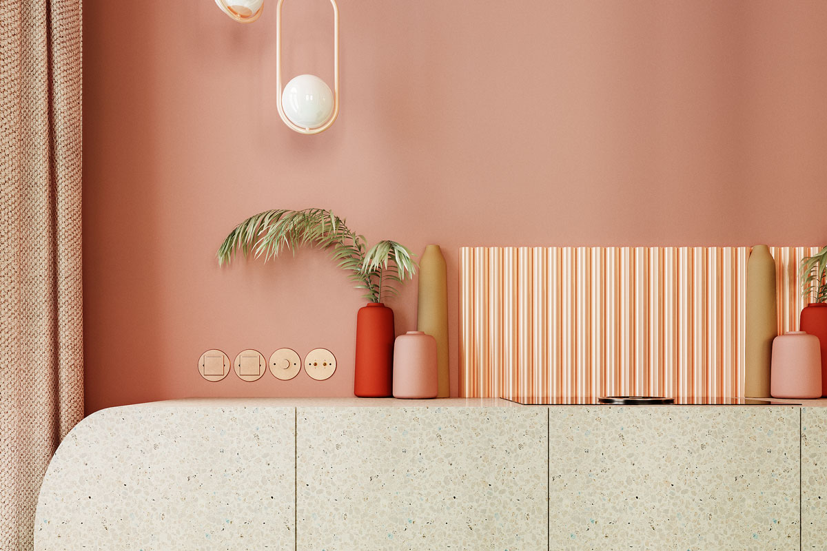
“People now want their own custom interior—especially non-residential interiors. Restaurants are especially fond of it. We’re getting many requests from the Gulf states—Qatar and Kuwait—because it’s unlike almost all their designs.” Photo courtesy of Dmitry Reutov
What is it about nature, though, that you keep coming back to?
It’s about colors, shapes, and textures. Nature doesn’t have two identical things. If we speak about my favorite green color, nature offers a million green shades. Even two cacti growing next to each other will have different hues. There are millions of textures and shapes, whether it’s botany or stones. I do like stone. The same goes with water. It is always a different color with different properties. Or sand.
When creating interiors, I always turn to nature, asking myself what it would look like in nature. Even when I look at plastic as a modern man-made material, I associate it with nature. I can relate transparent plastic to ice.
I attribute metal more to natural elements, although there are man-made alloys. In that New York apartment I used variations of copper. Copper is one of the materials created by nature—and a pretty spectacular one. Copper can polished, sanded, and it has the ability to oxidize and give a green color.
We have to ask, what do think of Trump right now? And what’s it like working with American clients?
I really like working with my American partners and clients because the vision is completely different. It’s like it’s already the 22nd century there. They appreciate design, beauty, creativity, and hard work. In Russia many customers treat designers like crap. They think we just “draw on paper.” On one hand, it looks like there is no excessive glamorizing of the profession. On the other, the attitude toward designers is more serious. People are ready for non-ordinary solutions and approaches, and they like it.
Interview translated from Russian and edited for clarity.
A version of this article originally appeared in the Spring/Summer 2019 issue of Sixtysix. Subscribe today.
