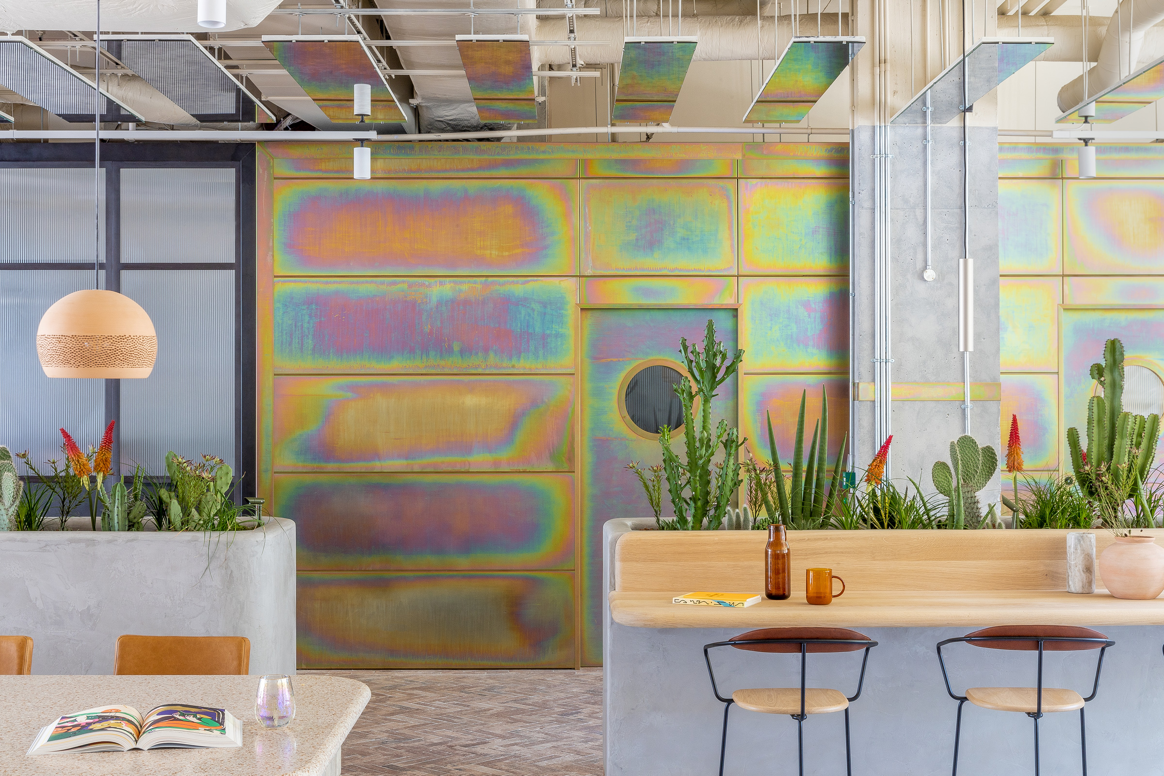
When you think of London, a psychedelic desert oasis is probably not what comes to mind. But that’s exactly what you’ll find at Bermonds Locke by Holloway Li.
“The client said to us that typically when they have a project in London, it references local character, but for this project they wanted it to feel like somewhere else,” says Holloway Li’s founding Creative Director Alex Holloway. “They had been to Joshua Tree, and they wanted us to explore that as a reference point.” And because Alex has never been—it’s on his list, he says—Holloway Li dove into immersive research on the desert town: what it feels like to be there, what it looks like, what it would be like to stay.
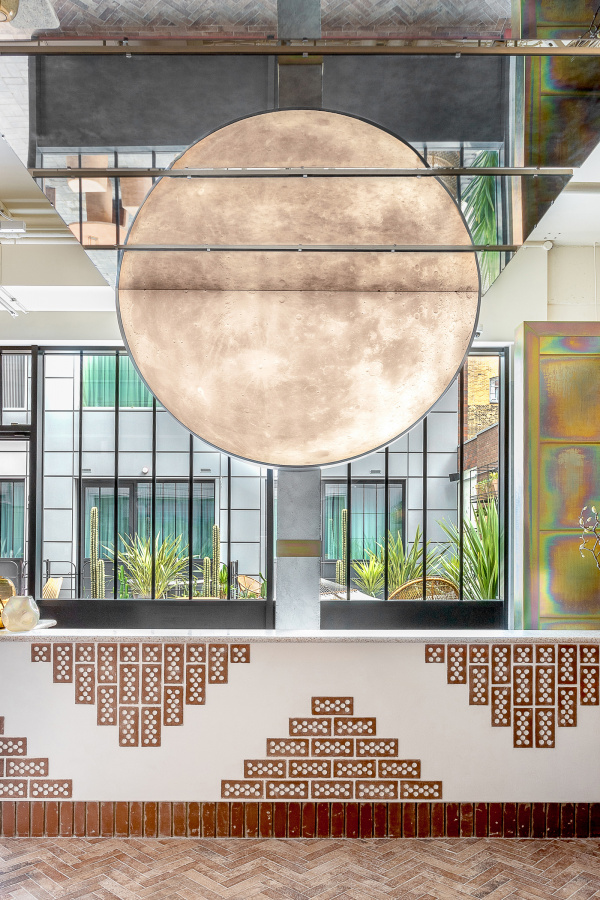
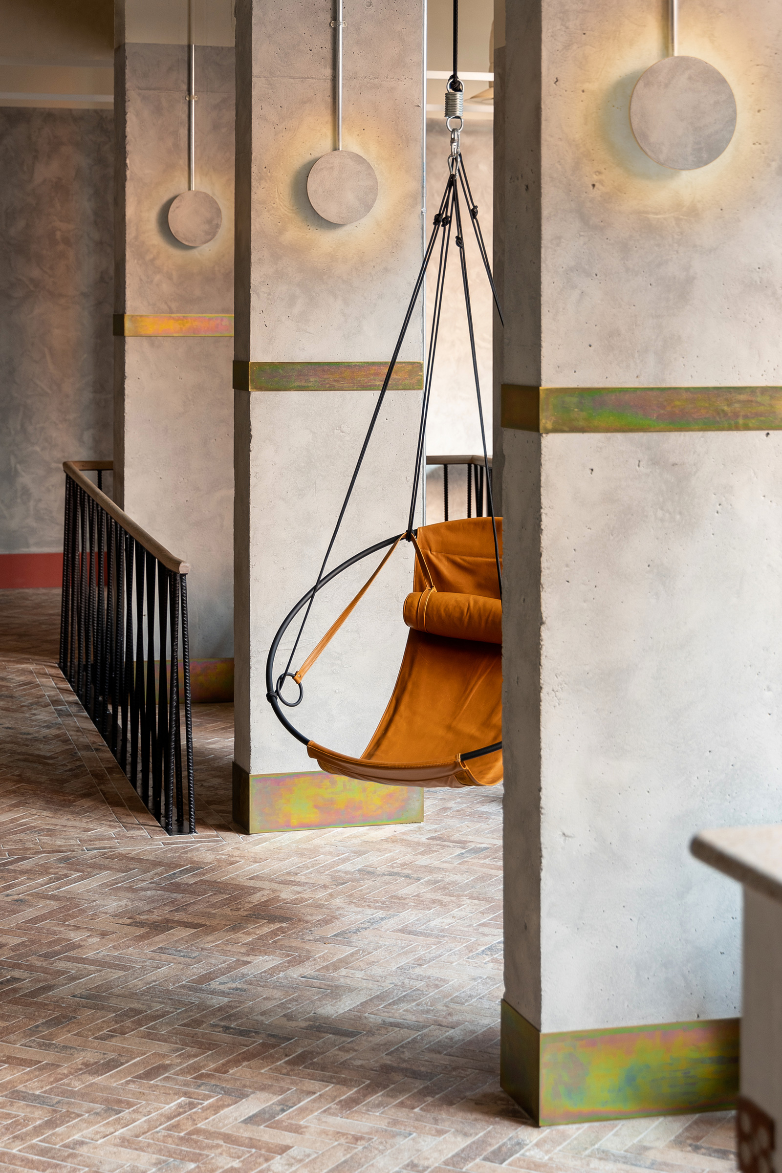
Moonlight installation over the welcome desk with mirrored ceiling creates a mirage effect. A Navajo-inspired pattern was made using re-purposed engineering bricks. Photo by Edmund Dabney
“We loved the aspect of being a place of psychedelic pilgrimage, and obviously also its otherworldly environment, being one with nature,” he says. “We took our colors, cues, and palette from that.”
The hotel is tucked in Bermondsey—an “unfashionable part of London getting more fashionable now”—but Bermonds Locke feels like a piece of California, from the terra-cotta InternoItaliano furniture in the courtyard to the birdcage-like rattan lampshades from Tine K Home hanging in the hotel restaurant.
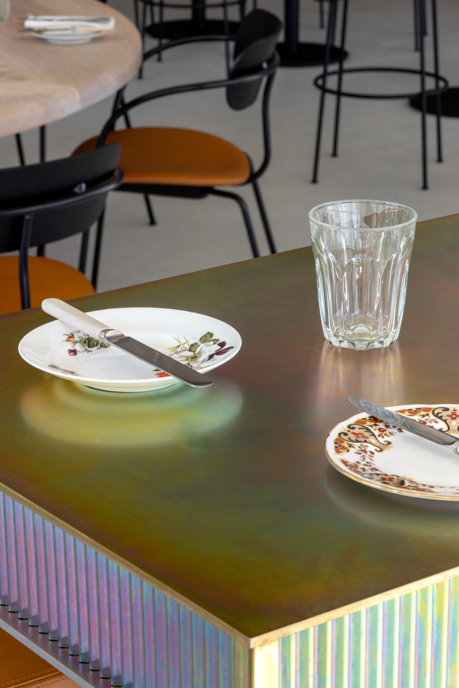
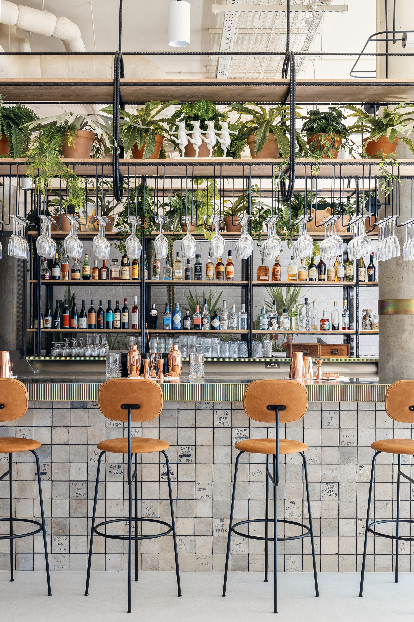
- The studio used the industrial process of zinc passivation to create the iridescent bar top. Bar frontage formed using recycled/upcycled concrete strength-testing cubes. Photo by Edmund Dabney
- Bermonds Locke restaurant used a steel rebar to form the bar gantry. Photo by Edmund Dabney
Other than its desert-like feel, Bermonds Locke is also focused on materiality, particularly how to strip it back. “A lot of our thinking on this project was about reusing materials,” Alex says. “You have this five- to eight-year refurb cycle in hotels. There is a constant rip out, start again. So part of our thinking was, ‘How do we use what is already there? Let’s work in a design so we can do a lot more with a lot less.’”
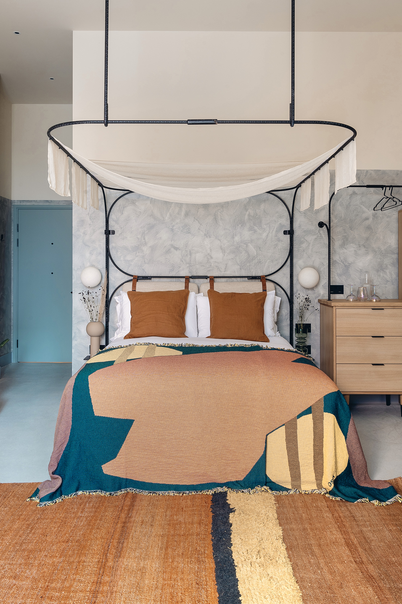
The building was an empty office building, a blank slate for the taking, with concrete walls and columns that were woven into the hotel’s design. What new materials were used were chosen deliberately. Steel reinforcement bars, typically used with concrete, became a decorative material throughout, including the bedrooms’ four-poster bed frames and bar’s gantry. Concrete strength-testing blocks set for the landfill, still with their original graffiti, transformed into table plinths in the coworking space and the bar front in the restaurant.
“Our philosophy is not to overcomplicate things,” Alex says. “You end up with this humble aesthetic, but overall you still look at it and see the hand of the designer and an unexpected end product.”
- Custom iridescent screens by Holloway Li were made using fluted glass and dichroic film to bring the psychedelic theme into the bedroom. Photo by Edmund Dabney
- The bespoke rebar bed frame and headboard were designed by Holloway Li. Rug by Toulemonde. Bed throw by Viso Project for Monologue. Photo by Edmund Dabney
A version of this article originally appeared in Sixtysix Issue 07 with the headline “Holloway Li / Bermonds Locke.” Subscribe today.
