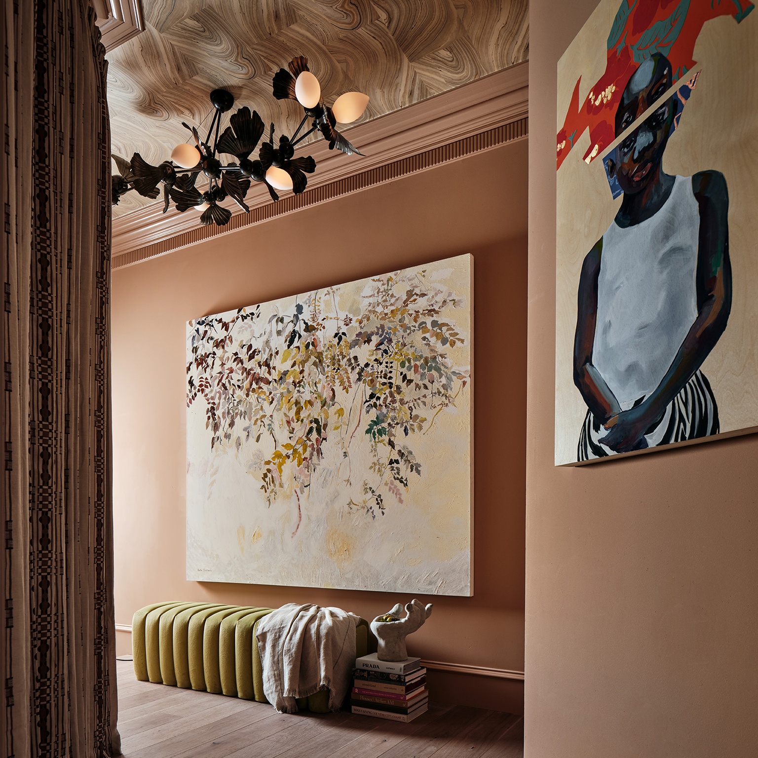
Designer Jessica Davis is a master at spinning webs of carefully selected details in interiors. Her background in art history, product placement, hospitality design, and hardware design gives her a special appreciation for parallelism between materials, colors, and structural geometries. Her spaces take an almost kaleidoscopic turn, reflecting shapes, colors, and themes across bathroom drawer pulls and living room structural beams.
Jessica’s design career kicked off with the details at its heart. Her first business, Nest Studio, launched two collections of decorative hardware at HD Expo in 2011. “It was sort of crickets—hardware within hospitality is like a niche market within a niche market.” Yet over time and with the help of her blog and the early days of Pinterest, Nest Studio gained traction and gave Jessica a valuable way to shift her focus to her interior design practice, Atelier Davis.
Now with roots established between New Jersey and Atlanta, Atelier Davis spaces don’t always employ Nest Studio’s designs, but Jessica does consistently use artistic hardware as a thoughtful architectural detail to ground and inspire interiors—from contemporary showhouses to midcentury modern bungalows. Alongside gorgeous artworks and flea market finds, Jessica’s eye for the little things creates robust spaces full of life.
Quotes by Jessica Davis unless otherwise noted.
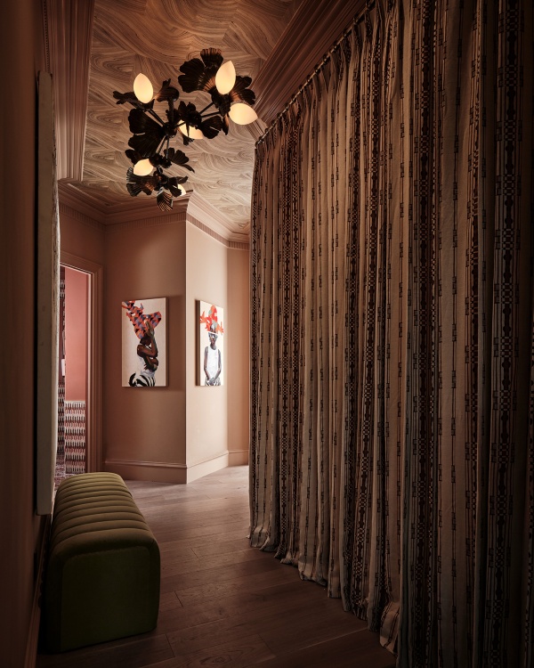
Kips Bay Dallas Show House. Wall drapery by Brook Perdigon Textiles, rug by Arsin, console and table lamp by OKA, mirror by Brent Warr. Photo by Stephen Karlisch
“All three light fixtures are by Brooklyn-based artist Rosie Li. I’m one of the founding members of the AAPI Design Alliance, and Rosie was on the first panel we hosted. I love that I was able to use an AAPI artist and that this organization brought us together.”
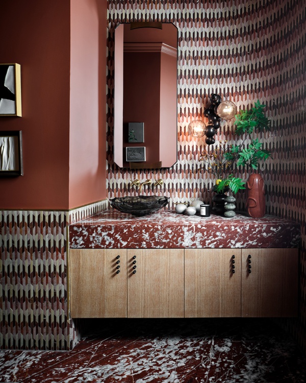
Kips Bay Dallas Show House. Mosaic tile by Artistic Tile, Tubular Hardware by Nest Studio, Bubble sconce by Rosie Li, sink and brass fittings from Kohler, mirror by Arteriors. Photo by Stephen Karlish
“Powder rooms are great places to push the limit because you’re not spending a ton of time there. It helps to have elements that speak to one another. We used this artistic tile mosaic on the walls, so I echo the faceted 45-degree angles with the mirror above the vanity and the glass bowl sink. It’s important to tie everything together if you’re doing something that bold.”
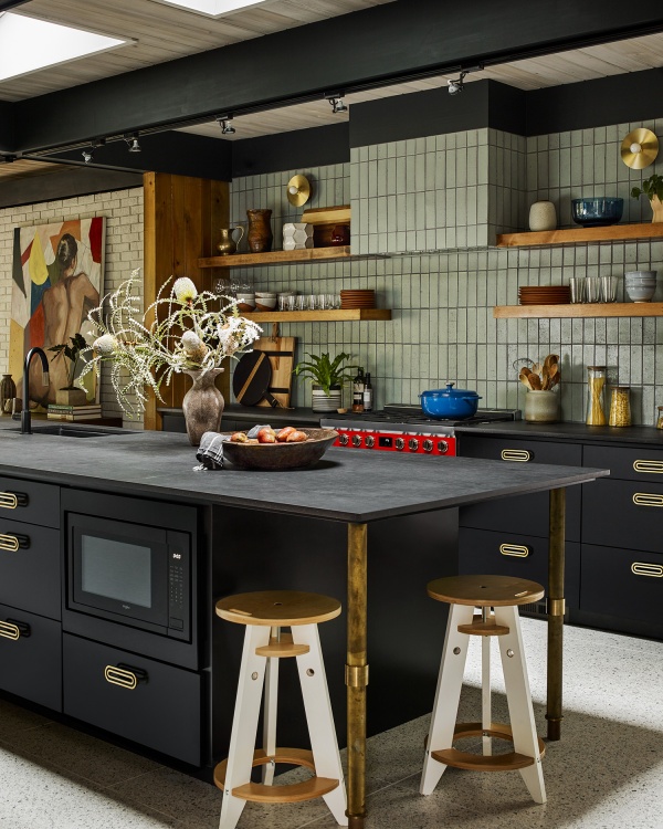
Atlanta Mid Mod (Jessica’s home). Fireclay Tile, countertop by Dekton, lighting sconces by Worley’s, Deco Hardware by Nest Studio, Velux skylights. Photo by Emily Followill
“When we opened up the kitchen we salvaged a lot of classic mid-century, golden Magnolia paneling. We used it to clad the wing wall, the shelves, and a wall on the other side with our pantry and our fridge. It’s a nice nod to the original architecture of the home.”
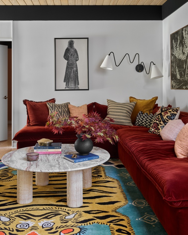
Atlanta Mid Mod (Jessica’s home). Rug from Etsy, bolster and pillows covered by Kufri fabrics, sconce by Mitzi, coffee table from Crate and Barrel, sofa in Yarn Collective fabric. Photo by Emily Followill
“It’s a classic mid-century post-and-beam designed by Jerry Cooper. In all the projects I do it’s important to start with the architecture and build from there. We wanted the addition [kitchenette and ‘snug’ below] to feel seamless so we reflected the tongue-and-groove ceilings and the beams to make it feel like it had always been there.”
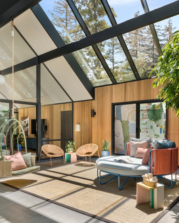
Palo Alto Eichler in collaboration with architect Gustave Carlson of Gustave Carlson Design. Custom daybed and pillows designed by Atelier Davis and made by Hancock Surface Studio, all fabrics by Perennials, swing and pillows by Mexa, Tube Arch Collection lighting sconces from WAC Lighting, custom skylights designed by Gustave Carlson and manufactured by Royalite. Photo by David Duncan Livingston
“The atrium is an indoor space, but in classic Eichler style there are elements that make it feel outdoors. Obviously the space gets a lot of sun too, so we wanted to make sure that whatever we selected was durable for that and wasn’t going to fade. I really treated it as an outdoor space.”
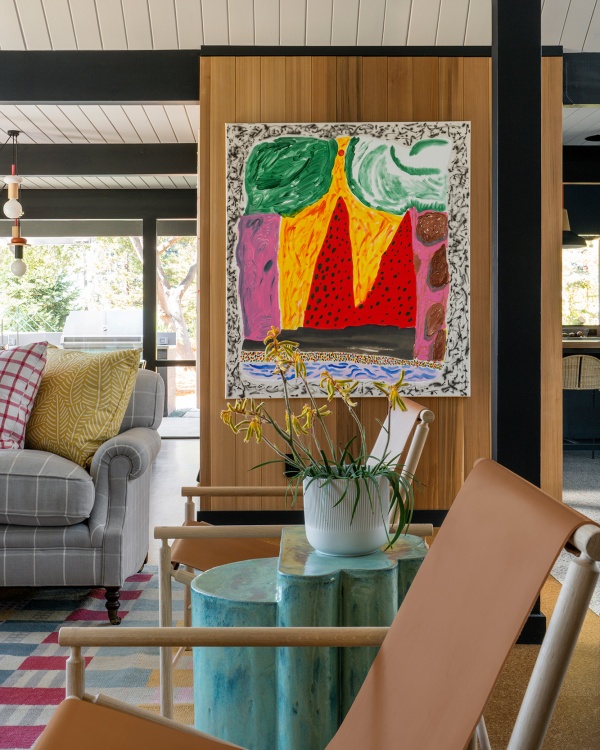
Palo Alto Eichler in collaboration with architect Gustave Carlson of Gustave Carlson Design. Artwork Cave Home by artist Shara Hughes, ceramic side table by Bari Ziperstein, chair from 1stdibs, sofa from George Smith. Photo by David Duncan Livingston
“With the clients’ four daughters running around, the space had to be durable and not too precious, even alongside this amazing art collection. We worked with Gustave Carlson Architects, who helped establish the language from the get-go: paying respect to the original Eichler while bringing in some new materials, like California Douglas fir. I think Gustave was excited I brought all these colors and materials to the table that still let the architecture sing.”
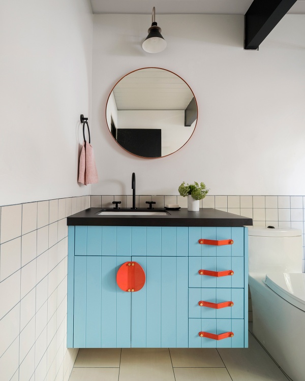
Palo Alto Eichler in collaboration with architect Gustave Carlson of Gustave Carlson Design. Geo Colorful hardware by Nest Studio, mirror by Room & Board, countertop by Dekton, sconces by Tudo & Co. Photo by David Duncan Livingston
“Partially because I started in hardware, I think of it as an integral part of the design from the start. People think hardware is like the jewelry that you add on at the end, but I’m always thinking of it from the very beginning. If you took it away the room would be way more boring.”
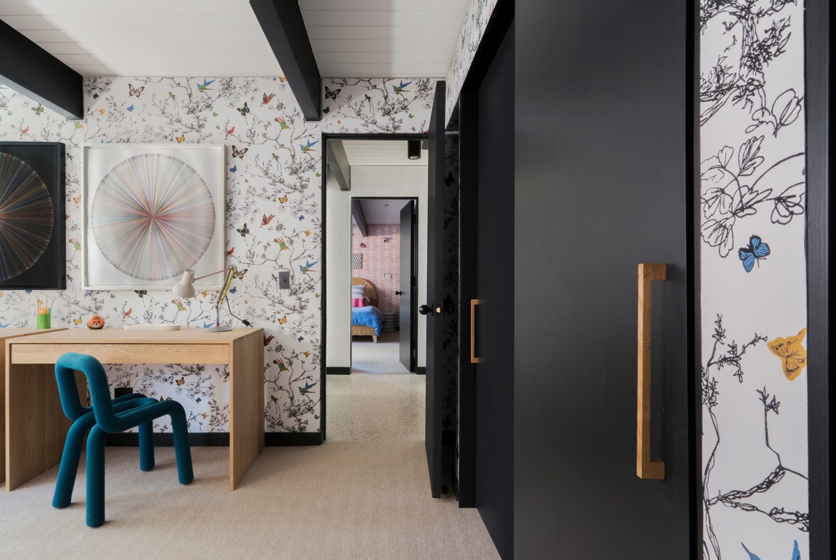
Palo Alto Eichler in collaboration with architect Gustave Carlson of Gustave Carlson Design. Bed from Crate & Barrel, bedding from Schoolhouse / Ikea, bedside table by Made Goods, lamp by Blu Dot, sconce from Etsy, Schumacher Wallpaper, Statford Carpet, sconce by Schoolhouse. Photo by David Duncan Livingston
“We wanted to play with that indoor-outdoor feel in the kids’ room with the Schumacher butterflies. Bringing that traditional feeling wallpaper into a mid-century home and mixing it with these other pieces—which might feel more kind of like Memphis, ’80s, or whatnot—is where you can really have fun.”
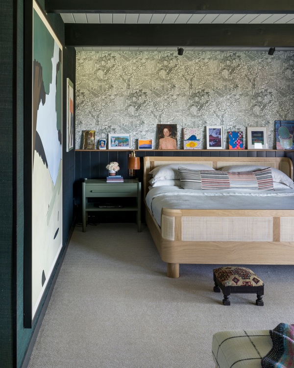
Palo Alto Eichler in collaboration with architect Gustave Carlson of Gustave Carlson Design. Custom bed designed by Atelier Davis and made by Hancock Surface Studio, throw by Aloka, lumbar pillow fabric by Zak & Fox, bedside table by Dowel Furniture, sconces by Lostine, flooring by Stratford Carpet, grasscloth wall by Phillips Jeffries, Floral wallpaper by Marthe Armitage. Photo by David Duncan Livingston
“We created that ledge behind the bed knowing the client is a big-time art collector. She ended up putting up all these pieces by young, up-and-coming women artists. I was there yesterday, actually, and she had a bunch of new pieces. The pieces here are not hung, so now it’s like her rotating gallery.”
A version of this article originally appeared in Sixtysix Issue 11 with the title “Atelier Davis.” Subscribe today.
