When interior designer Róisín Lafferty proposed furnishing a London penthouse entirely with Italian artisanal pieces, Artemest co-founder Ippolita Rostagno saw an opportunity: could traditional craftsmanship feel fresh and modern in a contemporary home?
The project, located in London’s Embassy Gardens, is a celebration of color. Róisín covered every surface from floor to ceiling in warm, tonal shades designed to push back against the city’s endless gray. The result is Artemest’s first full residential project in London, featuring only objects made by living Italian artisans.
Ippolita walked me through the apartment, showing how a mix of eclectic pieces can feel perfectly harmonious when color does the heavy lifting.
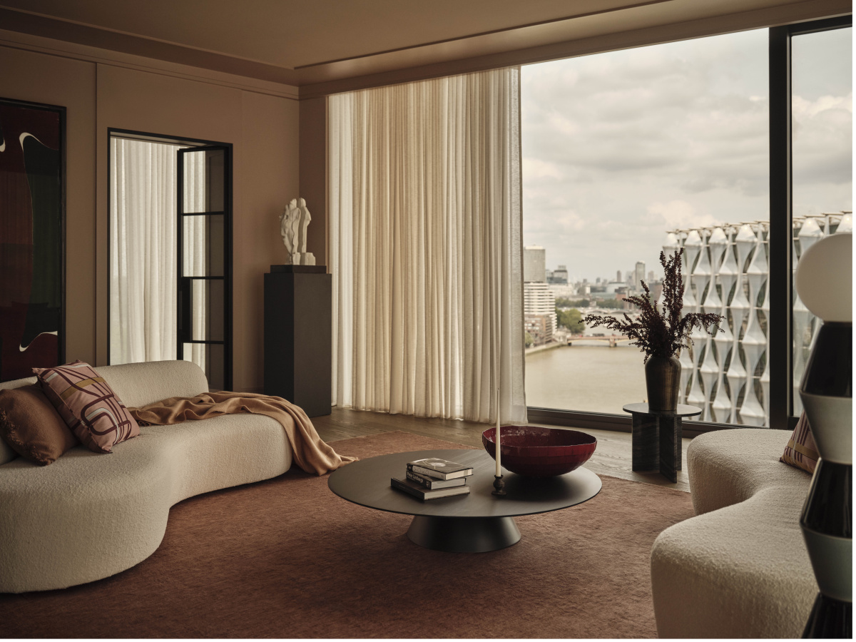
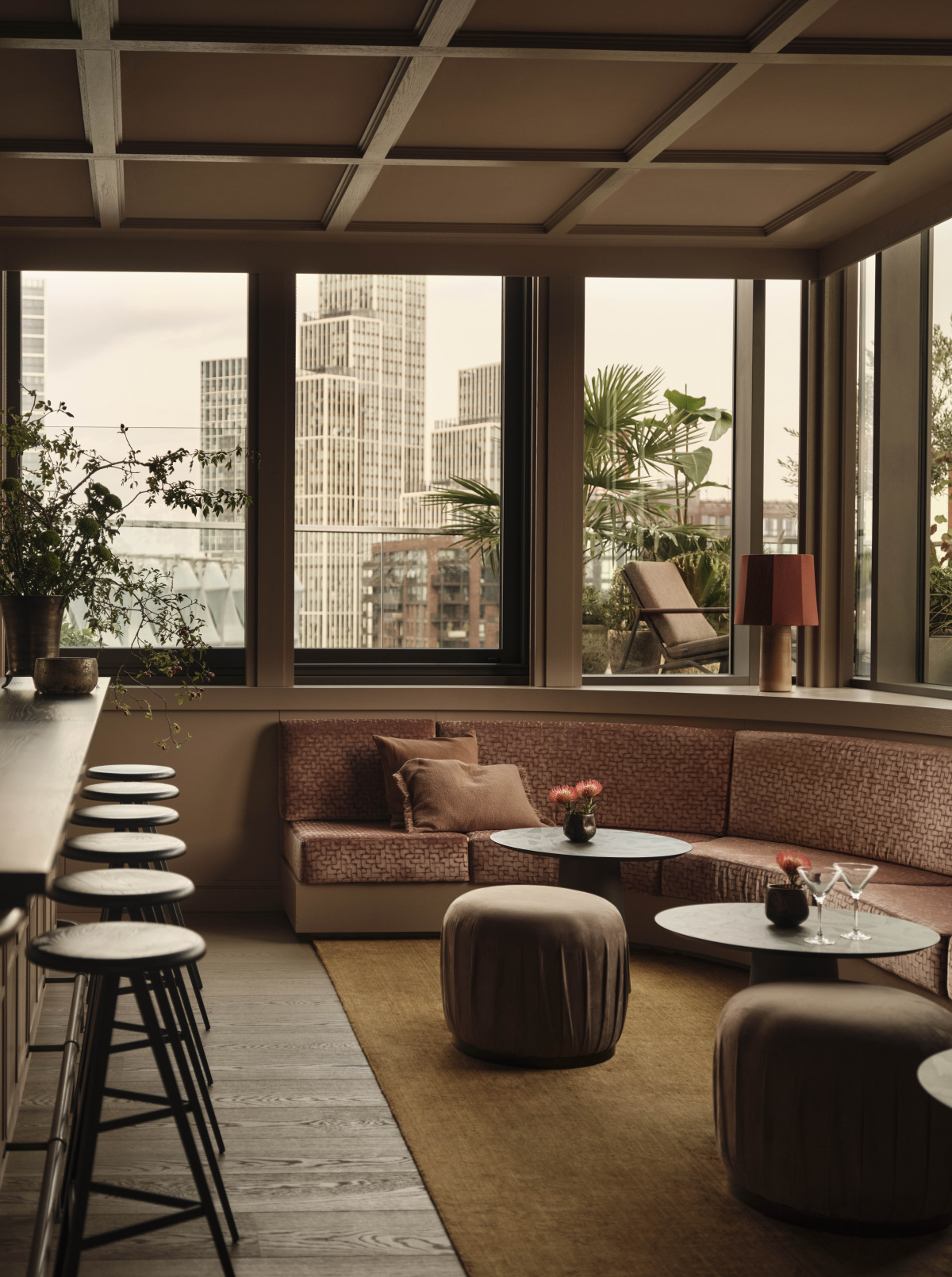
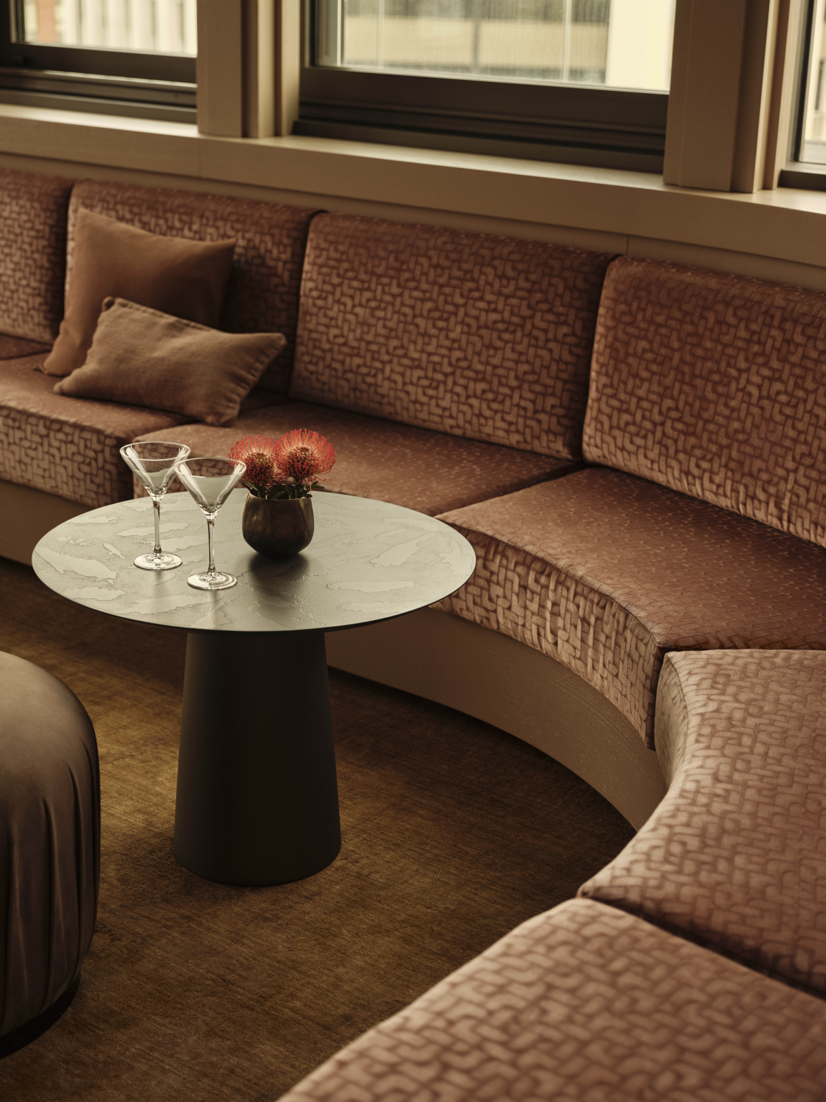
Perched across the 17th and 18th floors of Embassy Gardens, the penthouse frames sweeping views of the London skyline. Above: Curvy Mono sofa by Paola Navone, Palm floor lamp, Islands 3 coffee table, Kyushu Kenya side table. Photo courtesy of Artemest
What made this London penthouse project different from other collaborations you’ve done with designers?
We’ve worked extensively with the designer Róisín Lafferty, and she is really lovely. Her style is incredibly eclectic. She’s the perfect fit for Artemest because she really understands how to take the artisanal qualities of the things that we source and place them in a more contemporary context. The handmade aspect doesn’t overwhelm the aesthetic—she makes the story compelling and clear. It’s not obvious that every designer can showcase what Italianness means in a contemporary setting outside of Italy.
-
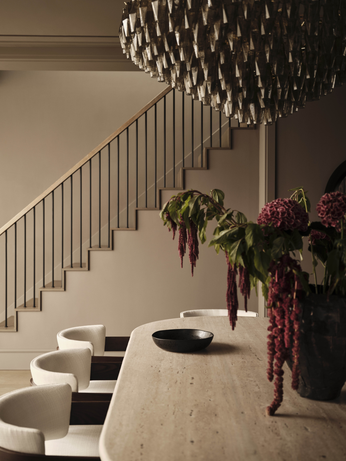
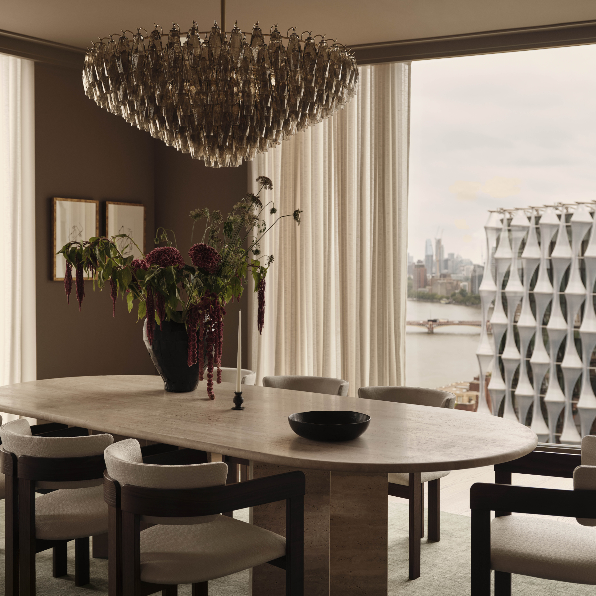
- Refined materials and warm tones are incorporate througout, reinforcing the penthouse’s cohesive design language. Above: Geometric Smoke chandelier, City Travertine dining table
-
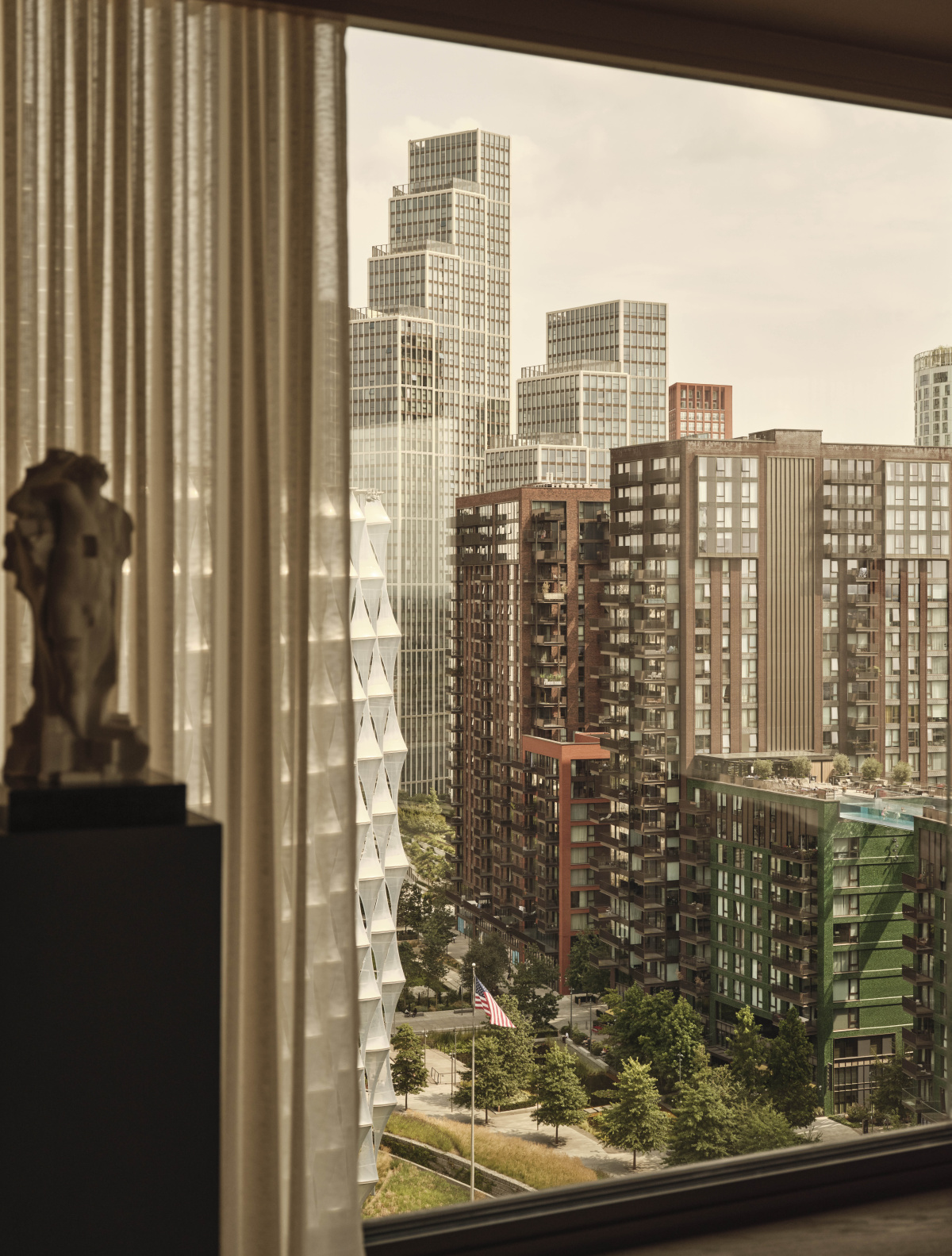
- Floor-to-ceiling windows frame a cinematic outlook over the city. Photos courtesy of Artemest
Róisín is known for her color-first approach. How did that philosophy translate into the process for this project?
In this particular project, she was very interested in countering the sort of grayness of the London landscape. This apartment is a penthouse in the air, in very close proximity to the dreary London sky—though of course there’s also the drama of the view. She wanted to counter that with this warm bath of color.
Everything is floor-to-ceiling covering, and she kept it all in the same tonal world, which is dramatic. From a production standpoint, it means that everything has to be custom made because every single thing has to be in tone. It’s tone-on-tone-on-tone with lots of variations of very similar colors. She worked with all the artisans to custom make everything.
This is what a 100% customized environment looks like, and the beauty is that you’re working with living artisans and living artists. It’s not vintage, it’s not a mix of things, but all handmade pieces by contemporary designers.
Curved seating in calm earth tones creates a cocooning living space layered with texture and light. Sculptural furniture, Murano glass accents, and tactile textiles bring warmth and depth to the area. Above: Carabottino coffee table by Medulum, Sacai sofa by Franco Ferri, Venus sideboard, by Ultraonbili, Imperfetto side table by Laura Meroni, Alfiere vase by Kose Milano, Mushroom lamp by Lampex Italia. Photos courtesy of Artemest
You talked about “Italianness” in a contemporary context. What does that actually mean when you strip away the buildings and frescoes?
Italianness comes through in this project because there are certain things about Italian design, especially from the ’70s on, that are very essential. It’s not flowery. In Italy the context is 500-year-old buildings with frescoes, so the design went very bare bones and essential to contrast with that. When you take those clean-lined things out of that Baroque or Renaissance context, sometimes they look a little too sparse.
Super modern design in a white box in New York doesn’t always look great—it can look too clean. In this context though, objects like that column lamp—which is halfway between a sculpture and a light with no shade, no fussiness—in the context of everything being super round and warm, looks like a tree. It brings you back to realizing this environment is designed. Every single item has a stamp of Italian identity, but it still feels like someone actually lives here.
-
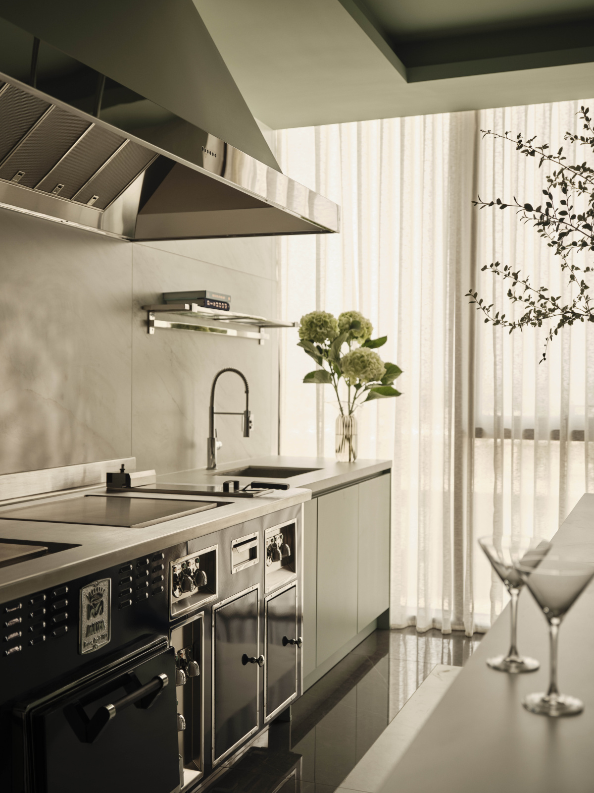
- A sleek, modern kitchen that provides a clean contrast to the more handcrafted living spaces.
-
- Above: Pink bucket Murano glass vase by Stories of Italy. Photo courtesy of Artemest
The home also blurs indoor and outdoor in a way that feels very contemporary.
The indoor-outdoor sense is very much part of the design and feeling. This is especially true when you get to the outside garden area on the top floor, which embodies this concept of indoor-outdoor living. Now furniture for the outdoors looks like indoor furniture, and conversely sometimes you use outdoor furniture inside.
It’s a more recent trend that the indoor and outdoor lines are blurred. On the top floor it feels more like a club or cocktail bar area. This is where the entertaining happens. The built-ins make it feel very posh and special.
-
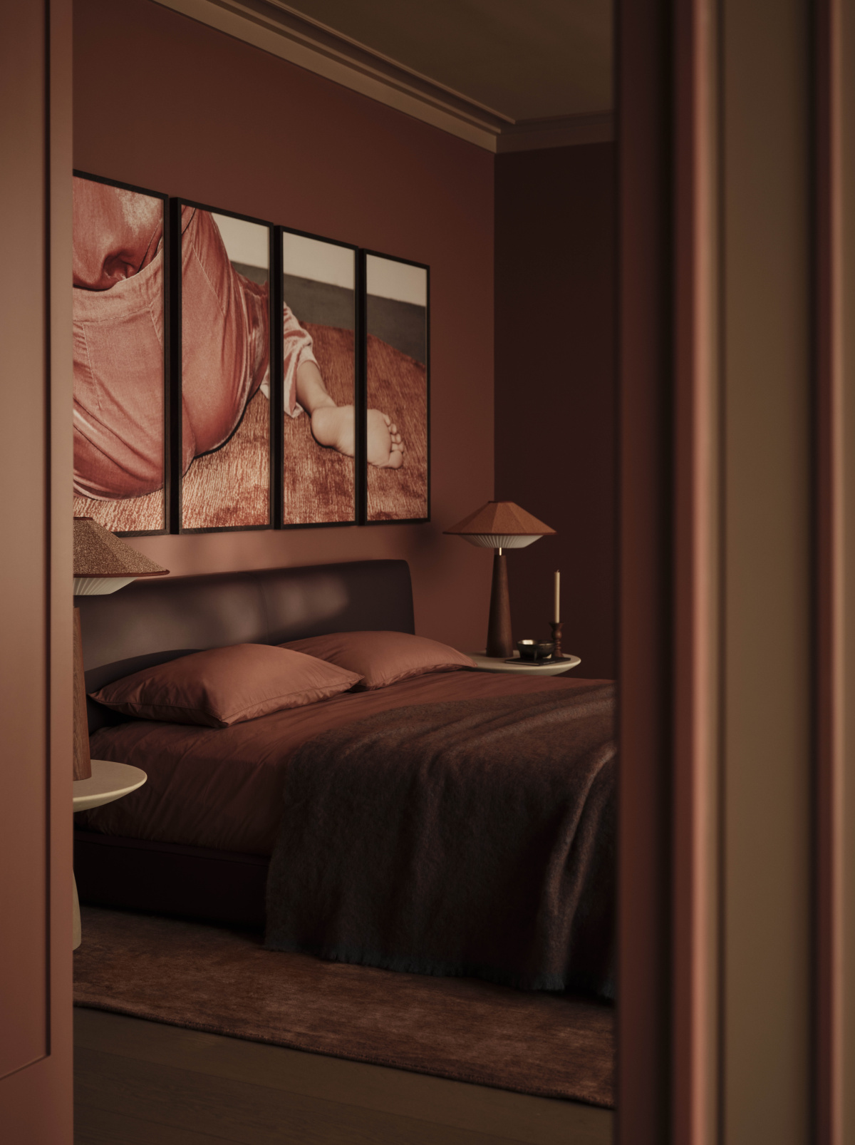
- The bedroom is designed as a womb-like retreat, where muted tones and tactile surfaces create a calm, enveloping atmosphere. Above: Long Island double bed by My Home, Otto table lamp by Servomuto.
-
- Above: Pampa chair by Chairs 7 More. Photos courtesy of Artemest
Do you feel each room has its own tonal identity?
Yes definitely, the tones of every room are slightly different. There’s brick turning into brown, then pink, then lighter pink. If you see from one room to the other, you can see the changing palette. In the main room there’s a room divider, and on one side is the dining room and on the other side is the living room, then there’s another more formal living room.
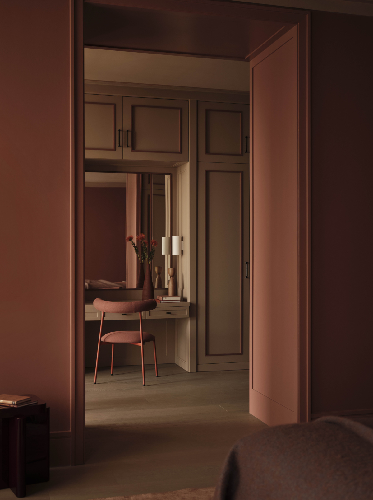
The bedroom is very womb-like. The colors and tones are very soothing. The dressing room is all attached in one suite too, creating this flowing private retreat.
-
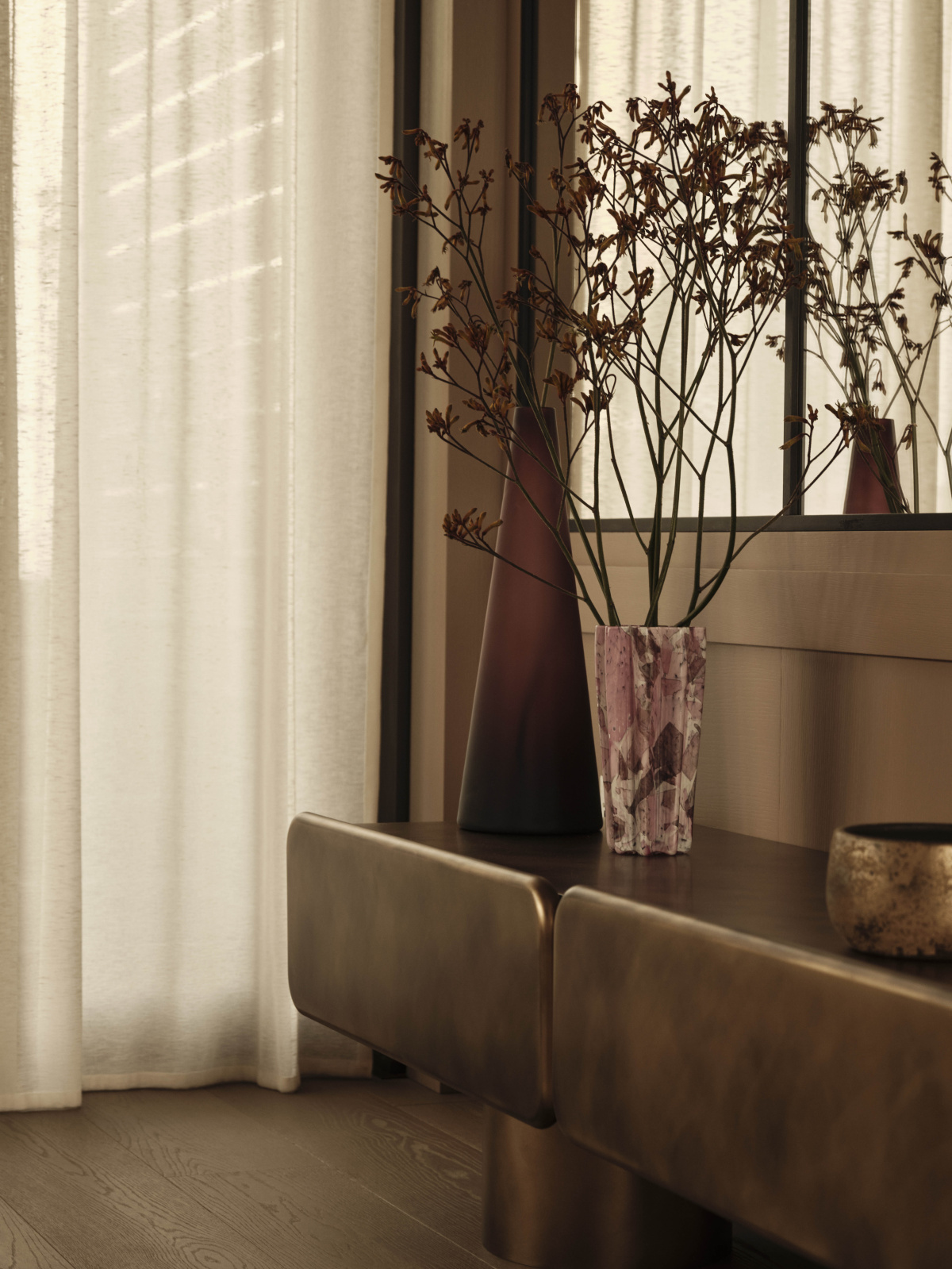
- Each room shifts subtly in tone—from brick to brown to soft pink—creating a chromatic journey throughout the penthouse. Above: Fungo coffee table Disain, Islands coffee table by Albedo, Margot pouf by Mantellassi 1926, Aky 61 stool by Emilio Nanni.
-
- Above: Fungo coffee table by Disain 1971. The room can host guests while still feeling comfortable for everyday use. Photos courtesy of Artemest
When you’re working with thousands of artisans, how does a designer like Róisín actually narrow down the choices? What’s the decision-making process?
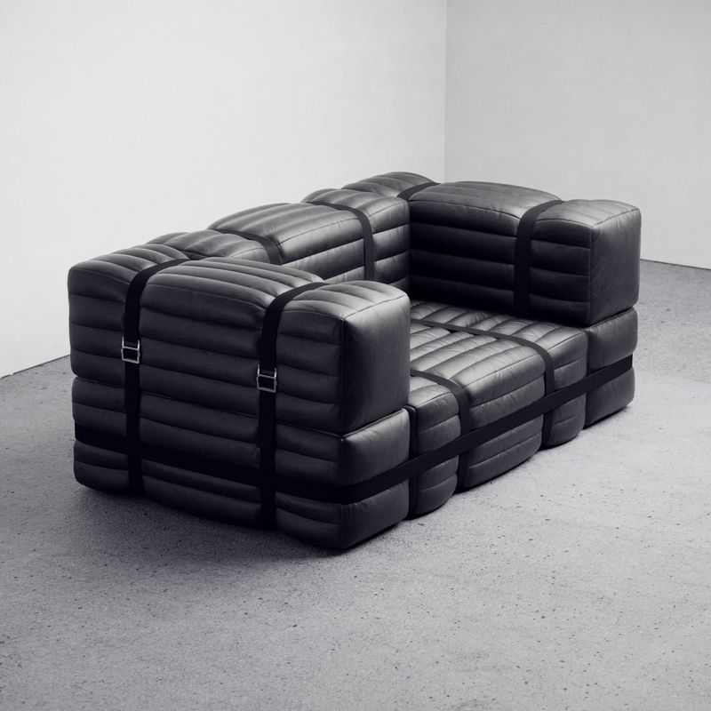
I think it’s easier once you pick the anchor piece. If you have this big bouncy couch that takes up a lot of room, then what are the more streamlined designer things that go around it? The cabinets, the lamp—it all has to fit. It’s funny because there are so many different shapes, but it all works really well. The eclecticism concept is held together by this very strong chromatic framework. The color unifies everything.
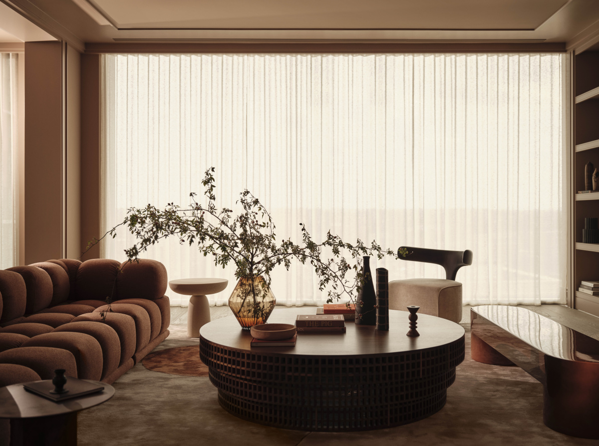
The interiors were designed with color first, creating a warm and emotional space. Rounded furniture and custom pieces also make the living room feel cozy and welcoming. Above: Carabottino coffee table by Medulum, Sacai sofa by Franco Ferri, Venus sideboard, by Ultraonbili, Imperfetto side table by Laura Meroni, Alfiere vase by Kose Milano, Mushroom lamp by Lampex Italia. Photo courtesy of Artemest
This is your first complete London project. Why does that matter for Artemest’s mission around preserving Italian crafts?
This project is very special because it was our first completely head-to-toe project in London. It perfectly showcases everything we do. It’s so fun because when you curate the entire assortment like this, it really demonstrates our mission to ensure the survival of all these crafts. So many of these companies we work with are not brands, they’re just makers. We try hard to make sure they have enough financial success that they can bring in a new generation and transfer the knowledge.
It’s very important to contextualize their work in real projects too. Sometimes when you’re viewing them online, you can’t get a sense for their true beauty. You think, “Would it look good? How would I use that? Is that too weird?” But when you see it in a beautifully resolved context, you can look at the rest of the assortment and think, “Oh yes, this is actually much more accessible.”
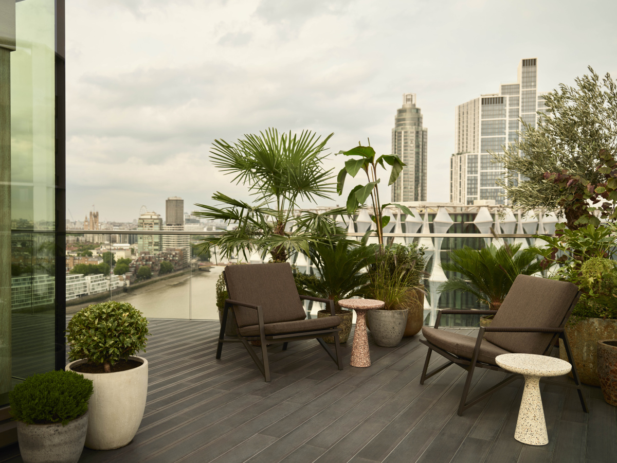
Furniture in this area is chosen to work inside or outside, making the transition between spaces seamless. It’s designed to feel natural, comfortable, and connected to the rest of the penthouse. Cottage brown armchair by Talenti. Photo courtesy of Artemest
We’ve done a few other apartment projects like this in the United States, and we’re starting to get a taste for them. Being an interior decorator is a pretty hard job. You think somebody just shows up and snaps their fingers, but there are all these very thoughtful decisions.
The moodiness and warmth of this environment is very compelling. This idea of putting color on the ceiling or floor and not just on the walls, bringing in 16 shades of the same color, and asking yourself “How much is too much, and how much does the right job?” The decision-making is a process in itself for every element.