In the middle of Milan Design Week’s annual frenzy, tucked behind a stately wooden door on Via Gaetano Donizetti, I found myself stepping into the world of Artemest’s third edition of L’Appartamento. Housed inside Palazzo Donizetti, a 19th-century mansion layered with Renaissance curves, L’Appartamento was many things: a celebration of Artemest’s 10-year anniversary, a six-room masterclass in contemporary design, and a tribute to Italian craftsmanship.
Each room throughout the home had been reimagined by a different interior design studio from across the globe. Six names, six visions, one beautifully aging palazzo filled with over 180 works by Italian artisans and artists. What could have easily turned into a design showroom instead felt like a journey through time, taste, and texture.
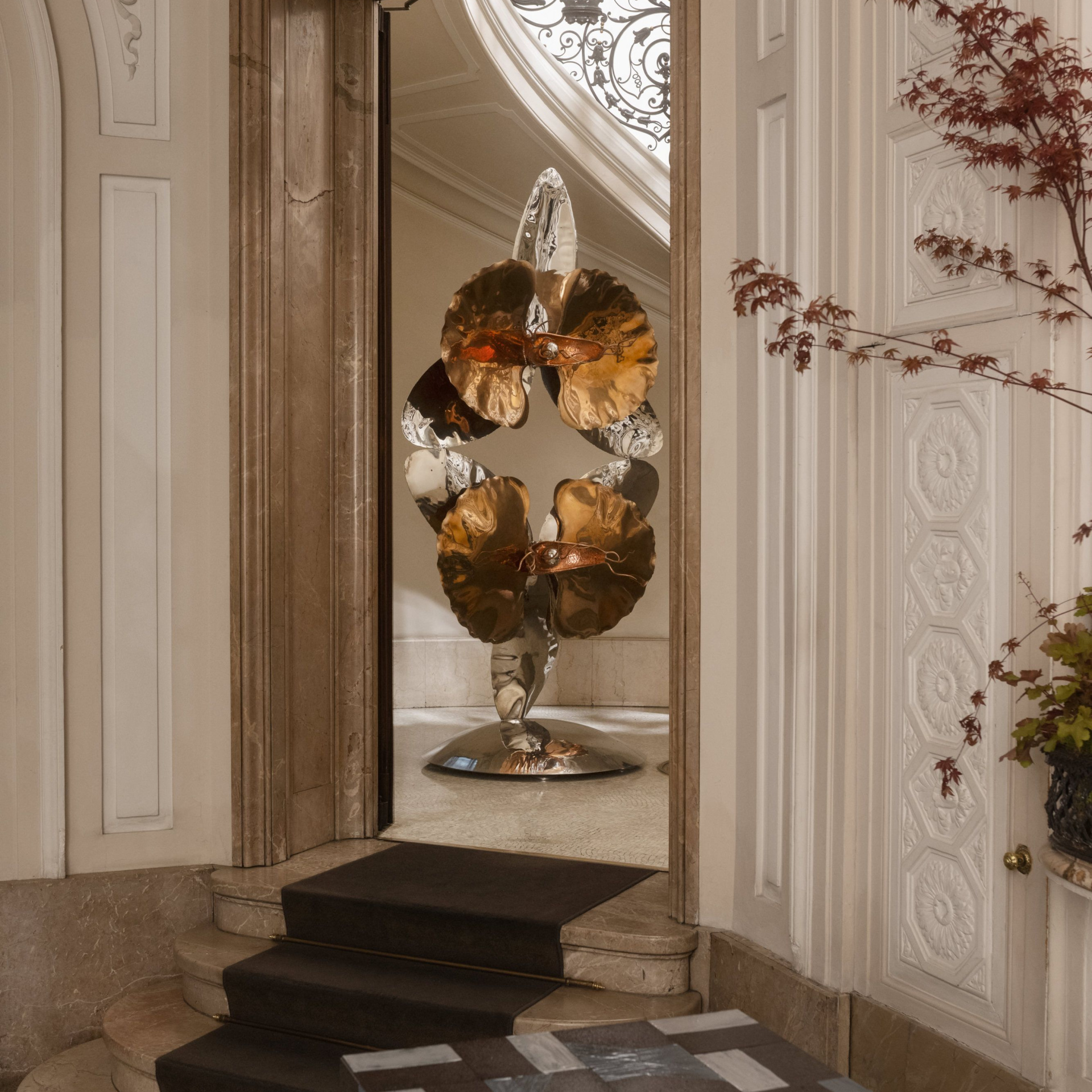
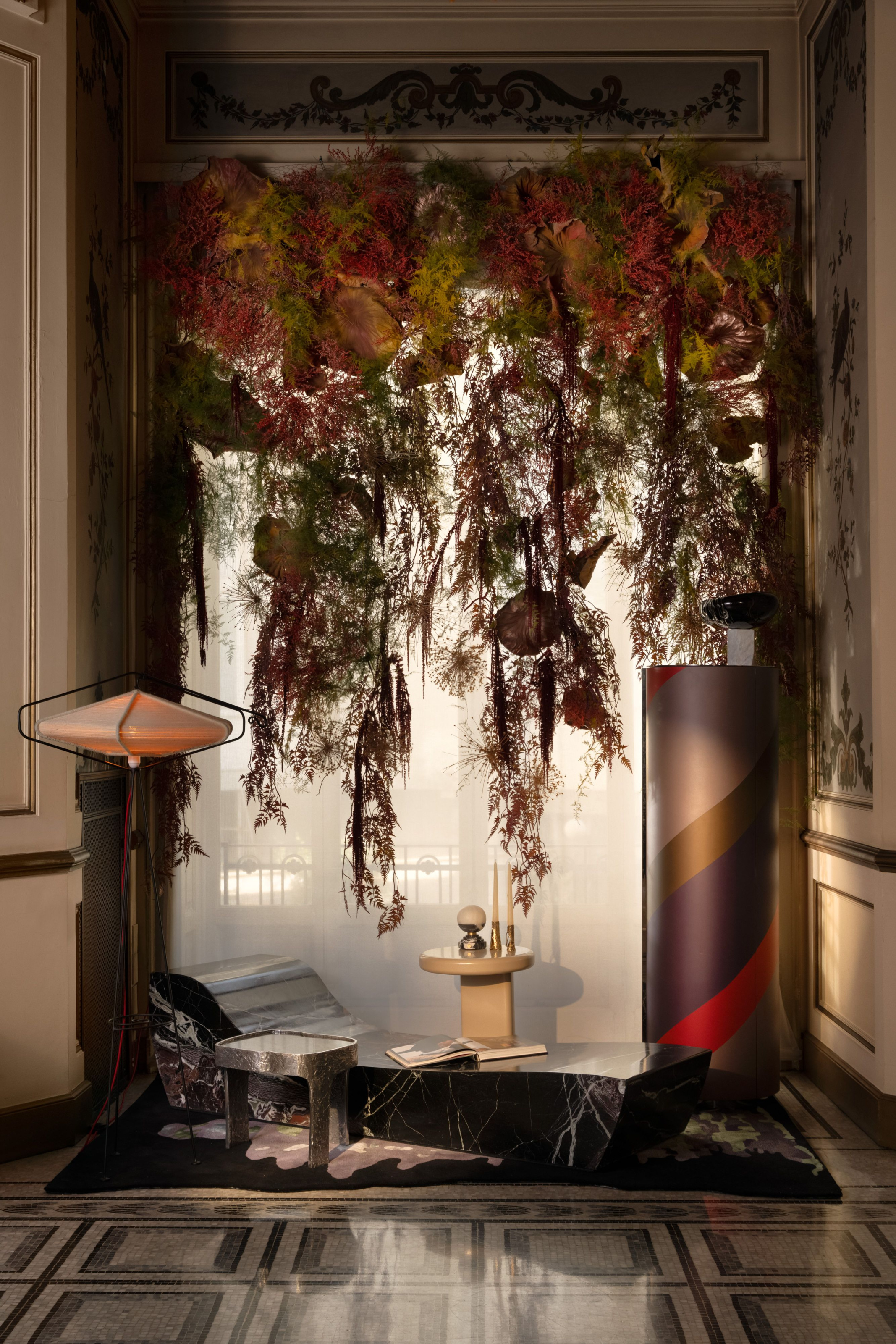
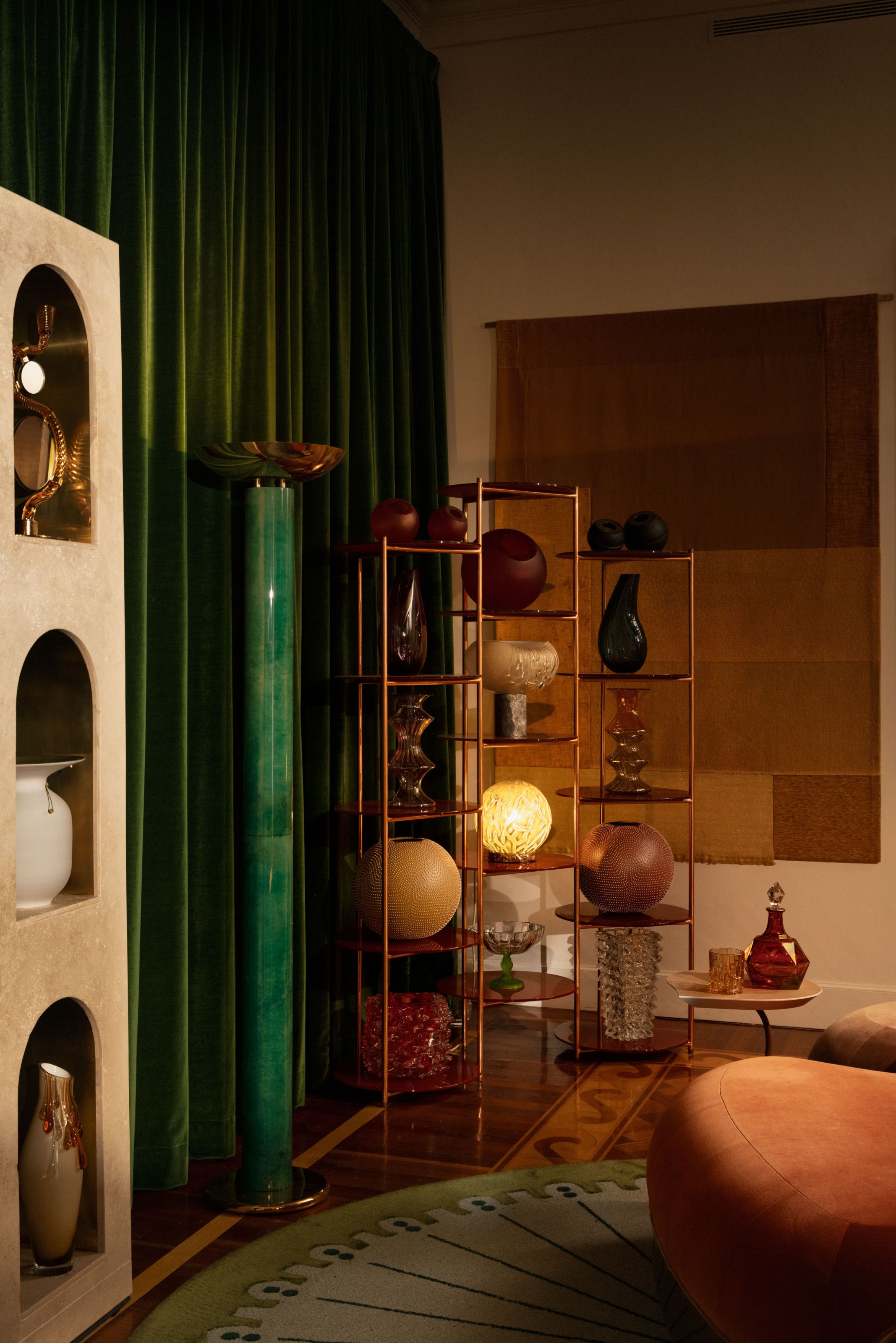
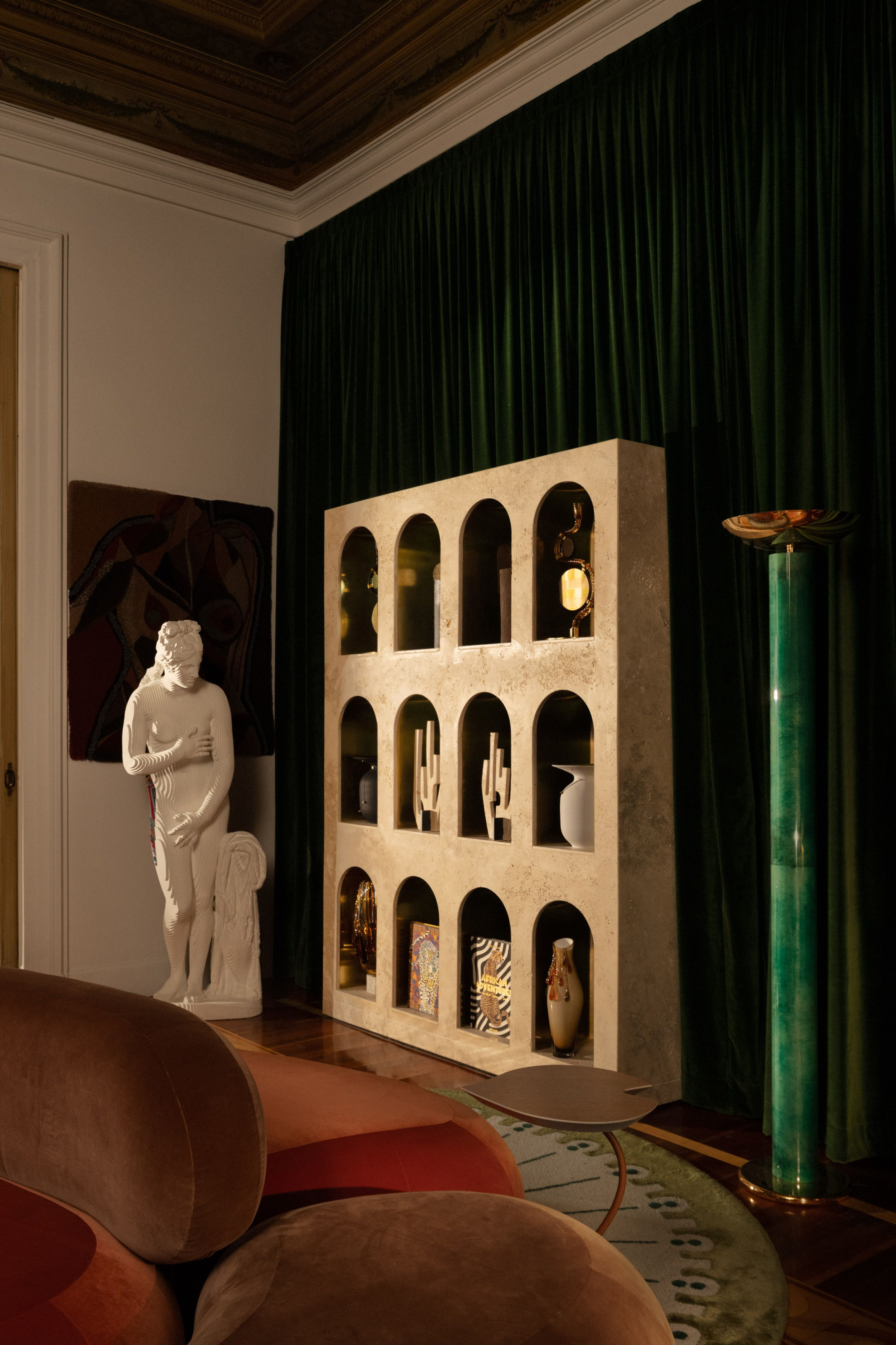
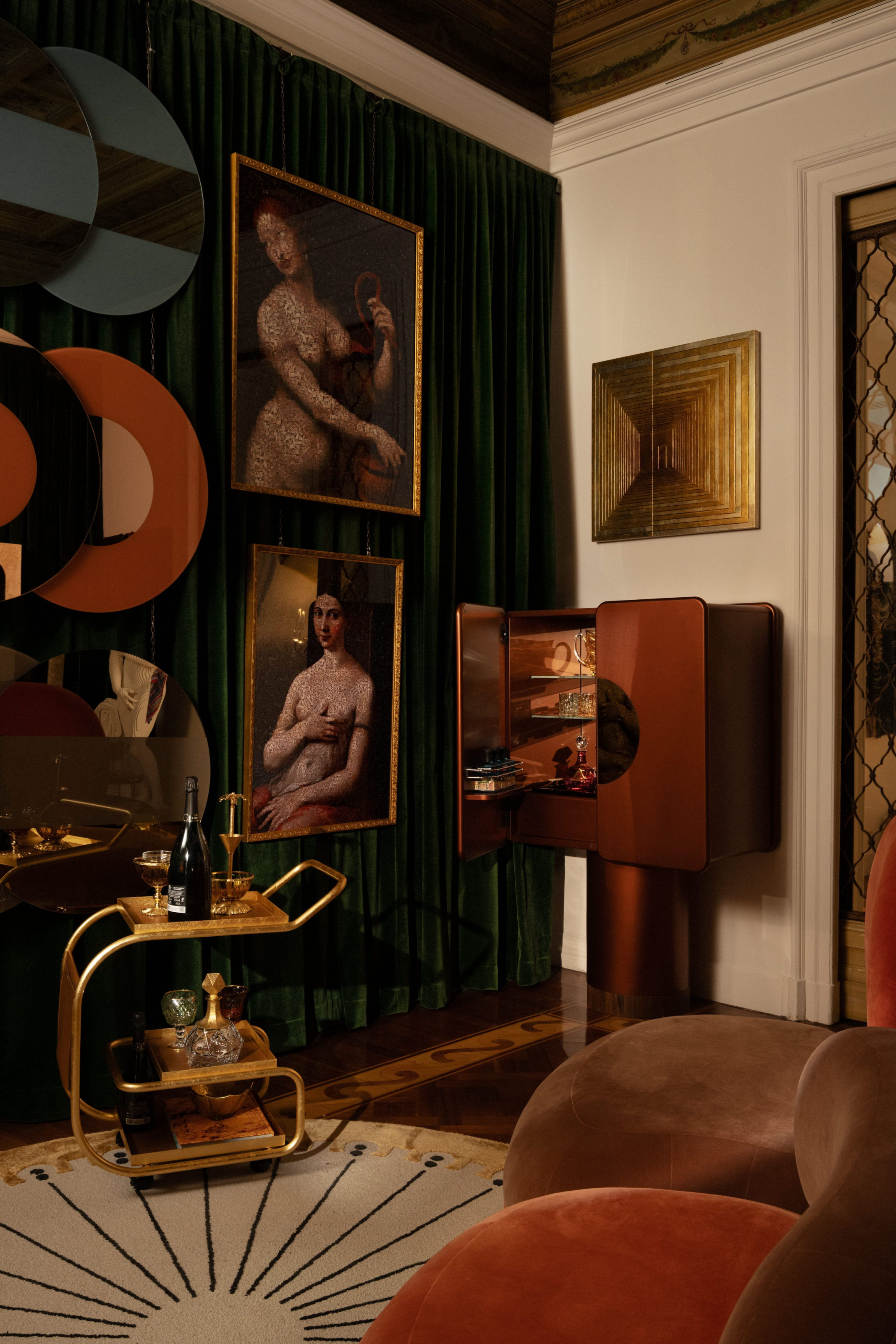
Simone Haag, an Australian designer with a clear love of drama, created a Foyer space that seamlessly combined centuries, with frescoes above a combination of vintage and modern sculptural pieces below.
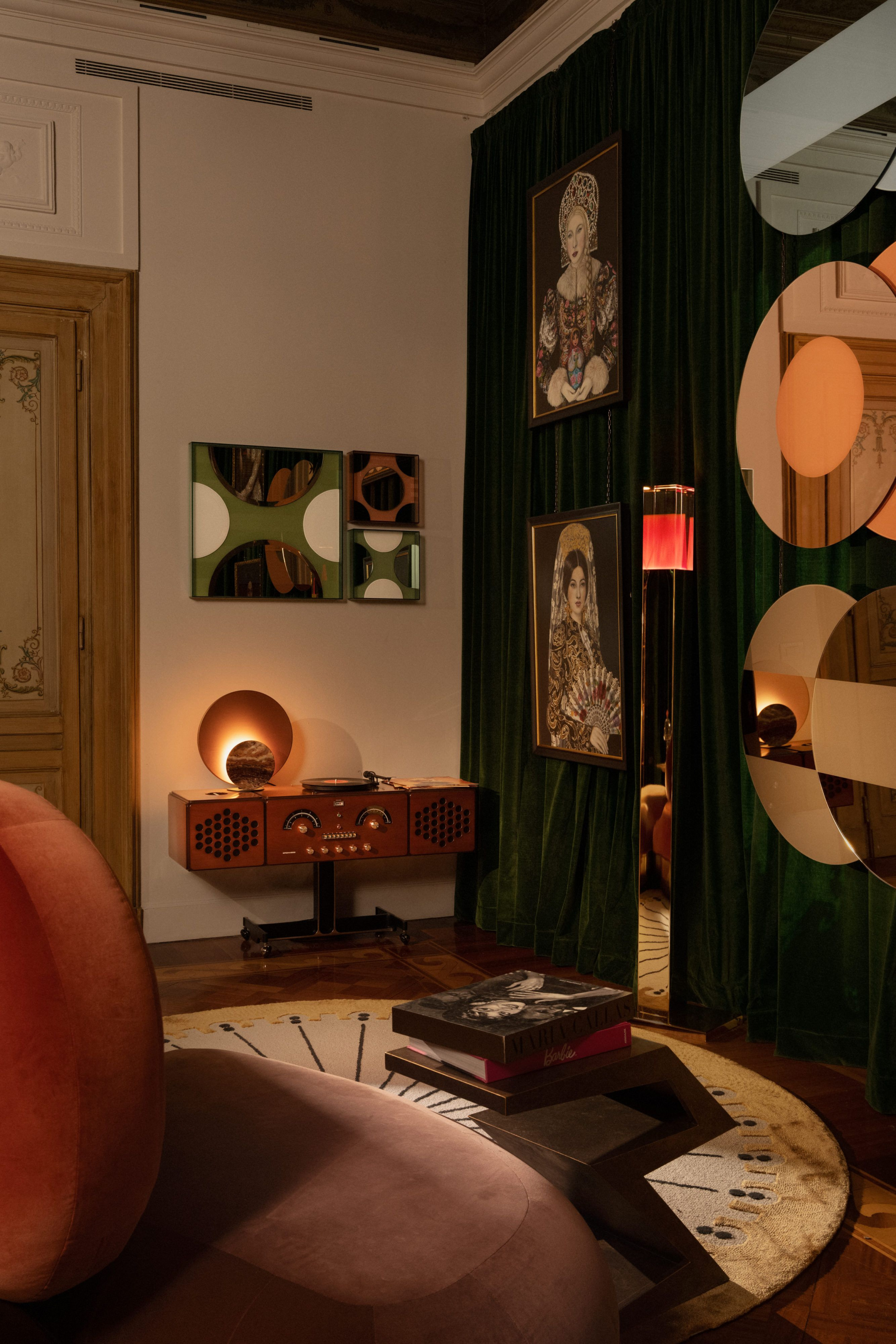
The first room you enter is the Foyer by designer Simone Haag. It’s a prelude that feels both transitional and cinematic. Simone, an Australian designer with a clear love of drama, created a space that seamlessly combined centuries.
When we briefly meet inside, she shows me her original digital rendering of the room. I notice it looks nearly identical to the project’s final form. “There were some pieces I wanted two of where I only got the one, or a lamp that is on one side of the room versus the other,” she says. “But overall it turned out pretty great. Our renderer captured all the details perfectly.”
The colors in the Foyer are warm and enveloping—earthy reds, soft browns—and everywhere, there are little vignettes you want to lean into. A marble chaise sits underneath grassy curtains as light peeks through a large window.
-
- The colors in the Foyer are warm and enveloping—earthy reds, soft browns—and everywhere, there are little vignettes you want to lean into. A marble chaise sits underneath grassy curtains as light peeks through a large window.
-
- “I leaned into the idea of contrast—introducing a sense of whimsy and curiosity, qualities I often explore in my residential work,” she says.
“I leaned into the idea of contrast and introduced a sense of whimsy and curiosity, qualities I often explore in my residential work,” she says. “The intention was to create a moment of pause within the grandeur, one that felt light, inviting, and unexpected. I wanted to respect the historical envelope while allowing the collectible pieces to come into focus after the architecture had.”
From a practical standpoint, the room presented its own challenges—six door openings, a single window, and the need to accommodate thousands of visitors over the course of the week. The space had to function like a stage set: captivating from every angle, intuitively navigable, and layered with detail that encouraged people to stop, look, and feel something.
“Every decision was intentional. To frame rather than compete, to gently guide rather than overwhelm, and of course, to create those Instagrammable moments,” Simone says. “We wanted the project to be strong enough that the design stays in the visitor’s mind long after the moment is captured.”
“Every decision was intentional—to frame rather than compete, to gently guide rather than overwhelm, and of course, to create those Instagrammable moments,” Simone says. “And hopefully, we want the project to be strong enough that the design stays in the visitor’s mind long after the moment is captured.”
Simone also focused on incorporating vintage pieces within the space. She tells me Artemest doesn’t have a lot of vintage in their lineup, so the incorporation added a special element.
“The laurel green Ernest cabinet was one of the earliest selections and became a foundational anchor for the palette,” she says. “Its hue spoke beautifully to the patina of the space and informed the choice of the Bottega Veneziana Cleo chandelier, which echoed the green in a softer, more decorative expression.
“Because I wasn’t permitted to decorate the walls, the furniture had to do the heavy lifting—color, form, and materiality had to carry the narrative. The measure of success for this room lies in that careful tension: between old and new, restraint and impact, and the unexpected joy of seeing considered choices spark appreciation by all who visited.” simonehaag.com.au
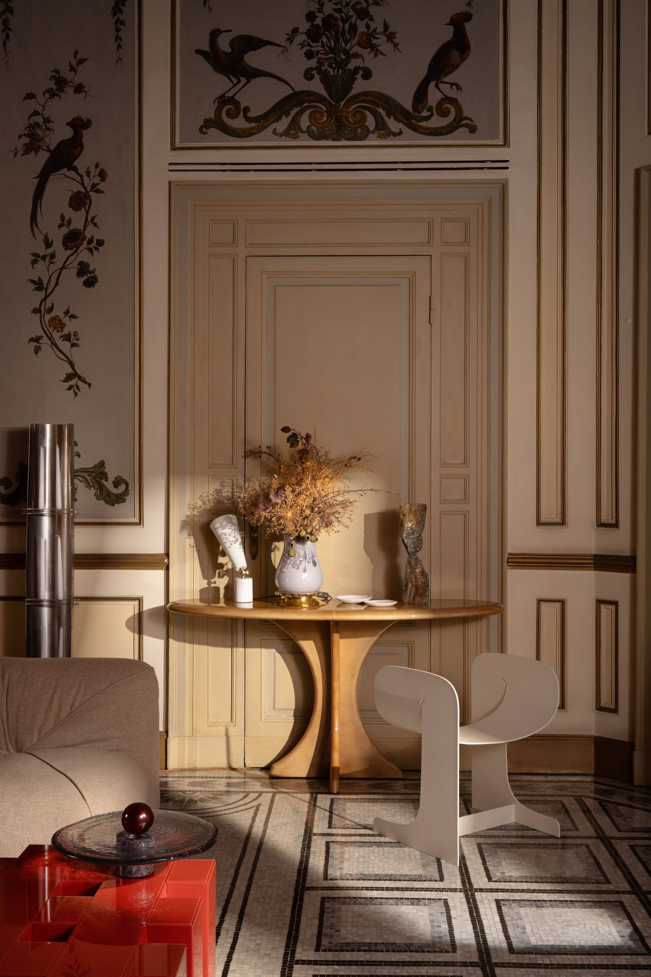
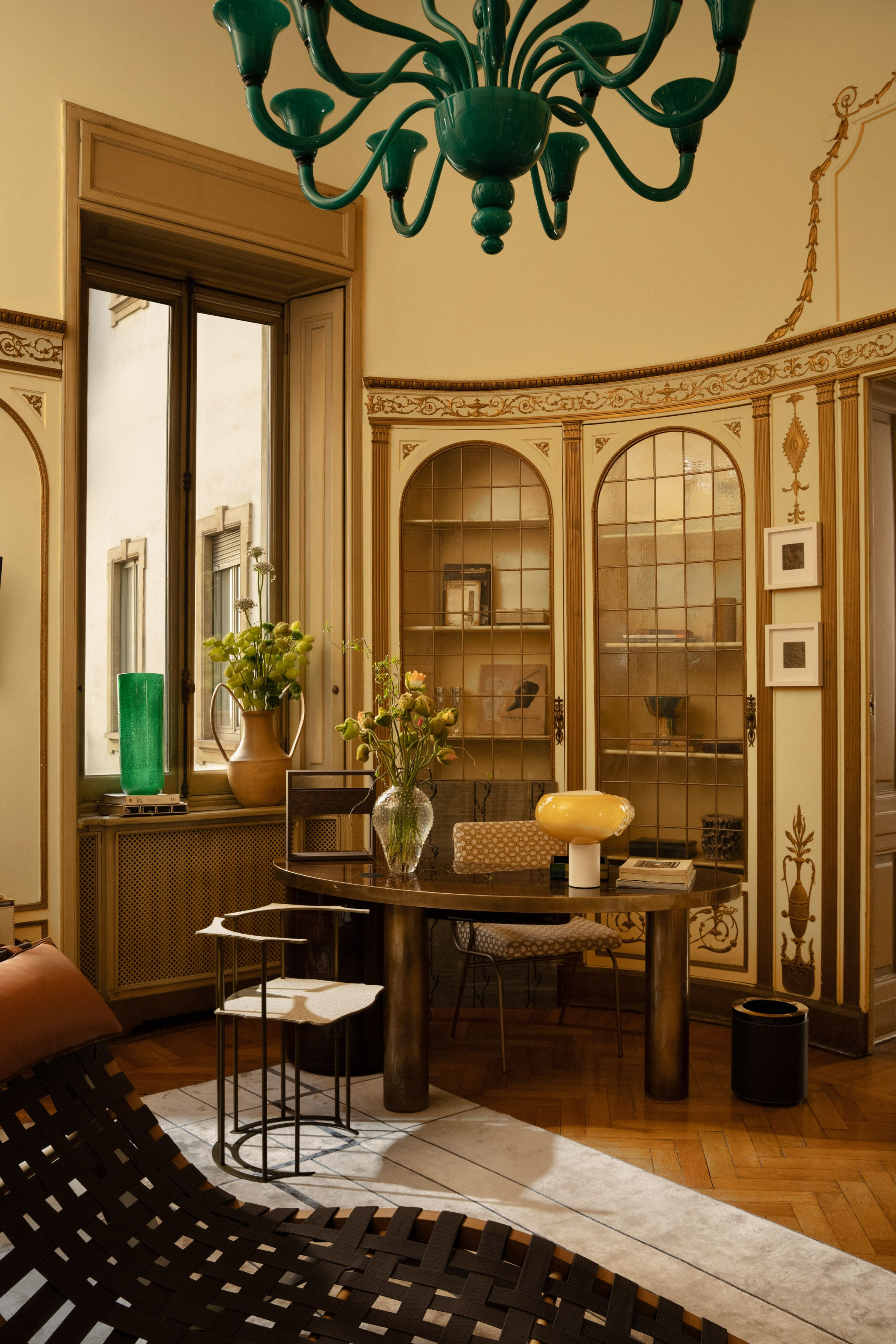
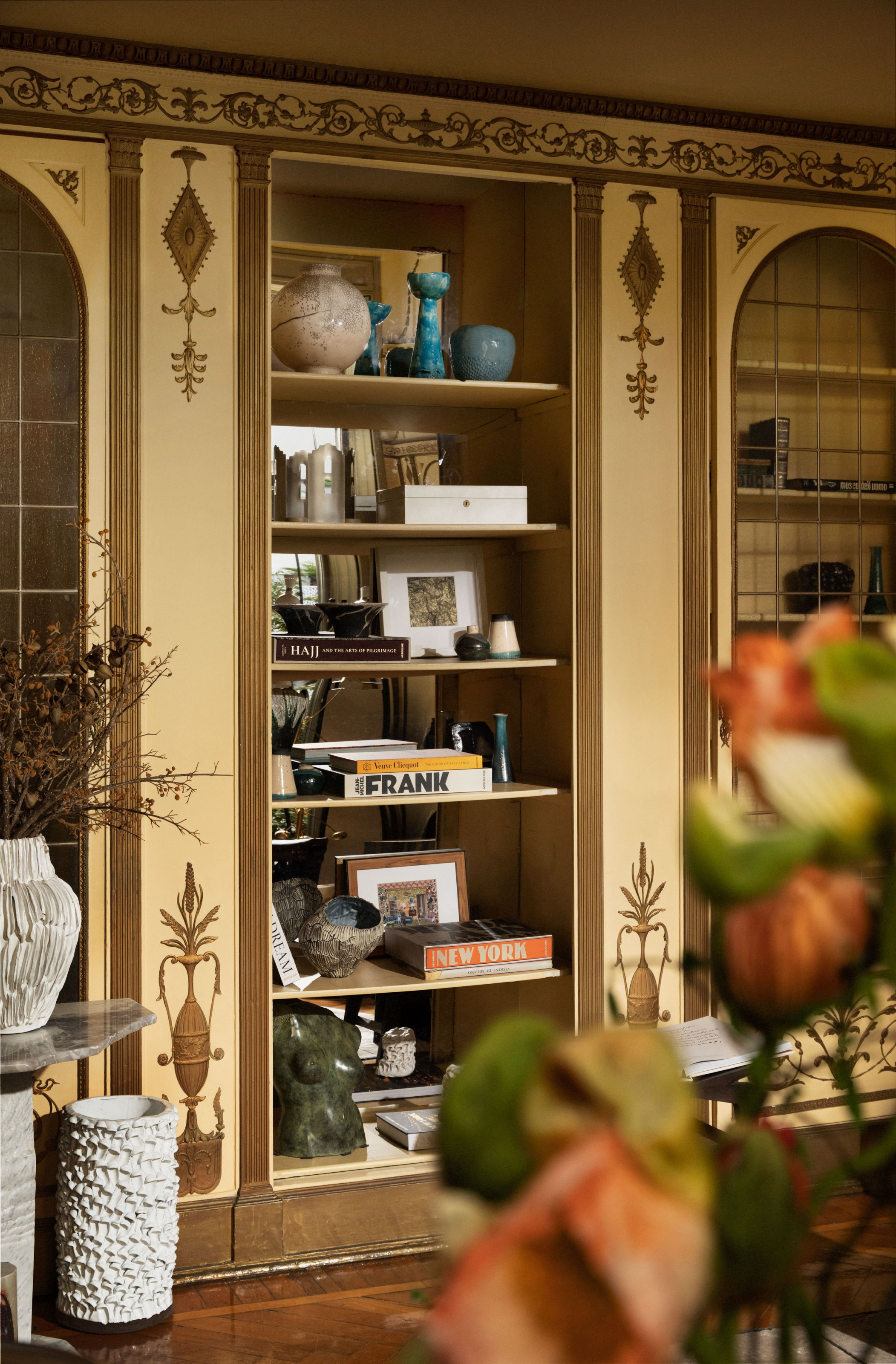
Saudi Arabian designer Nebras Aljoaib’s Reading Room and Studio is refined with a center of gravity that’s not a desk, but a conversation circle. She says here, she wanted to create a calm dialogue between space and purpose.
Saudi Arabian designer Nebras Aljoaib’s Reading Room & Studio strikes a different chord. It’s refined with a center of gravity that’s not a desk, but a conversation circle. Nebras says in this room, she wanted to create a calm dialogue between space and purpose.
“A traditional desk layout felt too rigid,” she says. “Instead I introduced a more relaxed composition: a sculptural chaise at the center, surrounded by pieces that invite repose as much function. There’s a quiet confidence in resisting the conventional: bold forms against classical architecture, asymmetry over order.”
-
- “A traditional desk layout felt too rigid,” she says. “Instead I introduced a more relaxed composition: a sculptural chaise at the center, surrounded by pieces that invite repose as much function.”
-
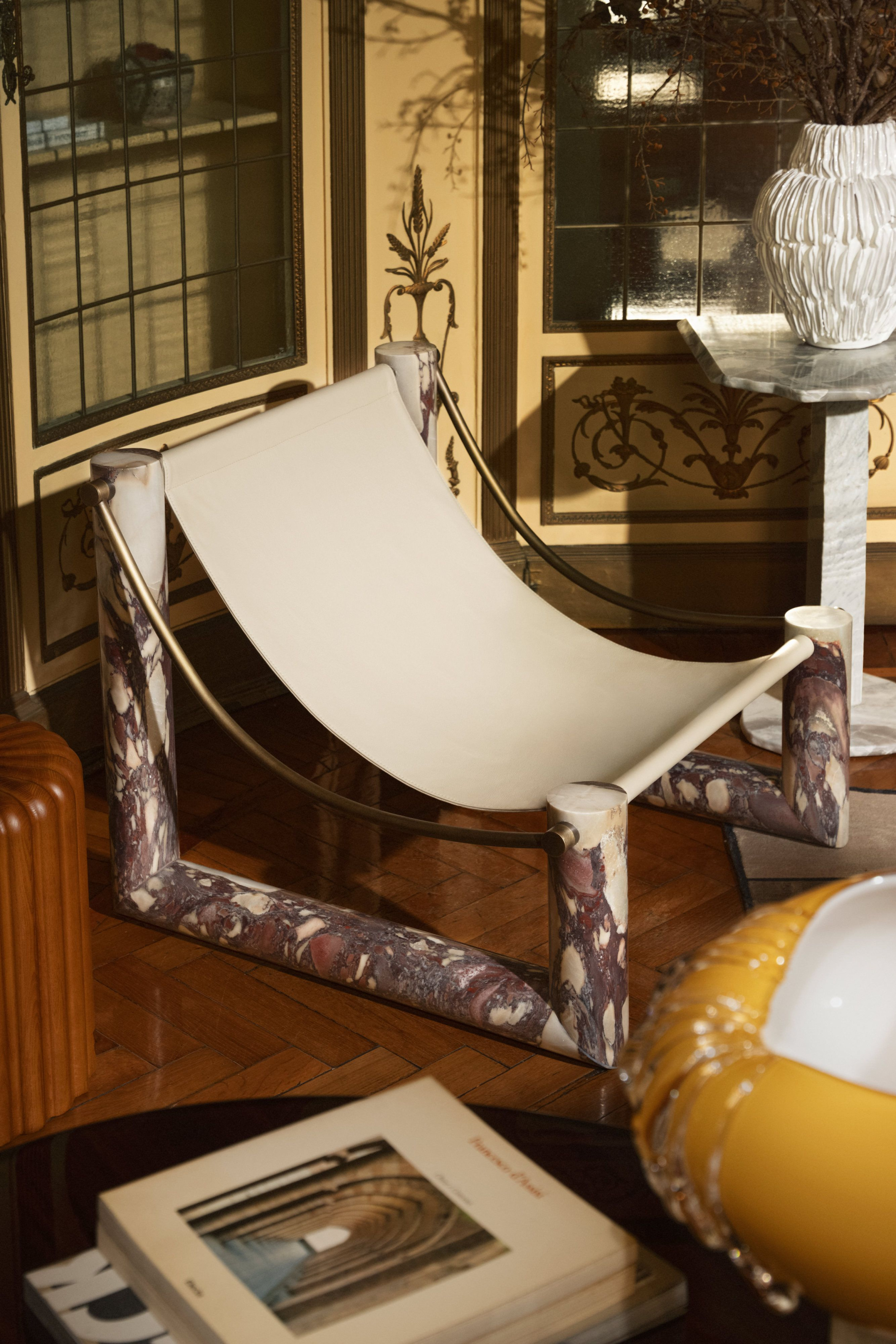
- The palette also tells a story of subtle contrast and textural interplay. In her selection, Nebras was drawn to materials that hold timelessness: marble, leather, wood, brass, and hand blown glass.
For her, balancing classical architecture with mid-century modern wasn’t about blending, but creating a conversation.
“I’ve always been drawn to the quiet strength of mid-century design: its sculptural forms, clean lines and sense of restraint. In this room the classical bones, arched niches, and ornate moldings already carried weight.” Rather than mirror them, Nebras introduced pieces that contrast and complement, allowing both styles to hold their own.
The palette also tells a story of subtle contrast and textural interplay. In her selection, Nebras was drawn to materials that hold timelessness: marble, leather, wood, brass, and hand blown glass.
-

- “Materiality shapes a mood rather than makes a statement,” she says. “The color palette follows the same rhythm: muted, tonal, and quietly rich, serving to anchor the space without overpowering it.”
-
- “I’ve always been drawn to the quiet strength of mid-century design: its sculptural forms, clean lines and sense of restraint. In this room the classical bones, arched niches, and ornate moldings already carried weight.”
“They don’t compete, they converse,” she says. “The antique mirror mounted on the wall becomes part of that dialogue, softly reflecting the room back to itself. Materiality shapes a mood rather than makes a statement. The color palette follows the same rhythm: muted, tonal, and quietly rich, serving to anchor the space without overpowering it.” nebrasaljoaib.com
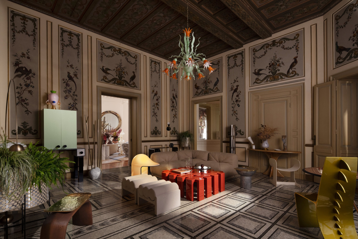
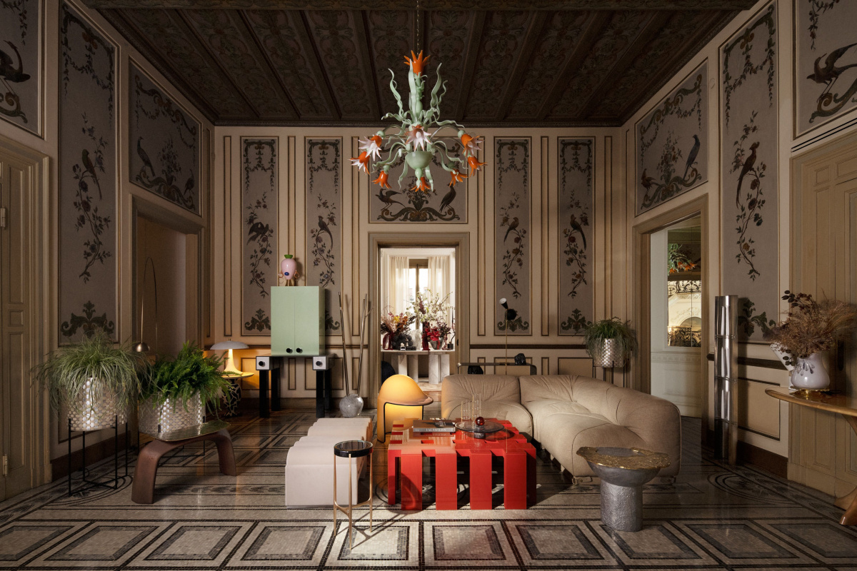
The Grand Salon by NYC-based Meyer Davis, called La Sirena, feels like falling down a rabbit hole. Inspired by an intrinsic connection to “place,” Meyer Davis wanted to explore the ways in which a classical palazzo interior could be presented as an ode to Italian modernity.
The Grand Salon by NYC-based Meyer Davis, called La Sirena, feels like falling down a rabbit hole. Inspired by an intrinsic connection to “place,” Meyer Davis wanted to explore the ways in which a classical palazzo could be presented as an ode to Italian modernity. Drawing inspiration from the Greek myth of the Siren, La Sirena is designed to be an immersive space suspended between ancient legend and contemporary design.
-
- Drawing inspiration from the Greek myth of the Sirens, La Sirena is designed to be an immersive space suspended between ancient legend and contemporary design.
-
- “The palazzo was originally built as a residence for a prince who fell in love with a Milanese woman. That romantic narrative became the foundation for our exploration of how a classical palazzo interior could be reimagined.”
“The history of the palazzo initially captured our imagination,” they say. “It was originally built as a residence for a prince who fell in love with a Milanese woman. That romantic narrative became the foundation for our exploration of how a classical palazzo interior could be reimagined. We wanted to create a space that seduces the senses like a Siren’s song—layered, immersive, and slightly surreal.”
The space is designed with a central cluster of four distinct seating arrangements, promoting conversation and fluid movement. Each seating group is also layered with an eclectic mix of curated objects and art. Stone, metal, and muted velvets make the space soft and reflective.
-
- The space is designed with a central cluster of four distinct seating arrangements, promoting conversation and fluid movement. Each seating group is also layered with an eclectic mix of curated objects and art. Stone, metal, and muted velvets make the space soft and reflective.
-
- “By clustering the seating, we moved away from a traditional open layout and instead carved out smaller, more intimate pockets within the space. Each grouping has its own distinct character, yet together they create a rhythmic flow—making the room feel dynamic, alive, and in constant motion.”
“By clustering the seating, we moved away from a traditional open layout and instead carved out smaller, more intimate pockets within the space. Each grouping has its own distinct character, yet together they create a rhythmic flow—making the room feel dynamic, alive, and in constant motion. The result encourages both conversation and a sense of fluidity throughout the space.” meyerdavis.com
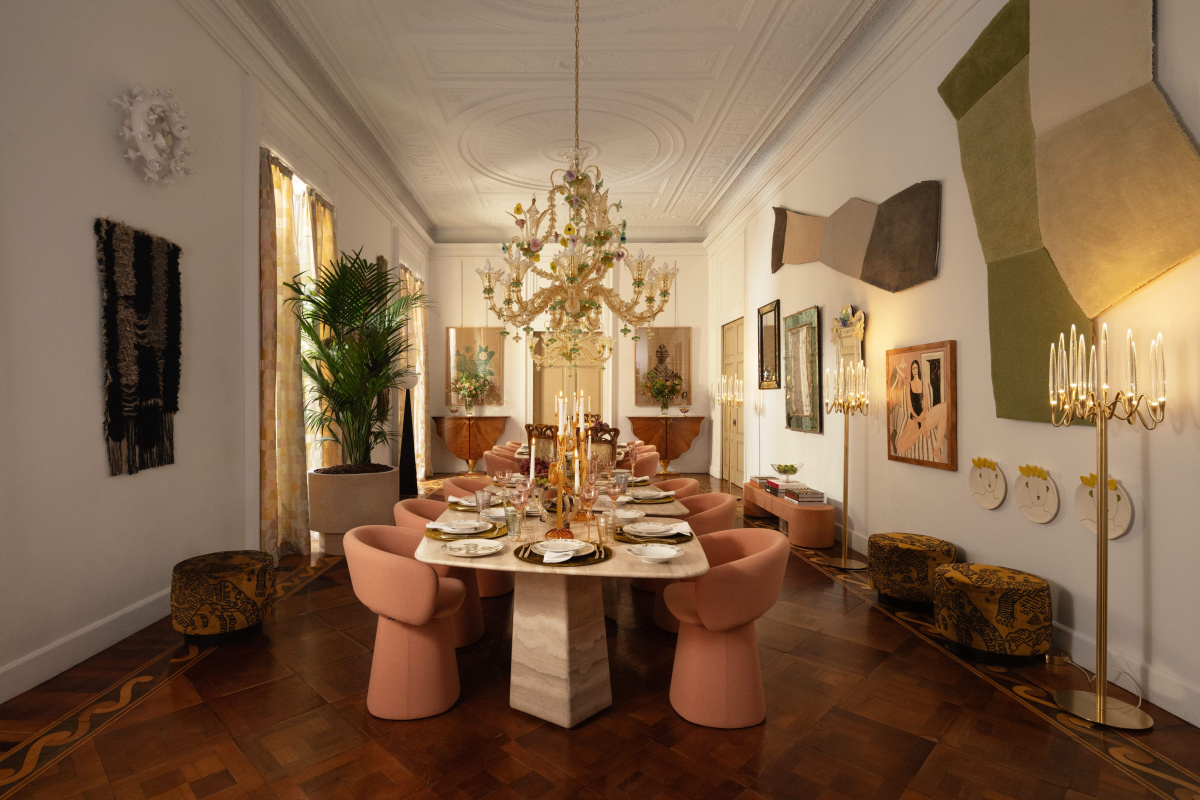
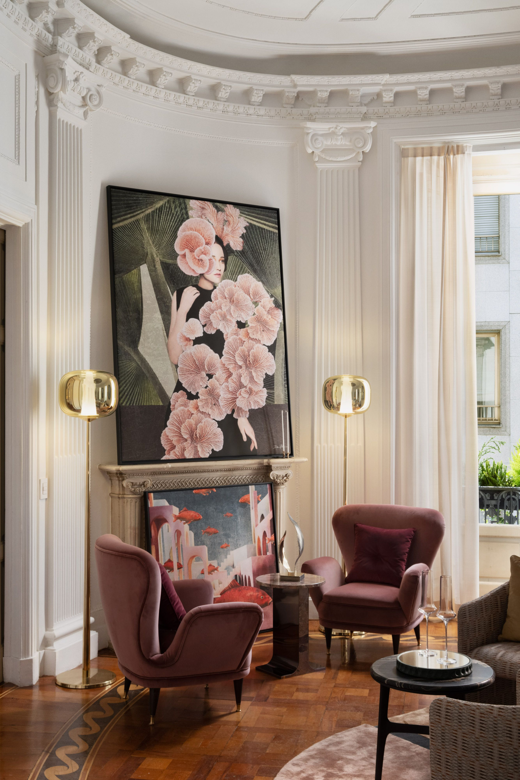
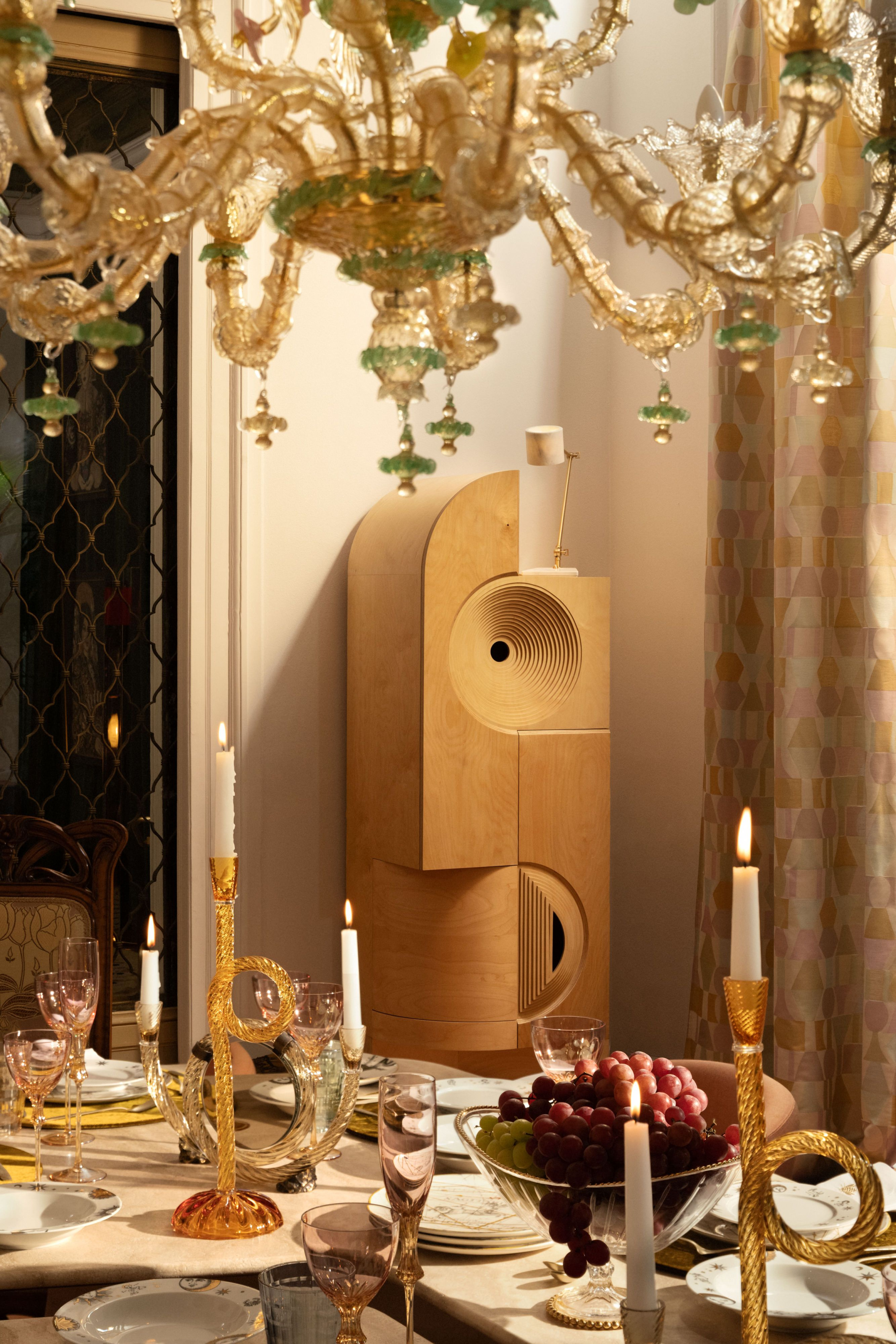
The Dining Room by Brigette Romanek of LA-based Romanek Design Studio is grand, no doubt—original parquet floors, massive windows—but Brigette has found a way to bring it back down to earth. A soft pink-and-cream palette, ornate glassware, and organic foliage ties the space together.
The Dining Room by Brigette Romanek of LA-based Romanek Design Studio is grand, no doubt—original parquet floors, massive windows—but Brigette has found a way to bring it back down to earth. A soft pink-and-cream palette, ornate glassware, and organic foliage ties the space together.
“It all brings about a feeling of being welcomed into a special sanctuary, a place where time slows down, and life feels a bit more magical,” Bridget says. “In my own way, I wanted to meet this grandeur with a sense of uniqueness and calm, a space where one can finally exhale and truly relax.”
-
- “It all brings about a feeling of being welcomed into a special sanctuary, a place where time slows down, and life feels a bit more magical,” Bridget says.
-
- “In my own way, I wanted to meet this grandeur with a sense of uniqueness and calm, a space where one can finally exhale and truly relax.”
Everywhere your eye lands there’s something to take in, something to ponder, and elements that ignite the imagination. Art from different periods lines the walls, while strategically placed mirrors reflect the beauty back. romanekdesignstudio.com
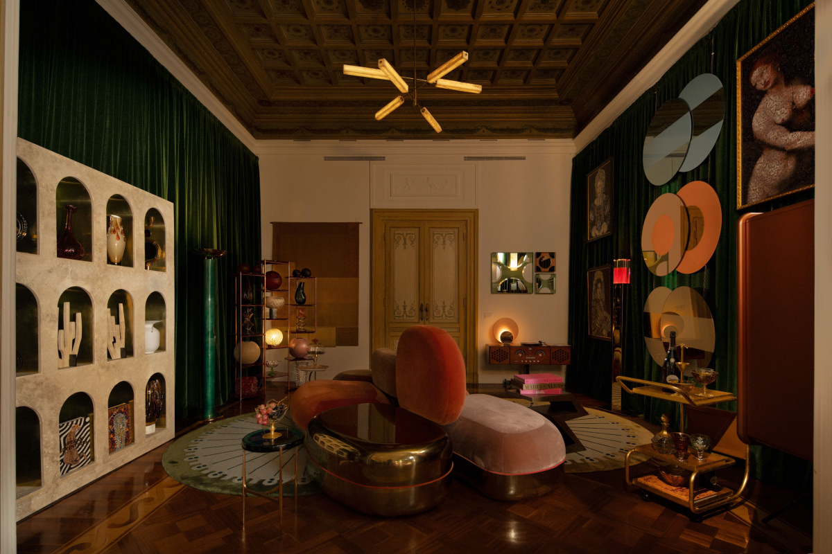
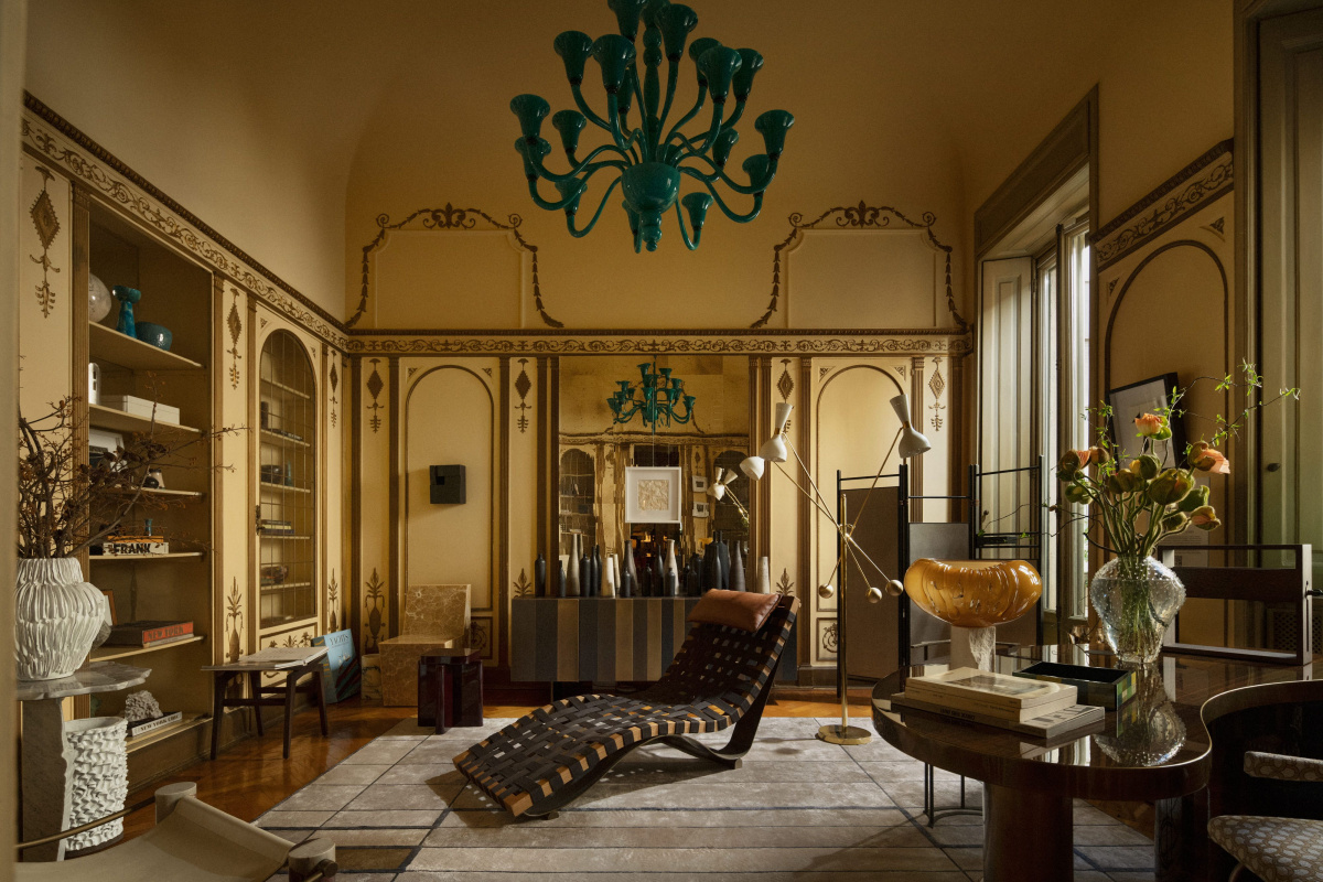
The riotously fun Entertainment Room by 1508 London. This is what happens when a Victorian salon has a fashionable existential crisis and comes out the other side full of charisma.
Then there’s the riotously fun Entertainment Room by 1508 London. Standing in that room feels as if a Victorian salon had a fashionable existential crisis. Every corner has its own stage set, mini scene, or moment to take in. It’s warm, a bit 1980s clubby, and layered with textures and colors.
-
- The furniture and accessories offer a fusion of bold shapes, colors, and textural depth set against the room’s elegant moldings.
-
- Every corner has its own stage set, mini scene, or moment to take in. It’s warm, a bit 1980s clubby, and layered with textures and colors.
The furniture and accessories offer a fusion of bold shapes, colors, and textural depth set against the room’s elegant moldings.
-
- Curated art throughout the room combines geometric forms and vivid blocks of color with images of women, celebrating their strength, beauty, and cultural significance.
Curated art throughout the room also combines geometric forms and vivid blocks of color with images of women, celebrating their strength, beauty, and cultural significance. This artistic narrative pays tribute to the women who shaped the history of salons while honoring their creative and intellectual contributions. 1508london.com
Inspired by the glamour of 1960s Italian film, NYC-based Champalimaud Design sought to create a playful space where friends meet before a night out.
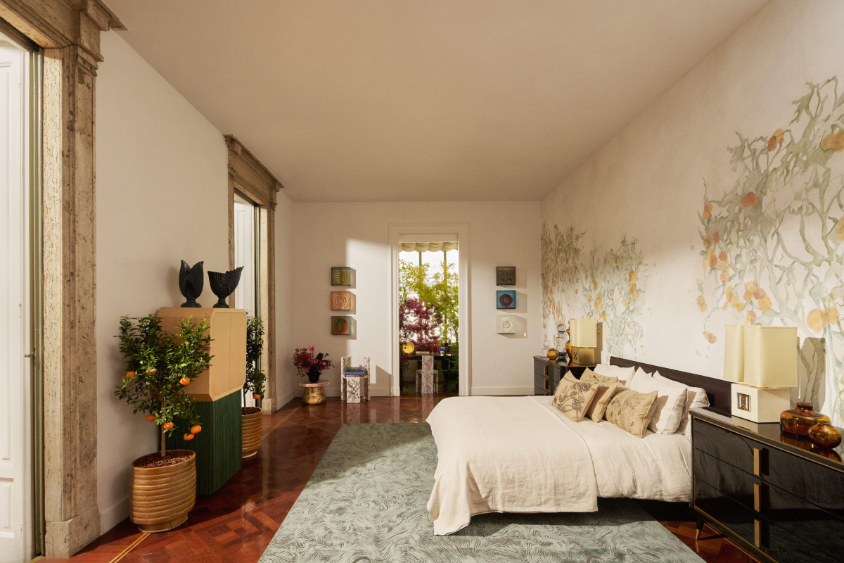
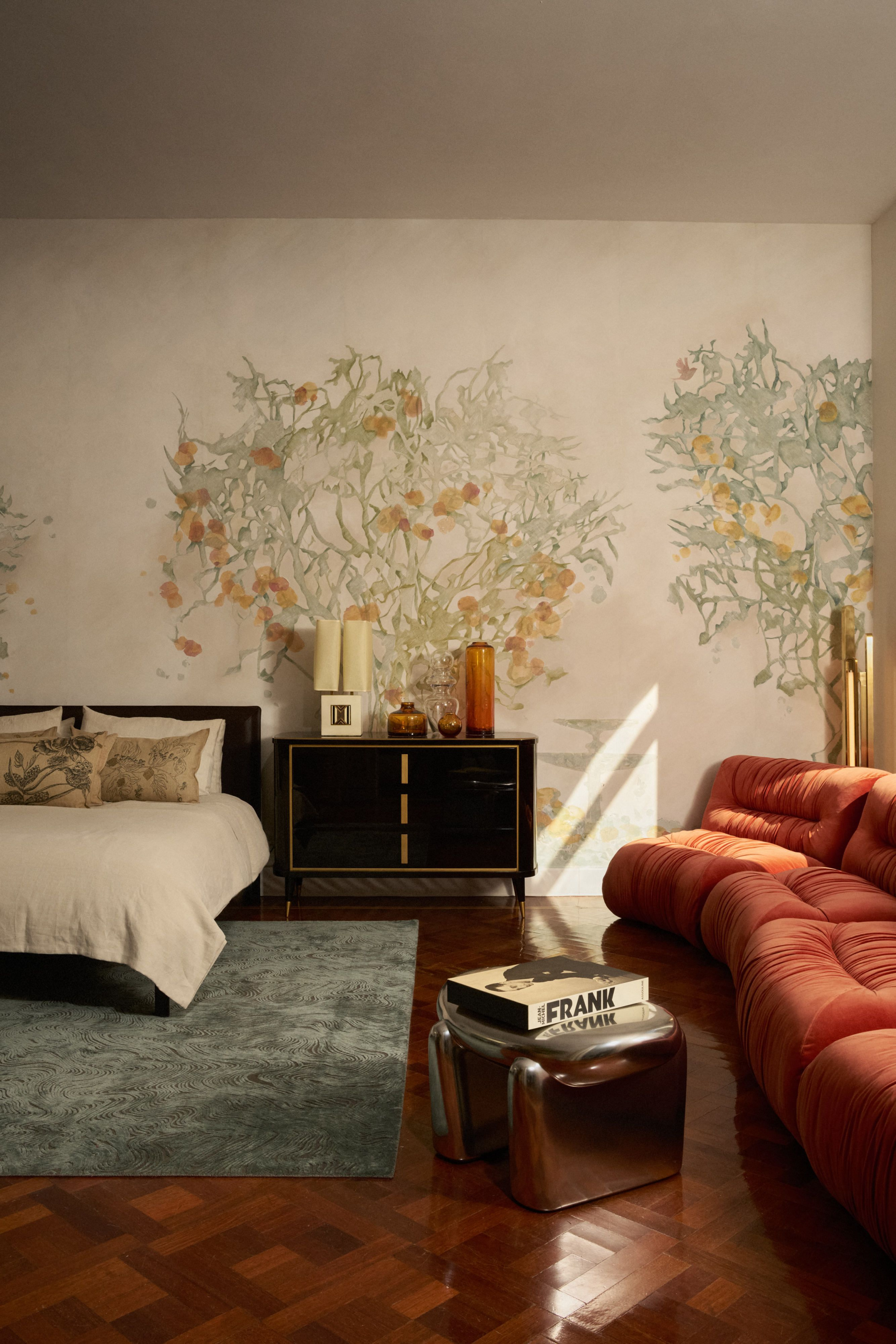
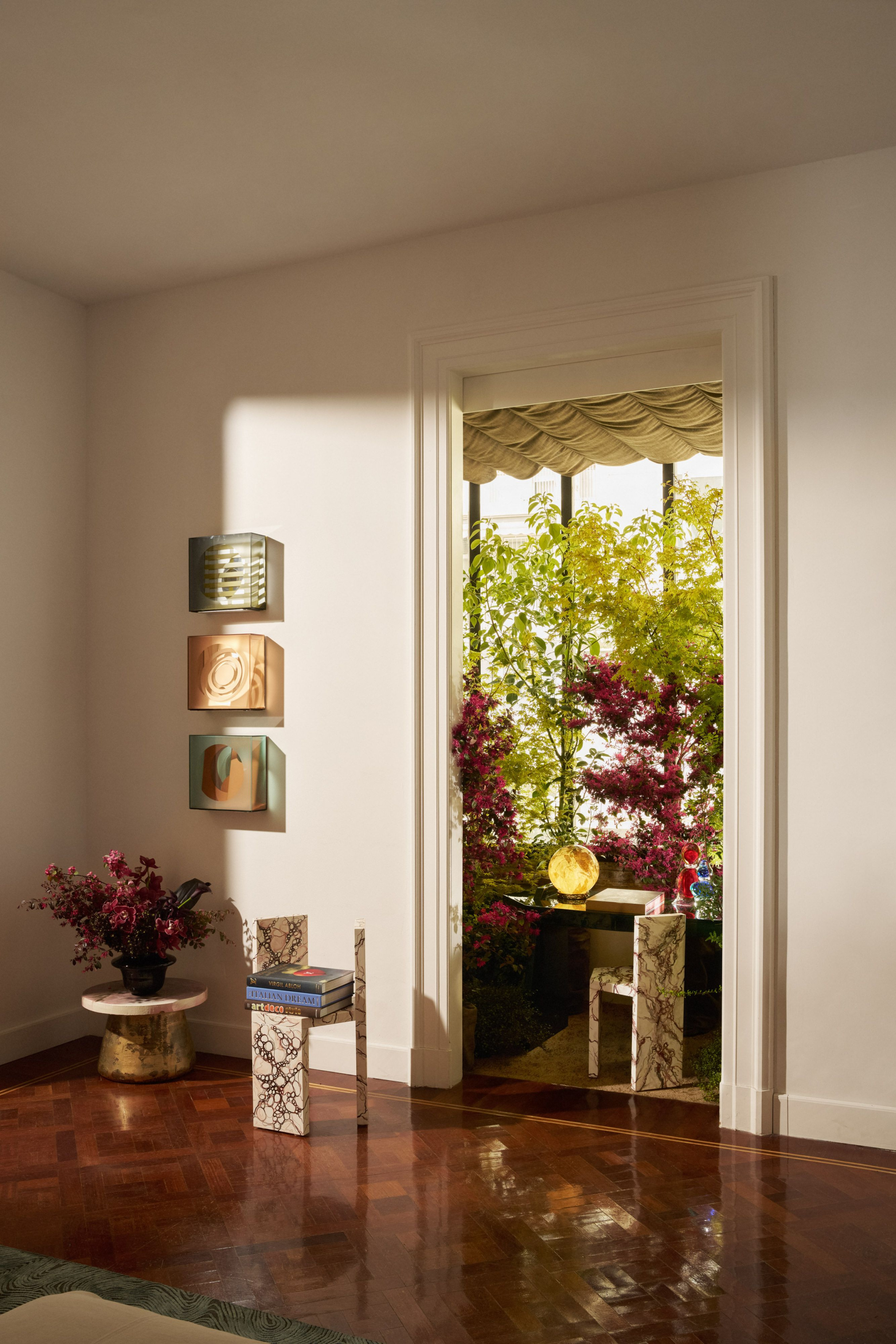
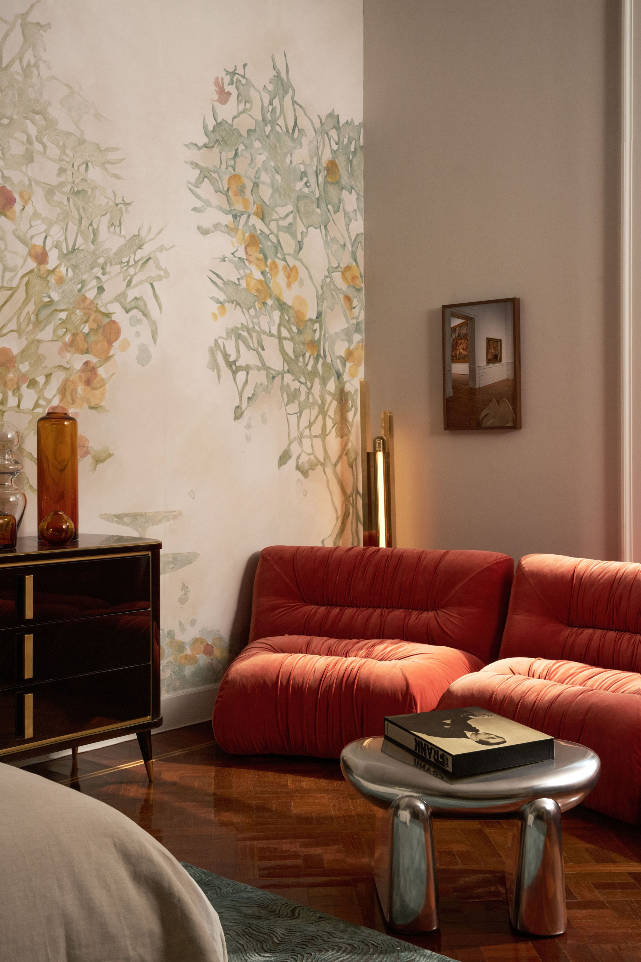
The Bedroom by NYC-based Champalimaud Design was an incredible closing number. Inspired by the glamour of 1960s Italian film, the group sought to create a playful space where friends meet before a night out.
“In the opulent setting of the L’Appartamento palazzo, we made these spaces into their own kind of party,” says Alexandra Champalimaud, founder and president. “We envisioned a seductive gathering place to pour drinks before and after the crowds, and an intimate haven for quiet and enchanting moments, all in celebration of La Dolce Vita.”
-
- “The elegant and relaxed bedroom has a palette of reds, creams, and metallic tones,” says Alexandra Champalimaud, founder and president. “A modernist bed frame is contrasted against a scenic handmade wallcovering of citrus trees in shades of green and yellow.
-
- “We envisioned a seductive gathering place to pour drinks before and after the crowds, and an intimate haven for quiet and enchanting moments, all in celebration of La Dolce Vita.”
“The elegant and relaxed bedroom has a palette of reds, creams, and metallic tones,” she says. “A modernist bed frame is contrasted against a scenic handmade wallcovering of citrus trees in shades of green and yellow. A flowing natural linen bed cover drops to the deep red rug beneath, and friends can lounge around on the sinuous sofa of wrinkled vibrant orange velvet, legs kicked up on a sculptural silver-coated stool.”
-
- “In the opulent setting of the L’Appartamento palazzo, we made these spaces into their own kind of party.”
-
- “Friends can lounge around on the sinuous sofa of wrinkled vibrant orange velvet, legs kicked up on a sculptural silver-coated stool.”
The adjourning vanity room was designed to be fun and effortlessly chic, says Courtney Brannan, Principal. “Anchored by a cylindrical chandelier made of hand-crafted ivory majolica, the space is illuminated above twin rugs with a color palette blending warm earth tones, with deep terracotta fading into softer hues evoking sunset.
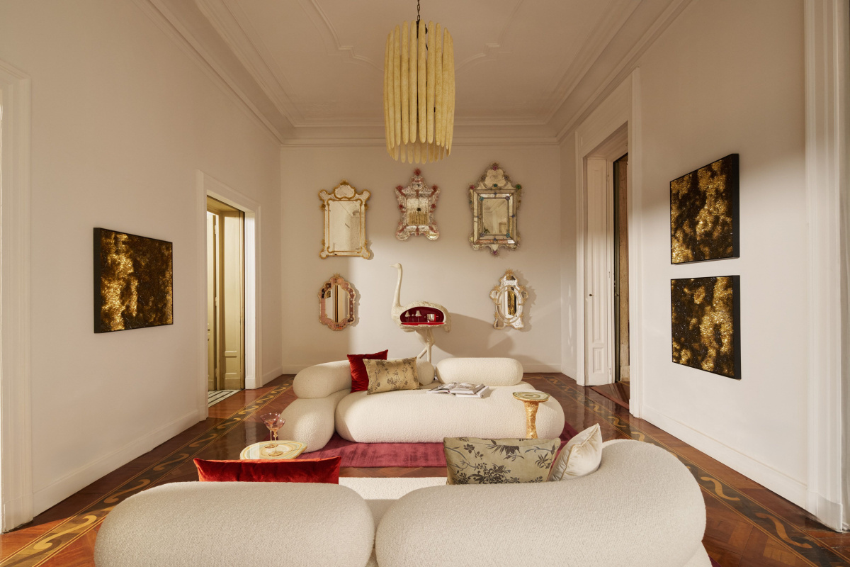
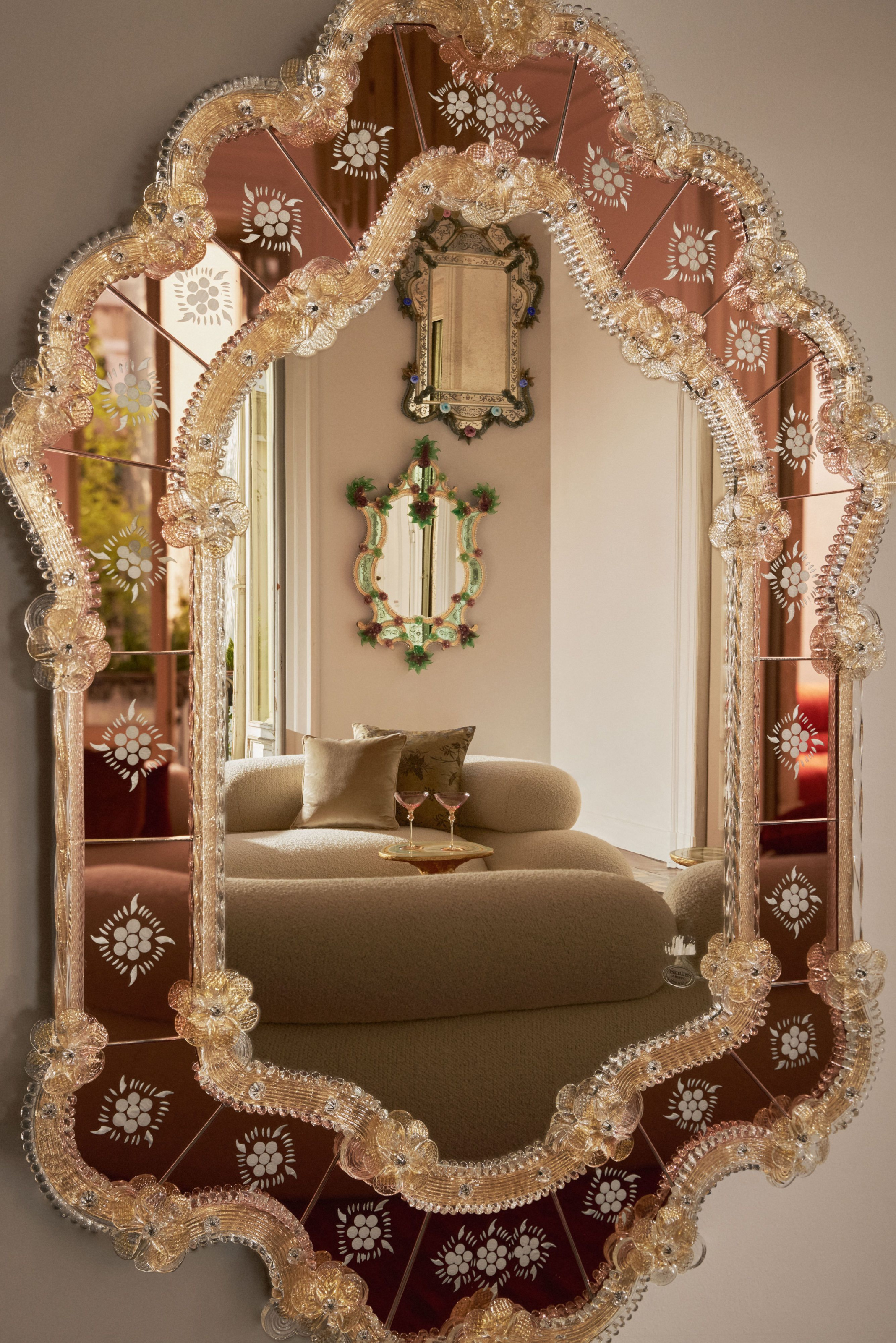
In the adjourning vanity room, the walls are adorned with over-the-top Venetian decorative mirrors and gold- and silver-leaf artworks, to be admired by guests luxuriating on cloudlike sofas accented with surreal painted wood side tables. The spirit is lightened by an ostrich sculpture whose belly opens to reveal a red lacquer bar filled with silver wine glasses and engraved crystal perfume bottles.
“The walls are adorned with over-the-top Venetian decorative mirrors and gold- and silver-leaf artworks, to be admired by guests luxuriating on cloudlike sofas accented with surreal painted wood side tables. The spirit is lightened by an ostrich sculpture whose belly opens to reveal a red lacquer bar filled with silver wine glasses and engraved crystal perfume bottles.” champalimaud.design, artemest.com