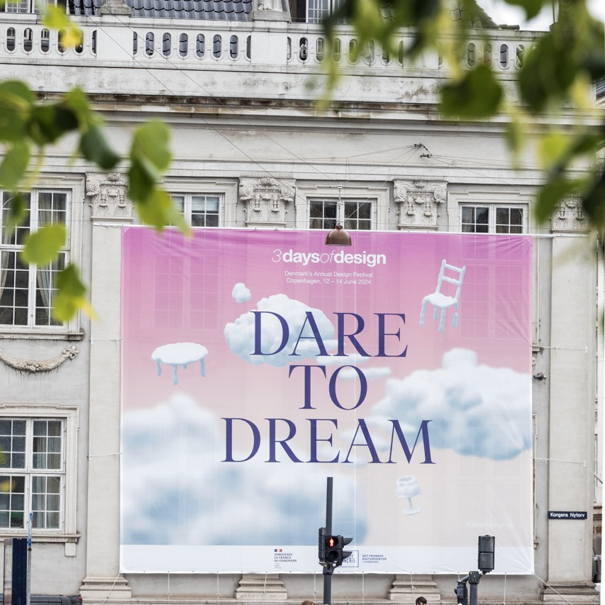
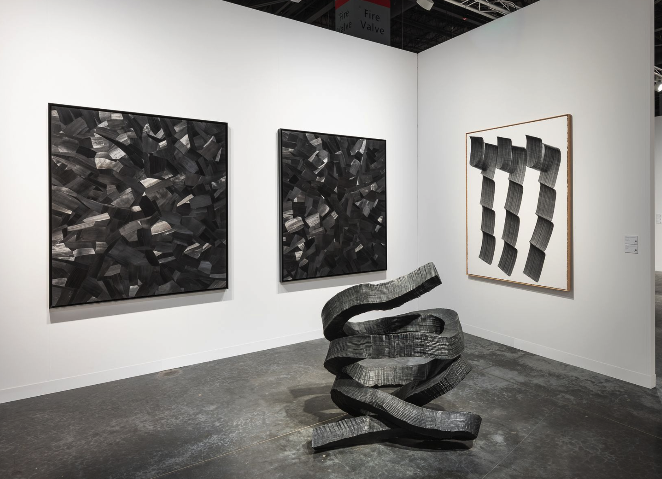
Northern Europe’s premier design festival, 3daysofdesign, celebrated its 11th year last week, drawing over 400 exhibitors from around the world to Copenhagen, Denmark. The city came alive as showrooms, shops, and galleries exhibited new furniture, lighting, accessories, and materials from both up-and-coming talents and established icons. The event provided a platform for both new and well-known brands from Denmark and beyond, offering a mix of surprises and beloved classics.
3daysofdesign began in 2013 as a small event held in an old warehouse in Nordhavn, a harbor area overlooking Copenhagen’s waterfront. Four Danish brands launched the event as a joint initiative: Montana, Erik Jørgensen (now owned by Fredericia Furniture), Anker & Co, and Kvadrat. Today, the 3daysofdesign festival extends to the entire city of Copenhagen and is considered the most significant annual design festival in Scandinavia.
This year’s festival offered an array of events throughout the three days, from breakfast offerings from local cafes to showroom parties and cocktail hours. When you weren’t witnessing a product debut or relaunch, you found yourself mingling with other design enthusiasts in the streets, all eager to experience the excitement. The 25hours Hotel hosted a spectacular party on the festival’s second night, where tables were lined with glasses of champagne and hors d’oeuvres were plentiful. Pink balloons tied outside of showrooms added a festive touch, making the entire week feel like an ongoing celebration.
While wandering through showrooms and biking between locations, these were some of my festival highlights:
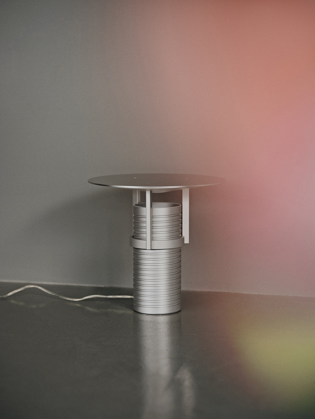
Jamie Wolfond’s Set Lamp for Muuto
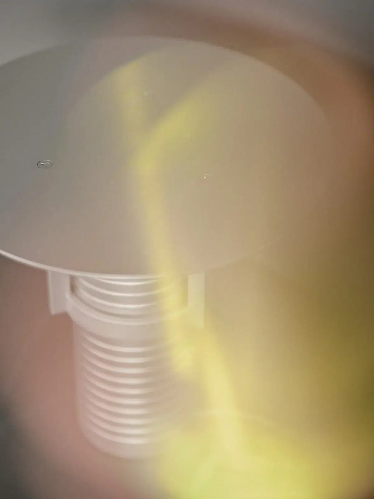
- Set features a spinning plate that rotates up and down above the light fixture. Photo courtesy Muuto
- The Set lamp by designer Jamie Wolfond for Muuto takes visual cues from a screw thread. Photo courtesy Muuto
Inside their two-floor showroom, Muuto’s new outdoor collection, Settle, celebrated the impact of biophilia on our daily lives. Displayed in the showroom’s courtyard, the collection aimed to explore neuroaesthetics. “The science of neuroaesthetics is something we’re working on quite a bit,” said Mikkel Friis Ovesen, global PR manager at Muuto. “We usually call it ‘a space that feels just right.’ We’re really focused on how to use color, light, and plants. Things we all love about design, but don’t necessarily put into words.”
Muuto’s Shaping Ideas exhibition also featured the Set lamp by Toronto-based designer Jamie Wolfond. Taking visual cues from a screw thread, Set features a spinning plate that rotates up and down above the light fixture. In the showroom, it was impossible to walk by without wanting to spin it. Jamie says he designed the lamp to inspire new (yet relatable) ways of interacting with lighting.
“The way I work is experimental and empirical,” he says. “It is something I call ‘backward design,’ meaning that we start at the end. We experiment with a process or detail until we find an application that allows us to make something useful or culturally meaningful.”
The Muuto Design Contest also launched during the fair, an open-call design competition seeking fresh perspectives on accessories and small furniture. The competition invites innovative, forward-thinking designs that challenge traditional notions, whether it’s a vase, stool, coat stand, or a new home object entirely. (Applications will be accepted here through October 12, 2024.)
“We know it’s difficult for less established talents to succeed with more commercial products,” says Line Brockmann Juhl, Muuto CMO. “We’re hoping to bring in new designers, give them a platform, and hopefully launch a new product next year for 3daysofdesign.”
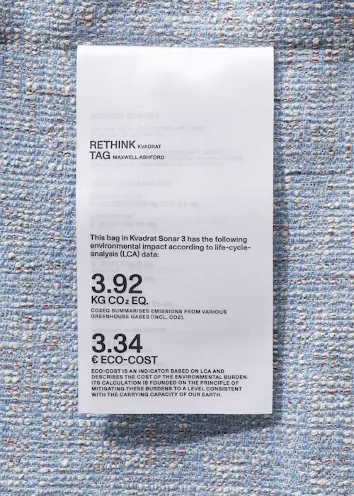
Maxwell Ashford’s “Tag” Project for Kvadrat
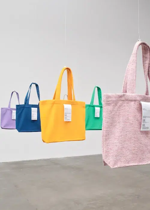
- Tote bags were chosen to give viewers a relatable item through which to understand its environmental footprint. Photo courtesy Kvadrat
- The labels attached to each bag reference standard garment tags. Photo courtesy Kvadrat
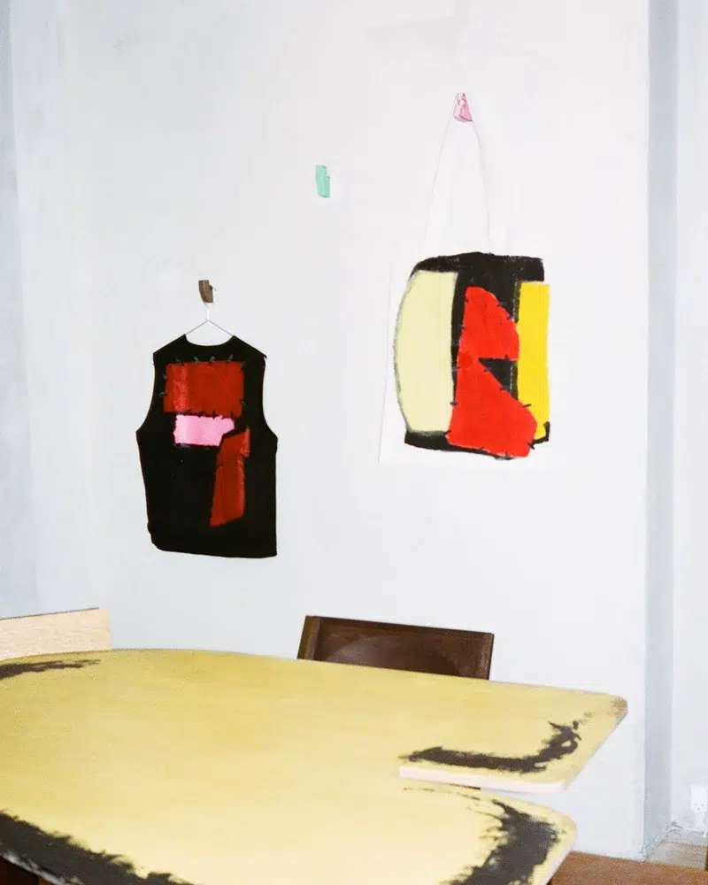
Kvadrat’s Rethink exhibition invited 12 designers to explore the potential of textiles as a medium for expression. Designer Maxwell Ashford’s project, titled Tag, featured 10 tote bags made from Kvadrat fabrics, each with unique environmental characteristics. Some bags addressed water reduction and utilized dry processing, while others employed post-consumer feedstocks to create recycled materials. Additionally, some bags were designed to be more durable for outdoor use, meeting more stringent demands. Each tote bag’s label detailed its environmental credentials through Life Cycle Assessment data.
Tote bags, commonly seen at trade fairs and exhibitions, were chosen to give viewers a relatable item through which to understand this information.
“I hope this project contributes to the topic of sustainability by encouraging communication through transparency and pushing the development of ecologically adaptive materials that can benefit everyone,” Maxwell says.
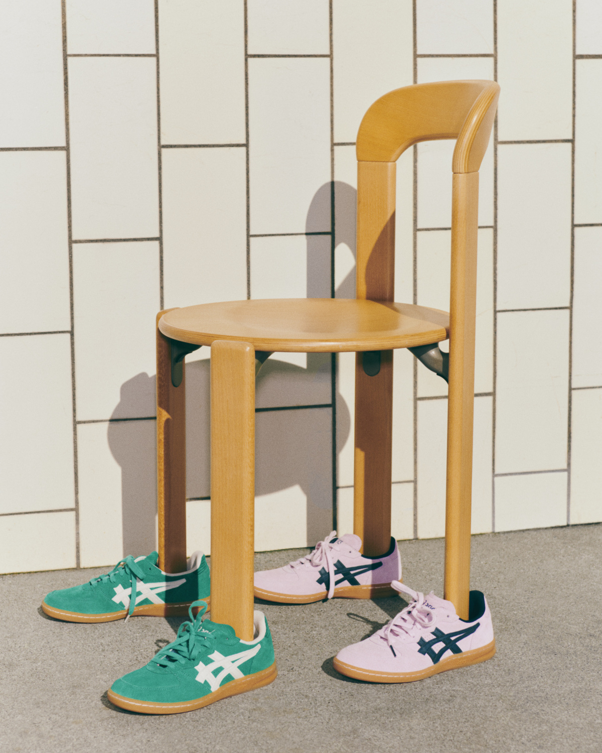
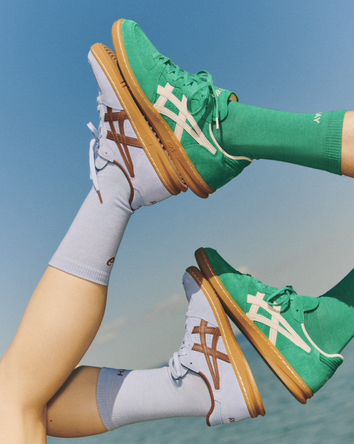
HAY x ASICS
- The ASICS x HAY collaboration re-envisions an iconic pair of shoes—the Skyhand OG, which dates back to 1994. Photo courtesy HAY
- ASICS x HAY in chambray blue and tortoise shell. Photo courtesy HAY
A Copenhagen local since 2002, HAY’s vision at this year’s festival was to invite color into all parts of everyday life. Over the last two decades, co-founders and creative directors Mette and Rolf Hay have worked with some of the world’s best designers, artists, and makers, creating everything from toothbrushes to chairs and sofas.
While walking through HAY’s massive 4-floor showroom, I felt the brand was driven by both design curiosity, and a unique vision for color. The group showcased the best of that vision through the ASICS x HAY collaboration. Both teams re-envisioned an iconic pair of shoes—the Skyhand OG, which dates back to 1994—through HAY’s eye for color. The collaboration also included matching branded socks and an ASICS x HAY logo bag.
The shoes are available in three colorways: Soft Pink, Soft Blue, and Emerald Green. The company says it hopes the block color design will give the reinterpreted Skyhand a “contemporary feel.”
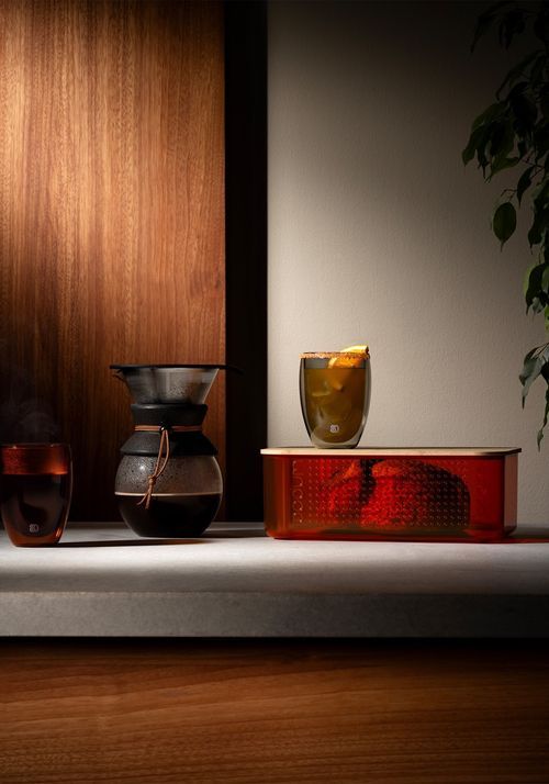
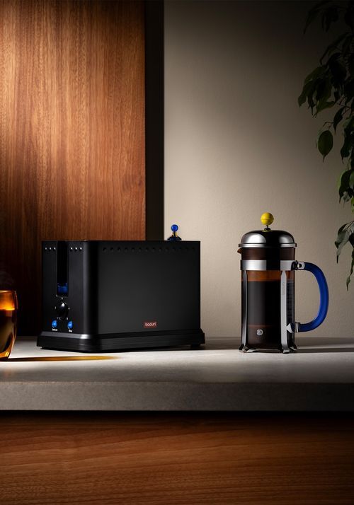
Bodum’s 80th Anniversary Collection
- In celebration of its 80th anniversary, Bodum debuted a special collection to honor its legacy of “pure and simple” design. Photo courtesy 3daysofdesign and Bodum
- The collection invites customers to spice up their kitchens with a dash of color. Photo courtesy 3daysofdesign and Bodum
The Bodum story began in Copenhagen, Denmark, where Peter Bodum founded the company in 1944. The company’s mission is straightforward: to bring high-quality coffee and tea solutions, as well as household accessories, to everyone. In celebration of its 80th anniversary in 2024, Bodum debuted a special collection to honor its legacy of “pure and simple” design. This milestone also marked the group’s first appearance at 3daysofdesign.
Cecilie Manz’s Monolit Chair for Fritz Hansen
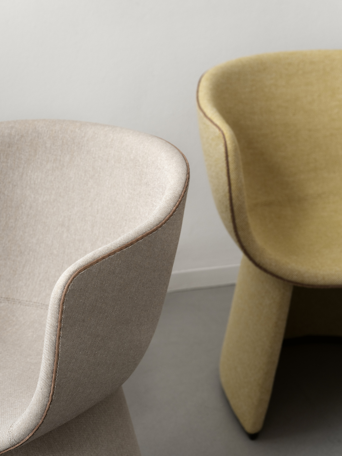
- Designed for dining or lounging, the Monolit comes in two heights with diverse upholstery options selected by Cecilie. Photo courtesy Fritz Hansen
- The horseshoe-shaped base is finished in metal for stability and cleaning. Piping comes in full grain leather or matched to the upholstery. Photo courtesy Fritz Hansen
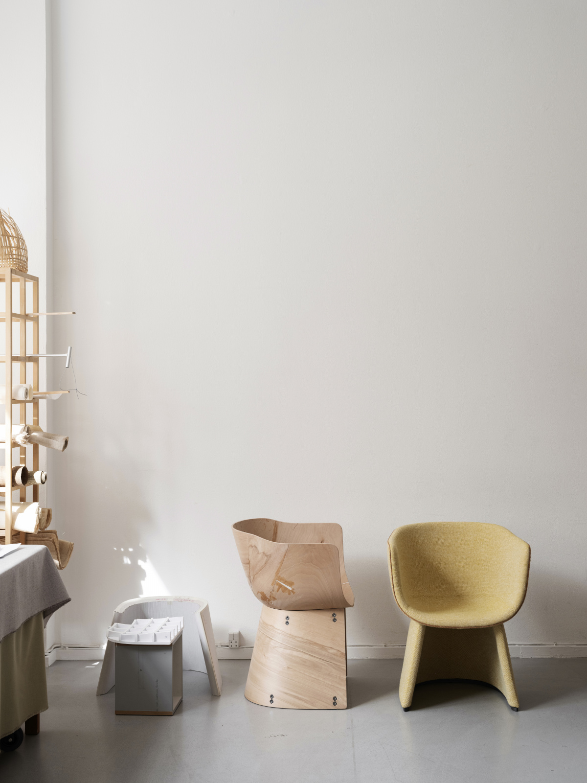
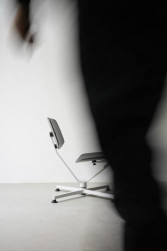
The Monolit chair by Cecilie Manz for Fritz Hansen is supremely comfortable and derives a deep character from its monolithic shape. The back of the seat is similar to a round protective shell that embraces the user, giving a sense of personal space. Designed for dining or lounging, the Monolit comes in two heights with diverse upholstery options selected by Cecilie.
“I wanted to do a nice, comfortable, and useful chair that didn’t take up too much space and would simply work well,” she says. “The name Monolit has a lot embedded in it. I wanted it to be really reduced, drawn like a quick sketch, without too many details. I wanted people to read it as one shape, a monolith, but in two defined parts, top and base.”
Comfort was imperative, ensuring people can spend an entire evening in the chair. The designer notably made the lounge chair higher than typical chairs to enable getting in and out with ease. The seat also has a small cut-out on the side at the front to allow for movement.
“The challenging part is to get the two points: comfort and aesthetics, to meet,” she says “We tried tons of shapes, different angles, different front contours, heights. We have boxes full of paper patterns where we were working out the cut-out of the front, so that you can twist around a bit in the seat. That was very important to me because human beings want to move around and change position, your body does not want to be locked in. With this slight opening you can move but still feel embraced.”
fritzhansen.com, ceciliemanz.com
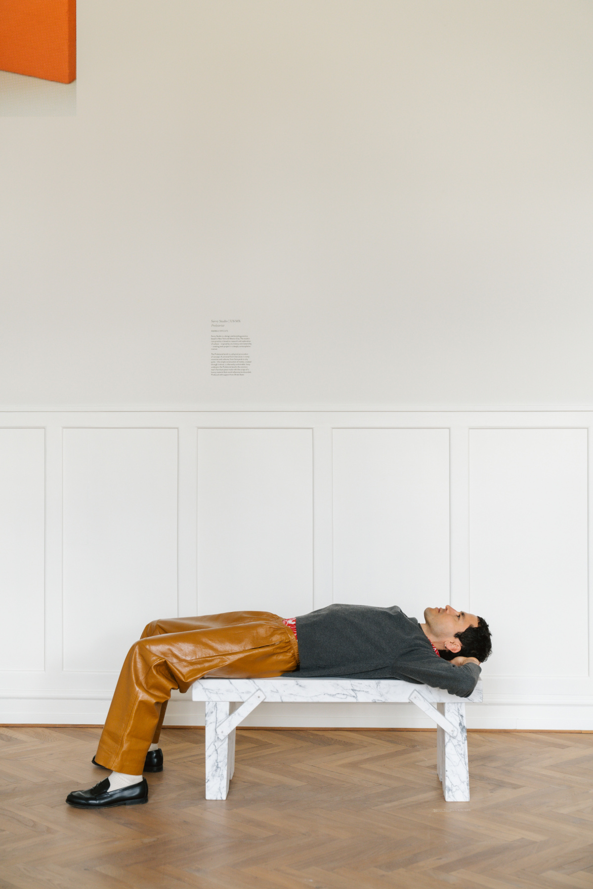
&Tradition’s “Studies of a Bench”
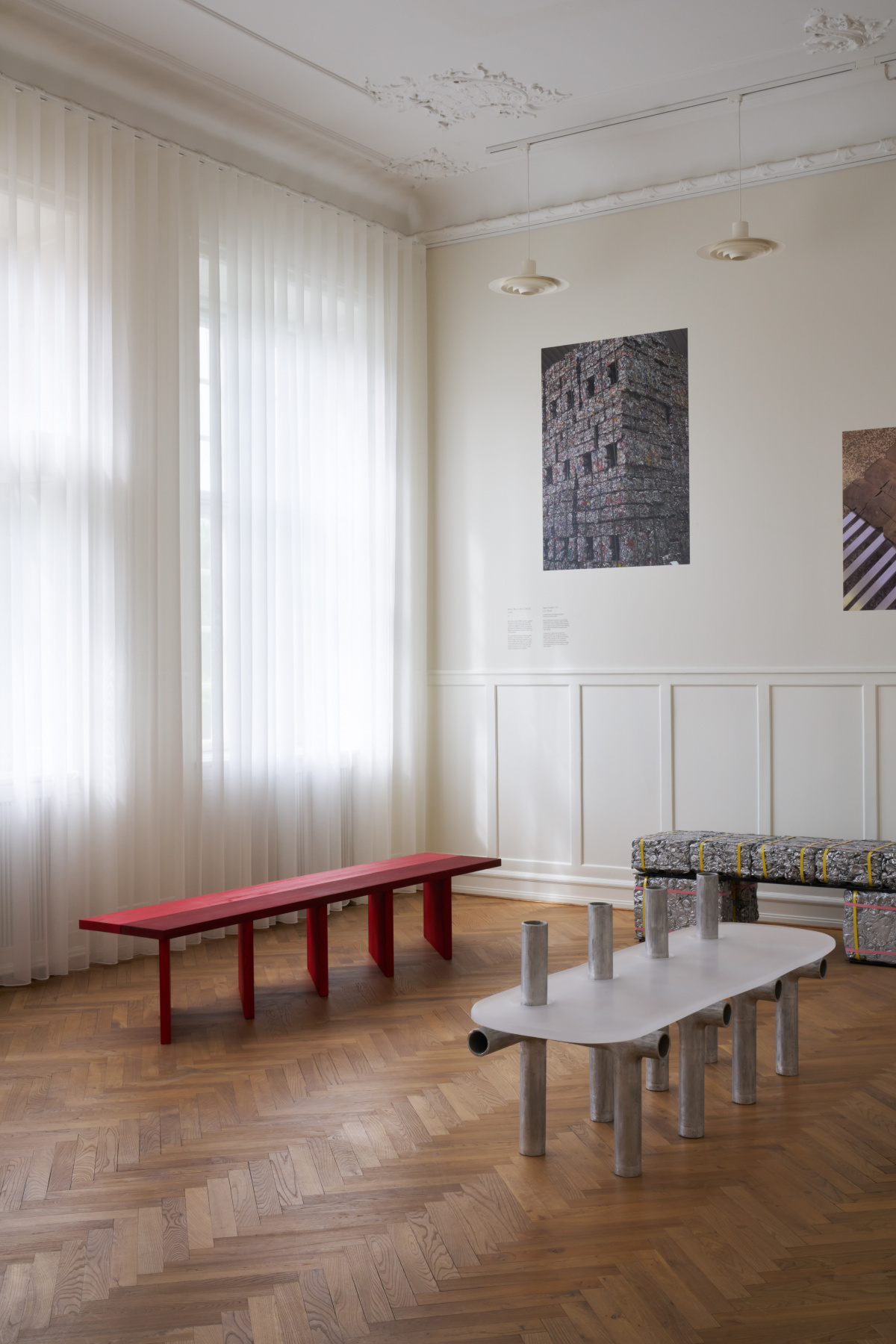
- In Studies of a Bench, the bench is explored through a hybrid art-design exhibition. Photo courtesy &Tradition
- The Proletariat bench from Savvy Studio is a physical provocation of concept, according to the company. Photo courtesy &Tradition
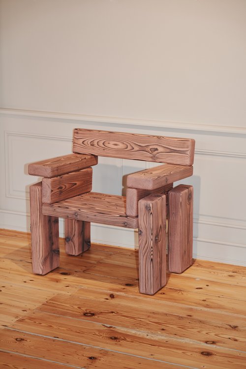
Danish furniture brand &Tradition unveiled a four-story showroom during 3daysofdesign, featuring a complete apartment and rooms designed by Jaime Hayon and Space Copenhagen. In an exhibition titled Under One Roof, &Tradition’s design team transformed the interior of a century-old townhouse.
The top floor of the house captures a feeling of home with the &Tradition Apartment, showcasing a mix of products from various international designers. A collection of artworks, both commissioned and found by &Tradition over the years, is interspersed among the products, creating the ambiance of a collector’s home.
Following the Studies of a Table project from 3daysofdesign in 2022, this year’s exhibition also explored the bench through a hybrid art-design collaboration with five international designers and studios. Studies of a Bench rethinks everyday perceptions of the bench, exploring materiality and form in unexpected ways.
Erwan Bouroullec x raawii’s “Happy Sobriety”
- The installation marked the beginning of a new collaboration, highlighted by the introduction of the Arba chair. Photo courtesy Erwan Bouroullec and raawii
- “We started from a simple principle and then spent a few days welding, drilling, sewing, and painting in my countryside studio,” Erwan says. Photo by Thomas Degner
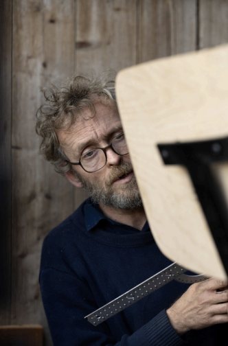
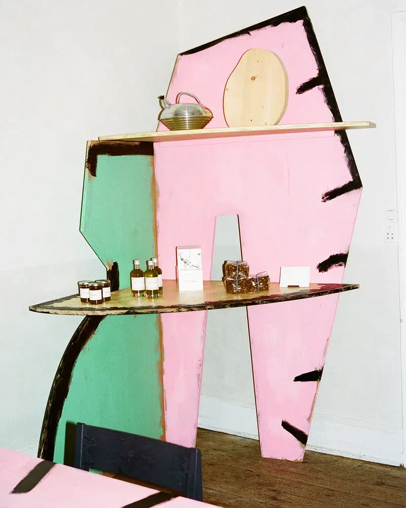
French designer Erwan Bouroullec and Copenhagen-based brand raawii joined forces for Happy Sobriety, an exhibition featuring both collaborative and personal works. This collaboration aims to empower designers in the production and distribution of their creations. Described as “a man-made ideal shop,” the installation blended elements of a lab, a bazaar, and an art gallery, offering a welcoming environment where everything is accessible, touchable, and useable.
The exhibition showcased Erwan’s graphic works and handmade furniture alongside raawii’s vibrant collection of objects and small furniture. Additionally, the installation marks the beginning of a new collaboration, highlighted by the introduction of the Arba lounge chair designed by Erwan for raawii.
“We started from a simple principle and then spent a few days welding, drilling, sewing, and painting in my countryside studio,” Erwan says. “We wanted to engage into a positive minimum: Being fast and lightweight, both mentally and physically, using available resources without needing to plan for more, discovering through the process of making, and finalizing by intuition.”
Tableau’s “Domestic Pleasure”
- The Tableau Gallery for 3daysofdesign in Copenhagen. Photo by Tobias Hoffmann, courtesy Tableau
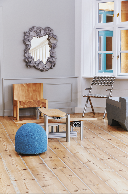
- Tableau focused on functional art as a reflection of intangible elements in this exhibition. Chair by Onno Adriaanse. Photo by Tobias Hoffmann, courtesy Tableau
Tableau is a creative studio and exhibition space renowned for its multidisciplinary and disruptive approach to design. Founded in Copenhagen in 2018 by floral designer Julius Værnes Iversen, the studio has collaborated with Hermés, Tom Dixon, and Vogue, among others. Tableau’s Domestic Pleasure exhibition posed a thought-provoking question: What makes a place a home? A diverse group of artists and designers curated bespoke works for the exhibition, challenging traditional ideas of belonging and inviting viewers to explore emotions woven into the concept of home.
Tableau focused on functional art as a reflection of intangible elements that turn a space into a sanctuary of belonging. For this year’s selection, the group handpicked bespoke collectible designs from their community of artists and designers such as Ali Gallefoss, Forever Studio, Jacob Egeberg, Laurids Gallée, Lino Gasparitsch, Onno Adriaanse, and Sigurd Nis Schelde.
FRAMA x Toogood’s “Collage”
- With the Collage exhibition, visitors were welcome to dine amidst tactile sculptures. Photo courtesy Toogood x Frama
- As part of Collage, a capsule collection of collaborative pieces are available for purchase exclusively at FRAMA Studio Store. Photo courtesy Toogood x Frama
Exploring the intersection of art, design, food, and human connection, FRAMA and Toogood joined forces for a collaborative exhibition at FRAMA’s space titled Collage.
At the heart of Collage is a reimagining of FRAMA’s adjacent eatery, Apotek 57, where visitors were welcomed to dine amidst tactile sculptures and engage with Toogood’s sculptural furniture, playfully challenging perception in every room. These sculptural pieces intertwine to form layered tables, surfaces, and screens, inviting exploration and interaction. Sculptural food presentations complemented these installations, inspired by Toogood’s classic shapes and thoughtfully placed around FRAMA’s tableware collections.
“I’m a form-led designer, and I like to question function,” says artist Faye Toogood of Toogood. “Why does a chair need to be that shape, height, proportion? Why do the pockets on your coat need to be in those positions? In all my work, I trust people to find the function. Make it personal. Figure out what works for you.”
framacph.com, t-o-o-g-o-o-d.com
Poppykalas’ Magical Garden Rugs for Layered
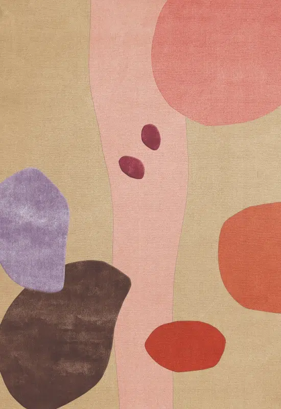
- The Magical Garden collection consists of two unique designs, each offering a different interpretation of the theme. Photo courtesy Layered
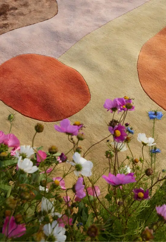
- The Magical Garden rug, which shares the name of the collection, is inspired by a peaceful garden with earthy tones accented by hints of pale pink, peach, and orange. Photo courtesy Layered
Following the success of the Secret Garden collection launched in 2019, Swedish rug company Layered debuted its second design collaboration with Danish florist Poppykalas, unveiling her enchanting Magical Garden collection during the fair. Inspired by the beauty of a garden in full bloom, each piece from the collection is set to evoke the feeling of strolling through a lively garden.
layeredinterior.com, poppykalas.dk
Signe Hytte Studio’s “Enter the Salon”
- Karimoku Case is a contemporary lifestyle brand based in Japan and born out of admiration and love for serene beauty. Photo courtesy 3daysofdesign
- Ladies & Gentlemen Studio is a multi-faceted design studio rooted in exploration through the development of objects, spaces, and experiences. Photo courtesy 3daysofdesign
The fair’s Enter the Salon exhibition by Signe Hytte Studio transported attendees to a bygone era, reminiscent of the famous salons of Paris, London, Berlin, and beyond. Housed in The Conary, an old townhouse in the heart of Copenhagen, the exhibition celebrates the gatherings where intellectuals and creatives once exchanged fresh ideas and challenged societal norms.
Unlike a typical fair stand, Enter the Salon felt like a culturally savvy, tasteful and timeless private residence, rich with layers waiting to be explored. Walking through the exhibition, attendees found a carefully curated selection of brands seamlessly blending together.
signehytte.com, karimoku-case.com, ladiesandgentlemenstudio.com
Form Us With Love x Stolab’s Alt Chair
- Form Us With Love x Stolab wanted to redefine the stick chair, blending tradition with contemporary design. Photo courtesy Form Us With Love
- The Alt collection offers versatile chairs that transition smoothly across various areas. Photo courtesy Form Us With Love
Swedish design studio Form Us With Love collaborated with Stolab, a Swedish manufacturer of solid wood furniture, to modernize the classic stick chair. The team’s goal was to blend tradition with contemporary design to suit diverse public spaces and modern offices. This resulted in the Alt collection, offering versatile chairs that transition smoothly across various areas.
“Form Us With Love was really into making something into solid wood,” says Martin Johansson, Stolab CEO. “We have a first and second version of this collection, and now we’re going to do a third one. We named the collection Alt to show that we can create a lot of alternatives. There’s one with a wooden base and top, and upholstered base and top, for example. I have a hard time sitting still—so I told my people we needed to make a swivel base as well.”
Foscarini x Felicia Arvid’s Pli Lamp
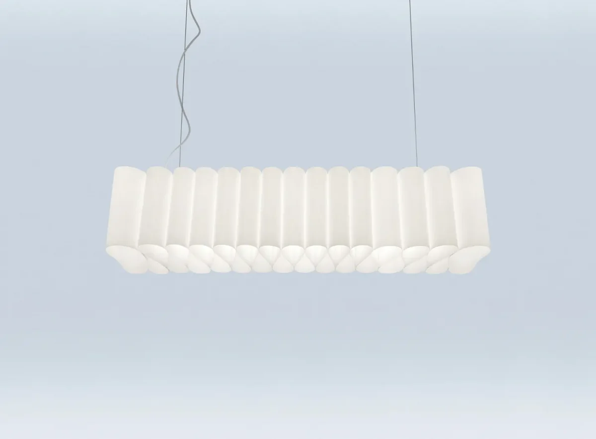
Pli is a pendant lamp in which the light source becomes a support structure: like a needle crossing a thin sheet. Photo courtesy Foscarini
I encountered Felicia Arvid in the Foscarini showroom, a young Danish designer making her debut in the world of lighting design. Her creation, the Pli pendant lamp, stood out among the exhibits.
Pli is not just a lamp; it’s a fusion of function and form, where the light source serves as both illumination and structural support. At the heart of Pli’s design is a delicate interplay of light and shadow, reminiscent of a needle delicately piercing a sheet, creating soft folds and waves.
“The idea for this lamp was to combine the shade and light source in a single gesture,” she says. “The light source is the key element that holds the lamp shade together. If you unscrew the ends, the lamp’s shade falls apart. Because of my background in fashion, I often worked with flat materials rather than this light’s three-dimensional shape. We arrived at using paper because it gives a nice, even light output. I see the lamp as an embodiment of both Italian and Danish design.”
What set Pli apart was its versatility. Available in both wood and paper, each material offered a unique luminous effect. Though the paper option was my favorite—I loved how it allowed light to permeate through its thin sheet, casting a soft, diffused glow that gently illuminated our surroundings.
foscarini.com, feliciaarvid.com
Nuura x Jessica Vedel’s Florii
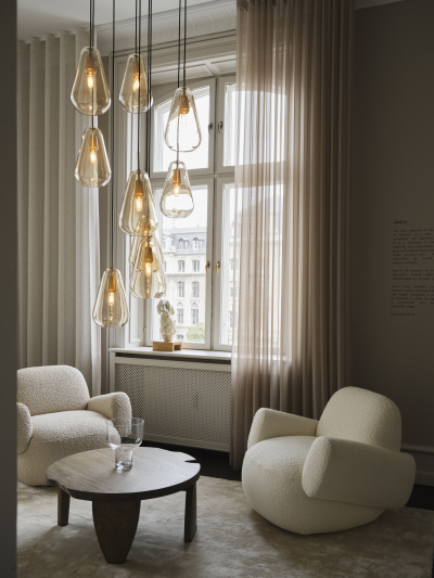
- Nuura’s Florii collection is designed to bring softness and a sense of poetry to any room or space. Photo courtesy Nuura
- The Anoli pendant is inspired by a raindrop’s elegant silhouette. Photo courtesy Nuura
Artist and designer Jessica Vedel was inspired by the beauty of nature while strolling through a sunlit forest. This vision led to the creation of Florii, a lamp series for Nuura that captures the essence of falling leaves and their interaction with light. Each lamp in the collection merges organic aesthetics with modern design.
“I wanted this collection to feel soft and inviting,” Jessica says. “Everyone has their own experience with the lamps, and they all look different from different angles. I think this collection would fit nicely in both a simple Scandinavian setting and a more colorful space as well.”
