Sun spilled down in Copenhagen last week for 3daysofdesign, illuminating all of the city’s best angles for the tenth anniversary of the festival. Watching locals dive into the city’s famously pristine canals, I almost ditched the design festival to splash around instead—but after biking and walking to open studios and showrooms citywide, I concluded without question: 3daysofdesign is the place to be.
In about 300 displays of the best of design from Denmark and around the world, a combination of Scandinavian classics and new innovations showed design ready to meet needs today and last long into the future ahead.
The festival was created in 2013 by Montana, Erik Jørgensen (now owned by Fredericia Furniture), Anker & Co, and Kvadrat. Since then, CEO Signe Byrdal Terenziani has worked tirelessly to see the festival grow even as it stays true to its roots: distinctly Scandinavian, the event is highly curated to show fantastic design.
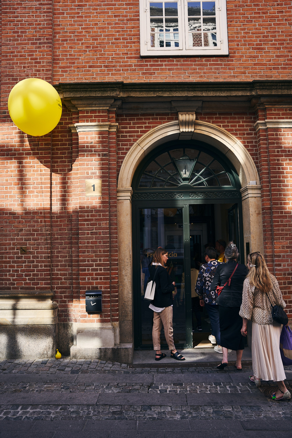
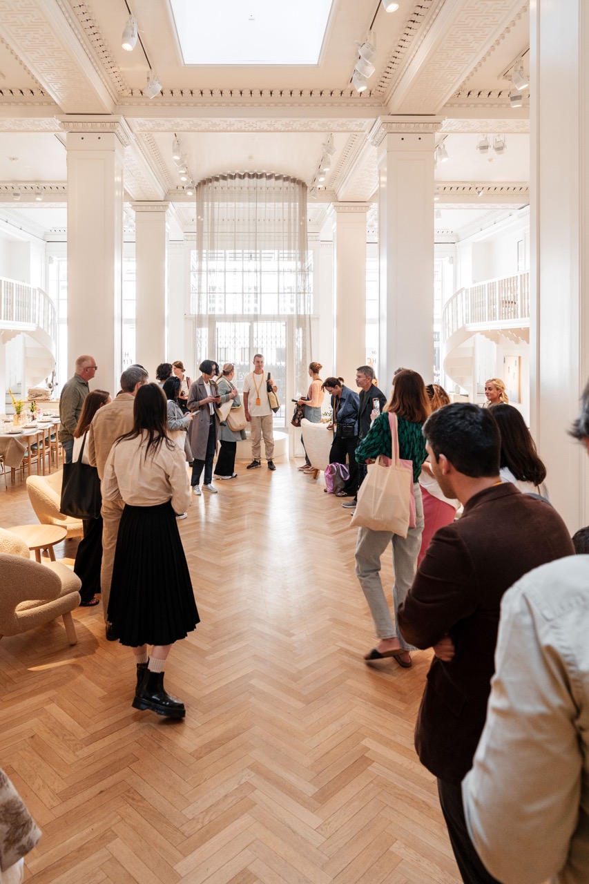
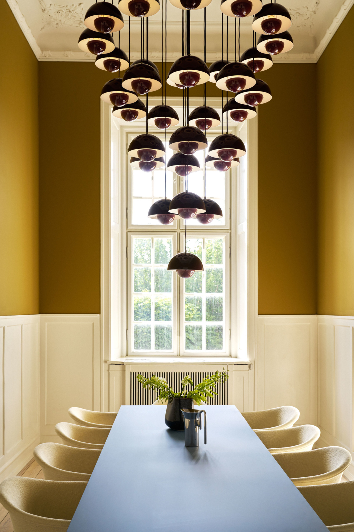
- Fredericia Furniture. Photo by chris1million courtesy of 3daysofdesign
- House of Finn Juhl. Photo by Filip Gielda, courtesy of 3daysofdesign
This year, studios, workshops, and brands greeted visitors with doorways marked by bright yellow balloons and welcoming signs. The whole festival felt like a party—and the actual anniversary party, held at the 25hours hotel in Copenhagen and complete with an acrobatic performance, a woman on stilts, a fortune teller, and a basement disco, felt surreal.
In its wake, murmurs among industry professionals would indicate 3daysofdesign has eclipsed Stockholm Design Week. Still quieter whispers wonder if 3daysofdesign’s growth might signal some kind of turning point regarding the king of all design fairs, Salone del Mobile. We all noticed a diminished presence from Scandinavian brands in Milan this year. In very Danish fashion, the brands seem to be pursuing for Scandinavian design something similar to what Salone has done to amplify Italian design, in a festival true to their values, right at home.
Danish design in the spotlight at 3daysofdesign
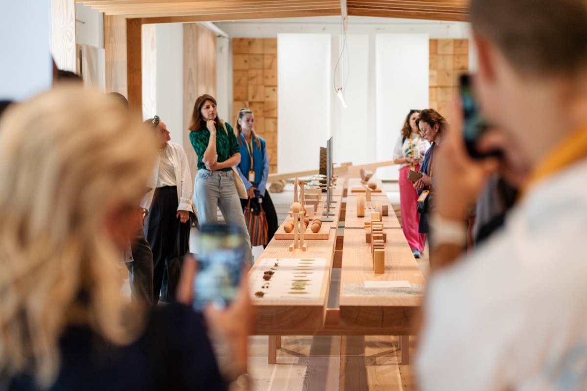
Christian+Jade’s exhibition with Dinesen “The Weight of Wood,” takes a mindful look into wood as a living material. Photo by Filip Gielda
Throughout the three days, exhibitors offered coffee and pastries, wine and Danish snacks alongside great work that portends a shift in taste to more colorful designs with sustainable roots. Wood is, as ever, an obvious and beautiful consistency across Scandinavian design, but more and more designers are utilizing recycled materials and bright colors to reenergize their collections.
Here are nine of our favorite exhibitions from Danish brands showing their vision for design:
1. HAY
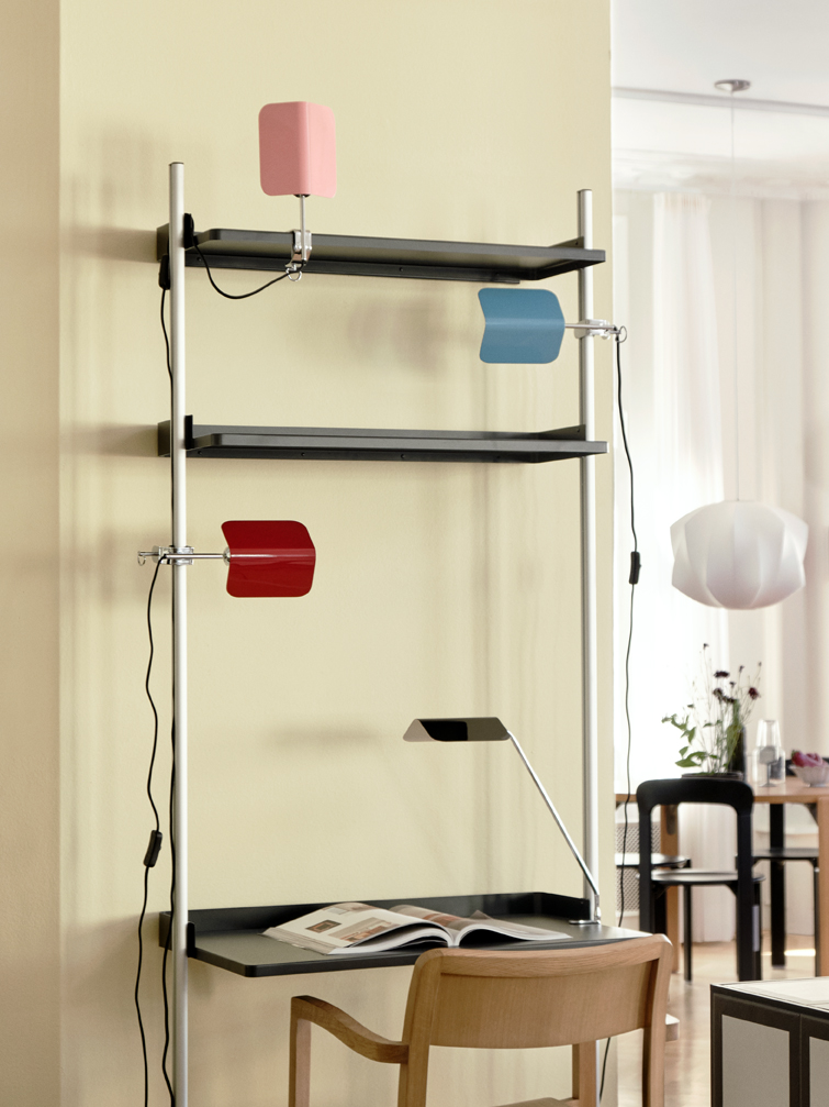
- Apex Lamp. Courtesy of HAY
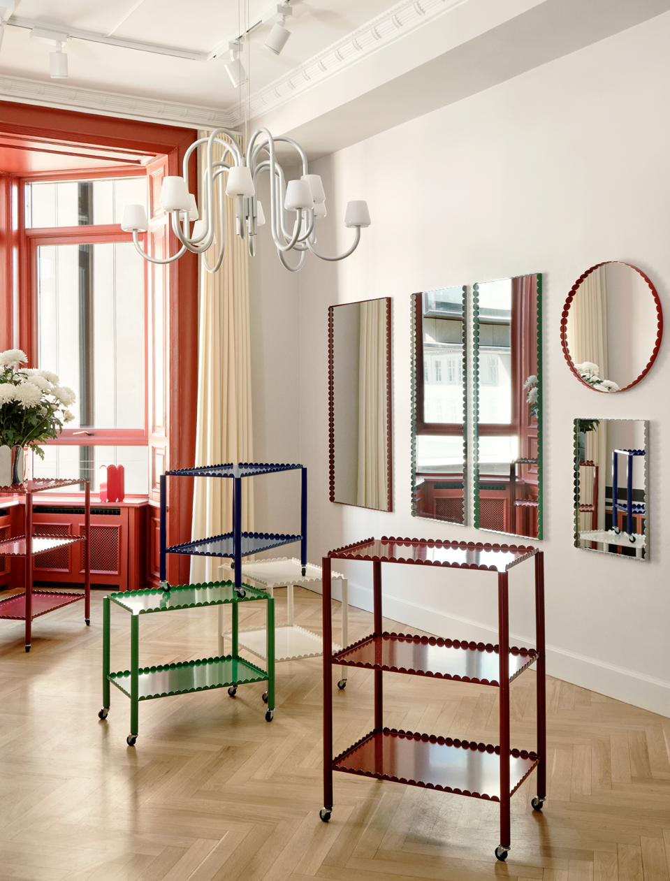
- Arcs mirrors and trolleys, Apollo Chandelier. Courtesy of HAY
Inside the four floors of HAY House, Mette and Rolf Hay’s vision for a colorful, simple lifestyle is convincing. Mette’s current fixation with checks scatters across towels, and the new Outline pajama collection by Tilde Bjerregaard marks the brand’s first venture into clothing. It’s cozy and light in HAY House, and traveling upstairs visitors get a rare view into HAY’s professional space.
It’s here that I get a first look at the Apollo Chandelier, which takes a classical chandelier form and HAY-ifies it by simplifying the shapes, removing visible hardware, and adding generous curves to the arms. Designed in collaboration with Studio 0405, the chandelier and accompanying wall sconces are inspired by and named after Mette and Rolf’s favorite Copenhagen bar, which also hosted the brand’s nightly festivities during 3daysofdesign.
Also new to HAY’s lighting collection is the Apex Lamp Collection by John Tree. Drawing on classic banker’s lamps, Apex’s shade is a single piece of folded steel that rotates to direct light. It comes in table, desk, clip, and clip desk versions as well as a variety of colors—including a reminiscent emerald green.
Both fixtures will arrive with HAY’s Autumn/Winter 2023 collection.
2. Muuto
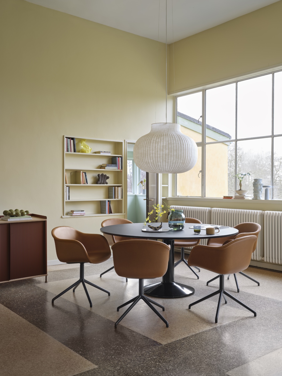
- Midst Table in red at the Muuto showroom in Copoenhagen
- Courtesy of Muuto
Muuto is a 3daysofdesign regular—and its annual rooftop party is legendary. This year, the rowdy party saw over 1,000 RSVPs, but by the time I got there the next morning everything was spic and span and ready to be shown off.
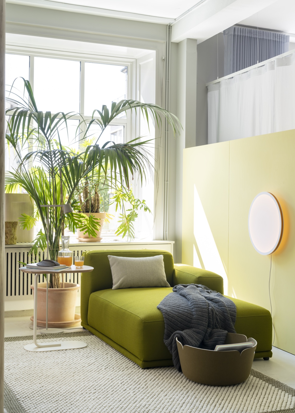
Much of Muuto’s space this year was dedicated to showcasing how you can invite meditation and restful energy in a space. Muuto executed this primarily using color—a lavender corner to sit down by the window, a green nook to recline underneath a potted palm.
When the new Midst Table by TAF Studio and Muuto met the public at Muuto’s takeover of the H+O Apartment Gallery in Milan, it was shown in black. In Copenhagen, we saw a new side to the table as it popped in deep red.
“The Midst Table’s form and construction was inspired by an iconic architectural feature, the column, merging a physical stability and steadfastness with a sense of elegance,” says TAF Studio. But in use, the table is designed to encourage convivial meeting around its edges, as round tables lack hierarchy and you can always pull up an extra seat for an additional friend.
3. Warm Nordic
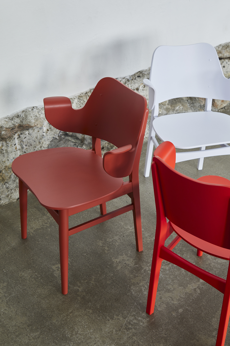
- Gesture Chair in new colors imagined by Alfredo Häberli. Courtesy of Warm Nordic
- The Fried Egg Chair in new colors imagined by Alfredo Häberli. Courtesy of Warm Nordic
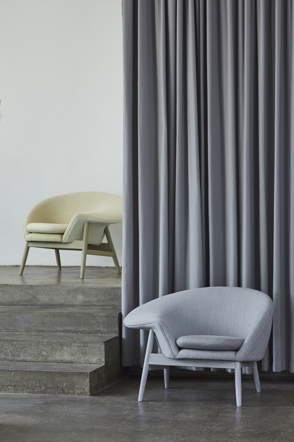
Warm Nordic invited Alfredo Häberli to reimagine two of the brand’s most iconic designs: the Gesture and Fried Egg chairs designed by Hans Olsen in the 1950s. In the Paustian store in Copenhagen, which occupies a stunning former bank, Alfredo explained his process: “Color is for me the first decoration, but also a gentle way to respect a design but add a lot of emotion.”
Instead of changing the designs dramatically, Alfredo refreshed the chairs with bold new colors like a vibrant red for Gesture and a subtle green for Fried Egg. Both chairs offer a nice variability in the hues as they are made up of several materials and textures, allowing the color to accentuate and add interest variably to different parts of the chair.
4. Frama
- Il Mercato by Frama. Photo by Fabian Martínez, courtesy of Frama
- Frama’s Studio Store. Photo by Fabian Martínez, courtesy of Frama
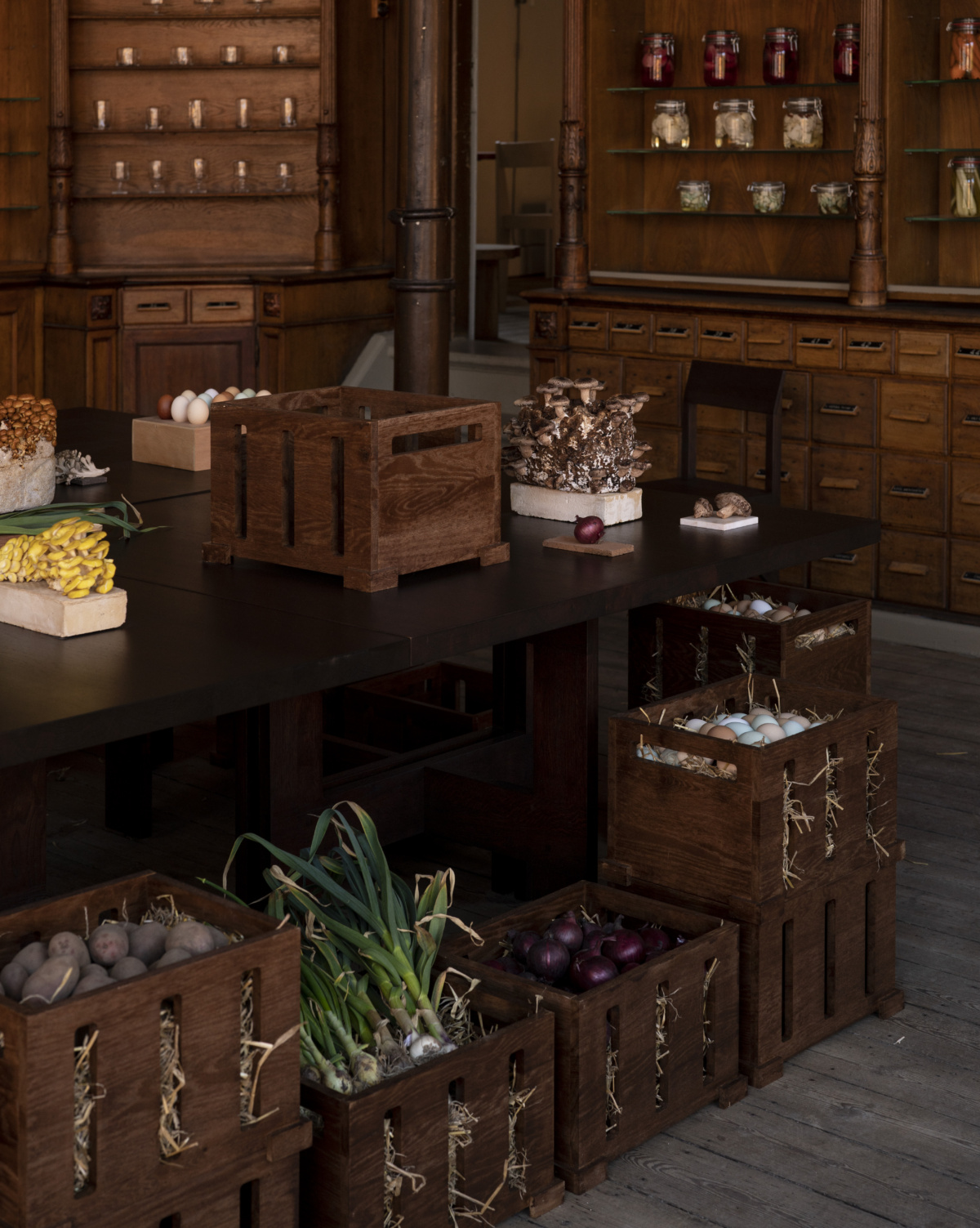
Inside Frama’s showroom in the old St. Paul’s Apotek, a large table holds mushrooms, fresh eggs, and heavy rounds of cheese while boxes below heap with red onions and potatoes. On the shelves lining the walls, vegetables pickle in big jars.
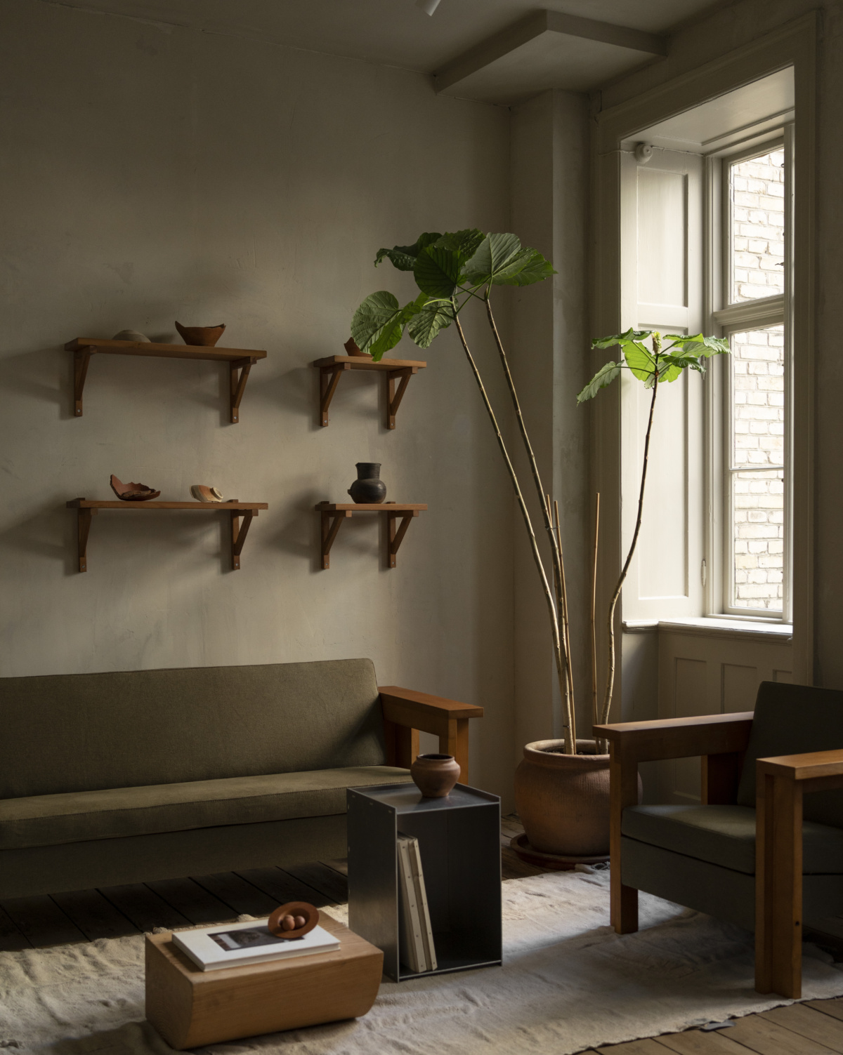
Frama’s new products, including extensions of the shelf collections in white and the Eiffel Floor Lamp, are on display. But in Il Mercato, we get a real look at Frama as a multidisciplinary brand influencing taste and style with a warm authenticity. The space contains some of Frama’s furniture, as well as their scents and skincare, and the adjacent apotek 57 eatery.
Altogether, the space intends to rouse the senses and encourage mindfulness—particularly when it comes to food and locality. Frama’s founder and CEO, Niels Strøyer Christophersen explains that Il Mercato is inspired by food as a way to start dialogue across communities, encouraging people to gather and ask questions about creativity, practicality, and each of our roles in a larger ecosystem. The exhibition was made in conjunction with apotek 57 and the Copenhagen-based farmers market GRØNT MARKED.
5. &Tradition
- Jaime Hayon’s Teatro Surreal at &Tradition “under ONE ROOF”
- Courtesy of &Tradition
There was never any doubt that &Tradition would be a highlight of 3daysofdesign. The Copenhagen-based brand is one of the largest in the city, and they filled every room of their house with their pieces, both archival and new—all “under ONE ROOF.”
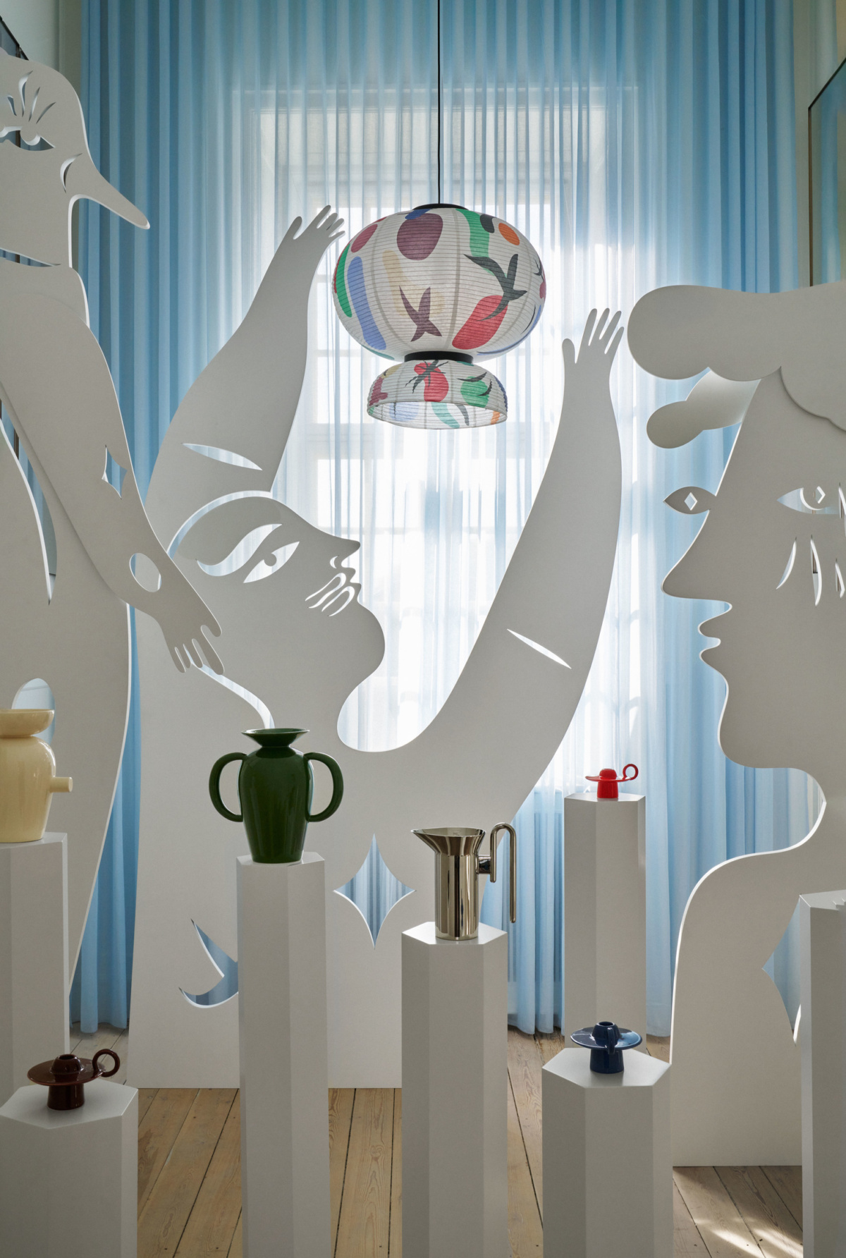
Jaime Hayon designed two rooms, Cabinet of Curiosities and Teatro Surreal, where a limited edition Formakami lamp alive with the designer’s characteristic sketches joins the Memento collection of home accessories. Space Copenhagen also designed two rooms, including a private dining room where the brand’s new fragrance range, Mnemonic—full of misty, fresh notes—is very much at home.
As you climb through the building, the spaces become more and more intimate until you reach a small apartment on the fourth floor, ready for life to unravel within. The apartment was curated with a combination of old and new pieces to reflect the way people collect things starting from early adulthood until the present, explains Els Van Hoorebeeck, creative and brand director. “It’s very eclectic and still coherent—the pieces have a way of talking to each other that is perfectly balanced. That is where you can truly understand who we are as a brand,” Els says.
6. Fritz Hansen
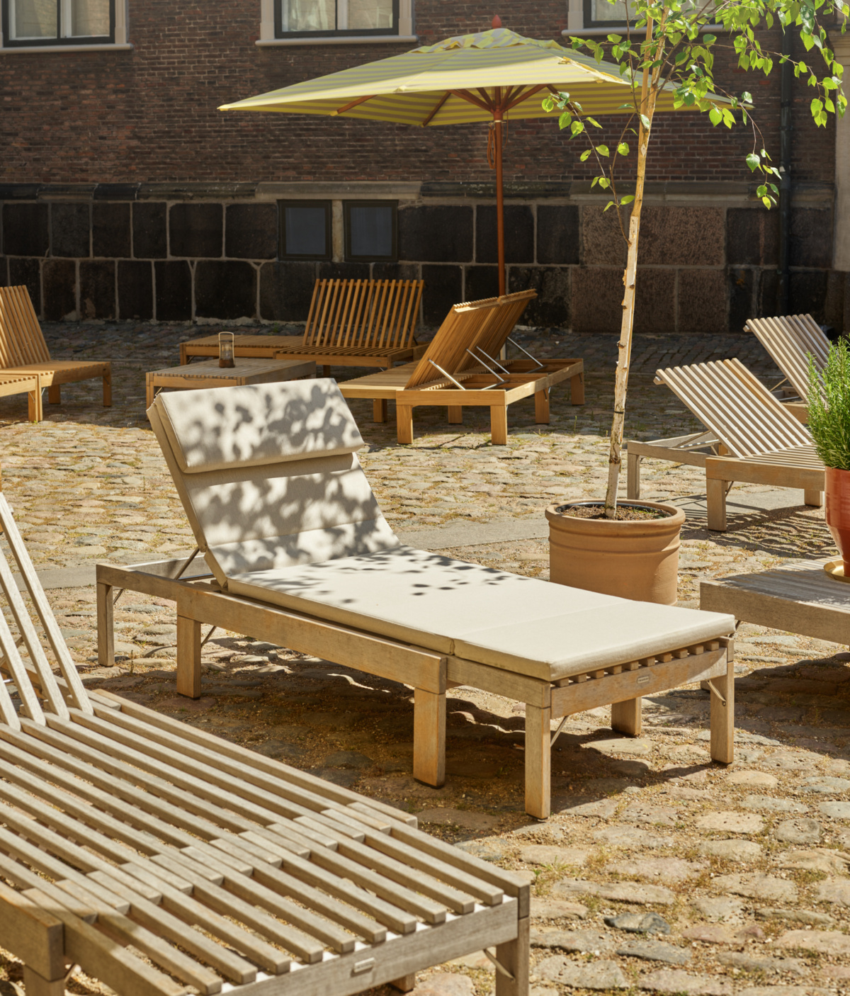
- Skagerak in the courtyard of Charlottenborg Palace
- Courtesy of Fritz Hansen
Charlottenborg Palace is the site of the Royal Danish Academy of Fine Arts, and of this year’s Fritz Hansen exhibition at 3daysofdesign. “This is the place to connect the dots between art and design,” says CEO Josef Kaiser. The Fritz Hansen team points out that in Danish furniture design is called møbelkunst, or “furniture art,” and that Arne Jacobsen wanted to be an artist. Between the architecture, the history, and the courtyard to enjoy the sun, Fritz Hansen was thrilled to exhibit here.
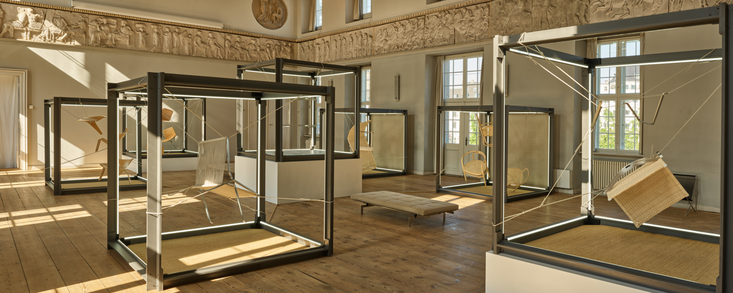
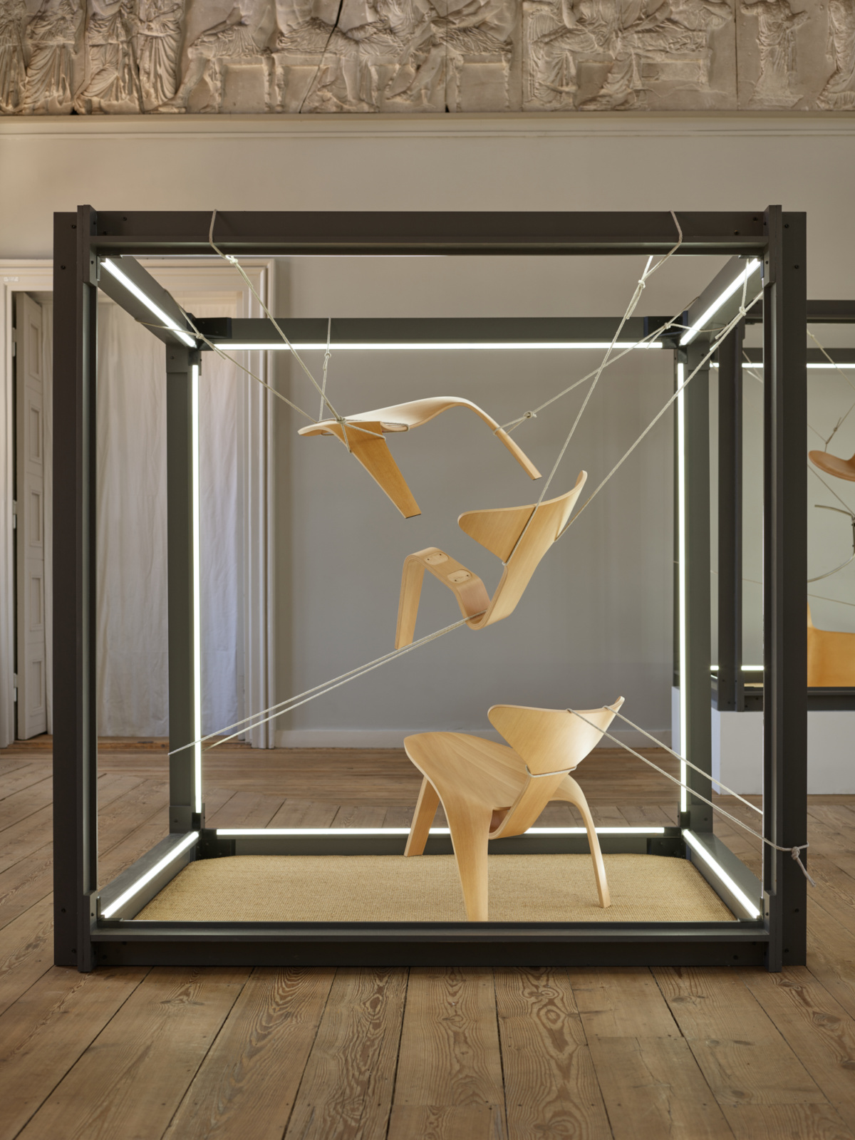
Fritz Hansen’s head of design Marie-Louise Høstbo led me through the exhibition. In the ballroom, a number of the brand’s most iconic chairs are disassembled and suspended in pieces to show the simple construction of great, lasting design. This also happens to be the room where Marie-Louise graduated from design school before the academy became dedicated solely to fine arts. Between her personal history, the icons in front of us, and the greater context of the space, it makes an impressive display.
Continuing through the interior of the Palace, we see designs by Poul Kjærholm and Arne Jacobsen, Jaime Hayon, Sebastian Herkner, Cecilie Manz, Vico Magistretti, and KiBiSi, each in displays that allow us to view and get a better idea of the tactility and craftsmanship of the designs. Back in the courtyard, the new Skagerak outdoor collection offers the perfect place to sit back and sip a beer.
7. Mazo Design
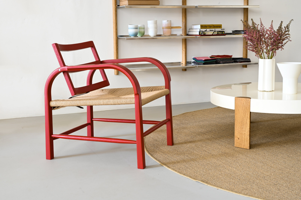
Arch Chair by Mazo Design. Courtesy of Mazo Design
Mazo Design is a smaller Danish brand founded in 2019 with a style grounded in Bauhaus simplicity, Scandinavian tradition, and Japanese culture. The studio has exclusive rights to the catalog of 1930s Danish designer Magnus Læssøe Stephensen, and today another Magnus Stephensen, his grandson, runs the design studio as CEO and partner with yet another Magnus (called Magnus Sangild, head of design).
Magnuses Stephensen and Sangild are dedicated to creating the archival works as well as contemporary pieces that all stick very close to the same functionalist design language. Critical to both are craftsmanship. “We make very simple things, but very simple things are very complicated to make,” Magnus Sangild says.
To create the Arch chair, a contemporary extension of one of Magnus the grandfather’s designs, today’s Magnuses searched far and wide for a steam bending partner to produce the chair in oak—which is more difficult to steam bend to the degree required in the arms of the lounge chair. The studio prioritizes aesthetic and craft over ease of production, which is apparent even in their homewares collection, KYO, where stoneware and ceramics are fused despite their different firing points in the kiln, or the extremely thin porcelain lights, the 16PLUS collection, which emits the warmest light possible through a white shade made of crisp bone china.
8. GUBI
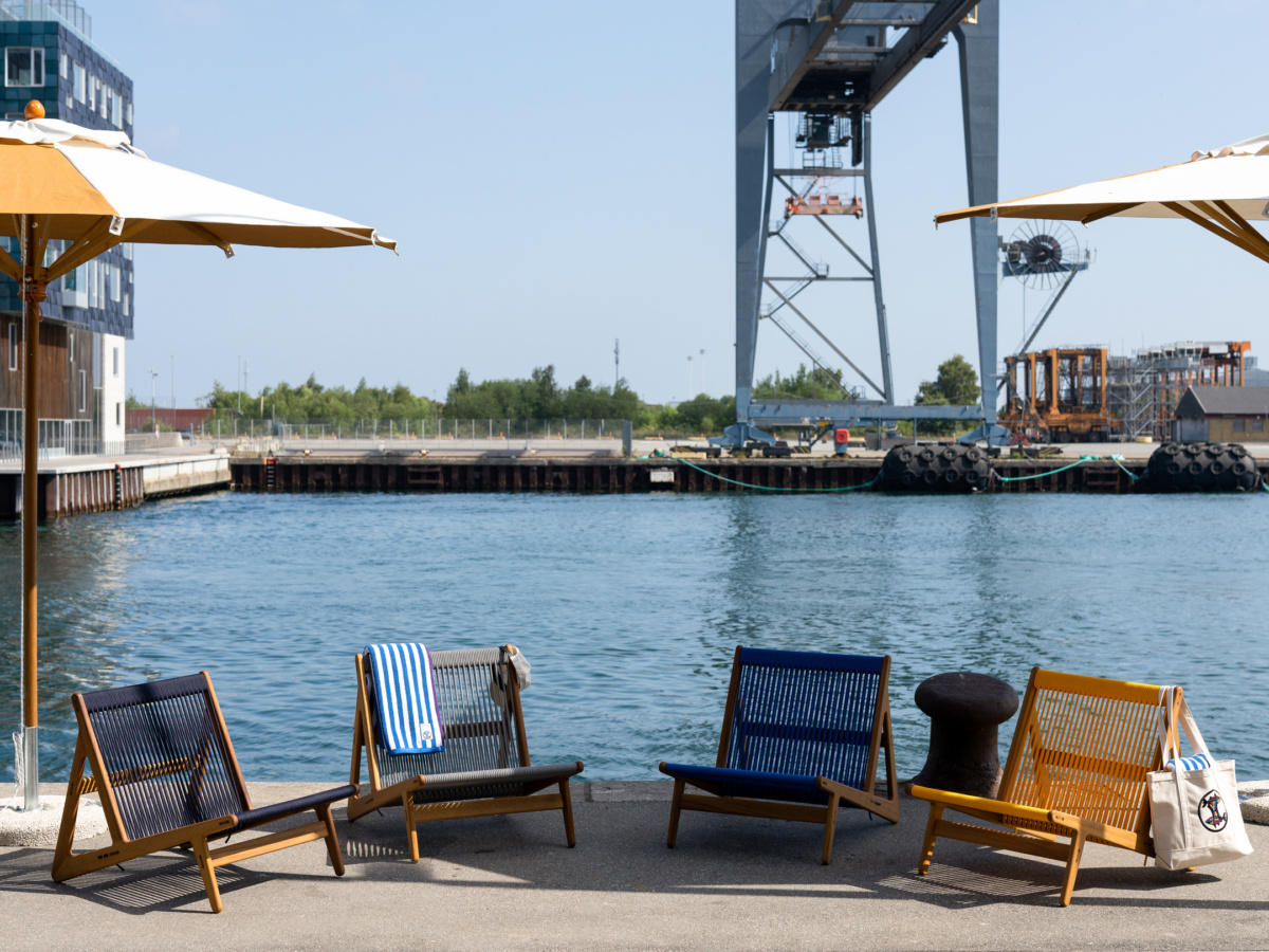
GUBI x Noah for 3daysofdesign. Courtesy of GUBI
The Scandinavian and East Coast meet in the new collaboration from GUBI and Noah, a New York fashion brand led by former Supreme creative director Brendon Babenzien and Estelle Bailey-Babenzien. The aspirational elements of seaside living inspire a colorful new edition of GUBI’s MR01 Outdoor Lounge Chair and a five-piece capsule collection of clothing that altogether summon the sea breeze.
The capsule and chair launched in GUBI’s newly refurbished, waterside showroom with a talk by GUBI CBO Marie Kristine Schmidt and Noah co-founders Estelle Bailey-Babenzien and Brendon Babenzien.
9. Kvadrat
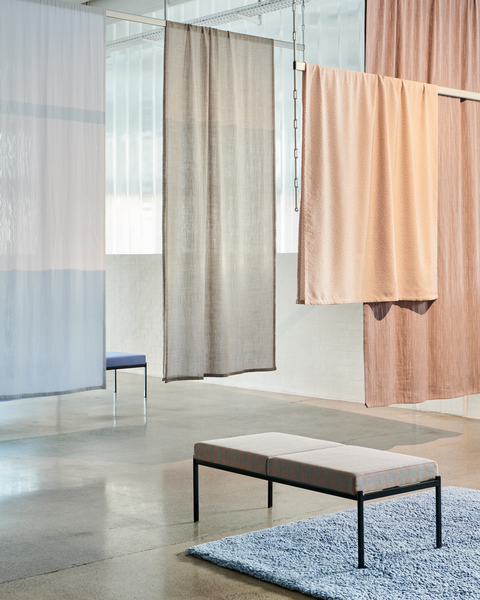
- Multiply, Sketches by Inga Sempé.
- Photos by Benjamin Lund
Kvadrat’s fabrics are one of those omnipresent products that you rarely take the time to really, fully appreciate. But with the 2023 collection Sketches by Inga Sempe, we get to dive into each thread to appreciate the tactility and multidimensionality of fabrics made from materials and natural fibers including linen, cotton, recycled silk, and hemp.
“All my work was driven by designing each thread, one by one, to enter into the construction of the fabrics,” Inga says. She did so by sketching on her iPad, enlarging everything to get deep into the details. “Fabrics are not flat, they are elaborate products,” Inga says. Diving into the yarns and manufacturing process, she infuses color and texture into the threads and weaves to differentiate from the expected, interpreting classic patterns like the herringbone with new variations.
More favorites from 3daysofdesign
- Kristina Dam released the new Outline Bar Chair during 3daysofdesign. Courtesy of Kristina Dam Studio
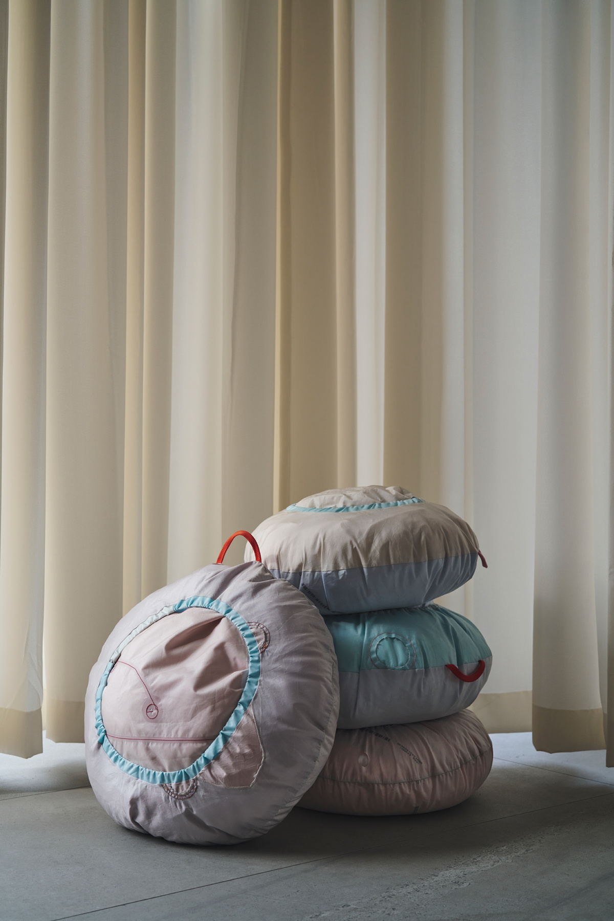
- FOLK Airbag cushions. Courtesy of Folk Reykjavík
- Panter&Tourron investigated the future of AI in design with “a couch in an envelope,” on display at IKEA’s design and research lab, Space10.
- Polestar invited FOLK to display at their Copenhagen store. The brand’s Airbag cushion, made of discarded fabric from the car manufacturing industry, formed a perfect connection between the Icelandic brand and the electric car company.
- Tom Dixon and his band played music while a Danish robot carved the cone-shaped base of his globe lights from Danish wood in Bruun Rasmussen Gallery for 3daysofdesign.
- Georg Jensen commissioned designer David Thulstrup to make a very special silver object with no obvious function. Penumbra is the shiny, sculptural result.
- Kristina Dam Studio filled an apartment where, fun fact, Hans Christian Anderson briefly lived, with her trademark sculptural minimalist sculptures and provided visitors the opportunity to engage more deeply with the works through drawing.
- Design duo Christian+Jade form a more meaningful connection with wood by investigating its inherent qualities—specifically, weight—and making its intangibility visually apparent in material explorations with Dinesen.
- Normann Copenhagen presented its collection in “Hotel Normann,” with multiple stories full of peaceful private rooms and lobby-style bars and gathering spaces where they hosted a rowdy opening party.
